Stacks
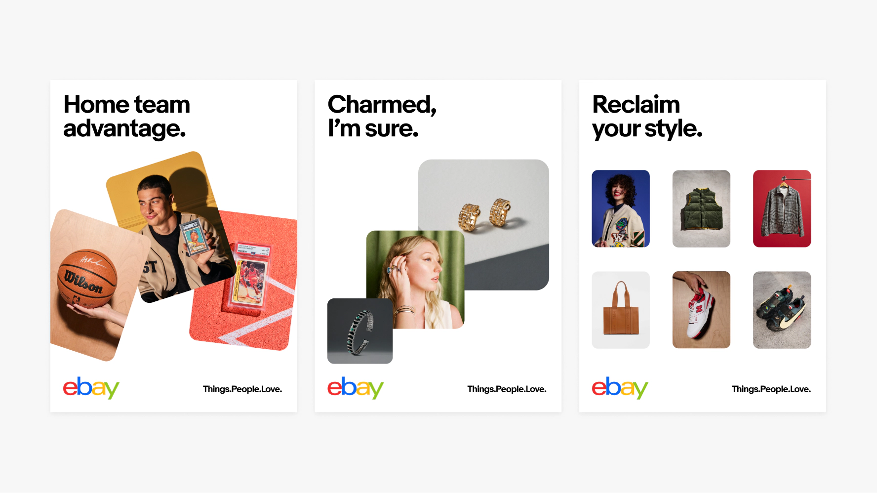
Discovery is at the heart of the eBay experience and our new approach to expressing our brand brings that notion to the forefront of all our communications. We’ve developed a visual mechanism, the stack, to demonstrate the different experiences customers have when searching for their perfect item.
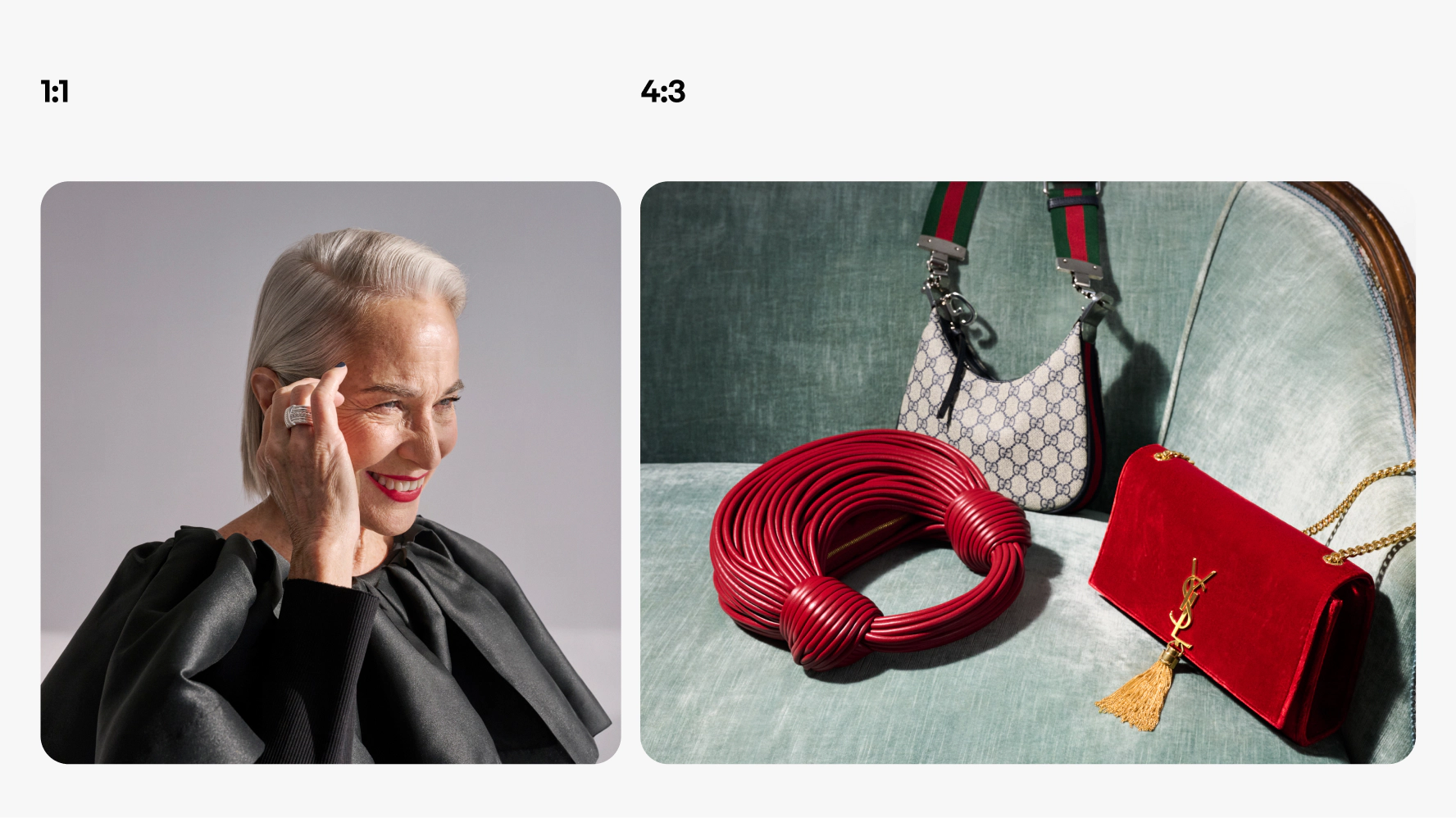

Catalog
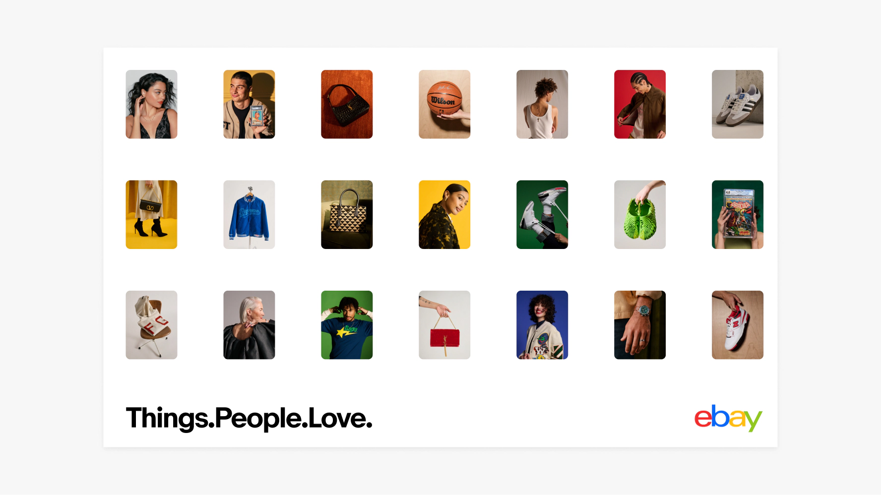
Catalog uses a modular grid layout that displays our product variety.

Discovery
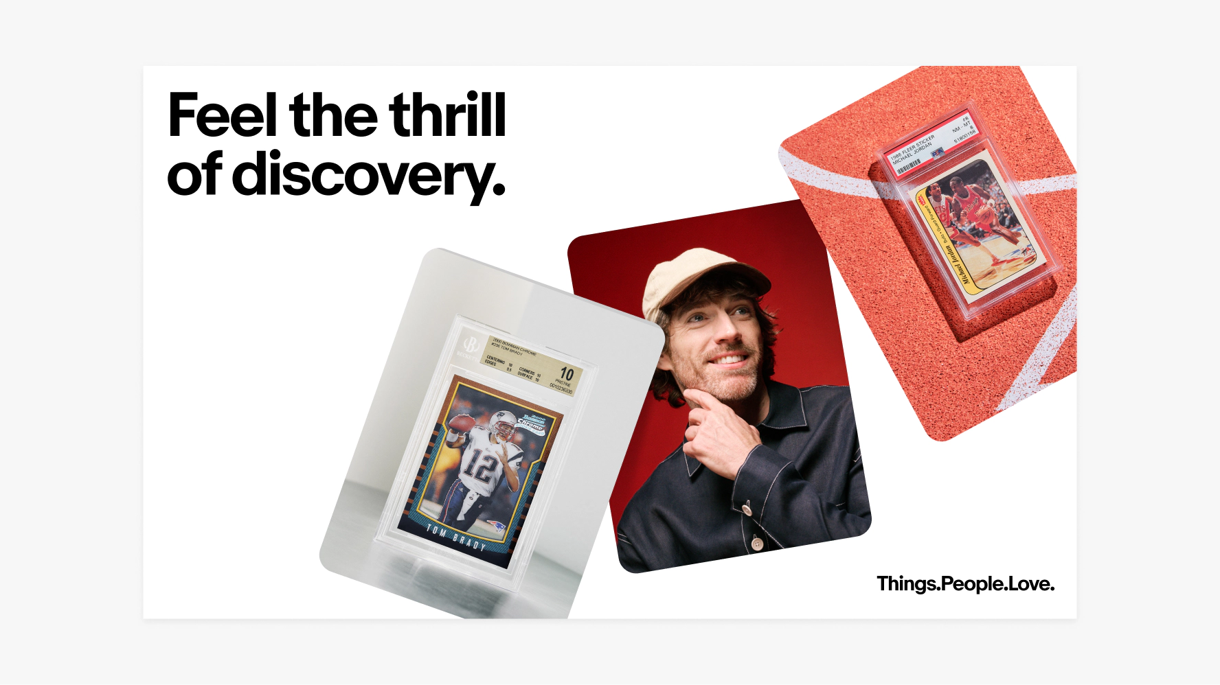
Discovery has a distinct layout that plays with scale and repetition.

Browse
Browse is the most expressive stack, adding a sense of playfulness.
Density
- When using the catalog layout, display a minimum of three cards. Always be aware of image quality and sizing, ensuring that photography is readable.
- Corner radii and spacing between cards are determined by using multiples of 8.

Curation of imagery
Tell our brand story through photography by selecting images that subtly incorporate eBay's colors into the overall composition without being the main focus or appearing too overt.


Uniform
Images within a uniform stack remain the same size and use the same radius.

Scaled
To create a scaled stack, we start with the largest card and decrease the size of each subsequent card by 25%.
- When using the discovery stack, display a minimum of three cards. Always be aware of image quality and sizing, ensuring that photography is readable.
- Corner radius and spacing between cards are determined by using multiples of 8. The smallest radius is 8 and scales upward from there.

Layering

Uniform
When using the uniform stack, ensure that more than 50% of each card is visible, including the edges of the cards.

Scaled
When using the scaled stack, the overlapping card must not exceed 25% of the overlapped card size. Ensure product visibility stays within the approved overlap area.
Adding depth
Adding shadows to our cards increases contrast and adds a sense of depth.
Drop shadow specs
- x0 y20
- Blur 64
- Color #000000
- Opacity 20%
- Multiply

Adding depth
Adding shadows to our cards increases contrast and adds a sense of depth.
Drop shadow specs
- x0 y20
- Blur 64
- Color #000000
- Opacity 20%
- Multiply

Ensure that more than 50% of each card is visible.

Don’t place cards in a way that obscures the subject matter.