Skip to main contenteBay Playbook
  • Get started
  • Foundations
  • Design system
  • Expressions
  • Resources
  • Articles

Foundations

  • Overview
    • Our logo
    • Using our logo
    • Using our tagline
    • Showcase
    • Our colors
    • Using color
    • Using color in product
    • Using color in marketing
    • Using color in illustration
    • Best practices
    • Showcase
    • Our typeface
    • Using type
    • Using type in digital
    • Using type in print
    • Best practices
    • Showcase
    • Our photos
    • Visual tone
    • Image types
    • Showcase
    • Our icons
    • Using icons
    • Confirmation indicators
    • Icon library
    • Best practices
    • Showcase
    • Our illustrations
    • Visual tone
    • Using illustration
    • Sizing and placement
    • Best practices
    • Showcase
    • Our motion
      • Using motion in product
      • Volume of motion
      • Product transitions
      • Expressive animation
      • Using motion in marketing
      • Layout in motion
      • Typography in motion
      • Depth in motion
    • Overview
    • Include plugin
      • Overview
      • Responsive layout
      • Image ratio
      • Uniform
      • Masonry
      • Mosaic
      • Overview
      • Stacks
    • Interaction levels
    • Interaction states
    • Using object styles in product
    • Using object styles in marketing

Confirmation indicators

Confirmation indicators express confirmation, verification, and fitment throughout eBay.

Confirmation indicators

On this page

  • Anatomy
  • Sizes
  • Color
  • Context
  • Alignment
  • Best practices
  • Specs
  • Resources
NextIcon library
Things.People.Love.
  • Get started
  • Foundations
  • Design system
  • Expressions
  • Resources
  • Articles
  • About eBay Design
  • Careers
  • Press
  • Privacy policy
© 2026 eBay. All rights reserved.

eBay Evo, the eBay trademark, and the eBay logo are the intellectual property of eBay Inc.

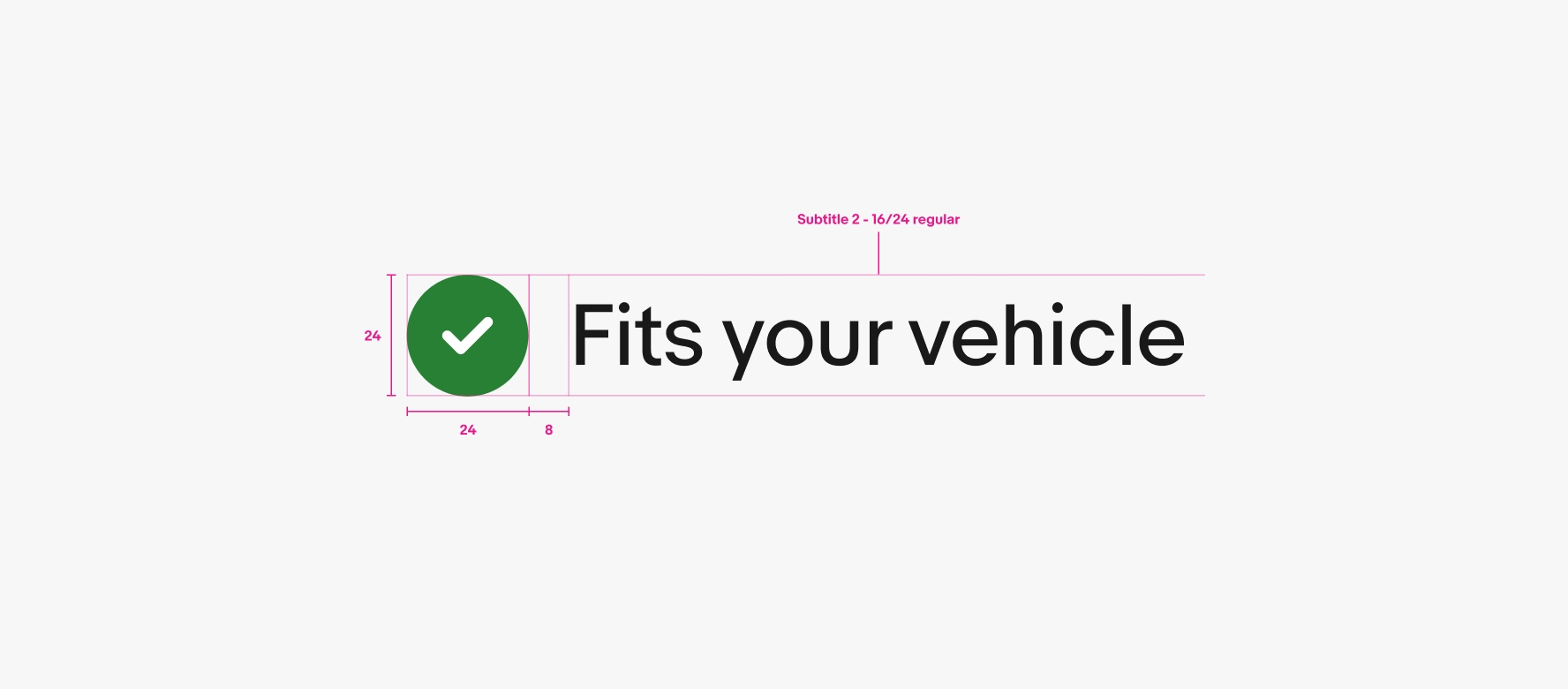
    24px lockup

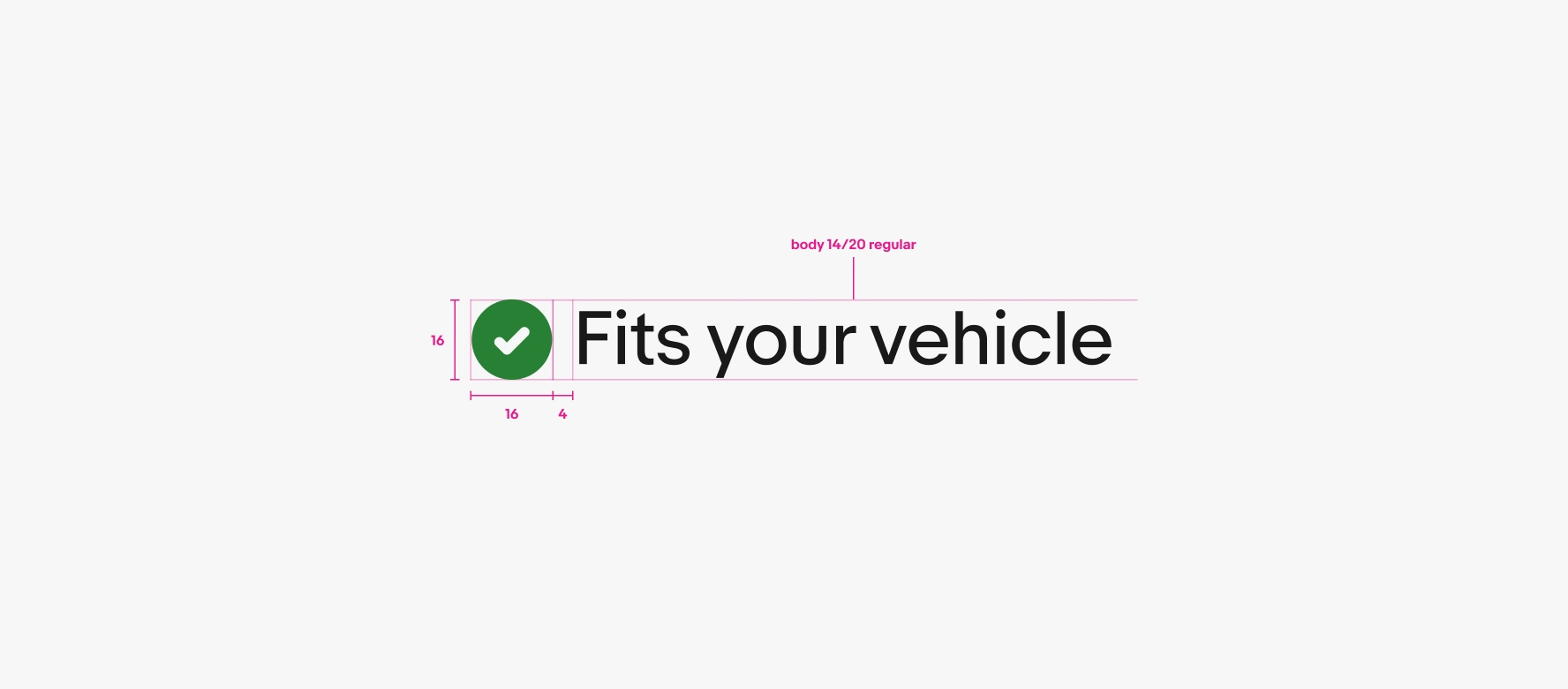
    16px lockup

    A detailed spec for a confirmation indicator combining icon and text. The green confirmation checkmark is 24px, followed by 8px of space, and then “Fits your vehicle” text using the Subtitle 2 - 16/24 regular type style.
    A detailed spec for a confirmation indicator combining icon and text. The green confirmation checkmark is 16px, followed by 6px of space, and then “Fits your vehicle” text using the Body - 14/20 regular type style.

    Anatomy

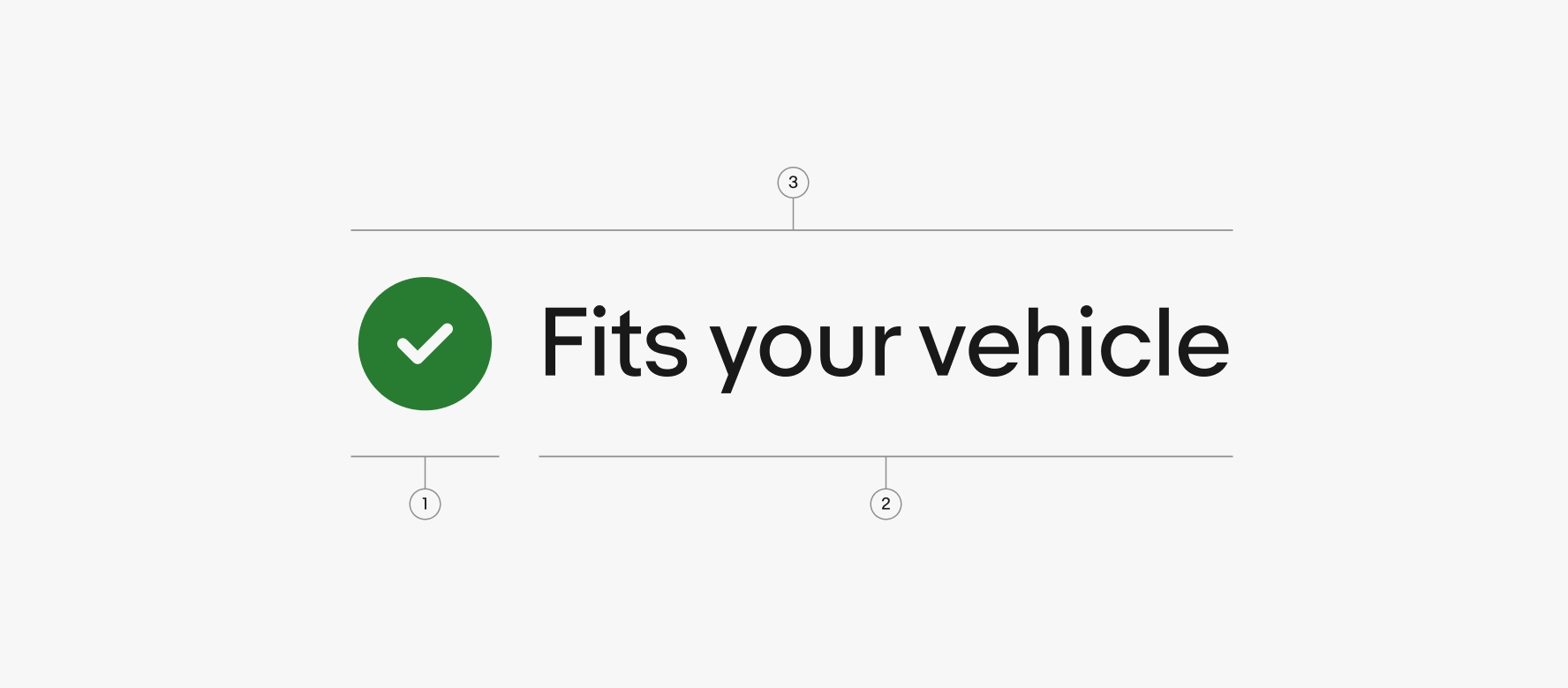
    A confirmation indicator is a lockup consisting of our green filled check mark icon combined with descriptive text.

    Sizes

    Color

    Context

    Alignment

    Best practices

    Specs

    Resources

    To discuss icon needs, reach out to the OneExperience (OX) team or sign up for office hours.

    A detailed spec of a confirmation indicator lockup. Number 1 points to the confirmation filled icon. Number 2 points to the confirmation text “Fits your vehicle”. Number 3 points to the full lockup.
    1. Icon
    2. Text
    3. Lockup

    Confirmation indicators come in both 16px and 24px icon lockups and use regular-weight text.
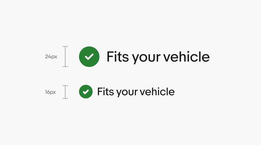
    Two confirmation indicator lockups with icons and text. The top is 24px and the bottom is 16px.

    Confirmation indicators use our green success color token. Learn more by visiting our Color tokens page.
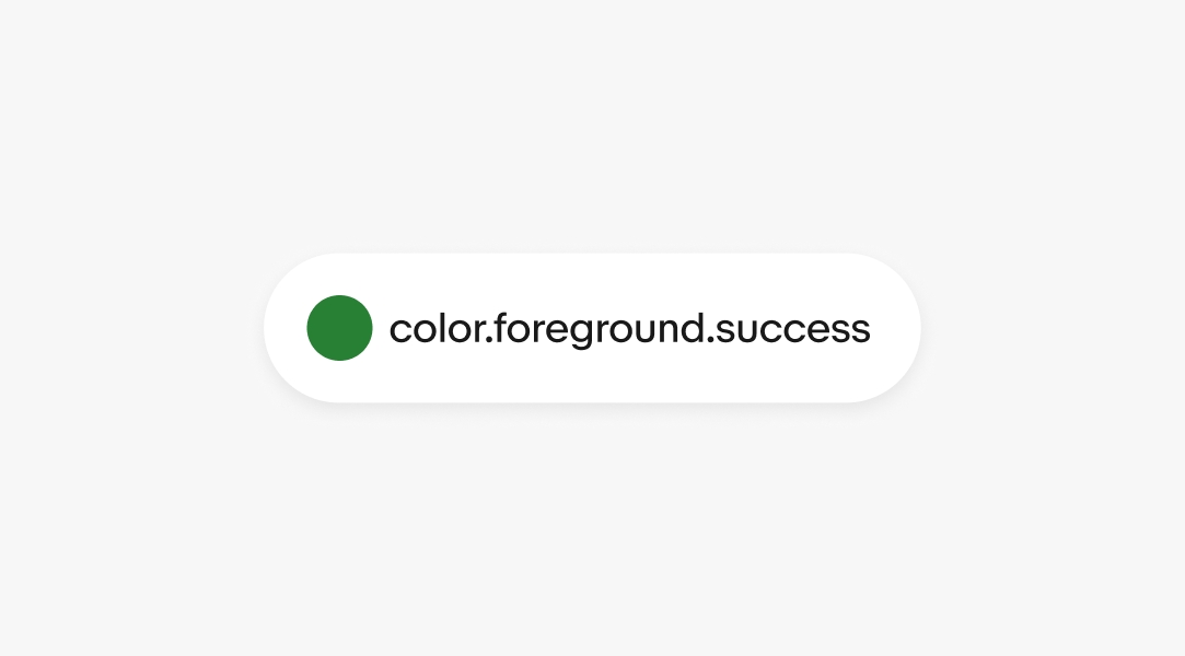
    A pill graphic containing a circle in green with the text “color.foreground.success”.

    Fitment

    Confirmation indicators are used to confirm when an item fits a vehicle for parts and accessories. The filled confirmation check mark should only be paired with regular-weight text. Fitment can extend to a variety verticals.
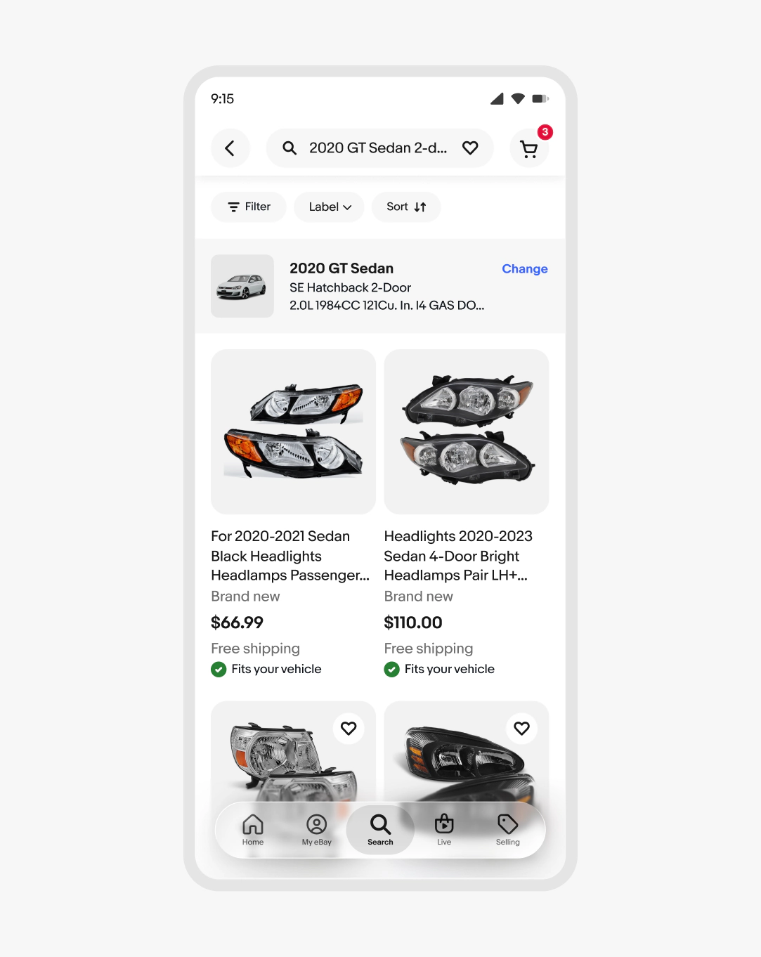
    A phone screen with a search results page of car headlights. The item tiles have a confirmation indicator with the text “Fits your vehicle”.

    Success

    Confirmation indicators are used to show success. Examples include when an item is added to a cart, an item has been delivered, or when a response has been sent.
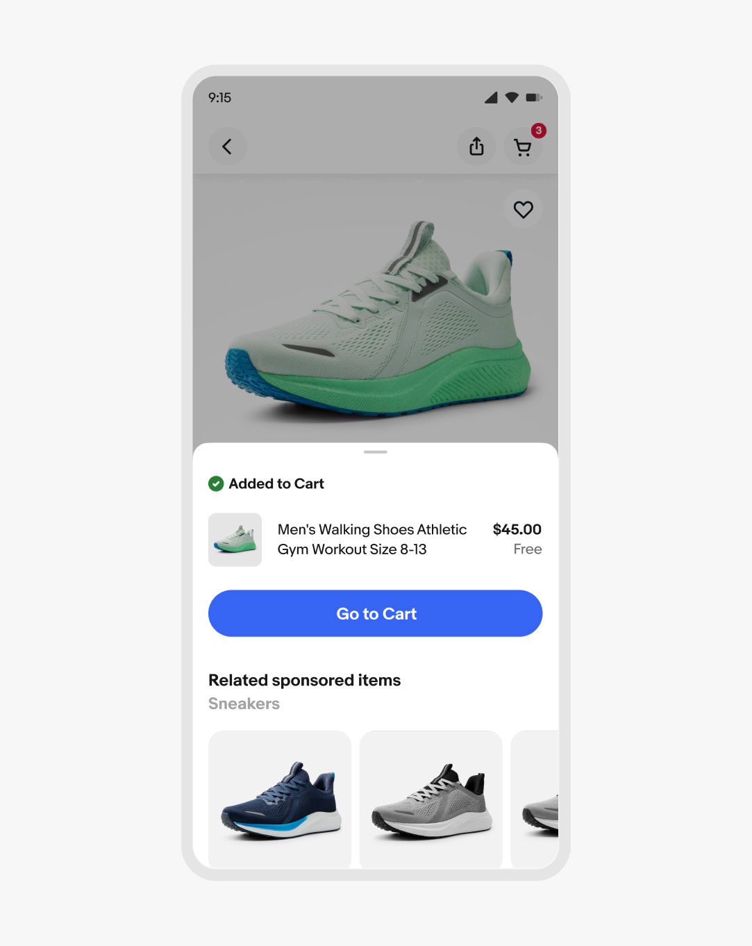
    A bottom sheet design with a confirmation indicator at the top with the text “Added to Cart”.

    Text wrapping

    When content is forced to wrap to 2 lines, the text is left aligned on the right side of the check mark. Text wrapping can occur during translation for other languages.
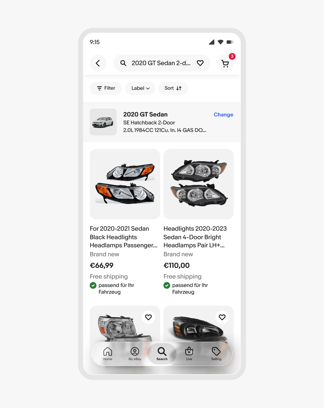
    A phone screen with a search results page of car headlights. The item tiles have a confirmation indicator with wrapping text in German.

    Do use our success color token for the filled confirmation check mark.
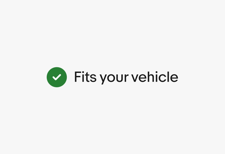
    A green filled confirmation checkmark icon next to the text “Fits your vehicle”.

    Don’t use other colors for the filled confirmation check mark.
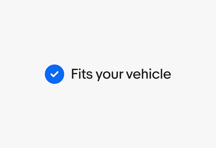
    A blue filled confirmation checkmark icon next to the text “Fits your vehicle”.

    Don’t use an unfilled version of the confirmation check mark.
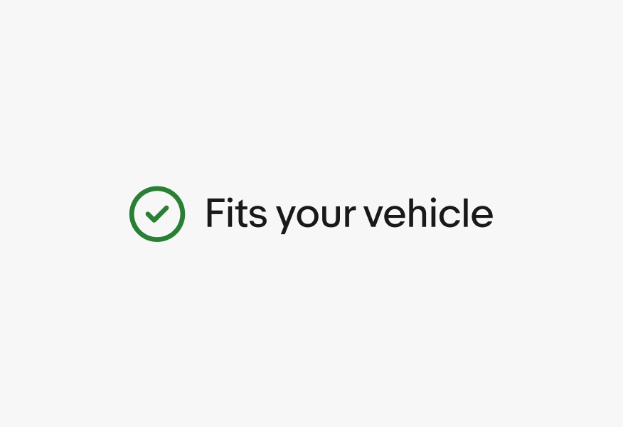
    A green checkmark icon with a stroke and no fill next to the text “Fits your vehicle.

    Don’t use icons to replace the filled confirmation check mark.
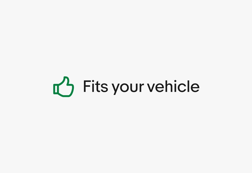
    A green thumb up icon next to the text “Fits your vehicle.

    Don’t mix regular and bold text weights.

    A green filled confirmation checkmark icon next to the text “Fits your vehicle”, but “vehicle” is bolded.

    Don’t create your own color combinations for confirmation indicators.
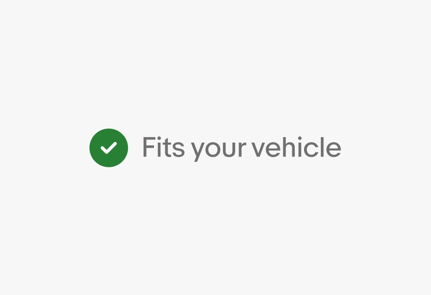
    A green icon next to gray text.
    • Icon library

      View our suite of available icons.

    • Type tokens

      View the tokens that we use to consistently apply these styles to any string in development.

    • Color tokens

      Learn about our color tokens.