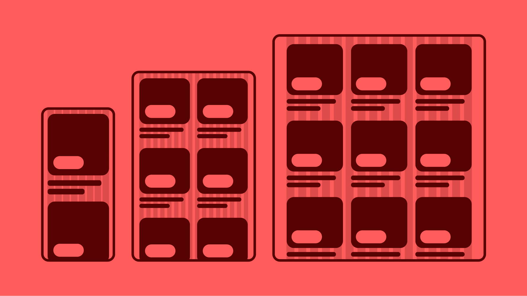
Responsive layout
A responsive layout according to viewport size. The use of a grid allows us to remain consistent throughout our products and platforms.
In the beginning, the web was accessed exclusively through desktop browsers. But today’s web is displayed across a wide variety of platforms and screen sizes. Providing a consistent experience across devices is a guiding principle that helps us earn our users’ trust and confidence. It provides an inclusive, performant, enjoyable user experience that increases conversion rates and simplifies analytics and business intelligence reporting.
Responsive web design (RWD) is the industry standard design approach that ensures that the content of a web page is delivered consistently on any device, whether it’s a phone, desktop, or TV web browser. Responsive web design is flexible and fluid, utilizing a single code base and a fluid grid system. Elements automatically resize and rearrange themselves, delivering the best user experience regardless of screen dimensions.
Responsive Web Design
A modern design approach that enables web page layouts, elements and images to be fluid and flexible in response to different screen sizes, orientations and platforms on which the web content is displayed.
Adaptive Web Design
A legacy design approach that creates a predefined layout for each of the devices, dimensions, and screen resolutions on which the content is expected to be displayed.
Media Queries
A Cascading Style Sheets (CSS) technique that dynamically applies styles to a single source of content to optimize it for the screen dimensions, orientation, and resolution on which it is displayed.
Breakpoint
The height or width threshold at which a layout breaks or changes to best fit the screen dimensions. In RWD the layout adjusts dynamically, in AWD a call to the web server is made to load the appropriate predefined layout for that breakpoint.
Grid
A layout structure used to organize content into rows and columns which form the foundation of responsive web design. In RWD grids are fluid and use relative units (percentages) instead of fixed pixels, allowing the grid to adjust or respond to different screen dimensions.
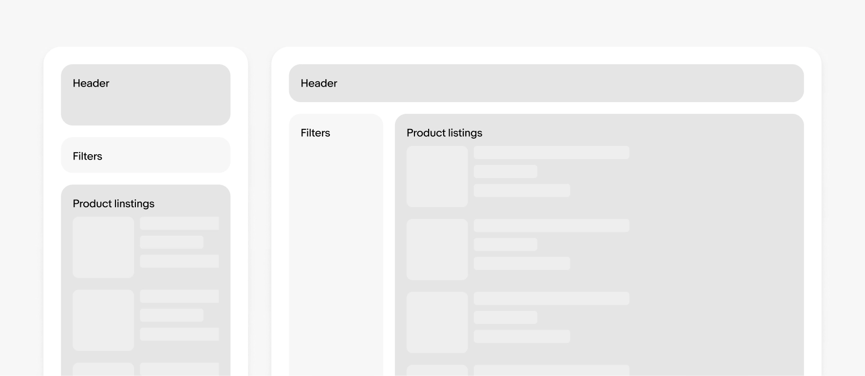
Effective information architecture (IA) can make responsive web design easier to implement by establishing a clear content structure that seamlessly responds to different screen sizes in an optimal way.
- Clear content hierarchy: Clear, structured hierarchy (headings, sections, calls-to-action) prioritizes what should be displayed or hidden (if it must) on smaller screens, ensuring optimal load times, good user experience, and achievement of business goals.
- Modular design: Structuring content into modular components (cards, blocks, sections)
- Progressive disclosure patterns: (accordions, carousel) can prevent the single column from becoming too long on narrow screens.
- Consistent navigation: Defining a flexible navigation system such as an overflow menu ensures familiar, consistent usability across devices.
Unlike a traditional design process, responsive web design prioritizes a mobile-first and content-first approach. Designing for the smallest screen first ensures that the most essential content and functions are prioritized. Then, progressively enhance the design for larger screens, adding complexity only where it enhances the experience.
Responsive web design not only responds to screen sizes but also accommodates different interaction modalities, such as touch and tap on mobile devices versus clicking and scrolling with a mouse, touchpad, and keyboard on desktops.
- Touch versus click: On touchscreen devices, elements like buttons, links, and menus need to be larger and more spaced out to accommodate finger taps and in the case of Apple, meet their Human Interface Guidelines (HIG). Responsive web design incorporates this by using sizing to make interactions easier.
- Scroll versus swipe: Mobile users rely on swiping and vertical scrolling due to the smaller screen space, while desktop users might use a combination of scrolling and precise clicking. Responsive web design simplifies layouts on mobile screens by stacking content vertically, making scrolling (swiping up or down) more intuitive. On larger screens, content fluidly expands into the multi-column grid layout previously discussed, to make better use of the space.
Many of our components are designed with flexible layouts to support responsive pages. Some examples:
These can work with our various page grids and may have minimum and maximum dimensions to consider.
Start web layouts using components that are responsive instead of starting with native app standards. Native design components are often unsuitable for use on responsive web designs.