Skip to main contenteBay Playbook
  • Get started
  • Foundations
  • Design system
  • Expressions
  • Resources
  • Articles

Foundations

  • Overview
    • Our logo
    • Using our logo
    • Using our tagline
    • Showcase
    • Our colors
    • Using color
    • Using color in product
    • Using color in marketing
    • Using color in illustration
    • Best practices
    • Showcase
    • Our typeface
    • Using type
    • Using type in digital
    • Using type in print
    • Best practices
    • Showcase
    • Our photos
    • Visual tone
    • Image types
    • Showcase
    • Our icons
    • Using icons
    • Confirmation indicators
    • Icon library
    • Best practices
    • Showcase
    • Our illustrations
    • Visual tone
    • Using illustration
    • Sizing and placement
    • Best practices
    • Showcase
    • Our motion
      • Using motion in product
      • Volume of motion
      • Product transitions
      • Expressive animation
      • Using motion in marketing
      • Layout in motion
      • Typography in motion
      • Depth in motion
    • Overview
    • Include plugin
      • Overview
      • Responsive layout
      • Image ratio
      • Uniform
      • Masonry
      • Mosaic
      • Overview
      • Stacks
    • Interaction levels
    • Interaction states
    • Using object styles in product
    • Using object styles in marketing

Best practices

What—and what not—to do when using color.

Best practices

On this page

  • Color with typography
  • Color backgrounds
  • Color with photography
  • Color with illustration
  • Color in product
  • Color in marketing
  • Color in emails
PreviousUsing color in illustrationNextShowcase
Things.People.Love.
  • Get started
  • Foundations
  • Design system
  • Expressions
  • Resources
  • Articles
  • About eBay Design
  • Careers
  • Press
  • Privacy policy
© 2026 eBay. All rights reserved.

eBay Evo, the eBay trademark, and the eBay logo are the intellectual property of eBay Inc.

    Color with typography

    Color backgrounds

    Color with photography

    Color with illustration

    Color in product

    Color in marketing

    Color in emails

    Do use color tones from the same color family.

    Text and graphic in dark blue against a light blue background.

    Don’t combine different color families.

    Text and graphic in brown against a light blue background.

    Do use solid colors on typography.

    Text in light purple against a deep purple background.

    Don’t use gradients on typography.

    Text in an orange, yellow, and blue linear gradient against a deep purple background.

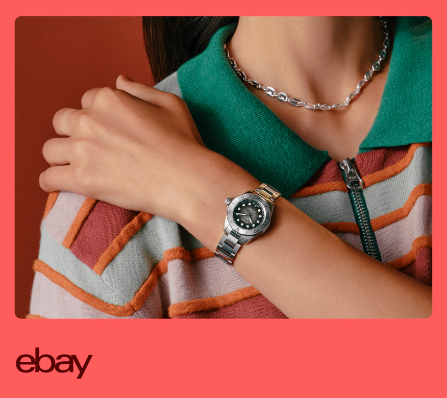
    Do use solid colored backgrounds.

    A close up image of someone wearing a watch and necklace. The person is cropped in and wearing a white, orange and red striped shirt with a green collar.

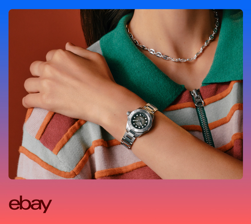
    Don’t use gradient backgrounds.

    A close up image of someone wearing a watch and necklace. The person is cropped in and wearing a white, orange and red striped shirt with a green collar.

    Do use color levels 400, 500, and 700 for background colors.

    The Authenticity Guarantee badge and three green-toned images sits on a green background.

    Don’t use color levels 100, 200, 300, 600, or 800 as background colors.

    The Authenticity Guarantee badge and three green-toned images sits on a dark green background.

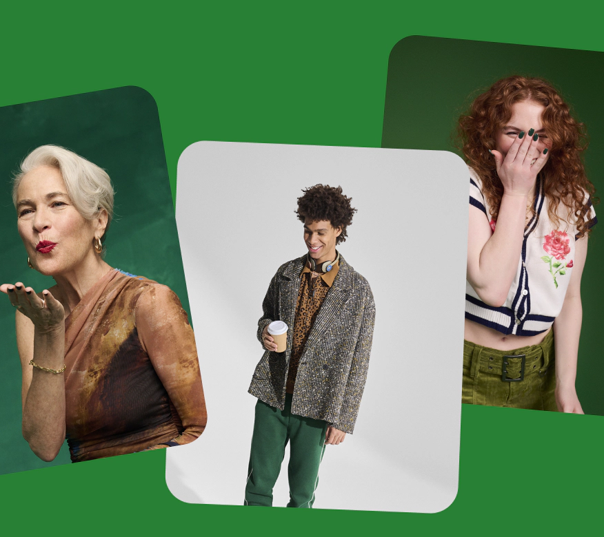
    Do make backgrounds a single, solid color.

    A green-toned image of a group of people in streetwear and dark green text sits on a green background.

    Don’t use color blocks.

    A green-toned image of a group of people in streetwear and dark green text sits on a green background with different shades of green color blocks.

    Do use levels 400, 500, and 700 for background colors.

    Brown text and a studio image of a person standing in front of an orange backdrop sits on an orange background.

    Don’t use black backgrounds outside of campaigns or video end cards.

    White text and a studio image of a person standing in front of an orange backdrop sits on a black background.

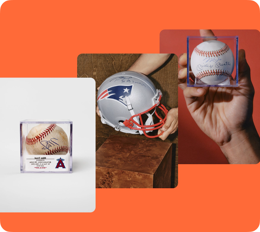
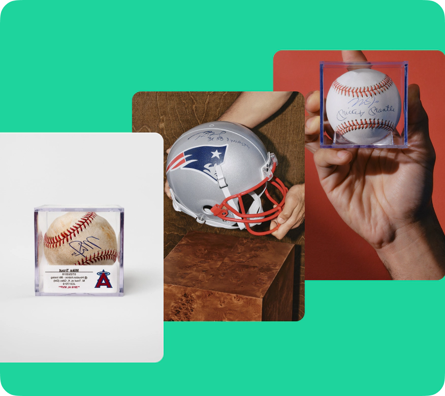
    Do use background colors that are complementary to photography color schemes.

    Three images–an autographed baseball, ann autographed football helmet and autographed baseball–are stacked on a light green background.

    Don’t use background colors that clash with photography and/or aren’t complementary or analogous.

    Three images–an orange Nokia smartphone, a studio shot of a person holding three smartphones wearing an orange and white dress, and wired orange headphones–are stacked on a light green background.

    Do use background colors that are analogous to photography color schemes.

    Three images–a person wearing a navy blue jacket facing the camera, a person wearing a blue jacket with their back to the camera, and a white jacket laying on a dark blue backdrop–are stacked on a blue background.

    Don’t use background colors that clash with photography and/or aren’t complementary or analogous.

    Three images–a person wearing a navy blue jacket facing the camera, a person wearing a blue jacket with their back to the camera, and a white jacket laying on a dark blue backdrop–are stacked on a dark magenta background.

    Do use the color background that is predefined for each illustration. You can also always use a neutral background.

    A bike with 6 eBay cardboard boxes attached to the bicycle is illustrated on a yellow background.

    Don’t apply your own color background colors to illustrations.

    A bike with 6 eBay cardboard boxes attached to the bicycle is illustrated on a purple background.

    Do use the original coloring of each illustration.

    A brown cardboard shoe box illustrated on a neutral grey background.

    Don’t change the colors in illustrations as there are legal implications of certain objects in certain colors.

    An orange cardboard shoe box illustrated on a neutral grey background.

    Do always use white backgrounds for empty states.

    An empty state illustration in the eBay app on a white transparent background.

    Don’t use colored backgrounds in empty states.

    An empty state illustration in the eBay app on a purple background.

    Do use roughly the same shade for all background colors when multiple illustrations are paired together in a list or carousel.

    The ‘Categories’ section in the eBay app with three categories: Home Decor with an illustrated orange lamp on an orange background, Books with an illustrated book of stamps on a green background, and Tools with an illustrated speaker on a purple background.

    Don’t mix extremely dark or light background colors when multiple illustrations are paired in a single view.

    The ‘Categories’ section in the eBay app with three categories: Home Decor with an illustrated orange lamp on a light orange background, Books with an illustrated book of stamps on a dark green background, and Tools with an illustrated speaker on a light purple background.

    Do keep colored illustration backgrounds separate from text-heavy areas.

    The ‘Your sizes’ section in the eBay app with three sections accompanied with a square illustration on the left of each section: Clothing showcases a folded purple shirt on a green square background, Shoes showcases a blue and white sneaker on an orange square background, and Accessories shows a brown watch on a yellow background.

    Don’t layer text on top of colored backgrounds in small, text-heavy areas.

    The ‘Your sizes’ section in the eBay app with three colored sections: The Clothing section showcases a folded purple shirt and black text on a light green background, the Shoes section showcases a blue and white sneaker and black text on a light orange background, and the Accessories shows a brown watch and black text on a light yellow background.

    Do use the colors provided in the components to ensure the semantic meaning holds true.

    A green alert notice sits in the Selling section on the eBay app.

    Don’t use colors that are not included in semantic components like alert notices. It reduces their meaning.

    A purple alert notice sits in the Selling section on the eBay app.

    Do use the color themes defined for each graph type and the ordering defined based on number of data sets.

    A graph with three values all in different blue color and pattern styles.

    Don’t use colors for chart types they are not meant for (i.e. line graph colors in an area chart) and don’t create new color themes for graphs that are not in the system.

    A graph with three values all in different pink color and pattern styles.

    Do use colors for signals that are built into the component.

    A green ‘NEW LISITING’ signal in one of four item tiles on the eBay app.

    Don’t use bespoke colors for signals.

    A teal ‘NEW LISITING’ signal in one of four item tiles on the eBay app.

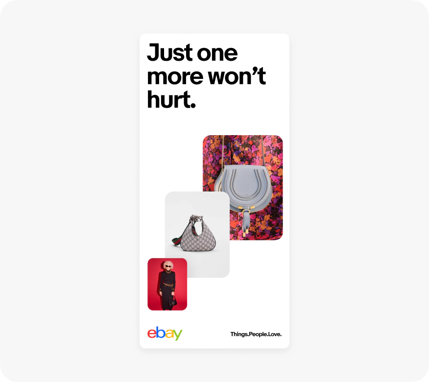
    Do use the 4-color logo on a white background for out of home and offsite marketing ads.

    A digital banner ad with black text, three red-tones stacked images, the 4-color eBay logo, and tagline in black on a white background.

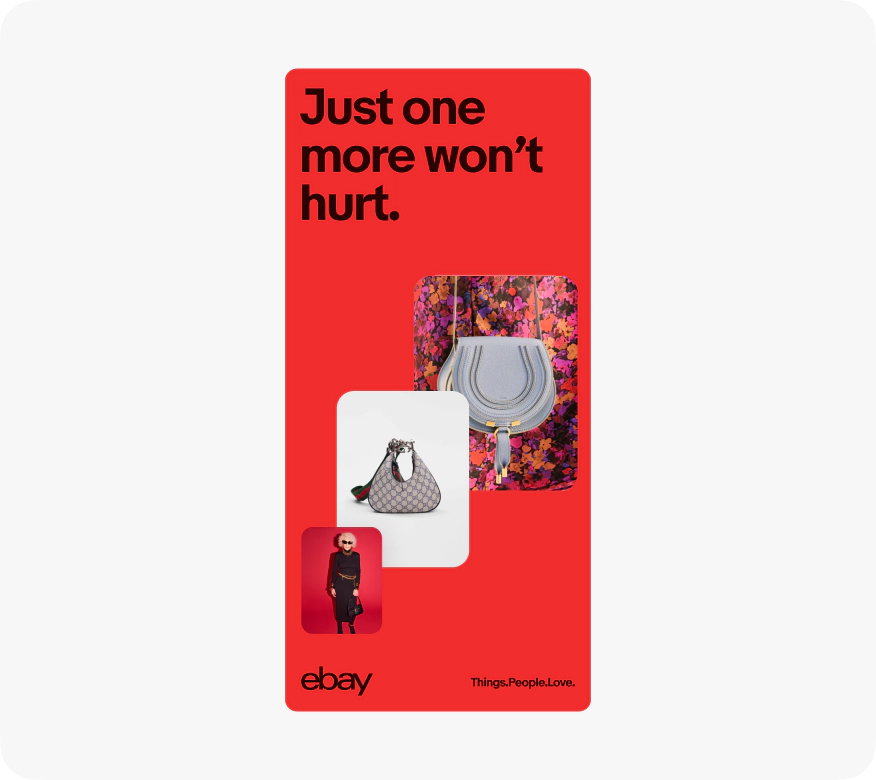
    Don’t use any of the extended marketing palette colors for out of home and offsite marketing ads.

    A digital banner ad with dark red text, three red-tones stacked images, the eBay logo in dark red, and tagline in dark red on a red background.

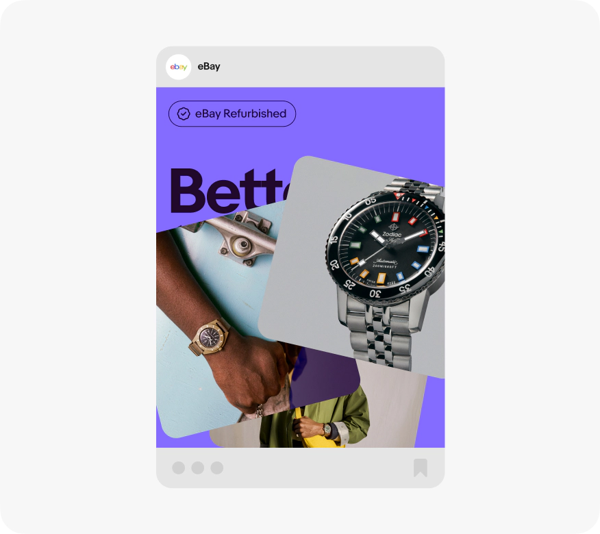
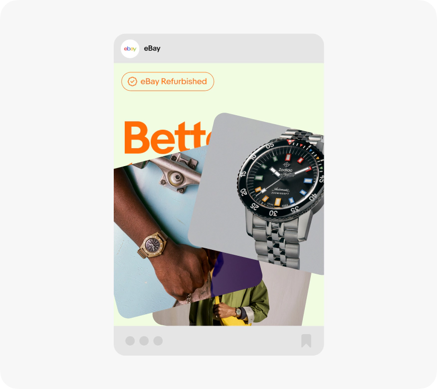
    Do use the extended marketing palette for more expressive messages on ebay channels like social.

    An eBay social post of three stacked images on top of a purple background with dark purple text.

    Don’t use colors or color combinations outside of the extended marketing palette in social.

    An eBay social post of three stacked images on top of a light yellow background with orange text.

    Do use level 200 colors as backgrounds in emails so they maintain adequate contrast ratios when translated in dark mode.

    A mobile eBay email in dark mode with a light orange icon and text on a dark orange banner.

    Don’t use colors outside of the Email marketing palette as they may be translated in unexpected ways and lose necessary contrast ratios.


    A mobile eBay email in dark mode with a light orange icon and text on an orange banner.