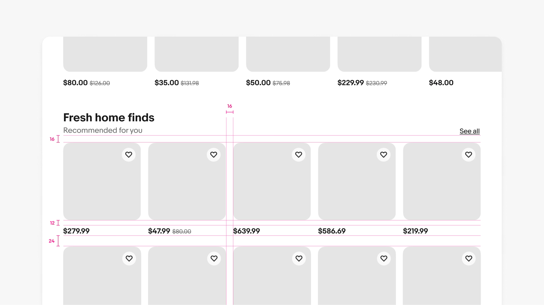
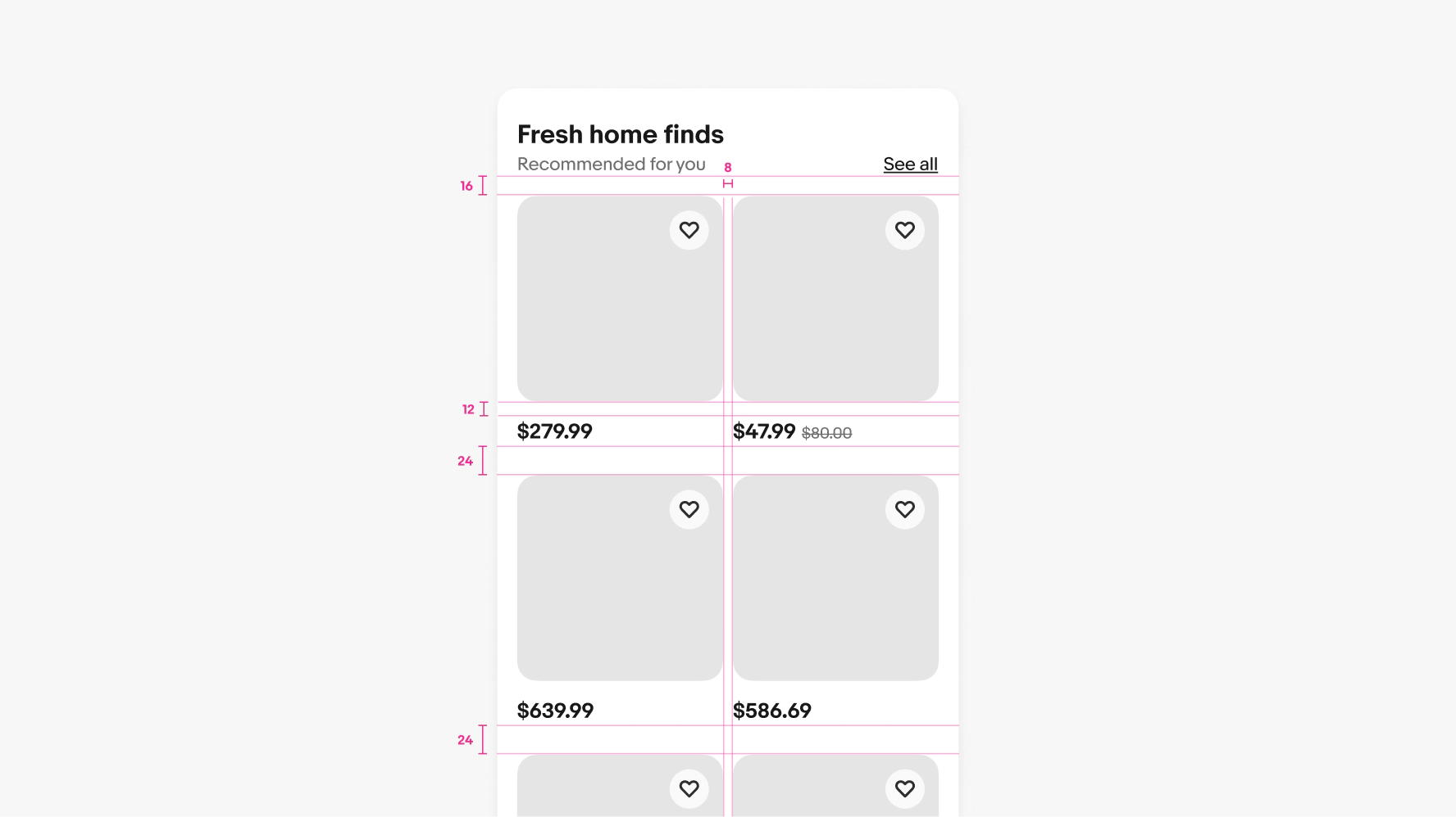
Skip to main contenteBay Playbook
  • Get started
  • Foundations
  • Design system
  • Expressions
  • Resources
  • Articles

Foundations

  • Overview
    • Our logo
    • Using our logo
    • Using our tagline
    • Showcase
    • Our colors
    • Using color
    • Using color in product
    • Using color in marketing
    • Using color in illustration
    • Best practices
    • Showcase
    • Our typeface
    • Using type
    • Using type in digital
    • Using type in print
    • Best practices
    • Showcase
    • Our photos
    • Visual tone
    • Image types
    • Showcase
    • Our icons
    • Using icons
    • Confirmation indicators
    • Icon library
    • Best practices
    • Showcase
    • Our illustrations
    • Visual tone
    • Using illustration
    • Sizing and placement
    • Best practices
    • Showcase
    • Our motion
      • Using motion in product
      • Volume of motion
      • Product transitions
      • Expressive animation
      • Using motion in marketing
      • Layout in motion
      • Typography in motion
      • Depth in motion
    • Overview
    • Include plugin
      • Overview
      • Responsive layout
      • Image ratio
      • Uniform
      • Masonry
      • Mosaic
      • Overview
      • Stacks
    • Interaction levels
    • Interaction states
    • Using object styles in product
    • Using object styles in marketing

Uniform

We use uniform grids to showcase a defined number of items for easy comparison.
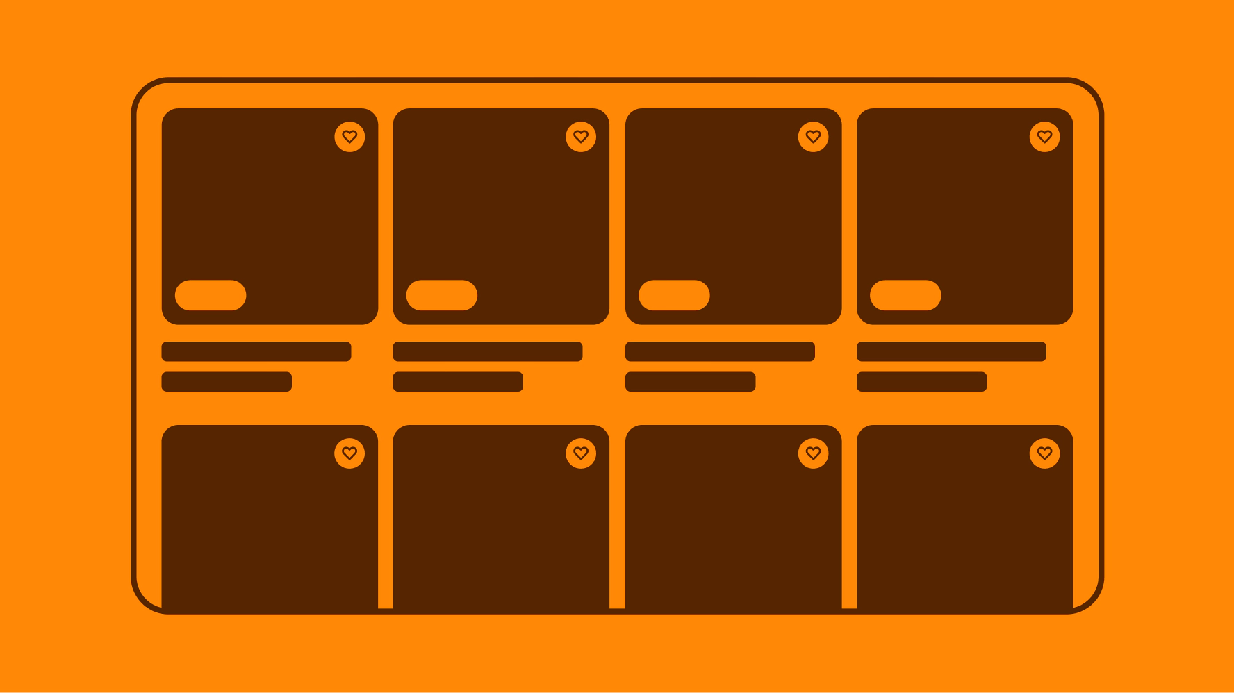
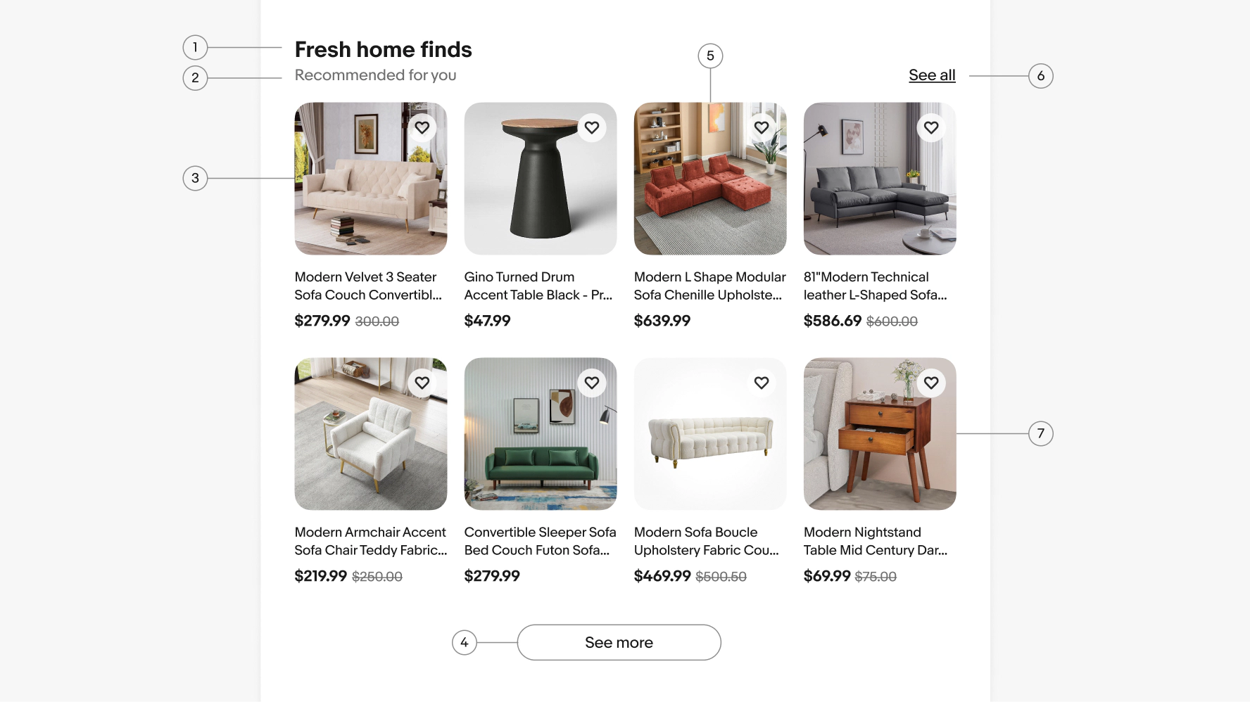
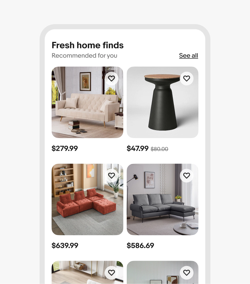
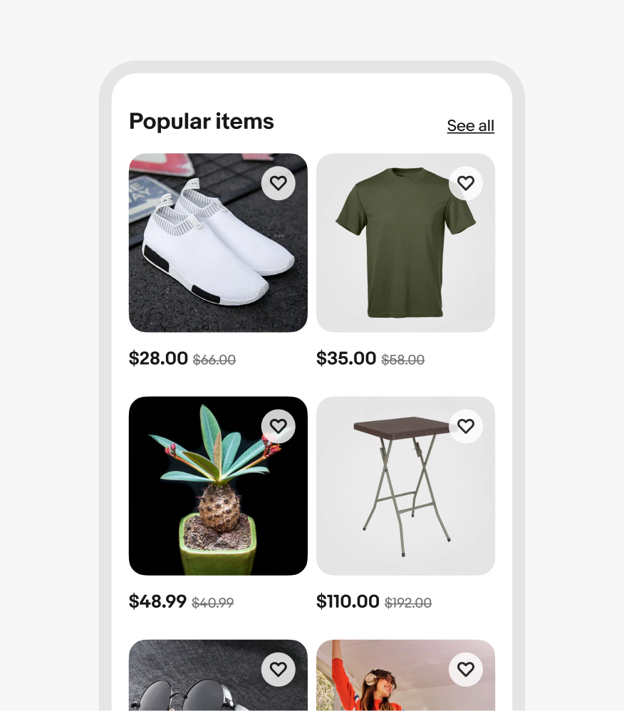
Stylized graphic of a uniform grid in orange.
Uniform

On this page

  • Considerations
  • Anatomy
  • Properties
  • Behavior
  • Screen sizes
  • Best practices
  • Specs
  • Resources

Anatomy

Properties

Behavior

Screen sizes

Best practices

Specs

Resources

PreviousImage ratioNextMasonry
Things.People.Love.
  • Get started
  • Foundations
  • Design system
  • Expressions
  • Resources
  • Articles
  • About eBay Design
  • Careers
  • Press
  • Privacy policy
© 2026 eBay. All rights reserved.

eBay Evo, the eBay trademark, and the eBay logo are the intellectual property of eBay Inc.

    1. Section title
    2. Subtitle
    3. Row
    4. See more button
    5. Column
    6. Action link
    7. Item tile

    Section title

    Section titles are required on uniform grids. They anchor the item tiles on the page and give context as to why the user is seeing them. Subtitles on section titles are optional and only used when additional detail is required.

    Item title and price

    Titles can be used in uniform grids to give additional information that may be critical for comparing similar items.

    Price only

    The minimum amount of information used in a uniform grid is price only. Strikethrough price will appear on the right when applicable.

    “See more” button

    You can add a "See more" button below the default number of rows in a uniform grid to load additional items in place. Once tapped, the button loads a specific number of rows below those shown by default, which pushes the content below the uniform grid down.

    After the max number of new items have loaded, the button text changes to "See all," which takes users to the primary destination page. This page should be the same page as the "See all" link in the header, if there is one.

    If the uniform grid module appears at the bottom of a page, scrolling will load more items, but no button is necessary. Users can scroll continuously and keep loading content until no more items are available.

    Number of items

    The number of columns in the grid changes responsively based on the width of the screen and its margins. The item width will grow and shrink to fill the column space. As you scale across breakpoints, be sure to follow the specific column guide for each grid size.

    Text wrapping

    On screens smaller than 540px wide, titles wrap up to 3 lines and then truncate with an ellipses. On screens larger than 540px wide, titles wrap up to 2 lines and then truncate with an ellipses.

    Keyboard interaction

    Focusing on an item tile outlines the image with a focus indicator. TAB navigates through interactive elements within the tile. ENTER or SPACE activates nested elements or navigates to a detail page when the image is selected.

    Small

    On small screens, there are only 2 items per row with max 8 items total shown by default.

    Medium

    On medium screens, there are only 4 items per row with max 12 items total shown by default.

    Large

    On large screens, there are only 5 items per row with max 10 items total shown by default.

    Large screen

    Small screen

    Anatomy of a uniform grid. Number 1 points to the grid’s title. Number 2 points to subtitle. Number 3 points to a row. Number 4 points to a “See more” tertiary cta button. Number 5 points to a column. Number 6 points to a “See all” text link. Number 7 points to an item tile.
    A section title, subtitle, and “See all” text link above two item tiles.
    Two item tiles with titles and prices.
    Two item tiles with prices only.
    Two item tiles with a “See more” tertiary cta button below them.
    A grid of 4 tiles with a “See all” tertiary cta button below them.
    A grid of tiles with a pink scrolling indicator symbolizing that loading happens on scroll.
    A detailed grid of screen size names and widths. There are 4 columns. From left to right reads “Small”, “Medium”, “Large”, and “X-Large”. Small has 320 Min, 360 Android HTML, and 375 IOS and 540. 540 is highlighted in pink with “2 columns”. Medium has 600, 768, and 1024. 768 is highlighted in pink with “4 columns”. 1024 is highlighted in pink with “5 columns”. Large has 1280 and 1440. X-Large has 1640+.
    A small and large screen using the uniform grid. The small screen has item titles that truncate after 3 lines. The large screen has item titles that truncate after 2 lines.
    Two item tiles with blue keyboard focus stroke indicators. The left example is around the save icon in the upper right of the image. The right example is around the image itself.
    A small screen design with a uniform grid containing 2 columns of item tiles.
    A medium screen design with a uniform grid containing 4 columns of item tiles.
    A large screen design with a uniform grid containing 5 columns of item tiles.
    A detailed spec of a large screen uniform grid. There is 16px of space between the title and top row of item tiles. 16px of space is between the item tiles.
Prices are placed 12px below the images and 24px of space is between rows of item tiles.
    A detailed spec of a small screen uniform grid. There is 16px of space between the title and top row of item tiles. 8px of space is between the item tiles.
Prices are placed 12px below the images and 24px of space is between rows of item tiles.

    Considerations

    Specific

    Whether it's user-curated or activity-based suggestions, items in uniform grids are closely related and generally share the same category.

    Comparative

    Uniform grids are organized so that all images are the same size and data like title and price are aligned so they can be compared easily.

    Concise

    Uniform grids are meant to contain a specific, curated set of items and are not meant to be scrolled endlessly.

    Section titles

    Do always include a section title, preferably with some context as to why the user is seeing the uniform grid in the subtitle line.

    Don’t leave off the section title. It makes long pages hard to scan and doesn’t give the user enough context.

    Alignment

    Do align price to a single baseline even if titles have different lengths.

    Three item tiles with titles ranging from 2 and 3 lines. The prices perfectly align on a baseline beneath them.

    Don’t stagger prices.

    Three item tiles with titles ranging from 1, 2, and 3 lines. The prices are misaligned and move with the title length.

    Scaling

    Do always splay items out vertically.

    A small screen uniform grid with 2 columns.

    Don’t extend uniform grids out of view or make users scroll horizontally to access more items.

    A small screen uniform grid with 3 columns that bleed off the side of the screen.

    Content

    Do use uniform grids for similar items in a specific category.

    A small screen uniform grid with home good items consisting of couches, and side tables.

    Don’t use for multiple content types and/or categories.

    A small screen uniform grid with random items consisting of shoes, shirts, plants, folding tables, and glasses.
    • Breakpoint tokens

      Learn about our breakpoint tokens.

    • Item tile

      Learn how to build and use item tiles.