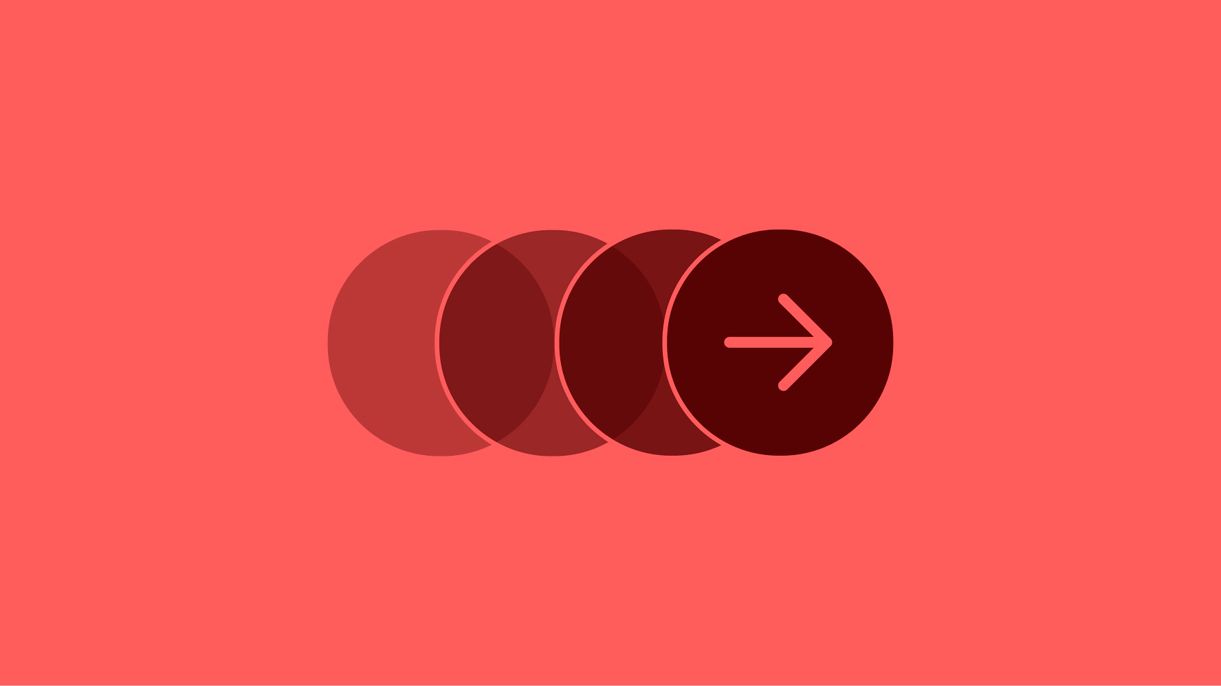
Interaction levels
Interaction design heavily impacts the overall product experience. Our system aims to keep interactions simple and direct.
Predictable
Interactions indicate what will occur when triggered. There are no surprises.
Proximity
Interactions trigger elements close to where they occur.
Simple
Start with simple interactions before considering complexity.
1. On page
On-page elements can be directly manipulated and cause a change in state immediately after an interaction. They can include level 1 elements like text fields or buttons.
When to use
- Form entry
- Quick filtering
- Title and label editing
Examples
- Text field
- Button
- Quick filter
- Selection control
- Tab
- Pagination
- Expansion
- Toggle button
2. Above page
Level 2 elements lie “above” the main page content. They are non-modal and allow access to the base layer.
When to use
- Temporarily surfacing supplemental actions or information.
- Transient messaging.
- Presenting information without obstructing the primary content
Examples
- Tooltip
- Menu
- Snackbar
- Popover
3. Modal
Level 3 elements lie 2 layers “above” the base layer and block access to the main content until dismissed.
Only one modal element should be present at a time. If multiple modal elements are being used, either dismiss the modal and replace it, or use a new page.
When to use
- When access to the primary content is distracting.
- When the user needs to acknowledge something before continuing.
- Content that must be explicitly saved and submitted.
Examples
- Modal
- Alert
- Bottom sheet
- Panel
4. New page
Complex experiences with multiple steps and interactive elements should use a dedicated page with an optional focused header. This allows for use of all other levels of interaction and improves the overall accessibility of the experience.
This can take the form of a hub and spoke navigation model or a fullscreen dialog on mobile.
When to use
- Multi-step experiences
- Complex data management
- Listing flows
- Detail views
Examples
- Focused header (TBA)
- Create a coupon
- Create buyer groups
- Edit multiple listings