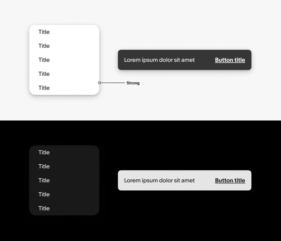
Object styles in product
Object styles provide structure and communicate shared behavior between elements.
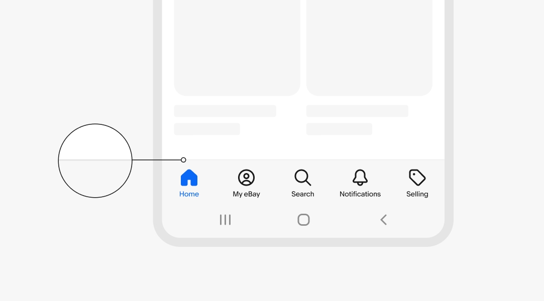
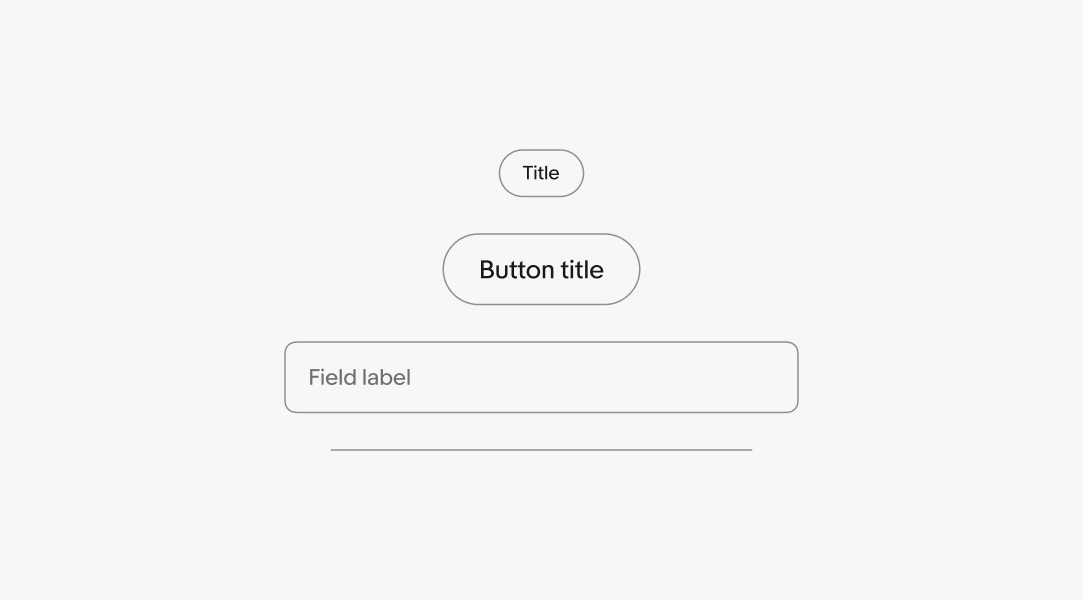
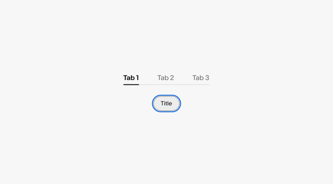
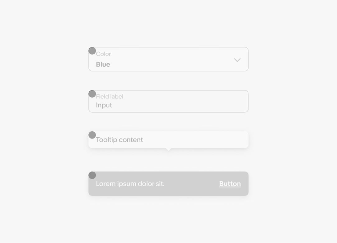
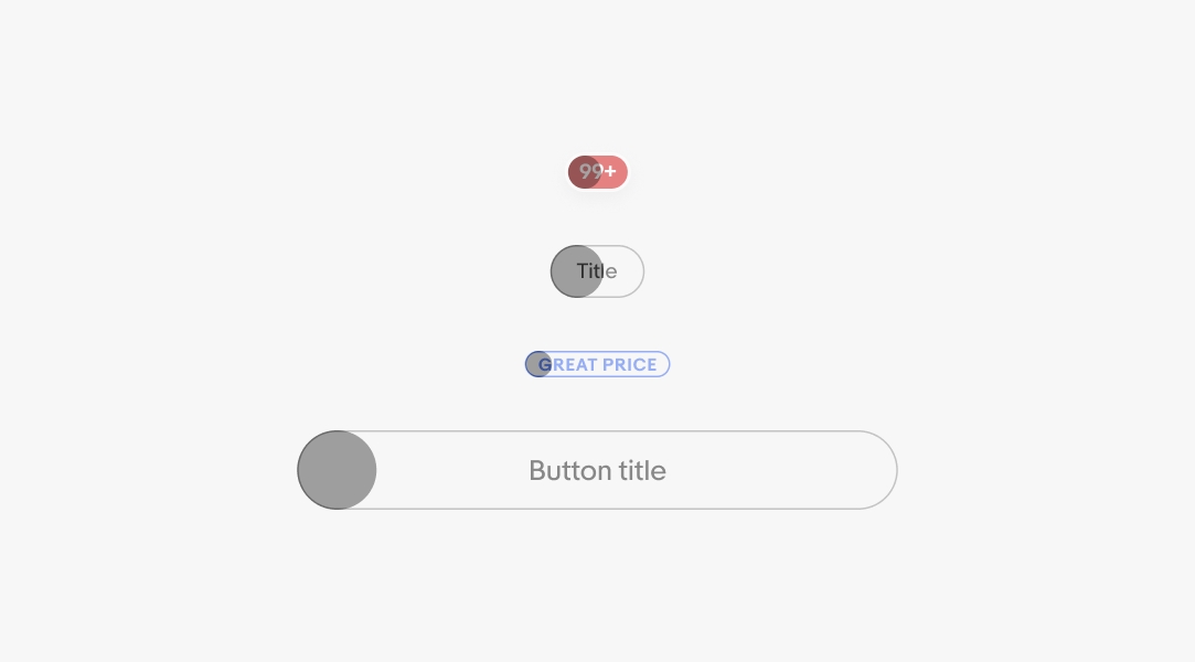
Border width is used to define structure and separation. View all border tokens.
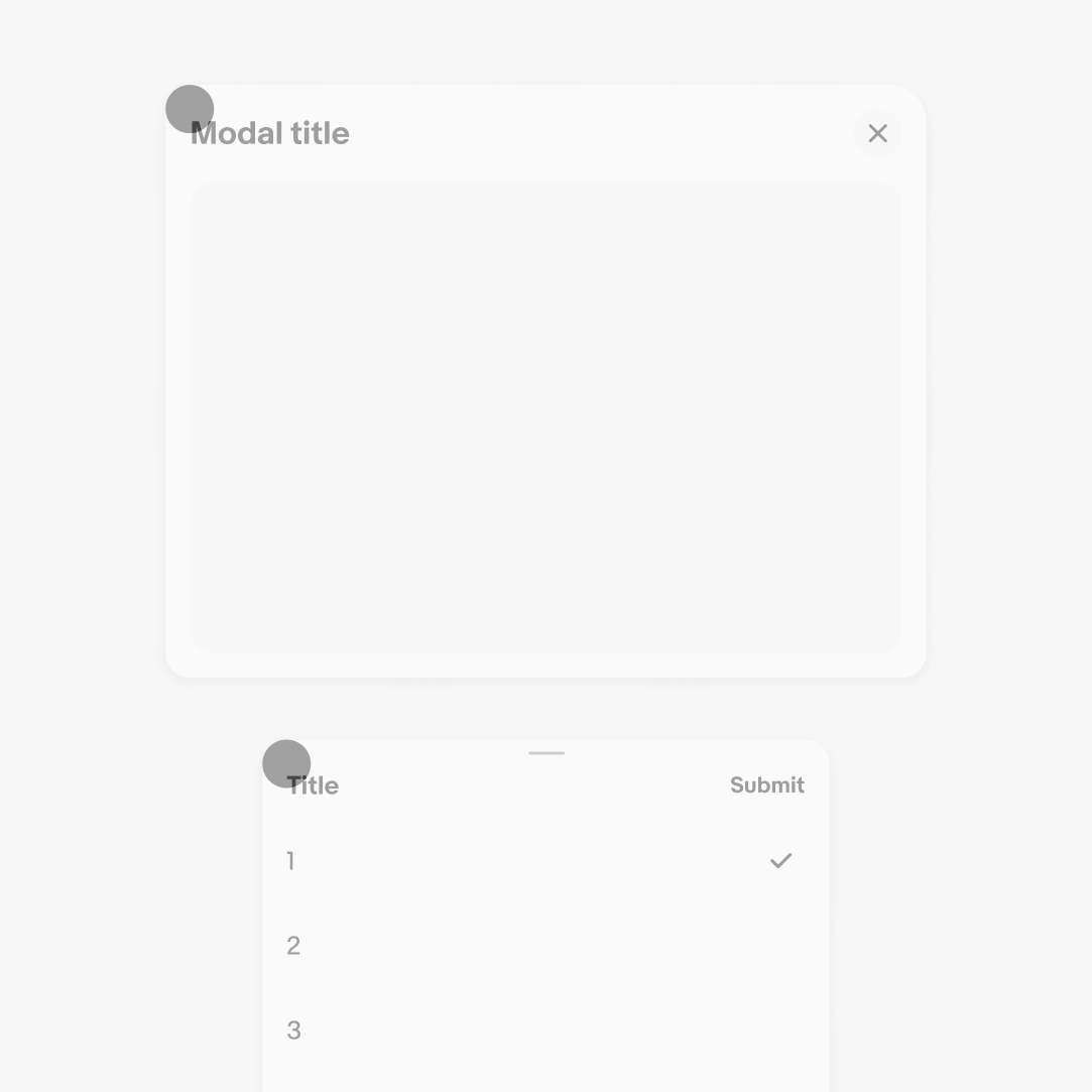
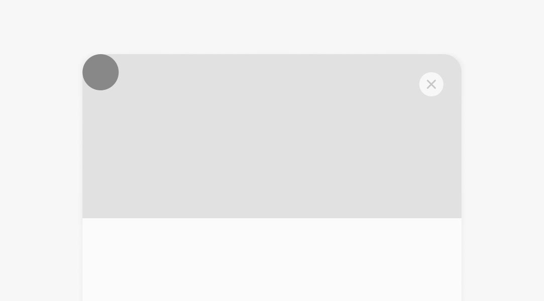
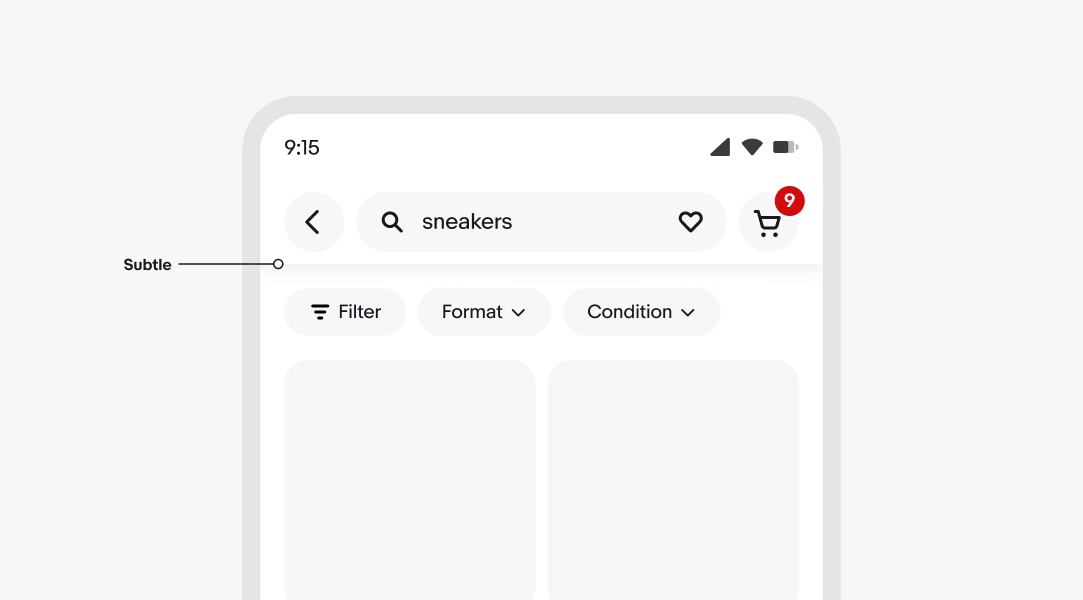
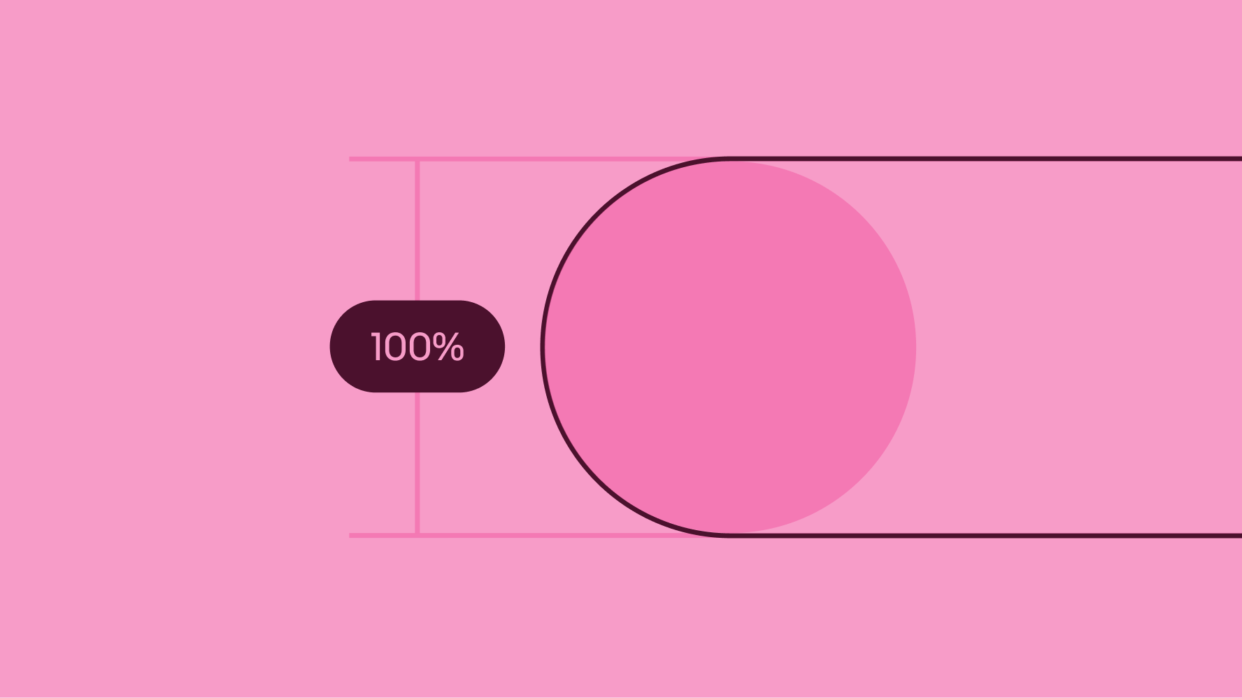
Radius is used widely throughout our system. Each radius size is intentionally applied to select elements. View all radius tokens.
Drop shadow is used for transient and fixed elements. View all shadow tokens.