Best practices
What—and what not—to do when using illustrations.
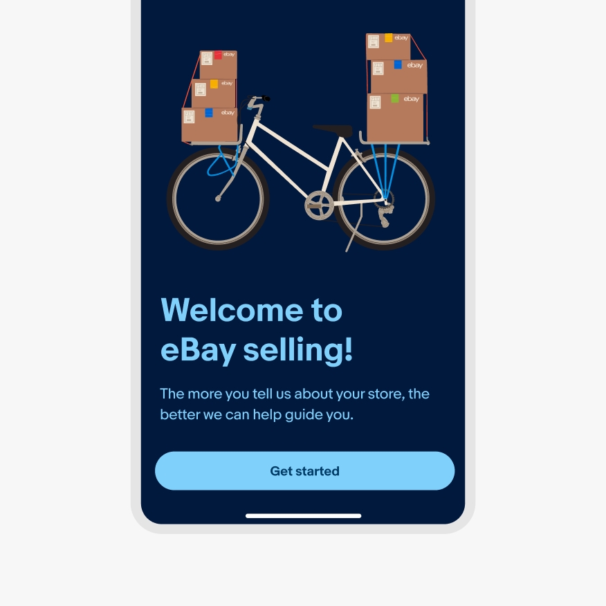
Do use the color backgrounds that are already applied to the illustration. You can also always use a neutral background.

Don’t apply your own background colors to illustrations.

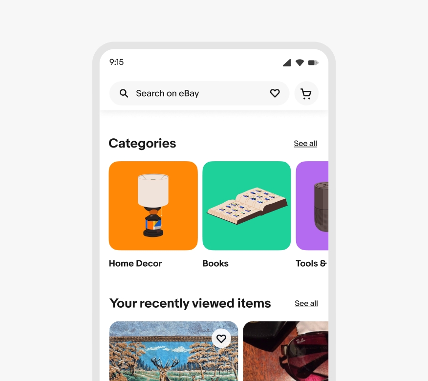
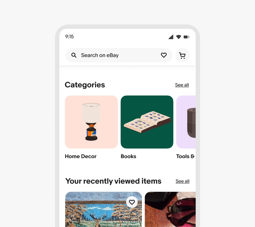
Do use roughly the same shade for all background colors when multiple illustrations are paired together in a list or carousel.

Don’t mix extremely dark or light color backgrounds when multiple illustrations are paired in a single view.

Do keep colored illustration backgrounds separate from text-heavy areas..

Don’t layer text on top of colored backgrounds in small, text-heavy areas.

Do place motif illustrations into background containers when multiple illustrations appear in a list.

Don’t let illustrations float without background shapes or use overly complex illustrations in list views.

Do use icons inside shapes under 80px by 80px.

Don’t use illustrations inside shapes under 80px by 80px.

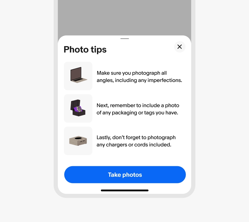
Do use illustrations when explaining a complex concept that a photo can't or that would feel too generic with a photo.

Don’t use photos for concepts or emotions that are too vague or don’t feel genuinely related to the message.

Do use photography or 3D when showing realistic details to gain trust.

Don’t use illustrations when showing realistic details could gain trust. A photo or 3D rendering will be more effective.
