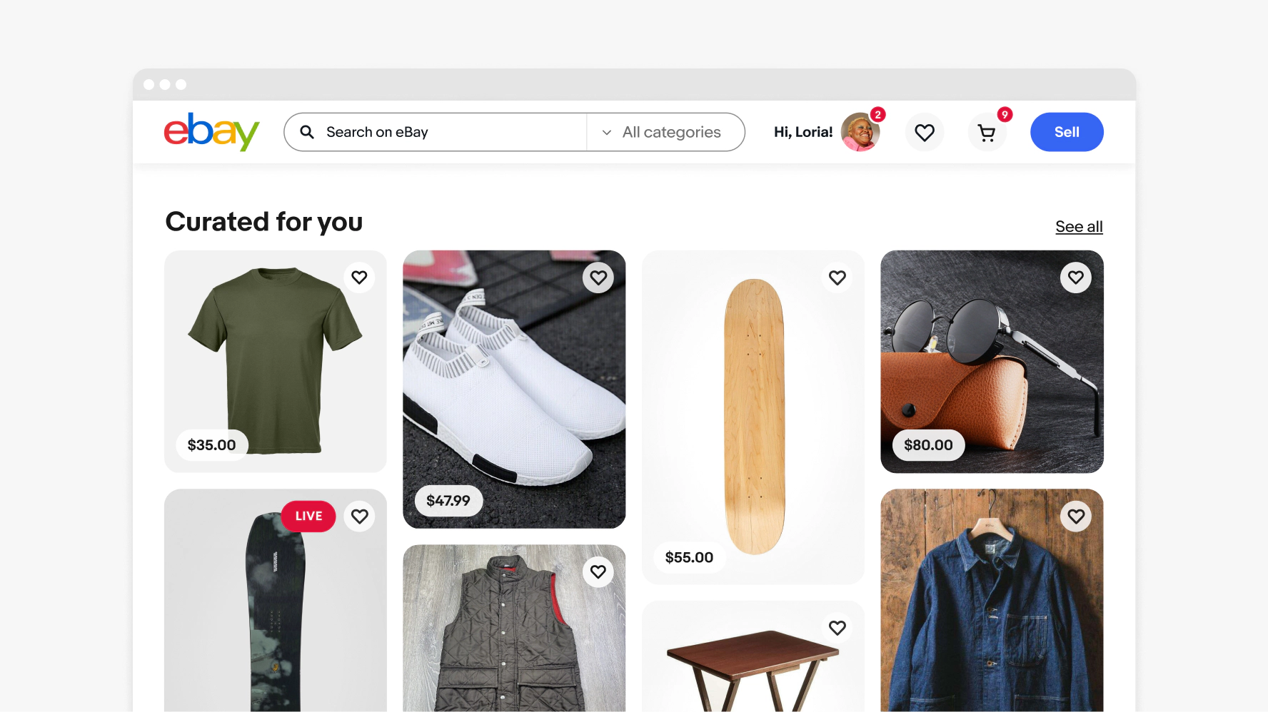
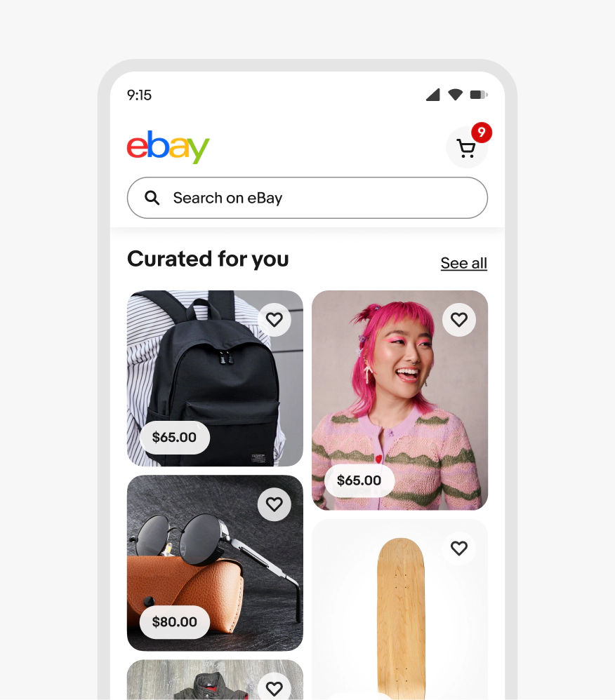
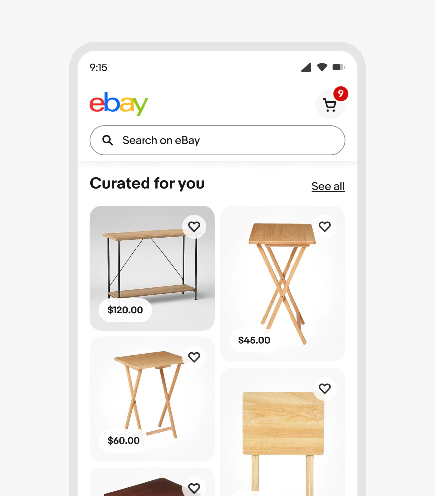
Masonry
Masonry grids create a deterministic grid layout, positioning items based on available vertical and horizontal space. It contains performance optimizations like virtualization and support for infinite scrolling.
Inspiring
Masonry is an immersive storytelling method for showing browsable content.
Scannable
Since masonry displays content collectively and cohesively, item tiles can be scanned quickly to preview and compare.
Engaging
Masonry is attention-grabbing without being overwhelming.

- Title
- Content
- Link
Title
A title is required for all masonry feeds. The title should be short and summarize the content within the feed. A link, “See all” by default, can be appended to the title. The link should lead to a page with more related content.

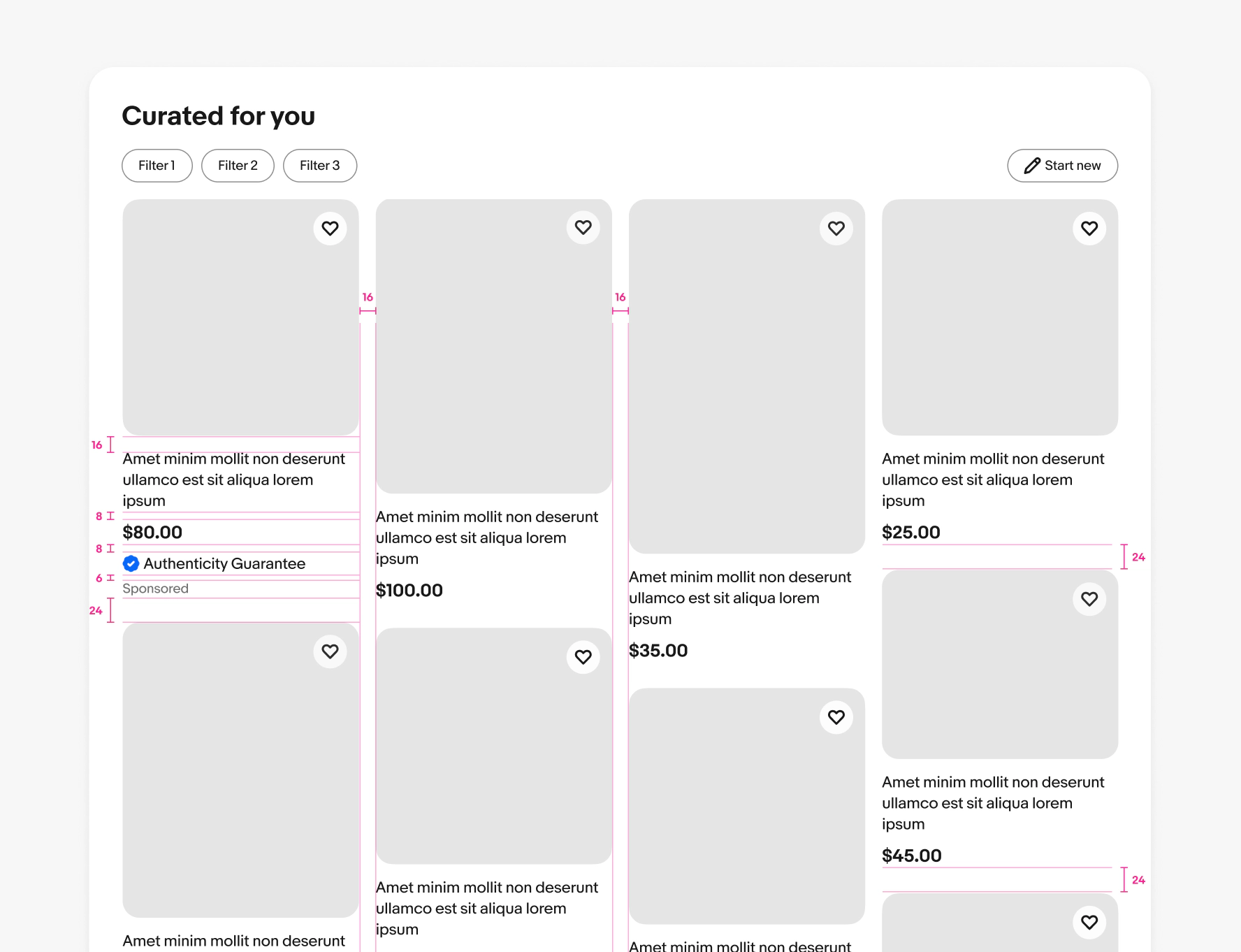
Filter bar
A filter bar can be added between the section title and items in a gallery grid. Filters only apply to the items in this module, not the rest of the page. If a user selects filters, they dynamically update this section only in-page. As they scroll, filters lock to the top of the page until the user scrolls past the module.

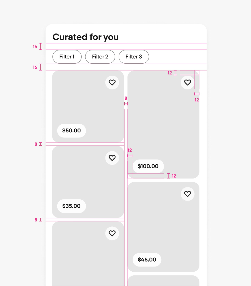
Size
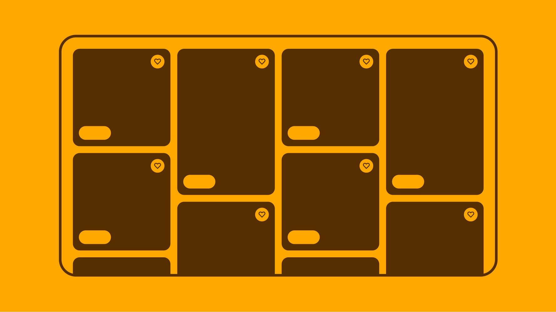
There are 2 sizes for masonry tiles: Small and Large.

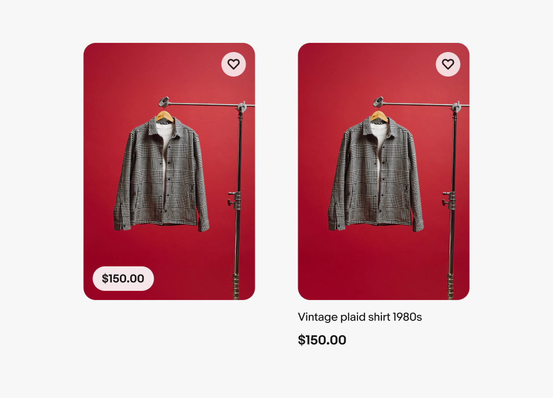
Style
There are two styles for masonry tiles: Pill and Title.
Aspect Ratio
Masonry grids should use at least 2-4 different ratios.
- 1:1
- 3:4
- 4:3
- 9:16
- 16:9

Ratio cropping
Images are cropped or scaled to their closest aspect ratio to best fit into the masonry grid.

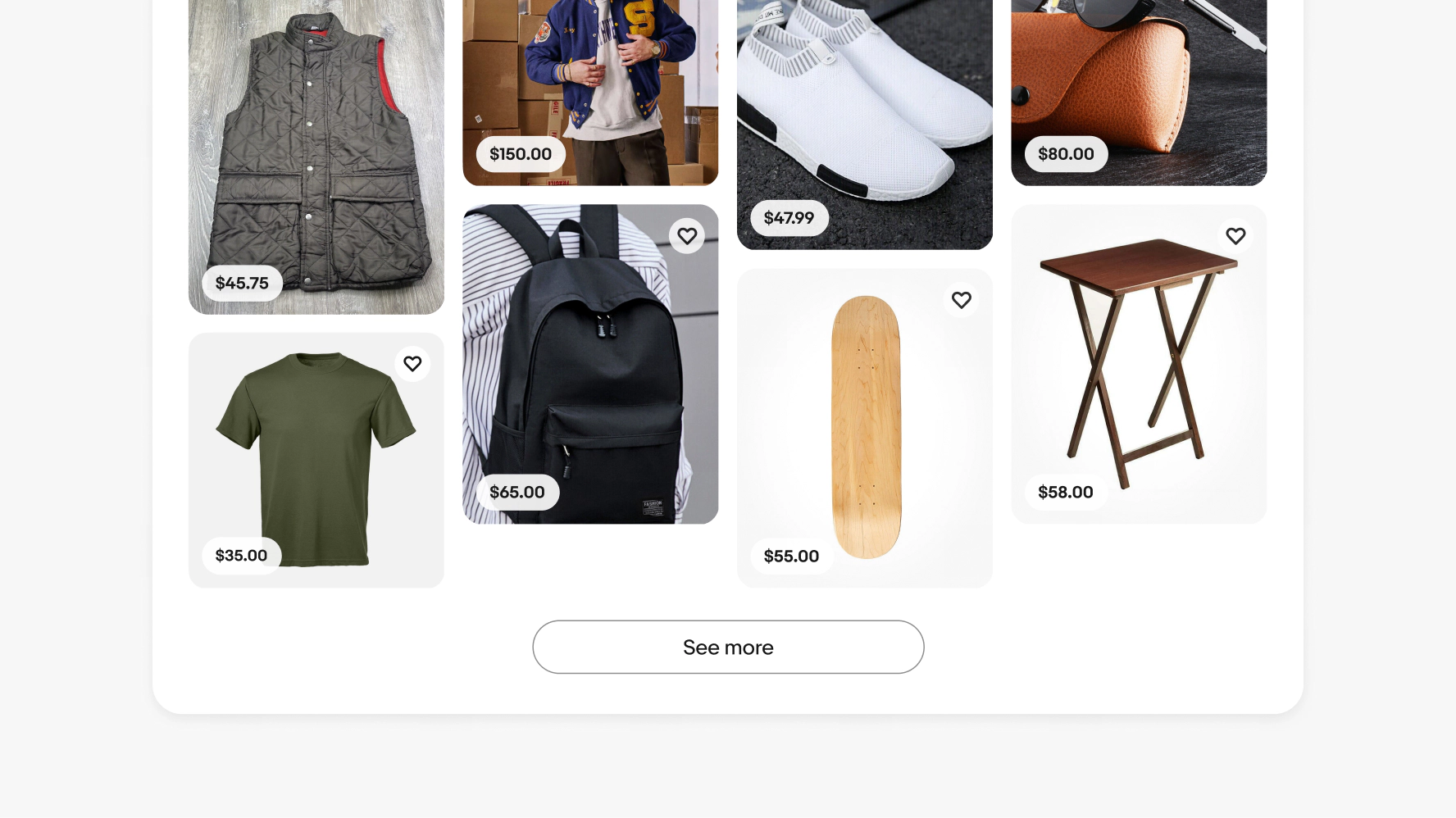
Number of columns
The number of columns in the masonry feed changes responsively based on the width of the grid and margins. The item width will grow and shrink to fill the column space. As you scale across breakpoints, be sure to follow the specific column guide for each grid size.

Pagination
We recommend avoiding pagination on small screens and native applications. Use a “see more” or infinite scroll pattern instead to allow users to load content on demand.
Medium-to-large screen and native tablet apps can use a “see more” pagination where infinite scroll patterns aren’t appropriate. “See more” controls are fixed to the bottom of grids. Users only need to tap the control once. After that, the feed should automatically load more once they reach the end of the scroll.

Product tiles
Product tiles display an item preview with a select set of details to further decision-making and quickly compare similar items.

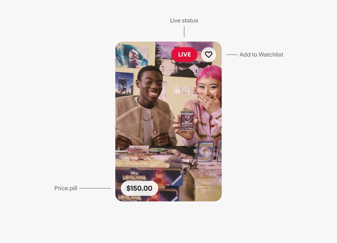
Live tiles
Live tiles display a live stream, preview an upcoming event, or display a playback of a stream. Live tiles have minimal attributes to focus the attention on the video.
Minimum content
There should be a minimum of 4-5 item tiles in each column on the initial load of the masonry grid.

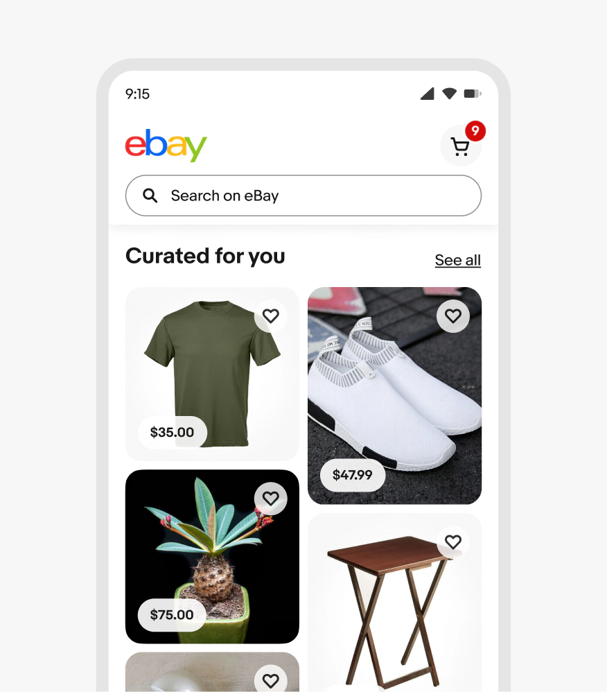
Small
At small-screen sizes we recommend defaulting to a pill-style feed for a clean and easy-to-browse experience.

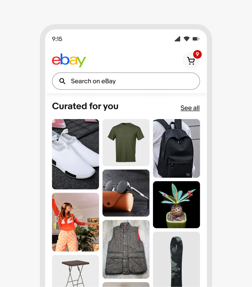
Medium
At medium sizes, tiles can either use pill or title versions, but we recommend keeping masonry tiles minimal by using the pill style.
Tile styles
Do keep all item tiles in a masonry grid the same style.

Don’t mix item tile-style in a masonry grid.

Content
Do use masonry grids for a mix of content and categories.
Don't use masonry grids to compare very similar items.
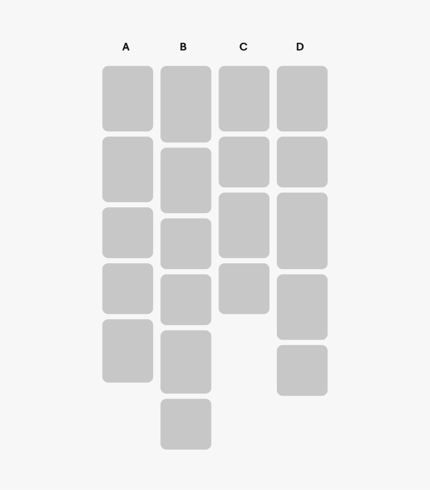
Tiles per column
Do keep the same number of item tiles in each column. For example, if column A has 5 items, each additional column should have 5 items.
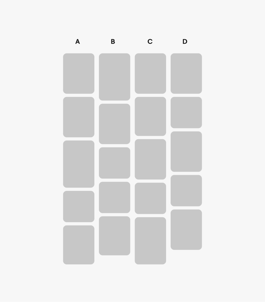
Don't have a different number of item tiles in each column. For example, if column A has 5 items, don't add fewer or more items in additional columns.
Follow the grid
Be sure to follow the grid and column guide for optimal visual density.
Don't overcrowd your designs.

Pill details
Item details
Pill details
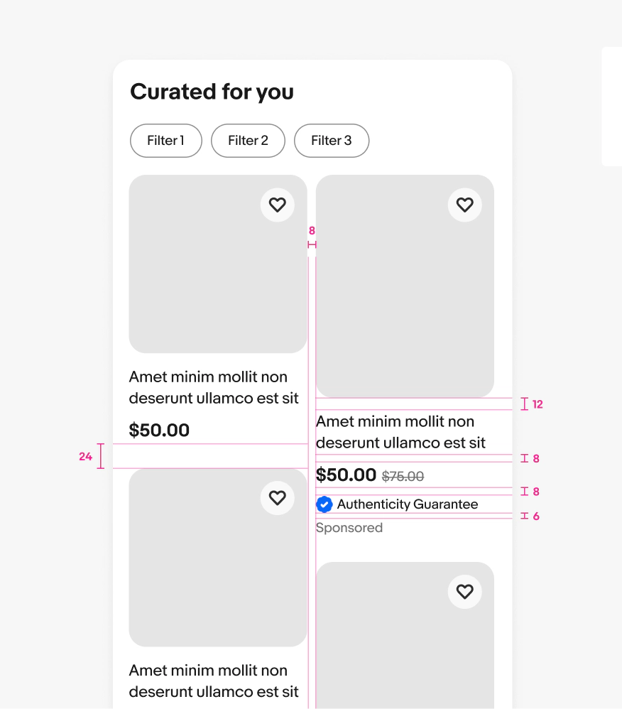
Item details