Our logo
Our logo is the colorful signature we put out into the world. It symbolizes who we are, unites our past and future, and represents our diverse global community.

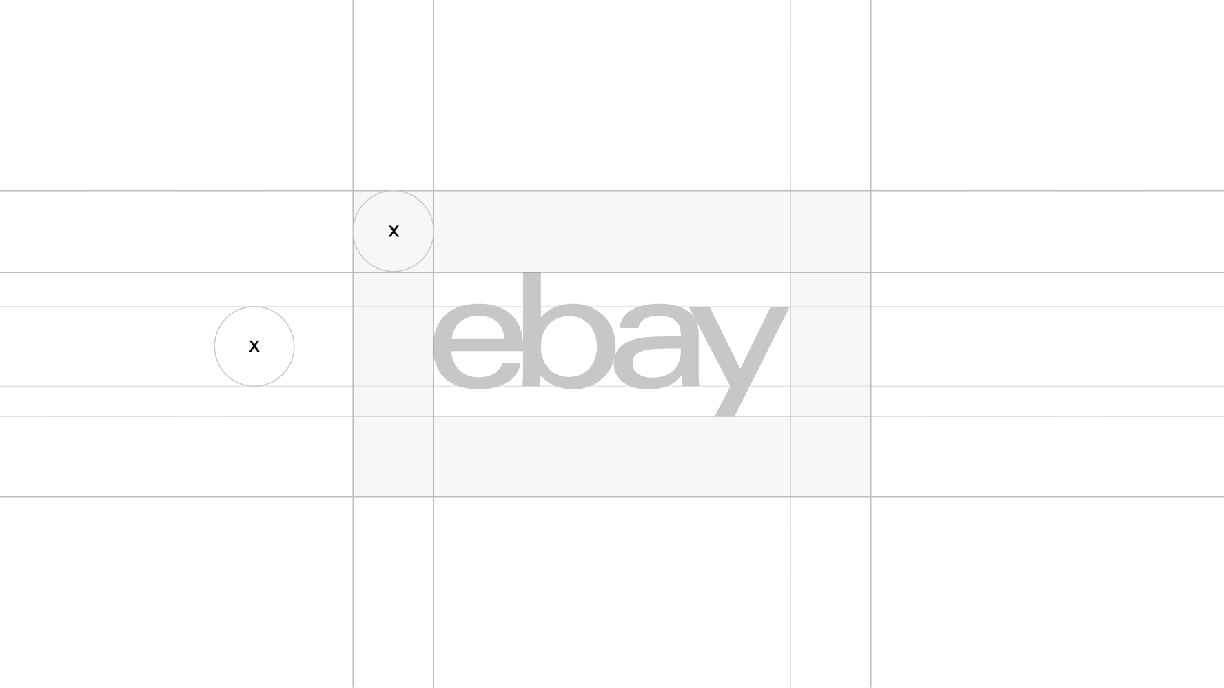
Clear space is the required amount of space around a logo to maximize its visibility and impact. To determine the minimum clear space, reference the logo's x-height when placing it in layouts or by neighboring elements. The x-height is measured from the type’s baseline to the top of flat lowercase letters, like the letters x, y, and z.

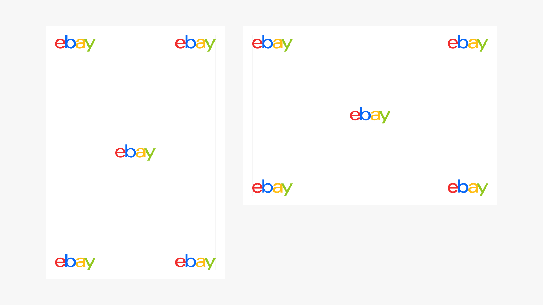
We define the recommended size of the logo based on its clear space. The logo’s clear space and layout’s margin should both be 5% of the shortest length of the layout. For example, if the length of the layout is 1024px, then the logo's clear space and layout's margin should be ~51px.
For additional details on calculating margins and setting up the layout, please visit Layout in marketing.


We like our logo to feel boundless, but there are times—like on social media—when it must live within a container. Remember that some sites add extra padding to an uploaded image, so make sure that what you see still adheres to our guidelines: a centered logo with plenty of clear space. When a container is small, use a white logo on a dark color background to maximize legibility.

Our favicon is the visual shorthand expression for eBay across our websites. It’s legible across light and dark modes for popular browsers. The favicon should only be used for web and not for native app tiles. Access our favicon in Tools & resources.


On platform
For anything on eBay's platform or internal channels, we use our favicon to represent eBay.

Off platform
For anything off eBay's platform like social channels, we use our heritage logo. This ensures brand equity and clear representation of eBay.
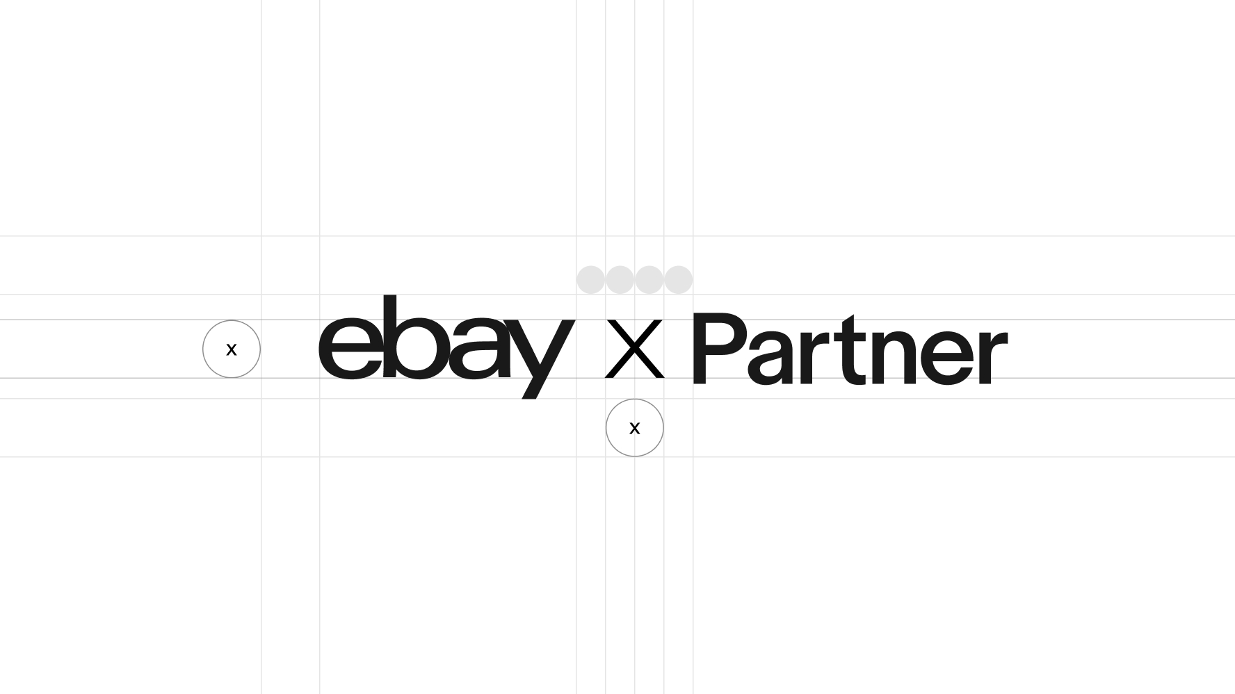
For brand partnerships, we display both our logo as well as our partner's and separate the two logos with an "X" on graphic devices. Space between each logo and the “X” is half of eBay’s logo clear space. When sizing the logos, start with the eBay logo, then optically size and center the partner logo for visual balance.

