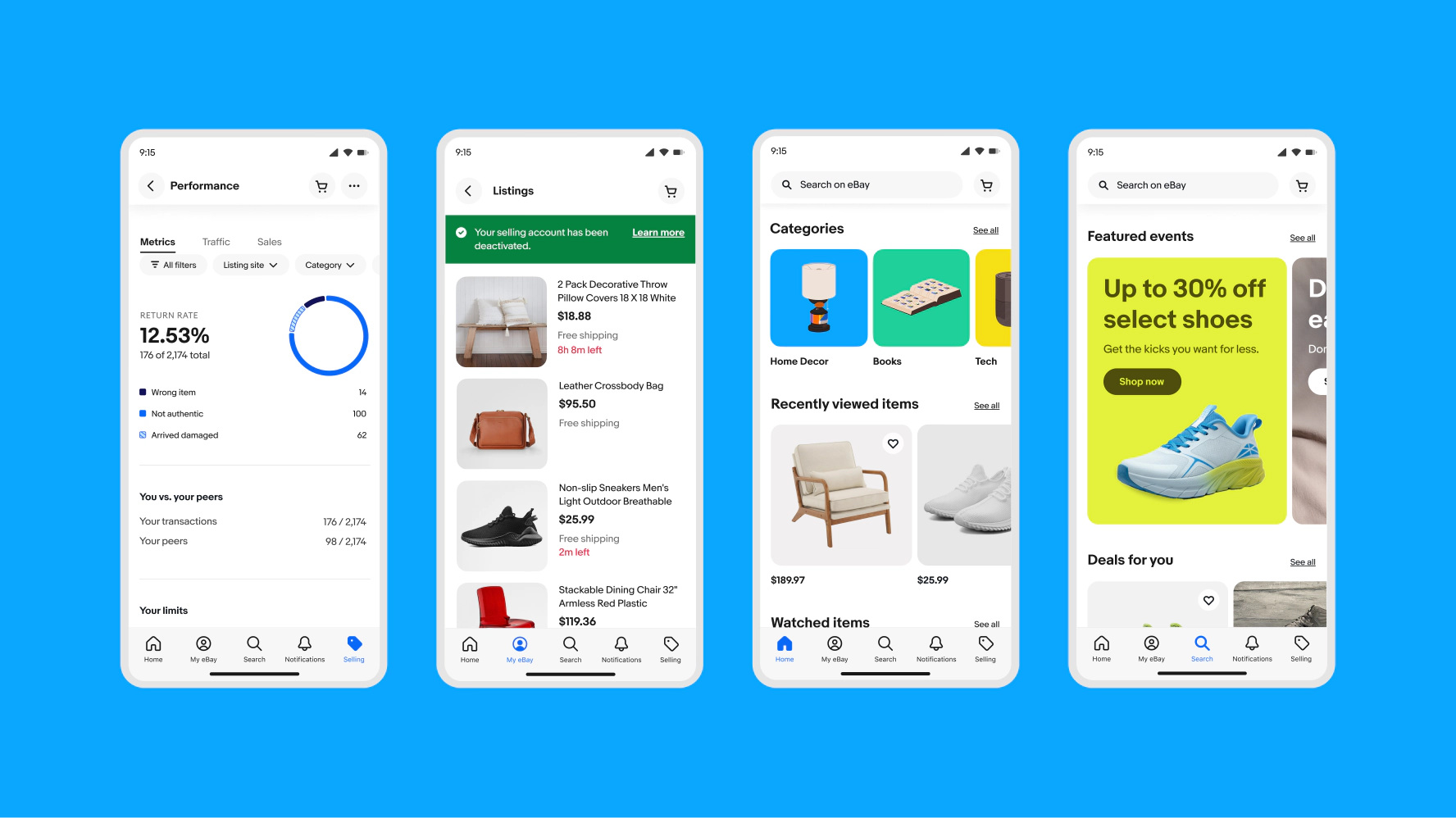
Using color in product
For product UI like buttons, alert notices, signals, and error states, we use a subset of our full color palette. We mainly use shades of green, blue, red, and neutral to educate, guide, alert, and celebrate our users as they move through our product.
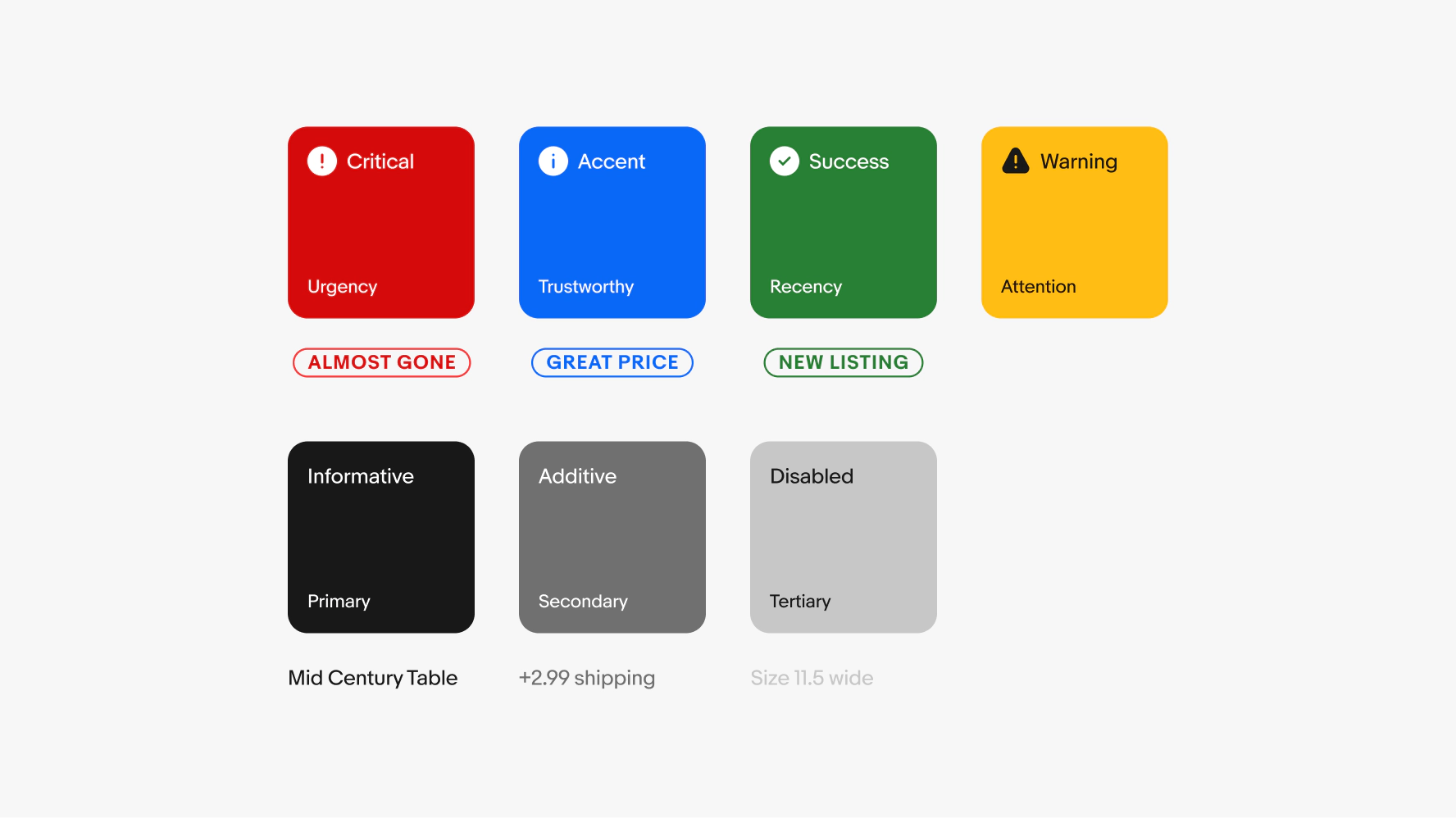

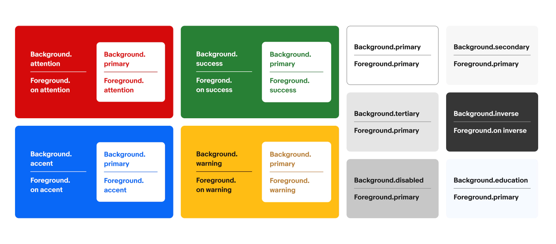
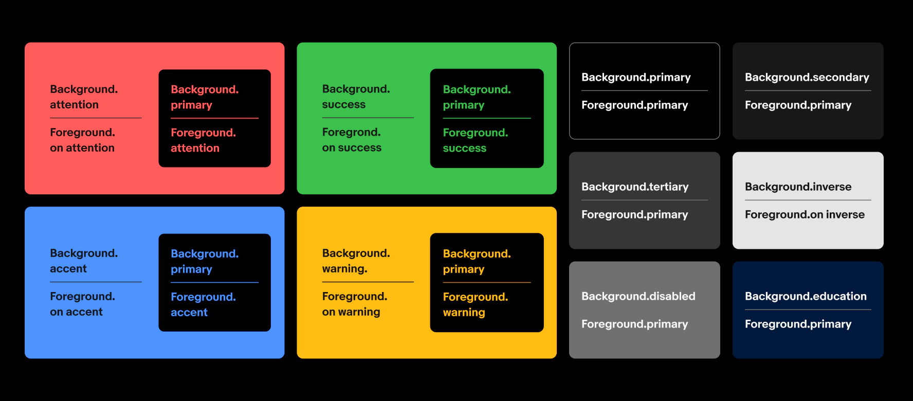
Critical
Critical colors indicate negative trends, destructive actions, time-sensitive content, and other important notifications that require urgent attention. These include error states, bulk delete buttons, and limited time left on items.

Accent
Our accent color uses our primary brand color to draw attention to important information or actions. Accent colors do not indicate a positive or negative sentiment—their purpose is to guide and educate our users in components like signals and primary action buttons.

Success
Success colors show recency, validation, and savings. They indicate a positive sentiment and are used for things like success messages, confirmation indicators, and positive trends.

Neutral
Neutral colors are used in varying shades for informational, selectable, or deactivated content. This includes text like item titles, informational alerts, radio buttons, and text links.
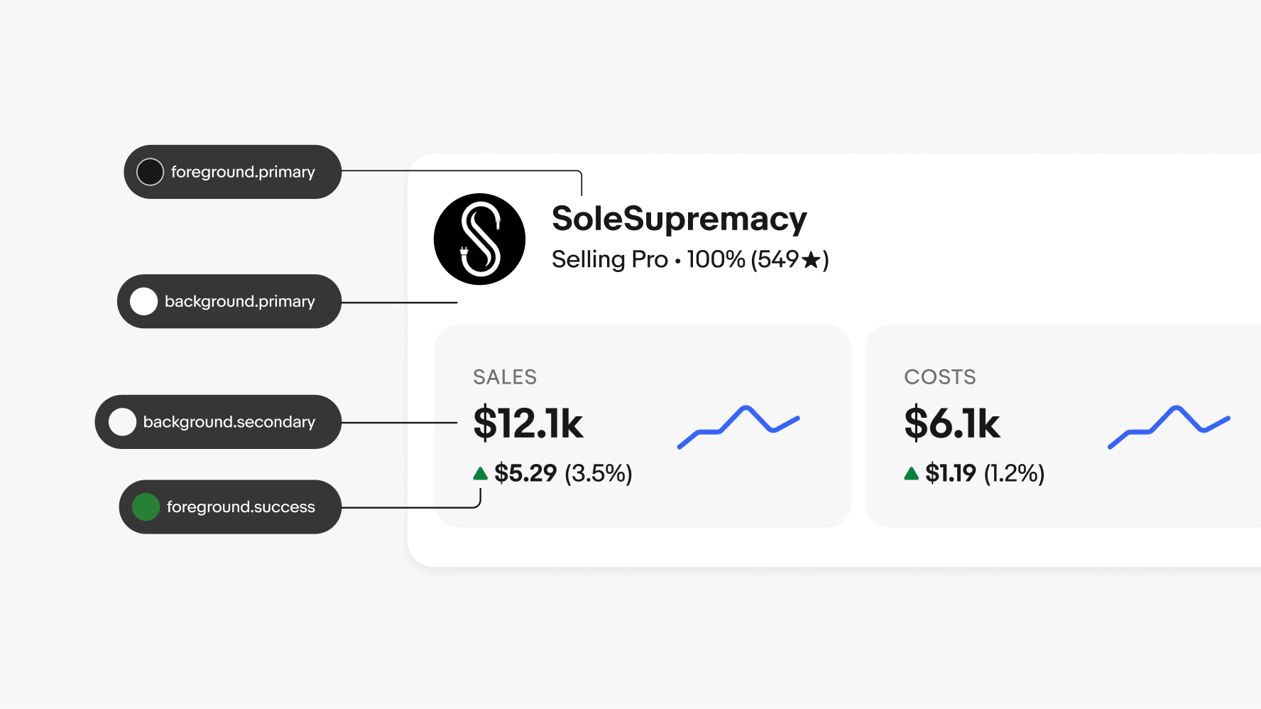
Color tokens represent repeated decisions about how color is displayed throughout our system and provide ways to apply them consistently. They replace raw values with meaningful labels that convey intention. This ensures that color is used appropriately and remains accessible in any given context. To learn more, see Color tokens.
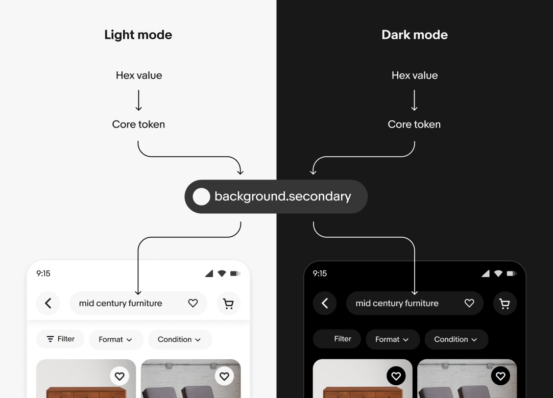
Light and dark mode
Modes are a collection of semantic token mapings. Semantic tokens are named references that define the intended use of a color. They help maintain consistency and clarity across different contexts and themes, such as light and dark modes.
A single token can point to different values depending on the context. The context can be a change in device theme, form factor, or accessibility settings. Semantic tokens map a meaningful name to a core token.
When context changes, the reference values are updated automatically and the changes cascade throughout the system.
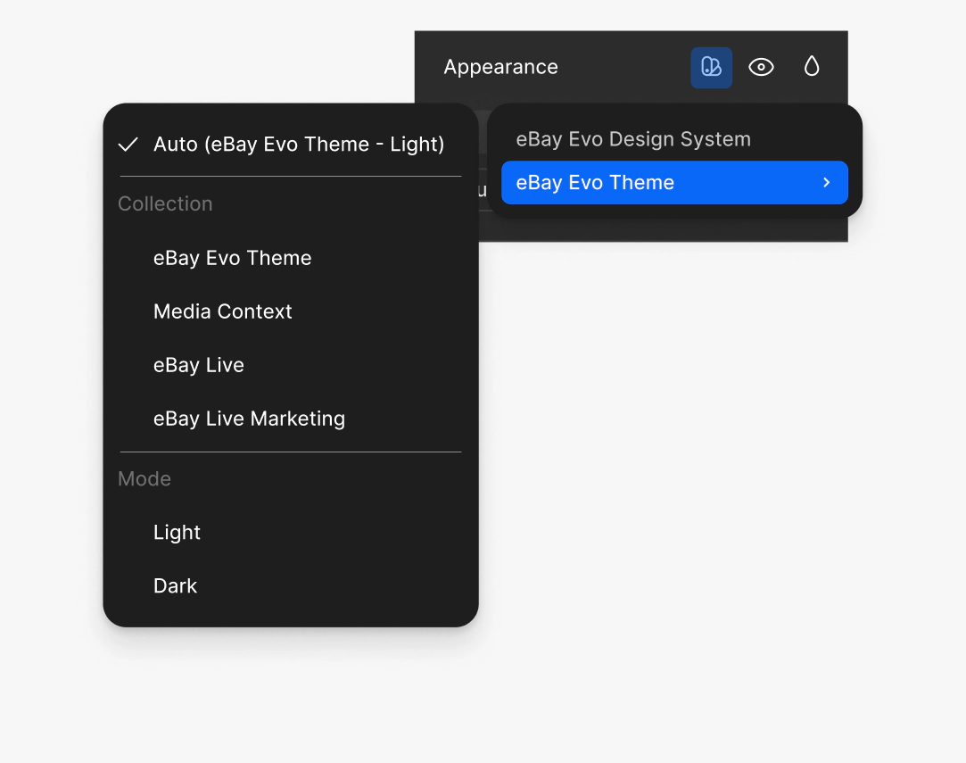
Color themes
eBay Live and future themes build on our existing token structure.
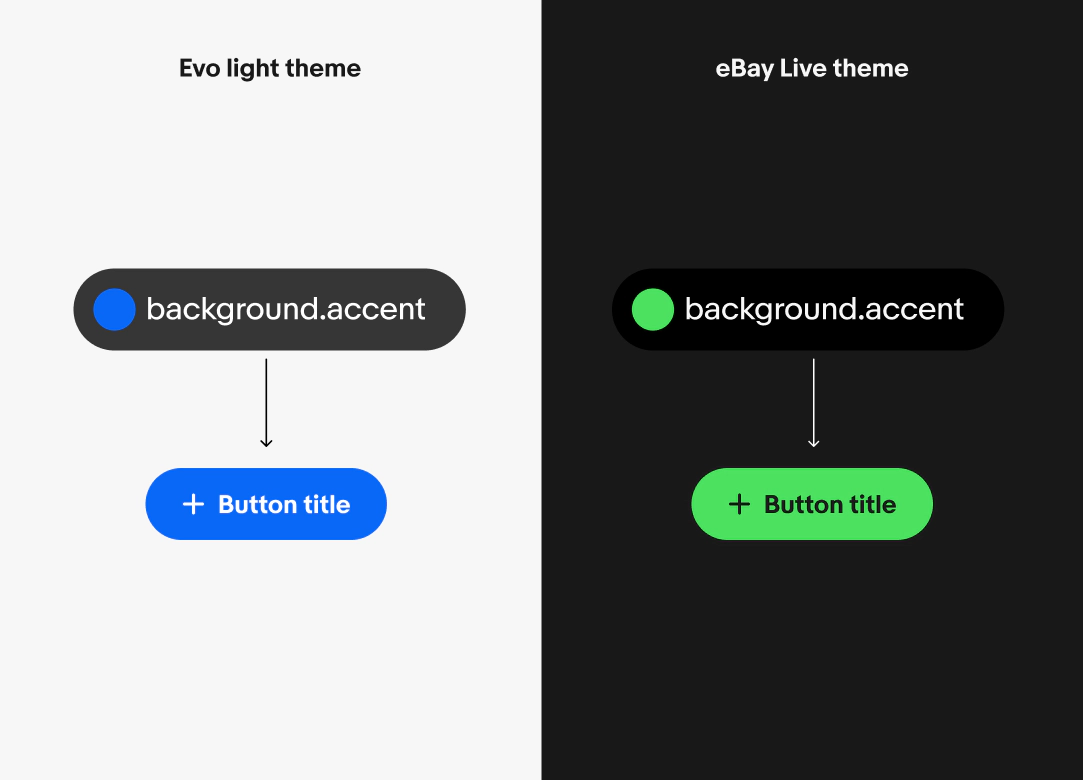
eBay Live
Live-Dark is based on Evo-Dark, with updates limited to accent colors.
Live-Marketing is based on Evo-Light, with changes to background, accent, and inverse tokens.
Changing modes and themes
To change the theme or mode of any component and see what the dark-mode-equivalent colors are, just select the frame you want to change and click the “change variable mode” icon in the Layer section of the Figma design panel.
To load extended themes, add the associated Domain Library to the file. For example, to view the eBay Live Theme, load the eBay Live Domain Library.
Each collection are a base theme with a set of light and dark modes.
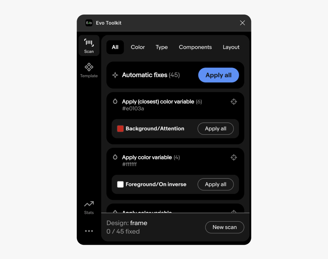
Evo toolkit plugin
Evo toolkit plugin is a holistic tool for designers to speed up their workflow, automate low-level tasks, clean up files, and reduce cognitive load when preparing for engineering.
It strengthens connection to Evo library components and tokens, to ensure consistency, quality, and scalability.
Data visualization
Data visualization components use their own set of colors to maintain accessibility. To view these colors and see how to use them, visit Data visualization.

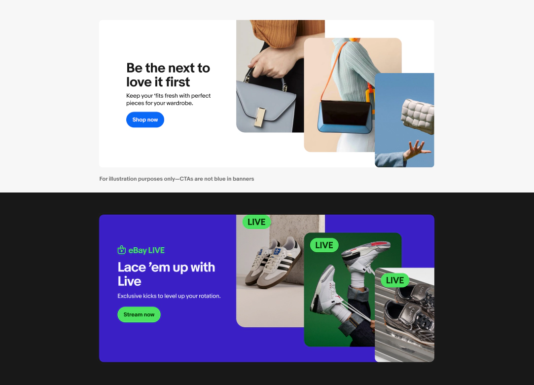
In-product marketing
In-product marketing uses an expanded color palette with more color families. This palette highlights inventory, tells stories, communicates emotions, and explains programs and ideas. To view these colors and learn how to use them, see Using color in marketing.

Do use semantic tokens in designs.
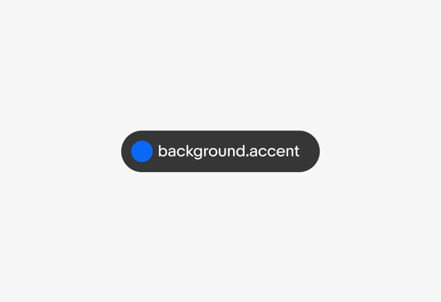
Don't use core color tokens or hex values in designs.