Alert notice overview
An alert notice is a non-modal message that informs users of system status, action outcomes, or conditions relevant to their current task.

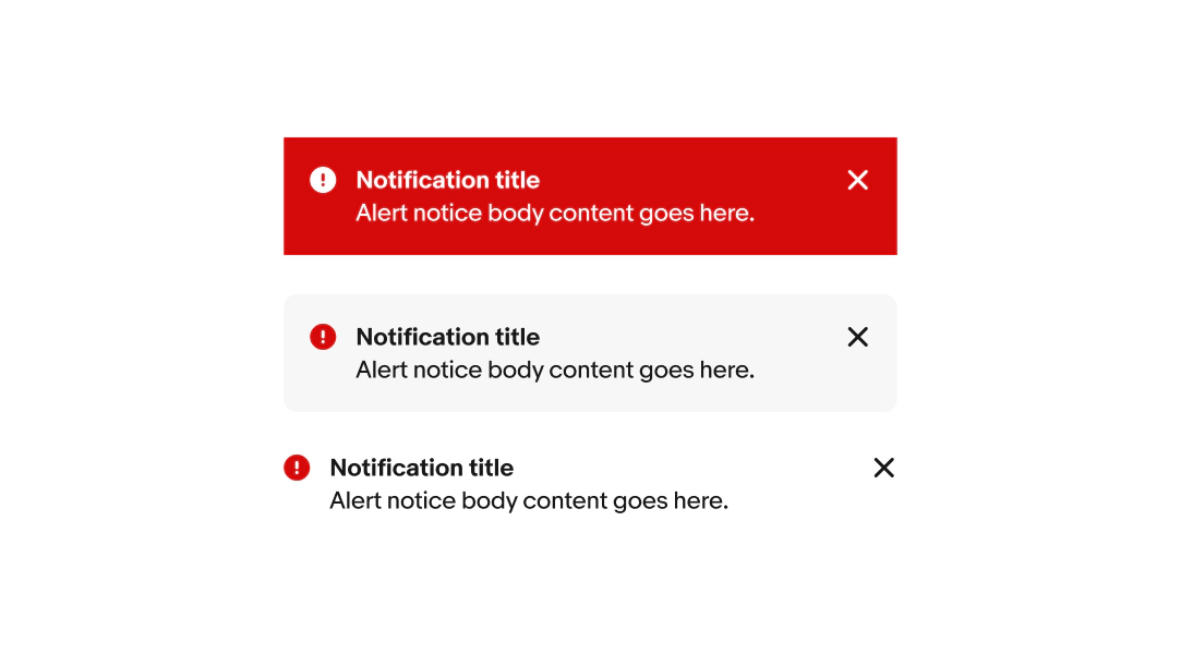
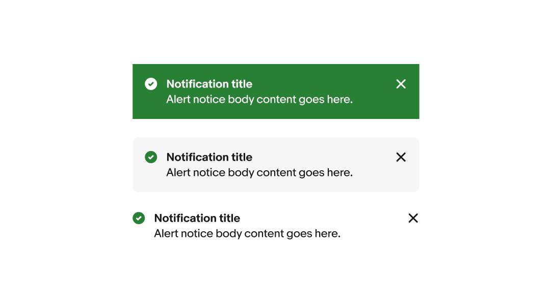
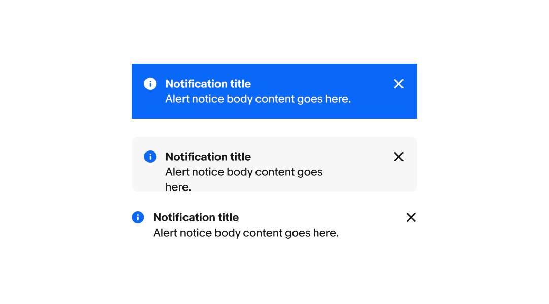
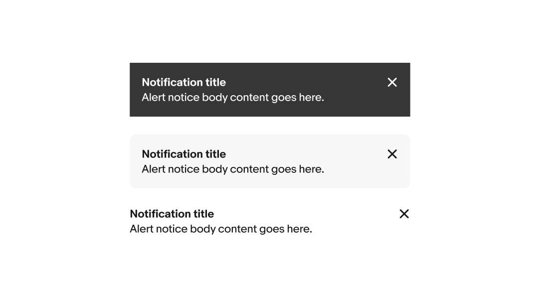
Semantic messaging means each notice type carries a specific meaning, paired with a distinct visual treatment. Choose the type of alert notice that most accurately reflects the situation.
Prioritizing notices
When multiple conditions are present, you can prioritize in two ways.
For problem-based notices, order by severity:
- Attention
- Warning
For notices that aren't signaling a problem, order by relevance to the user's current moment:
- Confirmation
- Information
- Neutral
Avoid showing notices of the same type at the same time. When a blocking condition is resolved, dismiss its notice before introducing a new one