Education notice
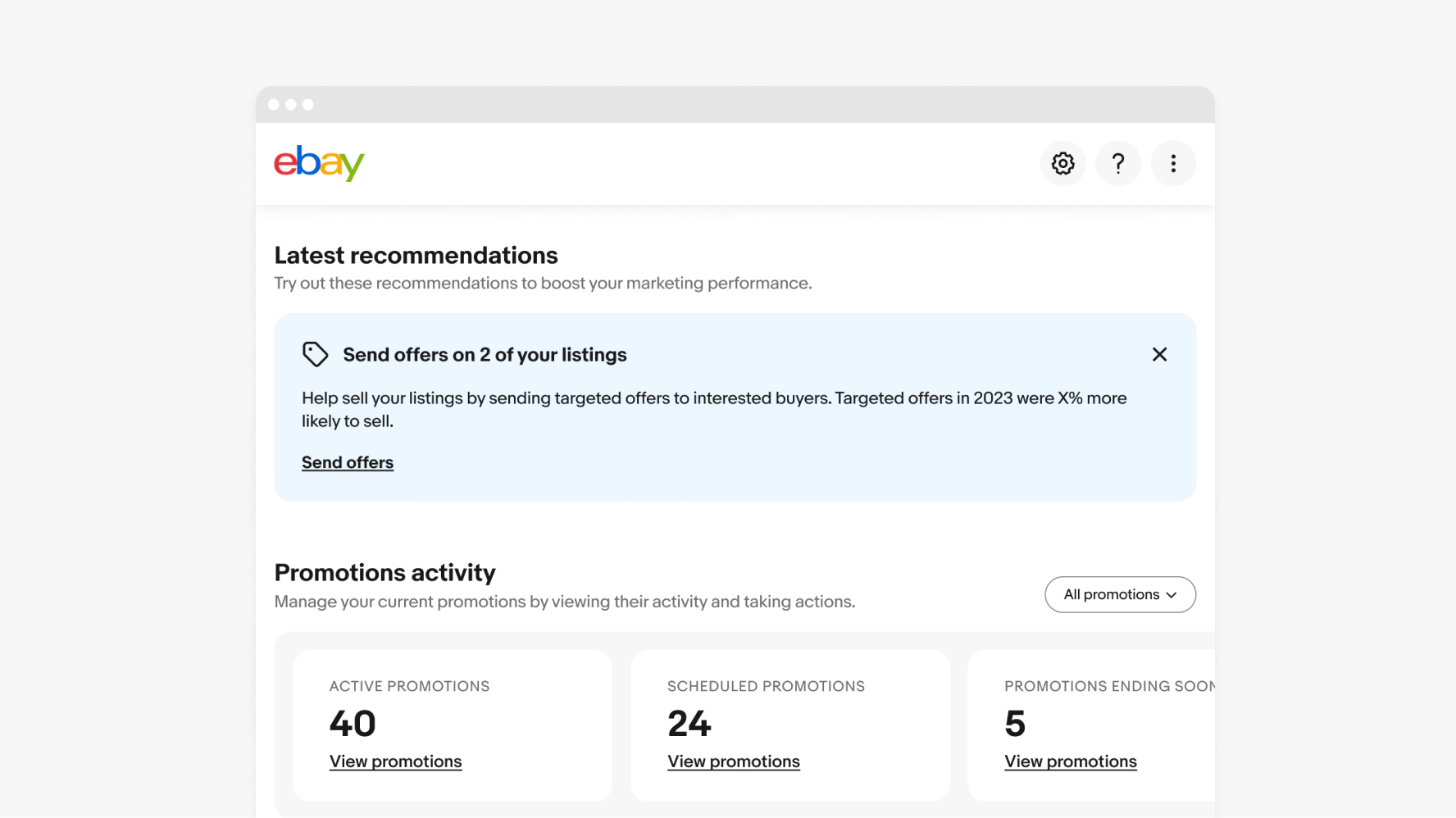
Contextual notices are supplemental, proactive messages that surface information, features, and opportunities in the context of users’ current tasks.
- CSS
- Marko
- React

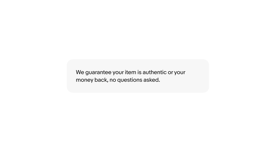
Informative
Contextual notices help users immediately access additional information.
Visual
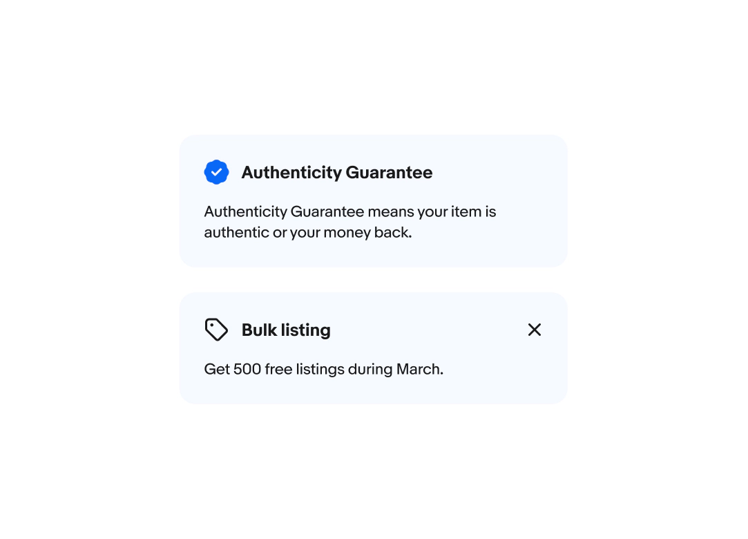
Contextual notices use icons to help support the message, explain a concept, or create a visual connection to the value prop.
Scalable
Contextual notices can be actionable and/or dismissable and have 2 levels of visual prominence to scale to all use cases.

- Icon
- Title
- Body
- Close/dismiss
- Action
Title
Optional. Use clear, specific language to summarize the purpose or benefit of the notice. Avoid redundancy and keep the title distinct from the body copy.
- Use sentence case, except for proper nouns and branded terms
- No punctuation
- Max character count: 55

Body
Required. Only include the essential information at that moment, such as the user benefits. Do not repeat what’s in the title.
- Use sentence case
- Use ending punctuation
- Max 120 characters
Icon
A leading icon is available to increase visibility and drive recognition of a feature or program. The icon relates directly to the messaging. If the message is about a program, use the respective program badge.
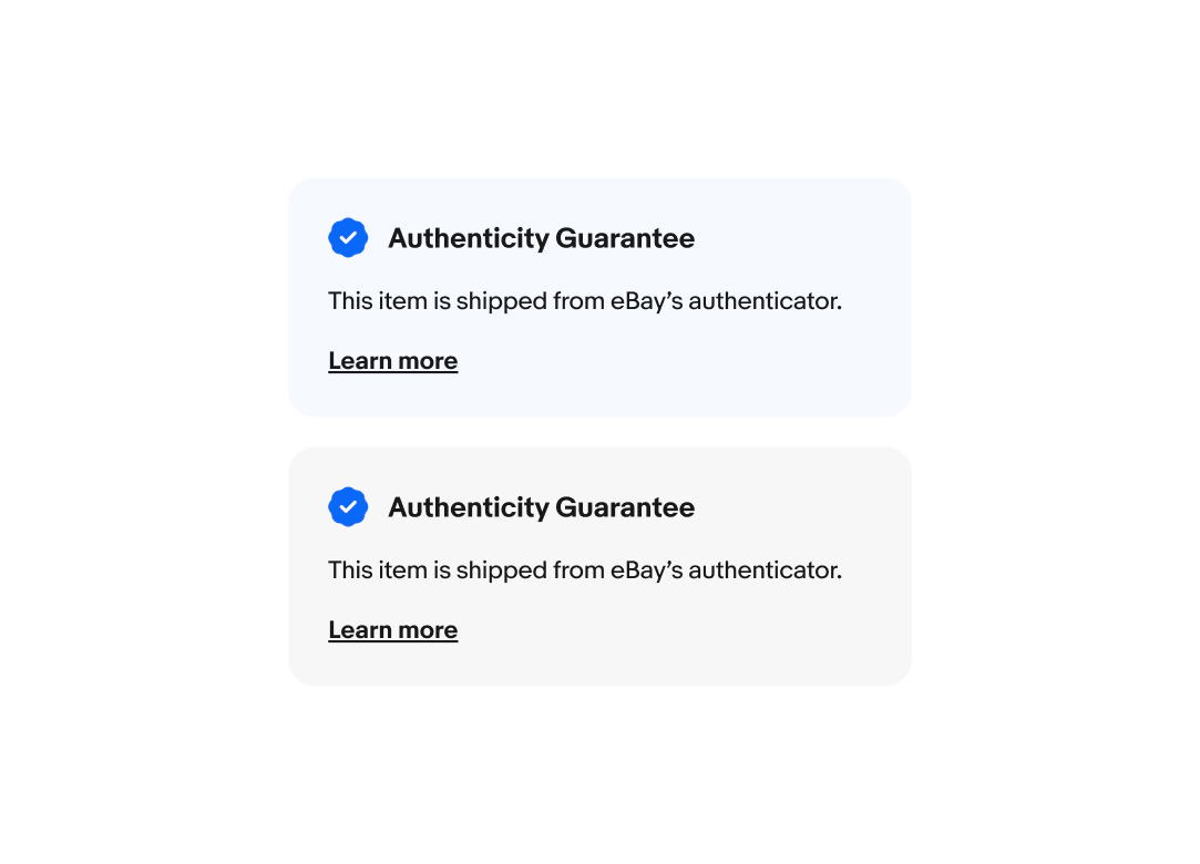
Background color
Contextual notices can have blue or gray backgrounds. Choose a background color based on the message's prominence and the page's hierarchy. Blue contextual notices are more noticeable, but can be overwhelming when there's a lot of adjacent colors. Gray contextual notices are less prominent, but better suited for pages with a lot of color.

Icon color
By default, leading icons are black. Some program badges appear in other colors. See Program badges for more info.
Dismissable
Contextual notices can include a dismiss button that removes the notice from the page. This is useful for general or supplemental information that users may only need once.

Action (Button label)
Contextual notices can include a link button for relevant actions.
On small screens, the action is stacked below the content. On large screens, the action is inline to the right.
Link button title
Use verbs to make the next step and outcome immediately clear. Don’t describe what the notice already says.
- Use sentence case
- No ending punctuation
- Use a [verb] [noun] or [verb] [article] [noun] pattern
- Keep to 2–4 words

Presentation
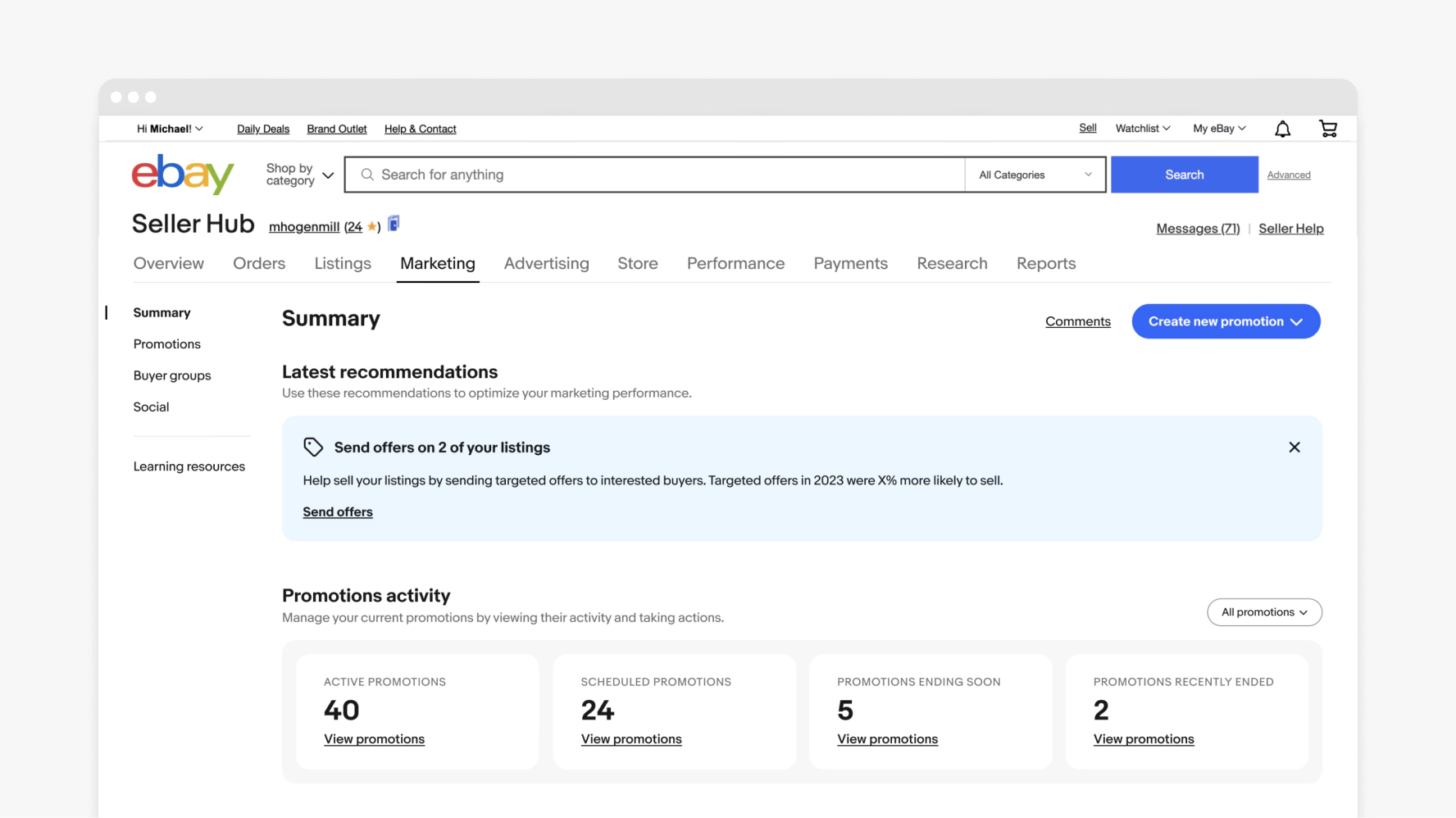
Contextual notices should be placed close to a relevant page section. For example, a payment message appears above a payment section. Similarly, a Guarantee Trust message is located further down the checkout page, just before the purchase button.


Stacking

Page level alerts are displayed above any contextual notices.

Section level notices are also displayed above any contextual notices if they're referring to the same section.
Width
The minimum width for contextual notices is 288px.

Overflow
Title and body copy will wrap if wider than the container. Action labels should avoid wrapping.

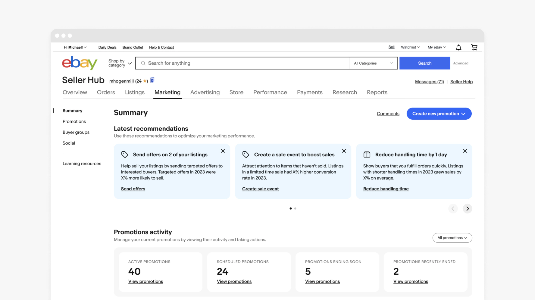
Carousels
Contextual notices can appear in a carousel when there are multiple related notices. If a notice is dismissible, the content shifts to fill the open spot after a notice is removed. The width doesn't change to fill available space.
Small
On small screens, contextual notices always extend to fill all columns and have rounded corners. Dismiss is always right top-aligned and the action is left-aligned below the body content.

Medium
On medium screens, contextual notices also extend to fill all columns and have rounded corners. Dismiss is always right top-aligned and the action is left-aligned below the body content.
Large
On large screens, contextual notices extend to their maximum width.
Content
Do use a bold title, regular-weight body copy, and a clear action label so users can quickly scan the notice.

Don’t bold the body copy or repeat the same message across the title, body, and action. Lack of visual hierarchy and repetition make the notice harder to scan and the action harder to identify.

Icons
Do use black for all icons that are not an approved program badge.

Don’t make generic icons that aren’t approved badges blue.

Priority
Do ensure alert notices appear above contextual notices when they occupy the same space.

Don't place contextual notices above alert notices when occupying the same space.

