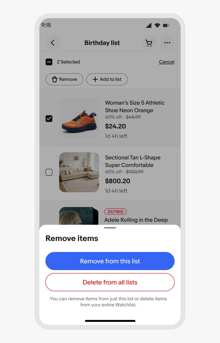
Bottom sheet
The bottom sheet is a native-only component that presents supplemental content anchored to the bottom of the screen.
For web, use a Dialog instead.
- CSS
- Marko
- React

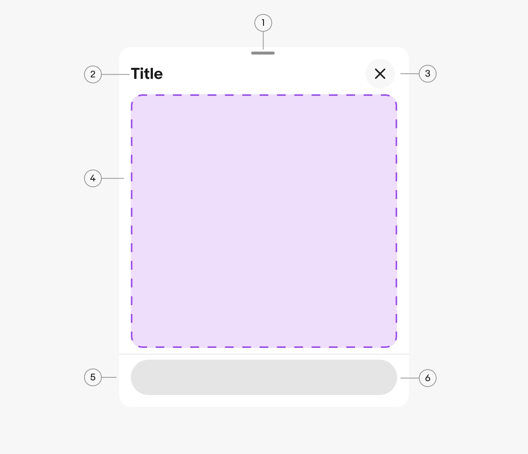
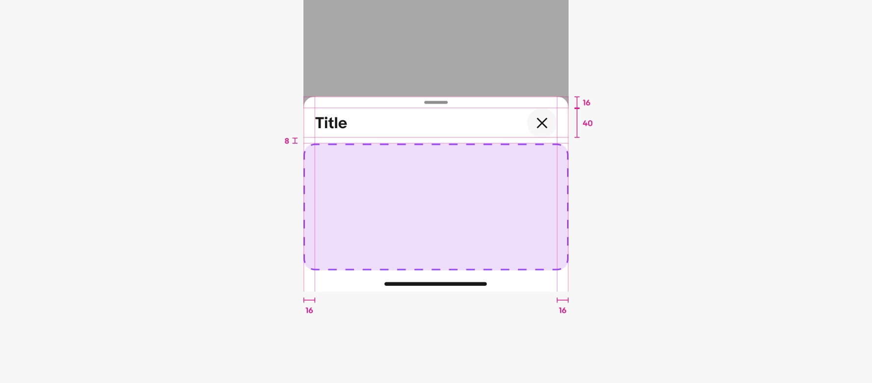
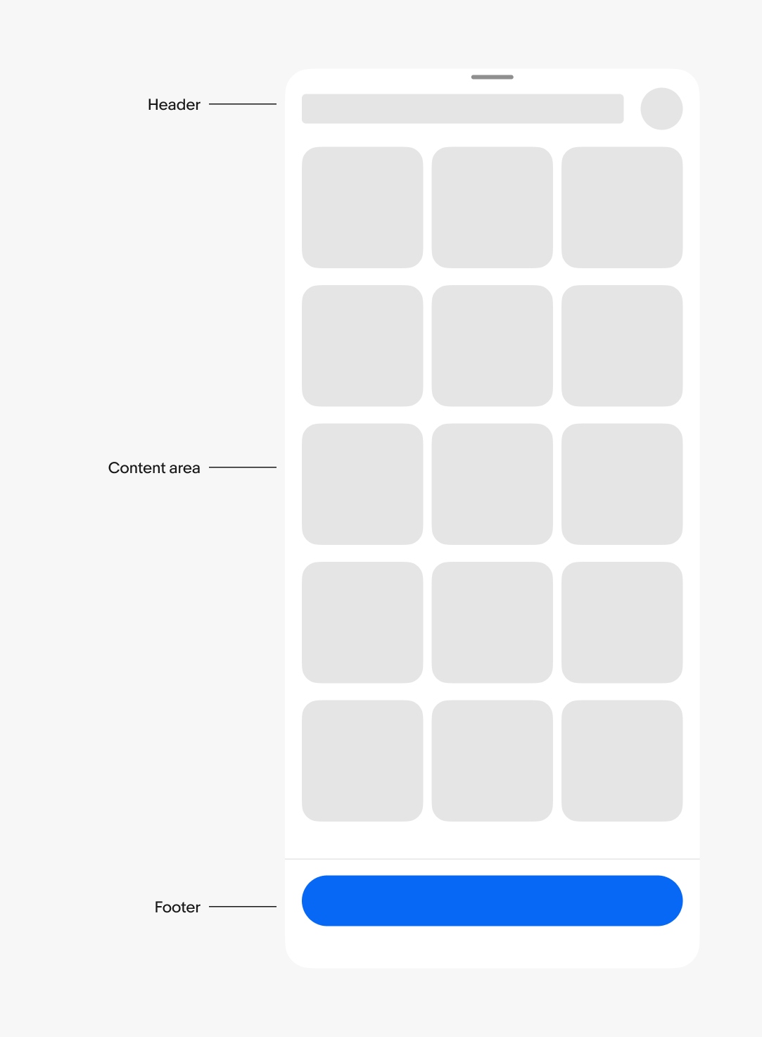
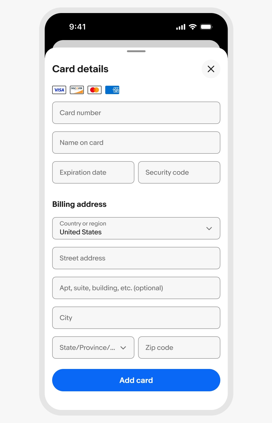
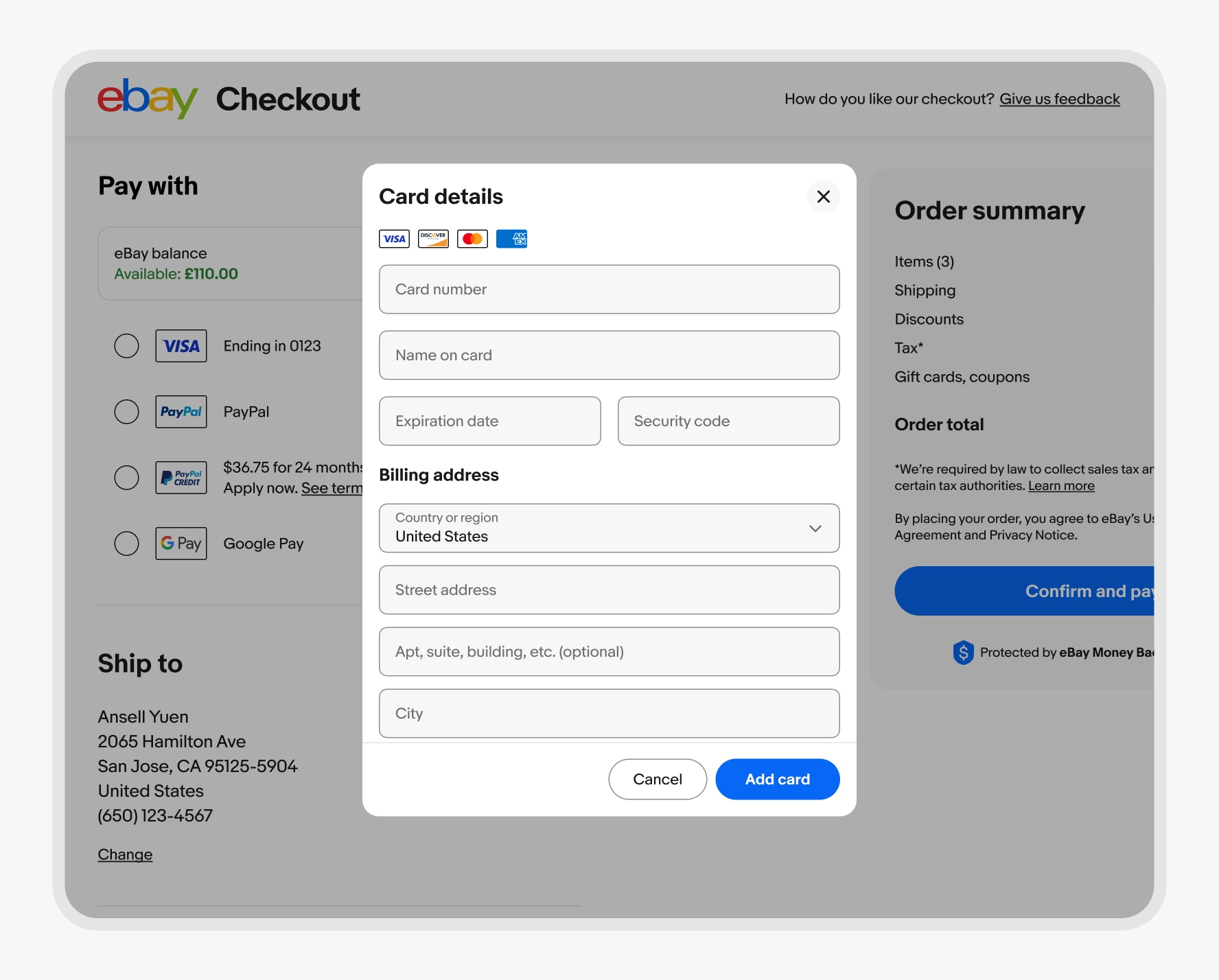
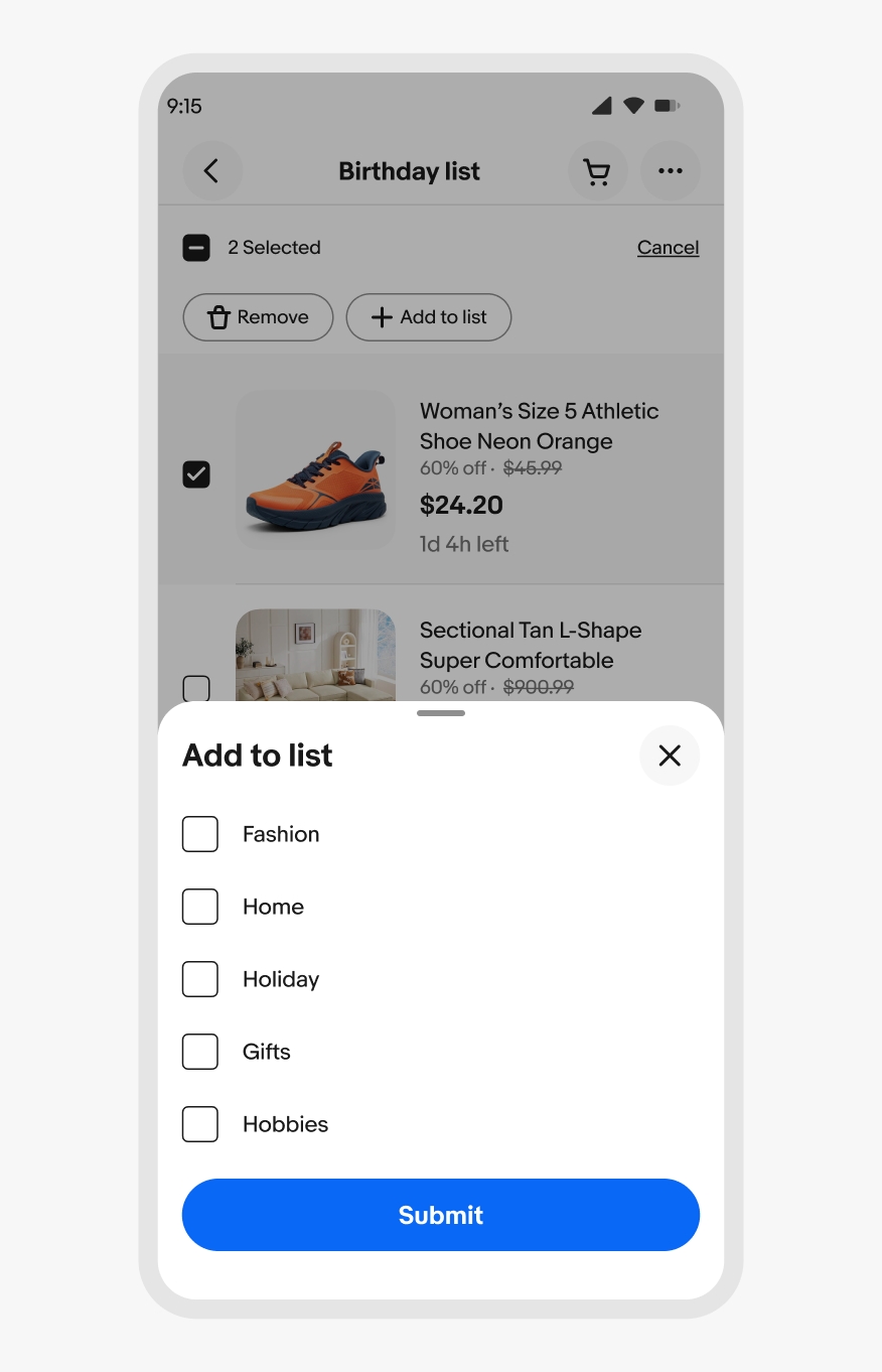
- Drag handle
- Title
- Close button
- Content area
- Footer
- Footer button
Container
The container adjusts to fit its content up to preset height. They can be expanded by scrolling content within the sheet or pushing to a fullscreen sheet.
Header
The header contains a title and a close button. Sheets require an accessible title that summarizes its purpose. Keep titles short and concise.
Content area
The content area includes all fields and information necessary to complete the sheet’s task. Keep sheet content simple and focused on the task to reduce cognitive overload.
Footer
The footer provides a consistent location at the bottom of the sheet for actions. The actions in the footer allow for completing, canceling, or moving to the next step of a task.
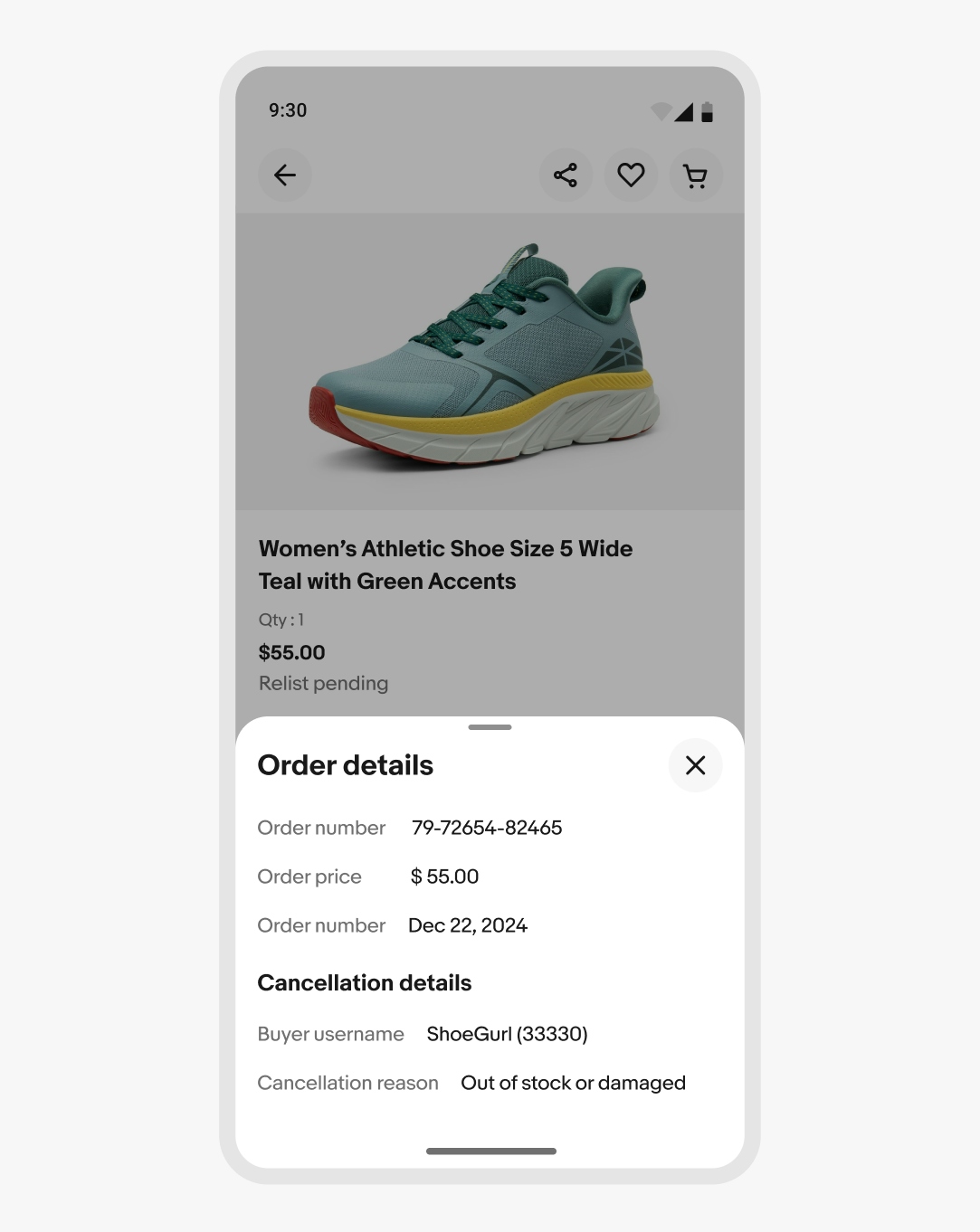
Scrim
The scrim blocks interaction with the main page and is active by default. Use the scrim to focus on the task within the sheet.
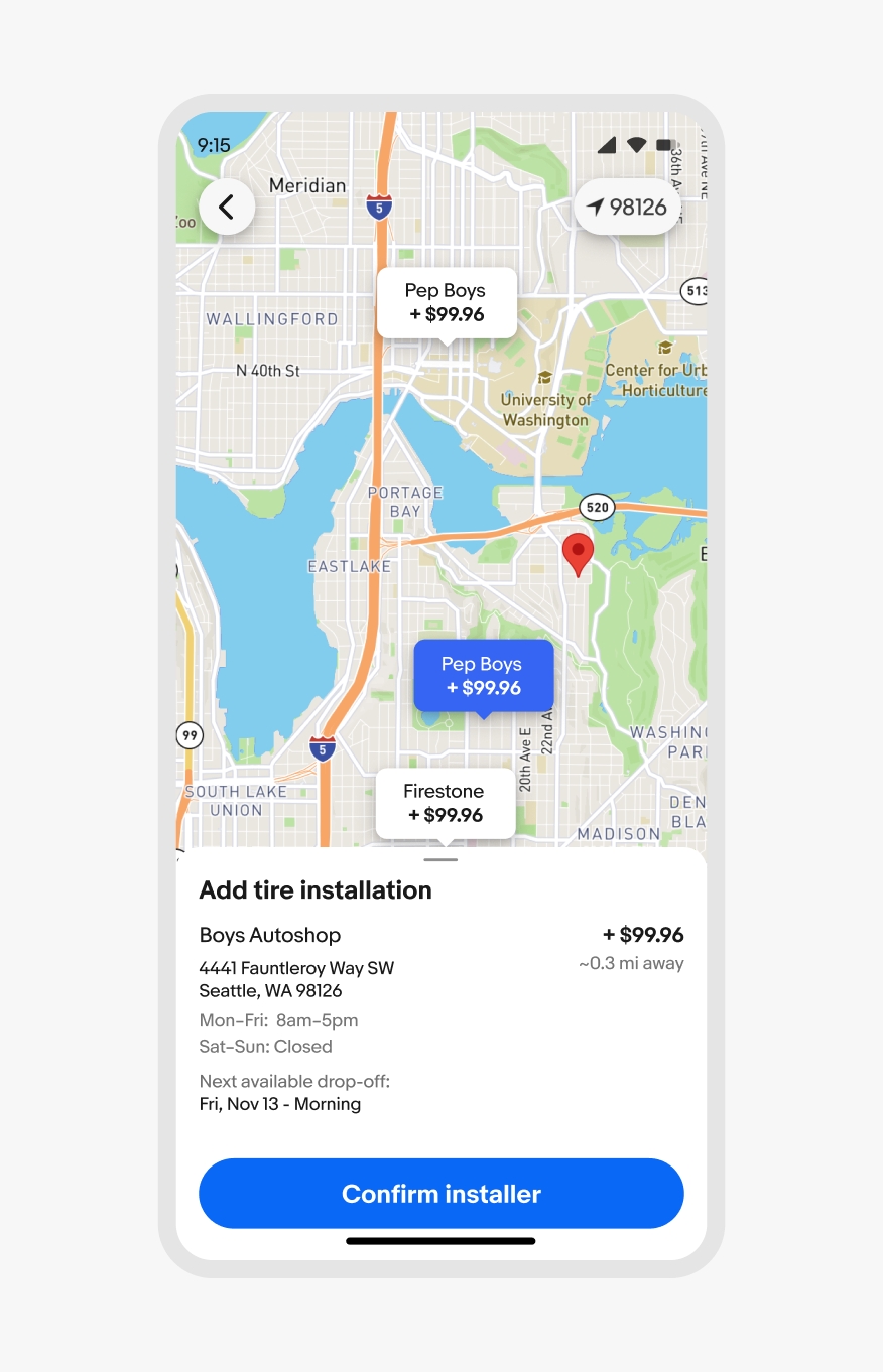
The scrim can be turned off when interaction with the main page is needed, like navigating a map where the sheet contains information about a selected location.
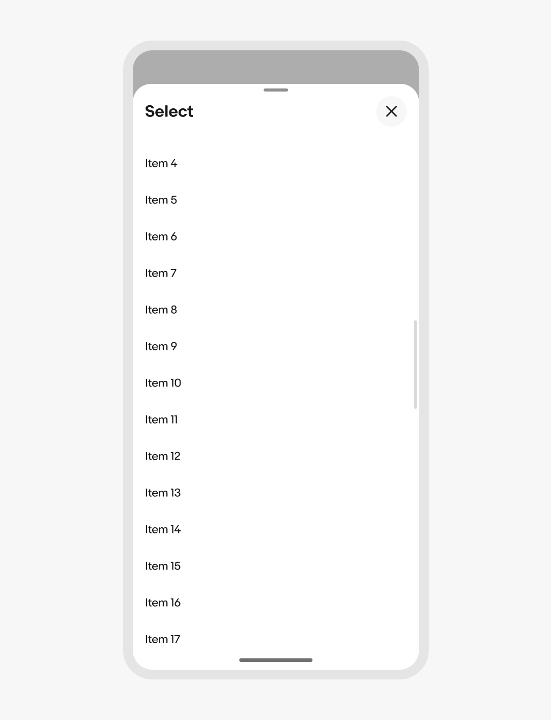
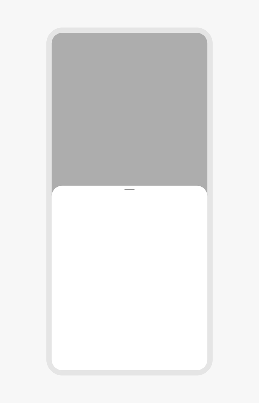
Scrolling
The vertical height of the sheet defaults up to 50% of the screen height to provide quick access to popular actions. When the content is scrolled, the sheet slides to full height and the content body scrolls when the full height is reached.
Height
The height of the sheet can be smaller than 50% of the screen height if there are only a few options. The minimum height is 30% of the screen height. It’s acceptable to have white space below options if the minimum height has additional room below the sheet content.
Content should open directly to a full modal overlay for long-form content or a large selection group with no apparent hierarchy of importance.
30% minimum height
Full modal
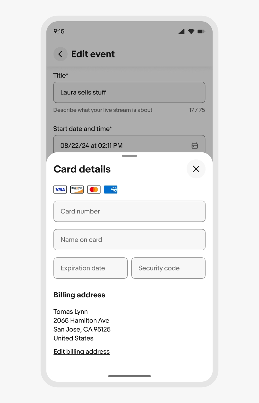
Device keyboards
If a sheet has input fields, the sheet expands upward with the native keyboard as the field gains focus. The sheet moves back down when the keyboard is collapsed.
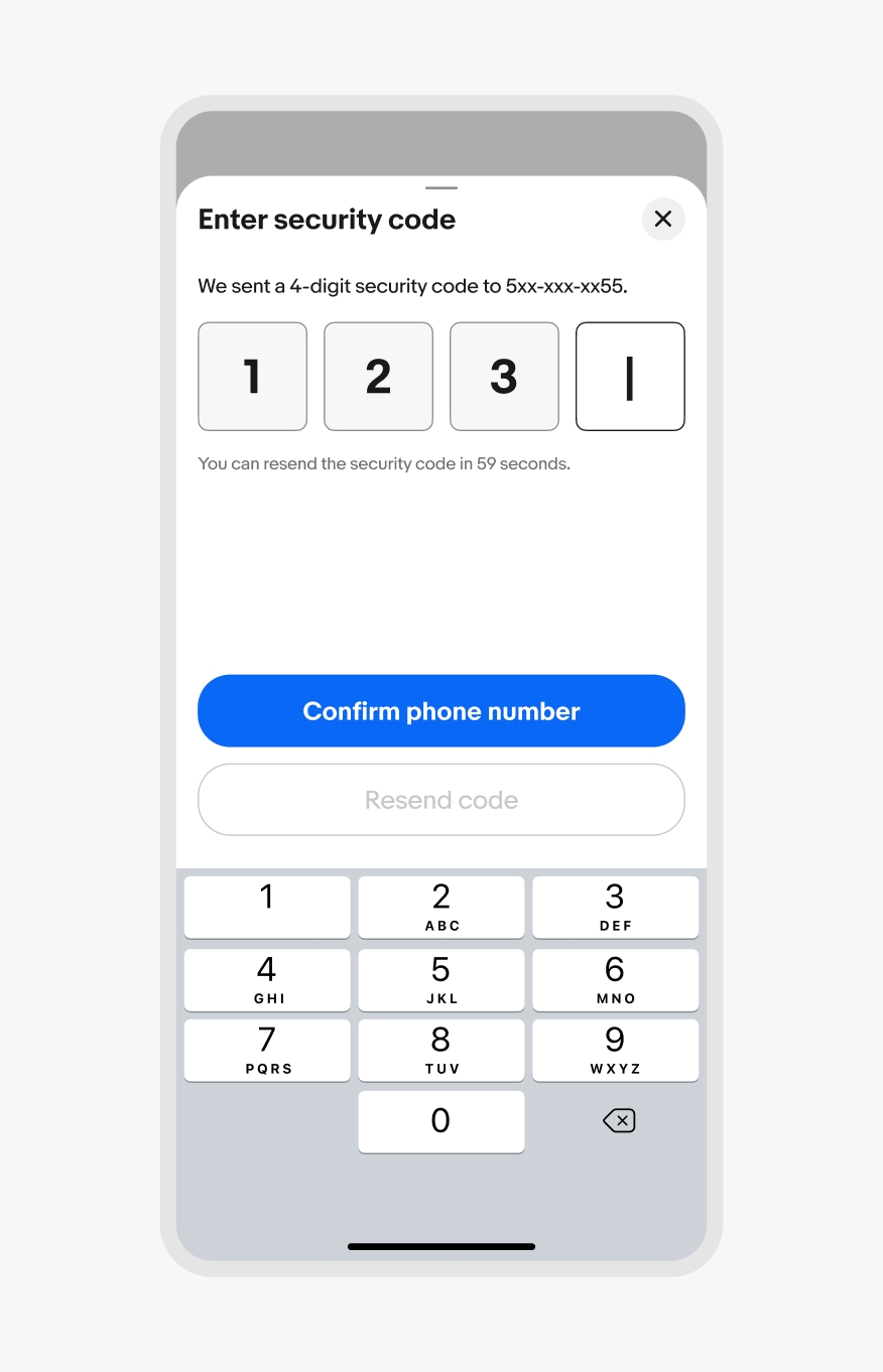
iOS keyboard
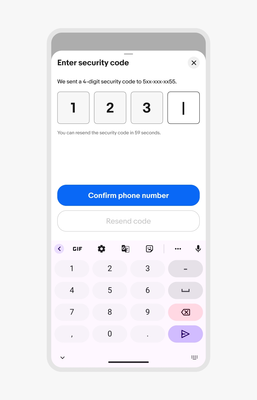
Android keyboard
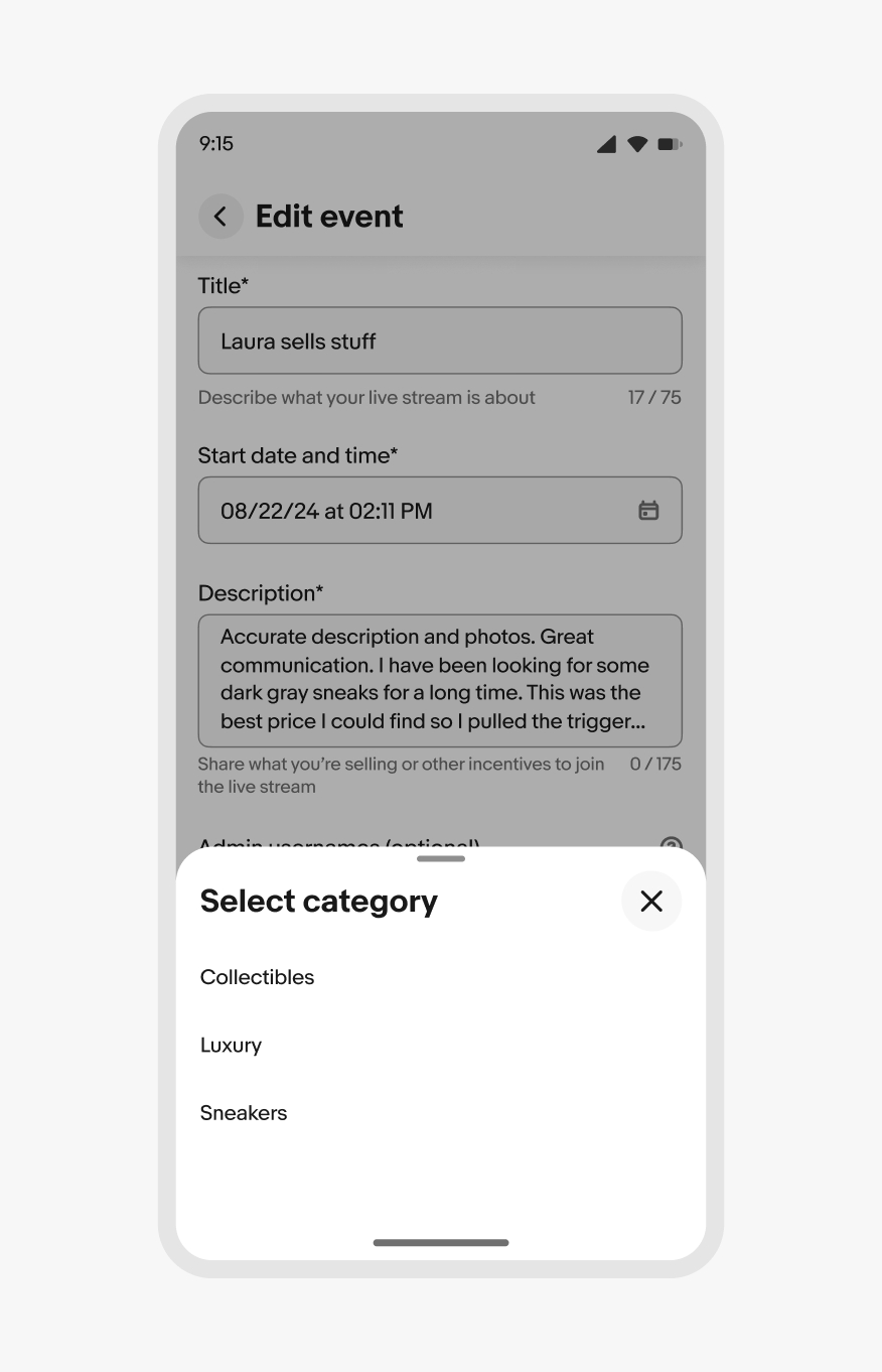
Modality
Bottom sheets can be either modal or non-modal. The default is modal, so interactions with the main page are blocked by a scrim until the sheet is dismissed.
Non-modal sheets omit the scrim and allow for interactions with the main page and the sheet content. This is common for experiences like navigating a map. A non-modal sheet allows for freedom of movement of the content below while also providing quick access to supplemental information.
Modal bottom sheet
Non-modal bottom sheet
Dismissing
Bottom sheets can be dismissed by:
- Selecting a single-select value
- Tapping a close action
- Swiping downwards
- Tapping outside of the sheet (modal only)
- Tapping a hardware back button
Asynchronous updates are preferred as users make selections within a sheet. Since the selections are already being made, dismissing the sheet doesn’t reset anything. If asynchronous updates are unavailable or disabled, dismissing a bottom sheet via the scrim, drag gesture, or a close button cancels the decision and returns to the state before the sheet was triggered.
Small screens
Sheets extend the full width of the screen and can open partially or fully by default. Partial height sheets expand to full height sheets when the content is scrollable.
Use bottom sheets for focused breakout tasks and selecting from a large list.
iOS modal stack
Android fullscreen overlay
Medium screens
Bottom sheets are aligned to the center of the screen on tablet.
Stacking
Do use a single bottom sheet per action.
Don’t launch other modal elements, like other bottom sheets, from a bottom sheet. This quickly becomes inaccessible and disorienting. Use fullscreen overlays instead.
Priority
Do use bottom sheets for low-to-medium-priority decisions and messages.
Don’t use bottom sheets for high-priority decisions or messages. Use an alert dialog instead.