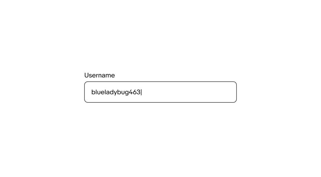
Text field
v4.0
Text fields let users enter and submit text.
- CSS
- Marko
- React

Text fields let users enter and submit text.
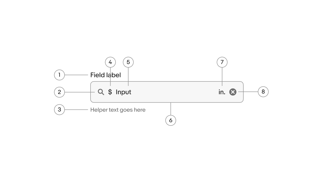
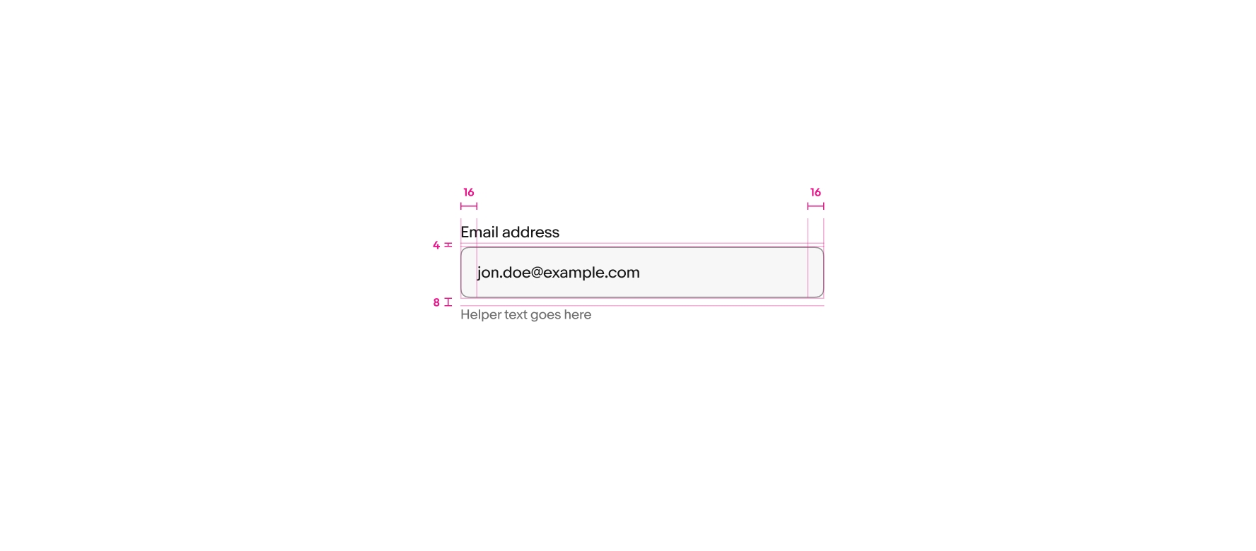
Include a label unless another adjacent element already serves that purpose. The label names what the user enters in the field.
The value is the text the user enters and submits with the form. User input replaces any placeholder text after the first character is entered.
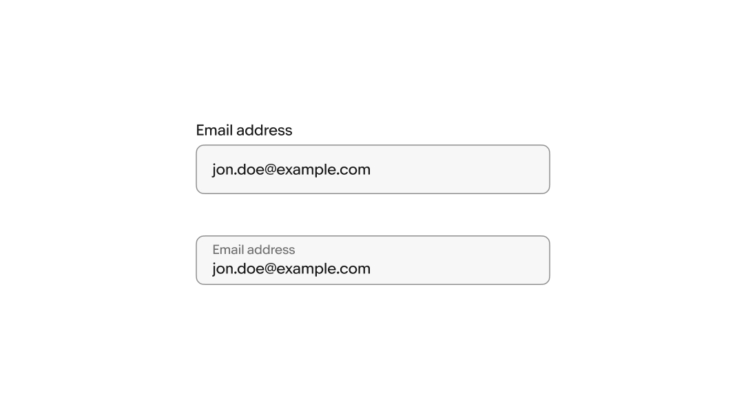
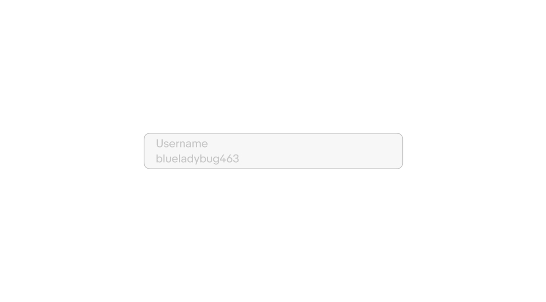
There are two layouts available for texty fields, stacked and floating. Stacked labels are above the field and floating labels are inside the field. A floating label animates upward on focus to make room for the value.
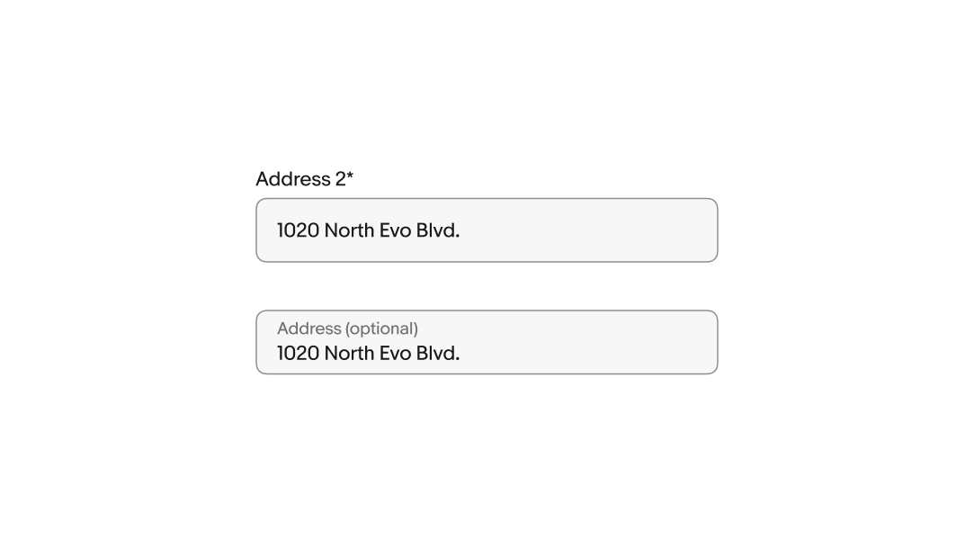
Use an asterisk to indicate a field is required. Display the word “optional” in parentheses next to the field label if the field isn’t required.
If most fields are required, only indicate the optional fields. If most fields are optional, only indicate the required fields.
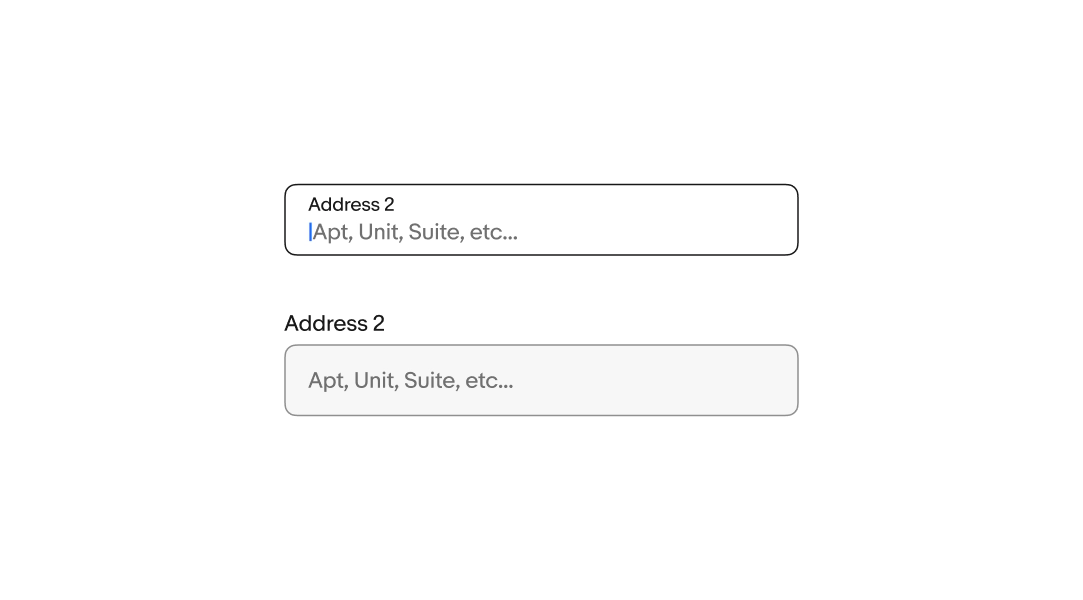
Placeholder text, or “ghost text,” gives users a hint about the expected input format. Use realistic examples of what a user might enter, not descriptions of the field.
Placeholder text disappears when the user starts typing, so don’t use it for instructions or required information.
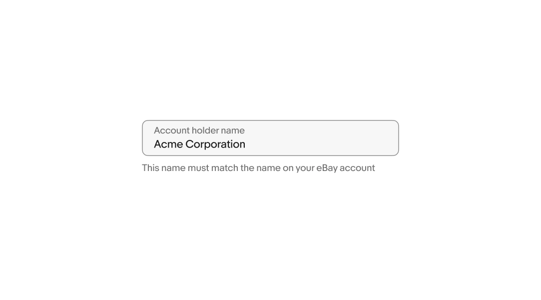
Helper text is placed below the field and informs the user of any requirements or disclaimers. It's shown persistently or on focus. Don't repeat the label.
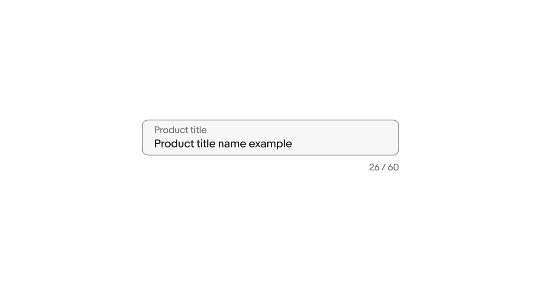
A character counter appears when a character limit is set. It updates in real time as the user types.
Format as xx / n (with spaces for clarity).
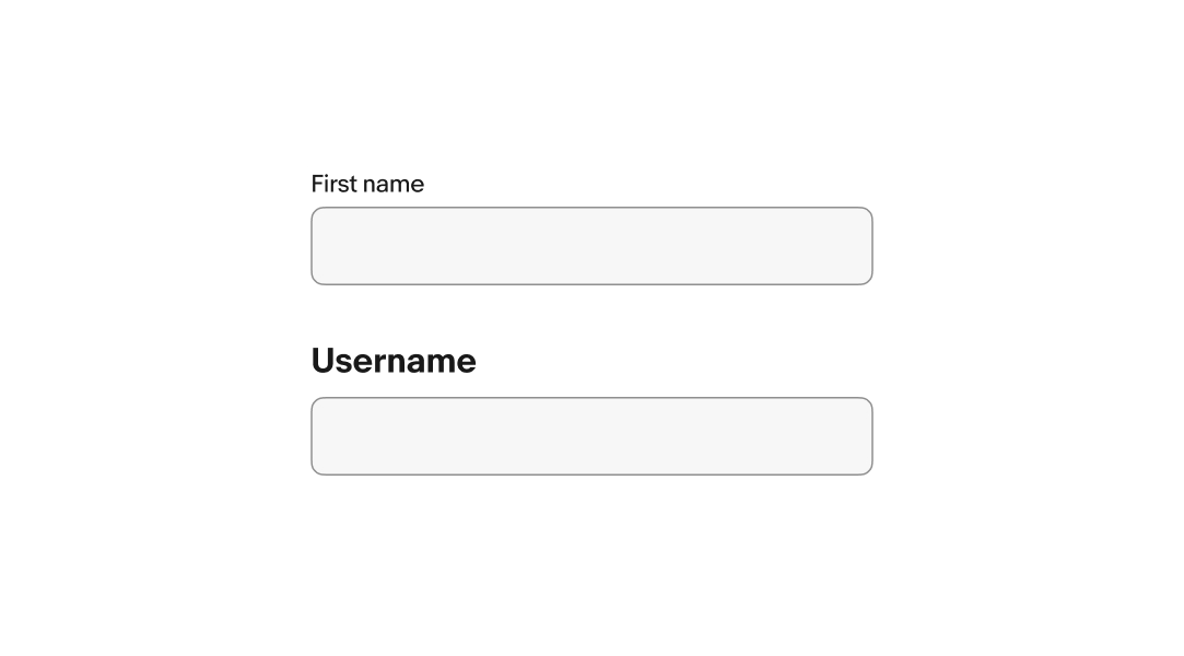
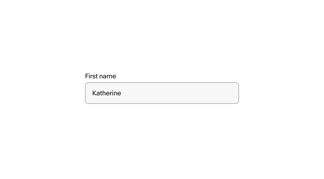
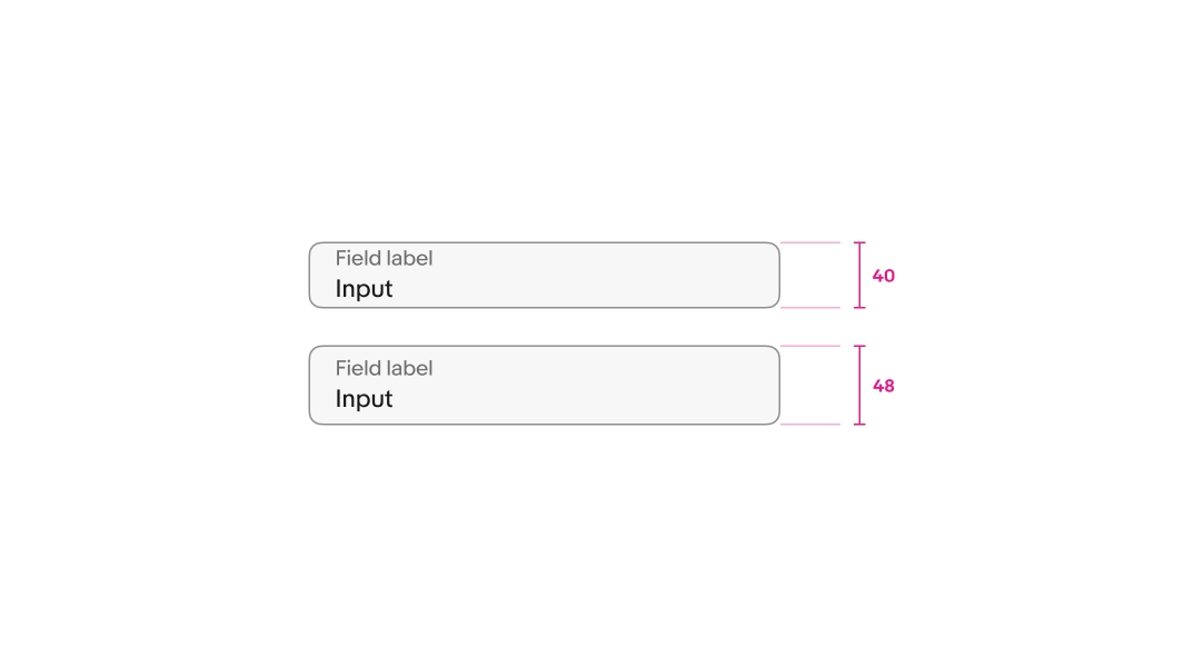
There is a small and large size available for text fields. The default is large and is recommended for smaller screens. Avoid mixing different sizes in a form.
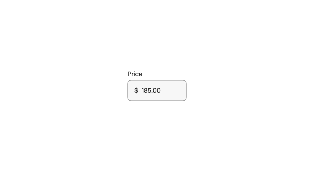
Static text or symbols can be prepended to the input. The prefix clarifies the expected input and removes the need for users to manually enter them. These are useful for values like currency.
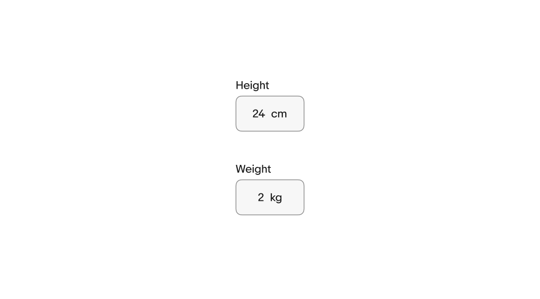
Static text or symbols can be appended to the input. The suffix, or postfix, clarifies the expected input and removes the need for users to manually enter them. These are useful for entering values like dimensions and weight or currencies that use trailing symbols.
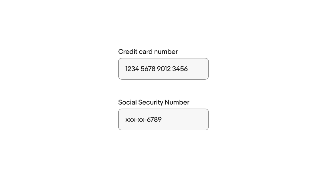
Input formatting clarifies expectations and formats the input to be easier to read. Slashes, dashes, and spaces are automatically added to the input as the user enters characters.
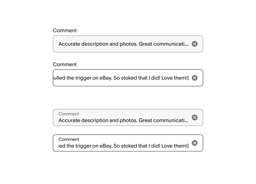
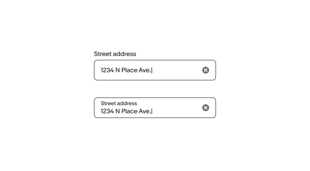
Text field values overflow left and right. While focused, the content will shift to keep the cursor in view as the user enters characters. When the field loses focus, the content will scroll to the beginning. Focusing on the field again returns the user to the end of the content.
Generally, text fields should avoid overflow. Use a Text area field if the value of a field is expected to be longer than a short sentence.
The active state is triggered whenever the user interacts with the field. While active, the background color is removed and the border becomes strong.
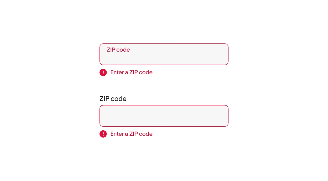
Error messages appear below the field when the input doesn't meet the required format or conditions. The error message replaces any existing helper text.
Keep the tone neutral, don’t blame or scare the user. Clearly inform users the requirements so they know how to fix it.
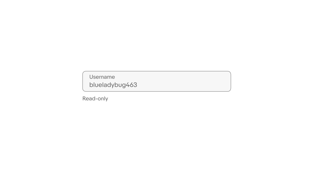
Users cannot focus on or change read-only fields. Their input is derived from other parts of the UI and is intended to be viewable for reference. The input is submitted with the form.
Users cannot focus on or change disabled fields. Their availability depends on certain requirements. No value will be submitted from disabled fields.
The clear button appears by default as a trailing icon while the field is focused and has one or more characters entered.
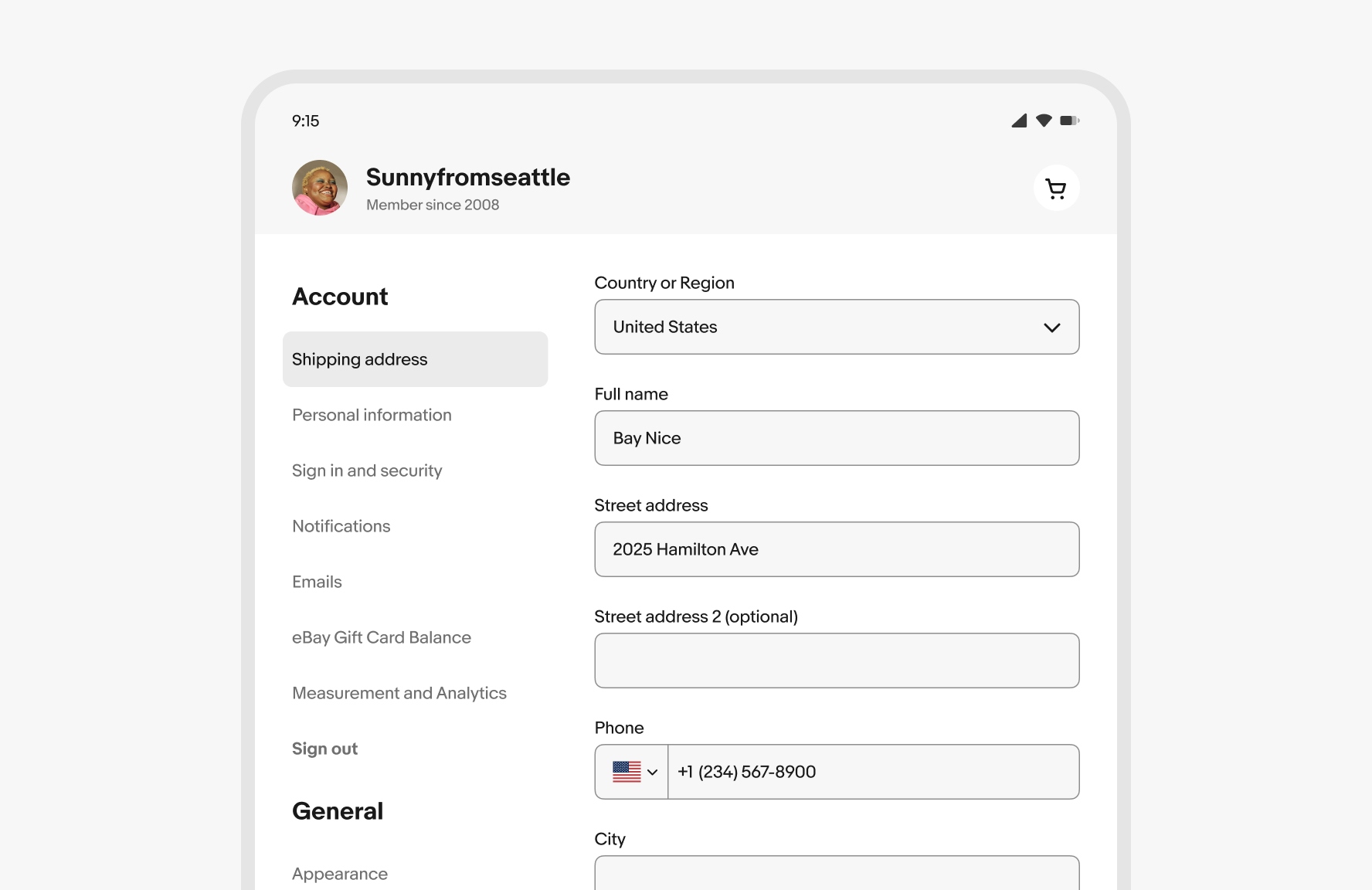
Text fields span the full width of the screen on compact screens.
Text fields are aligned to the grid up to their max width on larger screens. Avoid allowing text fields to span the entire width of the page on large screens.