Tourtip
Tourtips explain or inform users of new features, experiences, and UI elements.
- CSS
- Marko
- React
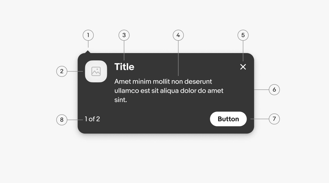
- Pointer tip
- Leading graphic
- Title
- Body
- Dismiss button
- Container
- Button
- Sequence index
Title
Optional. Use a title only when the tip needs an introduction. It should succinctly summarize the rest of the content. Most tips don't need a title.
- Use sentence case
- No ending punctuation
- Aim for 3-6 words

Body
Required. Use the body to explain what the new feature does and why it's useful to the user. Focus on the benefit, not just the feature's existence. Don't repeat the title or nearby content.
- Use ending punctuation
- Keep to 1-3 lines
- Lead with a verb to encourage interaction
- Only one text link (optional)

Leading graphic
Optional. If you use a leading graphic, you can use it to show a preview, a feature icon, and other related graphics. These graphics can be distracting if overused, so aim to use them infrequently.

Dismiss button
The dismiss button closes the tip. The dismiss button is required on web and is focusable, but optional on native.

Button
Optional. A button is used to dismiss the tip, navigate to a feature, or advance through a sequence. Use verbs to make the next step and outcome immediately clear.
- Use sentence case
- No ending punctuation
- Use a [verb] [noun] or [verb] [article] [noun] pattern
- Aim for 1-3 words
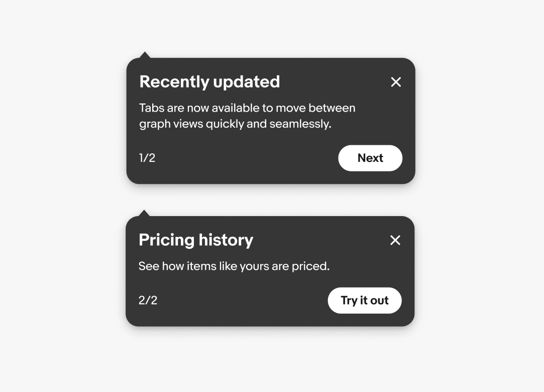
For multi-step tourtips, use:
- "Next" to advance
- "Back" to go back
- "Got it" to dismiss on the final step

Index
Include an index if there are multiple steps. The index tells users where they are in a sequence without interrupting the flow.
- Use sentence case
- No ending punctuation
- Use the format "X of X"
- Use numerals
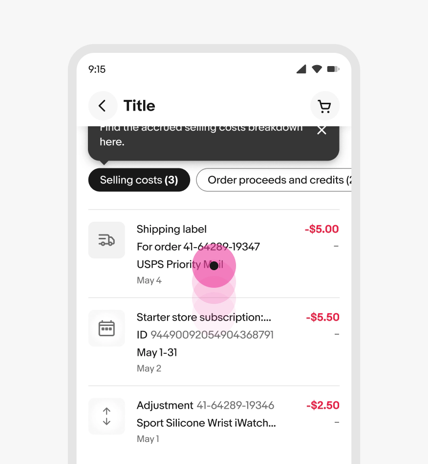
Pointer arrow
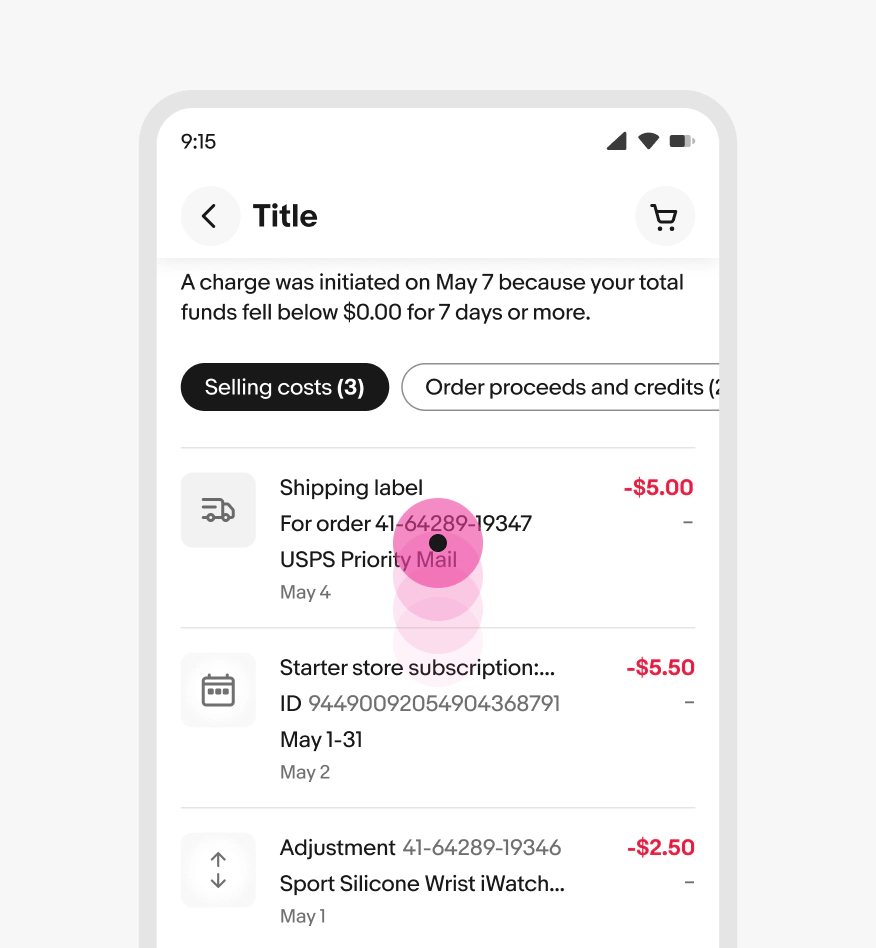
The pointer arrow points to the anchor element. The pointer can appear on any side of the tip and can flex freely along the side depending on the anchor element’s location. There’s a minimum margin of 16px from each corner.

Preferred placement
Tips can have a preferred placement beside, below, or above anchor elements. The default position is above and centered. The preferred placement will be overridden and adjusts according to the distance of the anchor element from the edge of the screen.
For example, a tip will appear below and offset to the left of an element in the top-right of a top navigation bar.

Presentation
Tourtips appear implicitly and have options for dismissal.
Implicit triggers
Implicit triggers include actions like navigating to a page with a new feature or scrolling to an item eligible for a tip. These tips appear automatically and dismiss when interacting with page content, pressing the dismiss button, or navigating to a new page.

Presentation
Tips quickly animate in near their trigger element. If the tip is located out of view, the animation won’t be seen but the tip will remain visible until the user scrolls and dismisses it. The timing depends on the type of tip.

Persistence
Tourtips can persist until explicitly dismissed by the user or after the user interacts with other elements on the page.

Dismissing
Tips are dismissed via the dismiss button, an info button trigger, interacting with content on the page, or scrolling the page.

Text overflow
The title and body text wrap when they reach the width of the tip container.

Small
On compact screens, tips can float below the top navigation header, anchor to an element in view on load, or present further down a page.

Medium
On medium screens, tips anchor to an element in view on load or further down the page.

Large
On large screens, tips anchor to an element in view on load or further down the page.

Frequency
Only show a single tip at a time.

Don’t present multiple tips at once.

Scrolling
Tips are dismissed when the page content is scrolled.
Don’t anchor a tip or move it around to keep it visible on scroll.
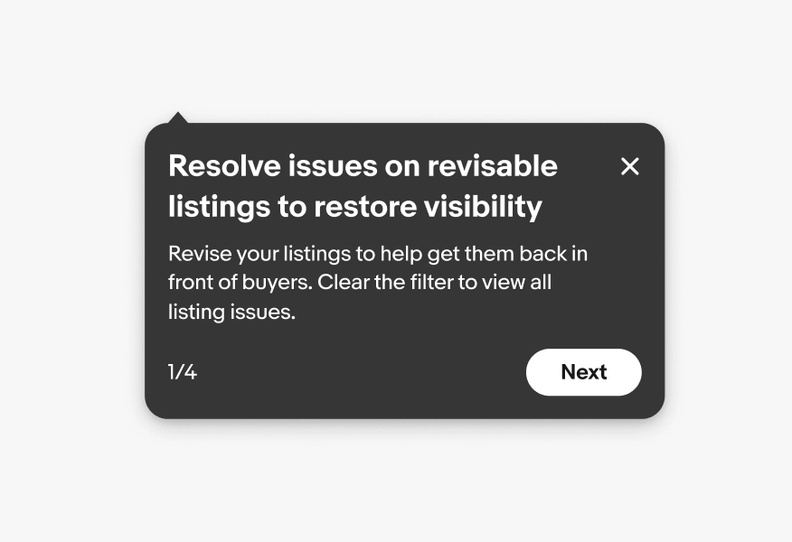
Sequence
Revise your listings to help get them back in front of buyers. Clear the filter to view all listing issues.
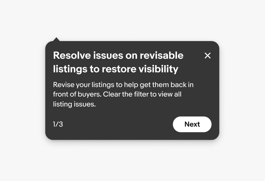
Revise your listings to help get them back in front of buyers. Clear the filter to view all listing issues.