Input chip
Input chips help users quickly select validated input values.
- CSS
- Marko
- React

Validated
Input chips ensure users can only select from validated values.
Lightweight
Chips are light and easy. They’re quick to scan, simple to tap, and always in support of the content.
Convenient
Input chips can surface popular values for users to quickly select without navigating to a new surface.

- Title
- Container
- Trailing icon
Title (Label)
The title labels what the chip represents. Use a noun or noun phrase that names the selected value, category, or filter.
- Use sentence case
- No ending punctuation
- Avoid verbs, articles, or full sentences
- Keep between 1–3 words
- Max character count: 24
Input chips
Input chips are ideal for adding or selecting items like tags, categories, and preferences. They’re useful for reinforcing the availability of a value and allowing for quick add or remove actions.

States
Input chips leverage our state layer tokens for state animations.

Width
Chips have a minimum width of 56px and a max width of 320px before the title is truncated. If input chips are nested within a text field narrower than 336px they’ll extend the full width of the field minus padding.

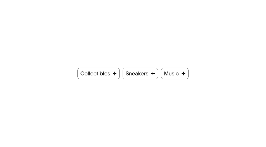
Suggested input
Input chips can be surfaced by default on a page to allow for quickly selecting and deselecting multiple values.
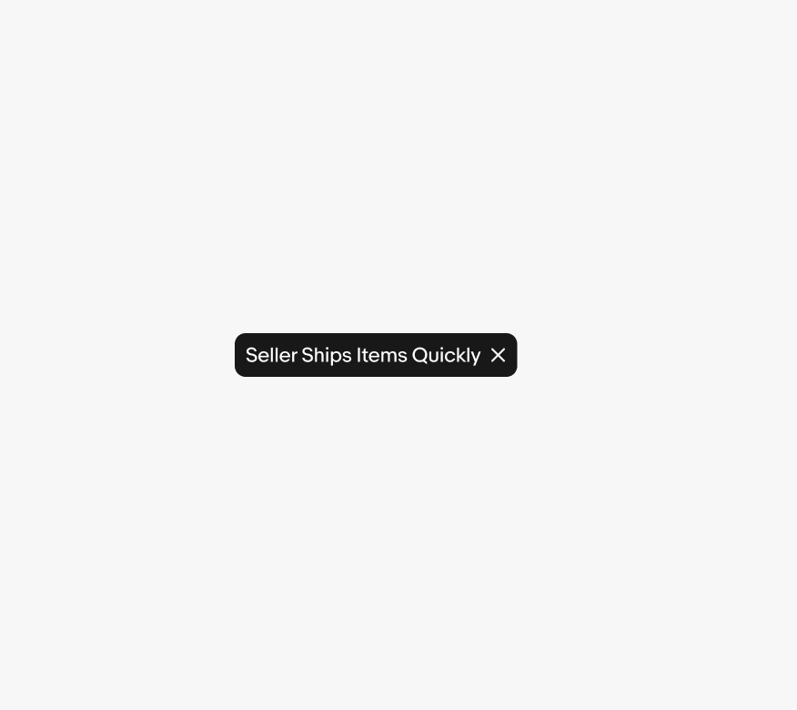
Video description: An animation of the input chip component interaction and its specific micro-interactions. This example shows the interaction on the chip container scaling down and using a micro-interaction on the "+" icon rotating into an "x" icon, the background color of the chip also fills in to its active state using a circular masking transition, and the contents fade to their active color variant as well. On deselection of the filter, the "x" reverts back to a "+" icon, and the background swaps back to its idle state.
Web combobox
The chips combobox on web converts values to chips within the field as users select and enter values. Refer to the combobox page for additional details.

Small screen
On small screen web, input chips are presented inside of a combobox or as a chip group. On native applications, input chips are presented as a chip group with a button that launches a search view.


Large screens
Input chips on larger screens can be presented within a combobox on web or in a chip group. Native large screens presents chips in a chip group.

Stacking types
Do reserve input chips for input views.

Don’t stack input chips below filter chips. This can overwhelm and confuse users.

Labels
Use a noun or noun phrase the user selected.

Don’t use descriptive language instead of naming it; don’t use title case.