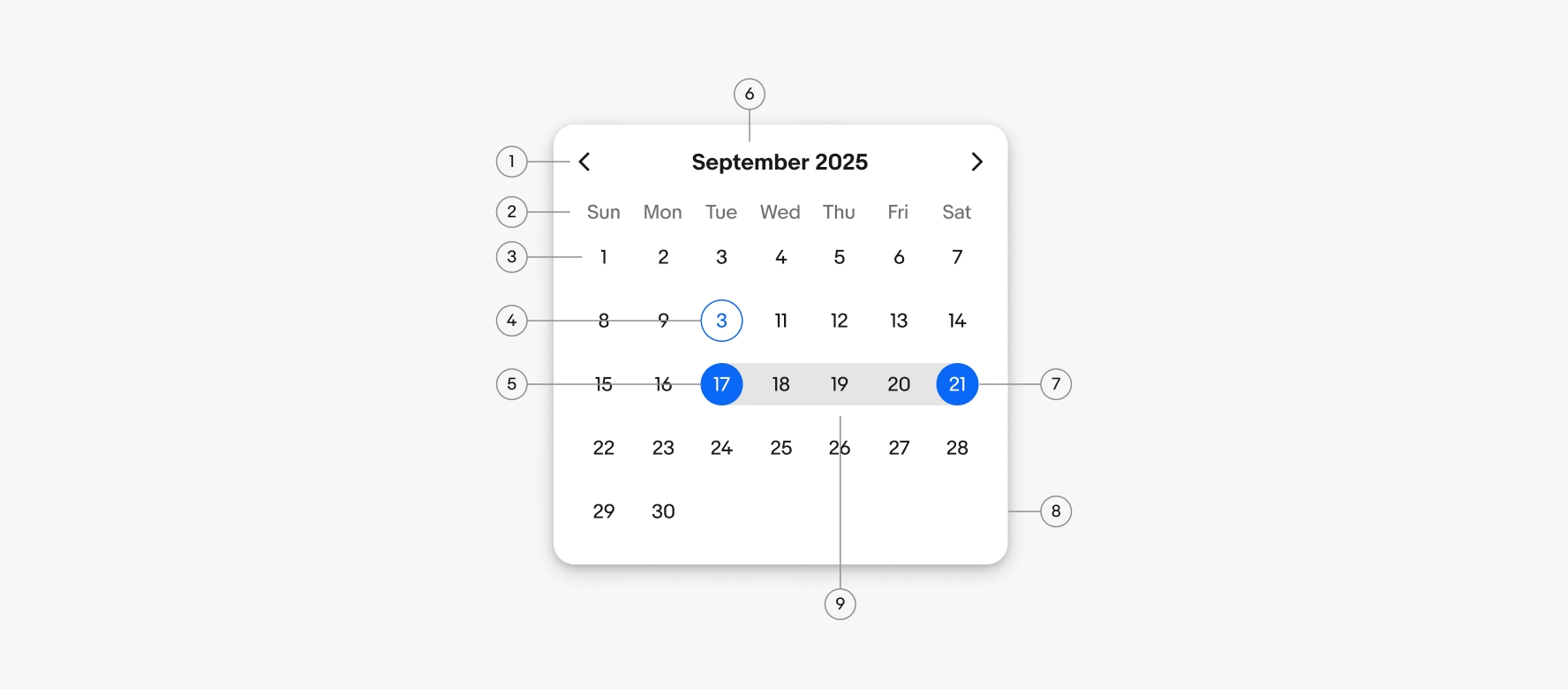
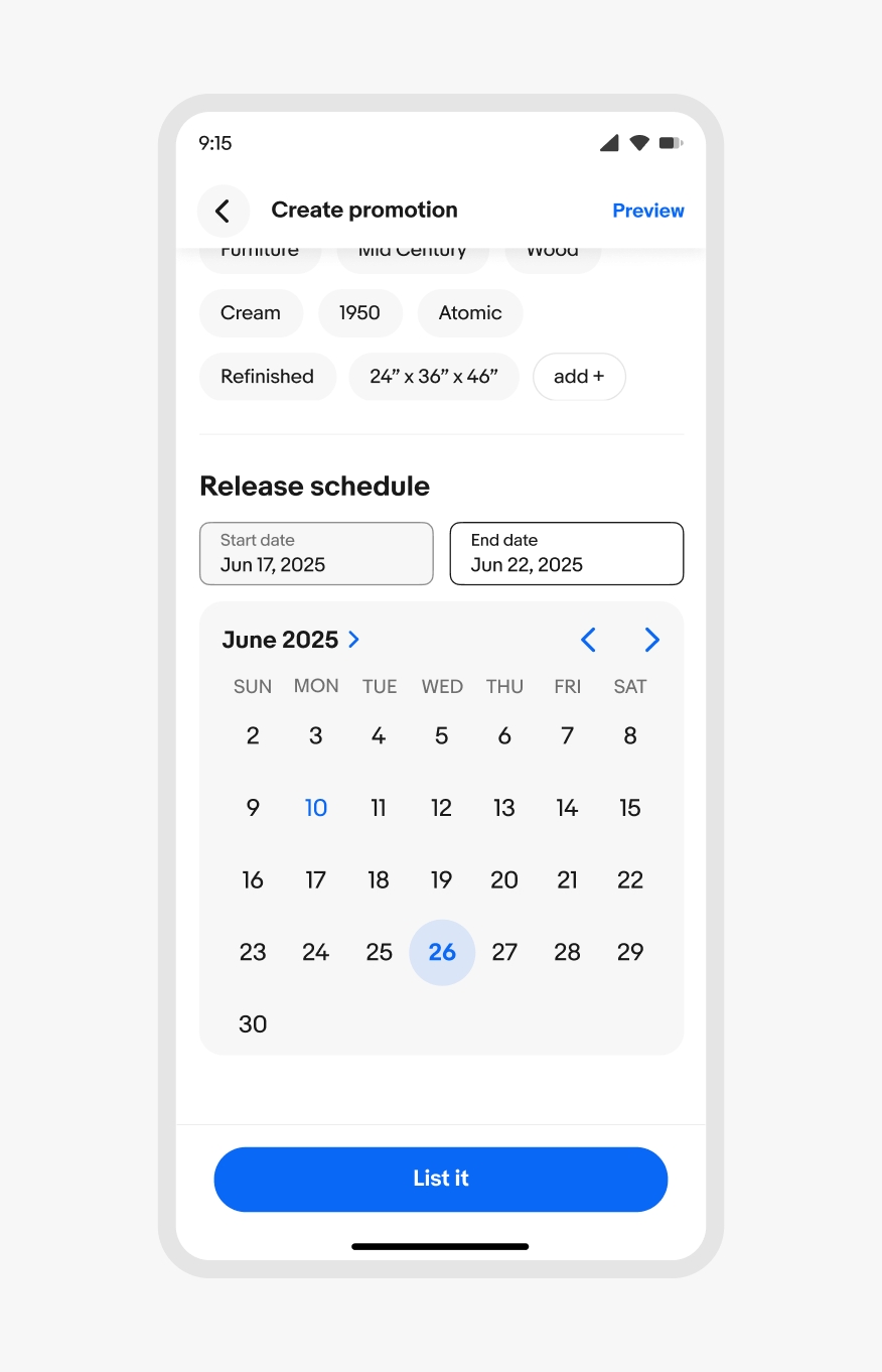
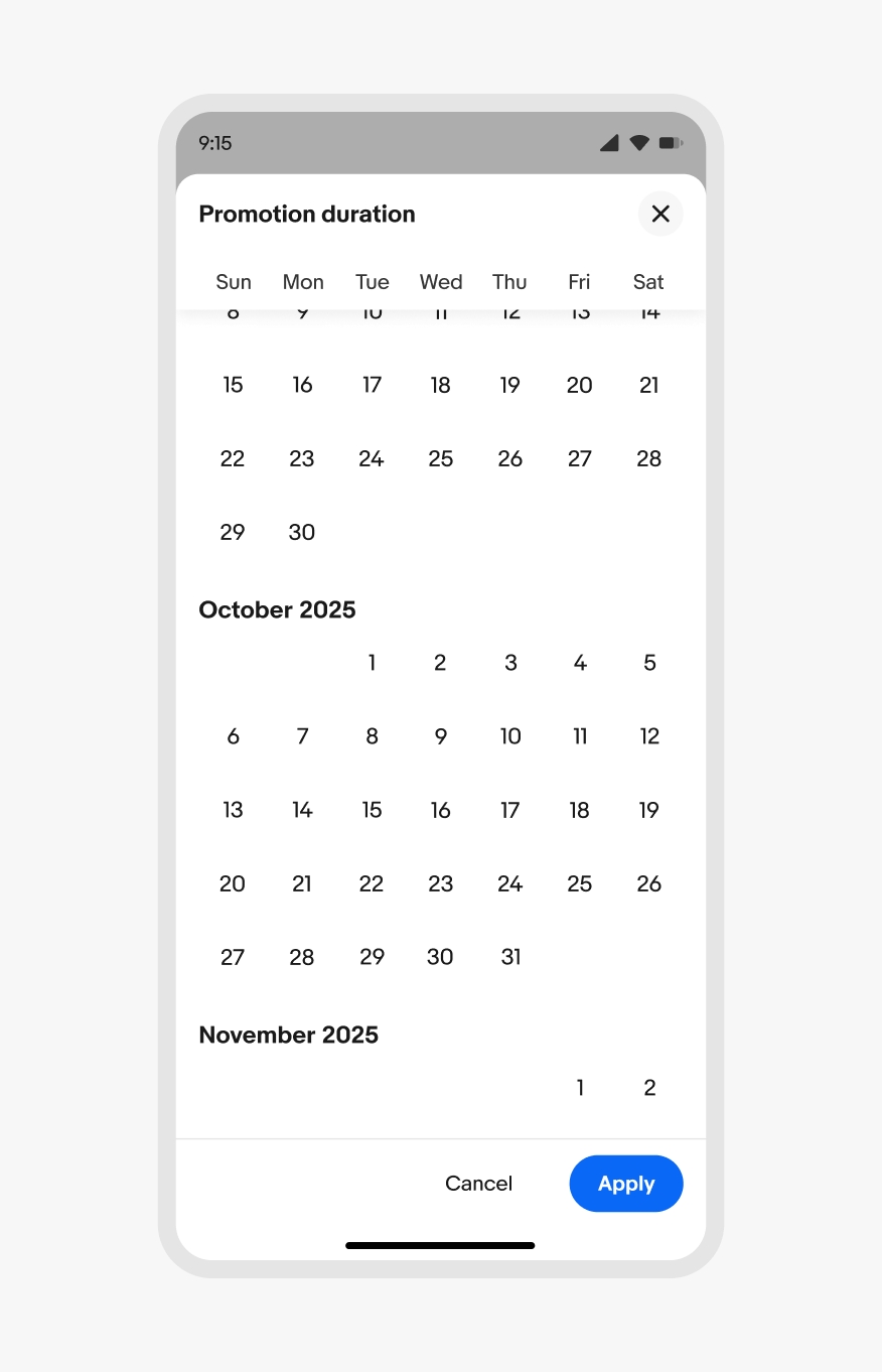
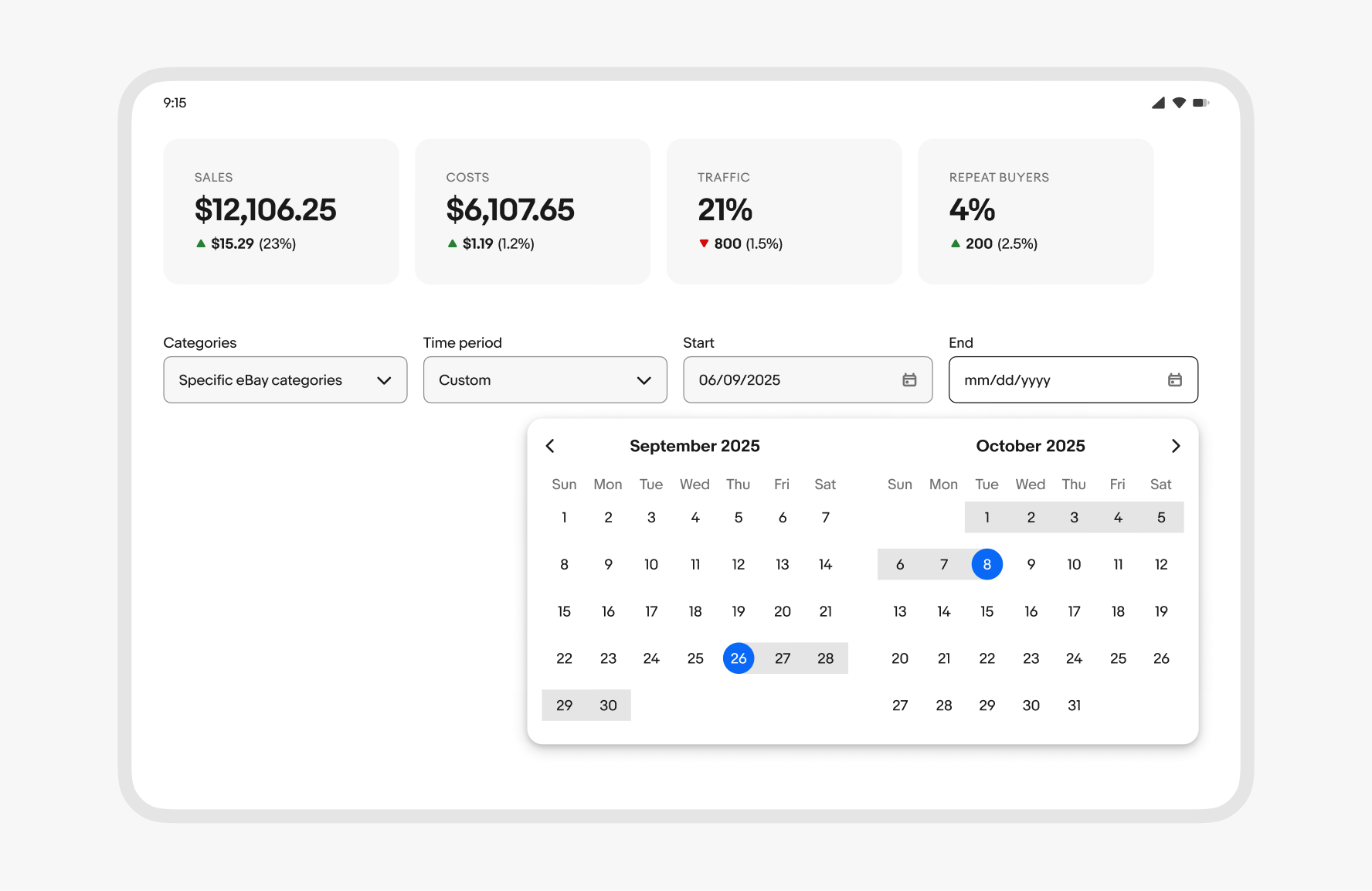
Date picker
v1.2
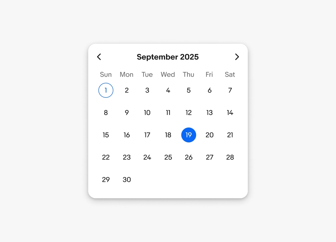
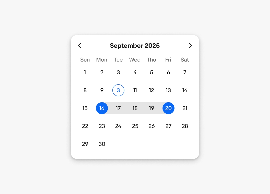
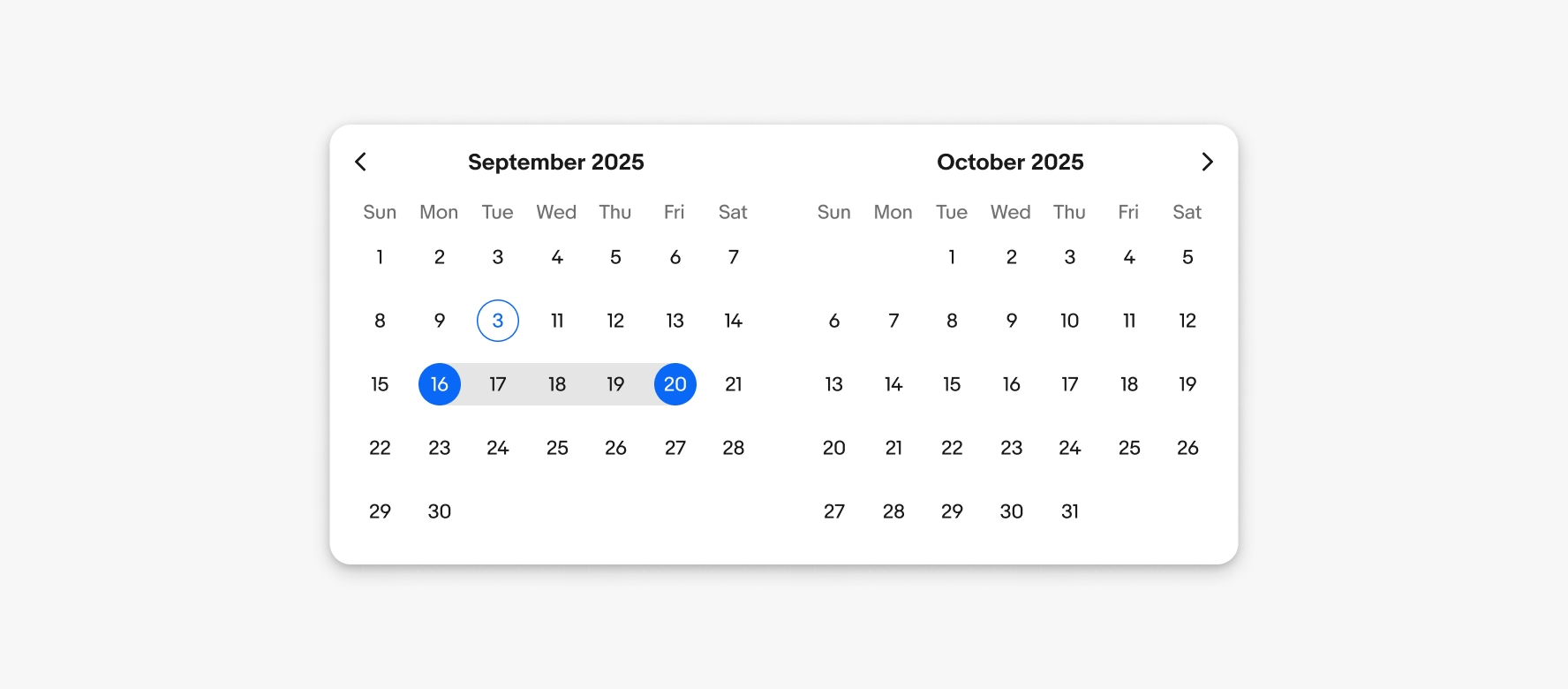
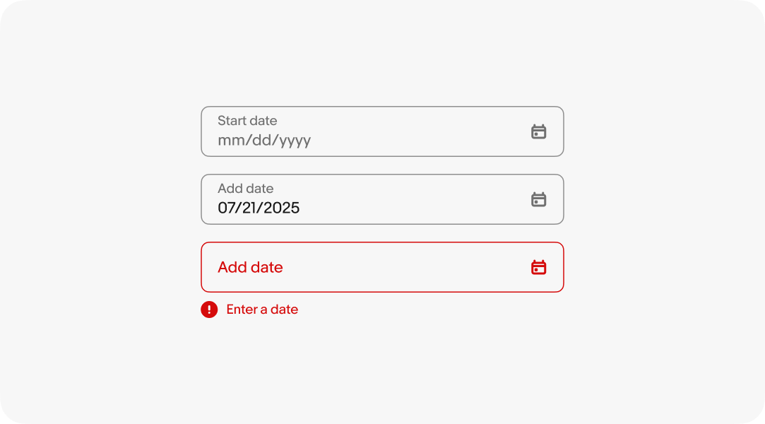
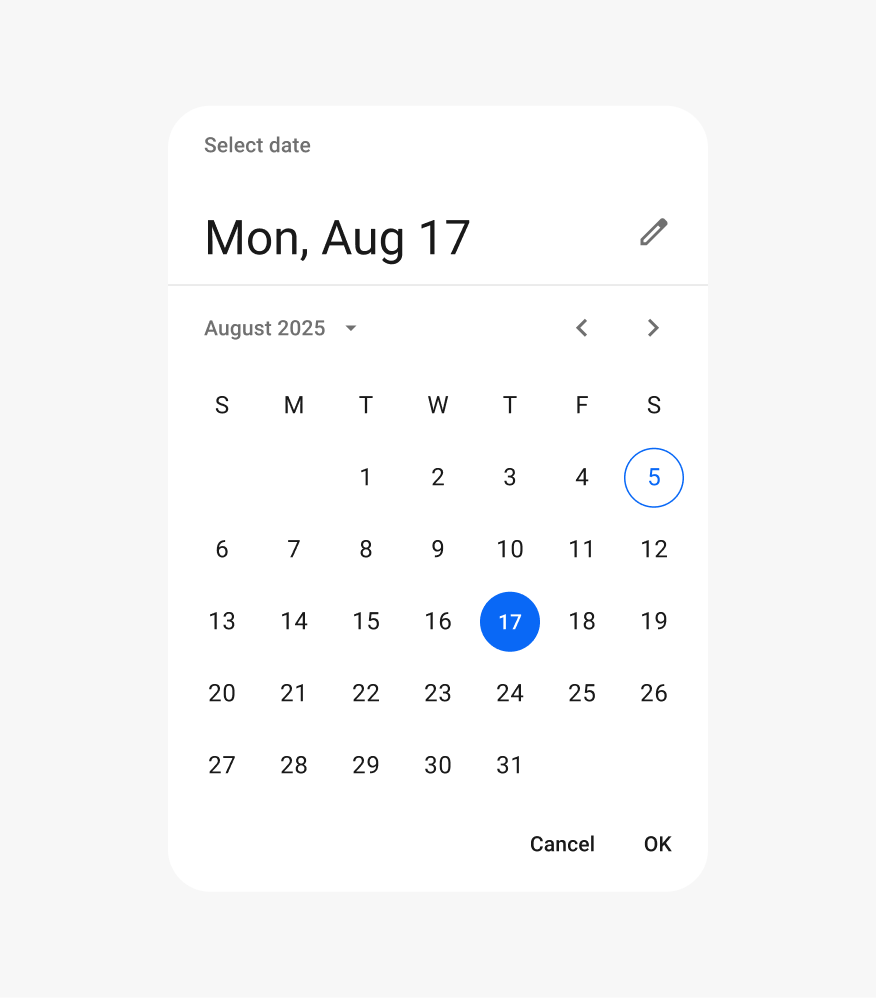
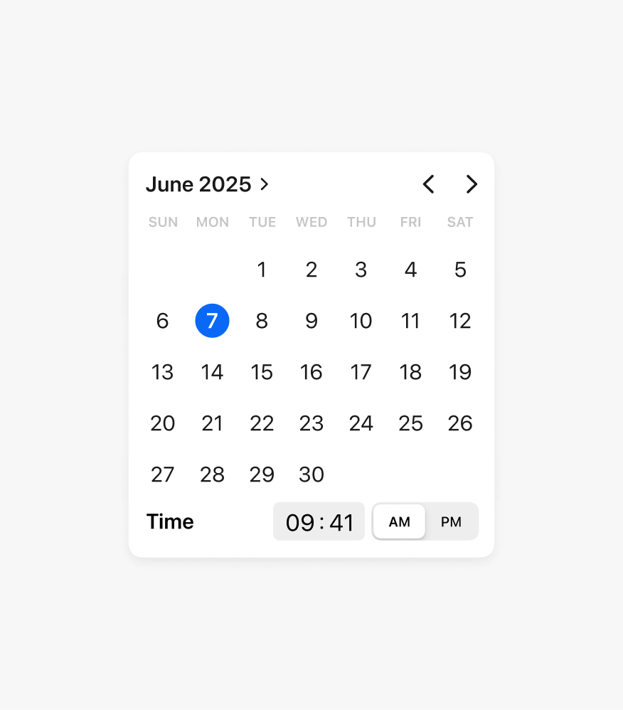
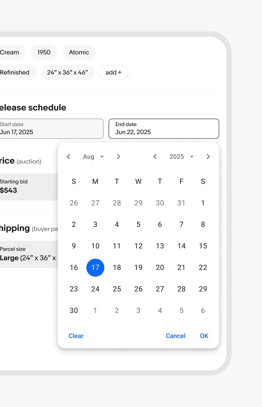
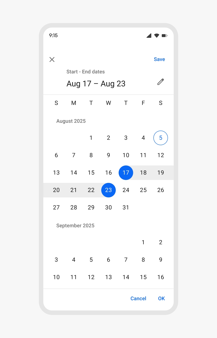
Date pickers allow users to choose a date or a range of dates.
- CSS
- Marko
- React

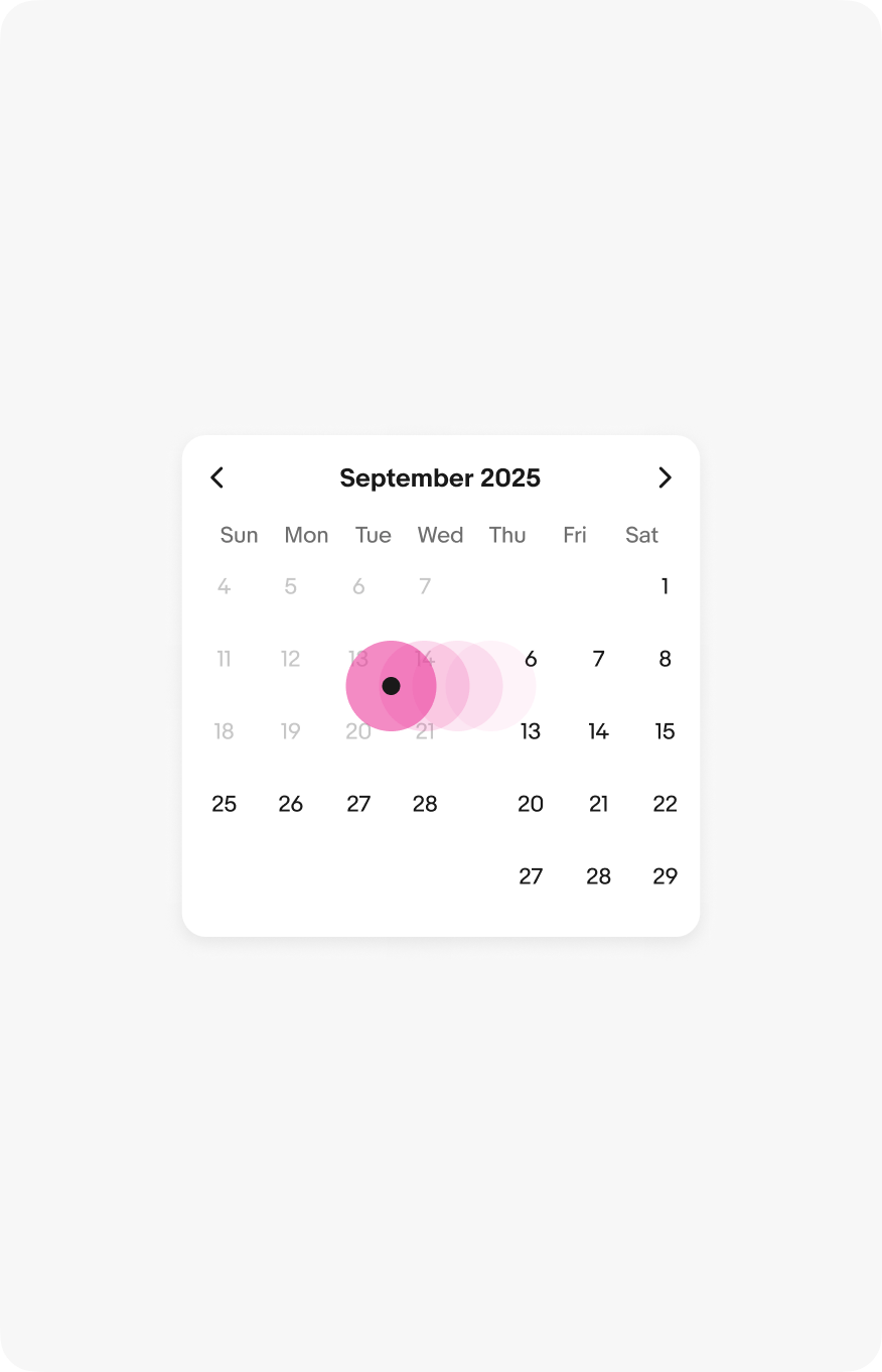
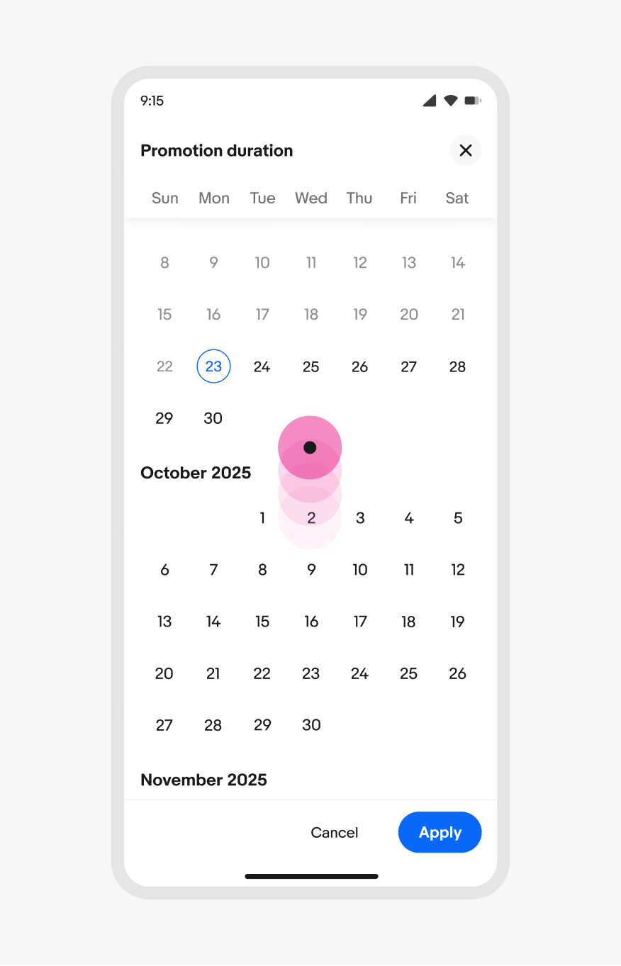
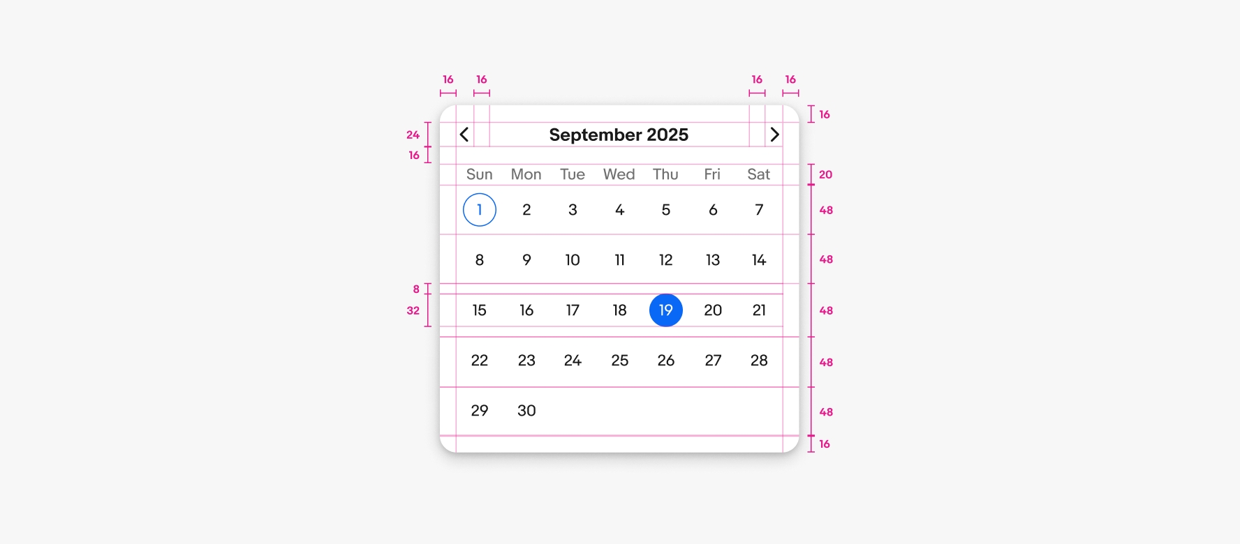
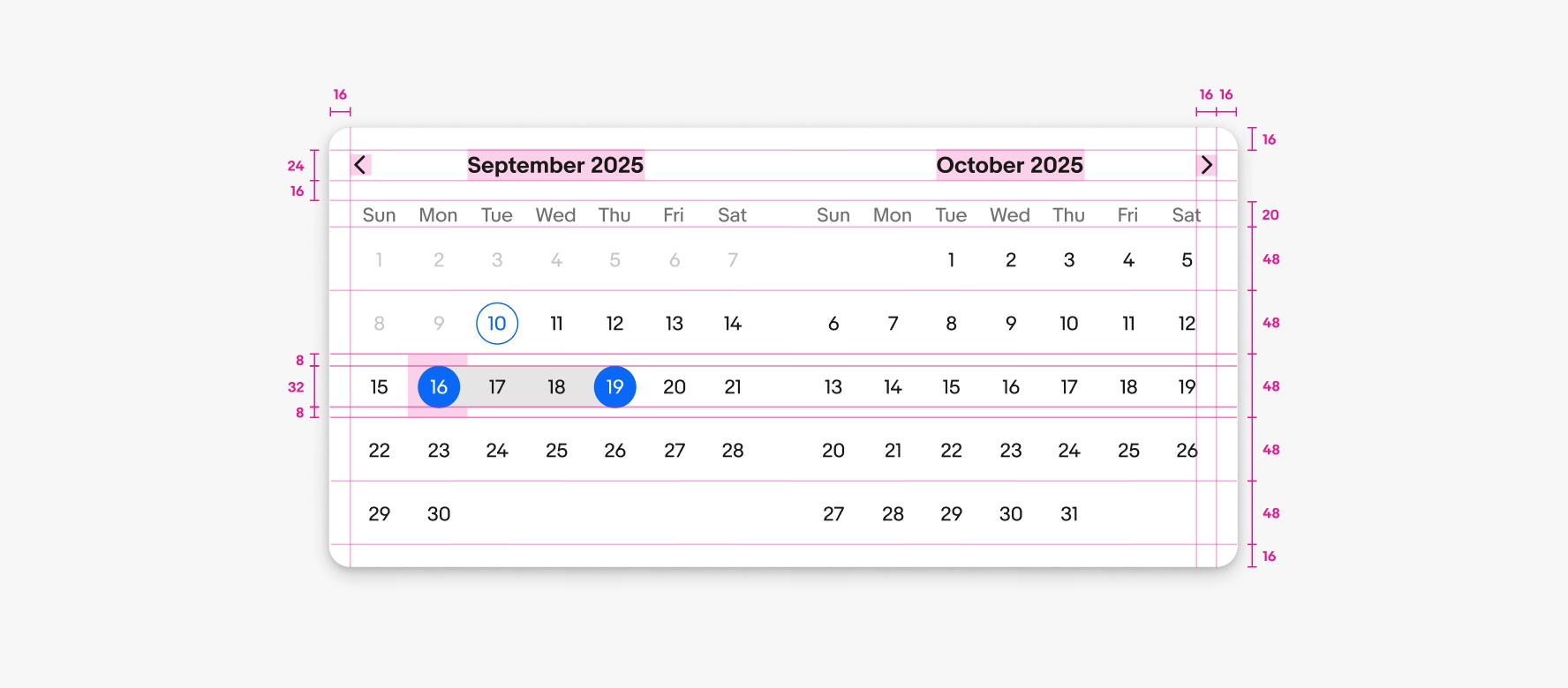
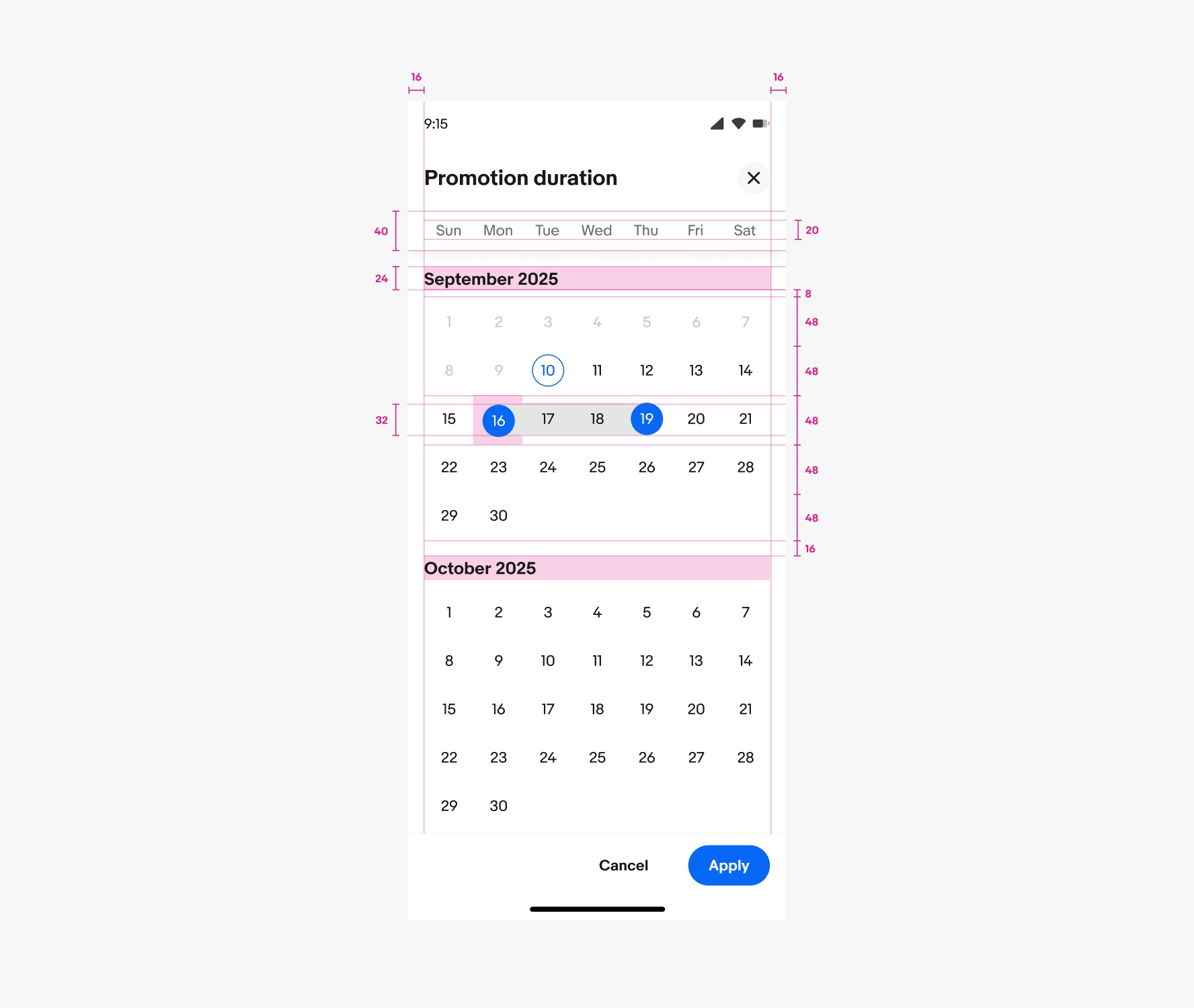
Navigating months
Both single and double pickers navigate horizontally via the top-right controls or by swiping left or right on the dates. Full screen dialog pickers scroll vertically.
Android
Android devices use the Material date picker component. The Material date picker is available in a docked popover or modal variant.
iOS
iOS devices use the native picker components. These are available as popovers or inline pickers.
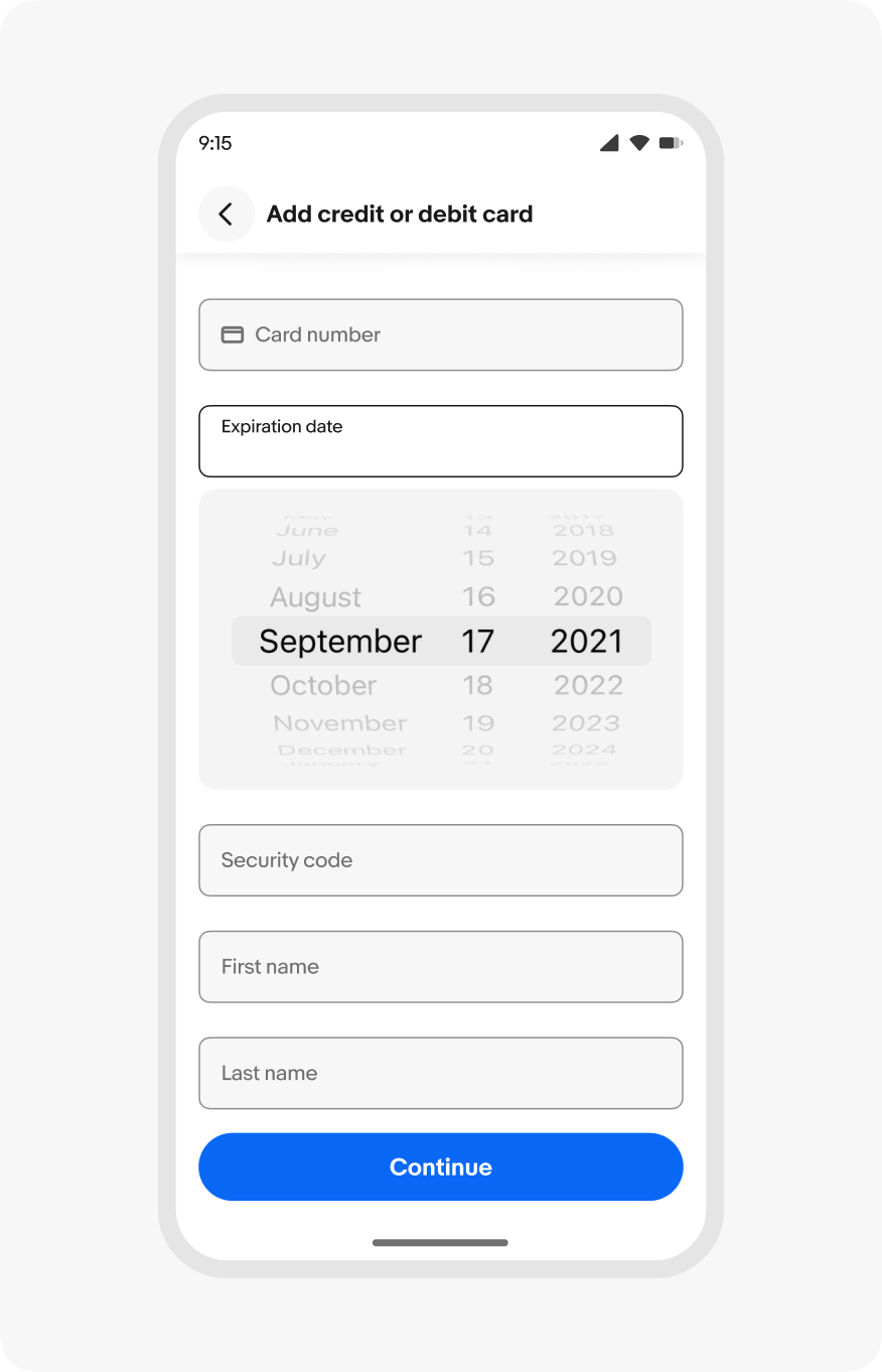
Small
Date pickers in native apps use the OS pickers. HTML uses the popover or fullscreen dialog version.