Popover
v1.0
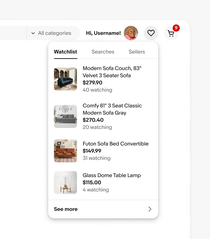
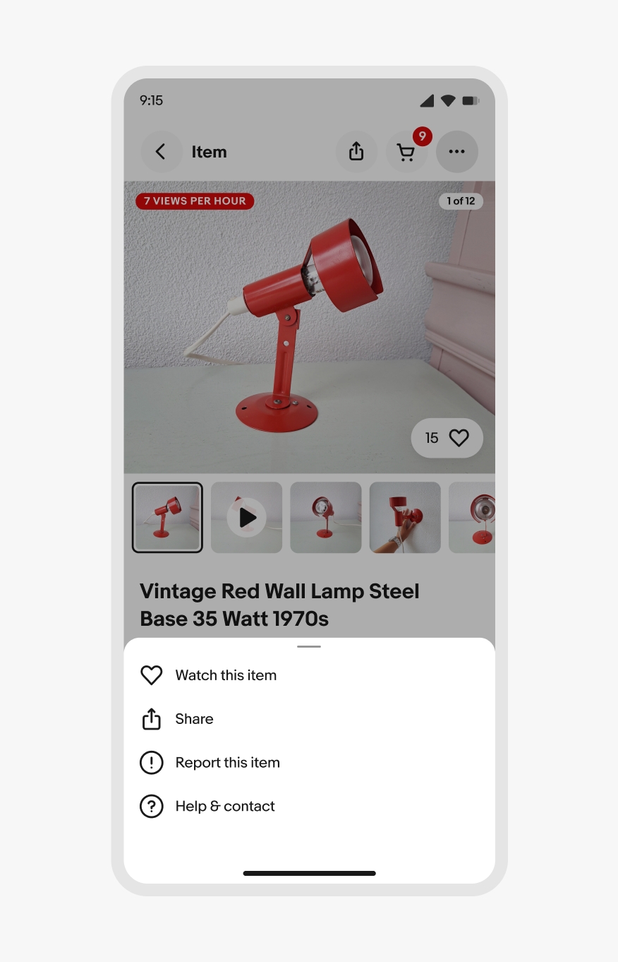
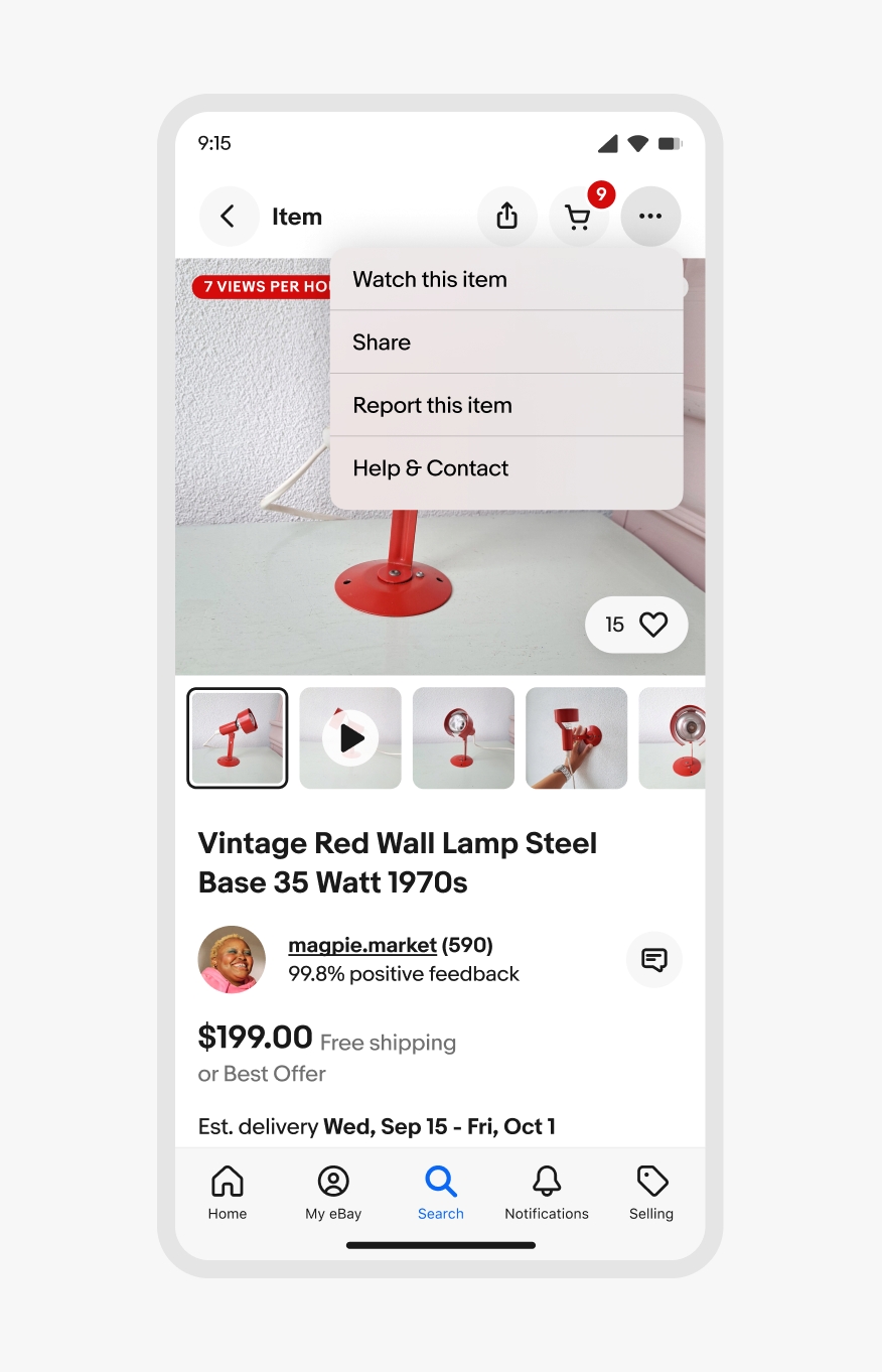
Popovers are non-modal transient containers that appear above other content. They disclose lists of choices or supplemental information.
- CSS
- Marko
- React

Popovers are non-modal transient containers that appear above other content. They disclose lists of choices or supplemental information.
Bottom sheet
iOS context menu
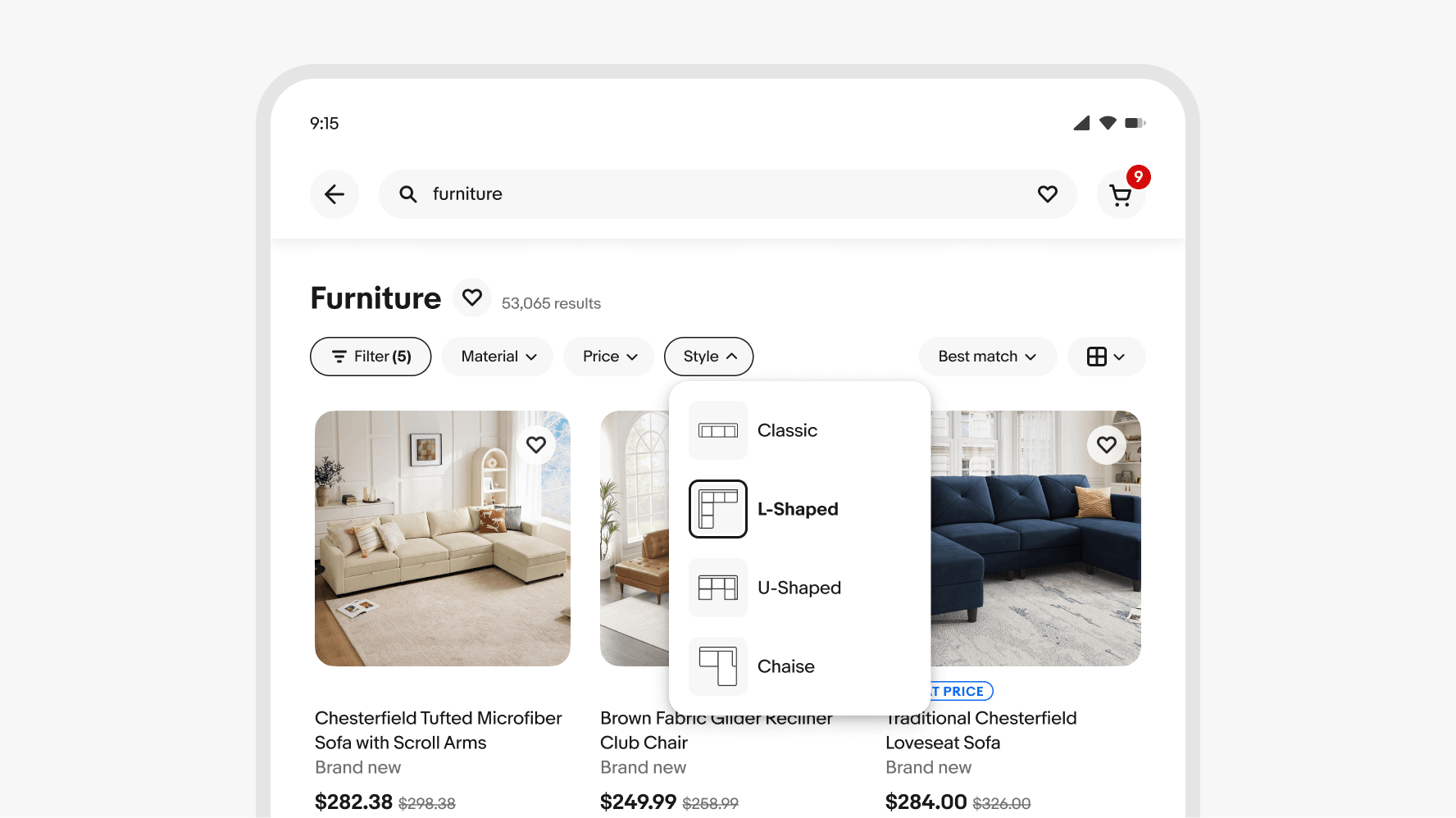
Popovers directly relate to its trigger element, which is usually a button.
Popovers progressively disclose additional choices or information.
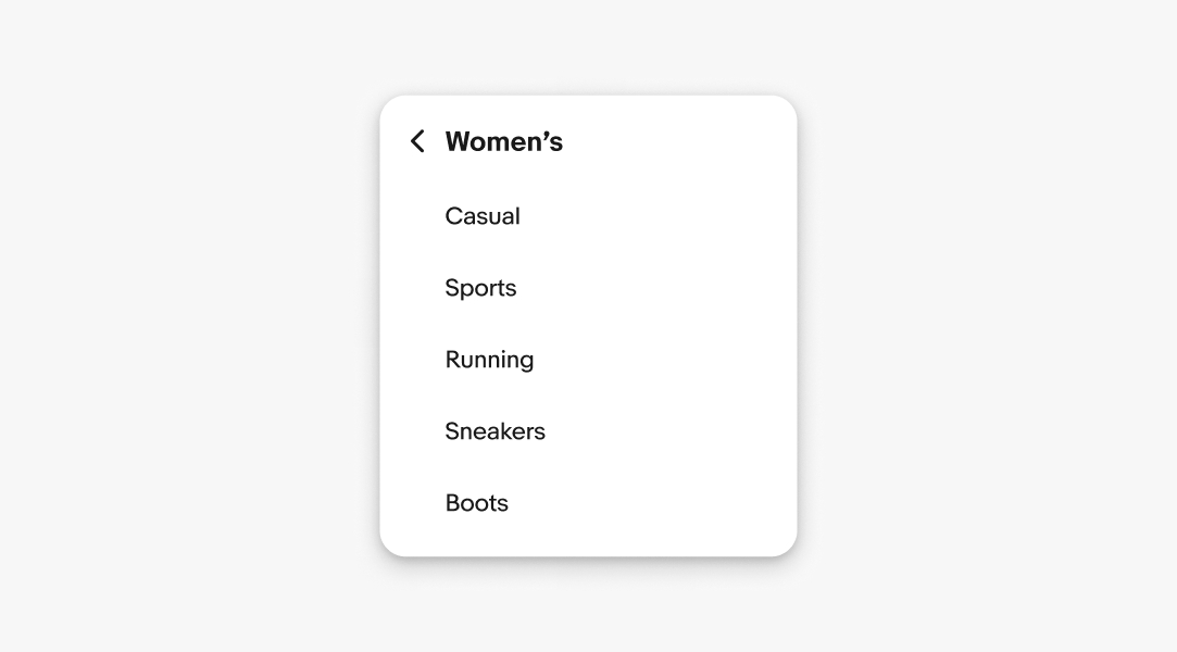
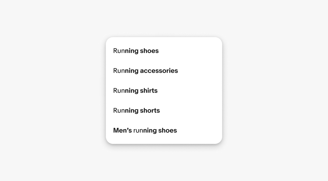
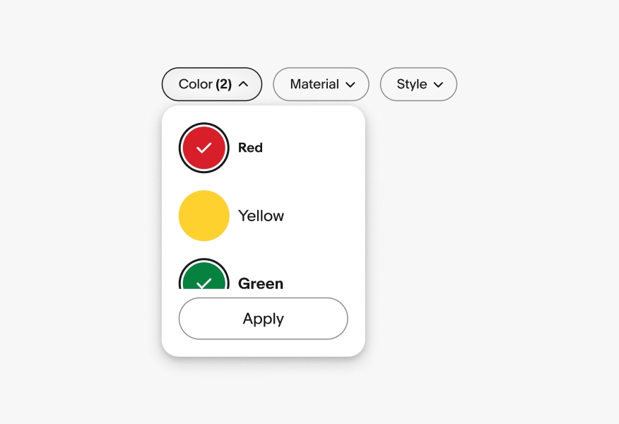
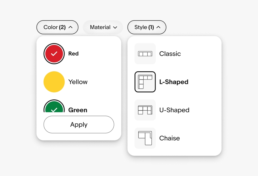
Popovers can contain a variety of content of varying complexity.
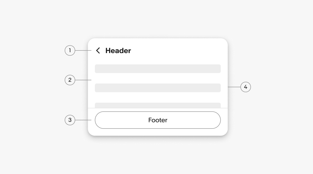
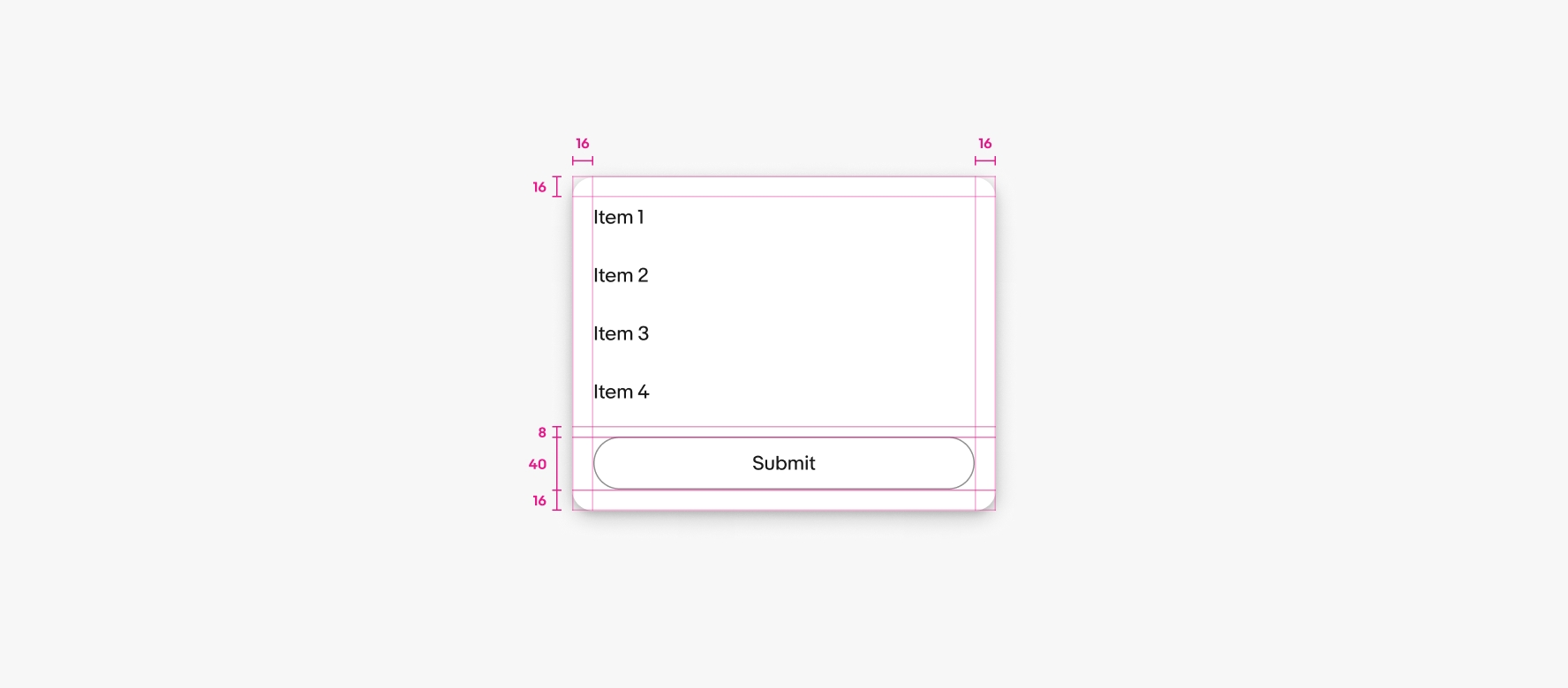
The header is optional for popovers without navigation. The header appears by default in child views and contains a title and back button. The title maintains the context of the previous view.
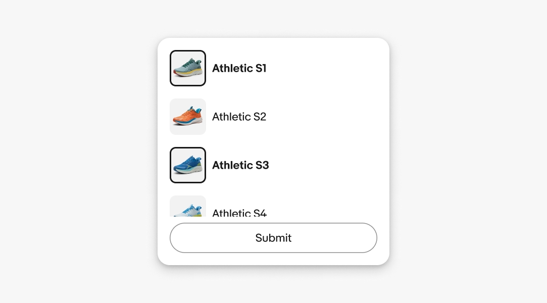
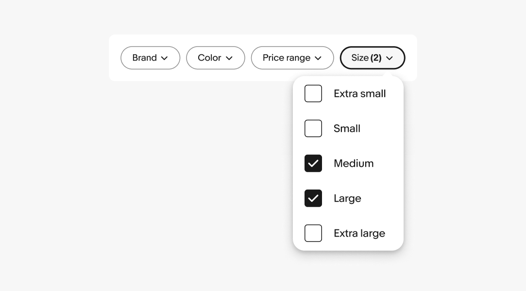
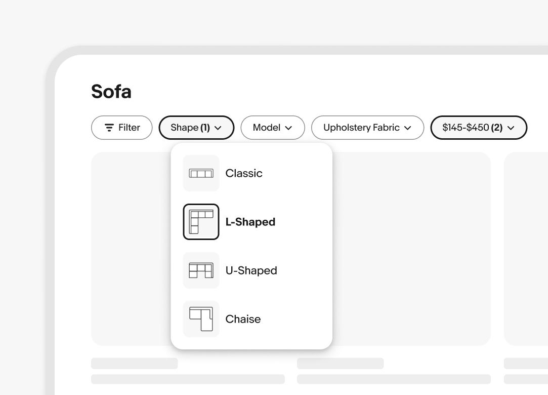
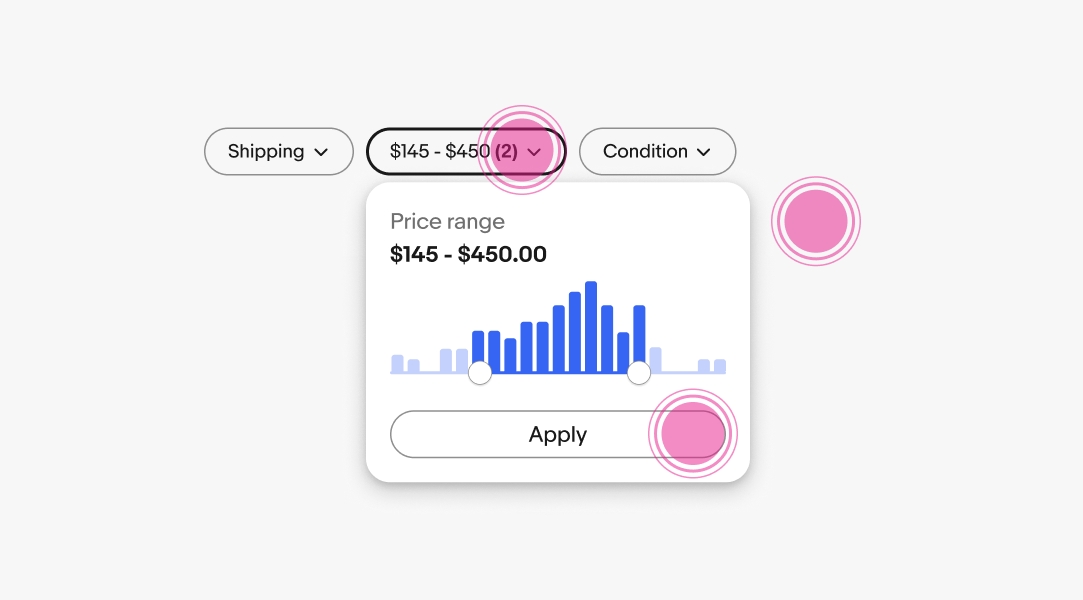
The popover body contains the primary content. Common body content includes radio button groups, checkbox groups, and option lists.
The footer is optional and usually includes a button to take action on a list. Use the footer when there are multiple decisions within the popover that need to be explicitly submitted.
The button submits the value(s) and closes the popover.
A tip is available to create a stronger relationship between the trigger element and the popover. A tip is recommended when the trigger element may be ambiguous or unclear due to surrounding content.
Popovers appear after interacting with another UI element, typically a button.
Popovers can be dismissed by:
Scrolling is enabled whenever content extends beyond the popover container.
Medium and large screens use popovers for menus, filters, and other views.
Do show one popover at a time. Always close an open popover before opening a new one.
Don’t stack popovers or show multiple popovers on the screen at once.
Do ensure popovers are explicitly invoked by pressing or selecting a button.

Don’t launch a popover on hover.