Password
v4.0
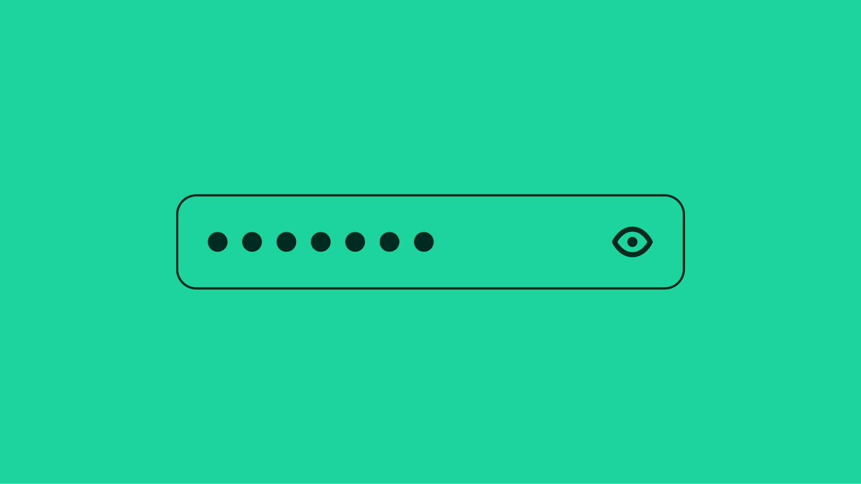
The password field lets users enter a password with characters concealed and a toggle to reveal them.
- CSS
- Marko
- React
The password field lets users enter a password with characters concealed and a toggle to reveal them.
Forms allow users to complete fields effortlessly.
Anyone, no matter their abilities, can complete forms.
Forms provide dynamic feedback so users can correct errors quickly and confidently.

Include a label unless another adjacent element already serves that purpose.
Use one of these options depending on the context: Password (default), current password, new password, or confirm password.

The value is the user's password. It is obfuscated by default and can be revealed with the show/hide control.

There are two layouts available for password fields, stacked and floating. Stacked labels are above the field and floating labels are inside the field. A floating label animates upward on focus to make room for the value.

Helper text is placed below the field and informs the user of any requirements or disclaimers. It's shown persistently or on focus. Don't repeat the label.

Error messages appear below the field when the input doesn't meet the required format or conditions. The error message replaces any existing helper text.
Keep the tone neutral, don’t blame or scare the user. Clearly inform users the requirements so they know how to fix it.

There are two sizes available: 48px and 40px. These sizes match available button sizes in case they’re inline together. Avoid mixing different sizes in a single form.

Longer passwords flow beyond the visible container. While focused, the value overflows to the left to keep the cursor in view as characters are entered. When the field loses focus, the value shifts to the beginning and overflows to the right. Focusing on the field again returns to the end of the value.

The privacy icon toggles between showing and hiding the characters entered to aid in situations where the password needs to be reviewed.
The icon conveys what will happen when interacted with, not the current state, so a concealed value has the show icon and a revealed value has the hide icon.

Password fields span the full width of the screen on smaller screens.

Password fields are aligned to the grid on larger screens up to the max width. Avoid allowing password fields to span the full screen width.

