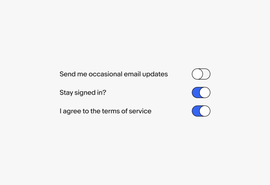
Switch
Switches provide a binary on/off choice. Their input is immediate and requires no additional action.
- CSS
- Marko
- React

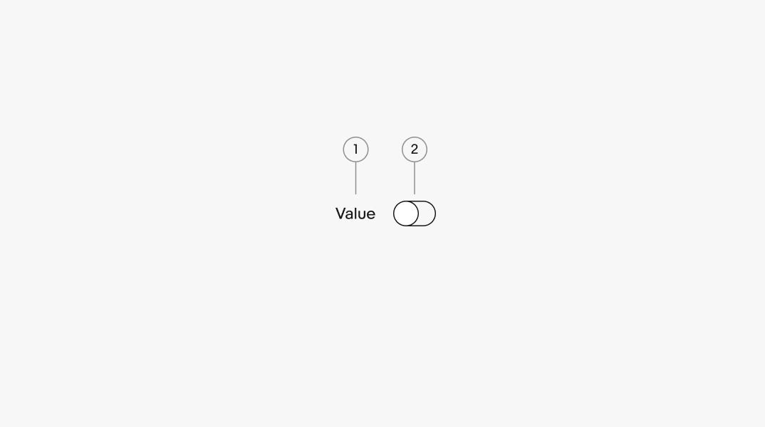
- Label
- Switch
Label
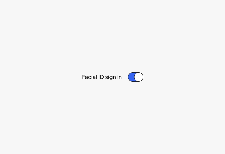
Switches should always have a label associated with them. The label should clearly indicate what is being activated.
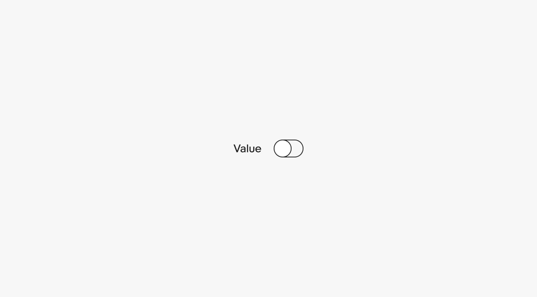
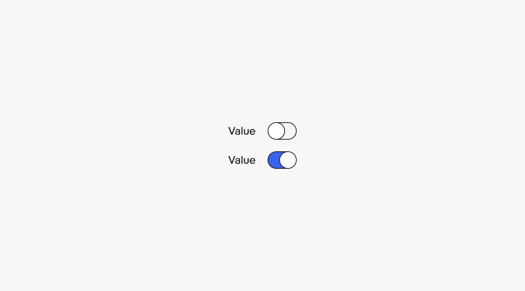
Selected
Switches appear as either selected (on) or unselected (off). Switches cannot be in an indefinite state.
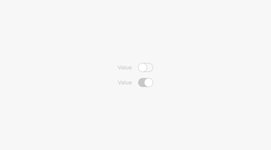
Disabled
Switches can be disabled in either a selected or unselected state if there is a prerequisite to altering its state.
Immediate
Switches immediately update the state of the application when their state changes. If a delay is necessary, a loading indicator should be used to inform the user that the process is taking longer.
Labels
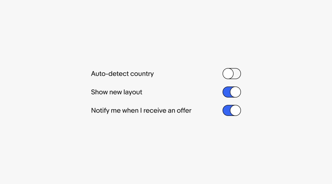
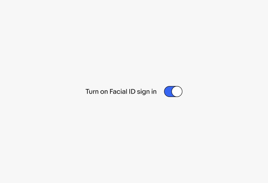
Avoid using the words “on” or “off” within the label. Switches imply an on/off state so including it in the label is redundant.
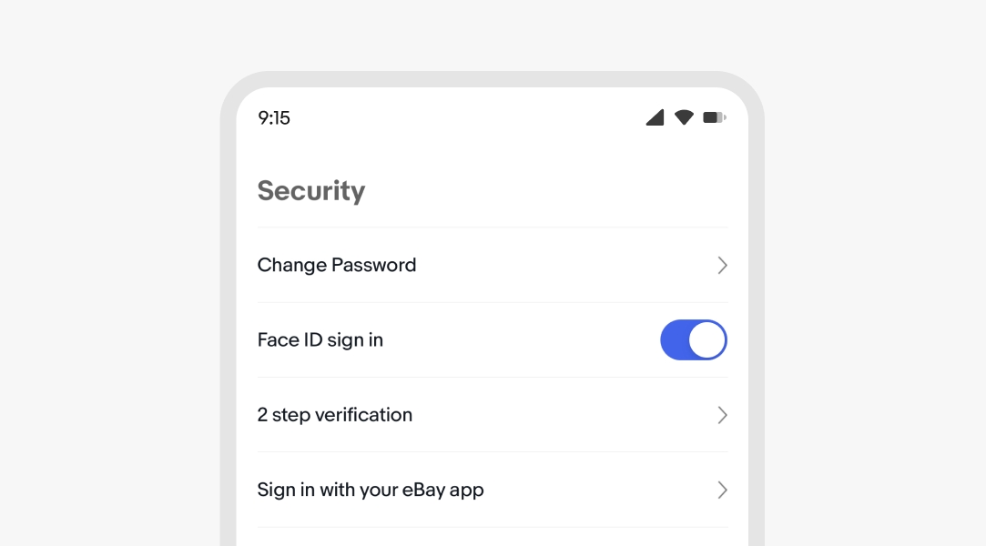
It is okay to use labels with verbs that clarify the decision if it isn’t a clear on/off decision, like “Show” or “Notify”.
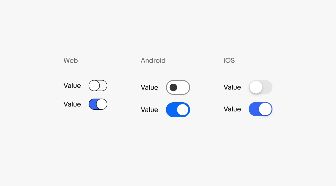
Platform-specific
Native platforms use the operating system’s default visual treatment. The behavior and options remain the same across platforms.
Labels
Do use clear and concise labels.
Avoid using action-related verbs with “on” or “off” when adding labels to controls. Switches imply an on/off state so including it in the label is redundant.
Placement
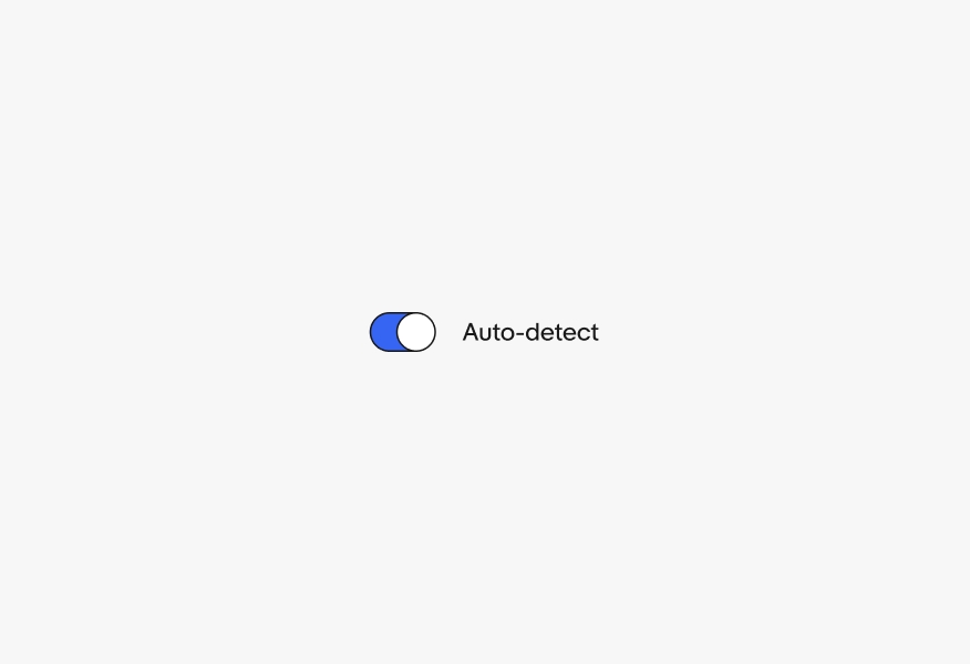
Do use switches as trailing elements.

Don’t use switches as leading elements.
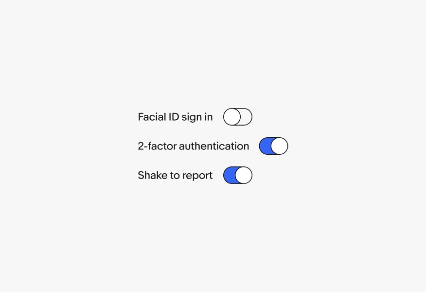
Do ensure switches are either aligned with the grid or with each other when multiple switches are stacked.
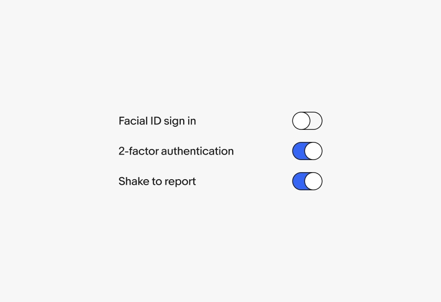
Don’t misalign switches by placing them immediately after labels when multiple switches are stacked, as this can affect legibility.
Checkbox or switch
If the action is part of a larger form, use a checkbox instead. The items will be submitted with the rest of the form details.
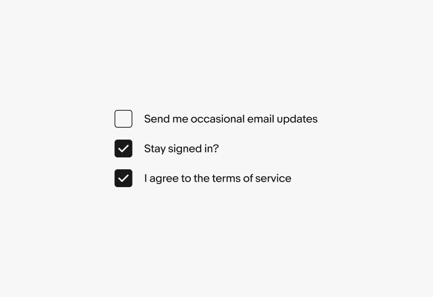
Switches apply changes immediately and don’t require the user to submit anything. If you need to include the data in form content, use a checkbox set.
Radio button or switch
Switches are used for activation, not selection. If you are selecting between two available options, use a radio set instead.
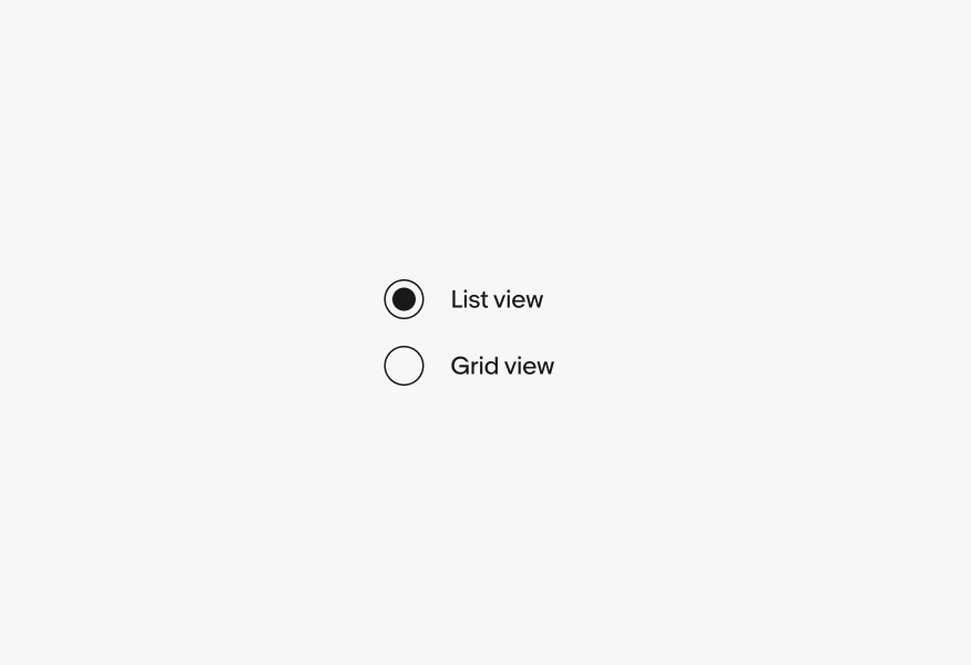
Switches should not be used to choose between opposing or discrete options. Instead, use switches for on/off situations.