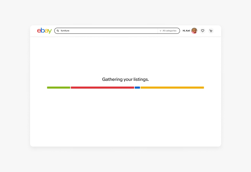
Expressive loader
Leveraging a branded expression, the expressive loader provides reassurance, guidance, and delight. The expressive loader is used as an alternative to the progress spinner, especially for longer loading times.
- CSS
- Marko
- React
Expressive
The expressive loader provides a branded experience, replacing traditional spinners to create a sense of faster loading during longer wait times.
Reassuring
To provide reassurance, the expressive loader uses support text to indicate that actions taken by users are being processed.
Quick
To portray responsive and quicker loads, the expressive loader's design utilizes visual momentum to indicate progression across page loading and user actions.
- Support text
- Bars
When to use
- When navigating to a page where the visual design is mostly unknown ahead of time and a skeleton loader can’t be leveraged
- For periods of longer loading where the user needs reassurance
- When a user action is being processed and it is expected to perform multiple calls to load
When to consider something else
- If the visual layout/format of the content being loaded is mostly known, a skeleton loader would be the better option
- If content can be pre-loaded or optimized in another way, don’t default to the expressive loader because it is easier to implement
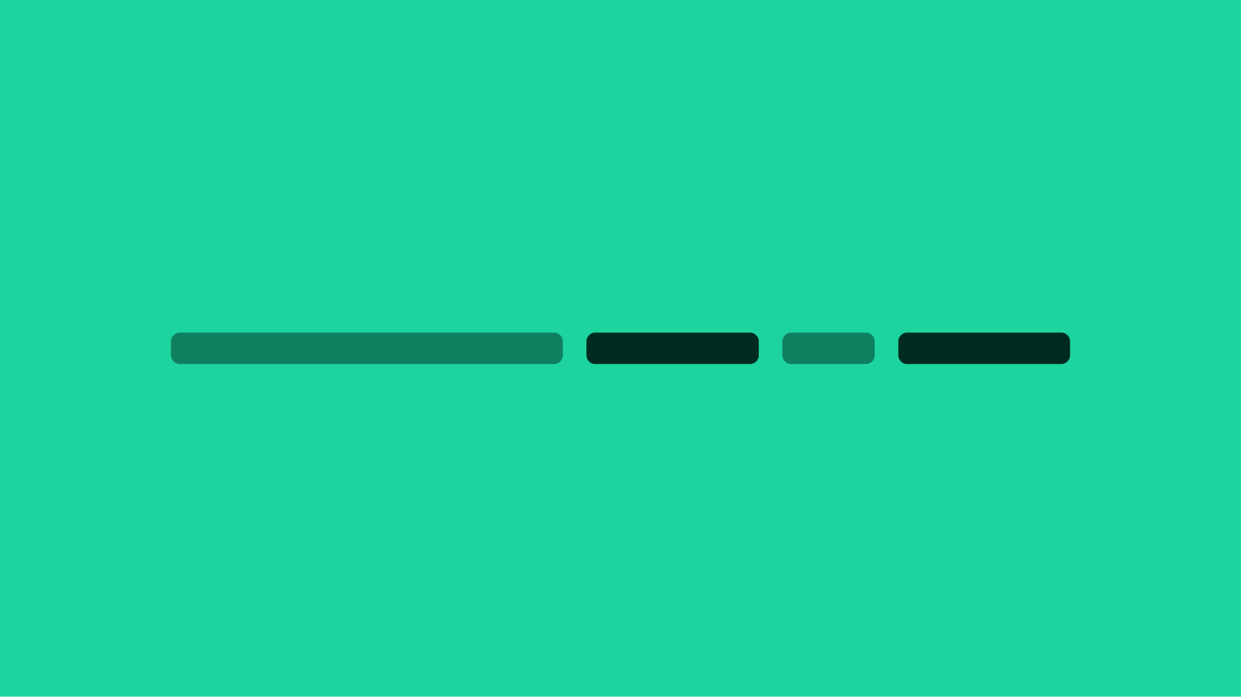
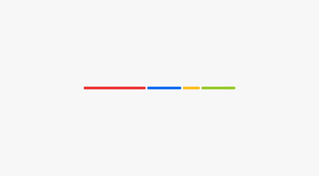
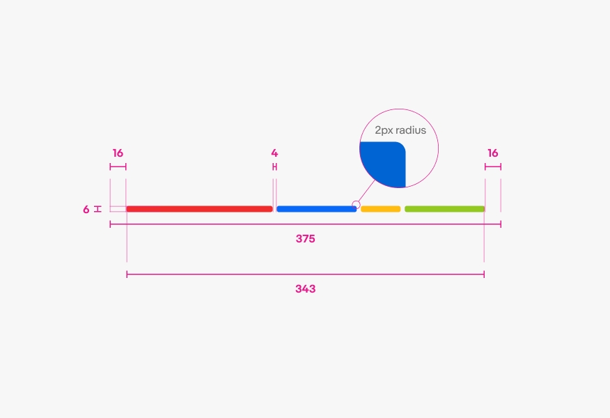
Bars only
The default expressive loader is the bars only variation. It is primarily used as a replacement for the traditional spinner, in order to help conceal loading speeds and make the experience feel visually faster.
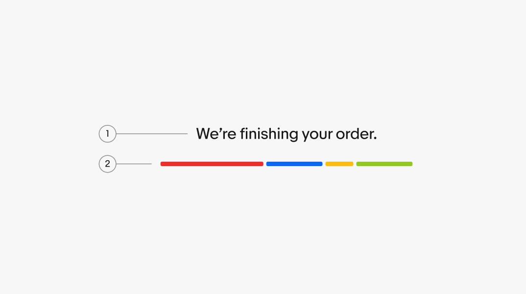
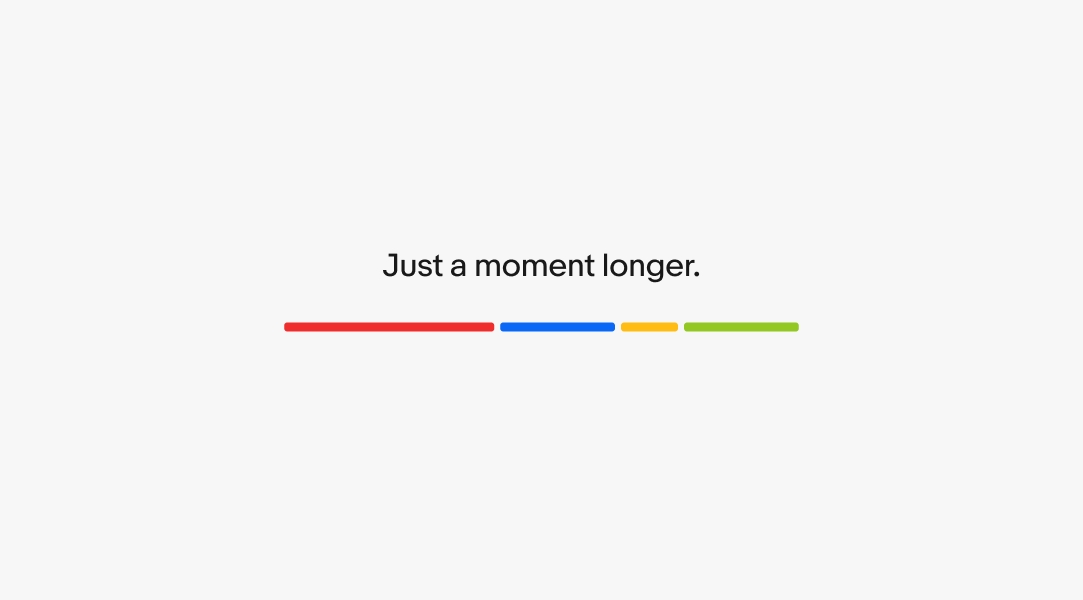
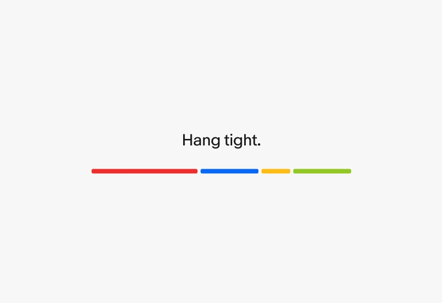
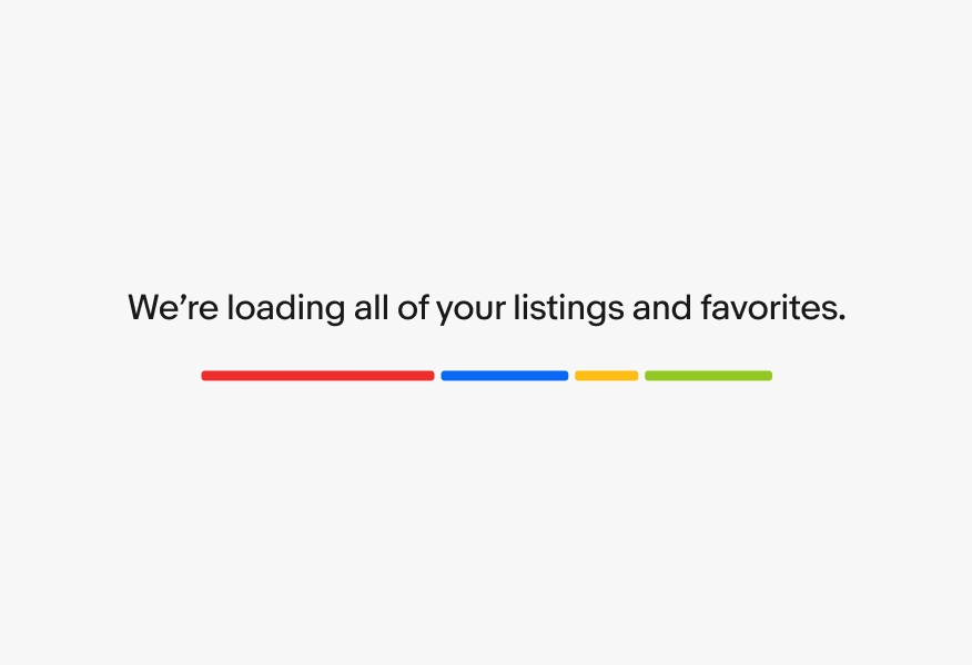
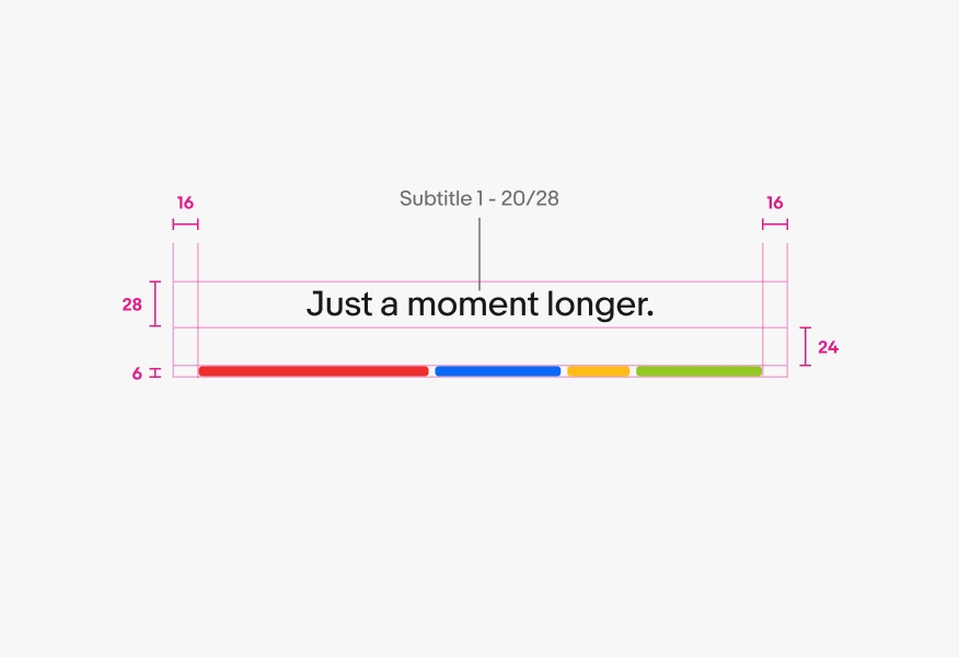
Bars with large text
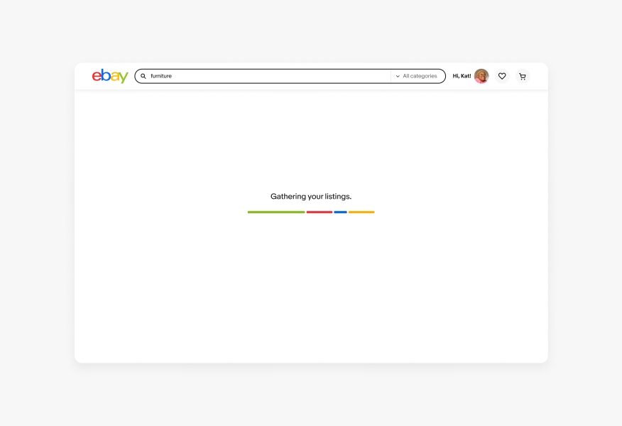
The bars with large text variation is utilized when support text is required to better inform users during longer loading periods. Common situations in which they are used include navigating to a page that is not fully known beforehand, loading a large set of data, or completing a purchase.
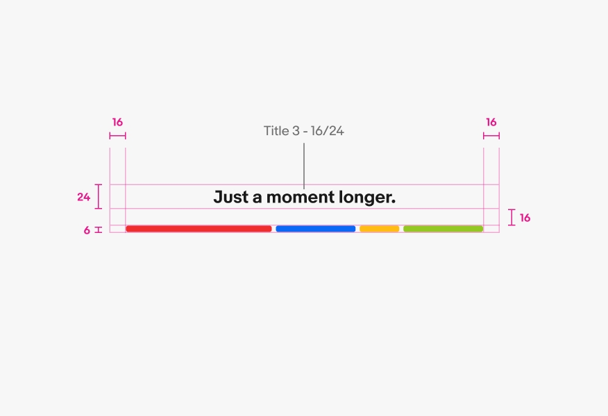
Bars with small text
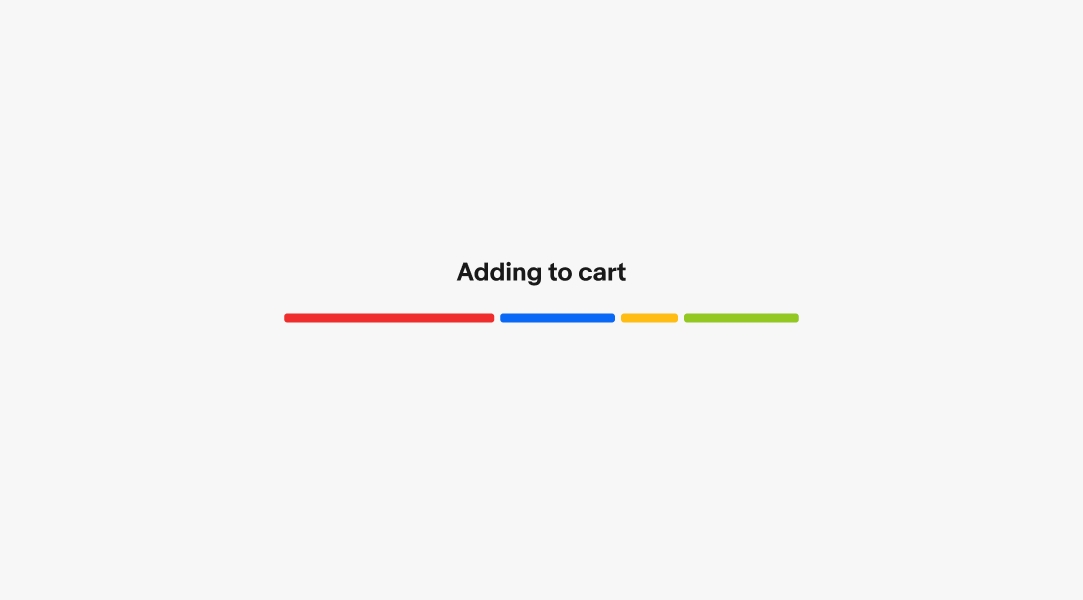
Common actions, such as adding items to the cart, may use the variation with small text within bottom sheets if additional load time is required. Due to its smaller visual footprint, this variation is only used in bottom sheets. Text should appear at the beginning of the animation since this loader is launched by a specific user action.
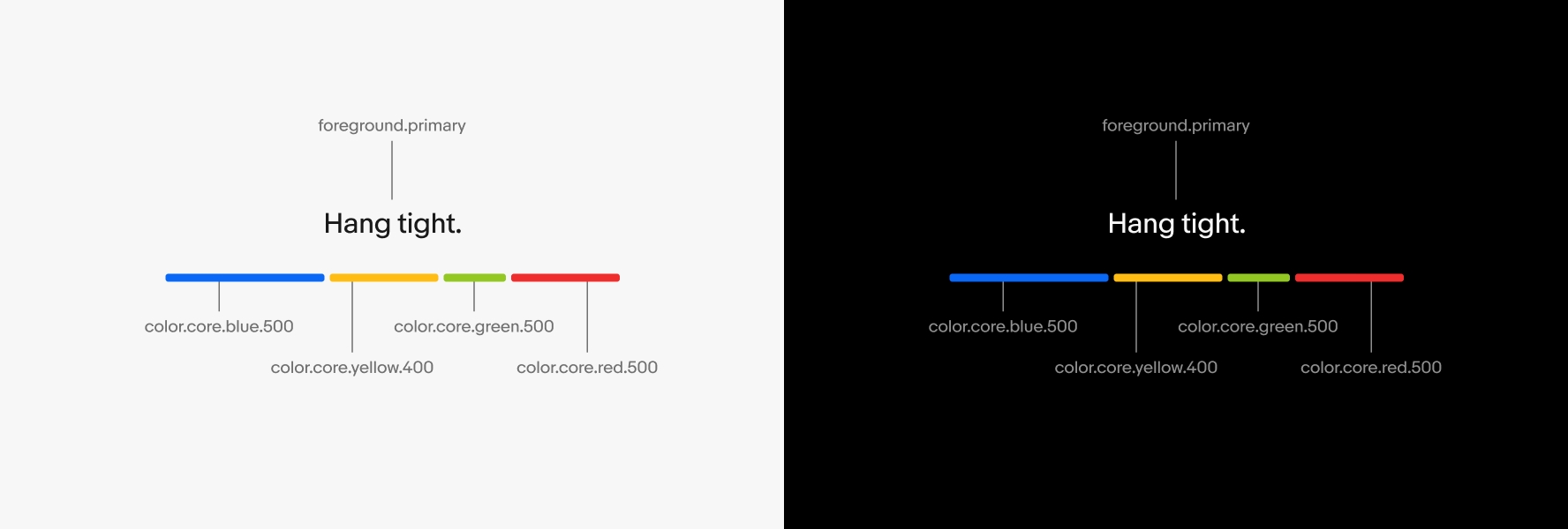
Color
Expressive loaders work across both light and dark modes.
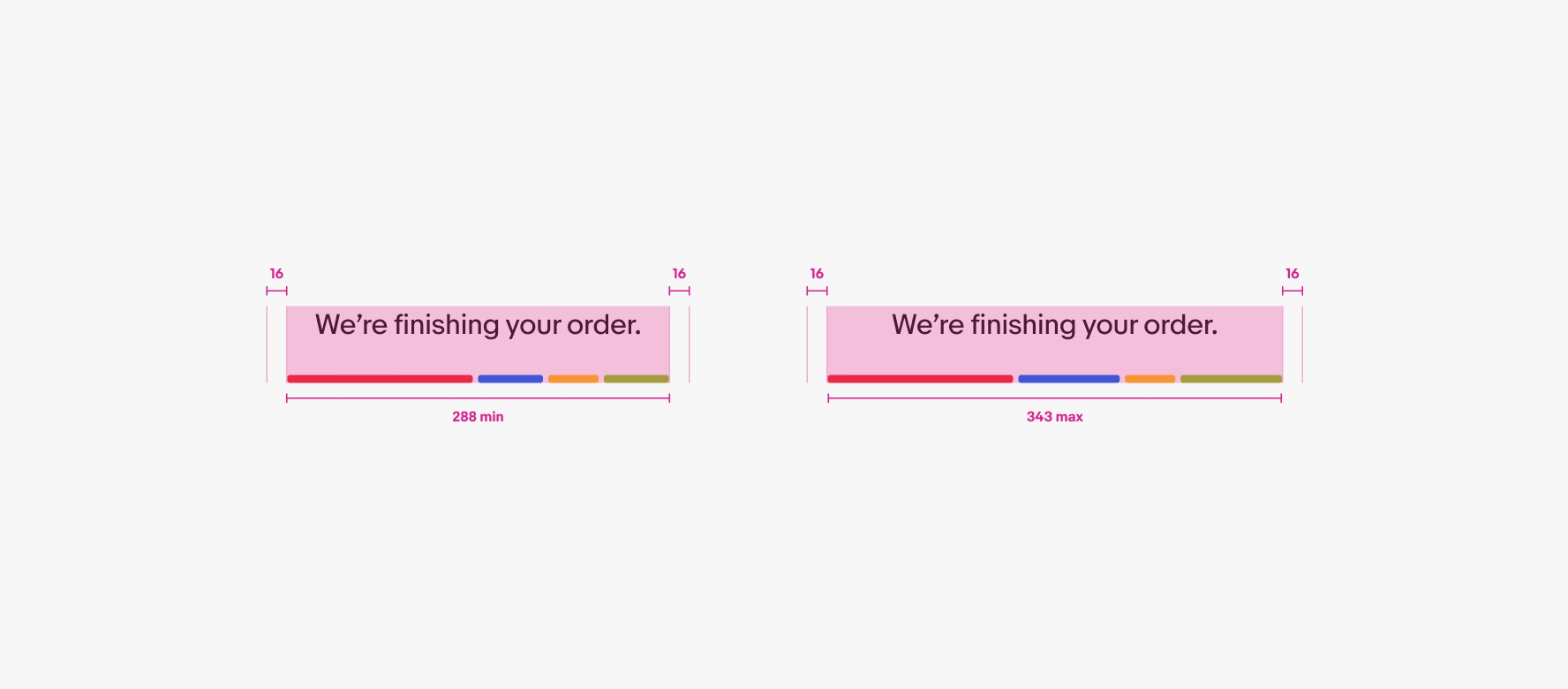
Minimum and maximum width
Expressive loaders have a minimum width of 288px and maximum width of 343px across both native and web applications. The minimum size reflects our smallest supported breakpoint of 320px. The maximum size should be used across all other sizes including large screens. These widths are for the color bars only and do not account for the left and right padding.
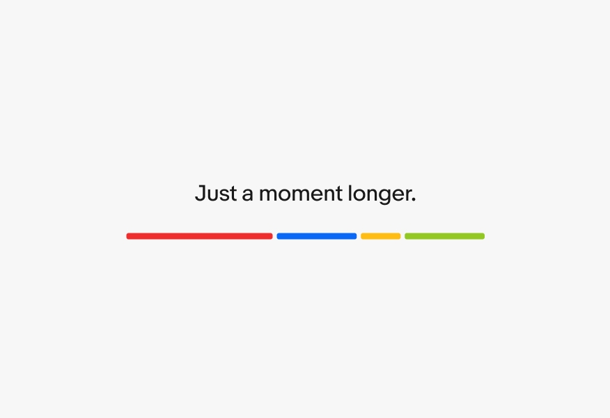
Support text
Do keep support text short and direct.
Avoid using text phrases that extend past the bars.
Do use the bars only version for quicker loading durations.
Don’t use support text when loading is expected to be faster. The exception is when using the loader in the bottom sheet for actions like “Adding item to cart”.
Do aim for a single line of support text.
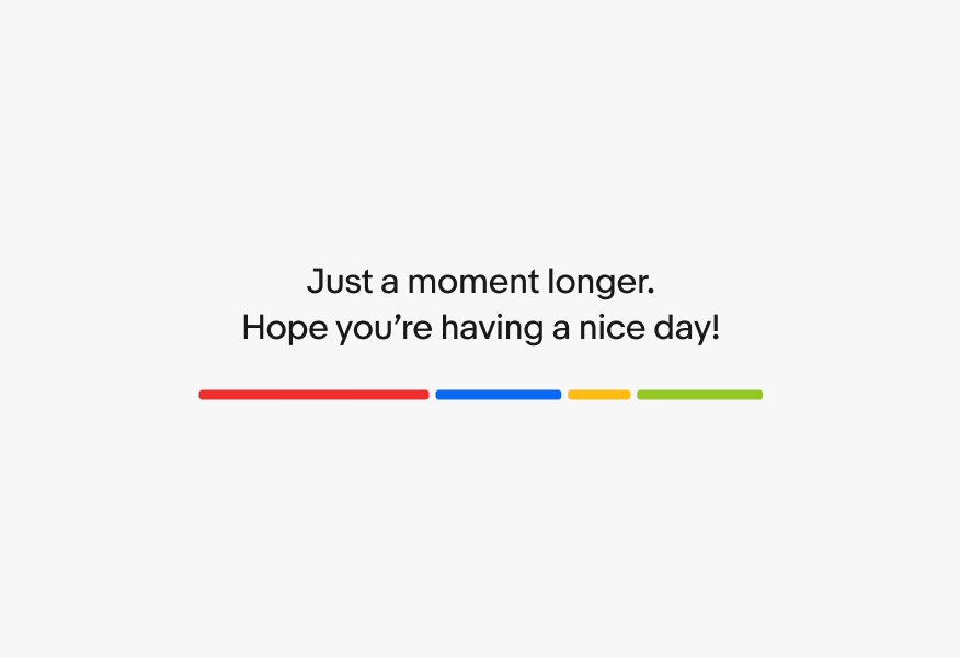
Avoid long phrases when possible. Translated content can naturally become longer and is able to wrap across two lines when needed.
Styling
Do use the standard sizes of the expressive loader on desktop.
Don’t extend the loading bars to the width of the screen on desktop or increase the size of the loader or text.
Bars only
Bars with large text
Bars with small text