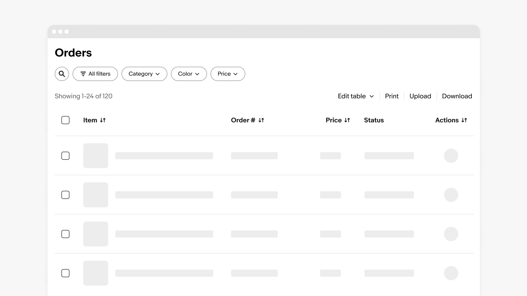
Table
Tables are used to organize and display data efficiently to provide users with insights and potential actions.
- CSS
- Marko
- React
Organized
Tables are organized logically with clear hierarchy.
Intuitive
Tables are easy to use and behave as expected.
Interactive
Tables allow interaction and customization for greater control.
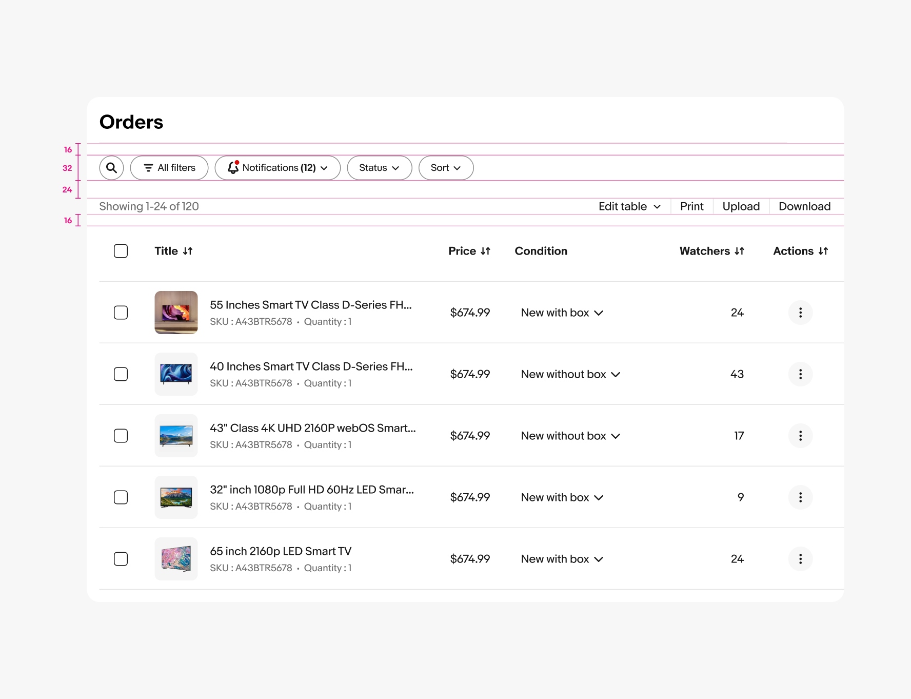
- Title
- Filter bar
- Tool bar
- Table content
- Pagination
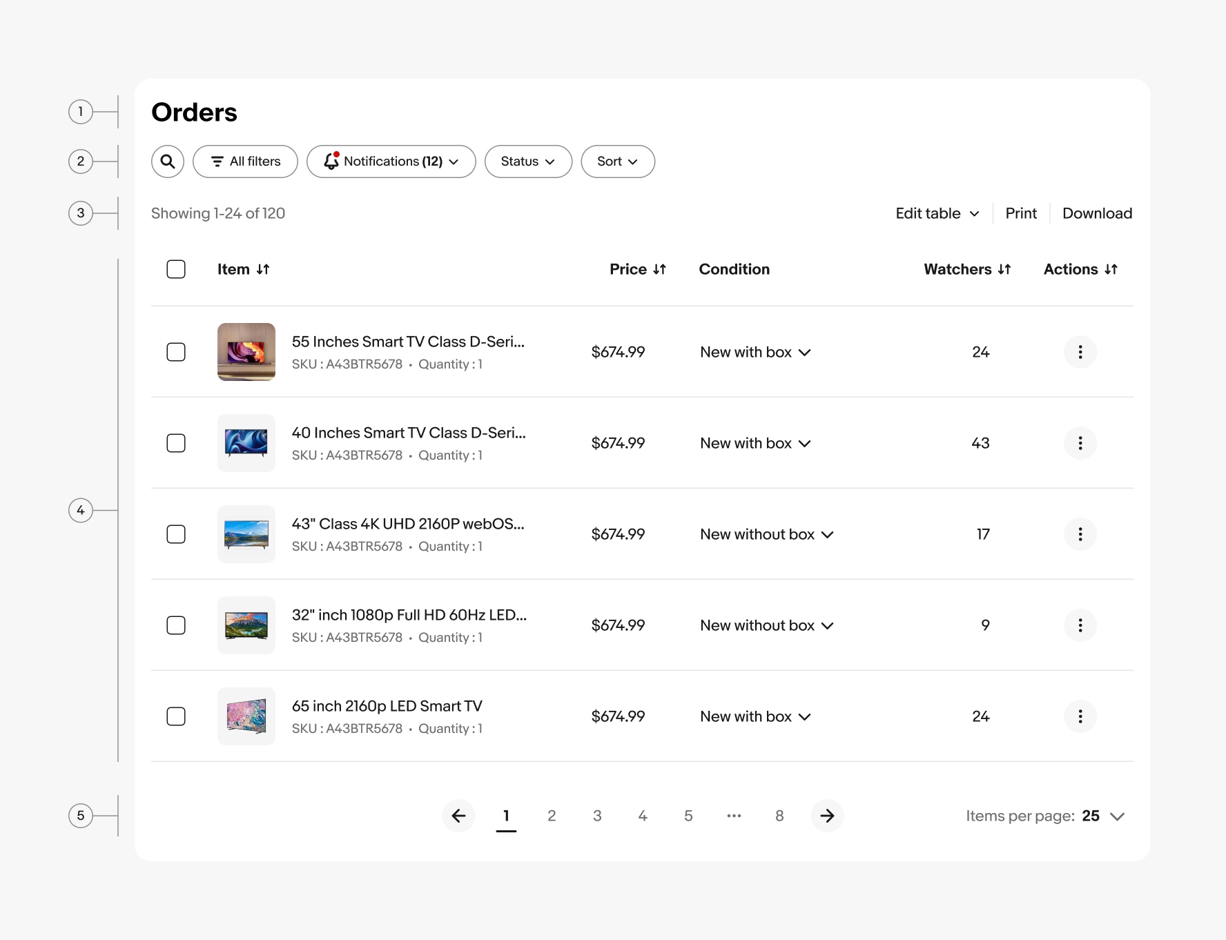
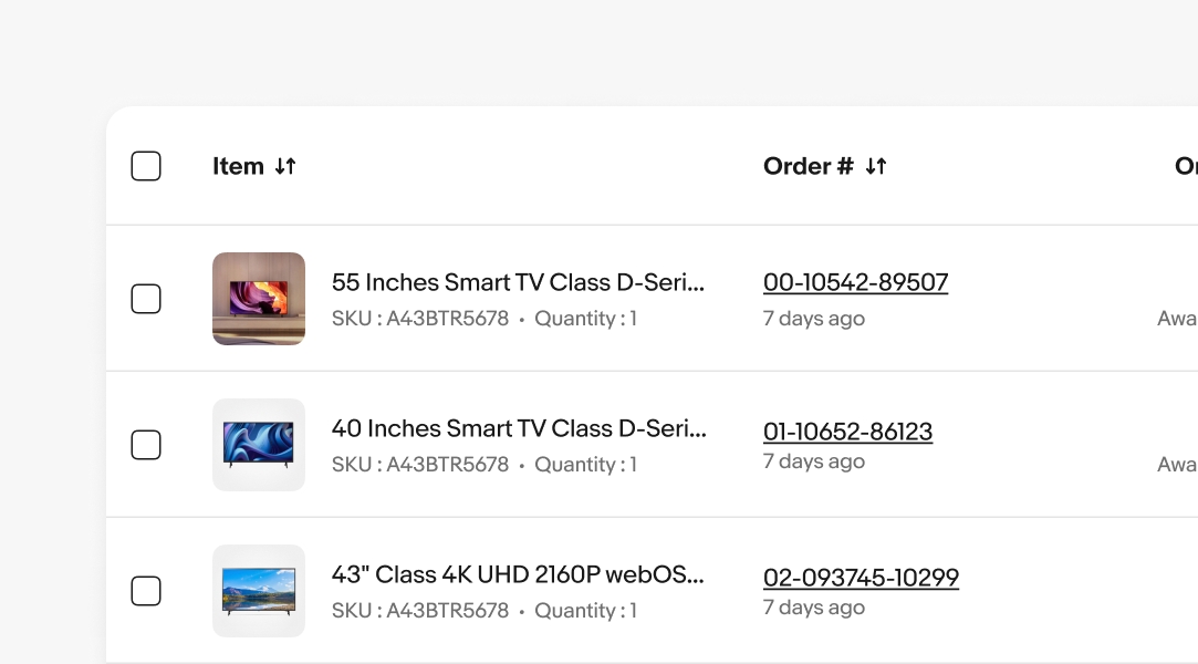
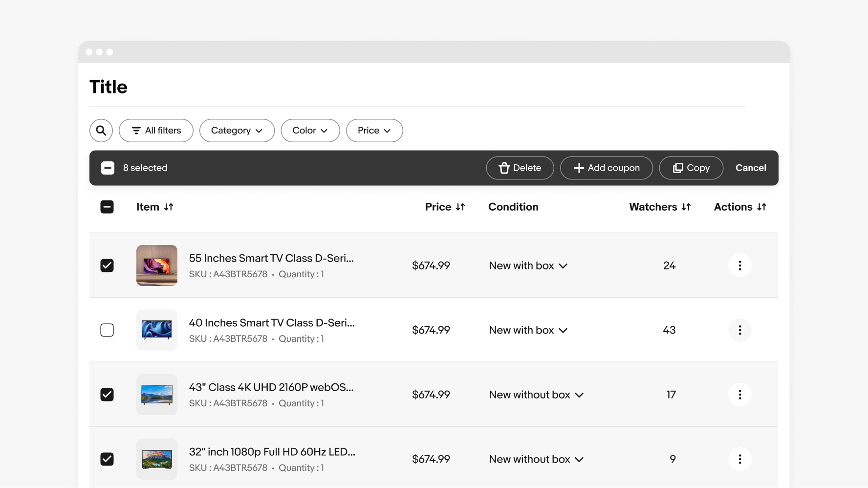
Selection
Bulk actions are functions that may be performed on multiple items within a table. Once the user selects at least one row from the table, the batch action bar appears and replaces the filter bar with actions they can take. To close “bulk edit mode”, the user can cancel or deselect the items.
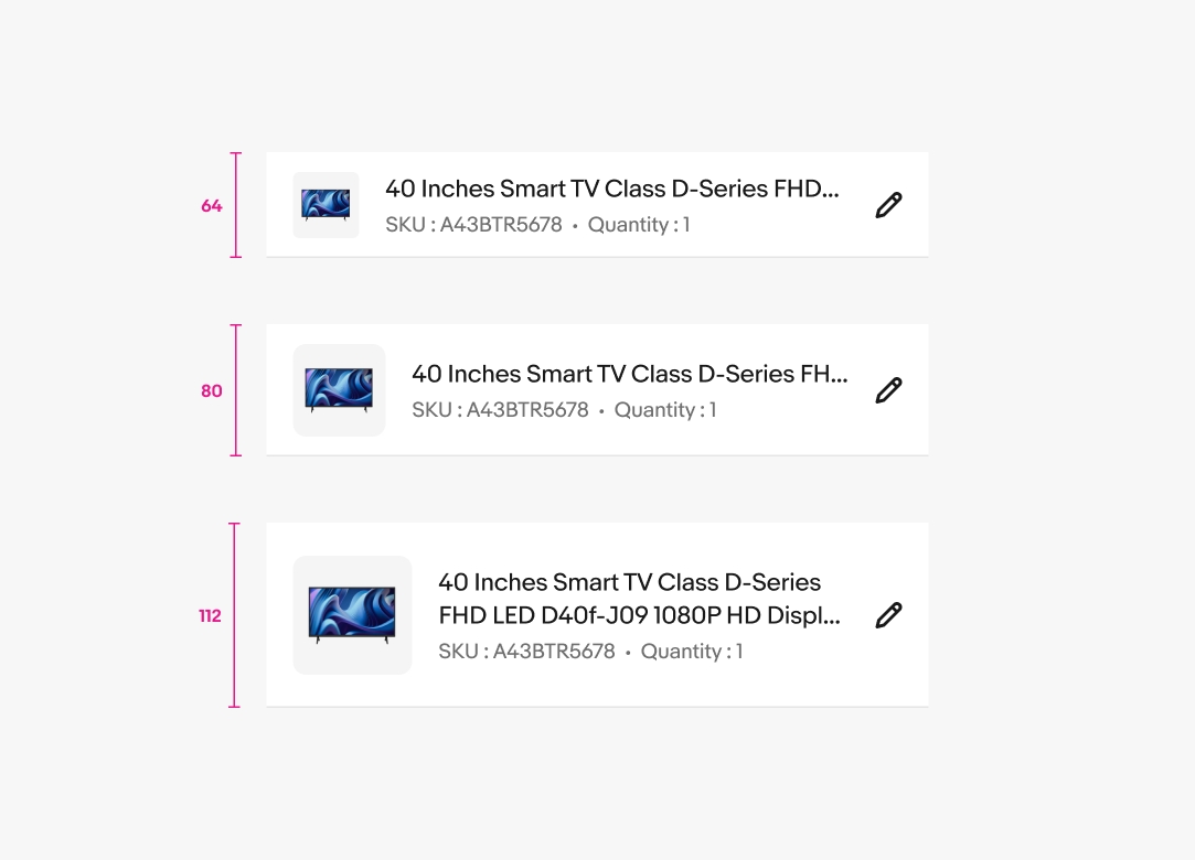
Density
Our tables are available in 3 different row sizes: Compact, Default, and Relaxed. All cells have a 16px left/right padding while the top/bottom have a minimum padding of 12px.
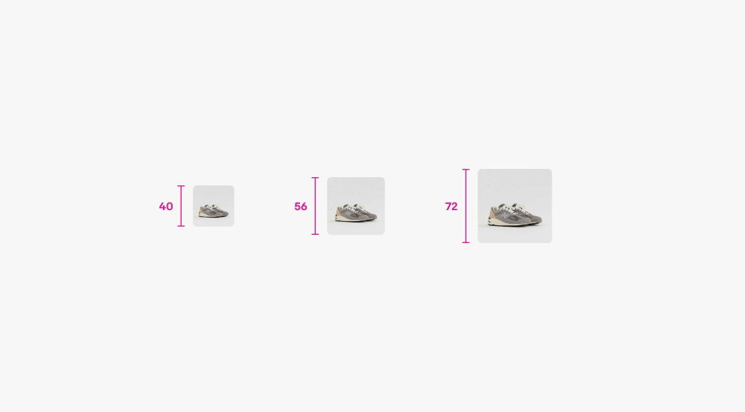
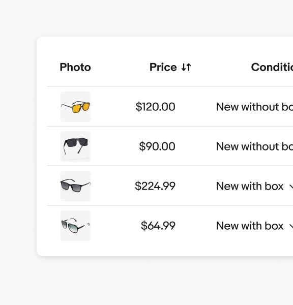
Image
For rows containing images or other media types, three sizes are available: Small, Medium, and Large.
Order
Column reordering is available to give users more control over their workflows and data sets.
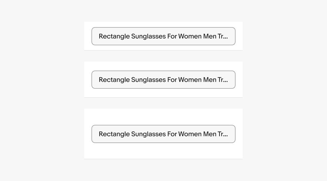
Simple
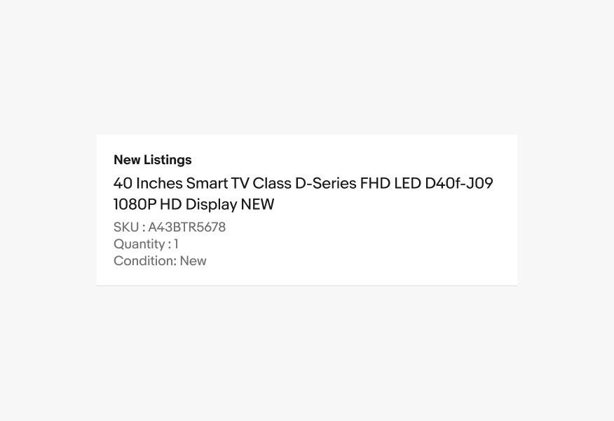
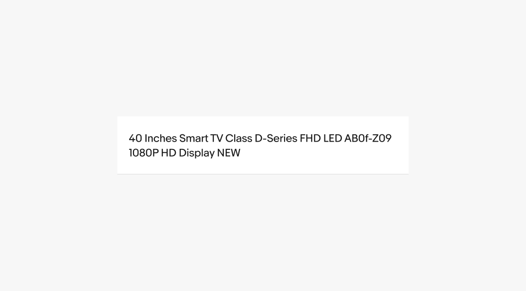
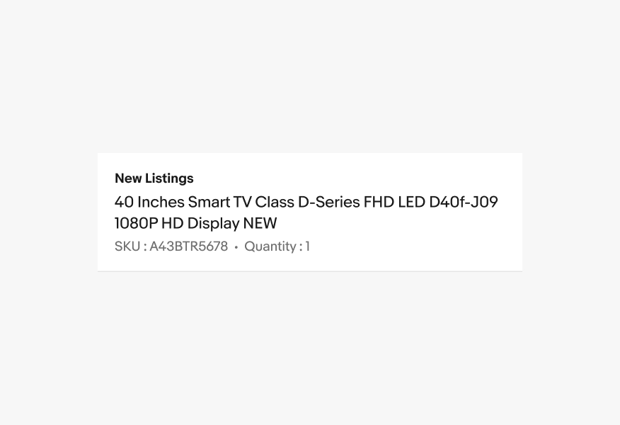
Simple cells are structured to accommodate a lead, middle, and trailing slot for content.
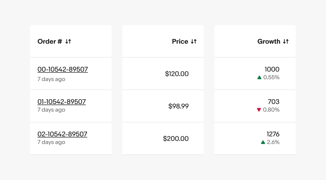
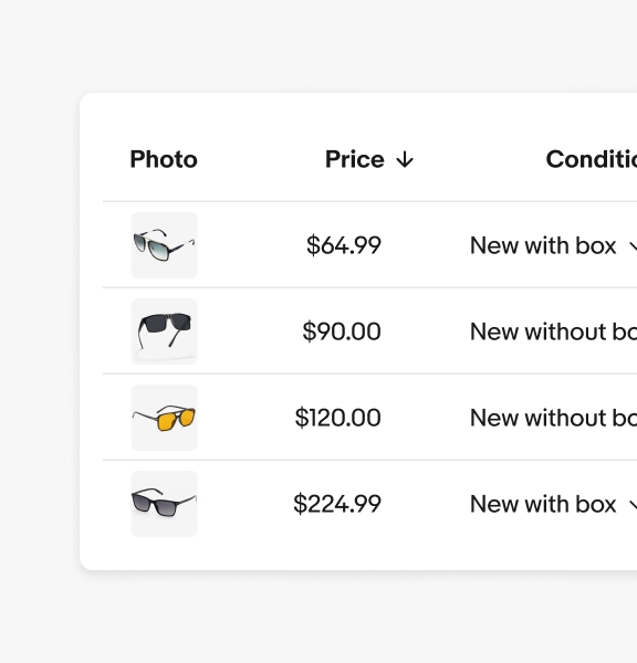
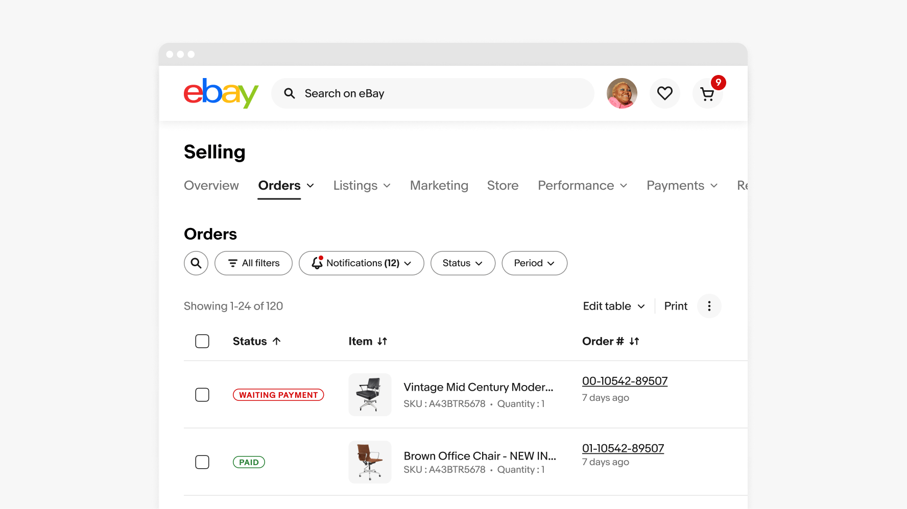
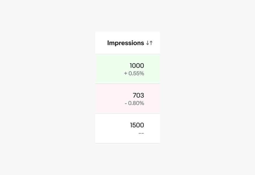
Numeric
Numeric table cells showcase numbers like costs, percentages, and stats for easy comparison and insight.
Field
Text fields display as an enabled state to allow for quick edits.
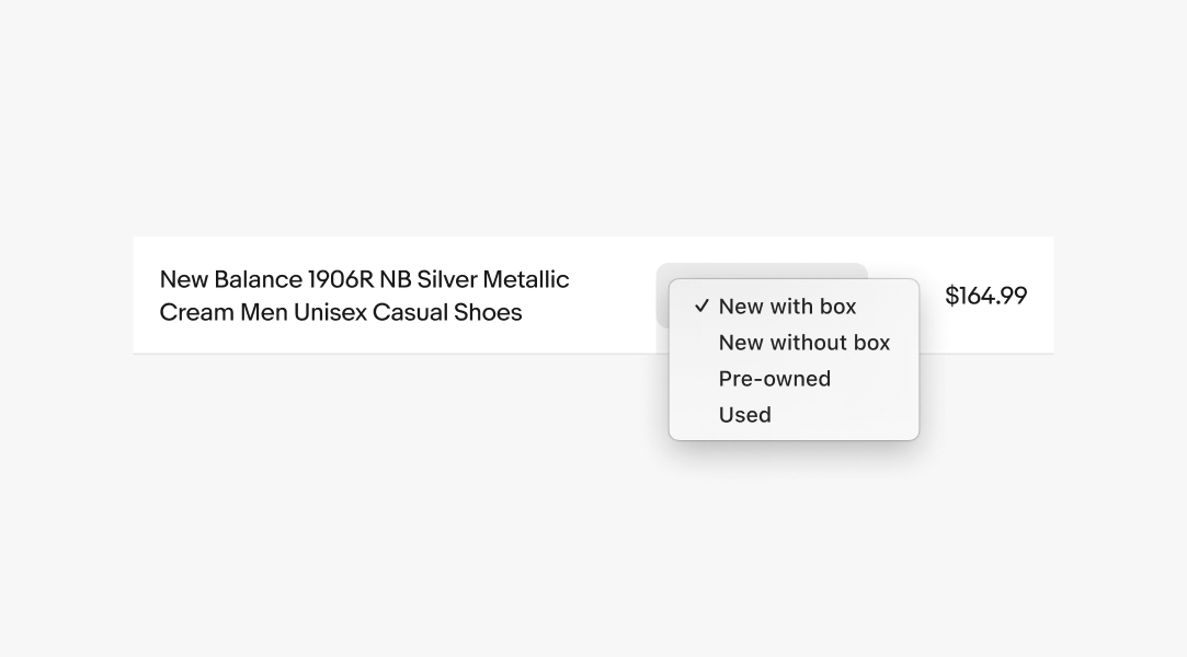
Dropdown
Dropdowns allow users to make quick selections from multiple options.
- They should be easy to open, close, and interact with
- Content should be suited to user needs
- Items should be easy to scan
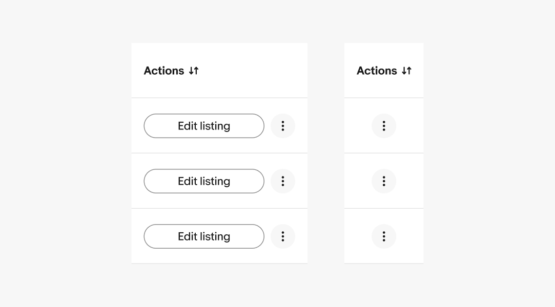
Actions
The action column is used to provide actions that may be performed on a specific table row.
Approved button combos
- CTA Button
- CTA Button + Overflow
- Icon Button
- Icon Button + Overflow
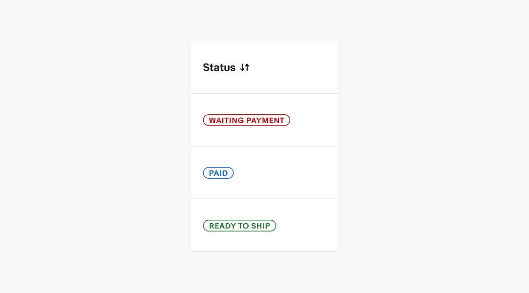
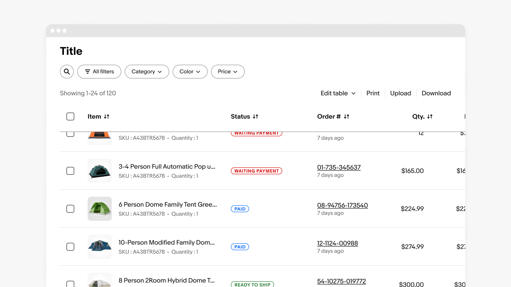
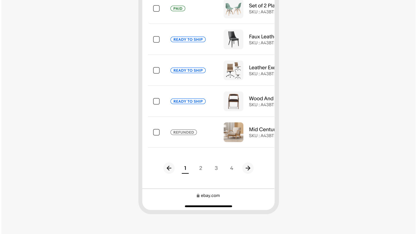
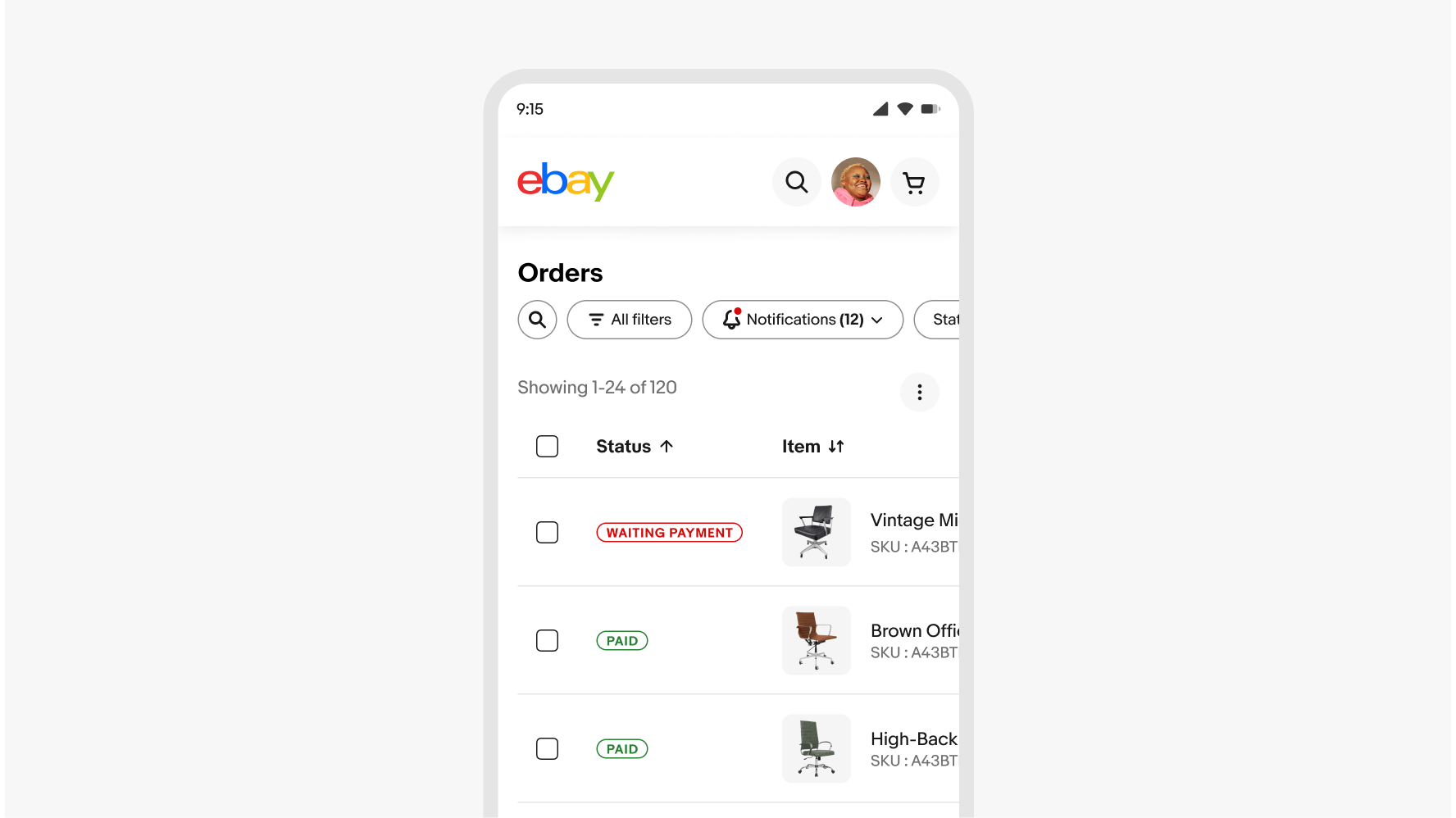
Status
A status cell visually represents the state of a specific row, helping users quickly make informed decisions. Status cells can also be used to indicate row-specific alerts or notifications.
Loading
Loading should be unobtrusive and seamless—minimizing any jarring flashes or content shifts whenever possible. When tables are in a loading state, the content is replaced with a simplified skeleton loader that preserves context as the updated or new information loads.
Sorting
A sorted data table has three states: Unsorted, Sorted-up, and Sorted-down. The icon indicates the current sorted state and is only shown if sorting is available.
Unsorted (Sort)

Sorted-up (Sort-up)
Sorted-down (Sort-down)
Scrolling
The table header is sticky on vertical scroll. If the table extends beyond the screen then the table will scroll horizontally. Tables have a max height of 90% of the viewport.
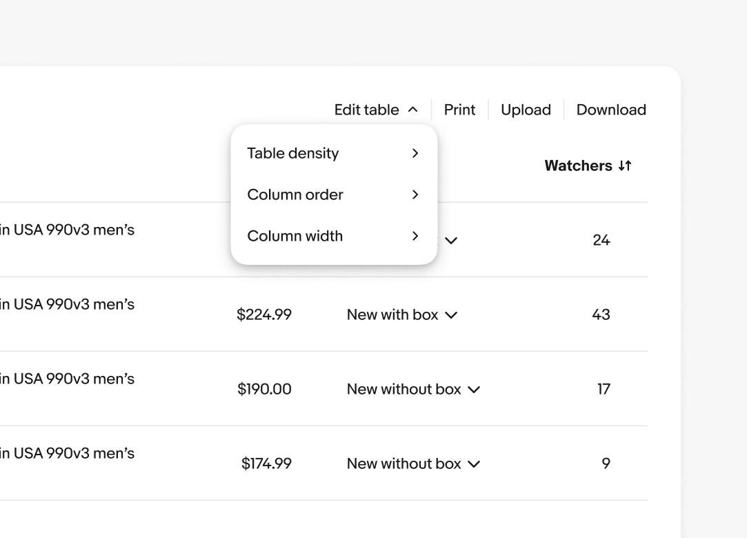
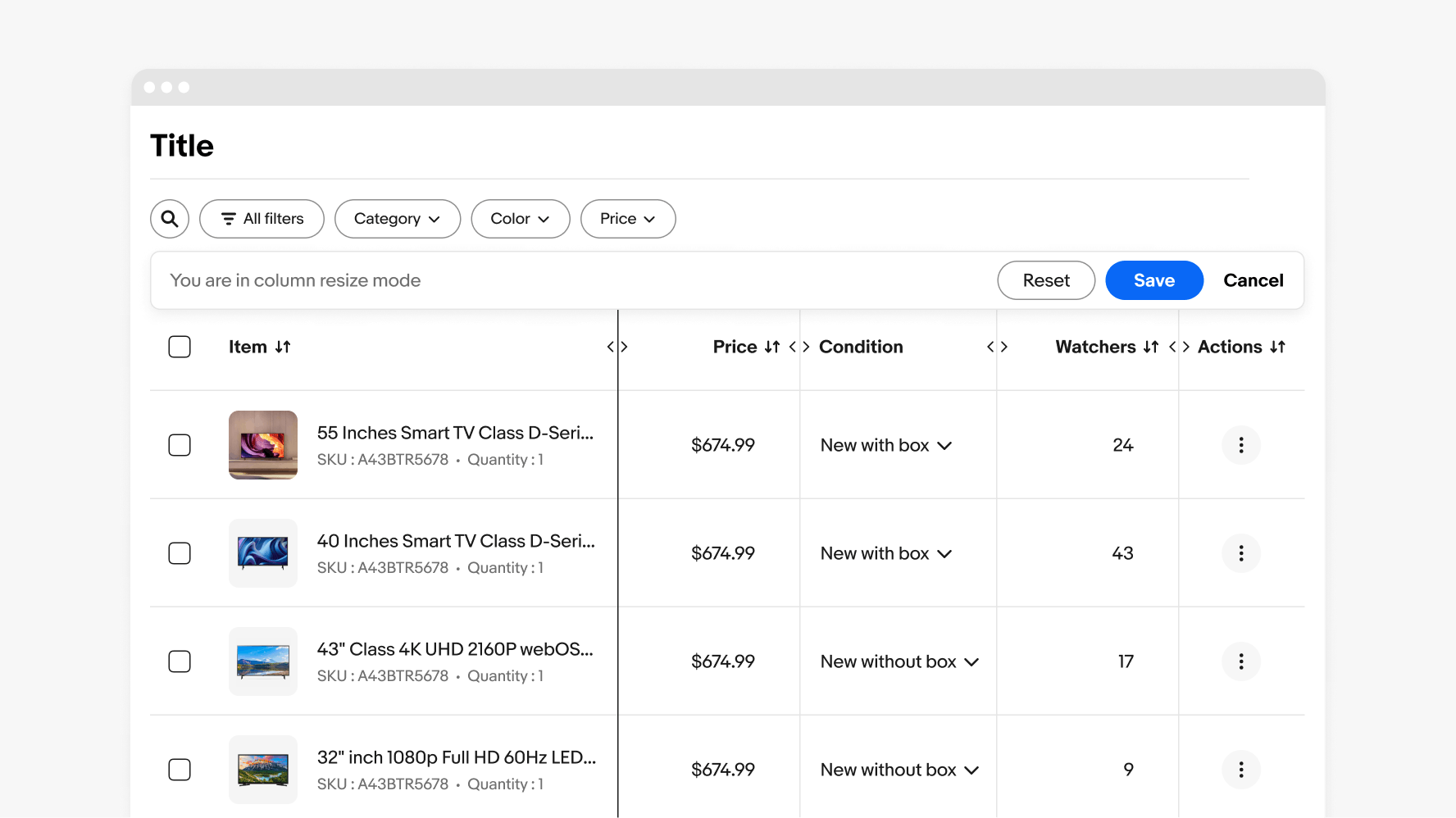
Column width
An adjusted column width indicator is presented in a focused editing mode that is visually similar to bulk editing, with explicit actions to save, reset, or cancel.
Minimum and Maximum
Columns have a minimum width of 124px and a maximum width of 400px, except for selection columns, which have a fixed width of 48px. Additionally, single icon action column types are set at a fixed width of 64px.
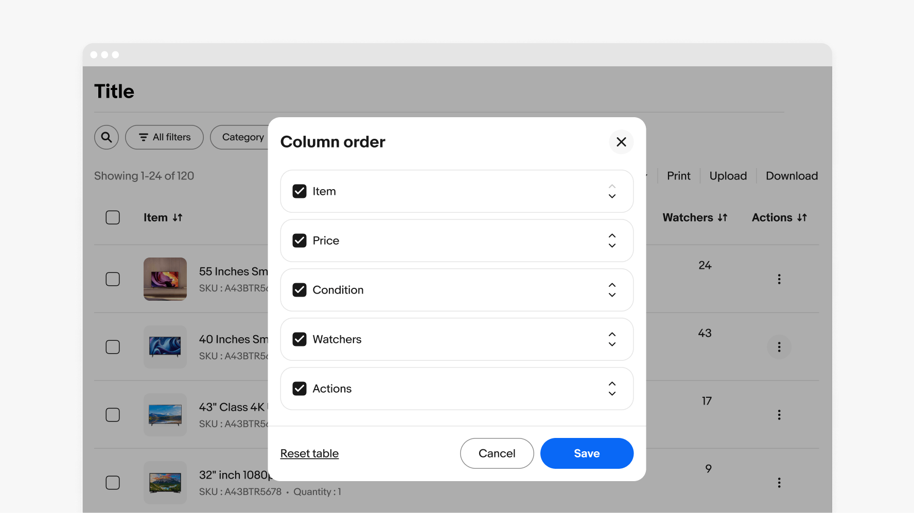
Column order
Column reordering is presented in a modal for a focused editing mode with explicit actions to save, reset, or cancel.
Bulk editing
When a user selects a checkbox from the table it enters the bulk action states with the bulk edit bar displaying on top of the table’s tool bar. Bulk actions are functions that may be performed on multiple items within a table.
Pagination
Pagination is provided for all tables with more than 60 rows, allowing for easy navigation through the content by limiting the maximum number of rows per page. Don’t use endless scrolling for tables, as it can hinder user experience and make it difficult to manage or act on large data sets effectively.
Layer states
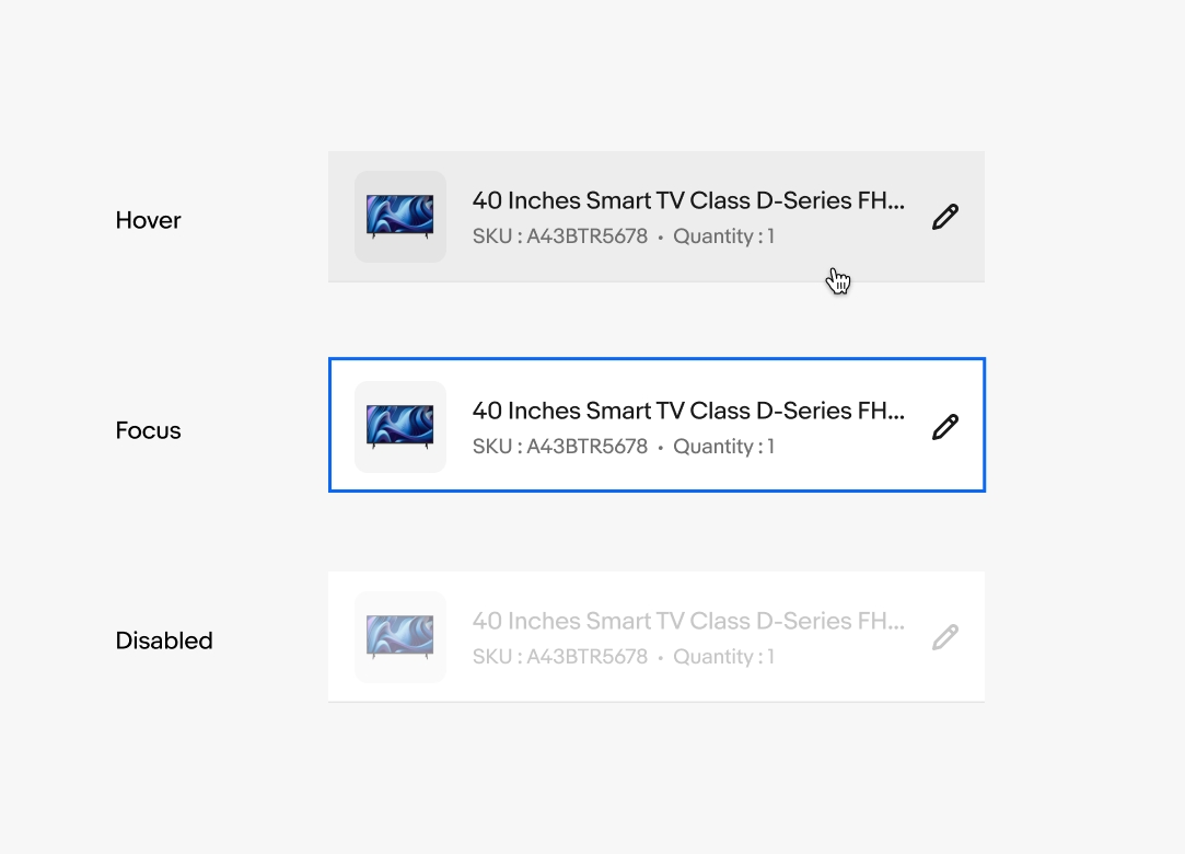
Hover is applied at the table row and cell levels for inner cell elements such as forms, dropdown, or buttons. Table focus is handled at the cell level. A disabled state can be applied at a row or cell level. See Interaction states for more details on layer state styling.
Small
Medium
Large
Color
Do use green to represent a positive trend for sales increasing or costs decreasing and red to represent a negative trend for sales decreasing or costs increasing. However, color cannot express this meaning alone. That is why we use the color in addition to an up or down arrow to represent this change. This provides contrast and conveys meaning for our color blind or low vision users.
Don’t color cells as this is an issue for our color blind or low vision users. Color cannot express meaning alone.
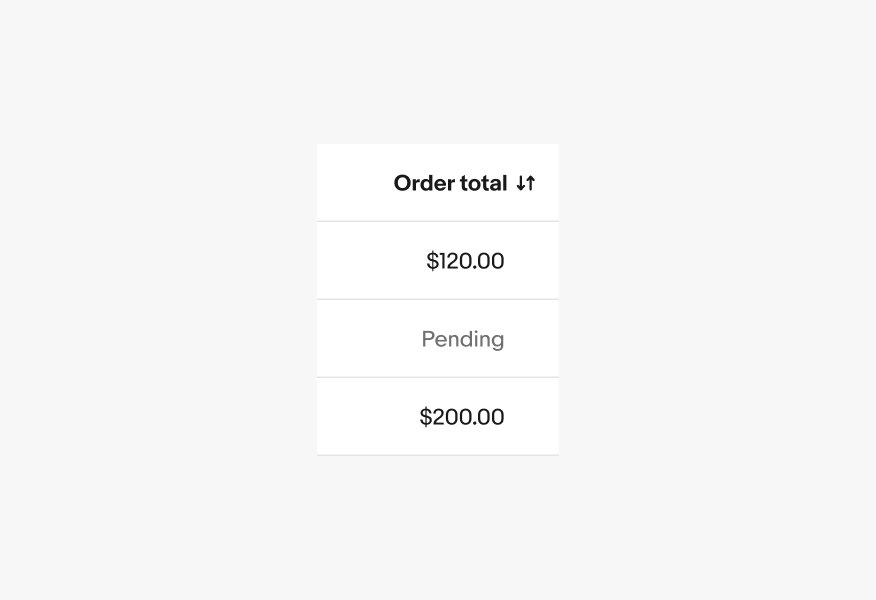
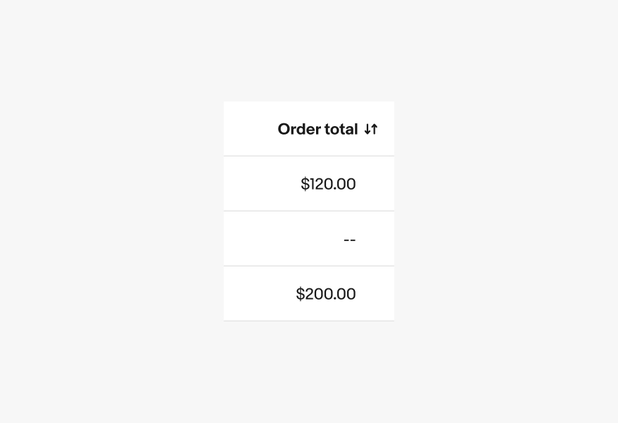
Null
Do be descriptive when a field is empty or unknown.
Don’t use “--” to represent null or unknown fields.
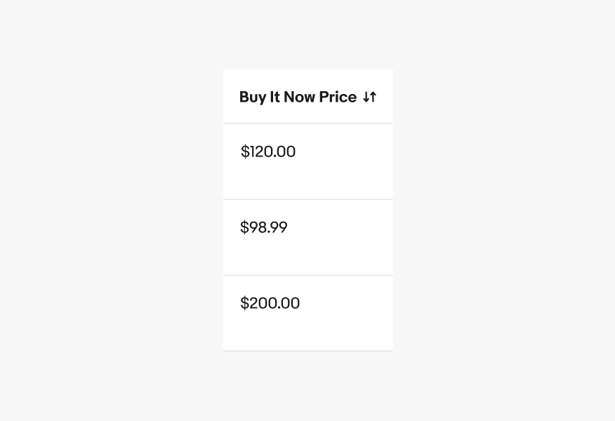
Numeric alignment
Do align numbers to the right for improved scannability.
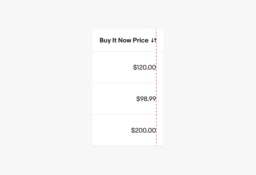
Don’t left align numeric values.
Max content lines
Do keep content concise and to 4 lines max within a cell.
Don’t exceeed more then 4 lines of content in a given cell.