Top navigation bar
The navigation bar displays common navigation, a global search bar, page titles, and page-level actions.
- CSS
- Marko
- React
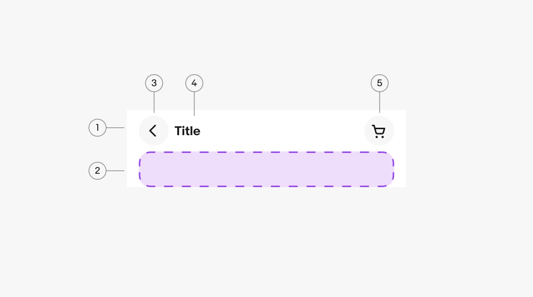
- Primary toolbar
- Secondary toolbar
- Leading button
- Content area
- Trailing buttons
Container
The container bounds the primary and secondary toolbars and automatically handles the devices safe zones.
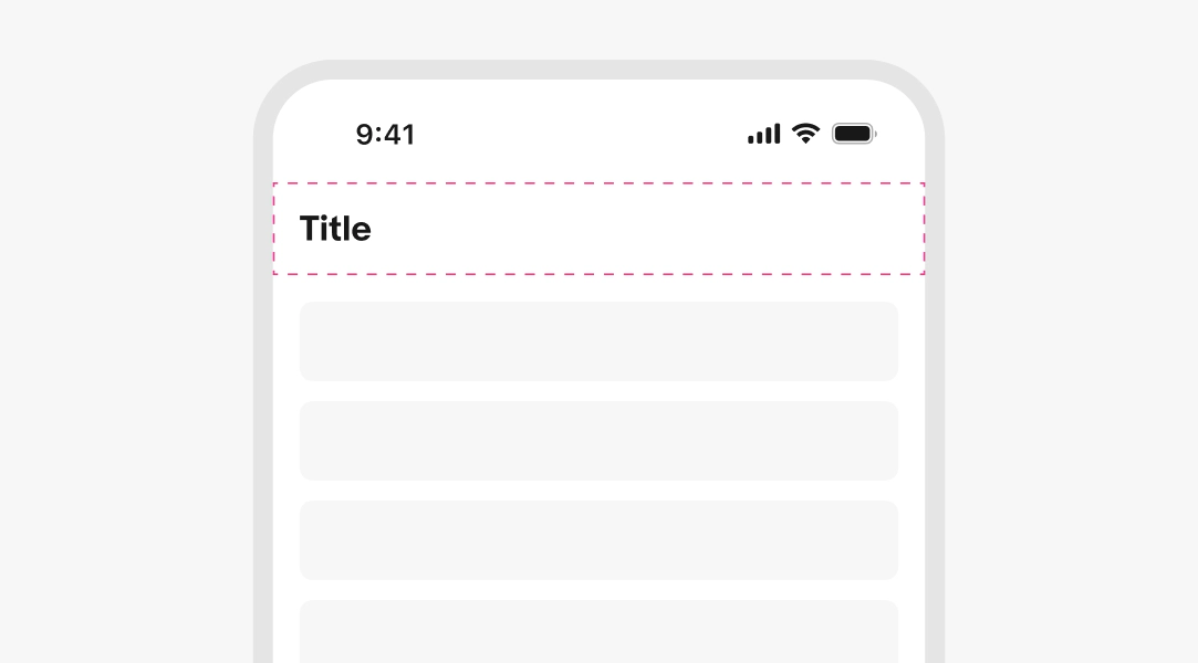
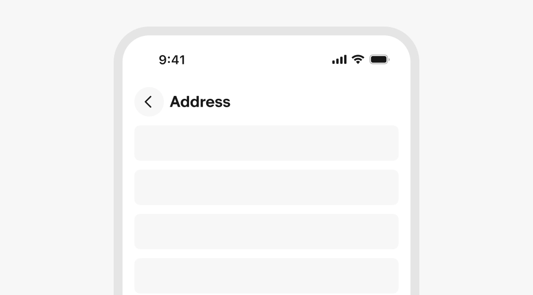
Title
Required. Match the navigation label that brought the user here. Adapt only if additional orientation is needed.
- Use sentence case
- No ending punctuation
- Use a noun or noun phrase
- Aim for 1–3 words
Layout
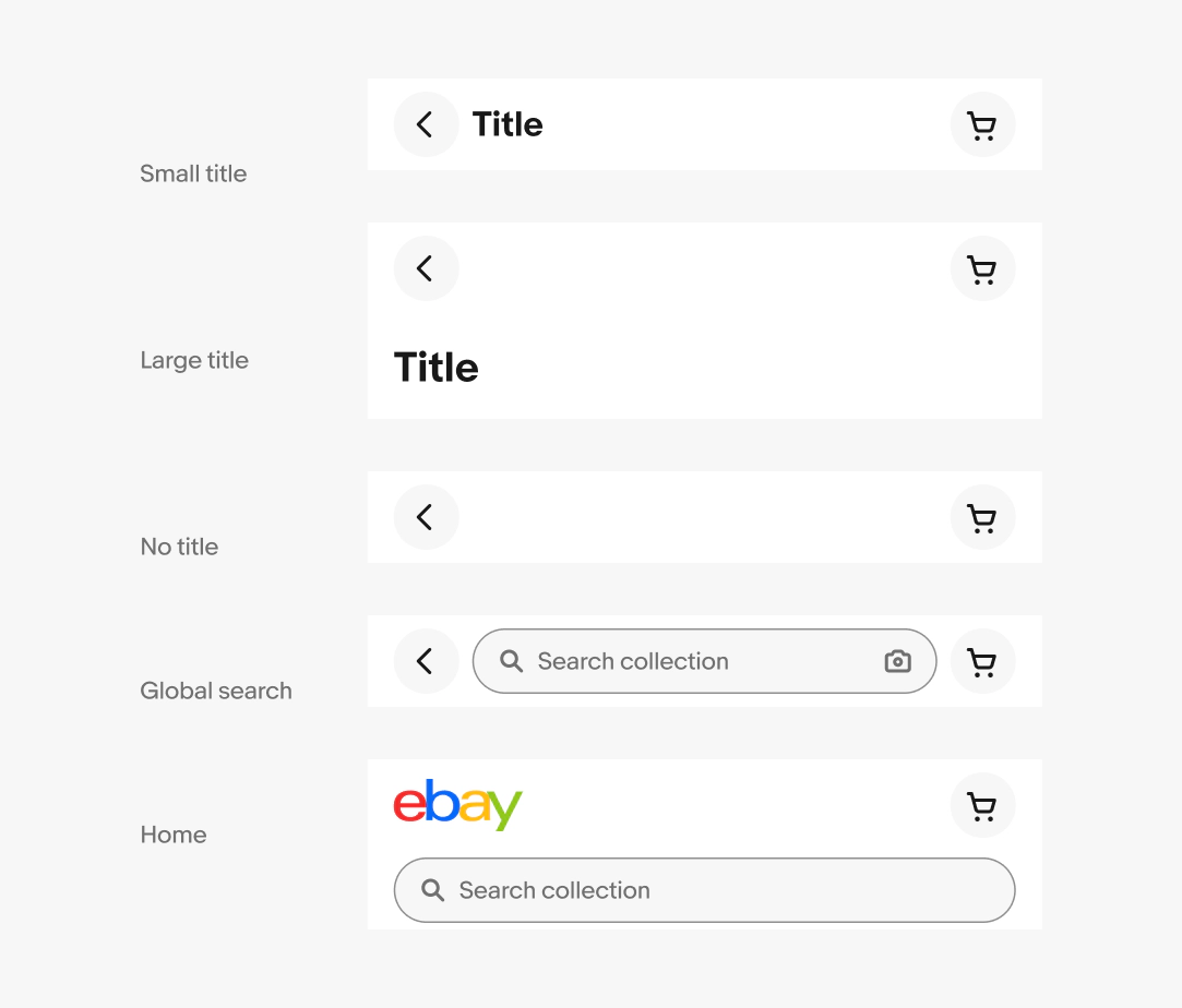
The top navigation bar is available in multiple layouts.
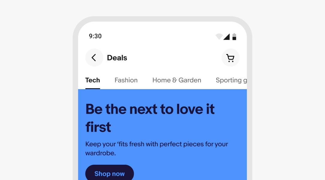
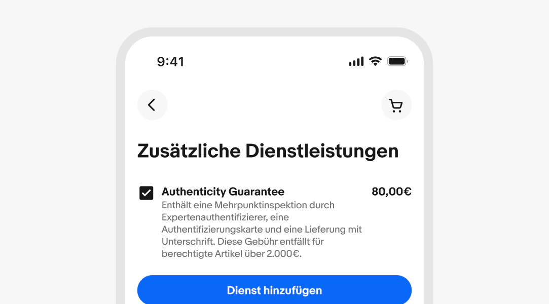
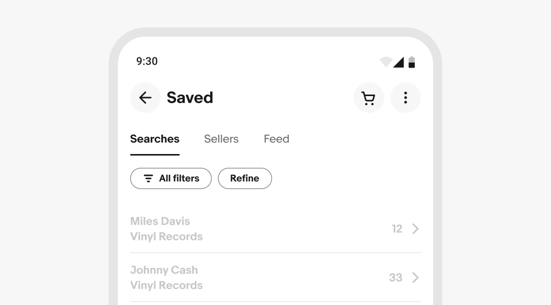
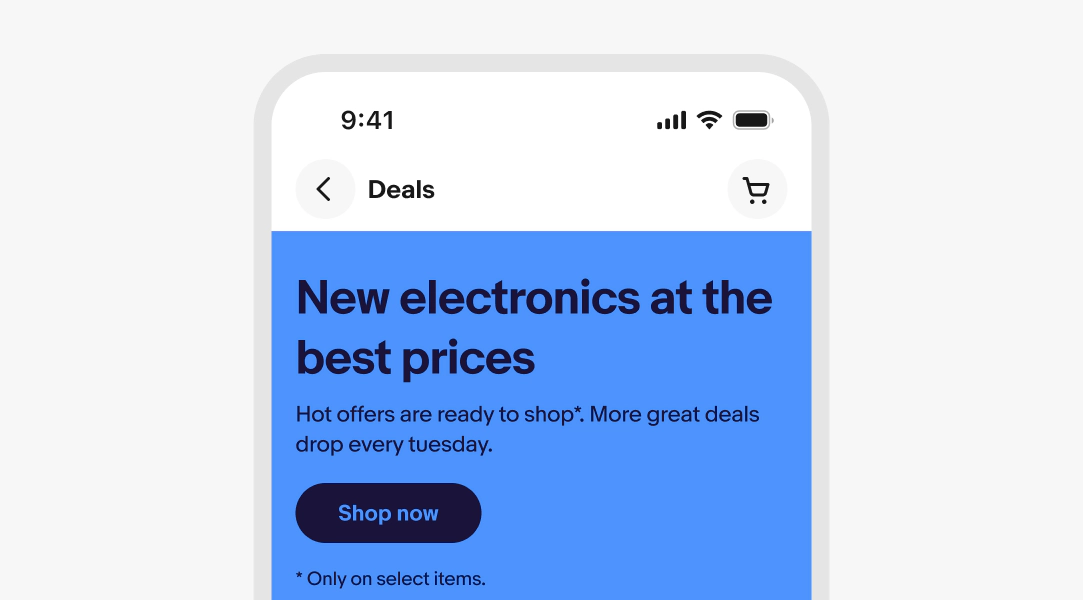
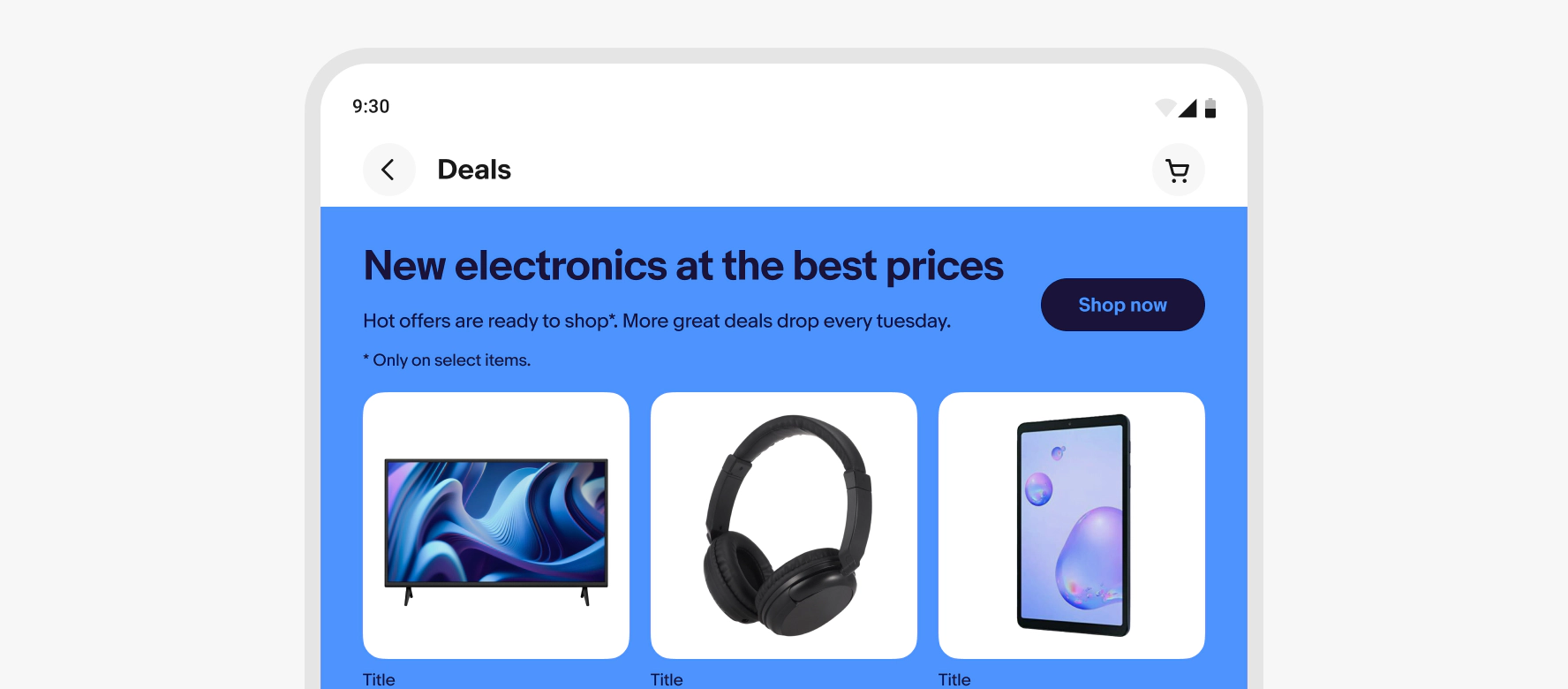
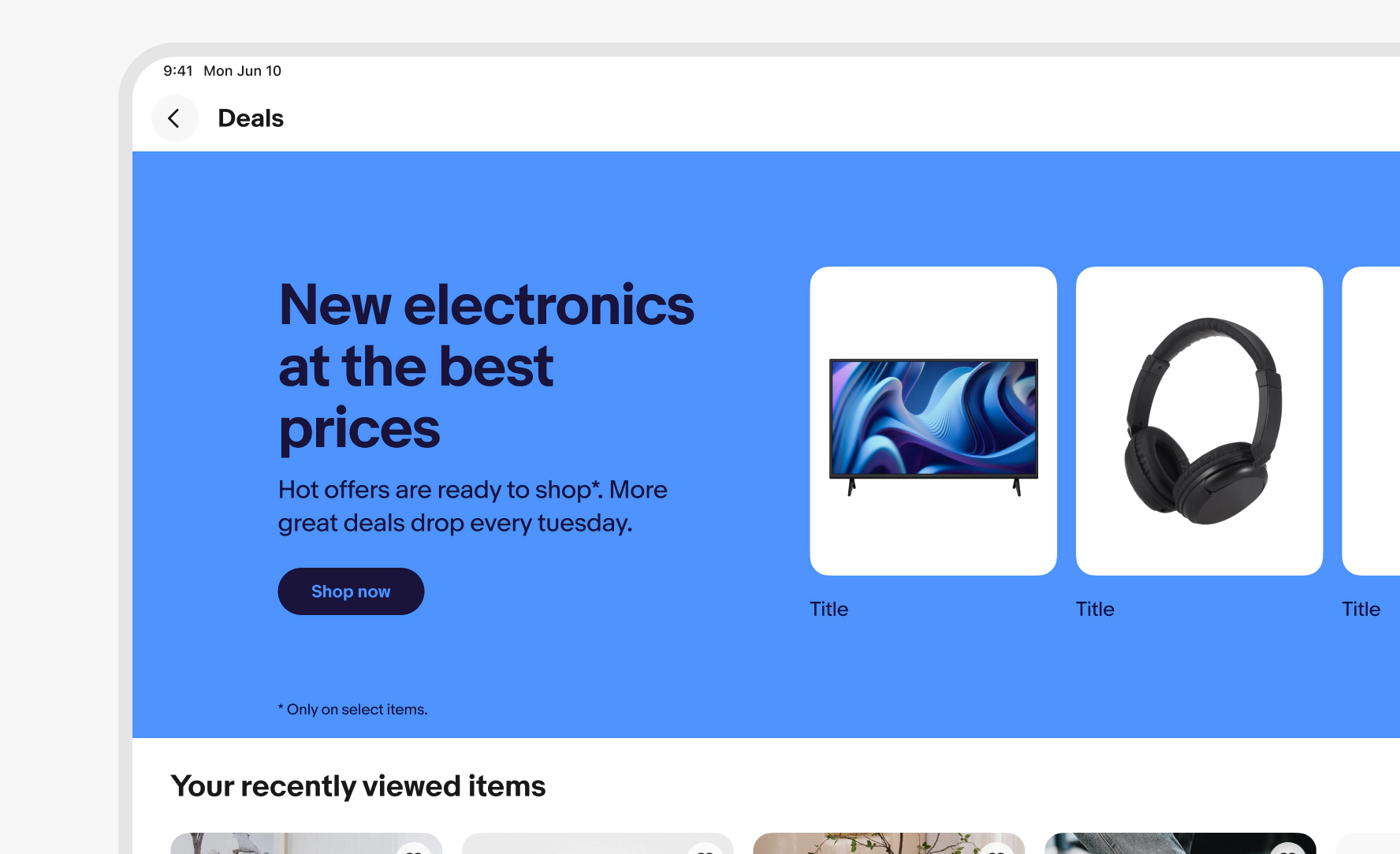
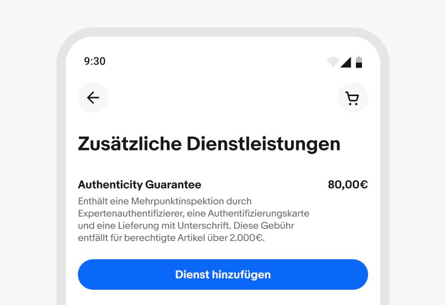
Small title: the default layout with the title inline between the navigation buttons.
Large title: for larger titles and expressive moments.
No title: For detail views where a title on the page acts as the page title.
Search only: For search views and search results pages.
Home: Unique layout for the home page
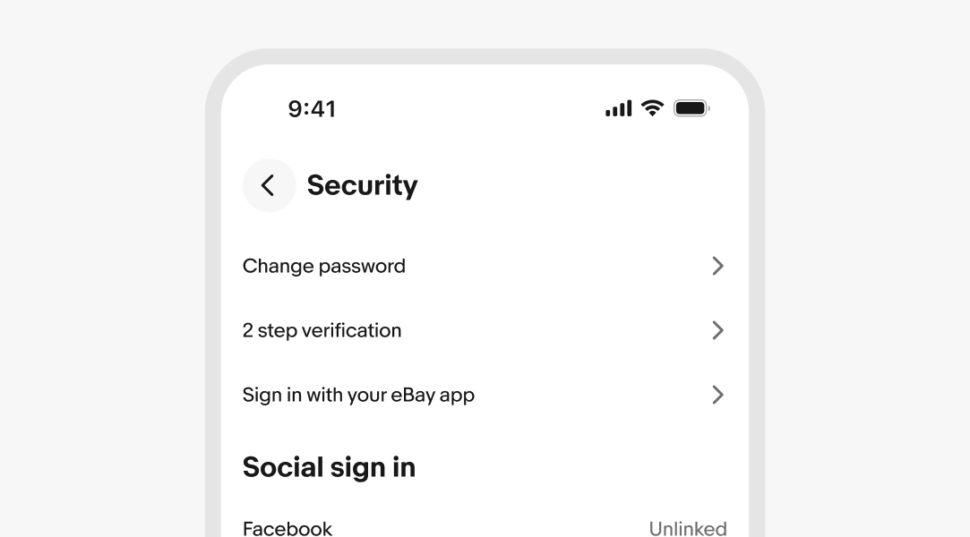
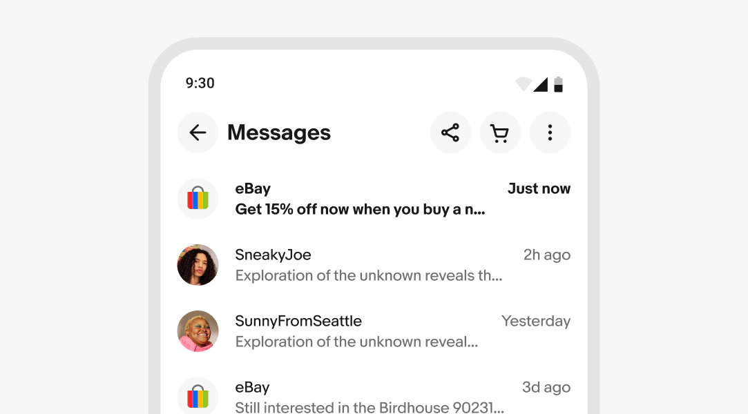
Leading buttons
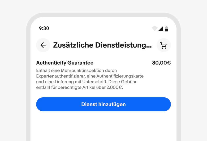
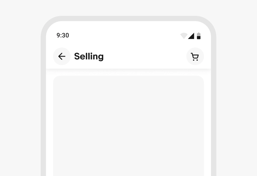
The leading button area of the primary toolbar contains the back button when viewing subpages and detail views.
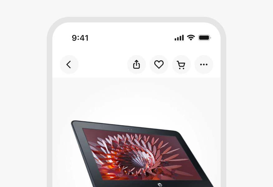
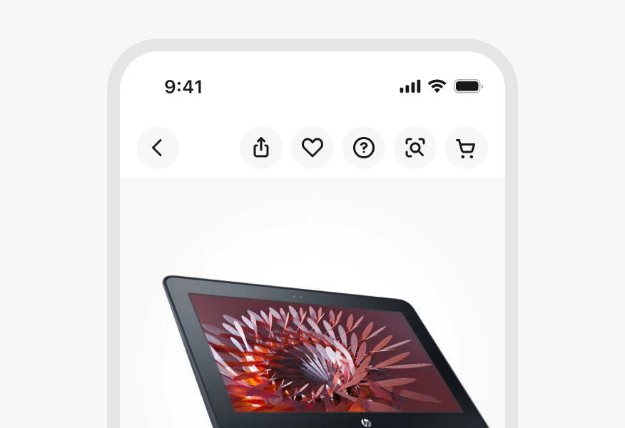
Trailing buttons
Up to 3 trailing buttons can be visible in the primary toolbar. Additional buttons are collapsed into an overflow menu.
Secondary toolbar
A secondary toolbar can be stacked below the primary toolbar. By default, the secondary toolbar hides and reveals with the primary toolbar when set to hide on scroll. However, the secondary toolbar can remain visible on scroll when providing convenient page navigation controls.
The secondary toolbar can include tabs, chips, a segmented button, a search field, or other related navigation elements.
Title overflow
Titles are truncated in the default title layout when wider than the available space. Stacked titles are truncated at two lines.
Button overflow
When there are more than 3 actions in the primary toolbar, the lower-priority actions are collapsed into an overflow menu. The overflow button is always on the trailing edge of the primary toolbar.
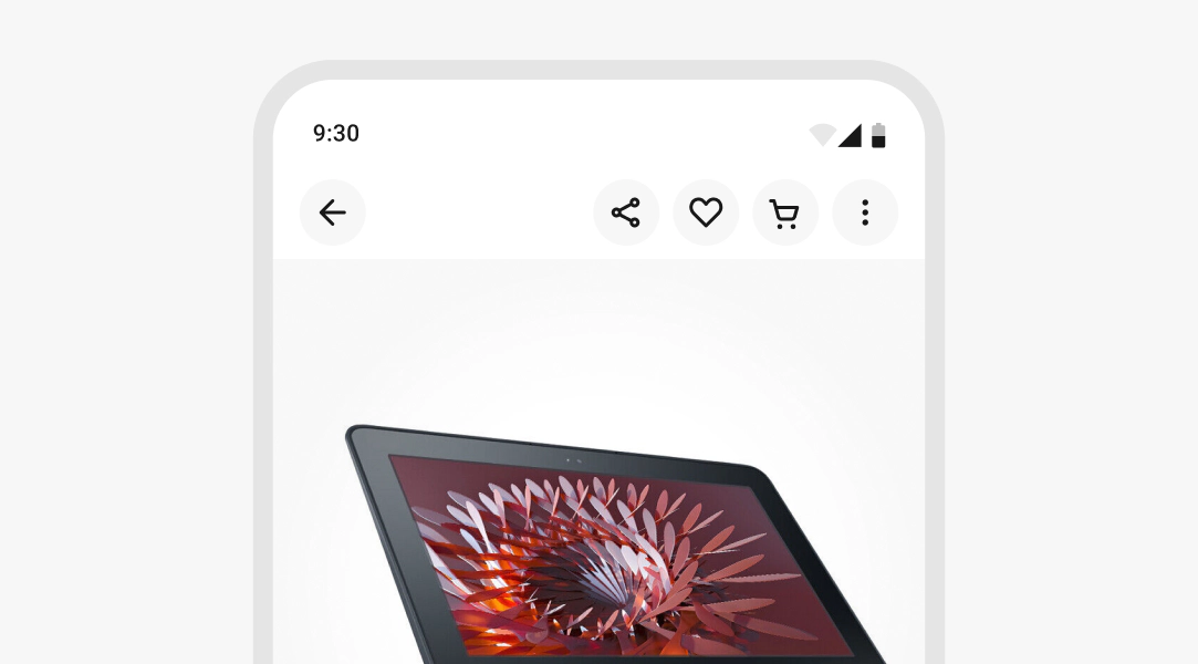
Cart button
The cart button is the last button of the primary toolbar unless an overflow button is present. Only remove the cart button in focused flows or form pages.
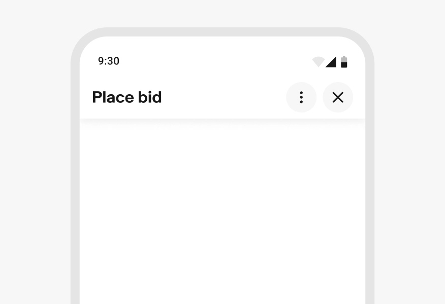
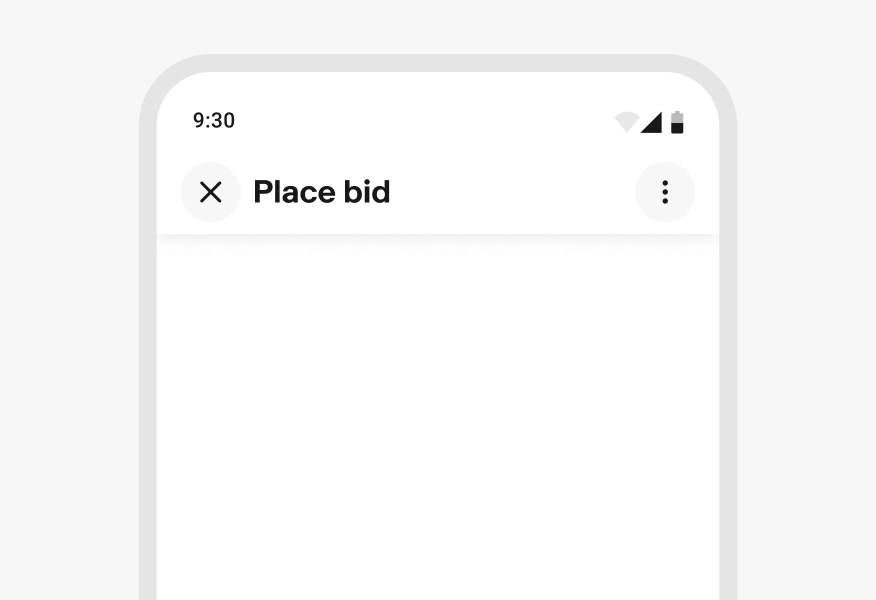
Overlays
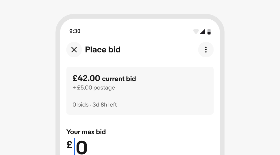
The navigation bar in modal overlays, like Sheets, show a close button in place of the back button across platforms, especially when trailing actions are present.
Hide on scroll
The top navigation bar hides when scrolling downward and reveals when scrolling upward to maximize visible screen space.
If a secondary toolbar is present, it hides and reveals along with the primary toolbar by default, but can be configured to remain visible.
Scrolled state
A drop shadow is applied to the top navigation bar when the page is scrolled. For the large navigation bar, the title collapses into the smaller layout when scrolled. It transitions back to the large layout when the page is scrolled to the top.
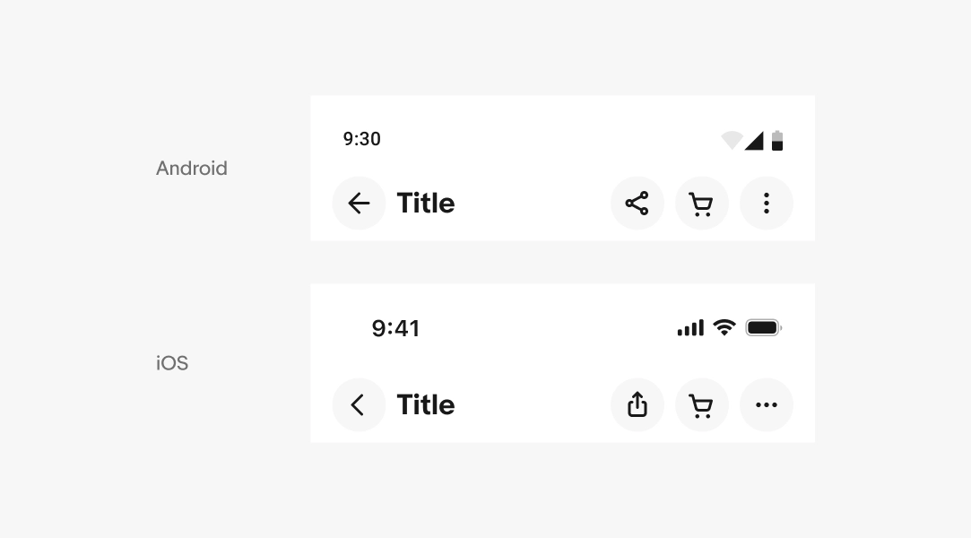
Platform differences
Certain elements differ across iOS and Android to adhere to platform patterns.
On Android devices:
- The back button uses an arrow
- The overflow menu uses the vertical dots
- The share icon uses the Android variant with the three connected dots
On iOS devices:
- The back button uses a chevron
- The overflow menu uses the horizontal dots
- The share icon uses the iOS variant with the upward arrow and square.
Small screens
The inline title configuration is the default on smaller screens. Small screens can use the larger layout when a page title is larger.
Medium screens
The inline title with a larger font size is the default configuration on medium screens. Elements that would normally stack on smaller screens can move into the primary toolbar as space allows.
If a navigation rail is present, the navigation bar will stack below the rail.
Large screens
The inline title with a larger font size is the default configuration on large screens. Elements that would normally stack on smaller screens can move into the primary toolbar as space allows.
If a navigation rail is present, the navigation bar will stack below the rail.
Title length
Do use a large navigation bar when the title is long and would lead to wrapping.
Don’t use the smaller navigation bar if the title is likely to truncate.
Amount of buttons
Do only show up to 4 actions, including the overflow menu. Collapse all additional actions into the overflow menu.
Don’t place more than 4 trailing actions in the toolbar.
Size
Do maintain the size and padding within the top navigation bar.
Don’t alter the size or padding of the navigation bar.

Close and overflow buttons
Do maintain place the close button in the leading position when trailing actions are present.
Don’t place an overflow button next to a close button.