Sheets
Sheets provide a consistent, adaptive, and accessible way to present content above the primary surface.

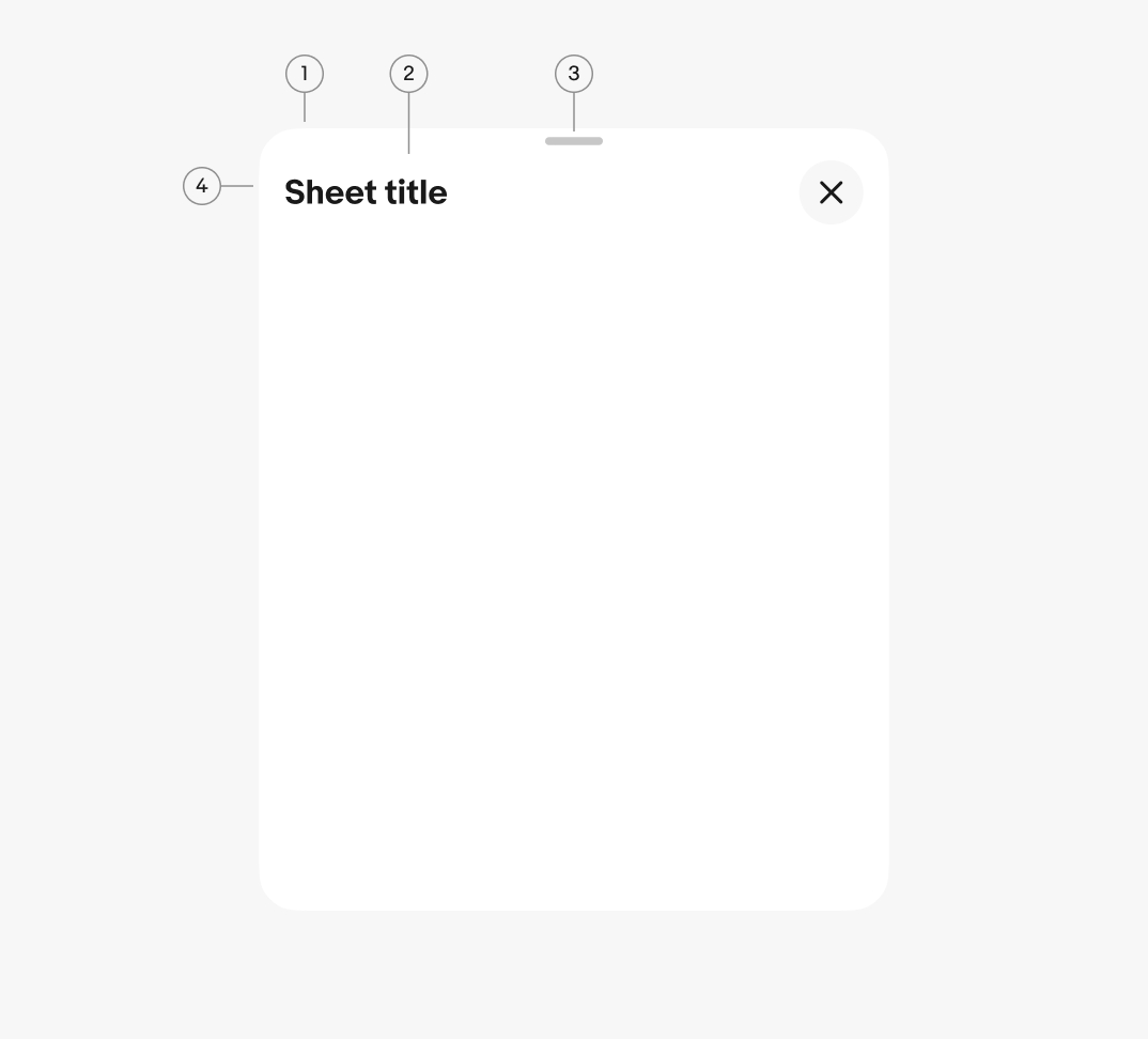
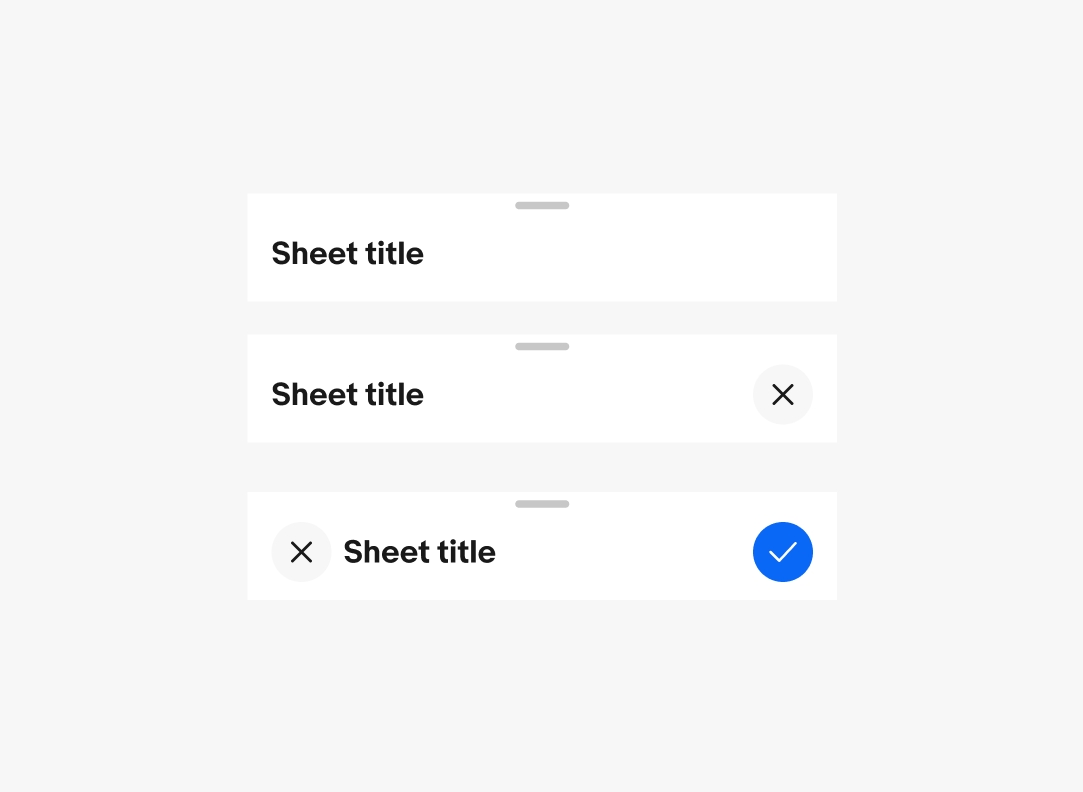
- Container
- Title (optional)
- Sheet handle (optional)
- Sheet toolbar (optional)
Container
The sheet container is the elevated surface bounding all of the sheet content and the only required element. The container handles the layering, transition, and interaction behaviors across sheet types.
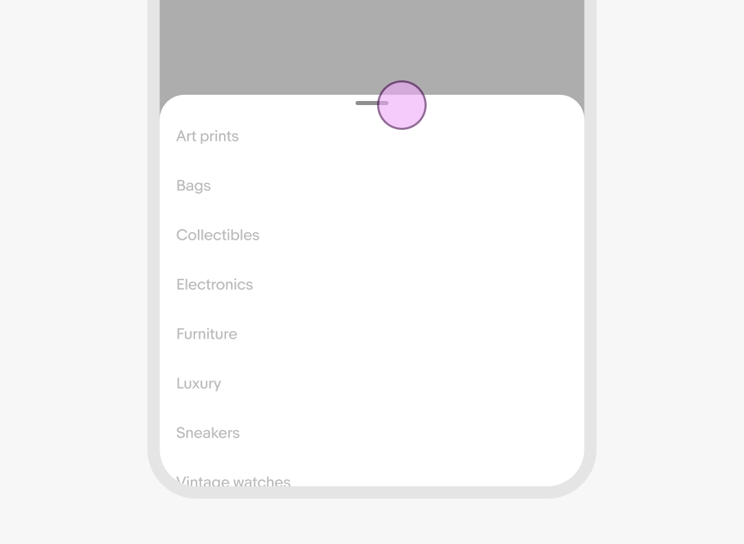
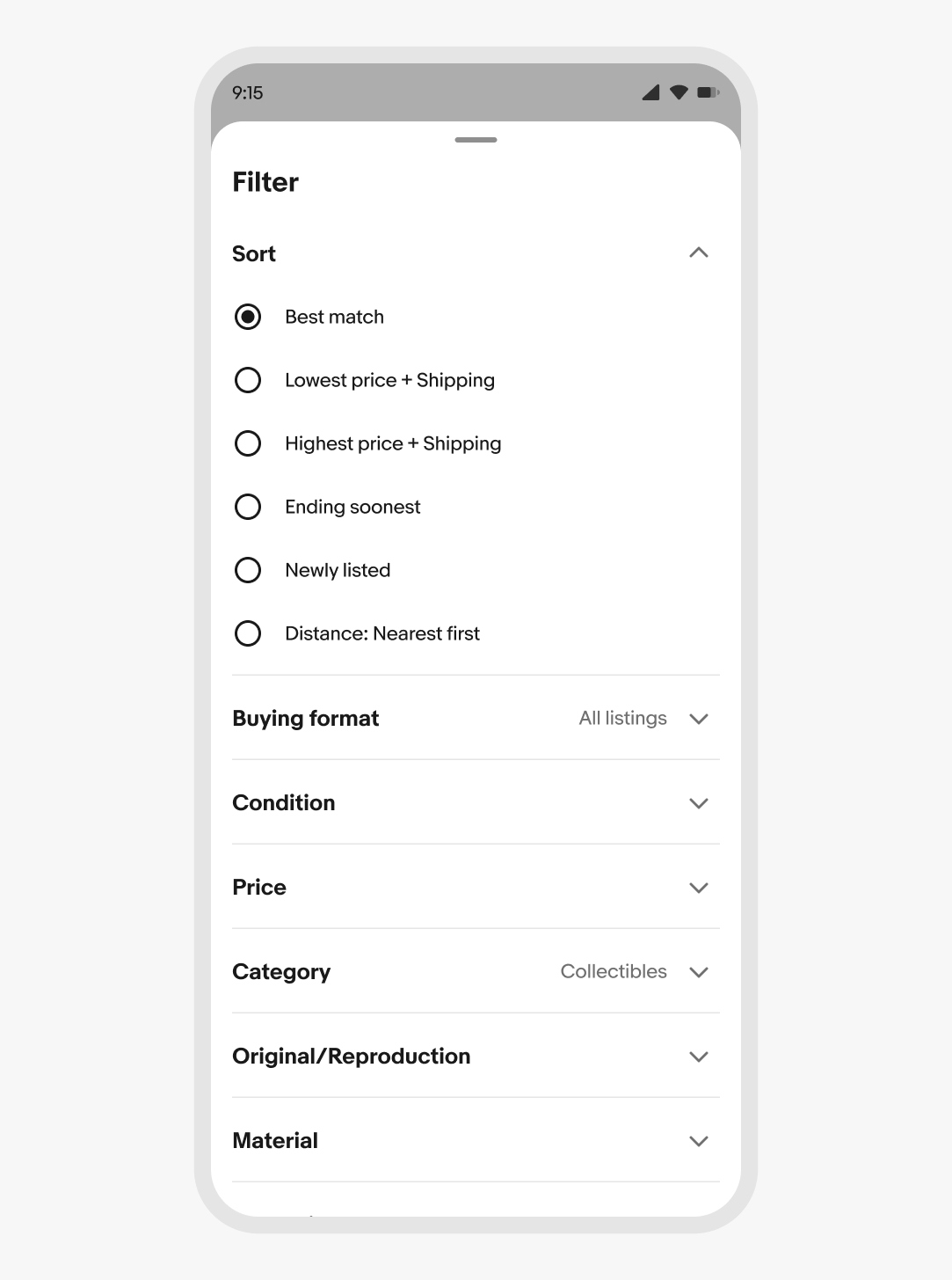
Sheet handle
The sheet handle acts as an affordance for the dragging behavior. Swiping upward expands sheets with overflowing content and swiping downward dismisses the sheet.
Sheets with defined heights will rest at the closest height to the dragged container. Tapping the handle toggles the sheet between defined heights.
The handle is always visible on iOS across focus and context sheets. The handle is only visible in context sheets on Android devices.
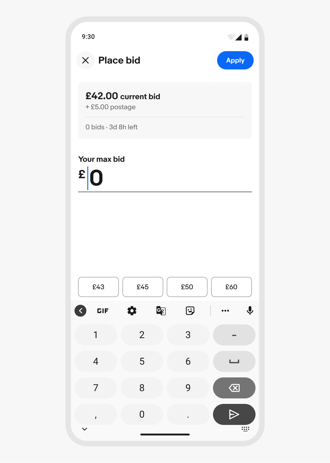
Sheet toolbar
The sheet toolbar appears at the top of the sheet container and contains the title, close button, and optional confirmation button.
If the primary action is to close the sheet, the close button appears as a trailing action. If the sheet has an affirmative action, the close button can appear in the leading position and the affirmative action appears in the trailing position.
iOS uses icon buttons by default for all actions. Android uses a CTA button as the affirmative action by default.
Height
Context sheets open partially by default and expand to full height as the content is scrolled. The content area scroll begins when the sheet reaches full height.
Focus sheets are always full height on small screens.
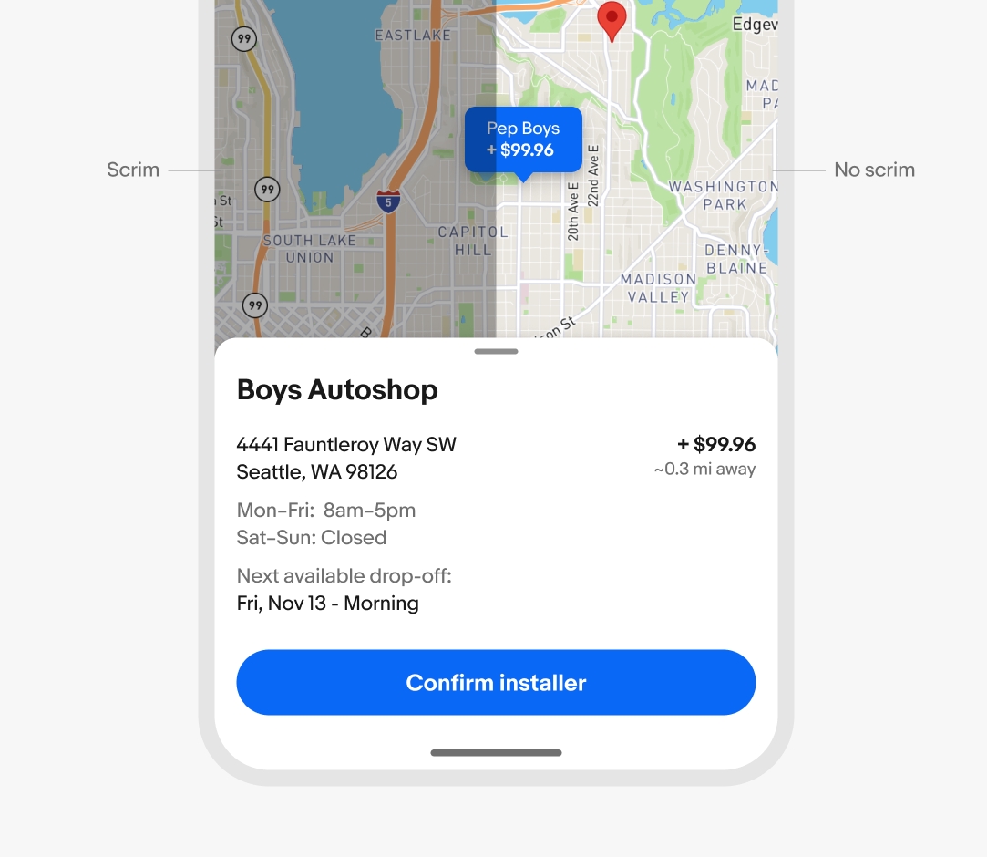
Scrim
Sheets use a scrim by default to darken and block interaction with the primary page, focusing users on the sheet task or information.
The scrim is optional for context sheets. Omit the scrim to allow interactions between the sheet and primary page surfaces simultaneously, useful in map or preview experiences where users are commonly referring to both surfaces.
Focus sheets require the scrim at all times.
Toolbar visibility
The sheet toolbar is optional and visible by default. The toolbar includes space for a title and close button where applicable.
The included toolbar can be toggled off to allow for more expressive, full-bleed imagery.
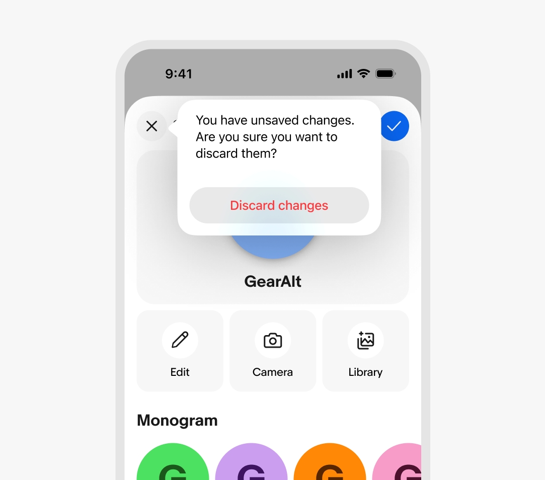
Interactive dismiss
Interactive dismiss is enabled by default, allowing the sheet to be dismissed using a downward swiping gesture.
If selections within the sheet don’t automatically apply, dismissing via swiping down is the same as canceling or closing the sheet.
Interactive dismiss can be disabled when the sheet contains decisions users may want saved. The sheet presents a confirmation alert dialog instead when attempting to drag the sheet away.
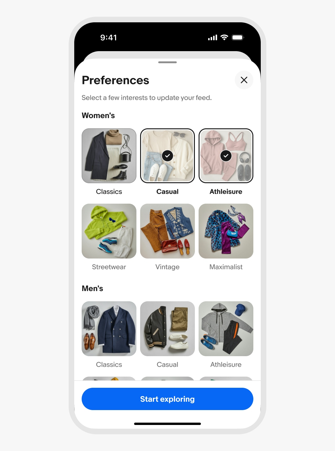
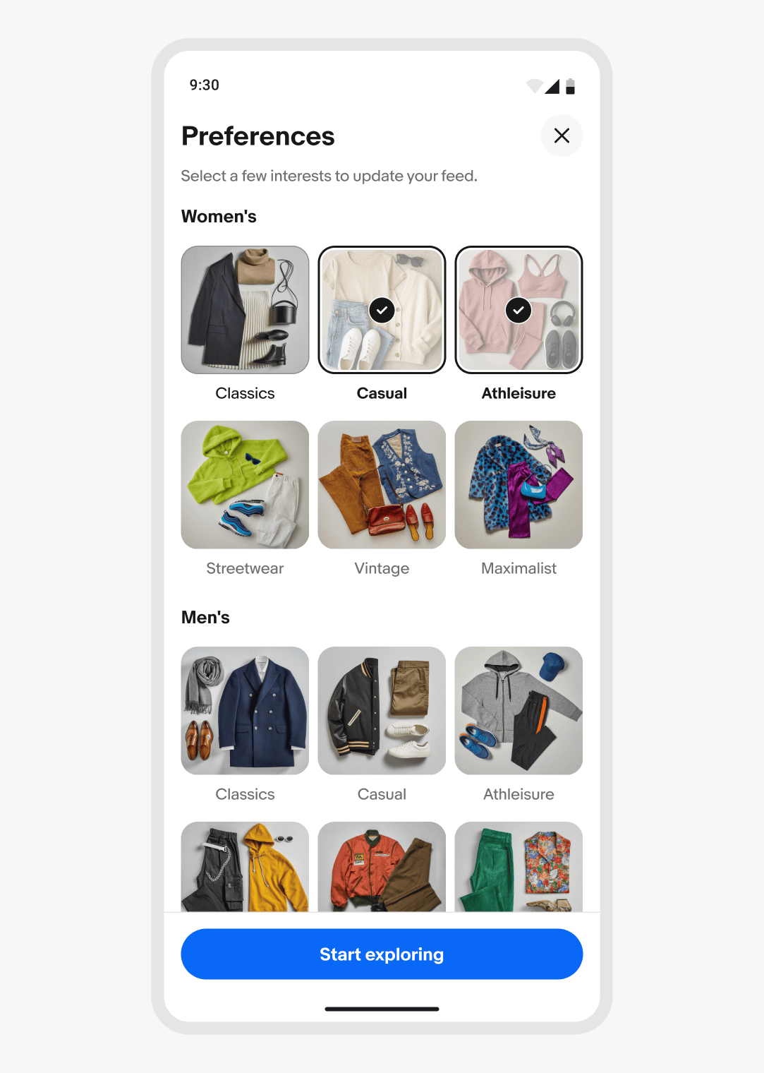
Focus sheet
Focus sheets are blocking, scoped surfaces for contained interactions related to the primary surface.
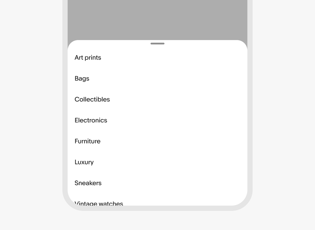
Context sheet
Context sheets are flexible, medium-attention surfaces for displaying relevant information above the primary surface.
Android
Sheets on Android leverage presentation behaviors from the Material Sheet or Fullscreen Dialog. The close button is only visible when the native TalkBack accessibility feature is enabled.
Avoid placing a back button in the sheet header—Android devices use the hardware back or predictive back gesture actions.
Read more about Material Dialogs and Sheets
iOS
Sheets on iOS leverage presentation behavior from the native formSheet and pageSheet elements.
Read more about iOS sheets