Using type in print
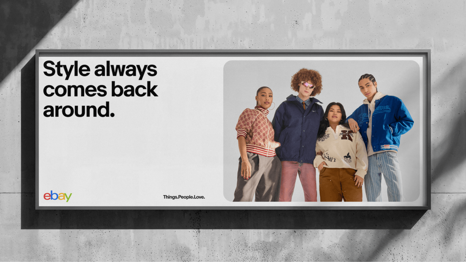
We define our type sizes, styles, hierarchy, and layouts differently in print applications than we do in digital applications. Print applications include posters, billboards, packaging, merchandise, and booth design. In print applications, we generally use larger type, smaller letter spacing, and smaller line height, and calculate the sizes based on the size of the logo.
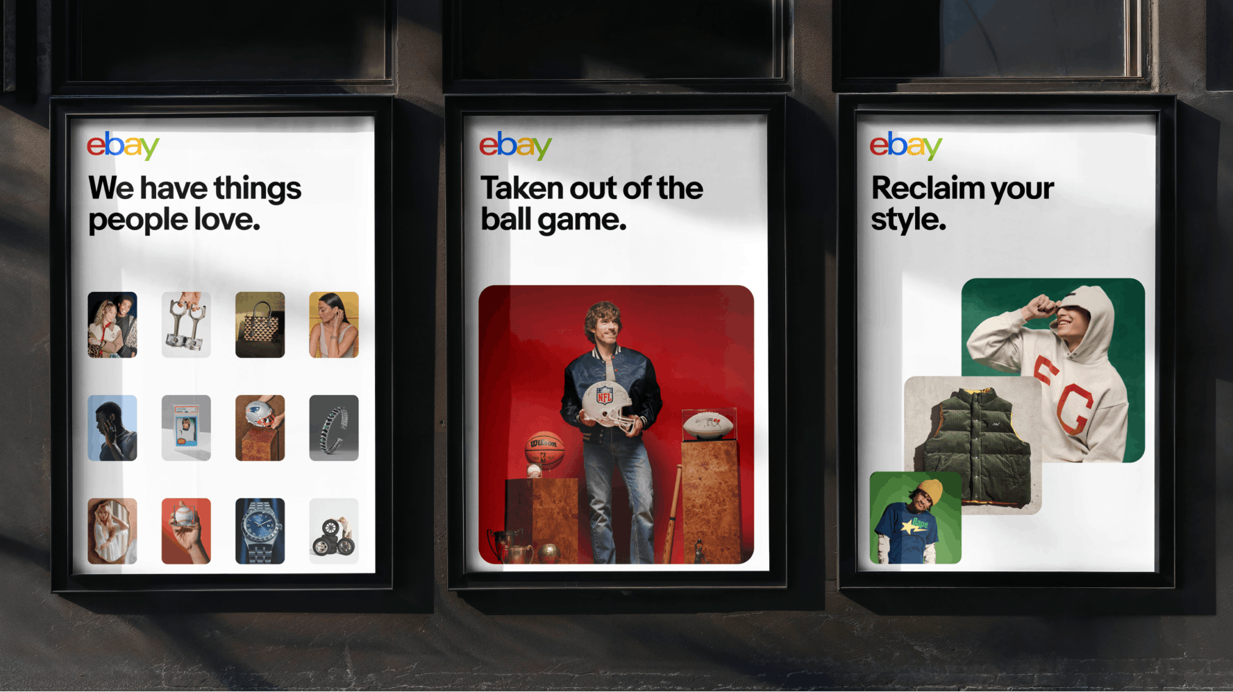
Both the size and weight of our typography contribute to creating clear hierarchy. The type sizes we use in print are calculated based on the logo size as well as the size of the print material. For guidance on how to approach layout for print, see Layout in marketing.
- Display
- Subtitle
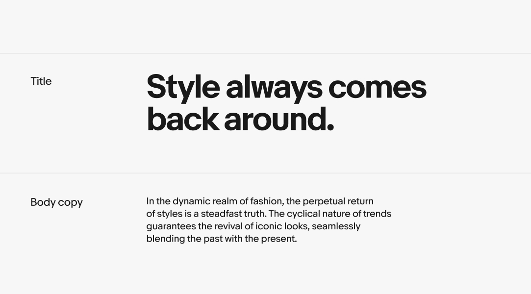
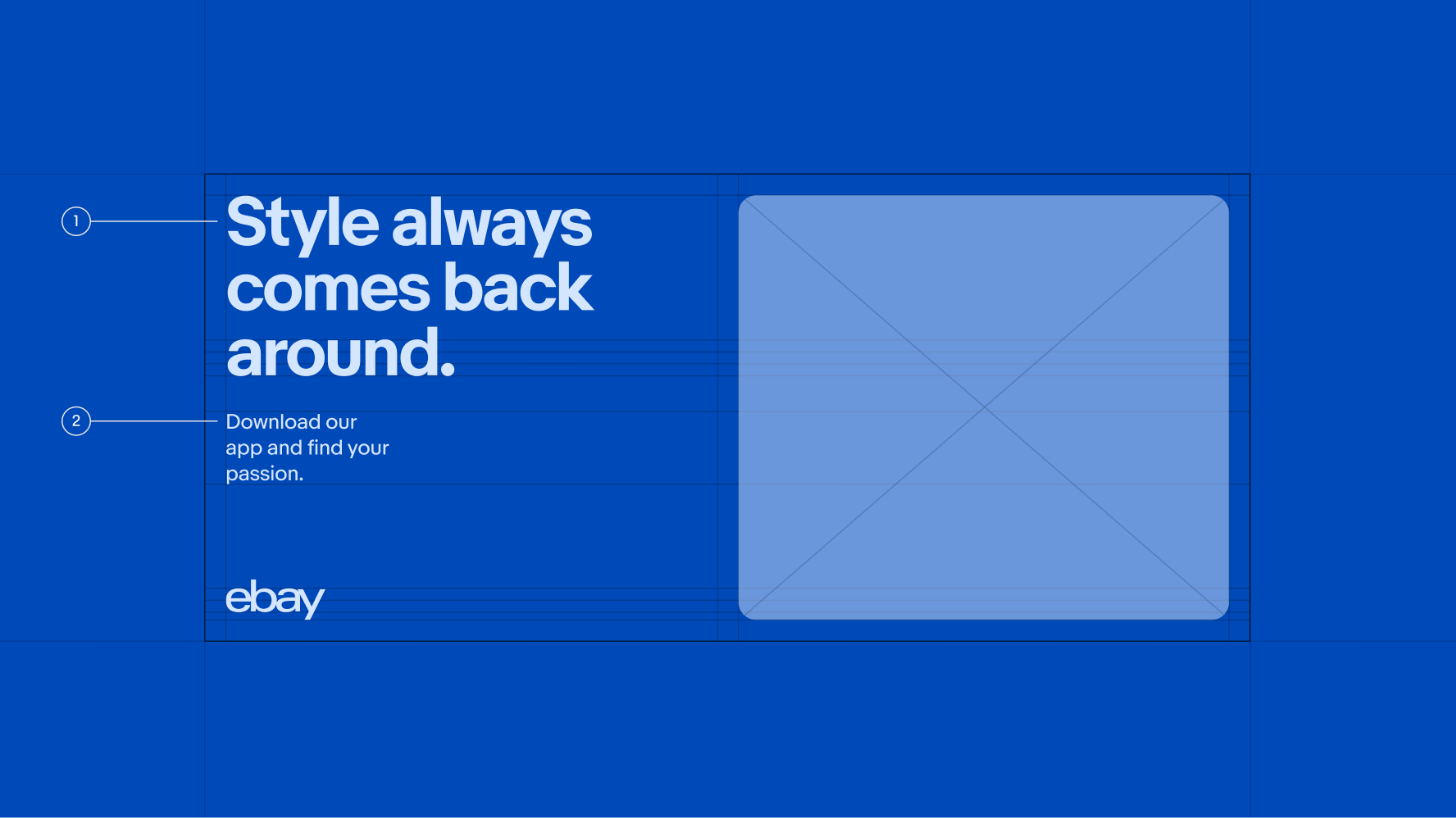
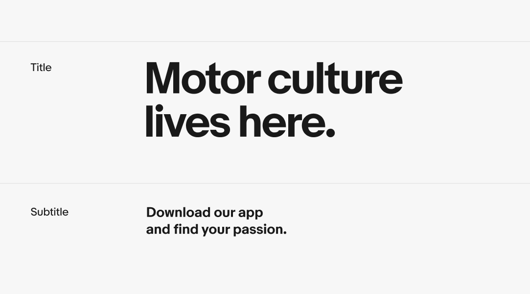
Titles
We scale our titles using the x-height of the logo as a baseline. To help with typographic consistency, we provide three designated type sizes as a guide for layouts: 50% of the logo, 75% of the logo, and 100% of the logo.
Video description: An animation showing the precise relationship between the height of the ebay logo and various headline heights defined in the playbook.
Subtitles
Subtitles are 30% of the title size.
Body
If subtitles are included in the layout, body copy should be 20% of the title size. If subtitles are not present, the body copy can be adjusted to either 30% or 50% of the title size.