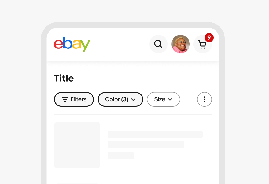
Skip to main contenteBay Playbook
  • Get started
  • Foundations
  • Design system
  • Expressions
  • Resources
  • Articles

Design system

  • Overview
    • Overview
    • Color
    • Dimension
    • Spacing
    • Typography
    • Breakpoints
    • Shadow
    • Shape
    • Opacity
    • Motion
    • Overview
    • Status
    • Accordion
    • Action bar
      • Overview
      • Inline notice
      • Page notice
      • Section notice
    • Avatar
    • Badge
    • Banner
    • Breadcrumb
      • Overview
      • Branded button
      • CTA button
      • Icon button
      • Link button
    • Card
    • Carousel
    • CCD
      • Filter chip
      • Input chip
      • Graphs
      • Metrics
    • Date picker
    • Dialog
    • Divider
    • Education notice
    • EEK rating and range
    • Expansion
      • Checkbox
      • Combobox
      • Dropdown
      • Numeric stepper
      • Password
      • Phone number
      • Radio button
      • Select list
      • Switch
      • Text area
      • Text field
    • Item tile
    • List row
      • Overview
      • Expressive loader
      • Skeleton loader
    • Media container
      • Top navigation bar
    • Pagination
    • Popover
    • Progress stepper
    • Search field
    • Section header
    • Segmented button
      • Bottom sheet
      • Panel
    • Signal
    • Snackbar
    • Tab
    • Table
      • Tooltip
      • Tourtip
    • Toggle button group
    • Video player
    • Overview
    • Bulk editing
    • File uploading
      • Text link

Action bar

v1.0

An action bar is a collection of components that provide controls to give users more agency over their content or data sets.

  • Skin
  • Marko
  • React
Stylized artwork of a filter bar.
Action barv1.0

On this page

  • Anatomy
  • Properties
  • Behavior
  • Screen sizes
  • Best practices
  • Specs

Anatomy

Properties

Behavior

Screen sizes

Best practices

Specs

PreviousAccordion
Things.People.Love.
  • Get started
  • Foundations
  • Design system
  • Expressions
  • Resources
  • Articles
  • Careers
  • Press
  • Privacy policy
© 2025 eBay. All rights reserved.

eBay Evo, the eBay trademark, and the eBay logo are the intellectual property of eBay Inc.

    1. All filters action
    2. Filter group
    3. Action group

    Filter group

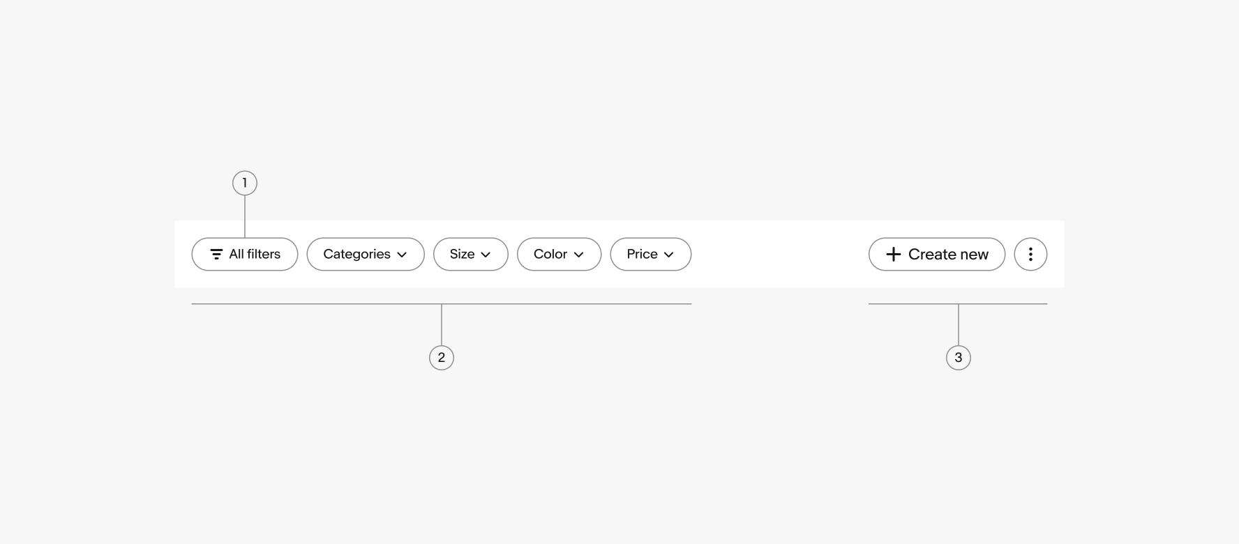
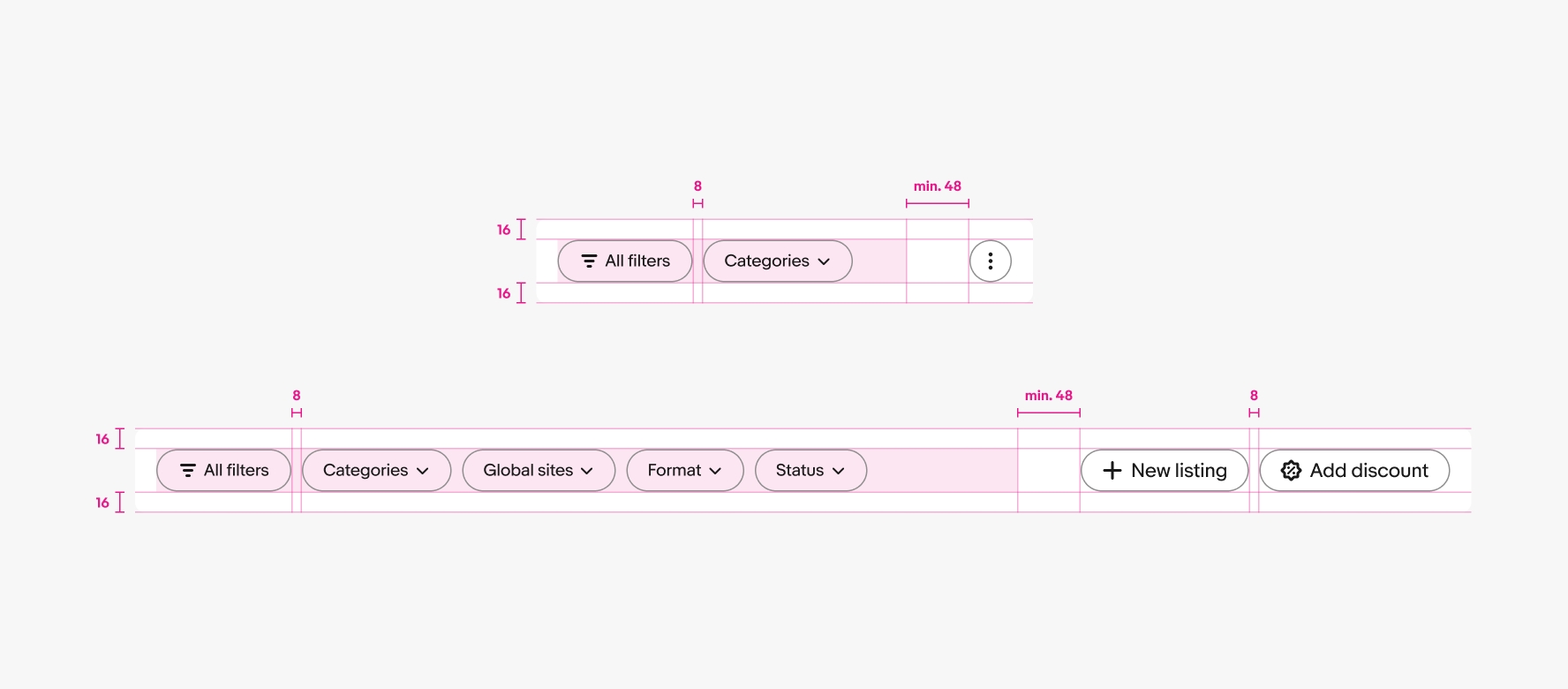
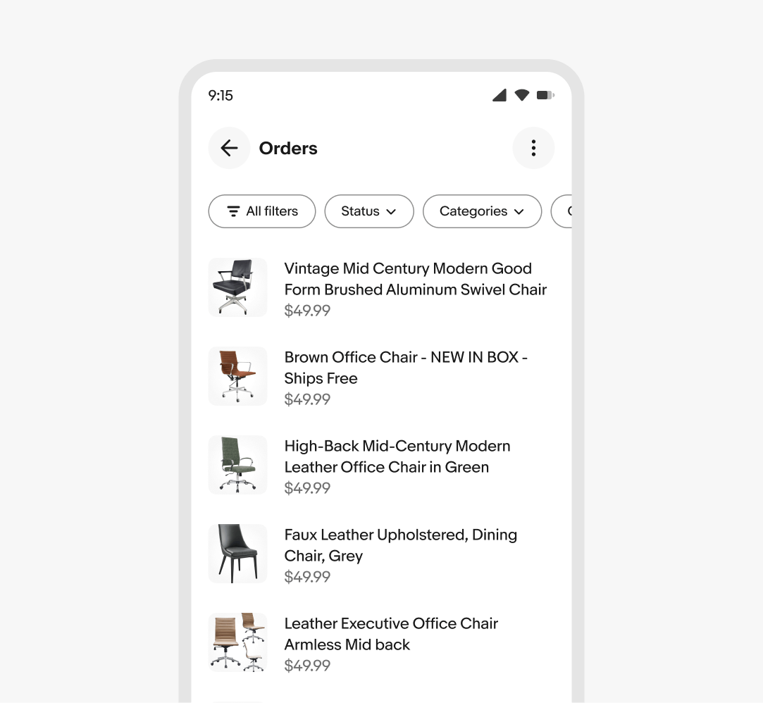
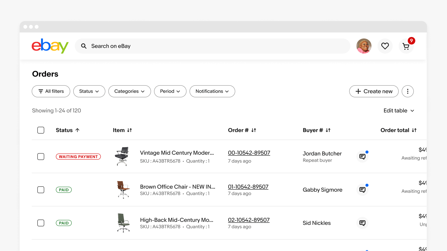
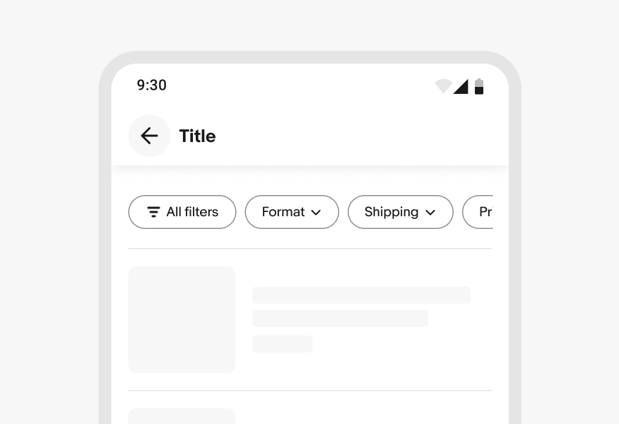
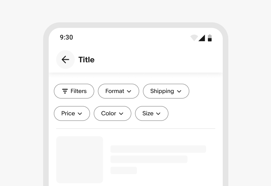
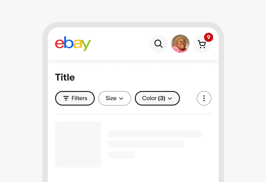
    The filter group contains all filter-related buttons. The lead filter button includes a generic “All filters” button that launches a sheet with all available filters.

    Action group

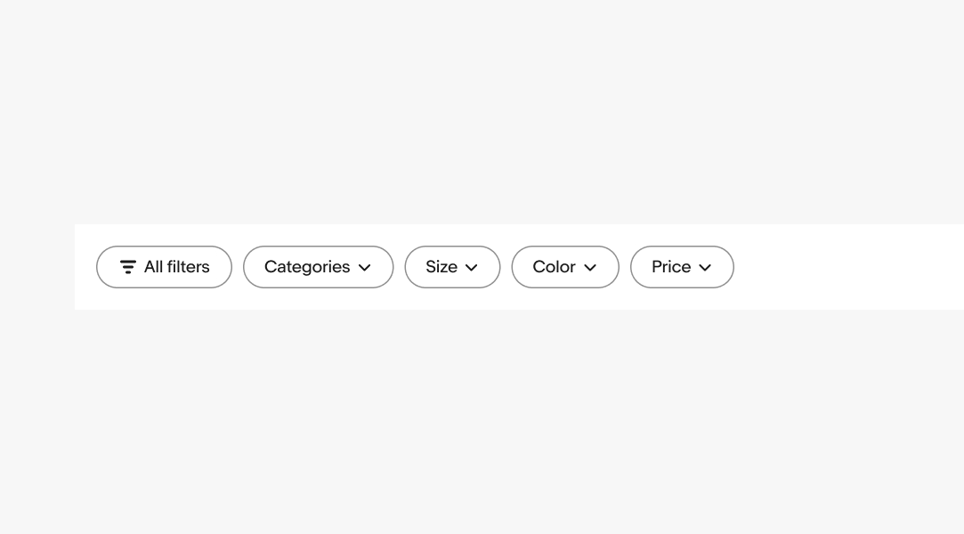
    The action group is optional and contains up to 3 non-filter actions. Additional actions can be collapsed into an overflow icon button in the first position.

    Collapsing buttons

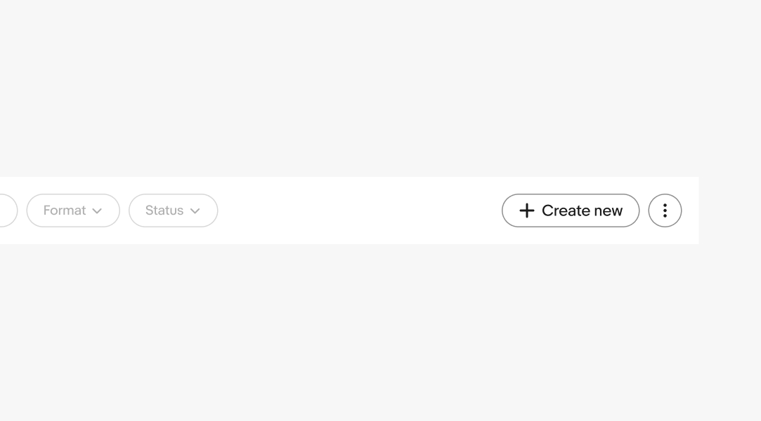
    Buttons are collapsed into an overflow button and filter menu as the overall width is reduced. The filter buttons collapse first before all action buttons are collapsed into an overflow.

    Small web

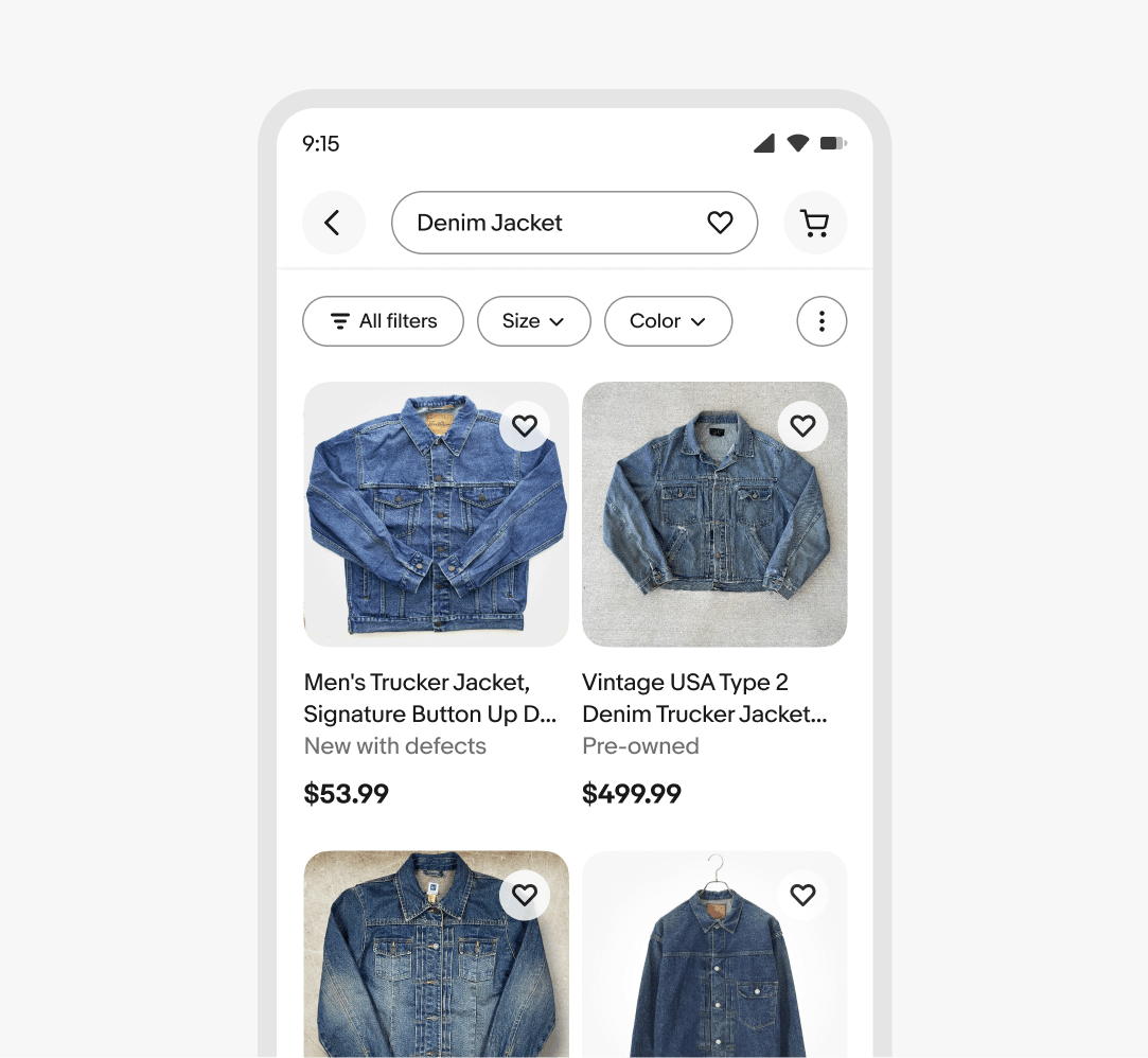
    On smaller screens, trailing buttons are collapsed into an overflow button and filter buttons are hidden.

    The trailing buttons collapse into an overflow first, followed by the filter buttons.

    Small native

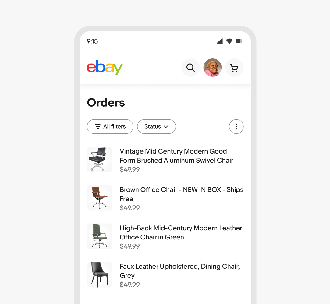
    If the trailing actions are present, the actions are collapsed into an overflow and the filter buttons are hidden on smaller screens, similar to the web behavior.

    If the trailing actions aren’t present, the filter buttons extend beyond the screen and the container becomes horizontally scrollable.

    Medium

    Filter and action group content remain visible as space permits. The action group will collapse into an overflow first, followed by the trailing filter buttons.

    Large

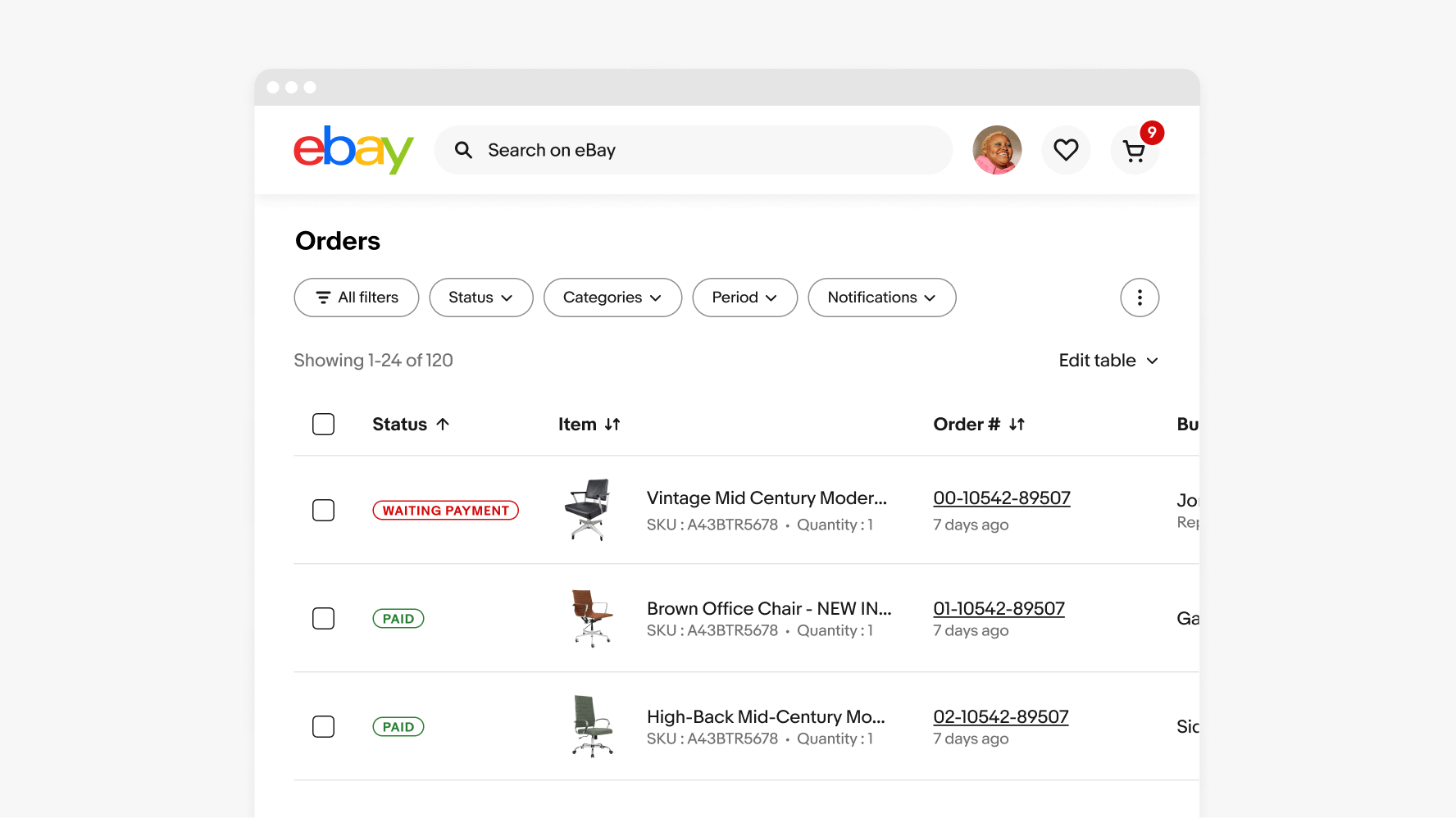
    Large screens surface up to the maximum number of content in each group as space permits.

    Non-stacking

    Content within the action bar remains on a single line.

    Don’t wrap content within the action bar.

    Selected position

    Do maintain each filter button’s original position as selections are made. For more details, see Quick filter.

    Don’t change the position of filters as selections are made.

    A filter bar diagram is shown with 3 elements numbered: 1. All filters action, 2. Action group, 3. Filter group.
    A filter group containing an ‘All filters’ button and dropdown filters.
    An action group containing a ‘Create new’ button, an ‘Add discount’ button, and an overflow icon button.
    A horizontal swiping gesture is shown on a filter group that is in mid-scroll.
    An order screen on the eBay mobile app with a filter group containing a search button, an ‘All filters’ button, a ‘Status’ dropdown filter, and an overflow button.
    An order screen on the eBay mobile app with a filter group containing a search button, an ‘All filters’ button, a ‘Status’ dropdown filter, and an overflow button.
    An order screen on a medium eBay screen with a filter group containing a search button, an ‘All filters’ button, a ‘Status’ dropdown filter, a ‘Categories’ dropdown filter, a ‘Period’ dropdown filter, a ‘Notifications’ dropdown filter, and an overflow button.
    An order screen on a large eBay screen with a filter group containing a search button, an ‘All filters’ button, a ‘Status’ dropdown filter, a ‘Categories’ dropdown filter, a ‘Period’ dropdown filter, a ‘Notifications’ dropdown filter, and an overflow button.
    A filter group placed on one line and spans across the mobile screen.
    A filter group placed on two lines.
    A filter group is shown containing a ‘Filters’ all filters selected action button with a counter of 2, a ‘Size’ dropdown button, a ‘$101 to $500’ selected dropdown filter, and a Color dropdown filter.
    A filter group is shown containing a ‘Filters’ all filters selected action button with a counter of 2, a ‘$101 to $500’ selected dropdown filter, a ‘Size’ dropdown button, and a Color dropdown filter.
    Three filter groups are shown with specs highlighted. The padding above and below the action groups is 16px. The padding between filters is 8px. There is a minimum of 48px space necessary between filters and the overflow button. The padding between the action group buttons is 8px.