Error states
Error states communicate when something has gone wrong and guide users toward recovery.

Error states communicate that something went wrong or is incorrect, and guide users to recovery. They should be clear, proportional to severity, and consistent across experiences.
Check out the Error Message GPT if you need help writing an error message.
Prevent errors first
The best designs eliminate conditions that cause errors before they happen. Remove invalid options or validate early so users can fix issues before they submit.
Be specific
Include exact values when you have them — character limits, amounts, timeframes. Vague messages like "something went wrong" or "file name is too long" force users to guess.
Calibrate tone to severity
Match the tone to the severity of the situation. Minor errors can be matter-of-fact. Severe errors like data loss, payment failure, or account restrictions call for calm, empathetic language. Acknowledge the impact and give users a path forward.
Communicate one error at a time
Consolidate multiple errors into a single message or grouped notice. Competing alerts cause users to miss critical information.
Lead with words, not images
Never rely on an illustration or icon alone to communicate an error. Copy must stand on its own for screen readers and low-bandwidth contexts.
Plan for unresolvable errors
When a user can't fix the issue themselves, give them a way forward — link to support, provide a contact number, or tell them what to expect next.

Page-level
Use for failures that block the entire page experience.
When an entire page or flow is impacted, the content area presents an error message aligned vertically near the top of the page. The error message explains the issue and provides a path forward to resolve the issue.
Examples
- Server is down or unavailable
- User doesn't have access to the page
- Content no longer exists or can't be loaded
- Account is restricted in a way that blocks all action on the page
- Session expired and the page requires authentication
- Security event requiring the user to verify identity before continuing

Section-level
Use for failures that affect a section of the page, while the rest of the page remains usable.
Components that fail to load content can present an error message within its container, like a card or dialog not loading correctly.
Examples
- A list, table, or set of results can’t be retrieved
- An action affecting the entire section fails, such as saving its settings
- A section can’t be displayed because required data is unavailable

Component-level
Use for component-level failures, appearing directly below the field that triggered the error.
An inline error message appears next to the element where the issue occurred, like an invalid form field value.
Examples
- Number input is out of range
- No selection was made for a mandatory dropdown
- Failed to upload a file
Text and icon
Most error messages use a simple text-icon lockup to keep the message direct and respectful. The icon also improves the visibility to those with color blindness.
The size of the font and icon scales according to the severity of the error – inline validation uses smaller text and icons while a section or page error uses larger sizes.

Text and illustration
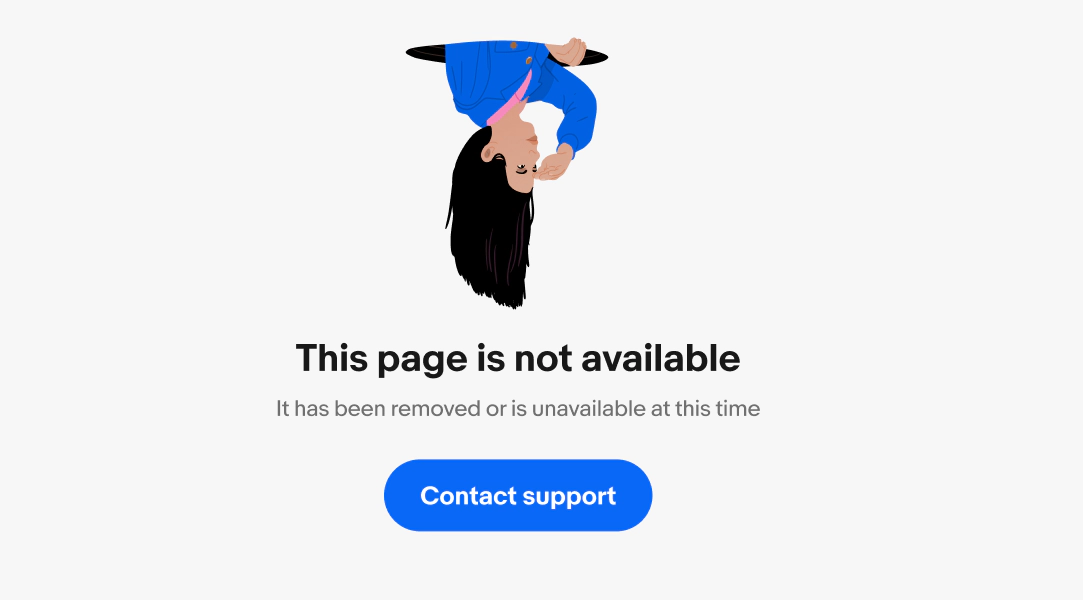
Illustrations are used sparingly in less-severe, full-page error states.
Error state illustrations are standardized across the experience for specific error types. These illustrations are neutral, calm, and add levity to low-stakes errors like a missing or broken page link.
Illustrations are never used for sensitive errors, like a declined payment or account lockout.
Find more information on the illustrations available and approval process in Our Illustrations.

Validation errors
A validation error occurs when an input value is invalid or doesn't meet requirements. It typically appears at the component level, close to the field that triggered it.
Formula:
[how to correct it]
- Lead with what needs to be corrected
- Include the reason only if it helps the user fix it faster
- Avoid generic messages like "invalid input" or technical language like "field validation failed”
- Keep it to one sentence

System failures
A system failure occurs when the product fails to complete a request because of a temporary technical issue — a connectivity problem, server outage, or application error.
Formula:
[what failed] + [retry or wait] + [alternative if available]
- Take responsibility using "we"
- Tell the user what happened and whether retrying will help
- If retrying won't resolve it, offer an alternative
- Avoid technical details, error codes, or language that suggests the problem is permanent

Process interruptions
The user's action fails mid-flow because it couldn’t be validated against a business rule, such as declined payment method or expired promotion. These errors often involve money or effort, so take responsibility and avoid language that feels like blame.
Formula:
[what failed] + [why (optional)] + [how to continue]
- Be direct but empathetic. Acknowledge the impact but don’t dwell on it
- Offer a clear path forward

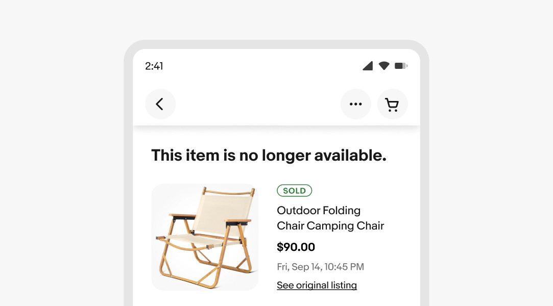
Unavailable content errors
Content, data, or a resource that should exist can't be found, has been removed, or failed to load. This covers broken API calls, deleted listings, expired data, or failed fetches.
This is different from empty state, where the user has no expectation of content (e.g. first time using a feature). Unavailable content errors happen when the user expected something to be there and it's not.
It's also different from a system error because the system is working, but the content isn't there.
Formula:
[what's unavailable] + [reason (optional)] + [alternative (optional)]
- Make it clear what isn't available
- Include a reason when it's known and relevant
- Offer an alternative action when possible
- Avoid technical language like "404" unless it's needed for support
Device limitations
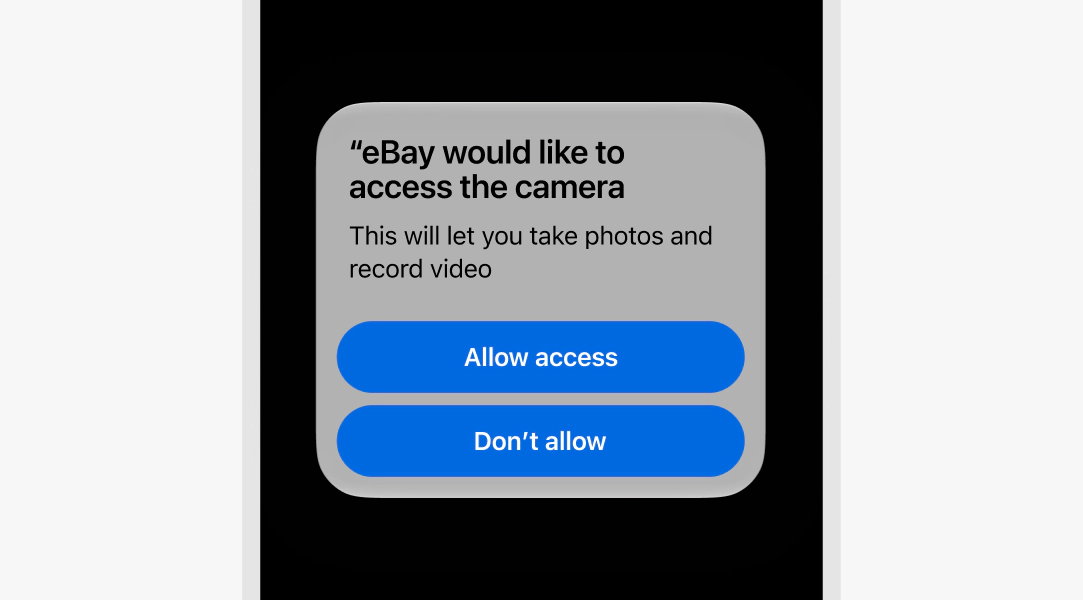
A feature is missing, unsupported, or can't run because of device-level limitations. For example, no camera or microphone access, insufficient storage, outdated OS, or unavailable hardware.
Formula:
[what's unavailable] + [why] + [fix or path forward]
- Use device-native language
- Explain what's missing and what the user can do (e.g., grant access, free up space, or use an alternative)
- Leverage native device components where possible
Helper text
Error messages appear below the field when the input doesn't meet the required format or conditions. The error message replaces any existing helper text. This keeps the error lightweight, contextual, and tied to the element that needs correction.
Keep the tone neutral, don’t blame or scare the user. Clearly inform users the requirements so they know how to fix it.
Learn more about formatting Input error message.

Snackbar
Use a snackbar for lightweight, transient messages for minor errors like a message failing to send. They inform users about a failed process and provide an option to retry without interrupting their flow.
Do not use for critical or important messages.
Inform the user what just happened in concise, plain language. Use past tense and passive voice to focus on the outcome, not who caused it.
Learn more about formatting Snackbar.

Alert notices
Alert notices present error messages in a horizontal container above a group, section, or page. They are more visually prominent without blocking or interrupting the user.
Use alert notices to group multiple errors in a form. This indicates a process is blocked but correctable, or a module is invalid.
Learn more about formatting Alert notice.

Alert dialog
An alert dialog is blocking and requires explicit user acknowledgement before proceeding. They’re highly interruptive and are reserved for critical, high-impact errors like transaction failures, irreversible data deletion, and potentially compromised account activity.
Learn more about formatting Alert dialog.

Full page
A full-page error state is reserved for critical service outages, incorrect URLs, or system failures. They clearly communicate the issue and provide space for users to recover.
Full-page errors should always provide next steps when possible, even if contacting support is the only option.
Respect people’s agency
Guide, don’t force.
Support people with clear options and helpful defaults, but always let them decide. Don’t force actions or trick them into decisions.
Use a single column
A single path is easier to follow than multiple.
A single-column layout aligns with how people naturally read. It’s easier to scan, reduces the likelihood of skipping fields, and helps avoid mistakes.
Voice and tone
Do phrase error messages neutrally. For more guidance, refer to the apologies and empathy section of our writing guidelines.

Don’t use language that blames or patronizes.

Message length
Do keep messages concise and human.

Don’t use technical jargon or present error codes that the typical user wouldn’t understand.

Next steps
Do provide resolution or recovery steps where possible.

Don’t leave the user at a dead end.

Graphics
It has been removed or is unavailable at this time

We could not verify this account

Presentation
Do match error message components with the error severity.

Don’t block a user with an alert dialog for minor issues and don’t present a critical error inside a snackbar.
