File upload
v1.0
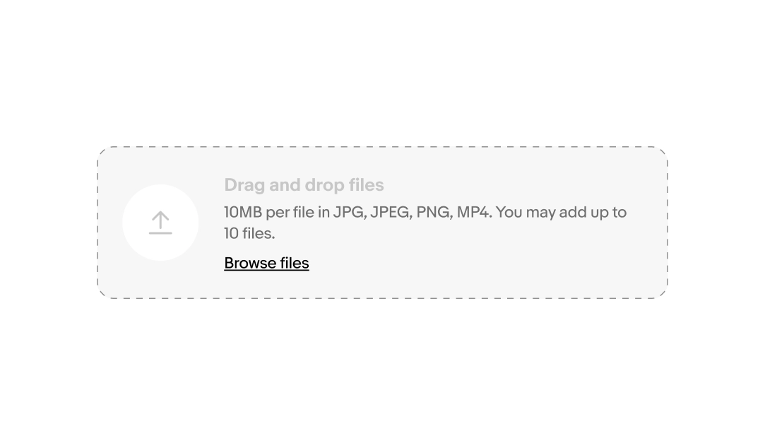
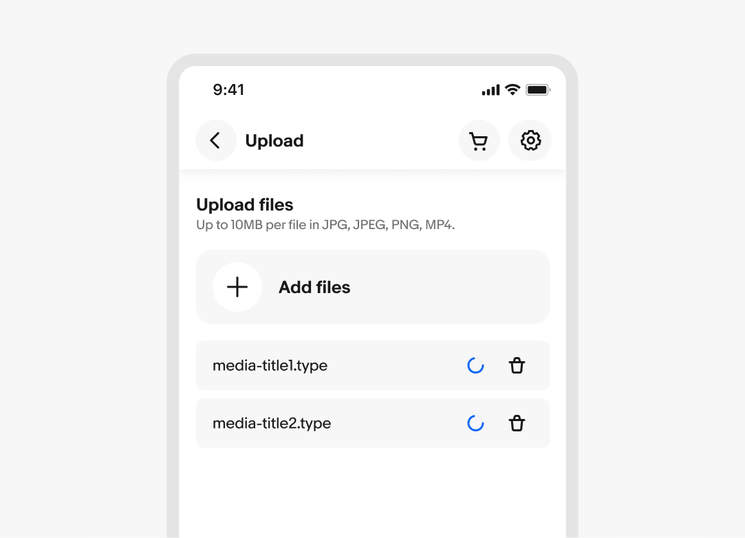
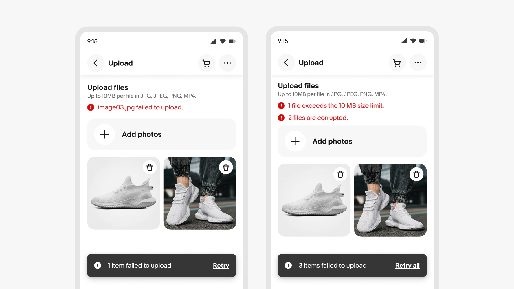
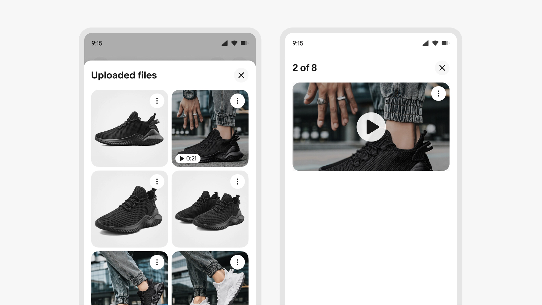
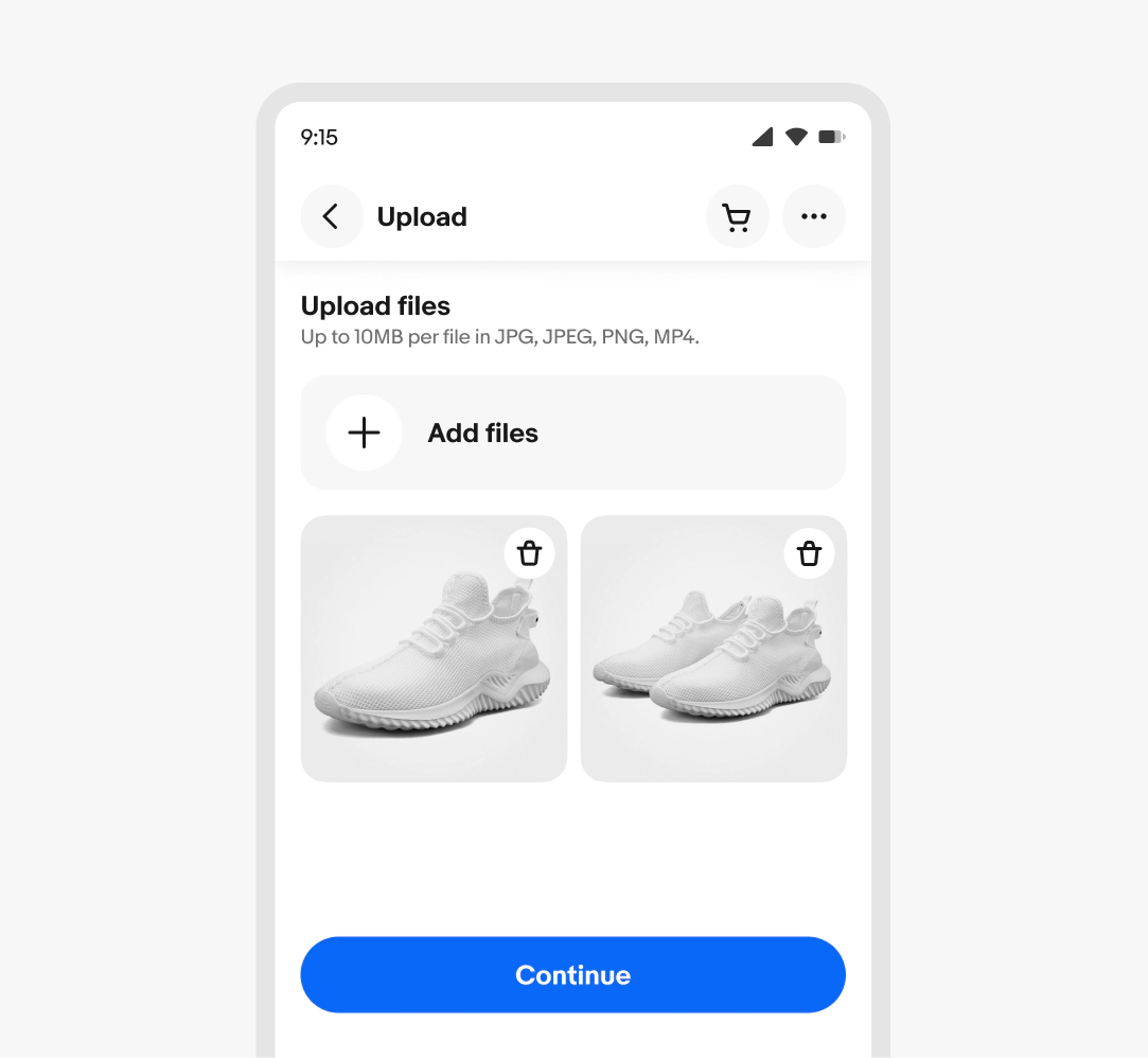
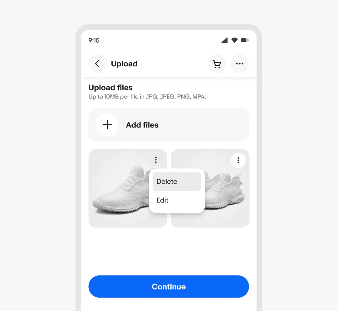
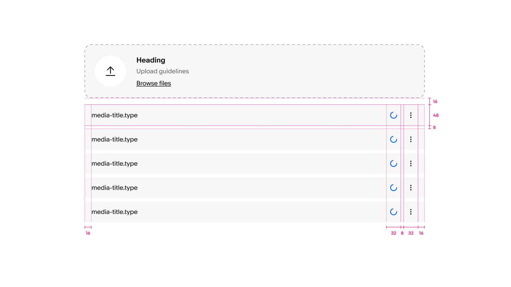
File upload allows users to upload one or more files to a location.
- CSS
- Marko
- React

Consistent
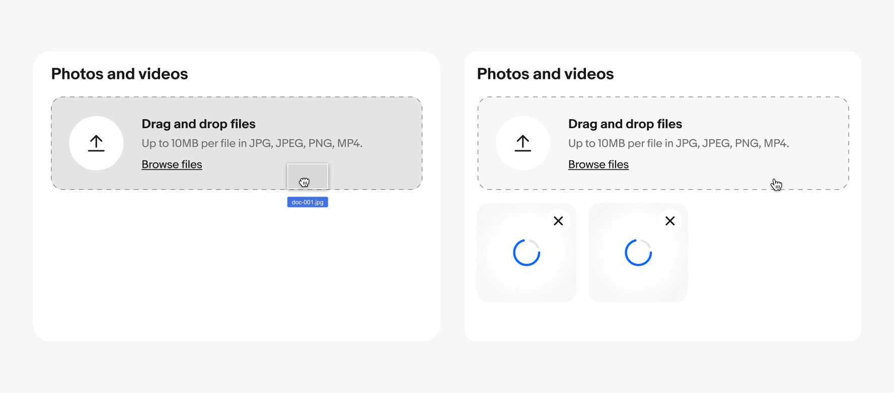
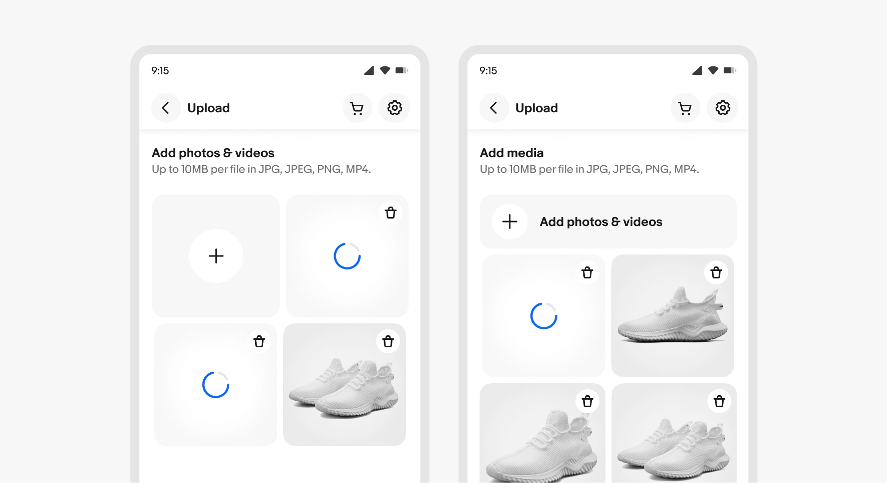
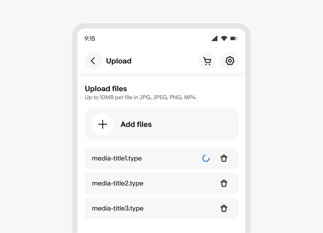
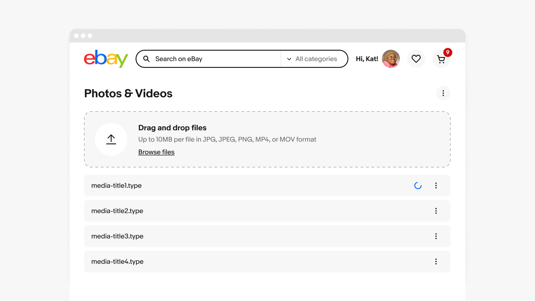
File upload ensures that users encounter the same interface and process whether they are uploading images, videos, or documents, promoting ease of use and reducing confusion across different parts of the system.
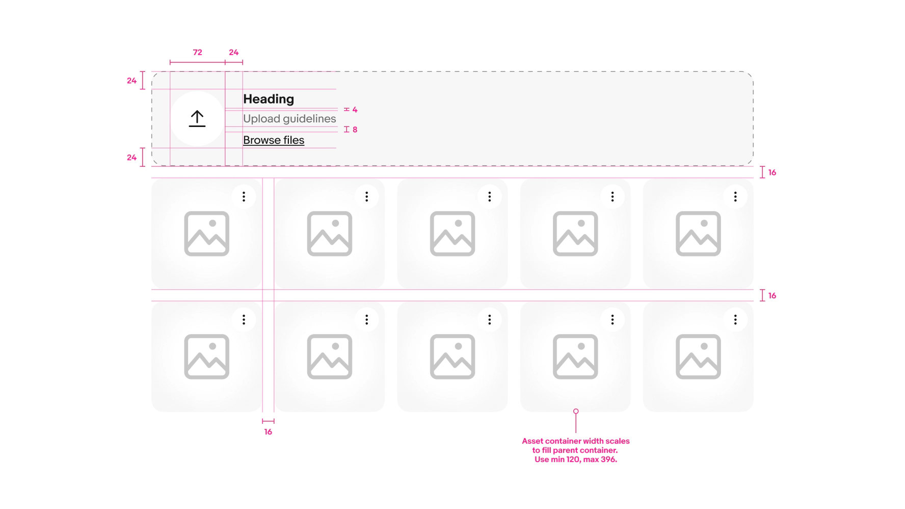
Compact
The design supports multiple file uploads and accommodates for properties like file name and description—all without overcrowding the interface or compromising usability.
Recognizable
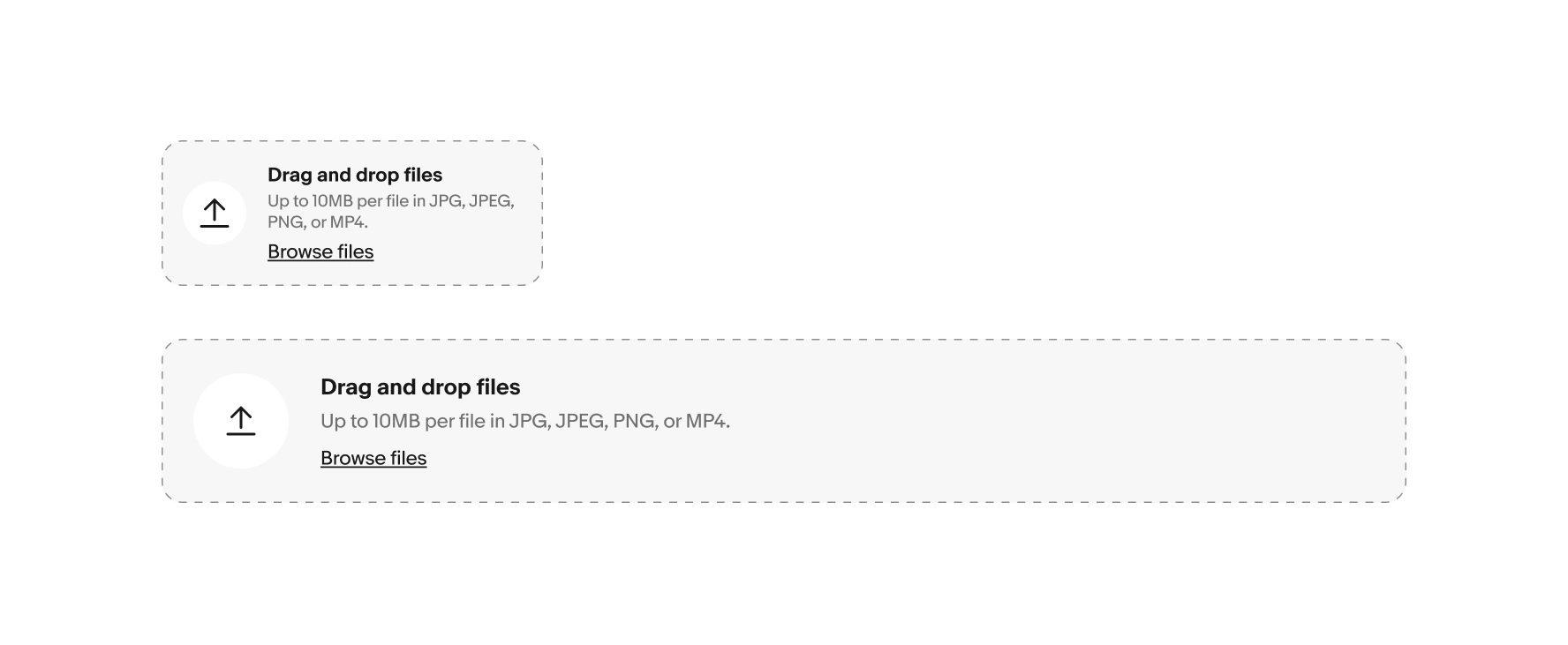
File upload leverages the familiar visual cues commonly found in industry best practices and are widely recognized across various platforms and devices. The design helps users swiftly locate the upload area, creating a familiar and recognizable experience.