Empty states
Empty states are screens or containers with no content to display.

Empty states occur when a page, section, or container has no content to display. Empty states provide context to your users about why the space is empty and guide users toward their next action.
Empty states transform potentially confusing moments into opportunities for education, engagement, and conversion. They help users understand the system, reduce friction, and take meaningful next steps.
When to use
- User is encountering a page or flow for the first time
- User has cleared all data
- A search, filter, or query returned zero results
- Data isn't available or no longer exists
When not to use
- An error has occurred
Informative
Empty states clearly communicate information about the system status. A user should understand what information isn’t present and why.
Guiding
Empty states can help encourage users to discover unused features or engage with a new experience.
Contextual
Empty states are directly related to data or content the user is trying to retrieve.
Full page
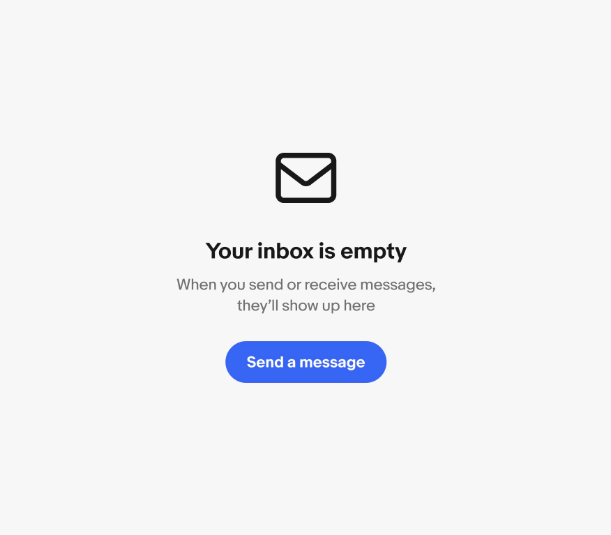
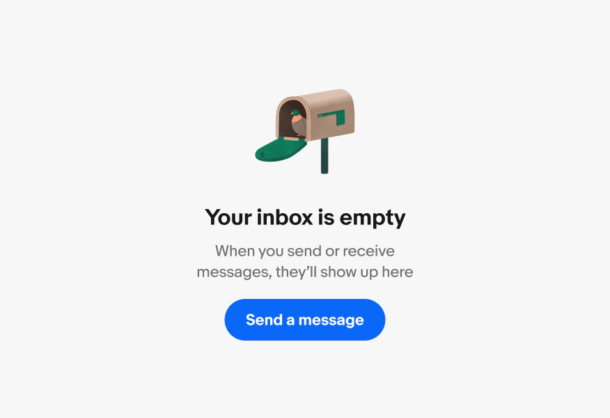
Full page empty states represent data that occupy a full page. The empty state content is vertically aligned to the top of the page.
When using full page empty states, keep page-level navigation to allow the user to leave the experience or proceed to other spaces.

Inline
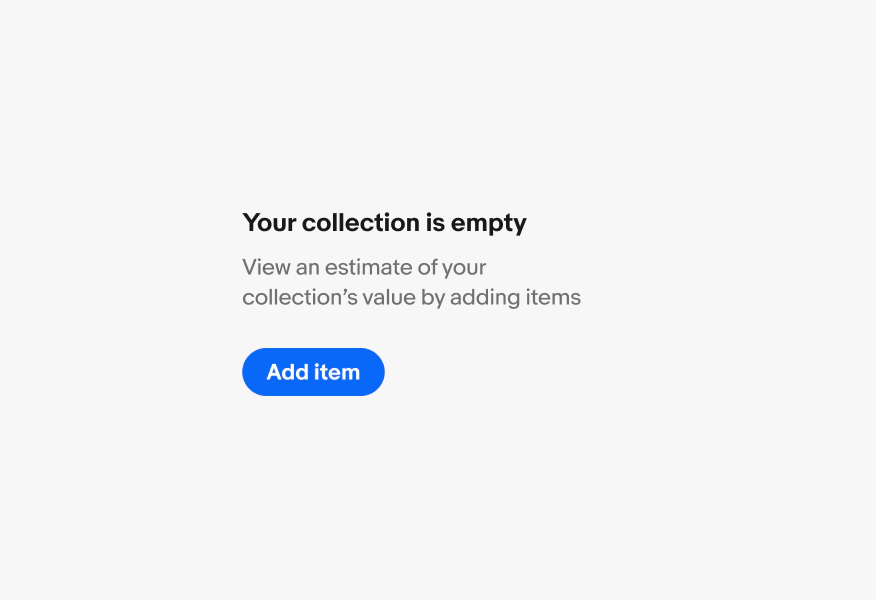
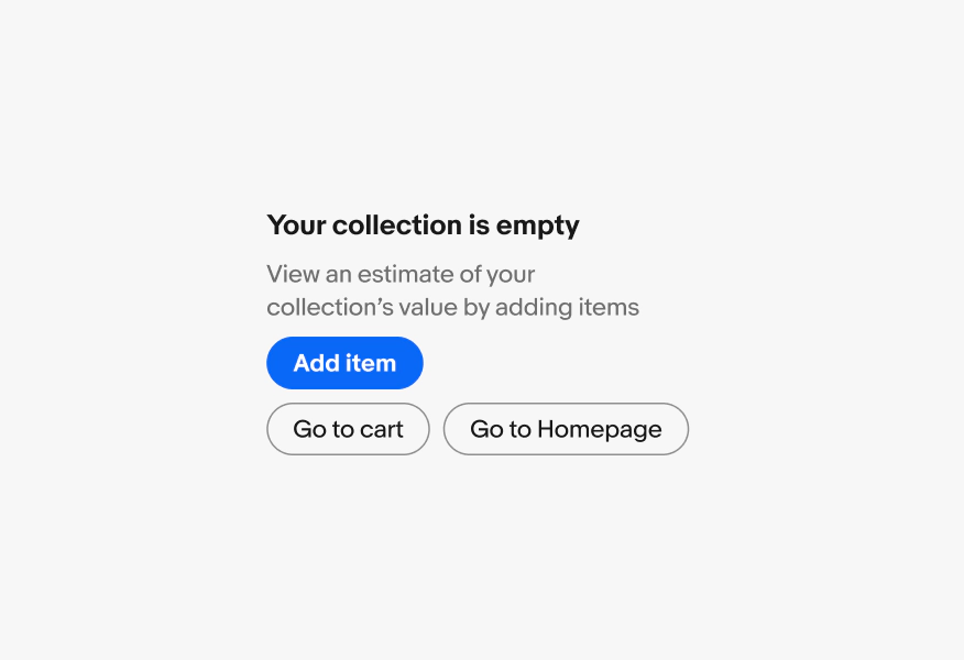
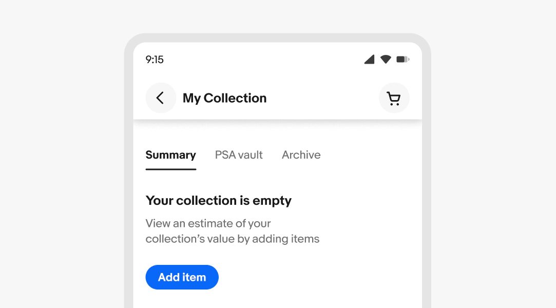
When showing module-based empty states that are small and/or near other prominent visuals, use text only. Most of the time, this layout will be left aligned.

Component
Some components include a starting or empty state. If using a component with a default empty state, don’t add additional empty state elements.

First use
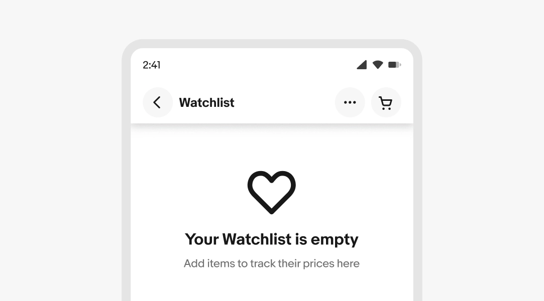
Appears when a user encounters a feature for the first time and hasn’t created any content yet. This is an opportunity to educate and encourage adoption.
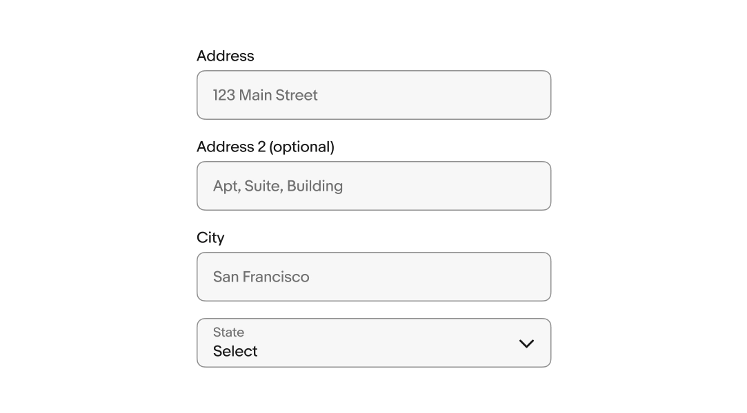
Encourage the first step with clear actions, such as “Add your address” or “Start a new search.”

User cleared
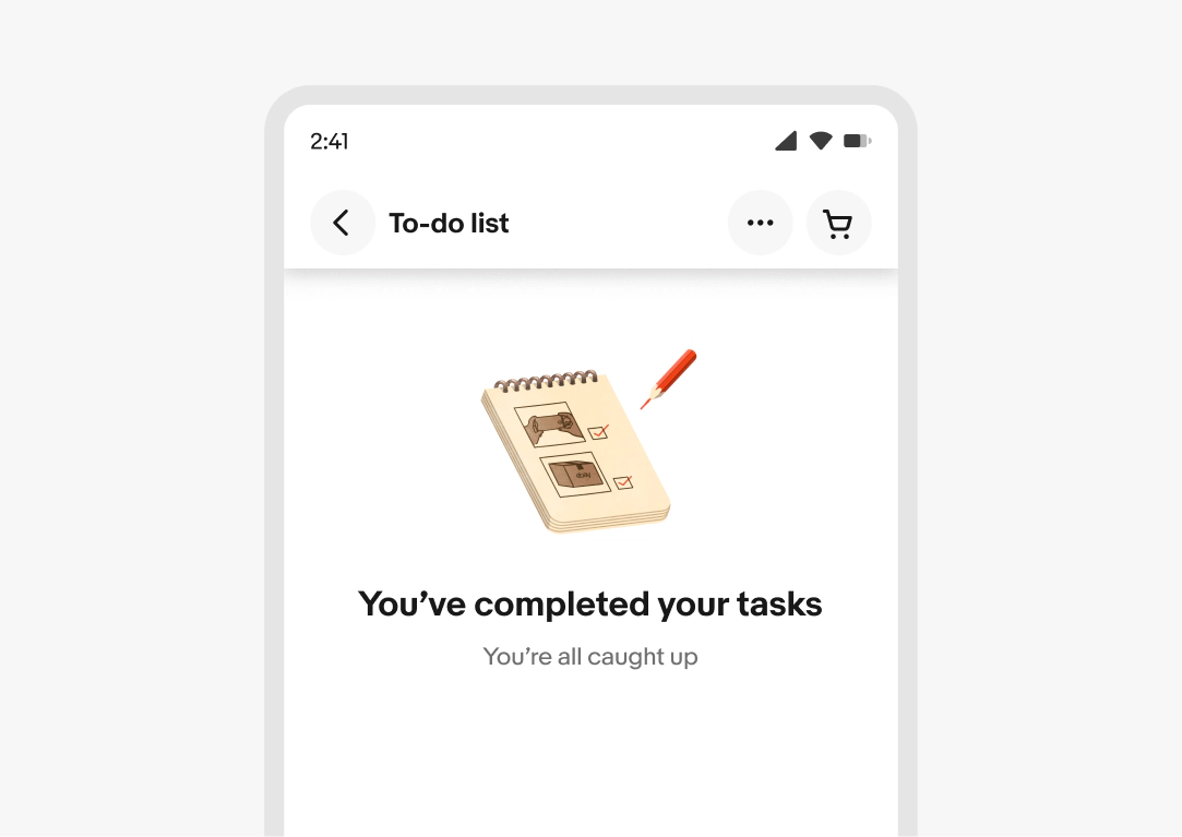
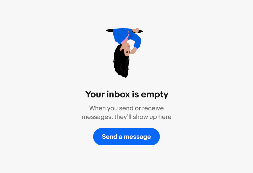
The user had content but intentionally removed all items. Acknowledge what happened without making it feel like an error. Consider adding delight to the experience with expressive colors and motion.

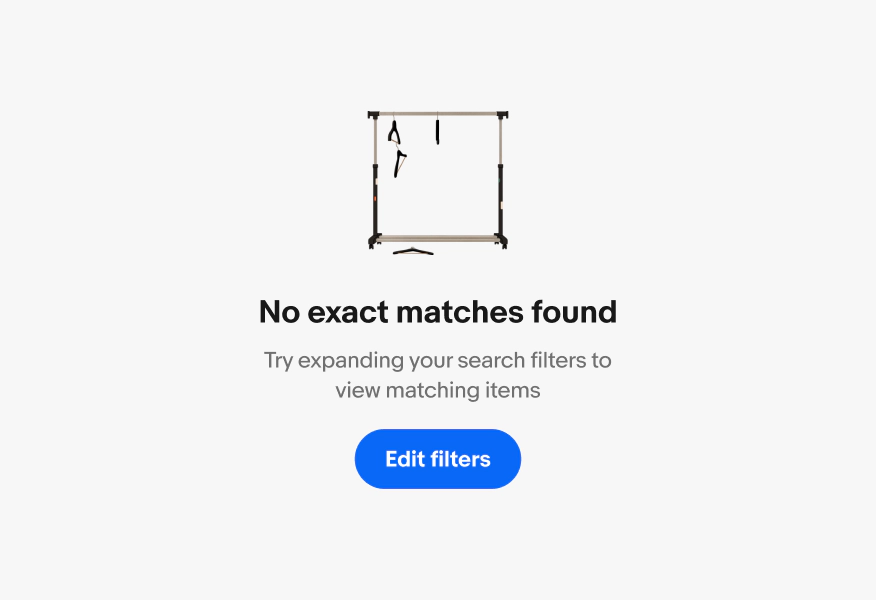
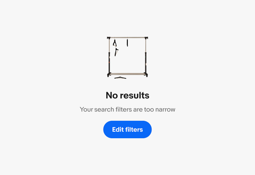
No results
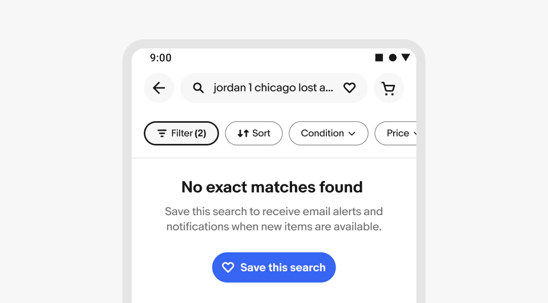
A search, filter, or query returned zero results. Explain why and offer a next step, such as adjusting filters or saving the search.

Graphic elements
A visual element that reinforces the empty state’s meaning. Use illustrations when it adds to the comprehension of the message, and use icons for simpler contexts. Not all empty states will require a graphic element

Illustration
Choose an illustration that literally represents the messaging. For example, use a bag illustration for an empty cart rather than a broken car. Find the Figma components with color variations and URLs for empty states in the illustration library.
Please note: using illustrations in your empty state designs requires approval from the OX team by filling out the Evo illustration approval form.

Icon
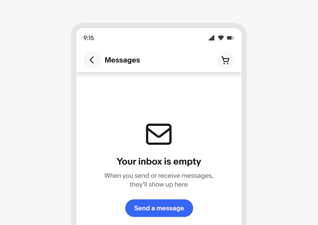
Icons can be used to add visual interest and information about the type of empty state. For data/list views, icons may be more appropriate than full illustrations
Headline
Required for full page and inline messages. The headline clearly and concisely explains why the space is empty.
- Use sentence case
- No ending punctuation
- Keep to 40–60 characters
Body text/description
Required. The body provides additional context by explaining the feature or what the user can do next. Don't restate the headline.
- Use sentence case
- No ending punctuation
- Keep to 1 sentence or 120–180 characters
Primary action (CTA)
Optional. The CTA provides the most direct path out of the empty state. Use verbs to make outcome immediately clear.
- Use sentence case
- No ending punctuation
- Use a [verb] [noun] or [verb] [article] [noun] pattern
- Keep to 2–4 words
Popover
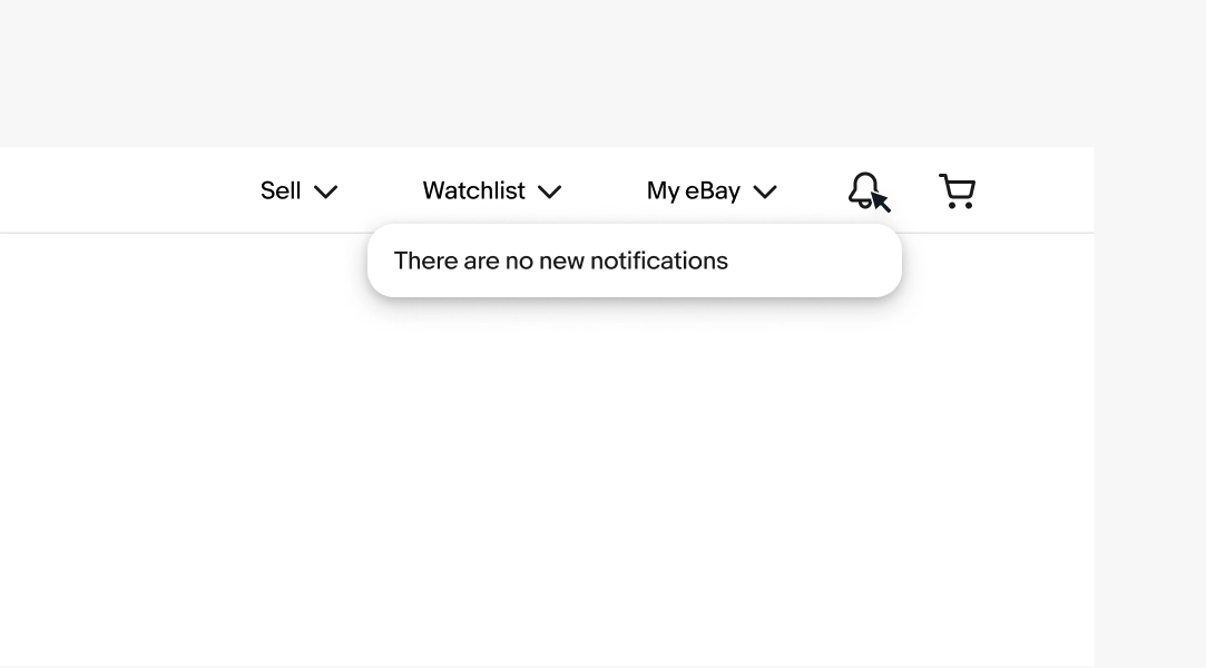
When displaying an empty state from a menu item, use a popover component to communicate the empty state.
View Popover

Spacing and layout
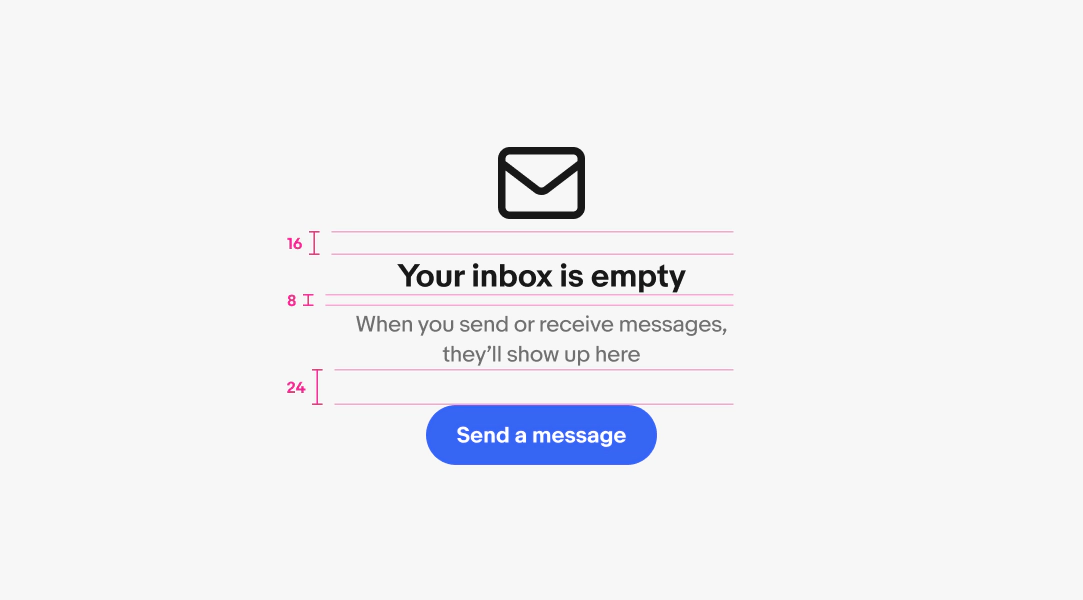
Spacing helps create a clear visual relationship between the elements within an empty state and improves readability and scannability.

Typography hierarchy
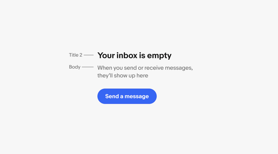
The headline should communicate the primary message quickly and be the most visually prominent element, while the supporting text provides additional context in a smaller, secondary style.

We have a set of three illustrations available for use with empty states. These are the only illustrations that should be used for null state patterns. Find the Figma components with color variations and URLs for null states in the illustration library.
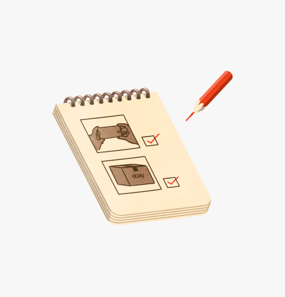
To do list
Use for user cleared empty states.

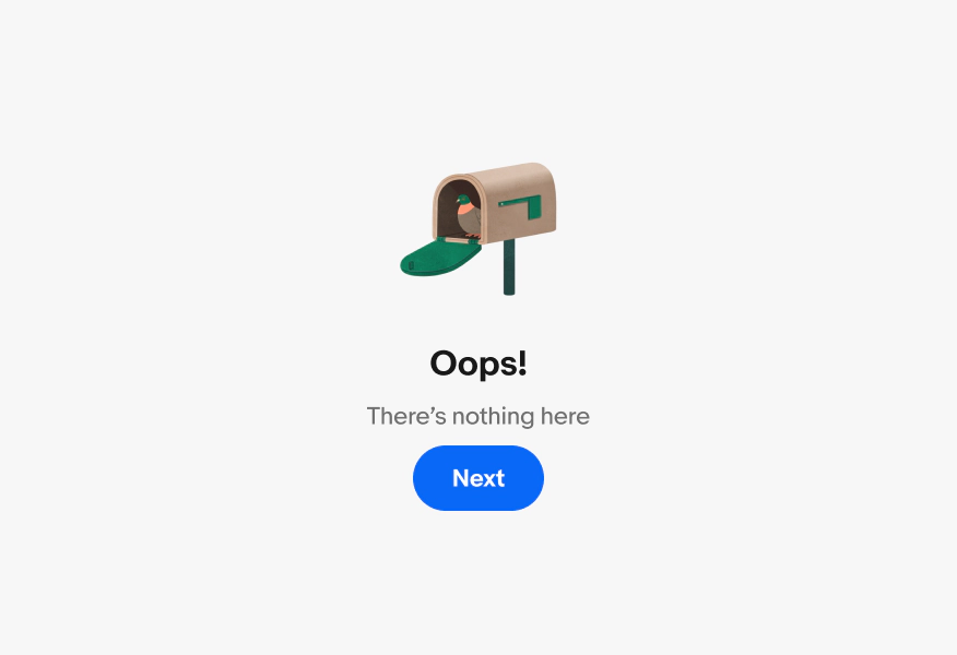
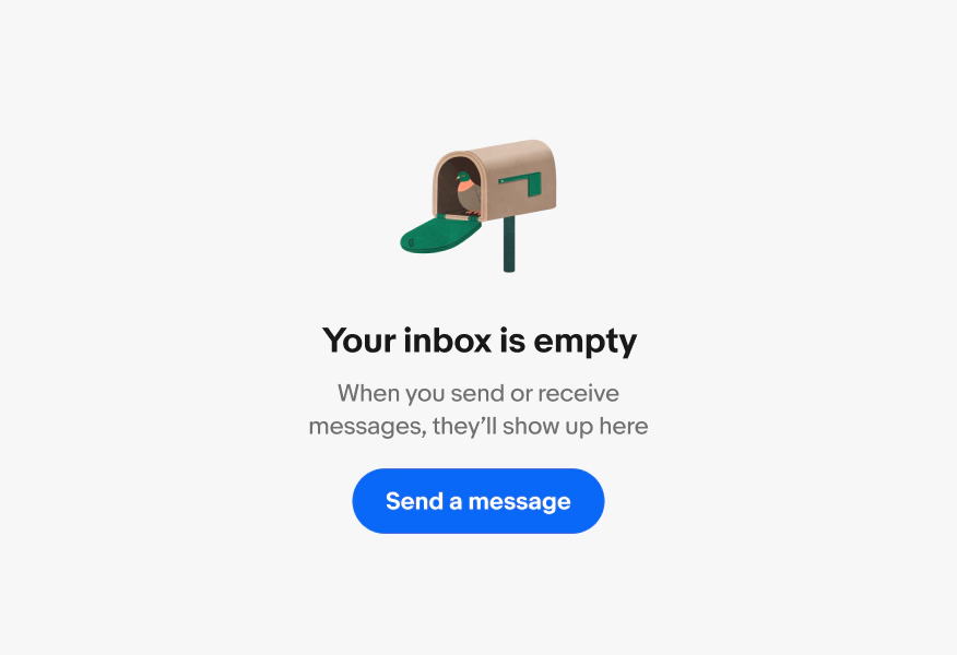
Mailbox
Use for empty mailboxes and messages.

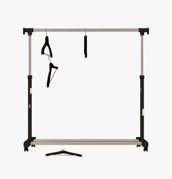
Clothing rack
Use for no results.
Content
Do use supportive copy to inform users of the empty state.

Don’t use overly-apologetic language or blame the user.

Do use clear, descriptive language.

Don’t use vague language.

Discovery
Do encourage engagement and discovery with a clear CTA.

Don’t include an error states with no apparent resolution or next steps or too many possible actions.

Graphic elements
Do use rich graphic elements like illustrations sparingly and intentionally.

Don’t use illustrations that aren’t clearly related to the message or distract from the page’s purpose.