Tip overview
Tooltips and tourtips are the two tip types that surface contextual information anchored to a UI element. They serve different goals and audiences.
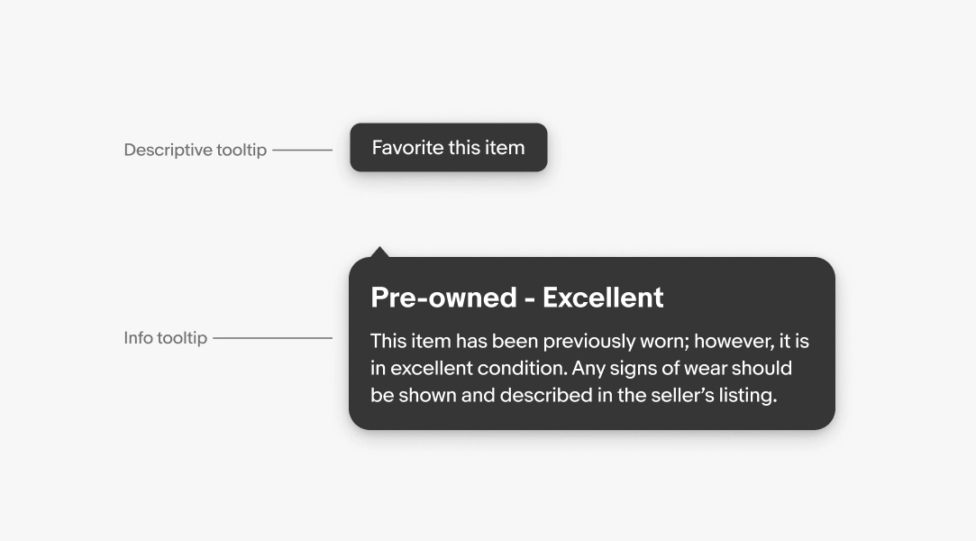
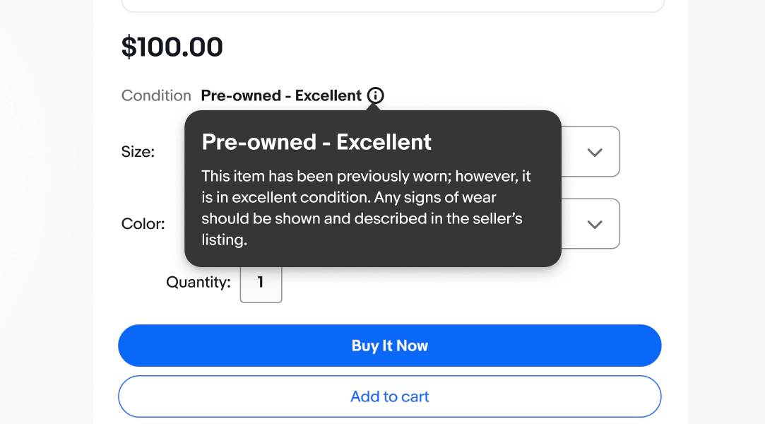
Tooltip
Tooltips reveal a label or additional information when a user interacts with a UI element. They are explicitly triggered and persist until dismissed.
Tooltips follow two semantic messaging structures:
- Descriptive
- Info
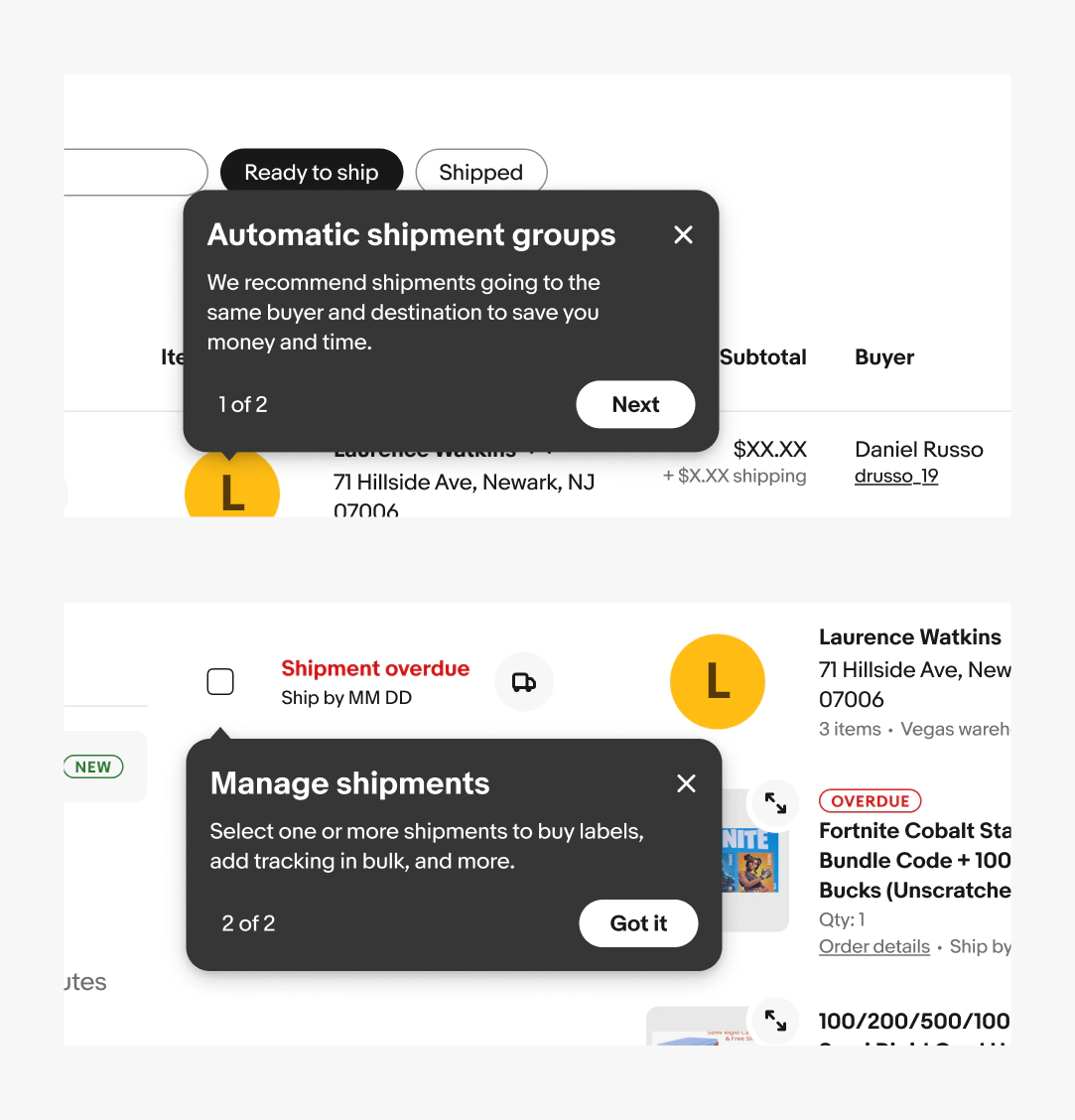
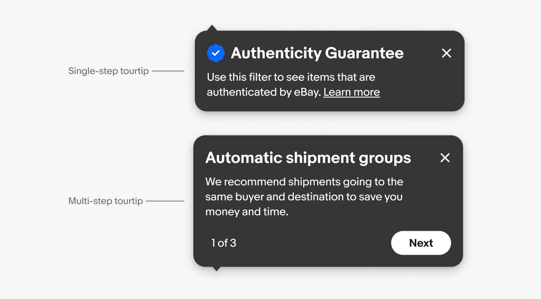
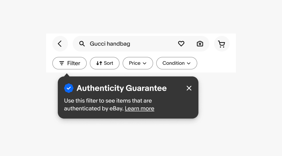
Tourtip
Tourtips are implicitly triggered and temporary. Use them sparingly, only when an interactive guide is needed to explain new or complex features.
Tourtips follow two semantic messaging structures:
- Single-step
- Multi-step
Descriptive tooltip
Clarifies a UI element that doesn't have a clear label.
Examples:
- Icon buttons without a text label
- Abbreviated or truncated UI text
- Datapoint on a graph
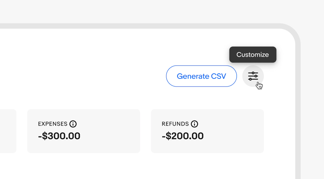
Info tooltip
Provides secondary, helpful context such as jargon or technical terms, without requiring users to leave their current page.
Examples:
- Jargon or technical terms
- Secondary details about a feature or setting
Single-step tourtips
Introduces a new feature or communicate a timely, one-off update.
Examples:
- New filter or sort option
- Limited-time promotion or program update
Multi-step tourtips
When a feature or update is complex and requires more than one piece of context to understand. Each step communicates only one idea or action.
Examples:
- Onboarding to a multi-part workflow
- Explaining a new, complex feature with several components