Skip to main contenteBay Playbook
  • Get started
  • Foundations
  • Design system
  • Expressions
  • Resources
  • Articles

Design system

  • Overview
    • Design system definitions
    • Overview
    • Theming
    • Color
    • Dimension
    • Spacing
    • Typography
    • Breakpoints
    • Shadow
    • Shape
    • Opacity
    • Motion
    • Overview
    • Status
    • Accordion
    • Action bar
      • Overview
      • Inline notice
      • Page notice
      • Section notice
    • Avatar
    • Badge
    • Banner
    • Breadcrumb
      • Overview
      • CTA button
      • Icon button
      • Link button
    • Calendar
    • Card
    • Carousel
    • CCD
      • Overview
      • Filter chip
      • Input chip
      • Graphs
      • Metrics
      • Overview
      • Alert
    • Divider
    • Education notice
    • EEK rating and range
    • Expansion
      • Overview
      • Checkbox
      • Combobox
      • Date field
      • Dropdown
      • Numeric stepper
      • Password
      • Phone number
      • Radio button
      • Select list
      • Switch
      • Text area
      • Text field
    • Item tile
    • List row
      • Overview
      • Expressive loader
      • Skeleton loader
    • Media container
      • Top navigation bar
    • Pagination
    • Panel
    • Popover
    • Progress stepper
    • Search field
    • Section header
    • Segmented button
      • Overview
      • Context sheet
      • Focus sheet
    • Signal
    • Snackbar
    • State layer
    • Tab
    • Table
      • Overview
      • Tooltip
      • Tourtip
    • Toggle button group
    • Video player
    • Overview
    • Bulk editing
    • Empty states
    • Filtering
    • Uploading files
      • Overview
      • Text link

Alert dialog

v3.0

Alert dialogs are highly interruptive modal dialogs that present critical application-level information. They require an explicit decision from the user before dismissing.
Stylized graphic of a set of dialogs.
Alert dialogv3.0

On this page

  • Anatomy
  • Properties
  • Behavior
  • Screen sizes
  • Best practices
  • Specs

Anatomy

Properties

Behavior

Screen sizes

Best practices

Specs

PreviousDialog: OverviewNextDivider
Things.People.Love.
  • Get started
  • Foundations
  • Design system
  • Expressions
  • Resources
  • Articles
  • About eBay Design
  • Careers
  • Press
  • Privacy policy
© 2026 eBay. All rights reserved.

eBay Evo, the eBay trademark, and the eBay logo are the intellectual property of eBay Inc.

    1. Container
    2. Header
    3. Body
    4. Button

    Title

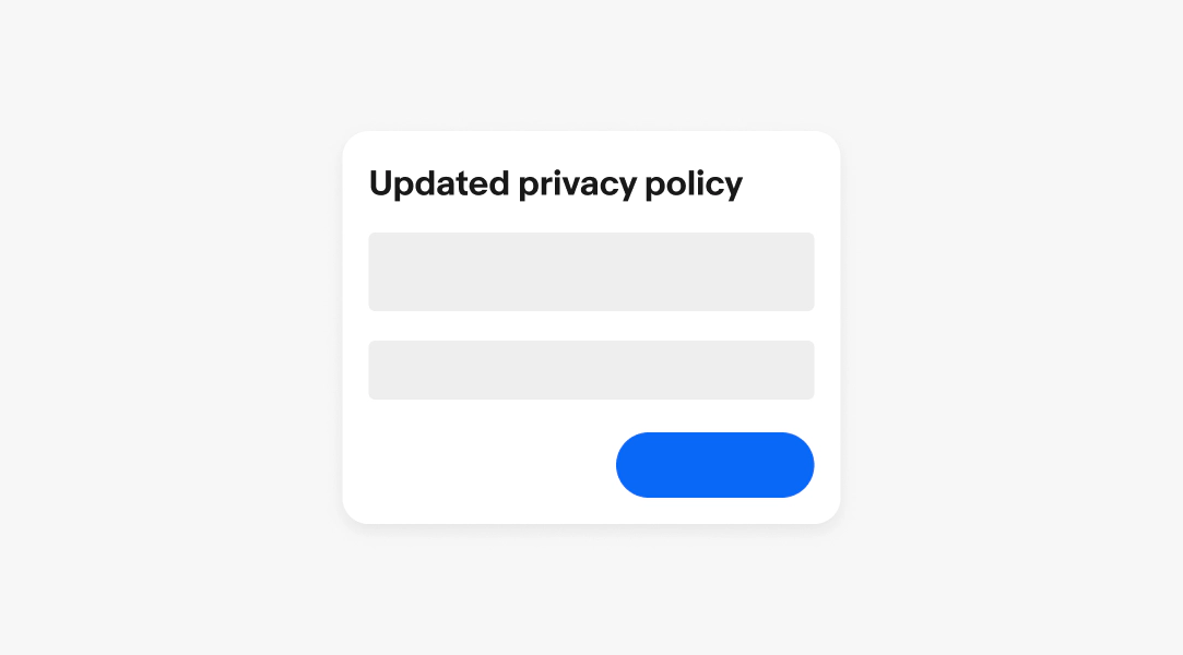
    The title is required and quickly informs users the issue or situation. A strong title uses direct, specific language and lead with the key message or decision point.

    • Use sentence case
    • Keep to 1 line
    • Don’t use ending punctuation, unless it’s a proper sentence like a question
    • Avoid generic titles like "Error" or "Alert"
    Body

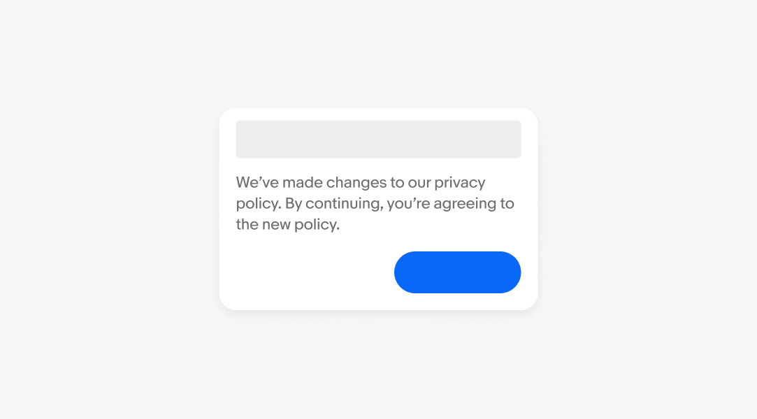
    The body is required and provides additional context about the action the user is being asked to take. A strong body clearly states what happened, why it matters, and explains the impact or consequence of the action.

    • Keep to 1-3 sentences
    • Avoid repeating the header
    • Avoid technical jargon unless audience is technical
    Button

    The button is required and is the only way to dismiss the alert dialog. The label defaults to “Okay” but can be updated to other confirmative strings where applicable, like “Accept” or “Got it”.

    • Use sentence case
    • Keep between 1-3 words

    See Buttons for more details on visual hierarchy and writing guidance.
    Scrim

    The scrim is a semi-transparent overlay that focuses attention on the dialog. The scrim isn’t interactive and doesn’t dismiss the dialog.

    Presentation

    Alert dialogs can appear at any time without notice. Because of this, they must be used sparingly and with heavy consideration. The dialog is aligned in the center of the screen and enter/exit using a quick fade animation.
    Button placement

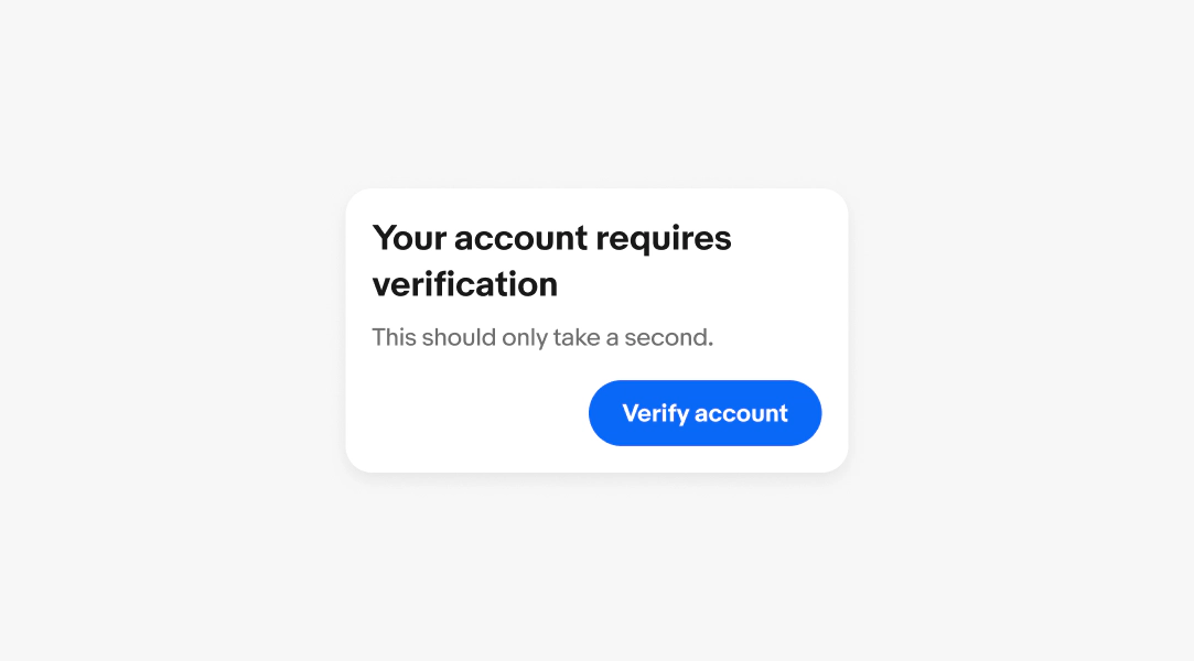
    The alert dialog button is positioned along the trailing edge of the dialog container below the body content.
    Width & height

    Alert dialogs are a fixed width and have a max height of 400px.
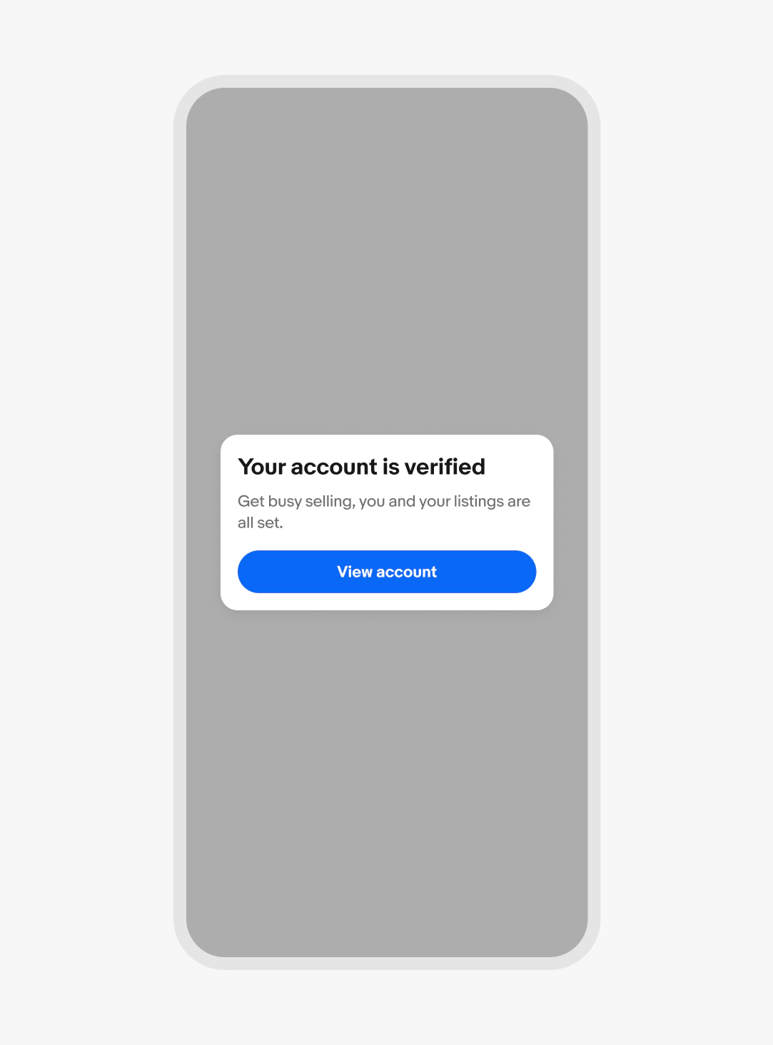
    Small screen

    Alert dialogs on small screens are centered.
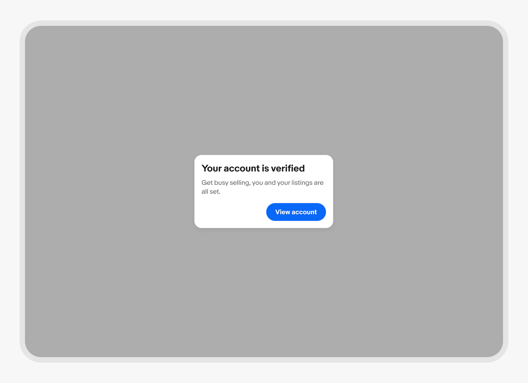
    Large screen

    Alert dialogs on large screens are centered as well.
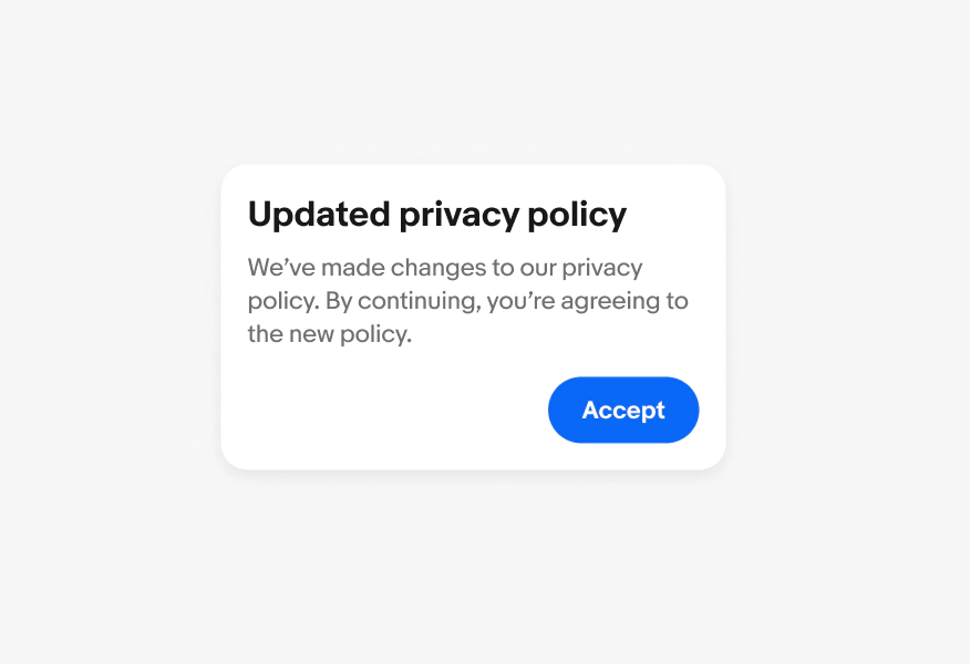
    Scrolling

    Alert dialog content doesn’t scroll.
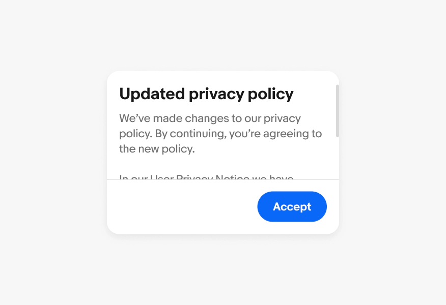
    Don’t pack alert dialogs with content that would cause it to flex vertically or scroll.
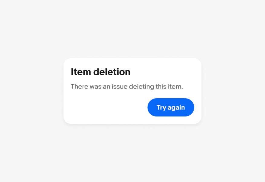
    Critical messaging

    Alert dialogs are reserved for critical information.
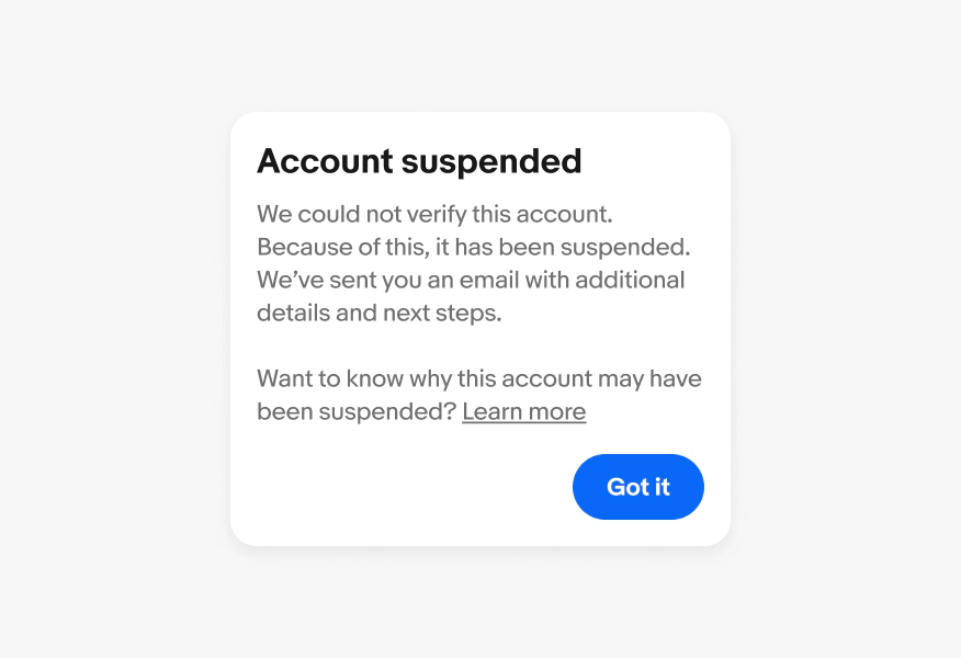
    Don’t use alert dialogs for confirmation of an action or any other non-critical information. Use a confirmation dialog or snackbar instead.
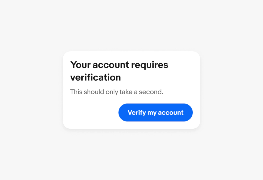
    Actions

    Alert dialogs always have a confirming action.
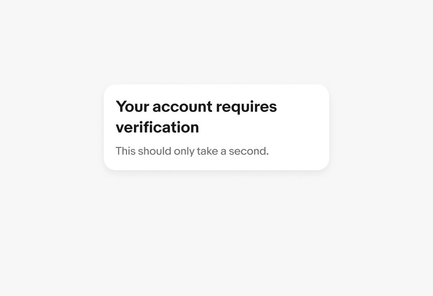
    Don’t have an alert dialogs without a confirming action.
    Confirm dialog
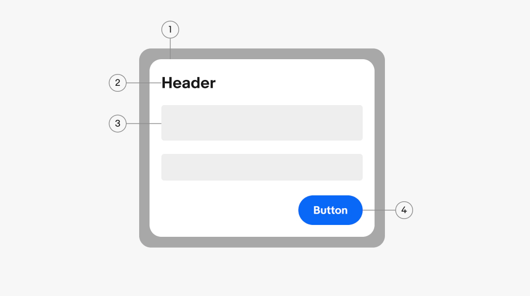
    Visual anatomy of a dialog showing 1. The dialog container, 2. The dialog header toolbar, 3. the dialog content body, and 4. the dialog footer actions
    A dialog with the Title "Updated privacy policy" above shapes representing the body content and footer actions
    A dialog with text in the body content area between shapes representing the toolbar and footer actions
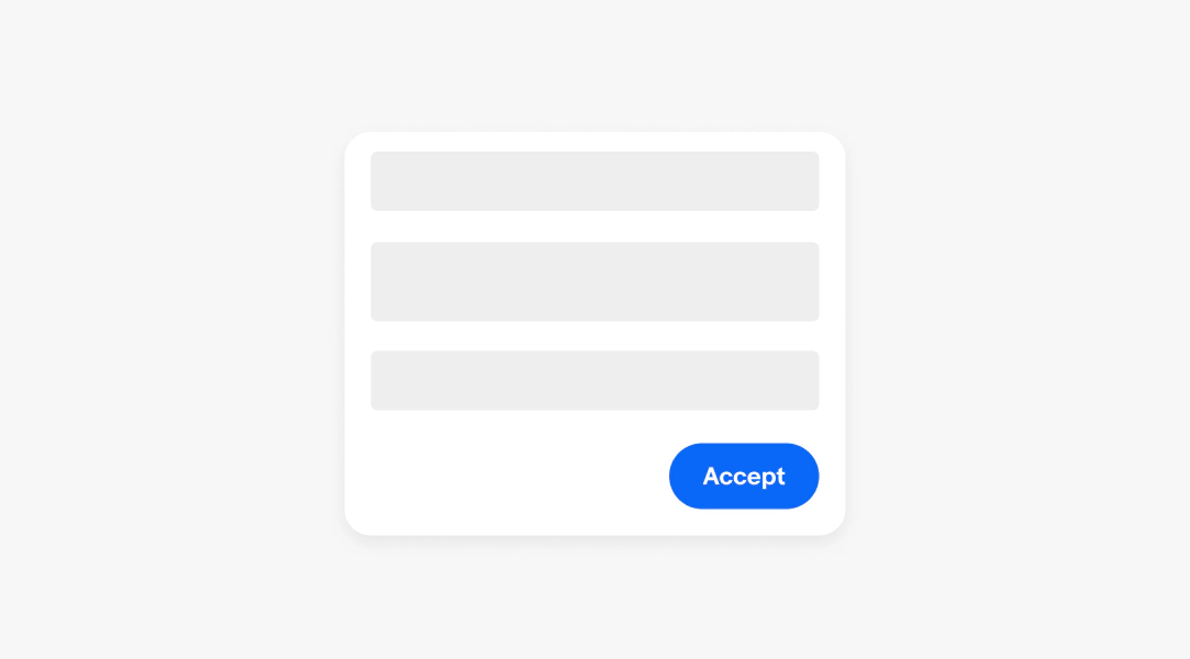
    A dialog with a button in the footer area titled "Accept" below shapes representing the header toolbar and body content area.
    Dialog over a scrim that darkens and separates the dialog from the elements behind it.
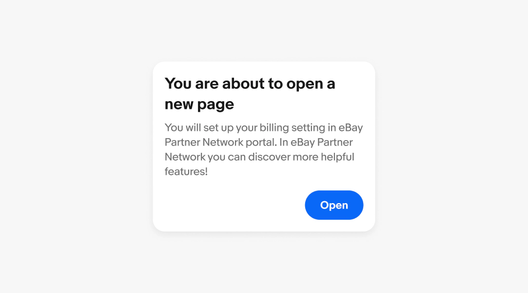
    Alert dialog box with a title of "you are about to open a new page", a body of "you will set up your billing setting in eBay Partner Network portal. In eBay Partner Network you can discover more helpful features!" and "open" button.
    Button positioned along the trailing edge of the dialog box reading, "verify account".
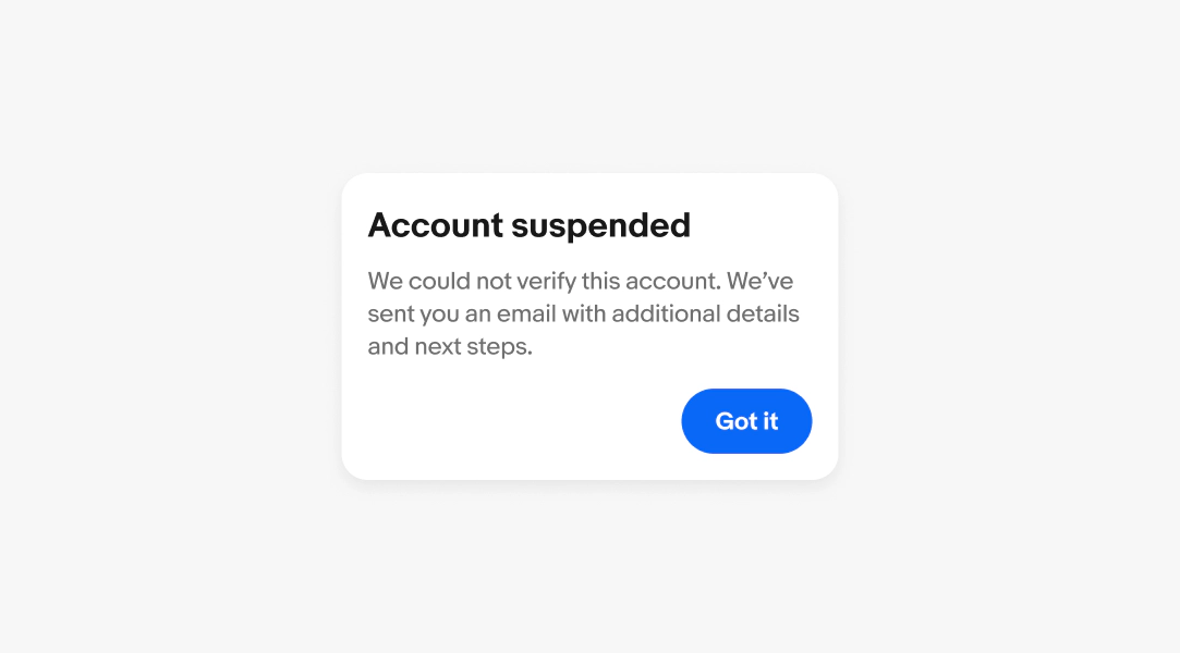
    Alert dialog box with a title of "Account suspended", a body of "We could not verify this account. We’ve sent you an email with additional details and next steps." and "got it" button.
    Alert dialog centered on small screen.
    Alert dialog centered on large screen.
    An alert dialog that doesn't scroll.
    A dialog with both a vertical scroll on the dialog content itself and a horizontal scroll on just a section of content.
    Alert dialog box with a title of "Account suspended", a body of "We could not verify this account. Because of this, it has been suspended. We’ve sent you an email with additional details and next steps. Want to know why this account may have been suspended? Learn more" and "Got it button.
    Alert dialog box with a title of "Item deletion", a body of "There was an issue deleting this item " and "Try again" button.
    An alert dialog with a confirming action of "verify my account".
    An alert dialog with a missing confirming action.
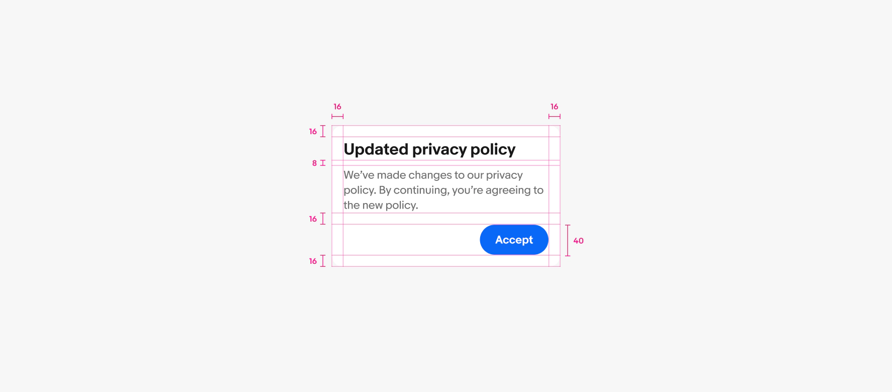
    A spec for a confirm dialog container. The container has 16px of padding on all sides. 8px of padding is between the title and body copy. 16px of padding is between body copy and button group. 8px of padding is between the buttons.