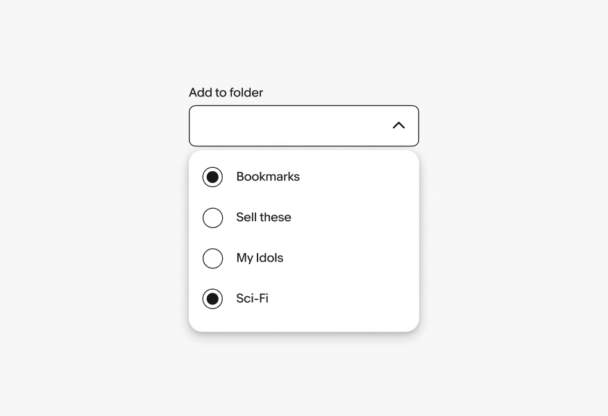
Filter menu
Filter menus open from a filter chip and allow users to adjust parameters before applying.
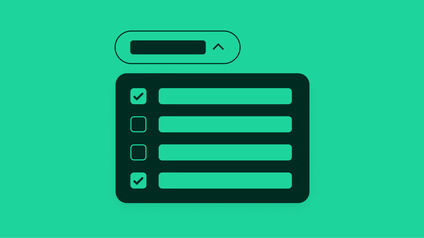
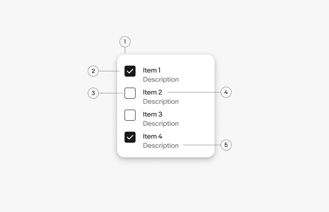
- Container
- Menu item
- Leading selection control
- Menu item label
- Menu item description
Container
The filter menu container groups all options related to the trigger element. Web uses the popover container by default. Native apps use native menus where appropriate.
On web, popover menus commonly use List rows for the menu item layout.
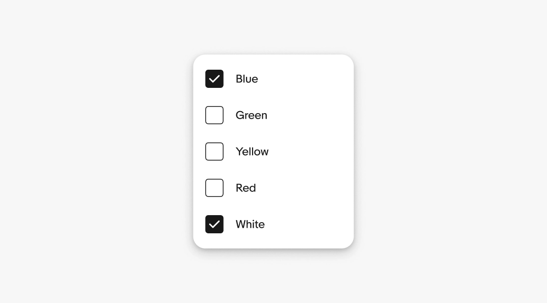
Labels
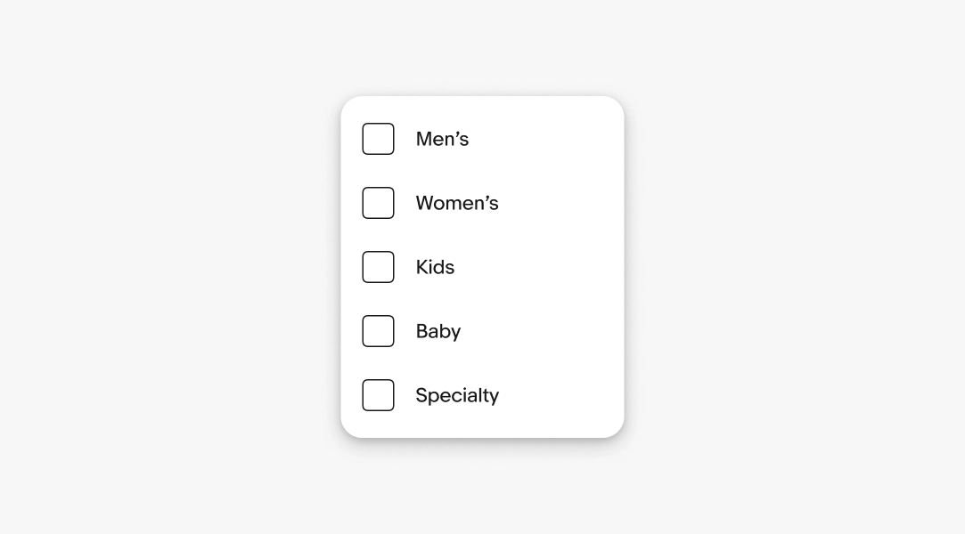
Required. The label names the filter option the user can select. Use short and distinct labels to name the filters so users can compare them at a glance.
- Use sentence case
- No ending punctuation
- Use noun or noun phrases
- Aim for 1–3 words
Descriptions
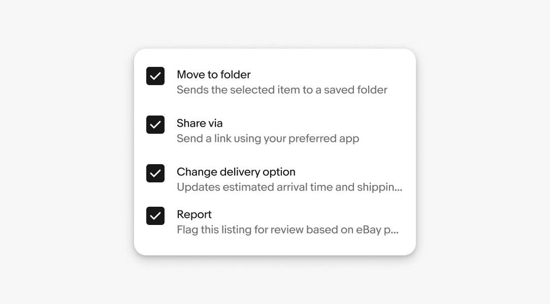
Optional. A description provides clarity or context when the label alone isn't enough. Don't restate the label.
- Use sentence case
- No ending punctuation
- Use parallel structure
- Max 1 sentence
Descriptions are only supported on web, not Android or iOS. If a description is necessary, use a context sheet on Android or iOS.
Density
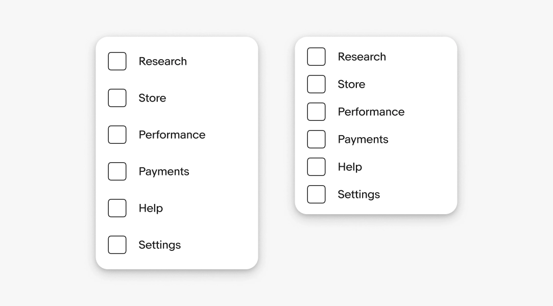
A filter menu’s density is determined by the height of the individual menu items. By default, menu items are 48px tall on web, 44px tall on iOS, and 48dp tall on Android devices. These defaults maintain a comfortable tap target size.
Smaller menu items save room but are more prone to accidental taps.
Grouping
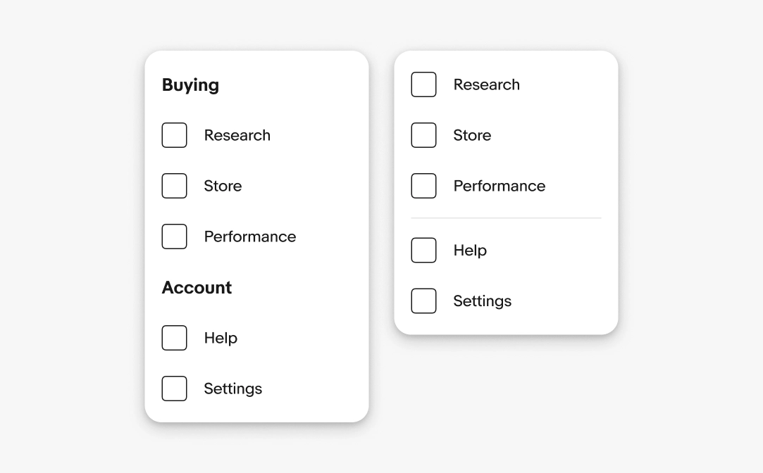
Content can also include optional dividers, with or without group titles.
Submenus
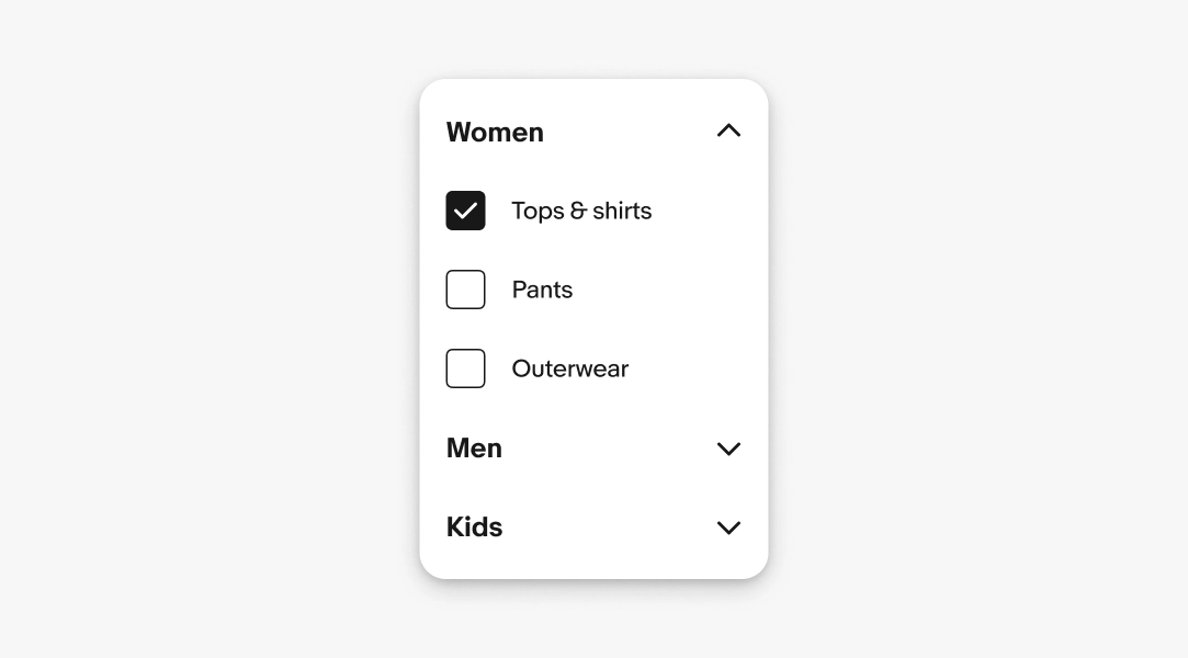
Submenus let users drill down into specific categories, and can be expanded and collapsed.
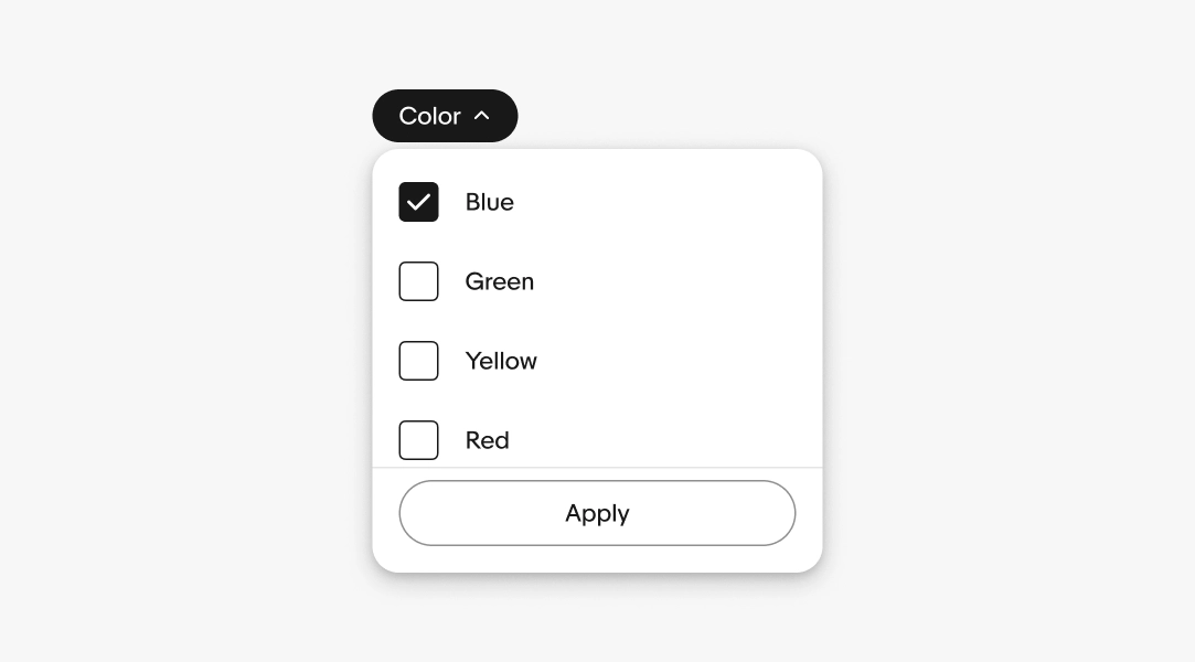
Filter chips can open a filter menu for users to adjust multiple parameters. The view updates immediately upon selection, or after the user selects the "Apply" button in the footer.
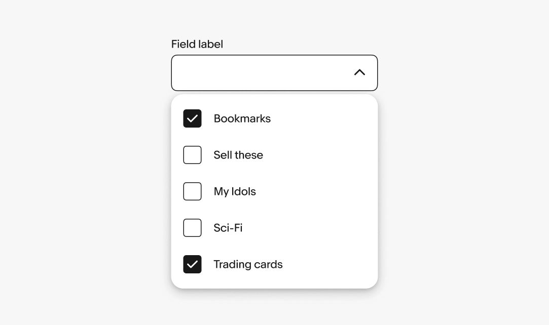
When a form field opens a filter menu, selections behave like input values. The selected values are held until the form is submitted or confirmed.
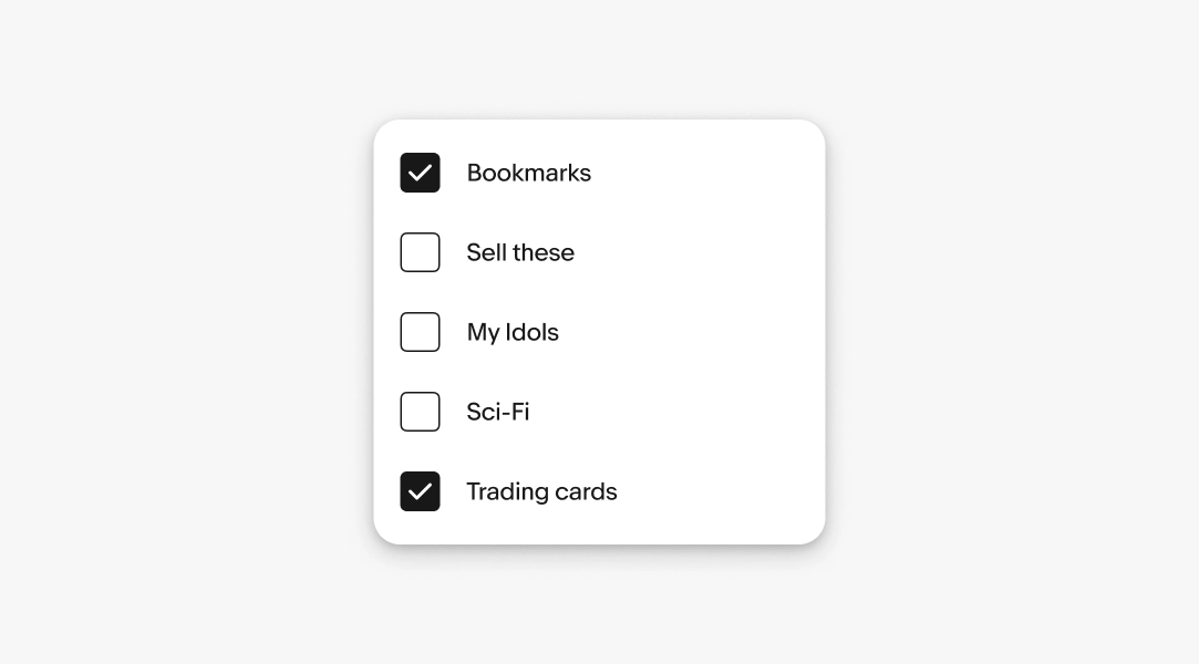
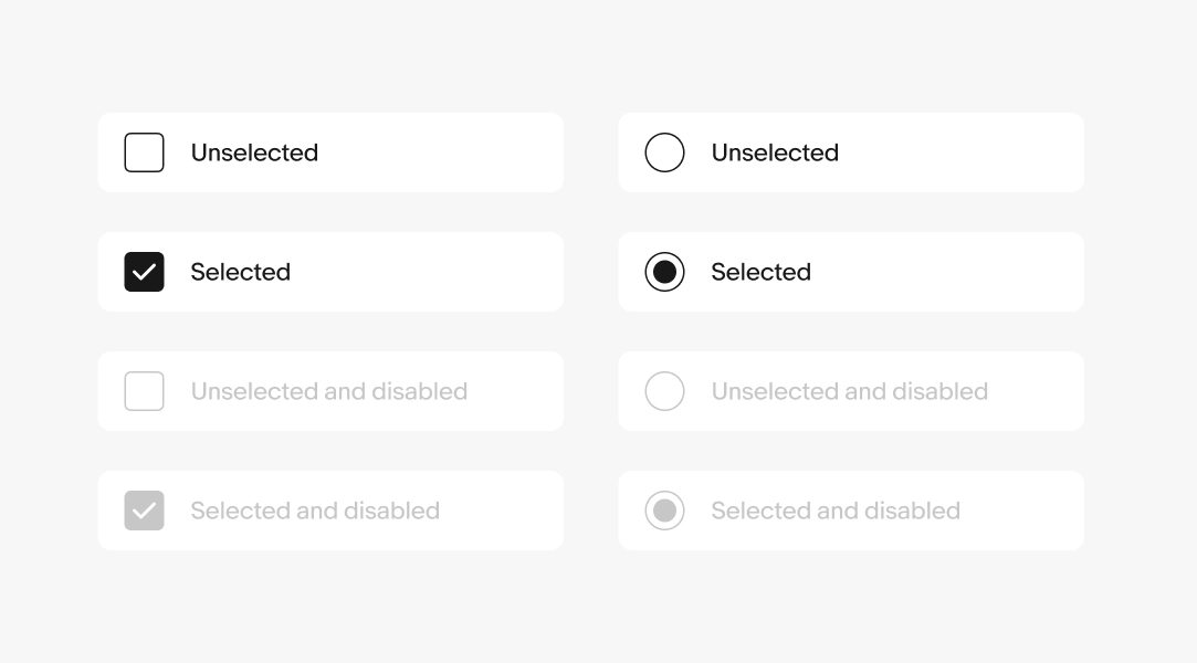
Checkboxes let users select one or more options from a list.
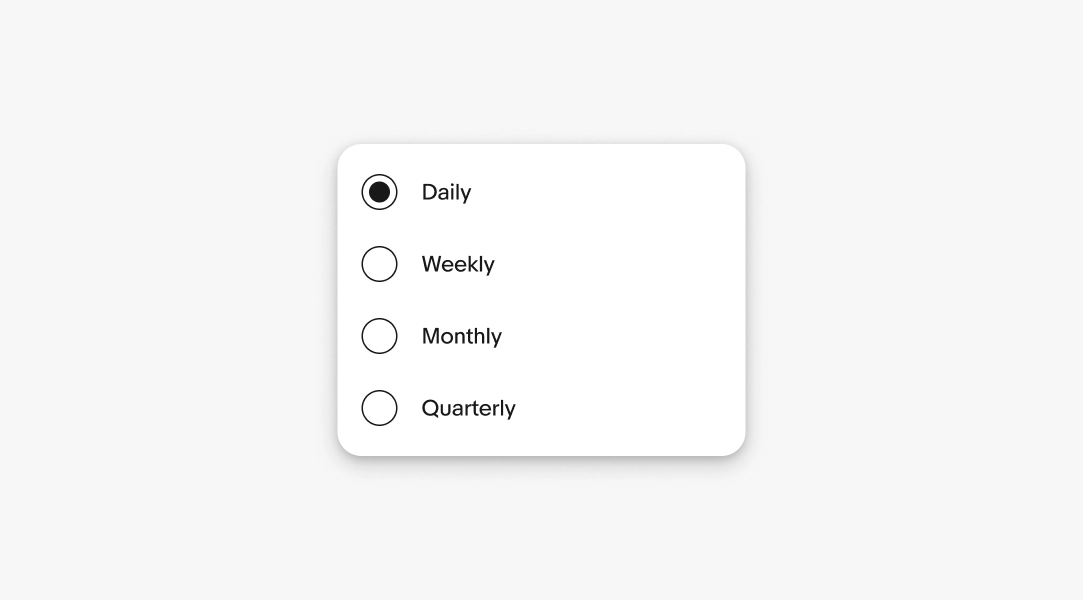
Radio buttons let users select one option from a list.
Menu items include selected, unselected, and disabled states to clearly indicate the current selection.
Positioning
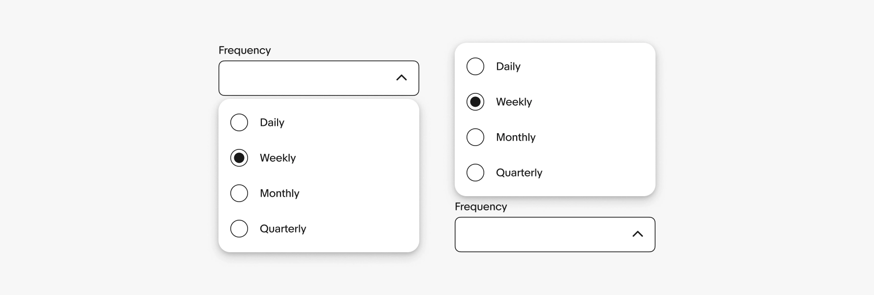
The filter menu should appear in the most logical and convenient place for users. The default placement is below the trigger element. If the trigger element is near the screen’s edge, the menu repositions to remain visible.
Height
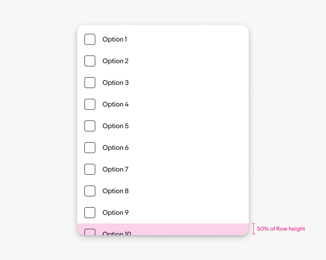
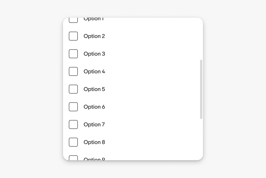
The height of the filter menu container can flex with its contents. By default, the container flexes to show up to 9 options plus half of the tenth option.
For example, if the rows are 48px tall, then 24px of the tenth option is visible from the bottom of the container.
Scrolling
Filter menus scroll when the content extends beyond the height of the menu. A scroll bar appears when scrolling to indicate the length of the list.
Width
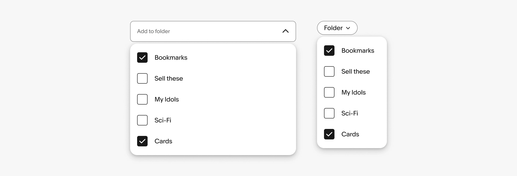
Filter menus triggered by a text field should match the field width. Filter menus triggered by filter chips default to a width of 160px.
Dismissing
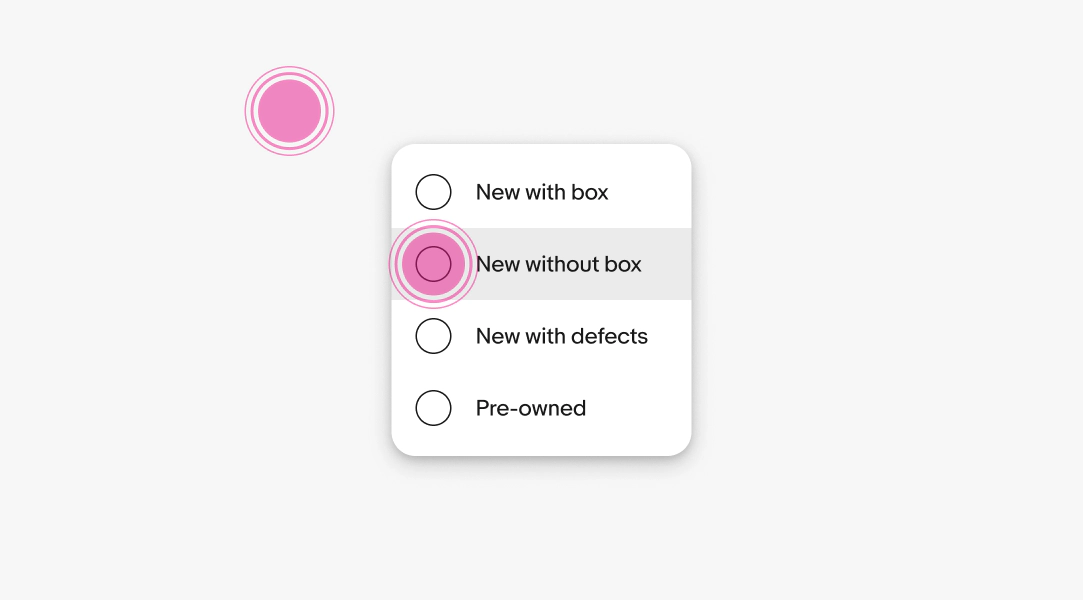
Filter menus are dismissed when:
- Selecting a single-select value
- Interacting with a submit button
- Interacting with another element on the page
- Pressing the Escape button on a keyboard
- Pressing the hardware back button on an Android device
Text overflow
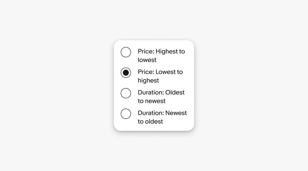
Menu item labels and descriptions wrap to a new line when extending beyond the width of the menu container.
Native sheets
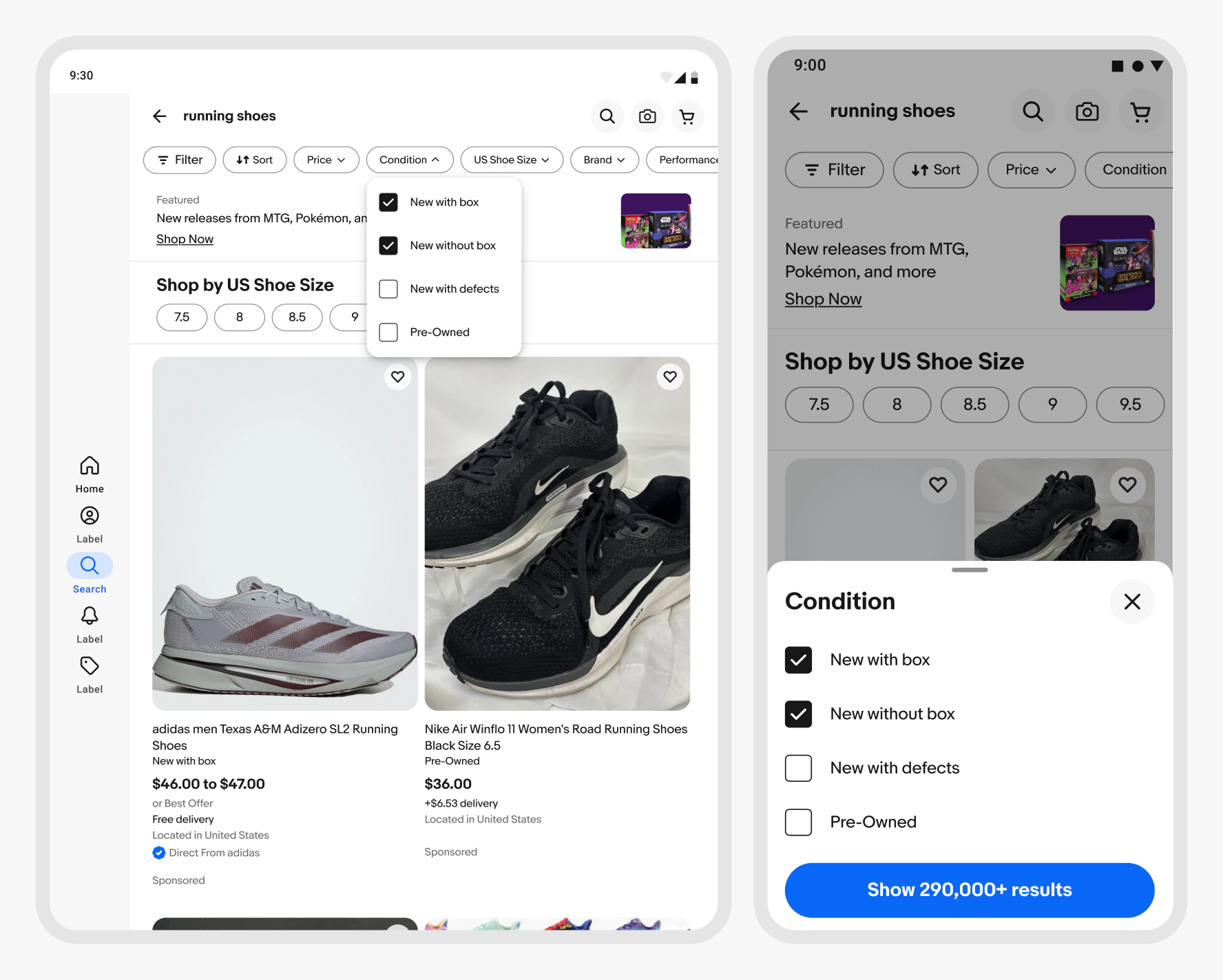
Native apps can use a context sheet if the list is long or includes layouts that aren’t supported by the native menu components.
If an interaction asks the user to slow down, scan a list, compare options, or make a more considered choice, a sheet should be used.
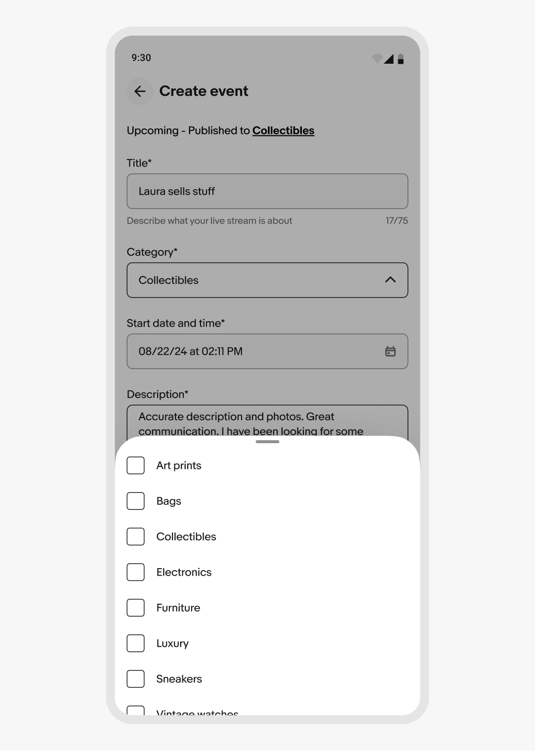
Android
Menus on Android use the Evo popover menu. Form and filter selections can use a context sheet for longer lists.
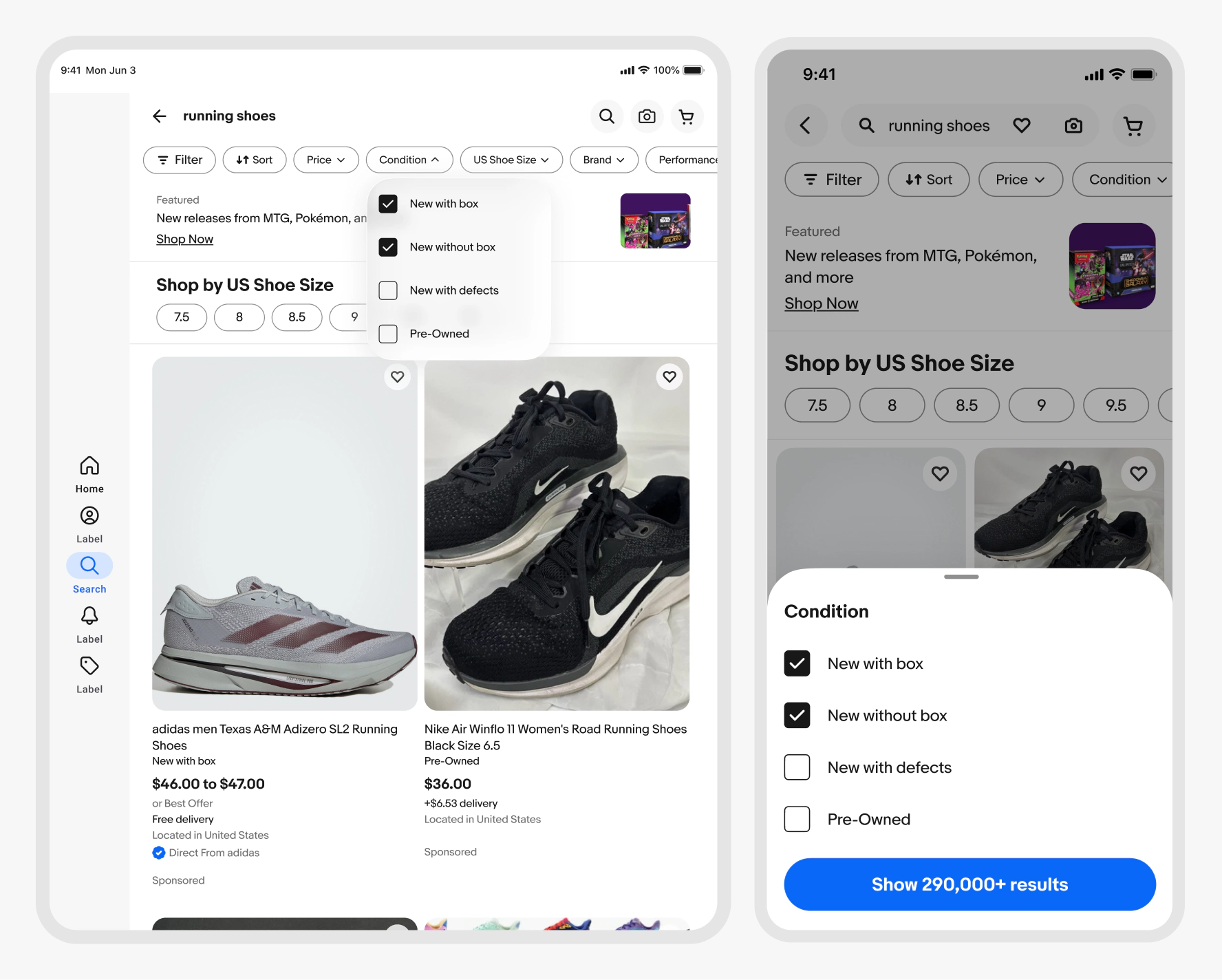
iOS
iOS devices use a native menu for actions. Form and filter selections can use a context sheet for longer lists.
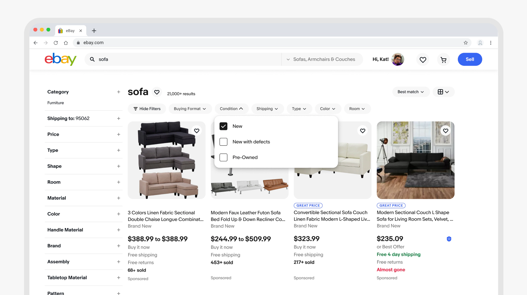
Web
Web uses the popover menu across screen sizes.
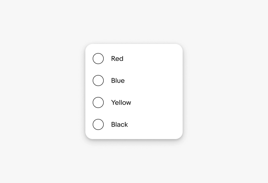
Keep labels short
Do use clear, short, action-oriented labels.
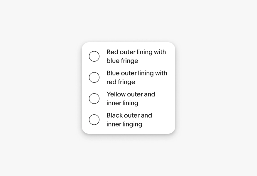
Don’t use unnecessarily long or vague labels.
Native app menus
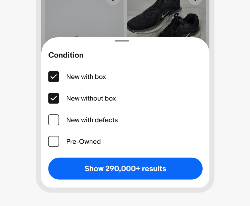
Do use a bottom sheet if the list includes interactive items that aren’t supported by the native menu components like checkboxes.
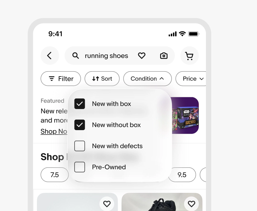
Don’t include interactive items in a popover menu on native platforms.
Web menus
Do present menu items in a popover menu across screen sizes.
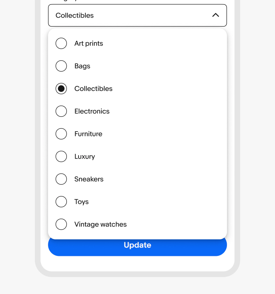
Don’t use a modal element for menus on web, even on smaller screens.
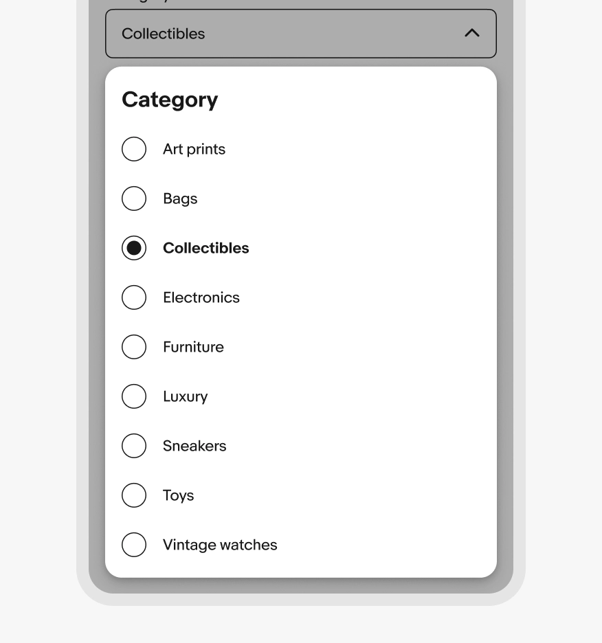
Leading selection control types
Do use radio buttons when the user should only select one option from a set.
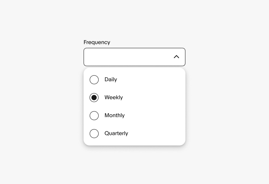
Don’t use radio buttons when the user can select multiple options from a set. Instead use checkboxes.