Navigation menu

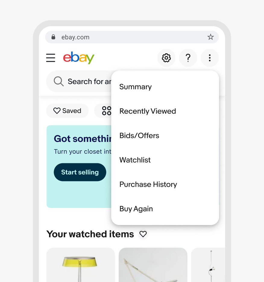
A navigation menu is a transient list of destinations that allows users to move to a different view or location.

Anatomy

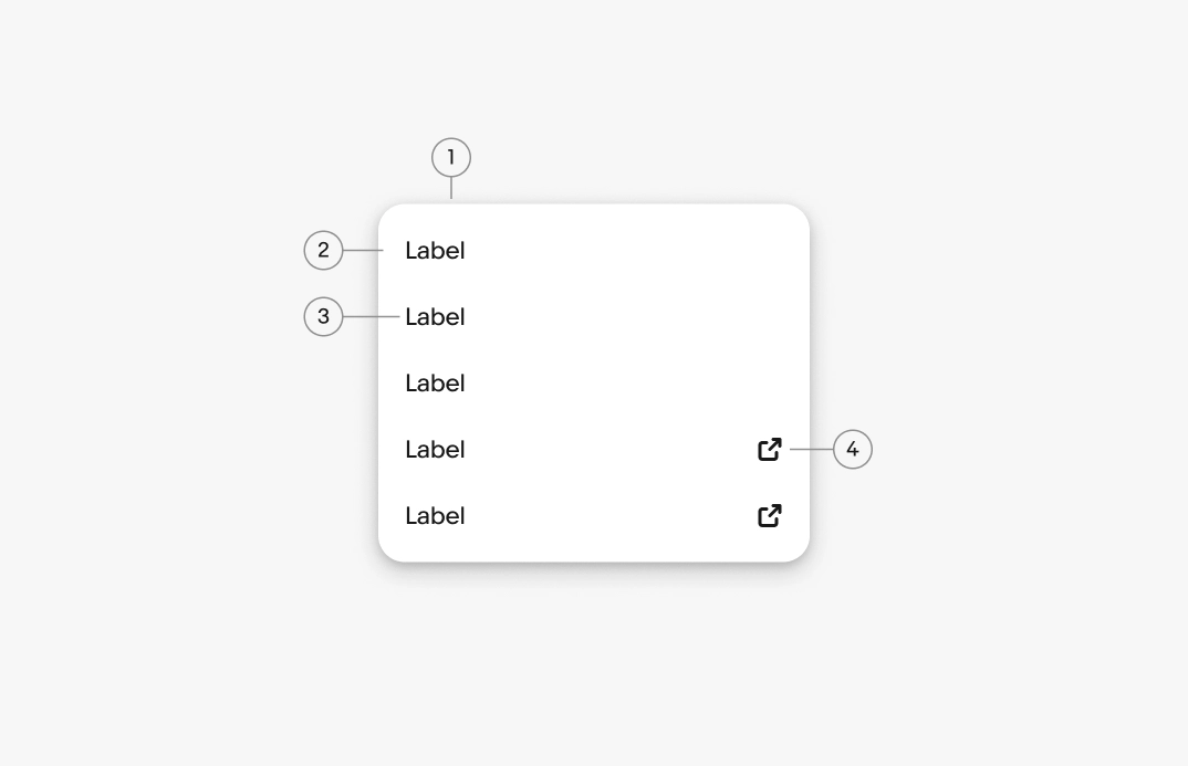
A menu diagram with 5 elements numbered: 1. Container, 2. Menu item, 3. Lead icon/control, 4. Menu item label, 5. Menu item description
  1. Container
  2. Menu item
  3. Menu item label
  4. External link icon

Properties

Container

The menu container contains all content related to the trigger element. The container uses the popover.

On web, popover menus commonly use List rows for the menu item layout.

Menu listing Replace, Generate with AI, Edit, Remove, each paired with minimal icons.

Labels

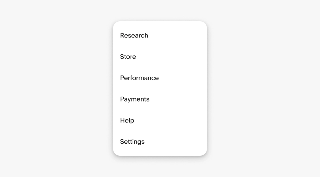
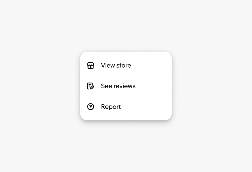
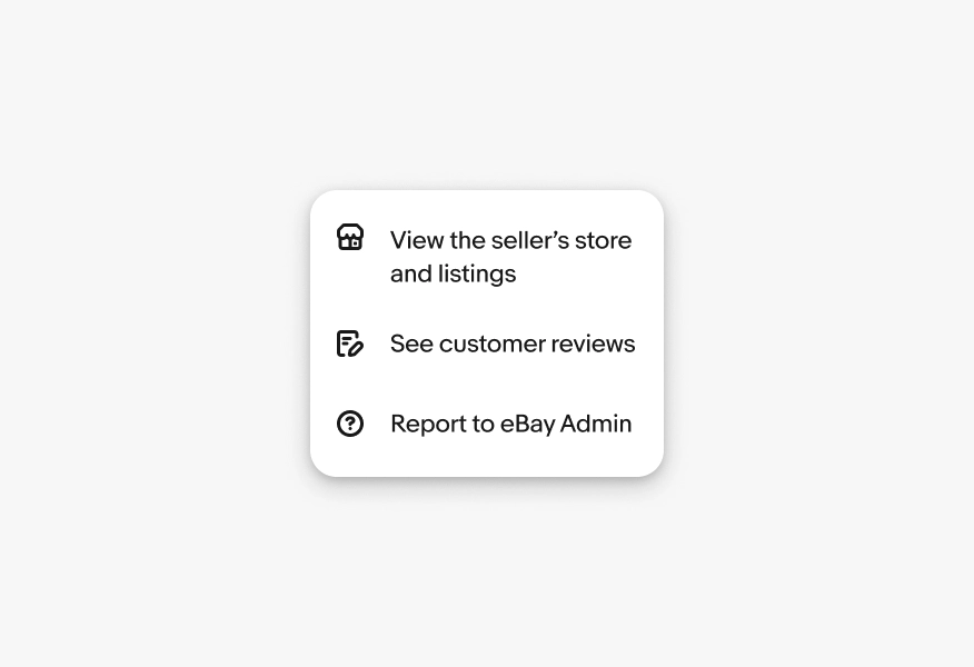
Required. The label names the destination the menu item leads to. Use distinct labels so users can recognize where each option takes them and compare them at a glance.

  • Use sentence case
  • No ending punctuation
  • Use the name of the destination
  • Aim for 1-3 words
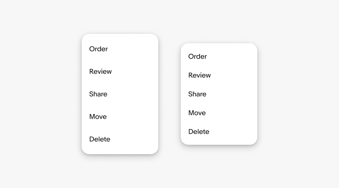
Menu action labels in a list with Order, Review, Share, Move, Delete

Lead icon

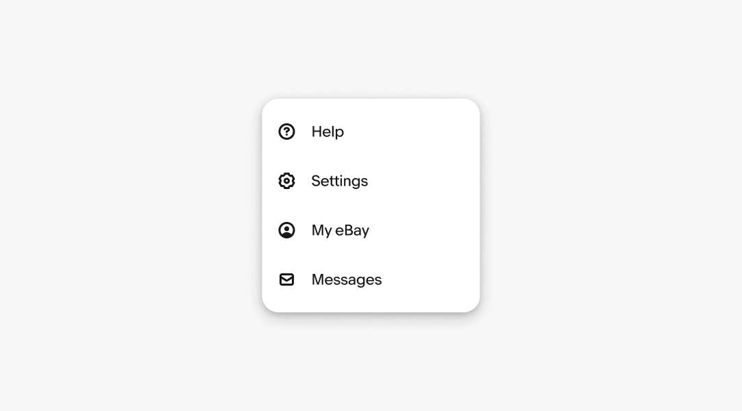
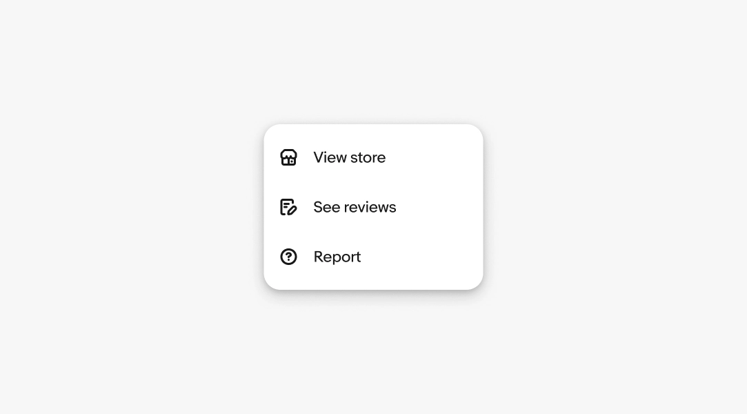
Optional. Lead icons reinforce the relationships with their labels. This helps when the icon is presented without a label elsewhere.

Menu with leading icons for Shop similar, View store, Remove, and Report.

External link icon

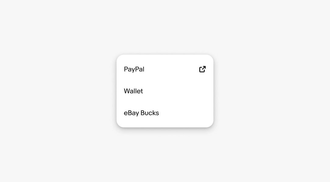
Optional. Trailing external link icons can be used to indicate that the destination is outside of eBay.

Menu with leading icons for Shop similar, View store, Remove, and Report.

Descriptions

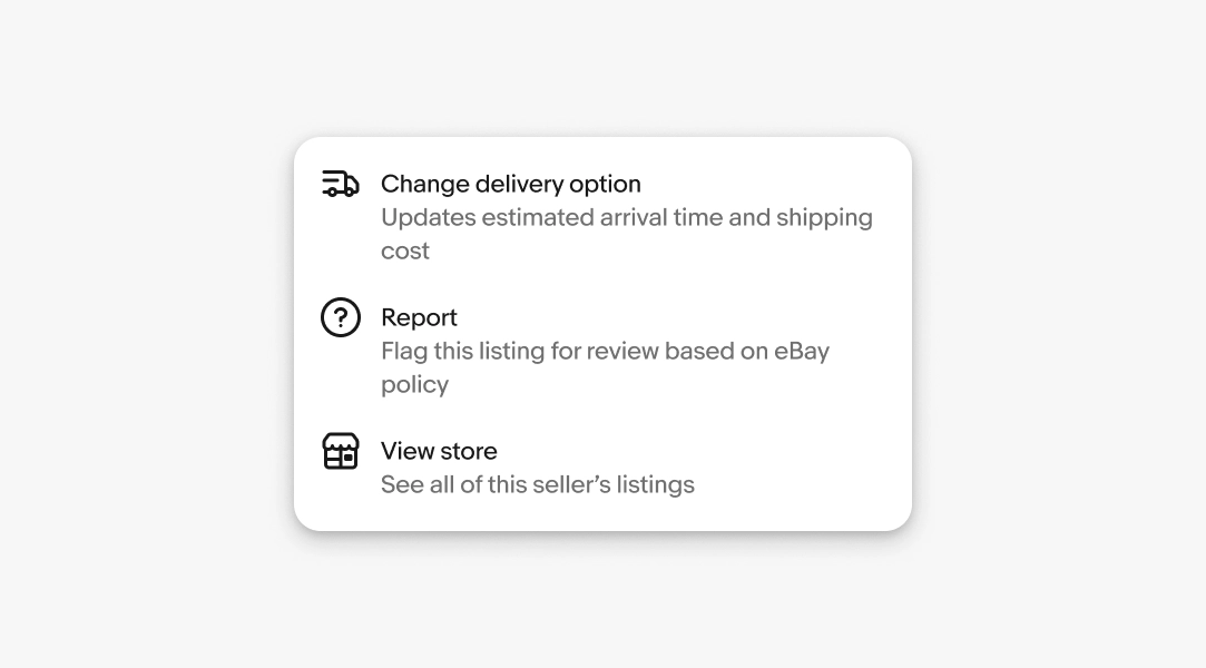
Optional. A description tells the user what they can do at the destination. Don't restate the label.

  • Use sentence case
  • No ending punctuation
  • Use parallel structure
  • Max 1 sentence

Descriptions are only supported on web, not Android or iOS.

Menu with icons and brief descriptions: Move to folder, Share via app, Change delivery option, Report.

Density

A menu’s density is determined by the height of the individual menu items. By default, menu items are 40px tall on web, 44px tall on iOS, and 48dp tall on Android devices. These defaults maintain a comfortable tap target size.

Smaller menu items save room but are more prone to accidental taps.

Two menu density examples side by side.

Behavior

Grouping

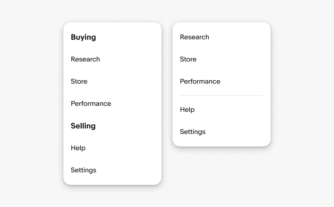
Group related destinations together using a group title or a divider.

Group title

Optional. A group title names a shared category across related destinations. Keep it broad enough to cover every item in the group.

  • Use sentence case
  • No ending punctuation
  • Use a noun or noun phrase
  • Aim for 1–2 words
Menu grouping example; left uses section headers Buying and Selling; right uses a divider to separate sections.

Height

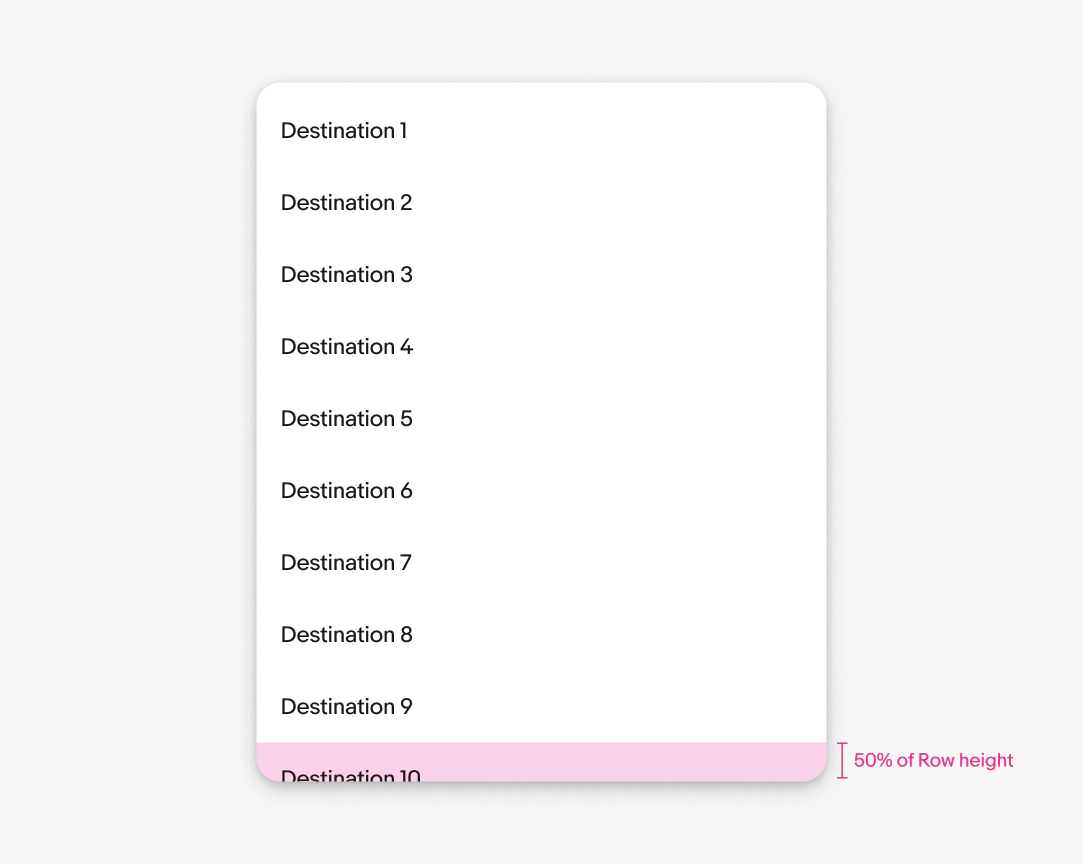
The height of the menu container can flex with its contents. By default, the container flexes to show up to 9 options plus half of the tenth option.

For example, if the rows are 48px tall, then 24px of the tenth option is visible from the bottom of the container.

Menu height guidance showing options 1–10 and a pink indicator for bottom padding equal to row height × 0.5.

Scrolling

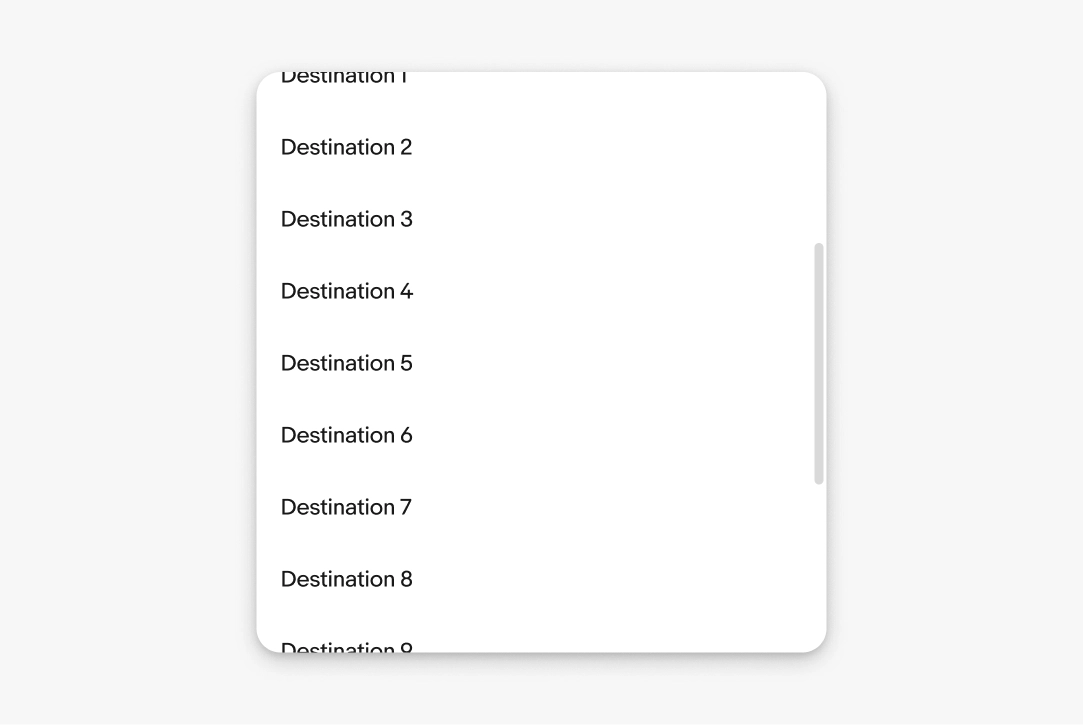
Menus scroll when the content extends beyond the height of the menu. A scroll bar appears when scrolling to indicate the length of the list.

Menu list with many options and a vertical scrollbar, indicating content extends beyond the visible area.

Width

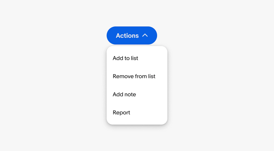
Menus default to a width of 160px. The width can grow up to 360px for longer labels or descriptions.

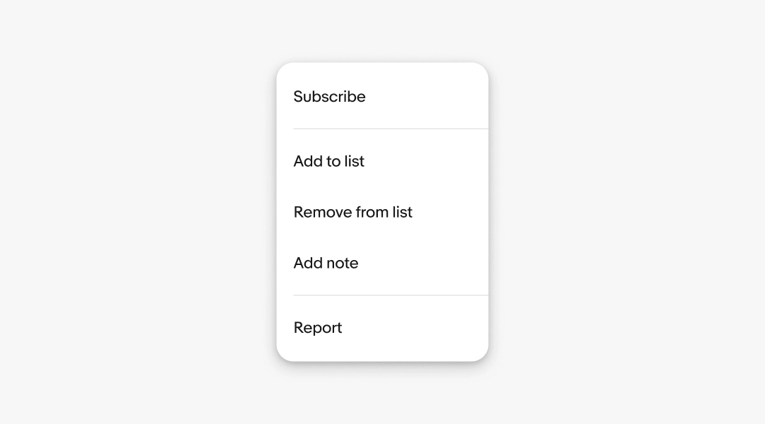
An Actions menu with Add to list, Remove from list, Add note, Report.

Text overflow

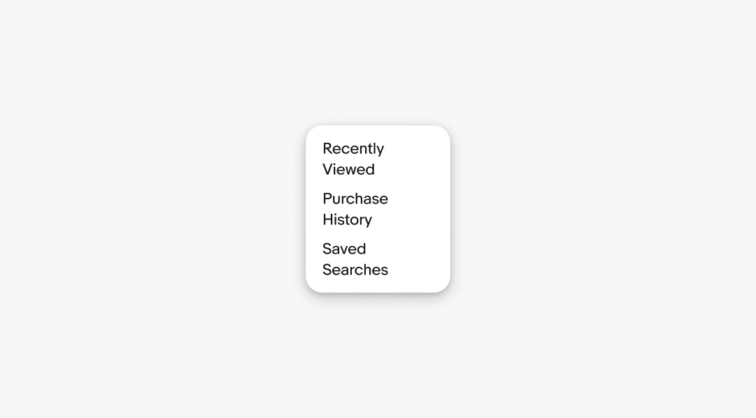
Menu item labels and descriptions wrap to a new line when extending beyond the width of the menu container.

Menu with multi‑line labels demonstrating text overflow; “Price: Lowest to highest” selected; includes price and duration sort options.

Dismissing

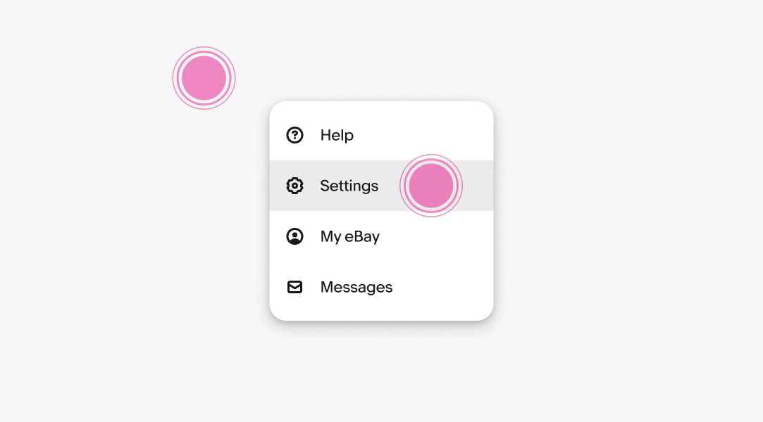
Menus are dismissed when:


  • Selecting a destination
  • Interacting with another element on the page
  • Pressing the Escape button on a keyboard
  • Pressing the hardware back button on an Android device
Menu interaction showing tap ripple on Remove from list and a second tap outside the menu to dismiss.

Dividers

Dividers help separate groups of menu items into logical collections.

Menu with section dividers separating actions: Subscribe; Add to list; Remove from list; Add note; Help and report.

Platforms

Android

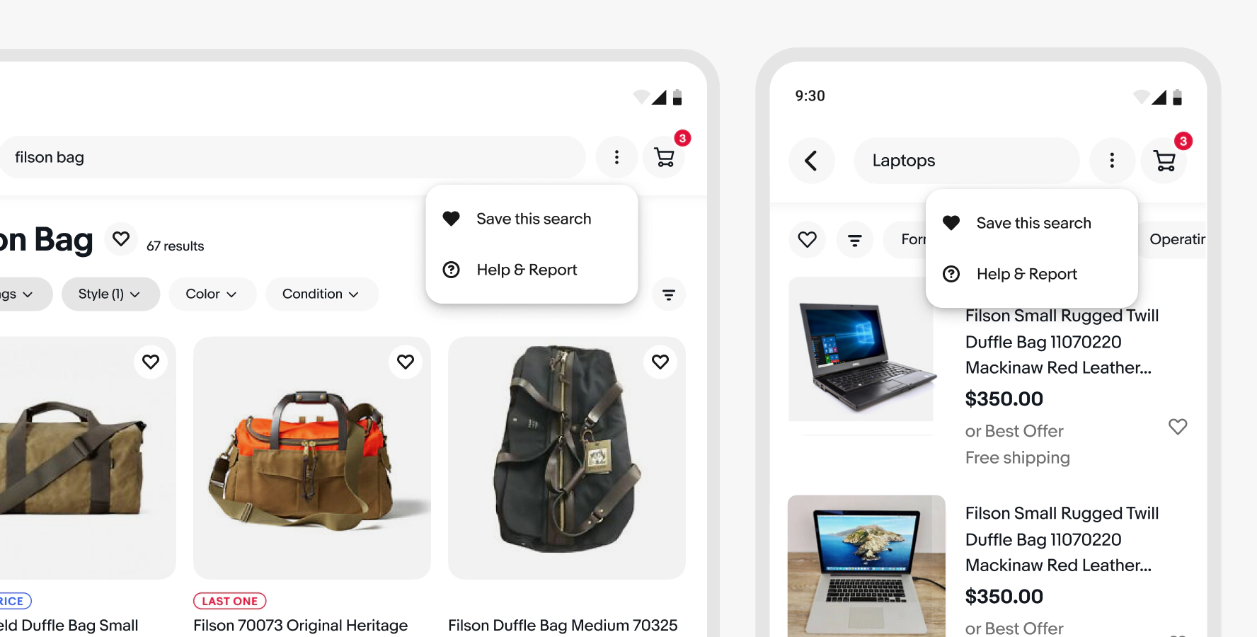
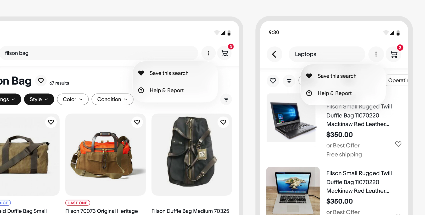
Menus on Android use the Evo popover across screen sizes.

A tablet and mobile Android screen side-by-side: eBay item page with overflow popover menu of actions; Unwatch item, Sell on like this, Share, Help & Report

iOS

iOS devices use the native menu for navigation. Form and filter selections can use a context sheet.

A tablet and mobile iOS screen side-by-side: eBay item page with overflow popover menu of actions; Unwatch item, Sell on like this, Share, Help & Report

Web

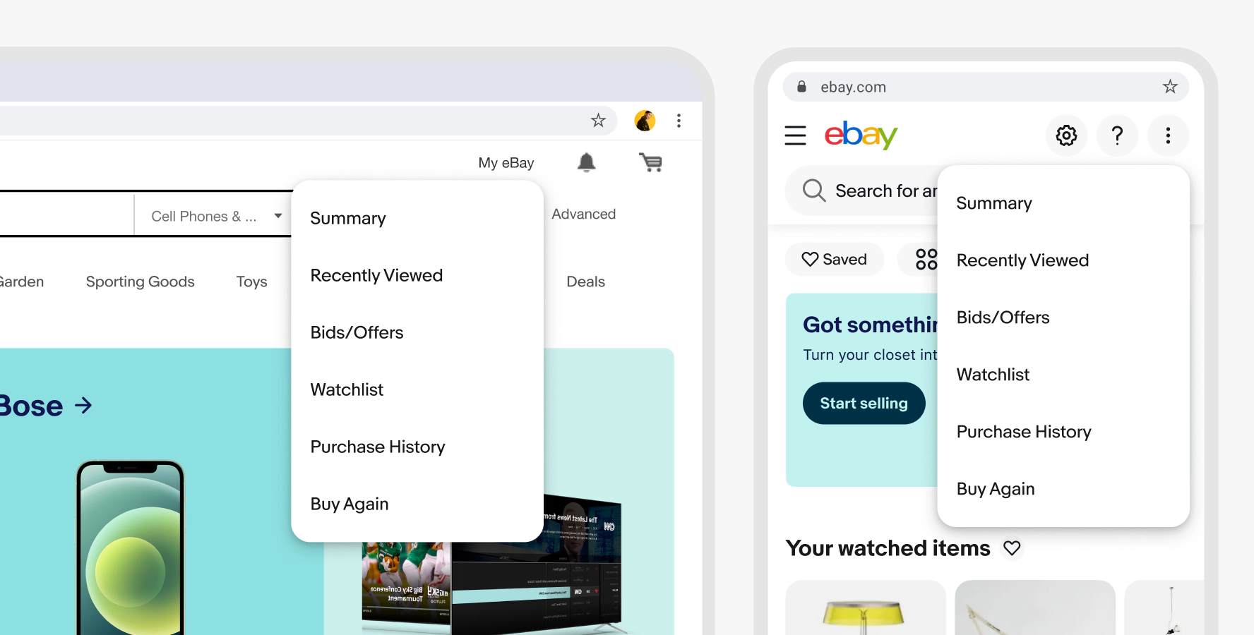
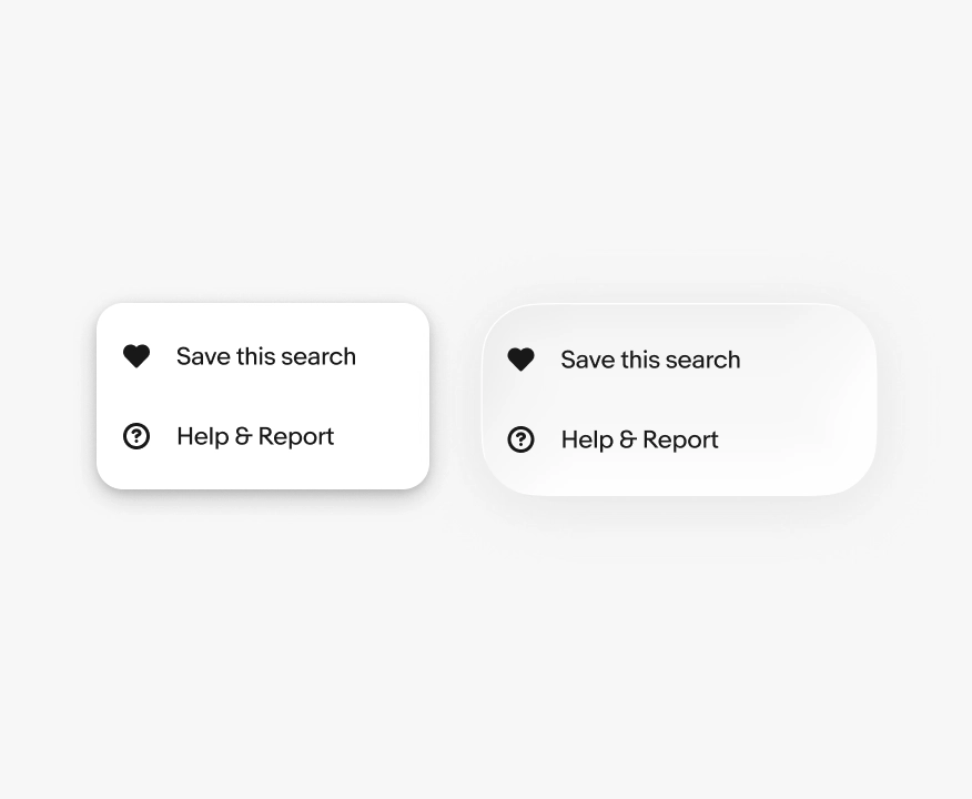
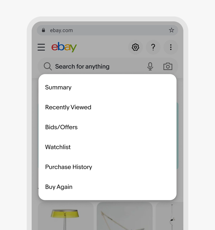
Web uses the Evo popover menu across screen sizes.

Web layout showing a menu anchored to a menu button on a large and small screen; actions include Buy again, Contact seller, Sell this item, Help & Report

Best practices

Label length

Do use clear and short labels that name the destination.

Menu with actions Replace, Generate with AI, Edit, Remove; each with simple icons.

Don’t use unnecessarily long or vague labels.

Menu with longer labels: Replace the selected item, Generate new content with AI, Edit this item, Remove this item.

Native menus

Do present menu items in platform-appropriate container.

iOS and Android app menus side by side listing Replace, Generate with AI, Edit, Remove; shows style/elevation comparison.

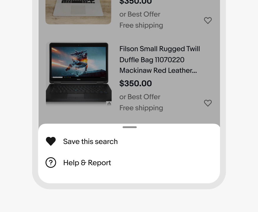
Don’t use sheets or custom menu popovers for simple menus on native devices.

Bottom sheet action menu on a mobile form with Replace, Generate with AI, Edit, and Remove (destructive) icons.

Web menus

Do present menu items in a popover across screen sizes on web.

A menu with actions triggered by an overflow button on a item card with Subscribe, Pin seller, Add note, Share seller

Don’t use a modal dialog for menus on web, even on smaller screens.
Improper use of a dialog with actions with Subscribe, Pin seller, Add note, Share seller

Specs

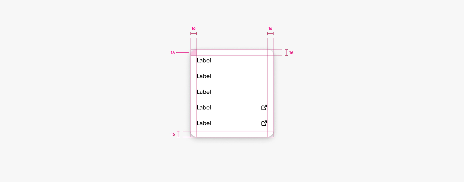
Menu spacing diagram showing 16px margins and padding; list with leading icons and trailing checkmark on Item 1.