Action Menu
Action menus present contextually related actions, revealed by a trigger, that allow users to take one immediate action before dismissing.
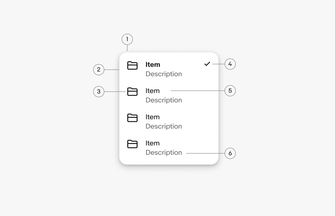
- Container
- Menu item
- Lead icon
- Selection indicator
- Label
- Description
Container
The menu container bounds all actions related to the trigger element. Web uses the popover container by default. Native apps use native menus where appropriate.
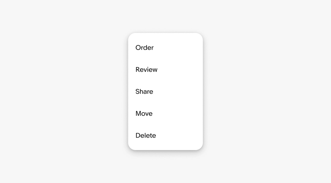
Labels
Required. The label names the action the user can take. Use short and distinct labels to name the actions so users can compare them at a glance.
- Use sentence case
- No ending punctuation
- Start with a verb
- Aim for 1-3 words
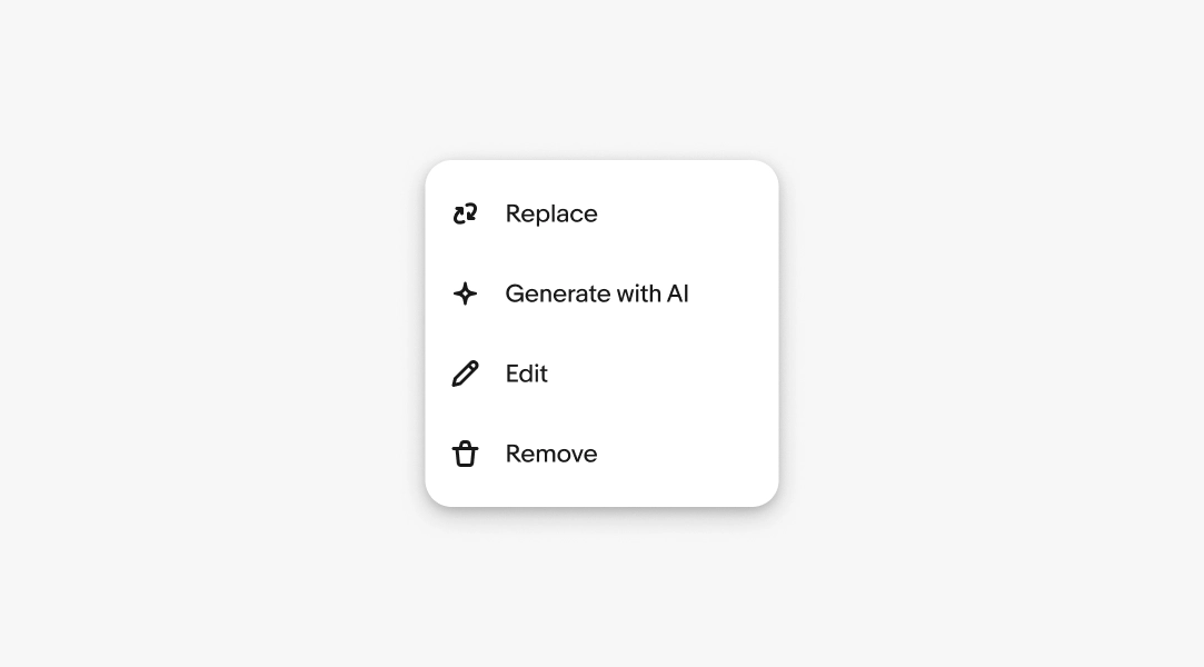
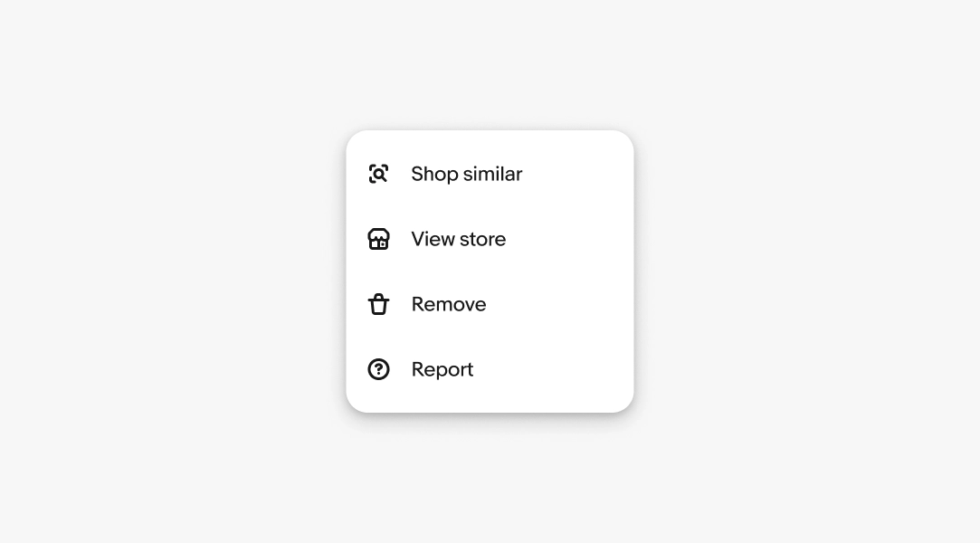
Lead icon
Optional. Lead icons reinforce the relationships with their labels. This is helpful when the icon is presented without a visual label elsewhere on the page.
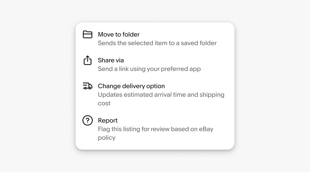
Descriptions
Optional. A description tells the user what the action will do when the label alone isn't clear enough. Don't restate the label.
- Use sentence case
- No ending punctuation
- Use parallel structure
- Max 1 sentence
Descriptions are supported on web only, not Android or iOS.
Density
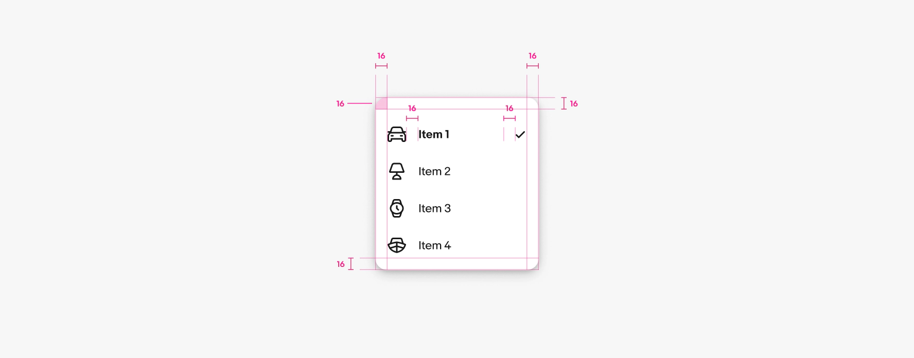
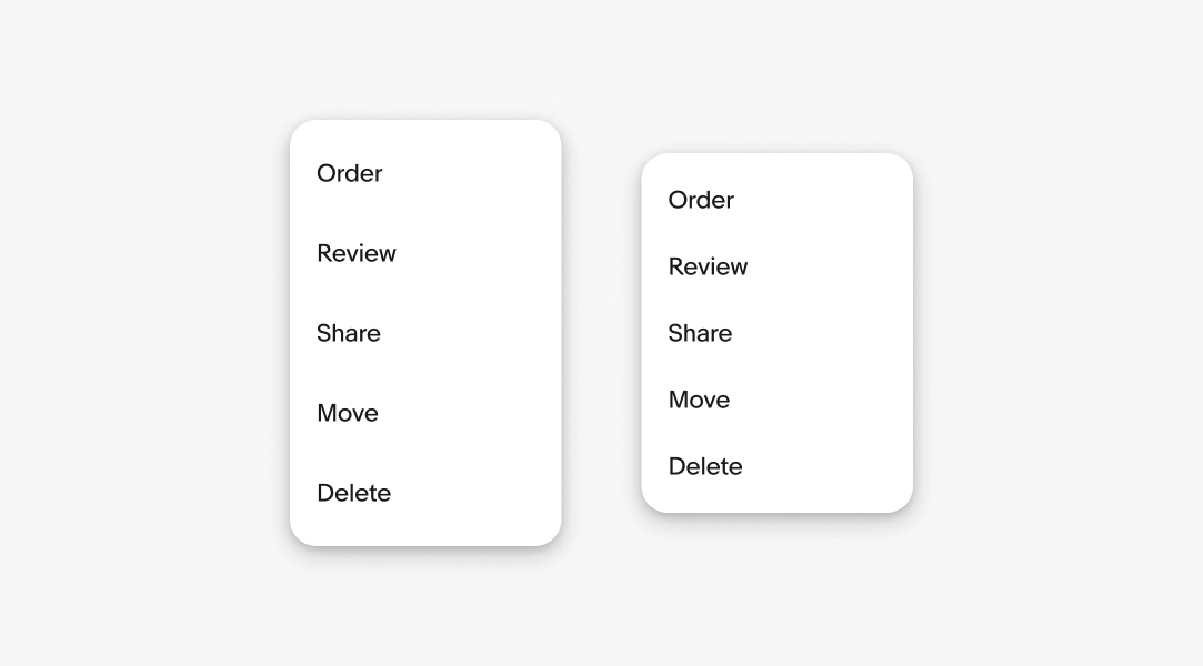
A menu’s density is determined by the height of the individual menu items. By default, menu items are 40px tall on web, 44px tall on iOS, and 48dp tall on Android devices. These defaults maintain a comfortable tap target size.
Smaller menu items save room but are more prone to accidental taps.
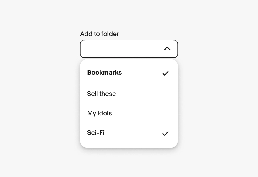
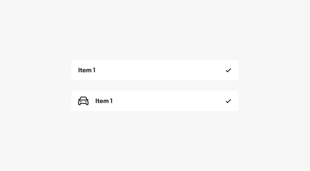
Selected items show a trailing tick icon to indicate a selected action or view.
Positioning
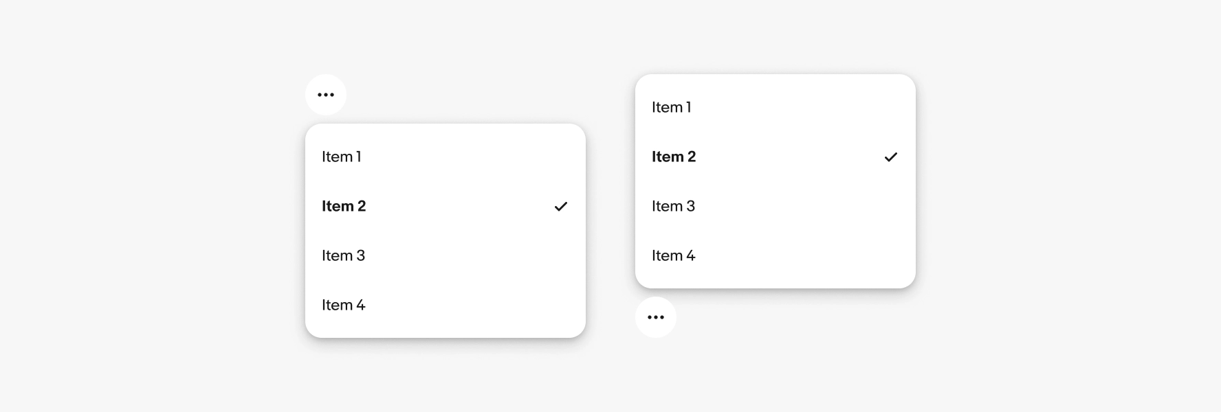
The menu should appear in the most logical and convenient place for users. The default placement is below the trigger element. If the trigger element is near the screen’s edge the menu adjusts to remain visible.
Height
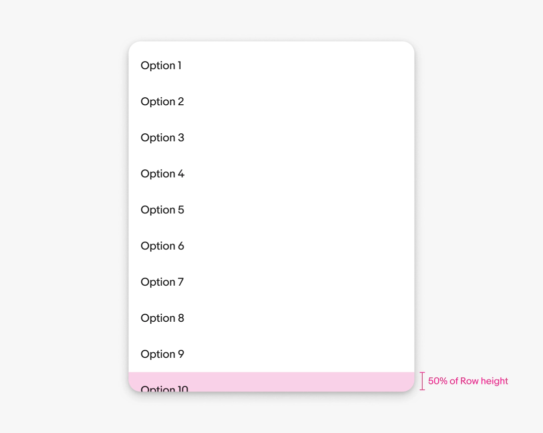
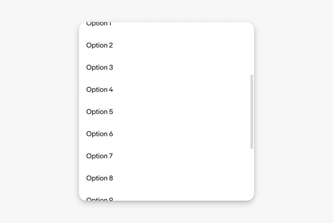
The height of the menu container can flex with its contents. By default, the container flexes to show up to 9 options plus half of the tenth option.
For example, if the rows are 48px tall, then 24px of the tenth option is visible from the bottom of the container.
Scrolling
Menus scroll when the content extends beyond the height of the menu. A scroll bar appears when scrolling to indicate the length of the list.
Width
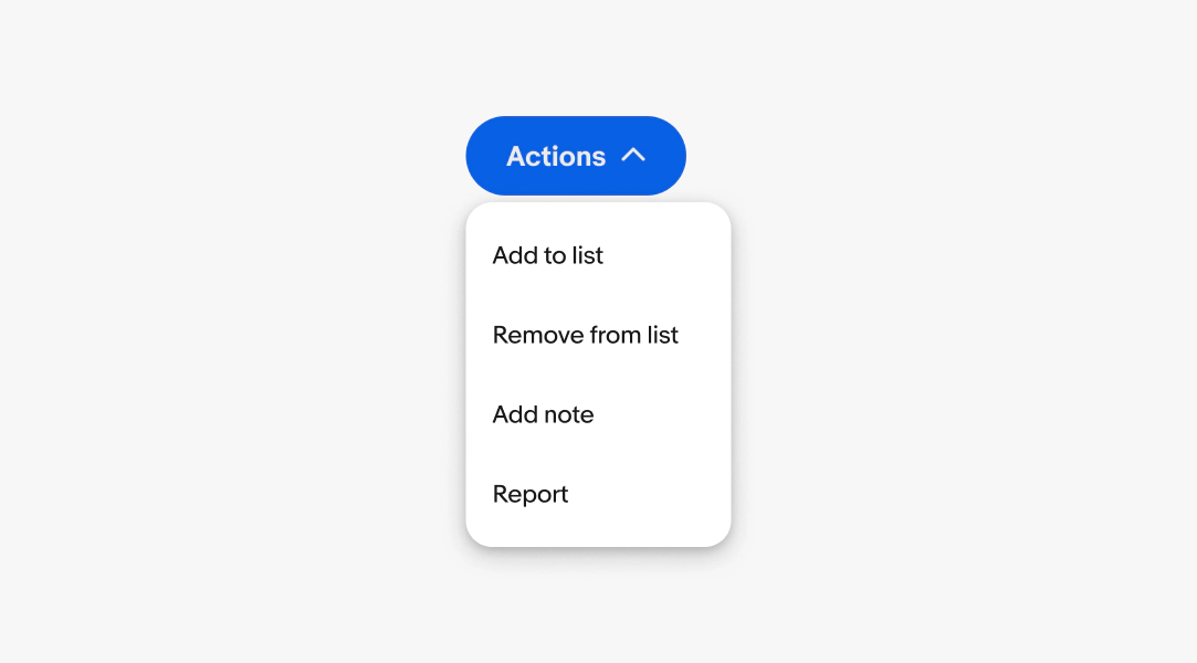
Menus default to a width of 160px. The width can grow up to 360px for longer labels or descriptions.
Text overflow
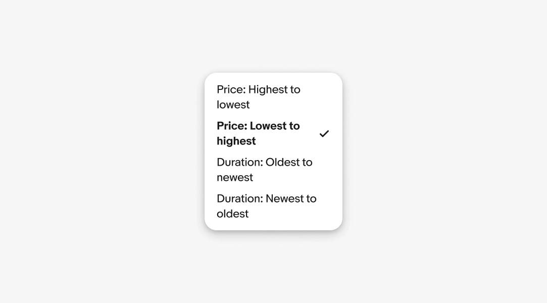
Menu item labels and descriptions wrap to a new line when extending beyond the width of the menu container.
Disabled list items
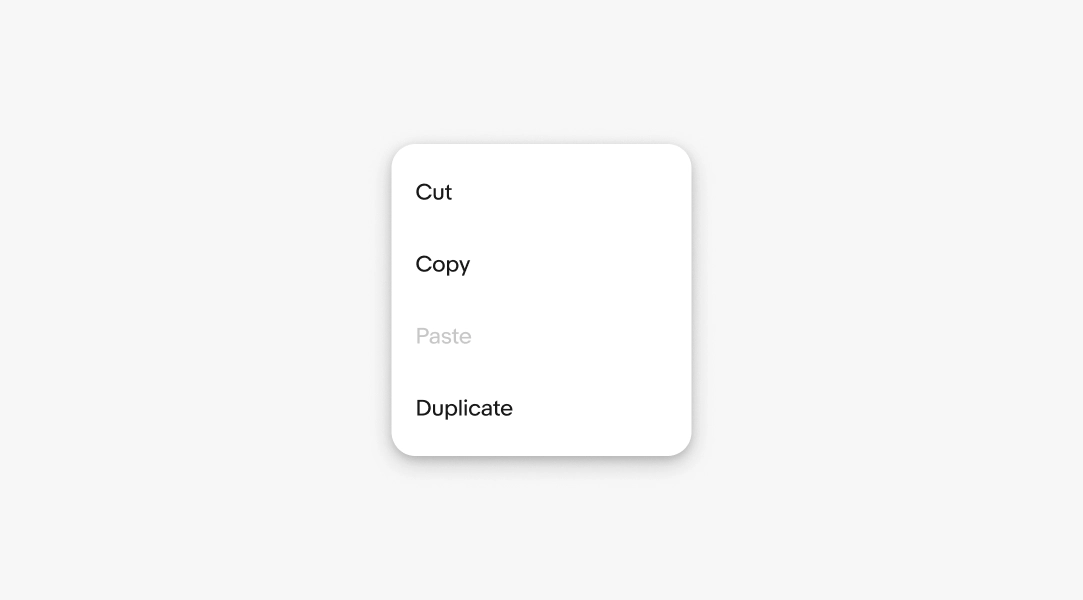
Actions in a menu can appear disabled but remain visible. Keeping the item visible maintains visual consistency and helps reinforce it’s discoverability when it becomes available.
Dismissing
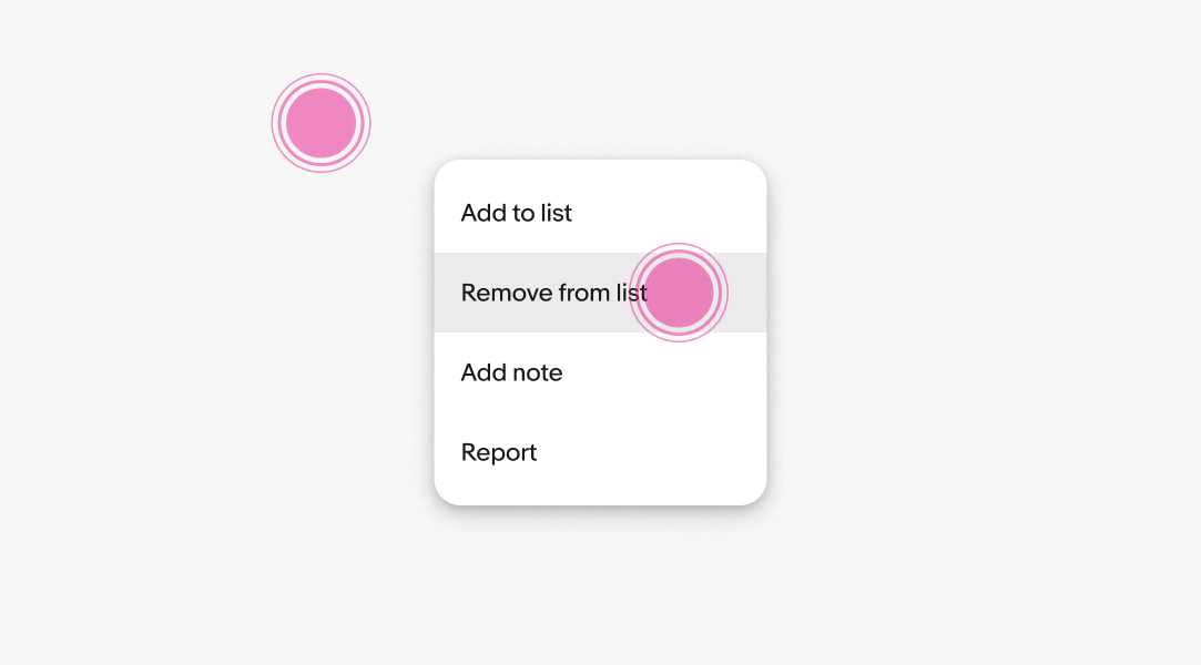
Menus are dismissed when:
- Selecting an action
- Interacting with another element on the page
- Pressing the Escape button on a keyboard
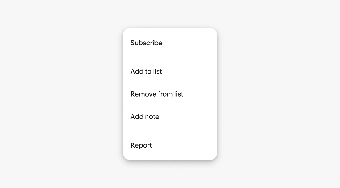
Dividers
Dividers help separate groups of menu items into logical collections.
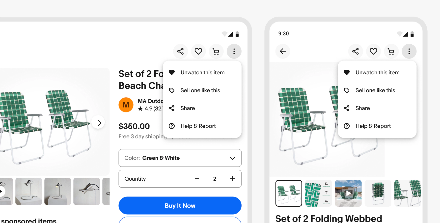
Android
Menus on Android use the Material menu component.
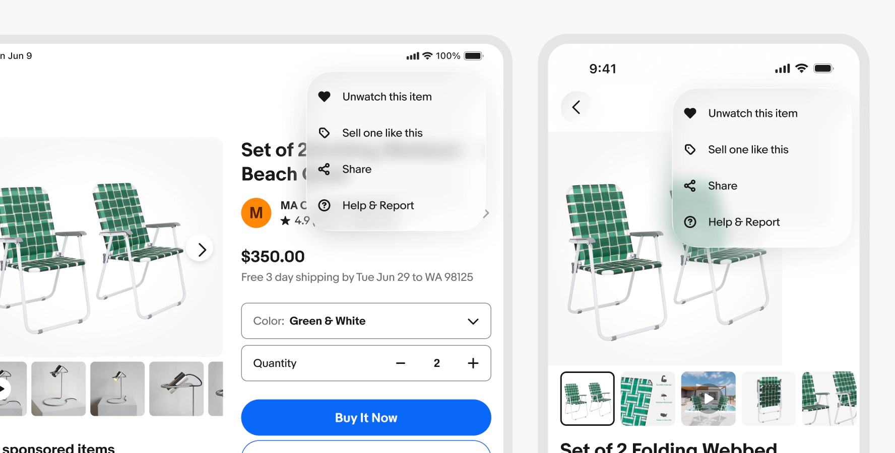
iOS
iOS devices use the native menu for actions. Form and filter selections can use a context sheet.
Web
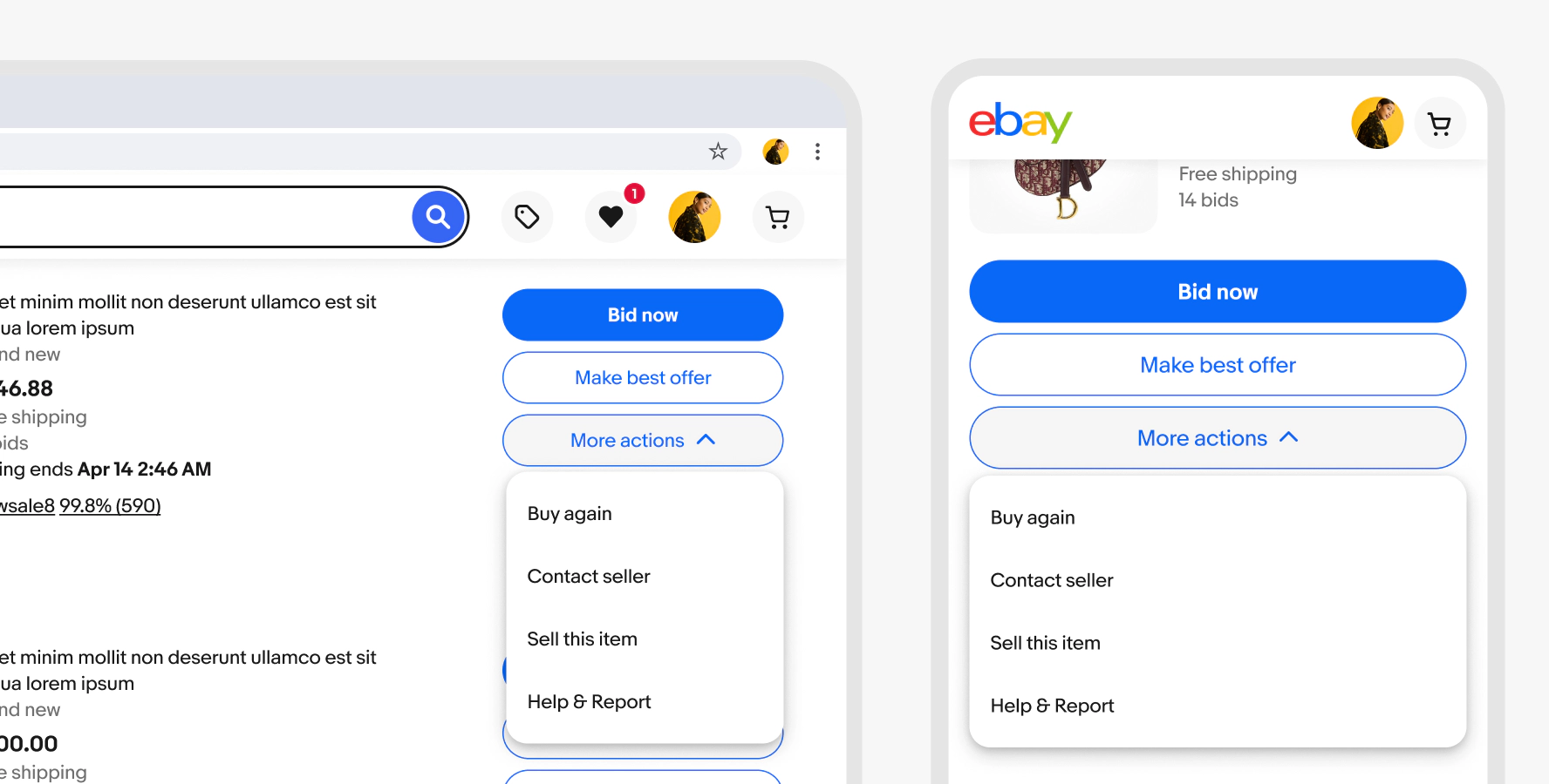
Web uses the Evo popover menu across screen sizes.
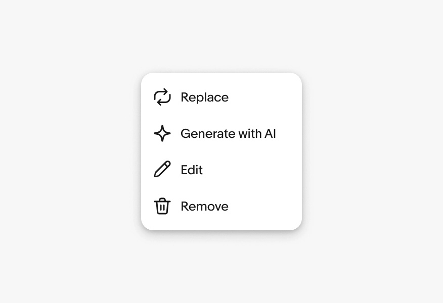
Label length
Do use clear, short, action-oriented labels.
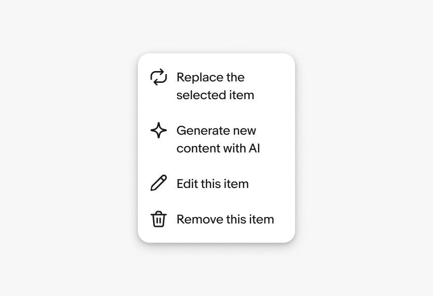
Don’t use unnecessarily long or vague labels.
Native menus
Do present menu items in platform-appropriate container.
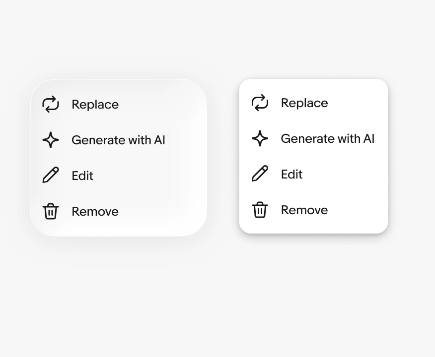
Don’t use sheets or custom menu popovers for simple menus on native devices.
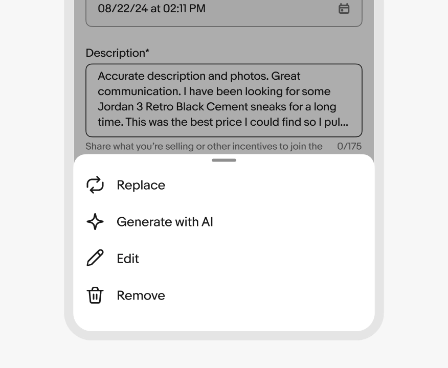
Do use native menus for simple action menus with text and optional icons.
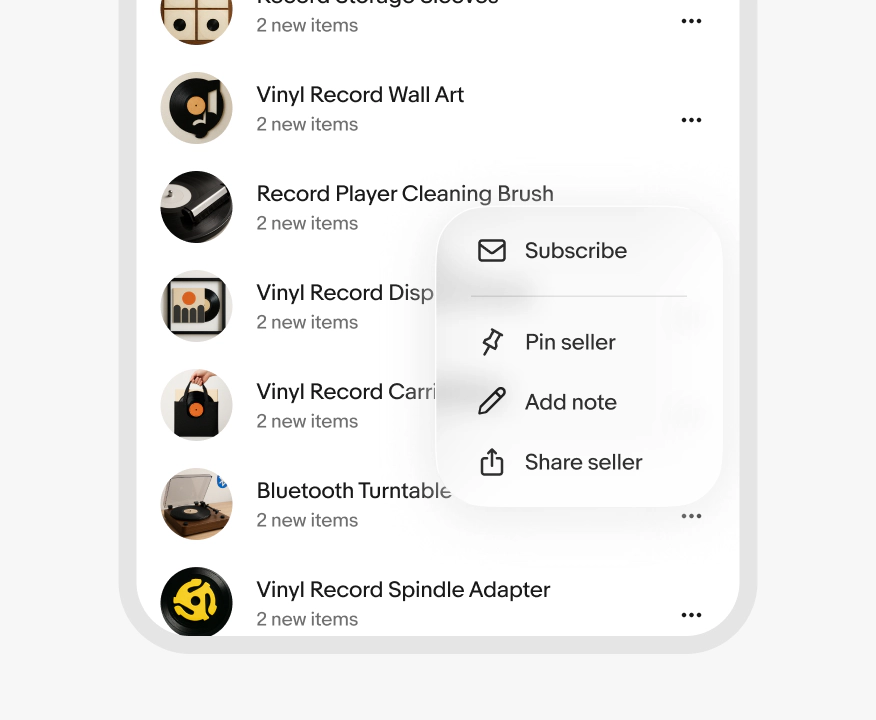
Don’t use a native menu for longer lists or unsupported elements and interactions. Use a sheet instead.
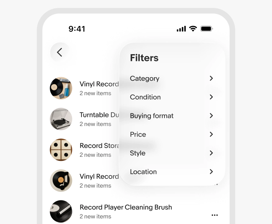
Web menus
Do present menu items in a popover across screen sizes on web.
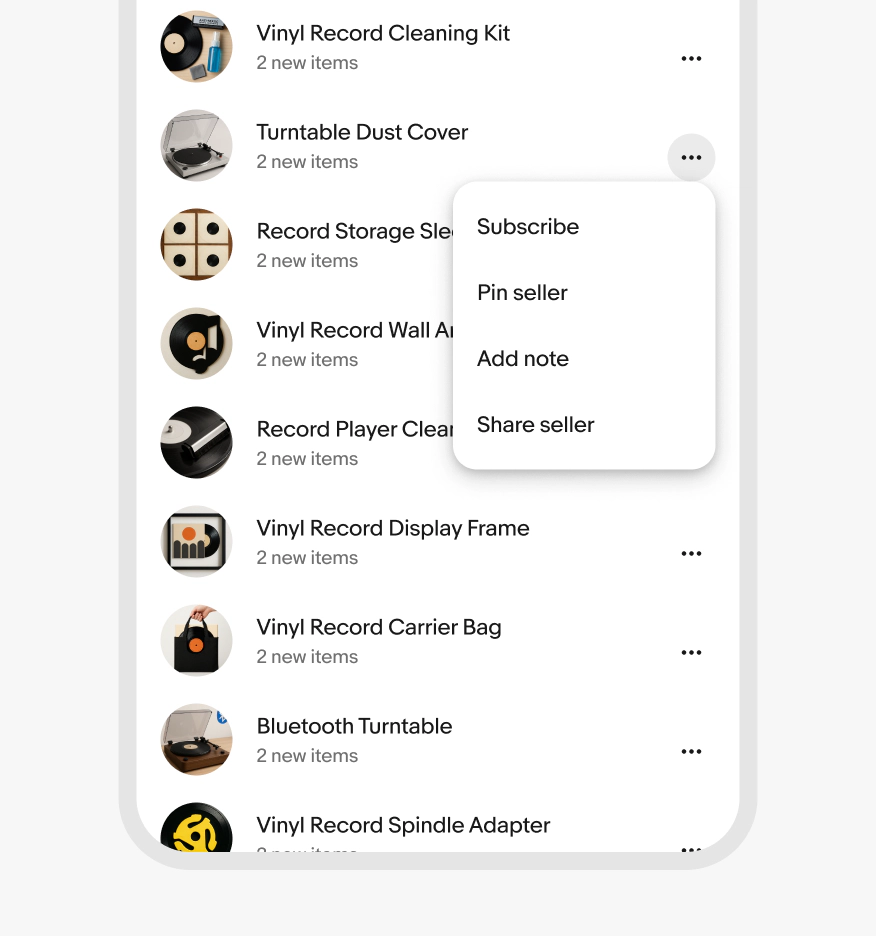
Don’t use a modal dialog for menus on web, even on smaller screens.
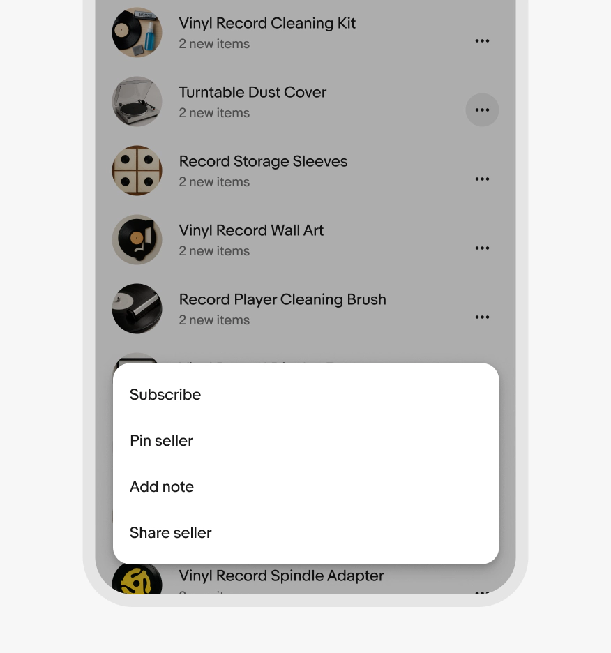
Form input
Do use menus for a list of actions triggered by either a menu, filter, or overflow button.
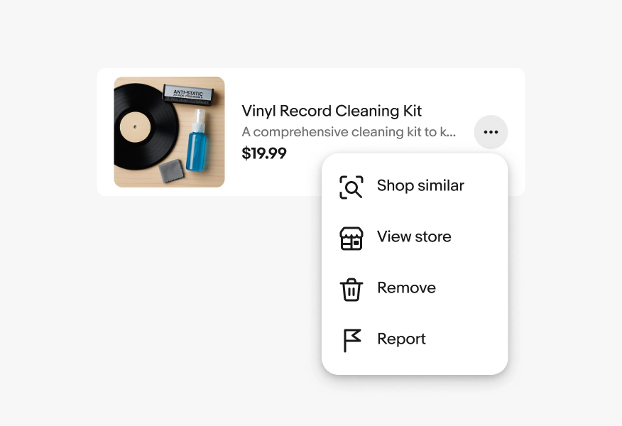
Don’t use menus for form field values. Use a Select list instead.