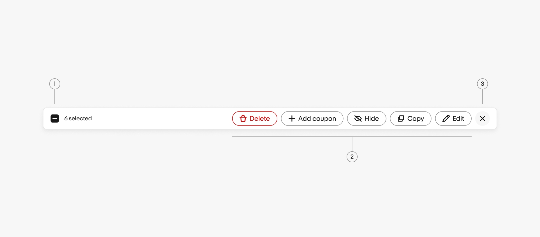
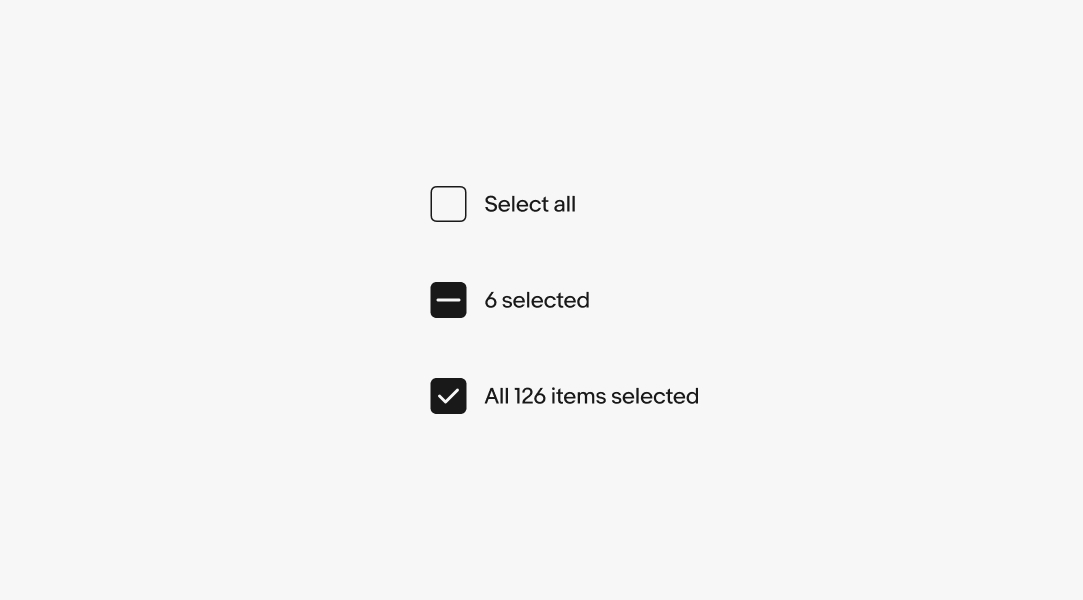
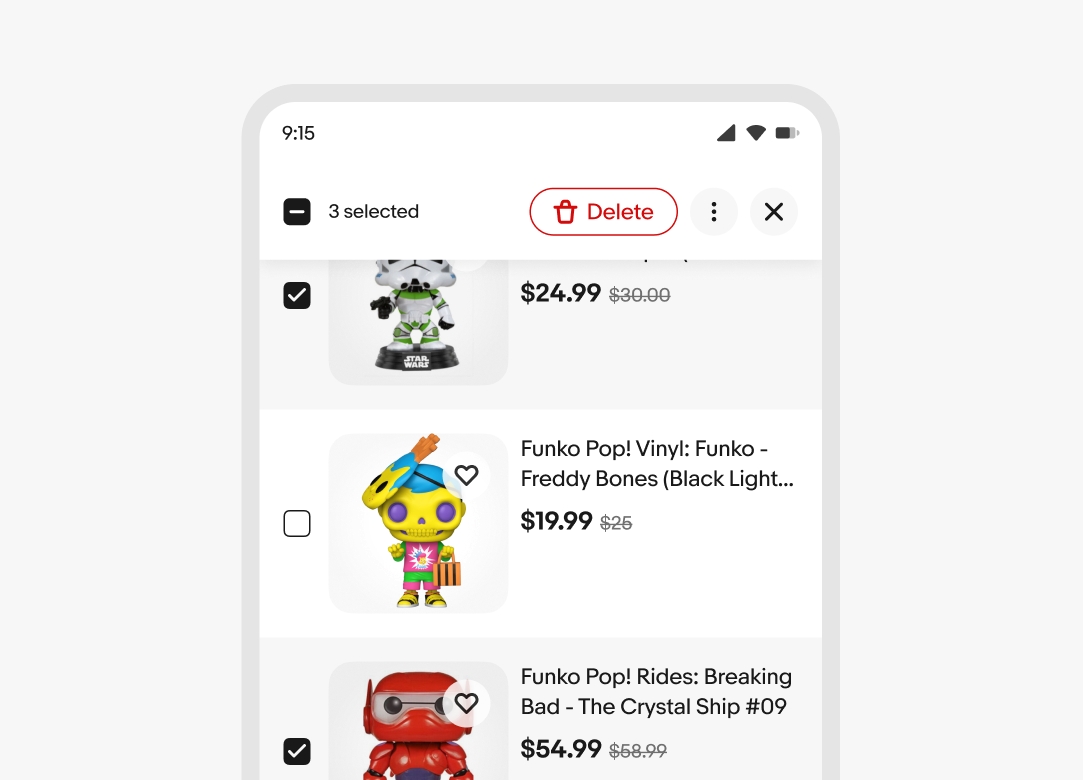
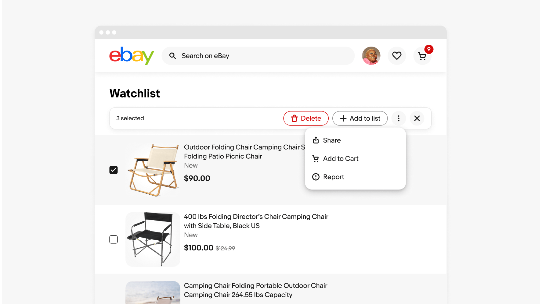
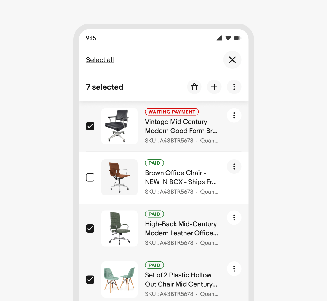
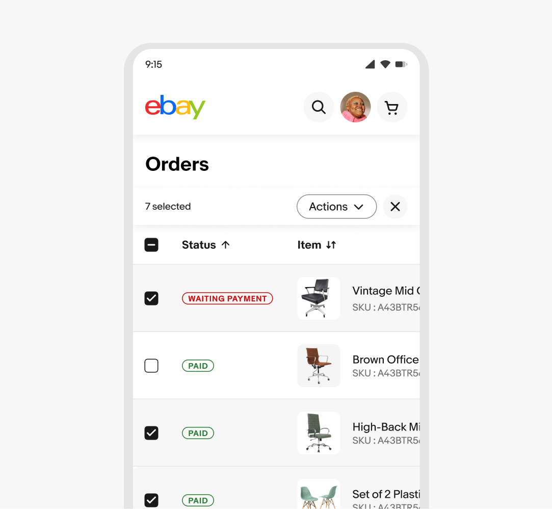
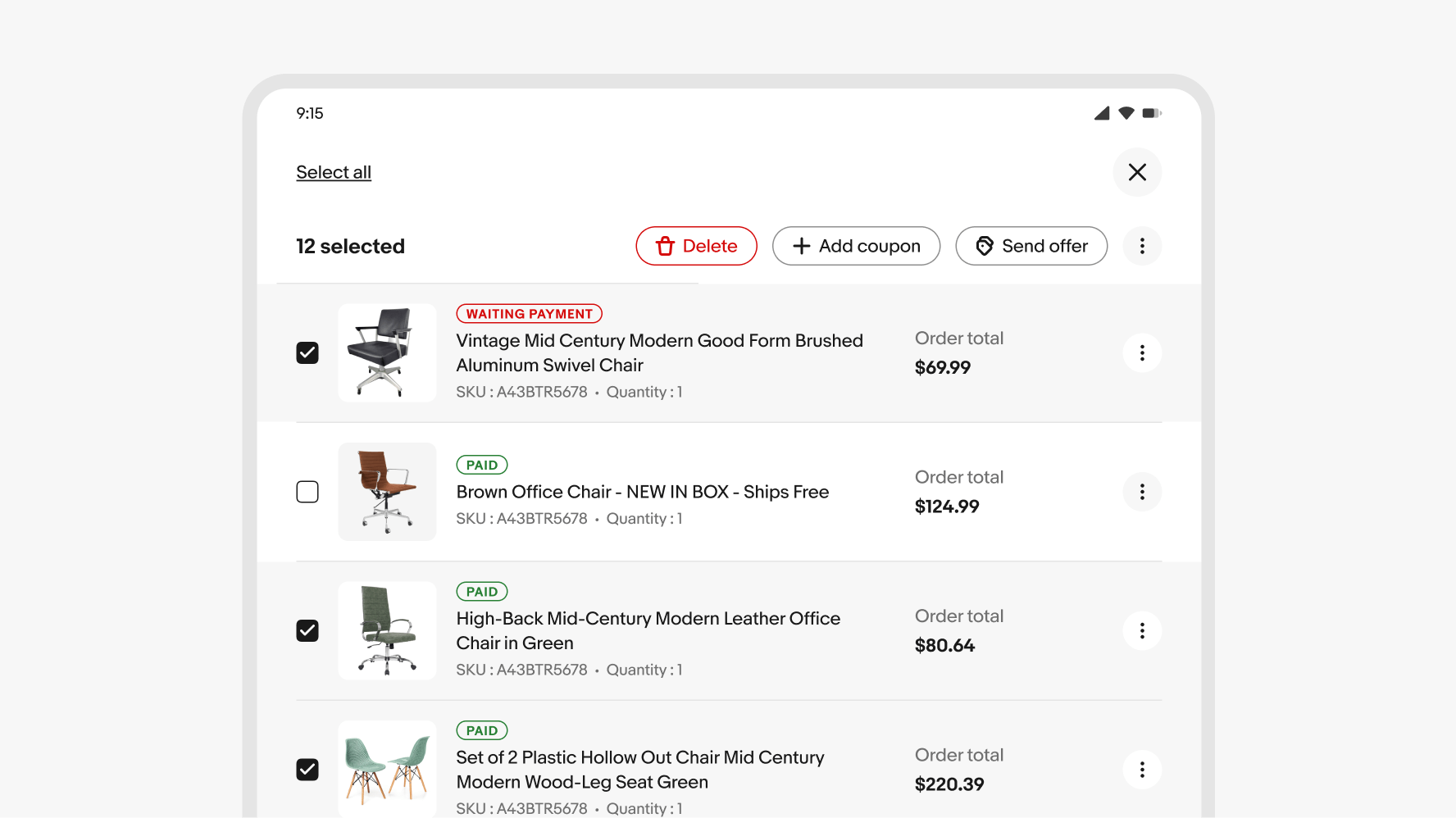
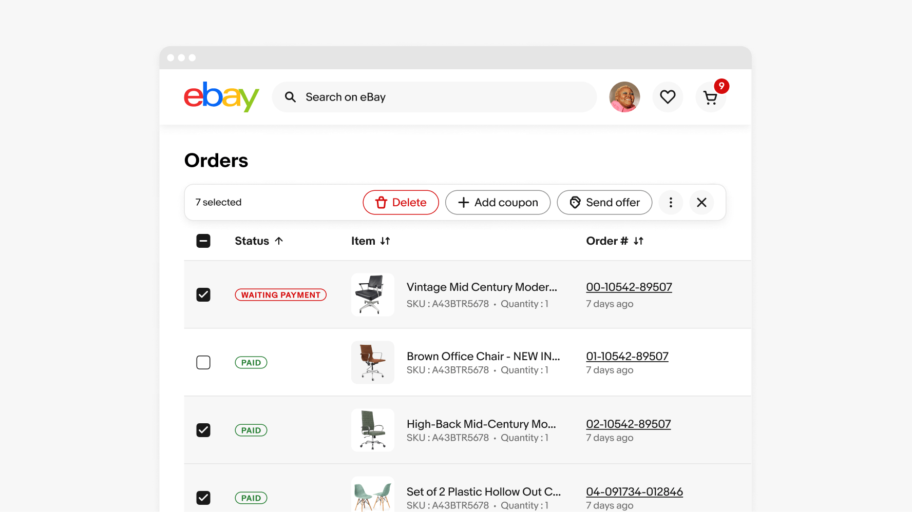
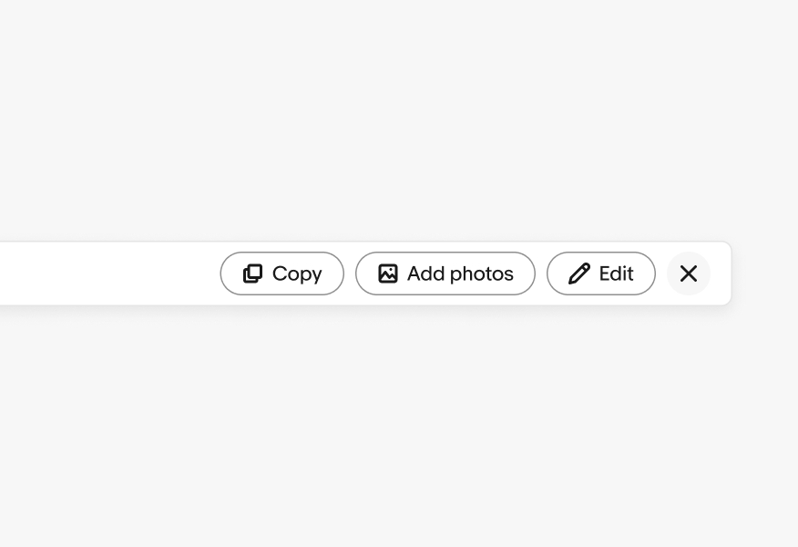
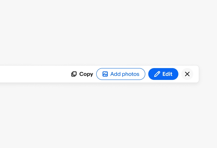
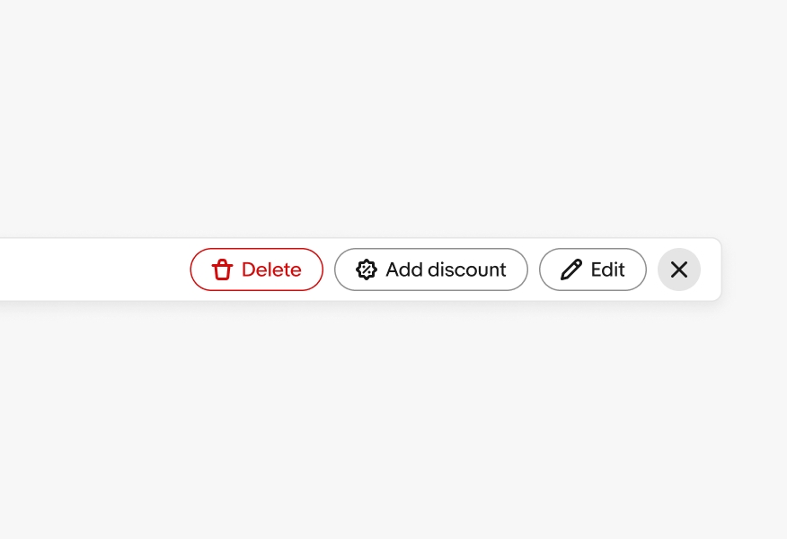
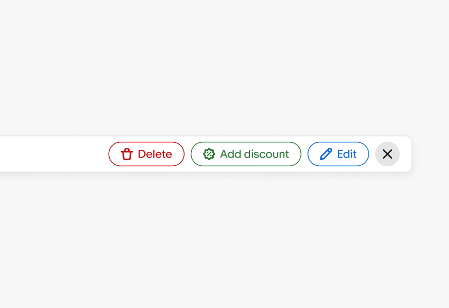
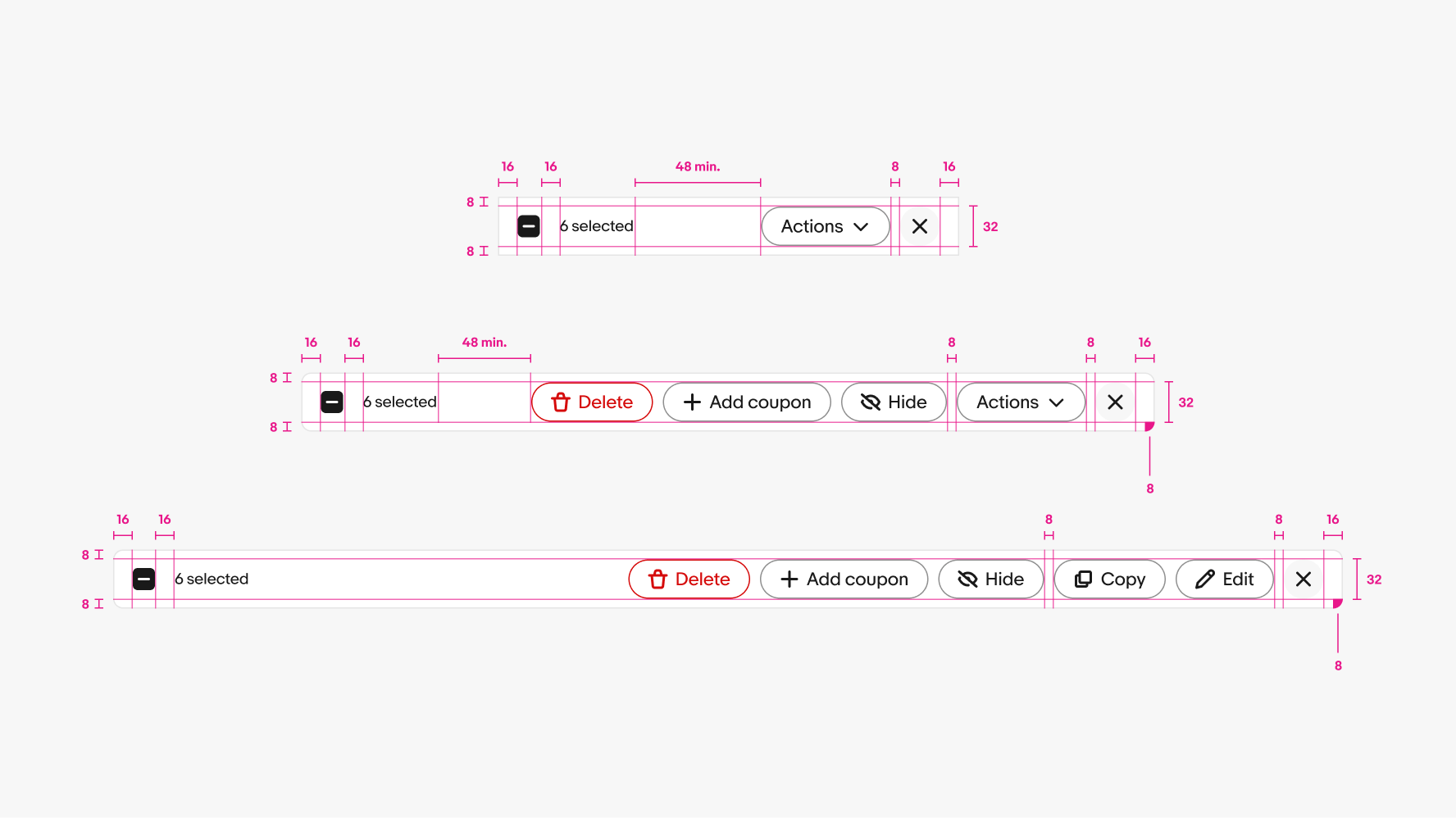
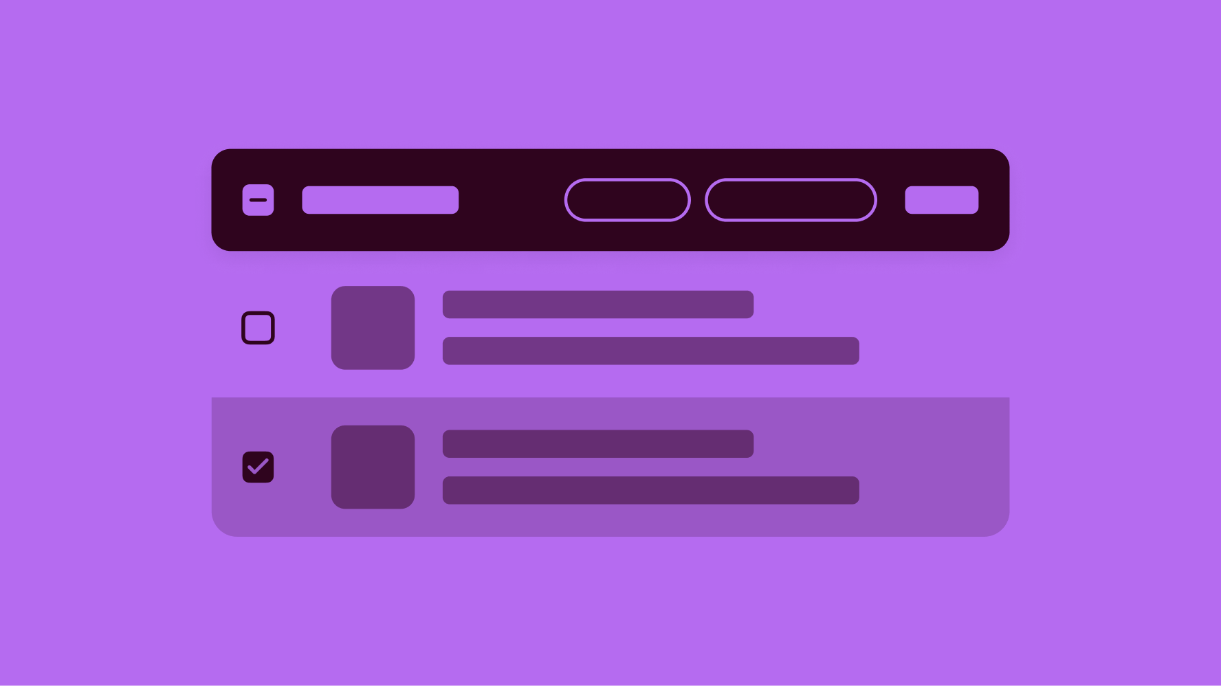
Bulk edit

v1.0.0

Bulk edit is a pattern for actions that may be performed on multiple items within a table or list. Once the user selects at least one item or enters edit mode, the bulk action bar appears at the top of the section with options.

  • Skin
  • CoreUI
  • React
Stylized artwork of a bulk edit pattern in a table.

Considerations

Related

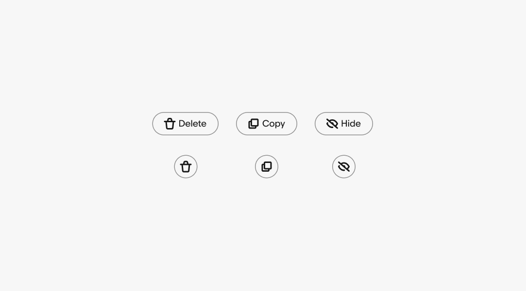
Actions should relate to the content or task at hand.

Lightweight

Bulk edit is not a replacement for individual item editing, but rather an entry point for quick, easy actions.

Quick

Bulk edit makes completing functions or tasks easy and intuitive.

Anatomy

A bulk edit diagram with 3 elements numbered: 1. Selector and counter, 2. Close, 3. Actions.
  1. Selector and counter
  2. Actions
  3. Close

Properties

Selector

The bulk action bar can include a selector element, but it is not mandatory if the base experience already has a default selector. The selector can also be a quick way to select or deselect all.

Three selector elements: an unselected ‘Select all’ element, a mixed selected ‘6 selected’ element, and a selected ‘All 126 items selected’ elements.

Actions

CTA buttons and Icon buttons can be used in the bulk edit bar. When using icon buttons, ensure that the action can be easily represented through an icon alone.

‘Delete’, ‘Copy, and ‘Hide’ CTA buttons sit above ‘Delete’, ‘Copy, and ‘Hide’ icon buttons.

Behavior

Scroll

The action bar remains fixed to the top of the page or section when scrolling while content scrolls beneath it.

An eBay mobile screen with a bulk edit action bar fixed to the top of the screen.

Counter

When items are selected, the results counter will reflect the selections made.

Three selector elements: an unselected ‘Select all’ element, a mixed selected ‘6 selected’ element, and a selected ‘All 126 items selected’ elements.

Menus

Dropdowns and overflows can be used to provide more options for actions. Use menus to group similar action when needed.

A popover menu is displayed under an overflow icon button on a bulk edit bar.

Screen sizes

As the screen width decreases in a responsive layout, the bulk action buttons collapse into an "Actions" dropdown or overflow menu.

Small native

When bulk editing is initiated on native platforms, the interface transitions into a focused mode with a header takeover and the tray navigation hidden for a cleaner, more streamlined editing experience.

A bulk edit action on the header of the native app. Four products are selected, with three action buttons and an overflow icon button.

Small web

On small web screens, the filter bar is full-width.

A bulk edit action bar on an eBay mobile screen. The bar spans the full width of the screen.

Medium and large native

On medium and large native screens, the interface also transitions into a focused mode with a header takeover and the tray navigation hidden for a cleaner, more streamlined editing experience.

A bulk edit bar on the header of a larger eBay screen. 12 products are selected, with a ‘Delete’ action button, a ‘Move to folder’ action button, and an overflow icon button.

Medium and large web

On medium and large web screens, the bulk edit bar extends across the entire width of its content section, allowing it to display more actions by default.

A bulk edit action bar on a larger eBay screen. The bar spans the full width content on the page.

Best practices

Button styles

Do use the tertiary button style for actions.

Bulk edit / Best practices / Button style do

Don’t add other buttons styles to the bulk edit bar.

Three action buttons in various styles on a bulk edit bar.

Color

Do use the appropriate semantic color for destructive actions.

A ‘Delete’ action button, an ‘Add discount’ action button, and an ‘Edit’ action button on a bulk edit bar. The ‘Delete’ button is red.

Don’t add semantic colors to non-destructive actions.

A ‘Delete’ action button, an ‘Add discount’ action button, and an ‘Edit’ action button on a bulk edit bar. The ‘Delete’ button is red, the ‘Add discount’ button is green, and the ‘Edit’ button is blue.

Specs

Three bulk edit bars are shown with specs highlighted. The padding on the top and bottom of the bar is 8px, and the padding on the left and right of the bar is 16px. The padding between the checkbox and the selector & counter label is 16px. The padding between the action buttons is 8px. The padding between the last action button and the close button is 8px. The corner radius on bulk edit bars on larger screens is 16px.

Change log

VersionDateNotes
1.0.0
Oct, 2024
  • Updated to eBay Evo
1.0.0
Oct, 2023
  • Updated small screen scaling guidance
1.0.0
Dec, 2022
  • Added bulk edit pattern for single and multiple actions
  • Added guidance and documentation for small, medium, and large screens