File uploading
File uploading allows users to upload one or more files to a location.
- CSS
- Marko
- React

Consistent
File upload ensures that users encounter the same interface and process whether they are uploading images, videos, or documents, promoting ease of use and reducing confusion across different parts of the system.
Compact
The design supports multiple file uploads and accommodates for properties like file name and description—all without overcrowding the interface or compromising usability.
Recognizable
File upload leverages the familiar visual cues commonly found in industry best practices and are widely recognized across various platforms and devices. The design helps users swiftly locate the upload area, creating a familiar and recognizable experience.
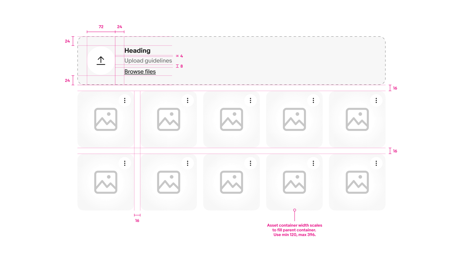
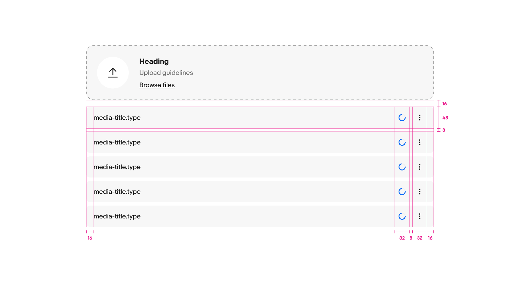
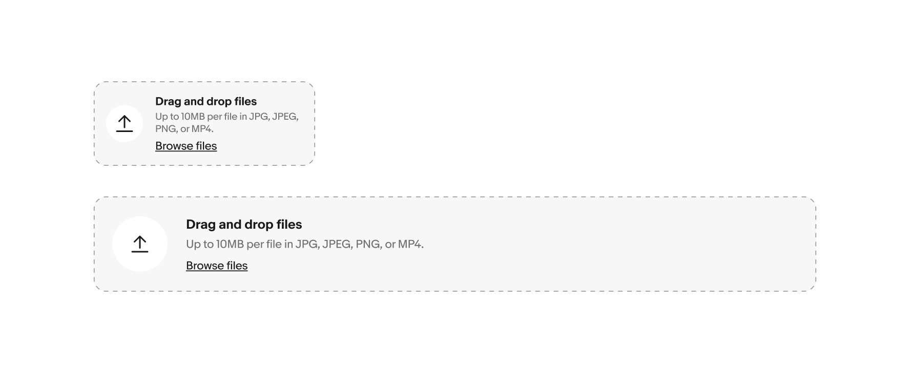
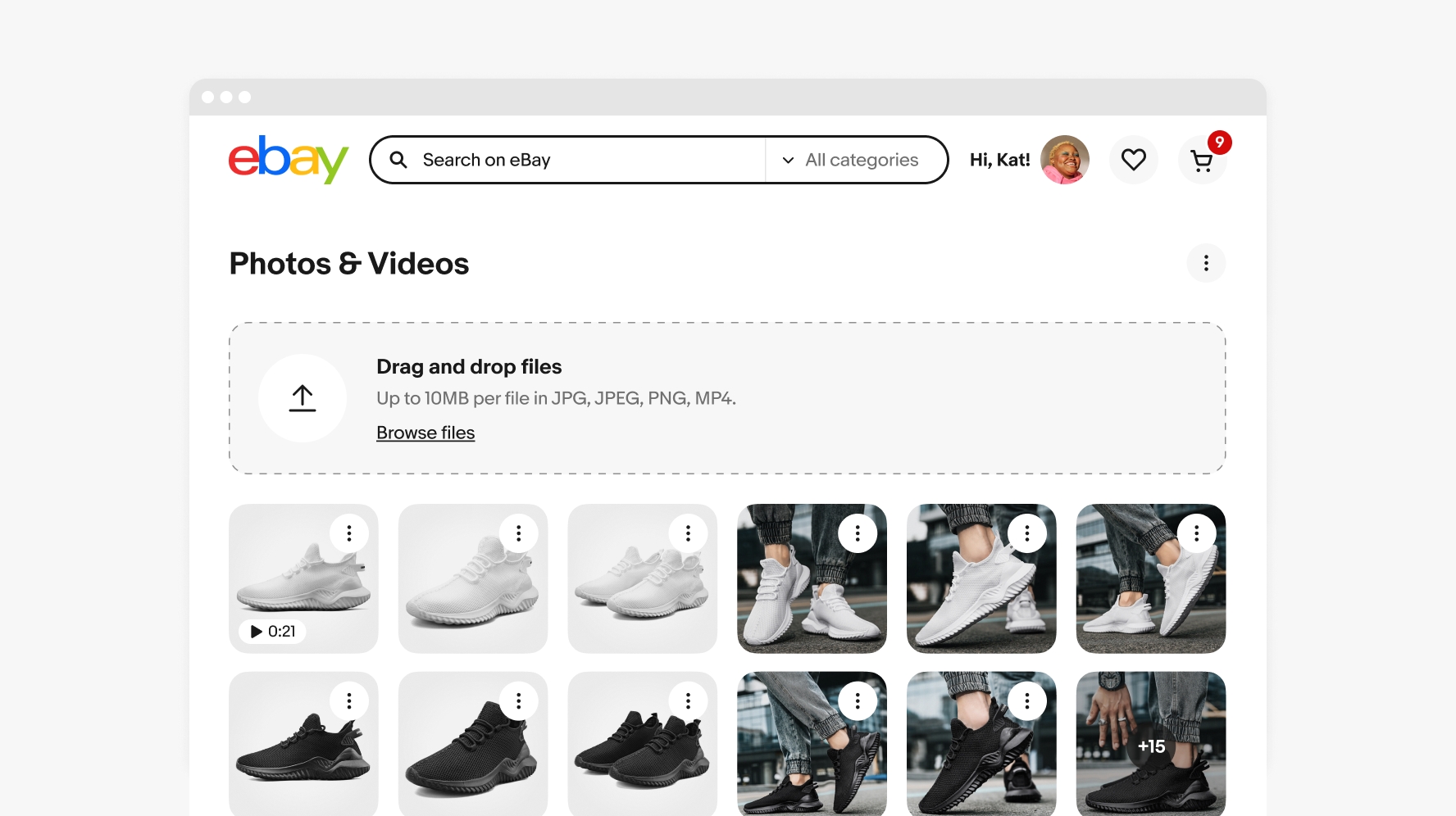
File input field
- Heading
- Description
- Select/drop zone
- Complementary CTA
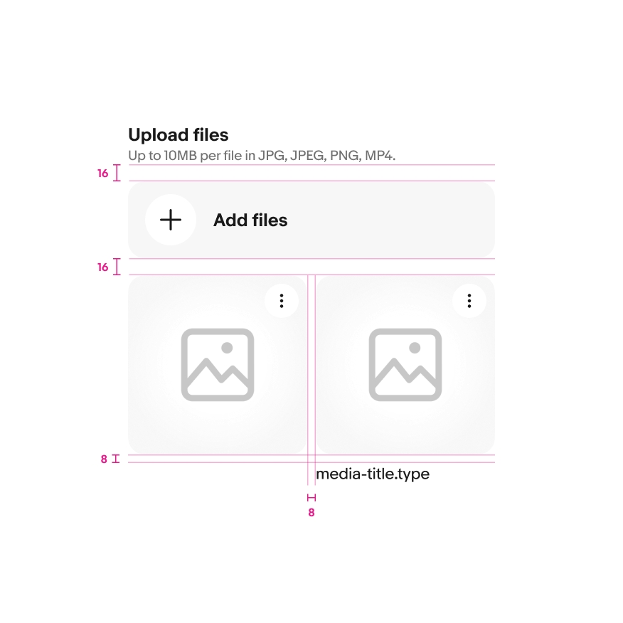
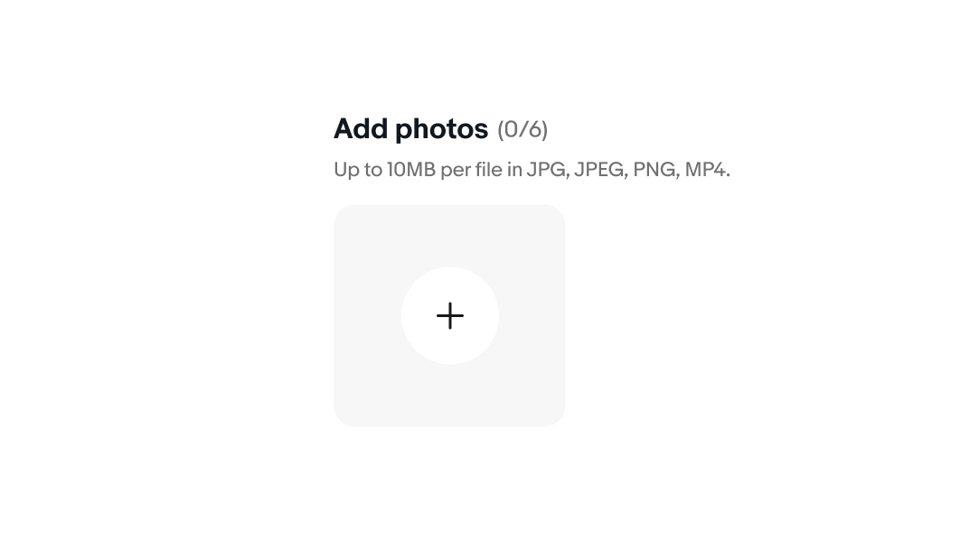
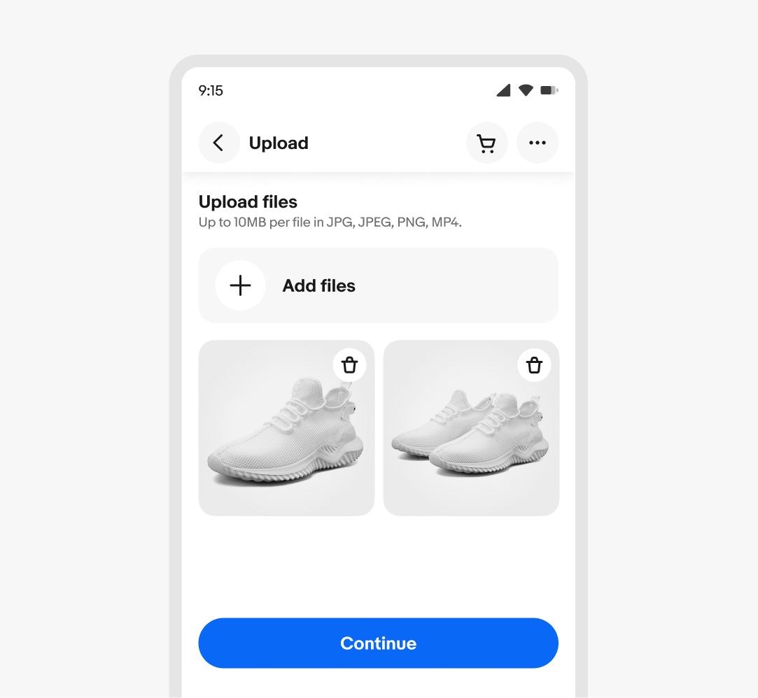
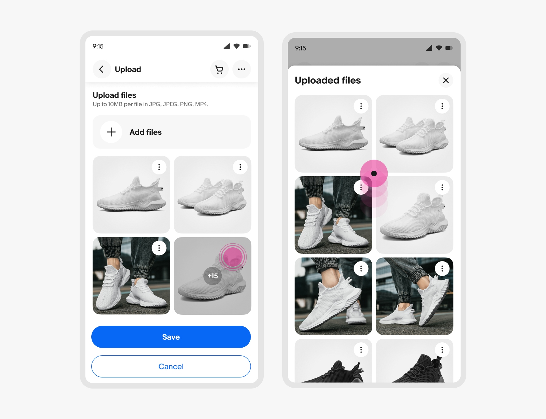
Add file button
- Heading
- Icon
- Background
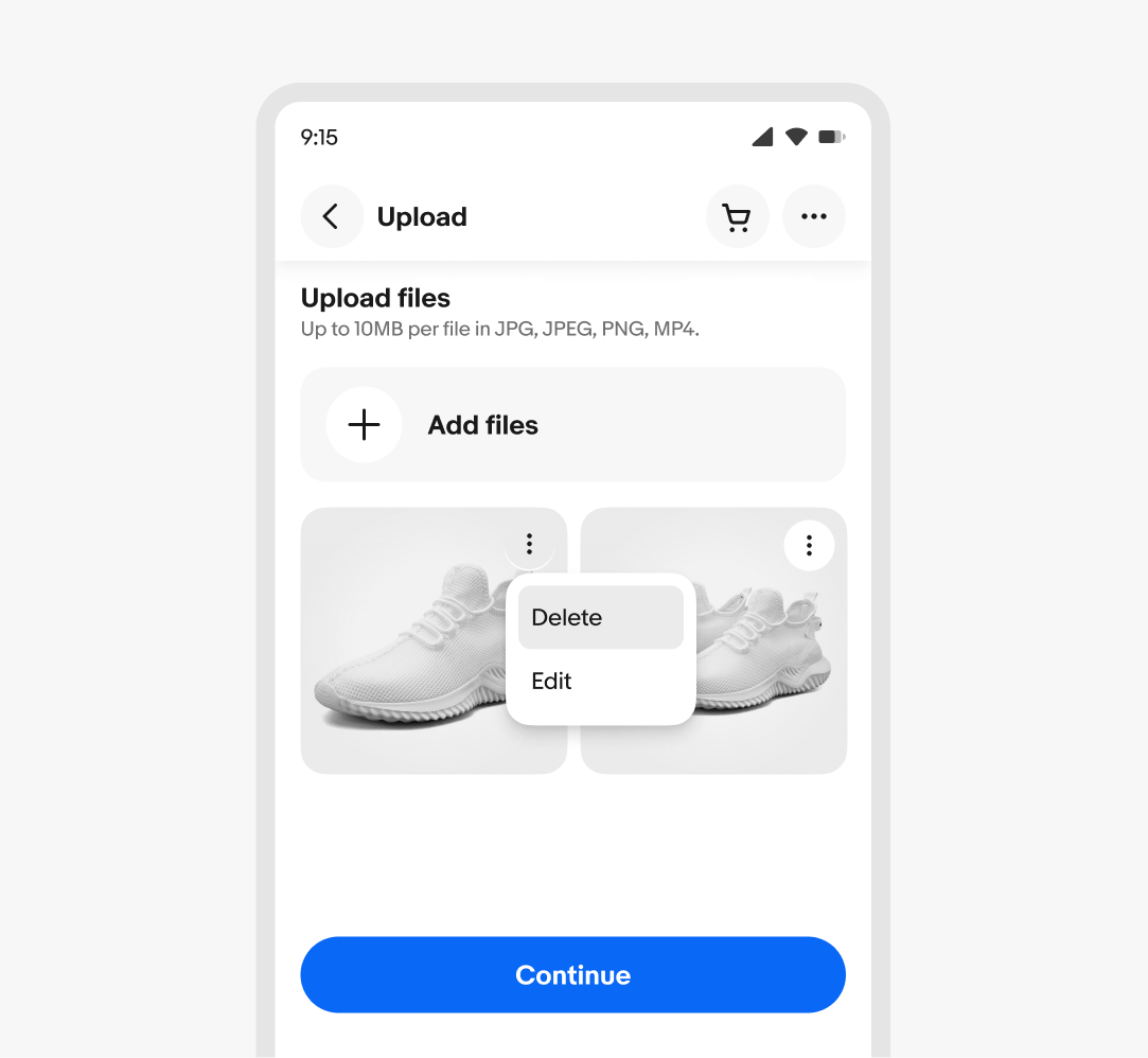
Preview card
- Asset container
- Media indicator
- Icon button
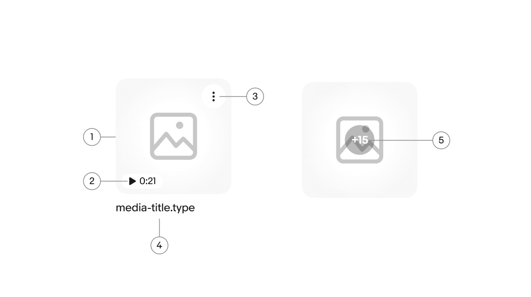
- File name (optional)
- Counter
List item
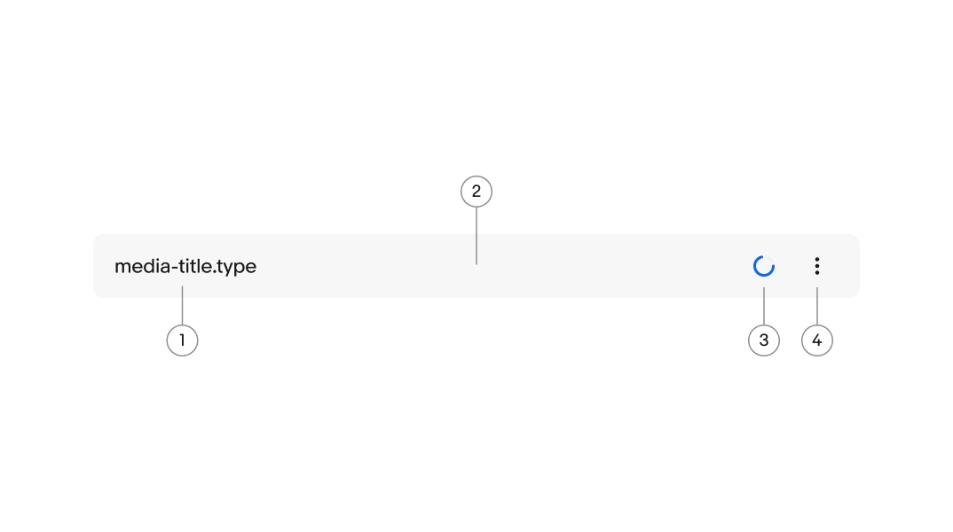
- File name
- Item container
- Loading spinner
- Icon button
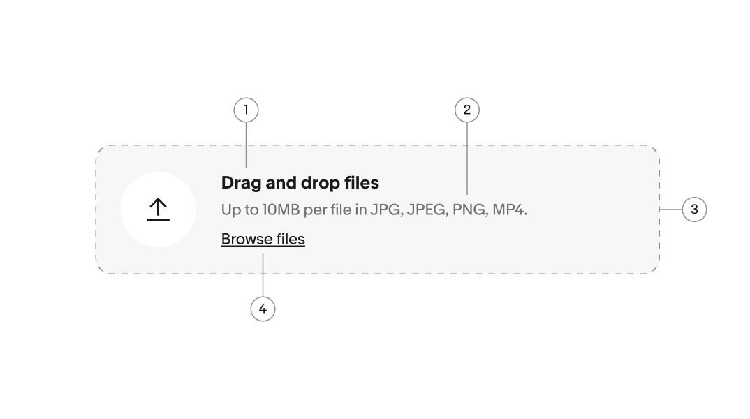
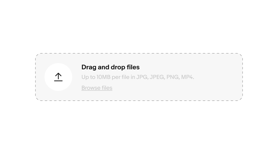
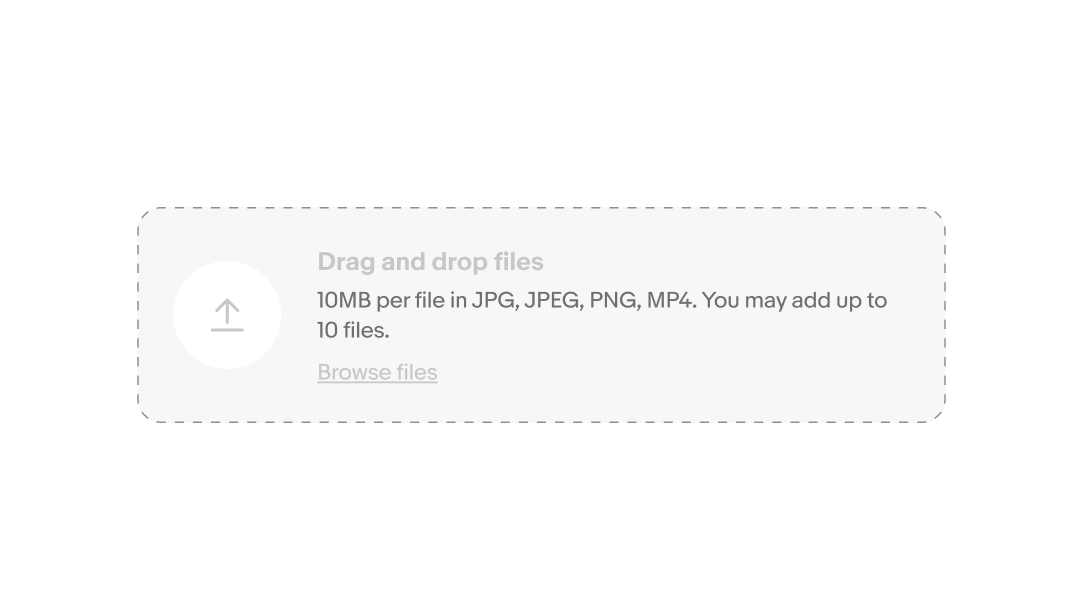
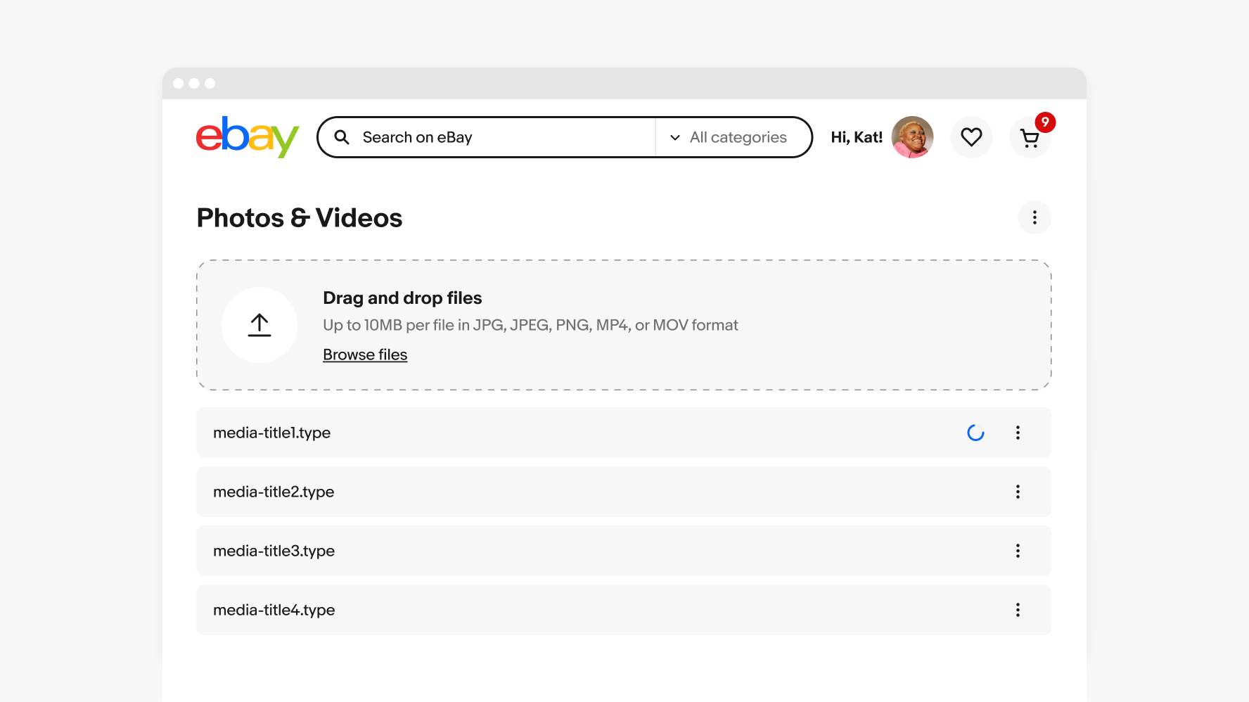
Heading
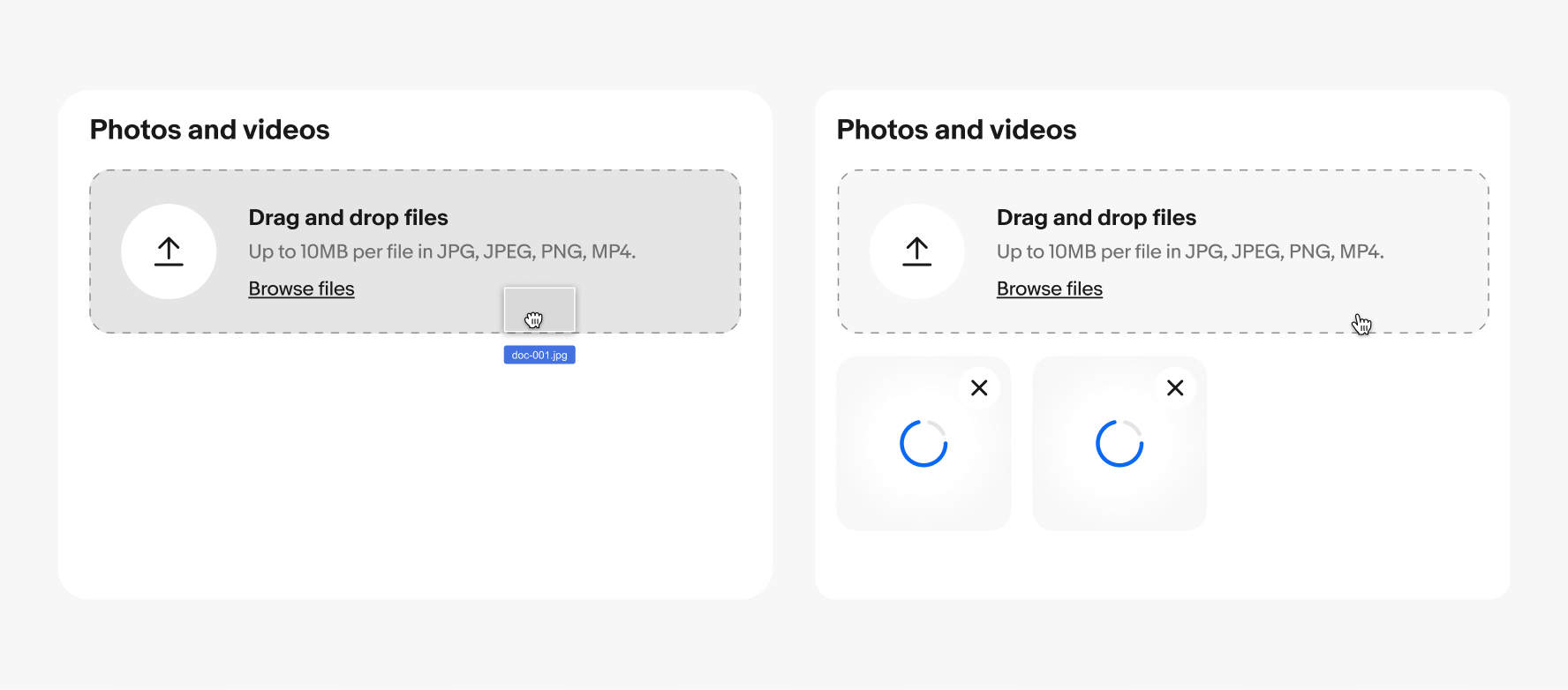
On web, “Drag and drop files” is the required bolded heading to describe the user’s available action in the file upload container. This sets the correct expectation for interactions.
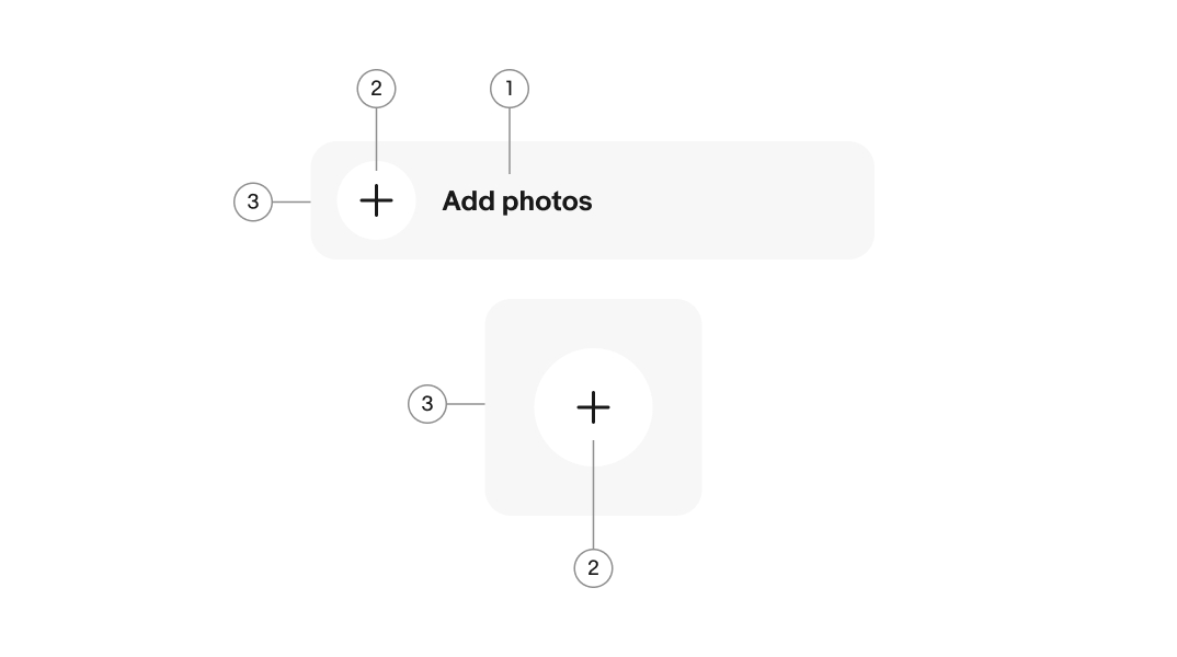
On native, the heading can be adjusted to be specific, for example “Add files” or “Add photos”.
Description
The description provides guidance on the acceptable formats and sizes for users. It can be modified to adapt to varying file upload requirements.
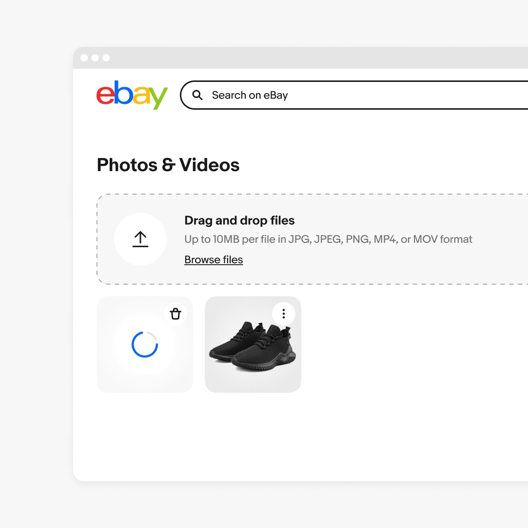
Drag and drop
Drag and drop functionality is available on the web. When a user grabs a file and hovers over file input field, the cursor changes to a closed hand. Once the file is released into the file input field the cursor switches to a hand pointer.
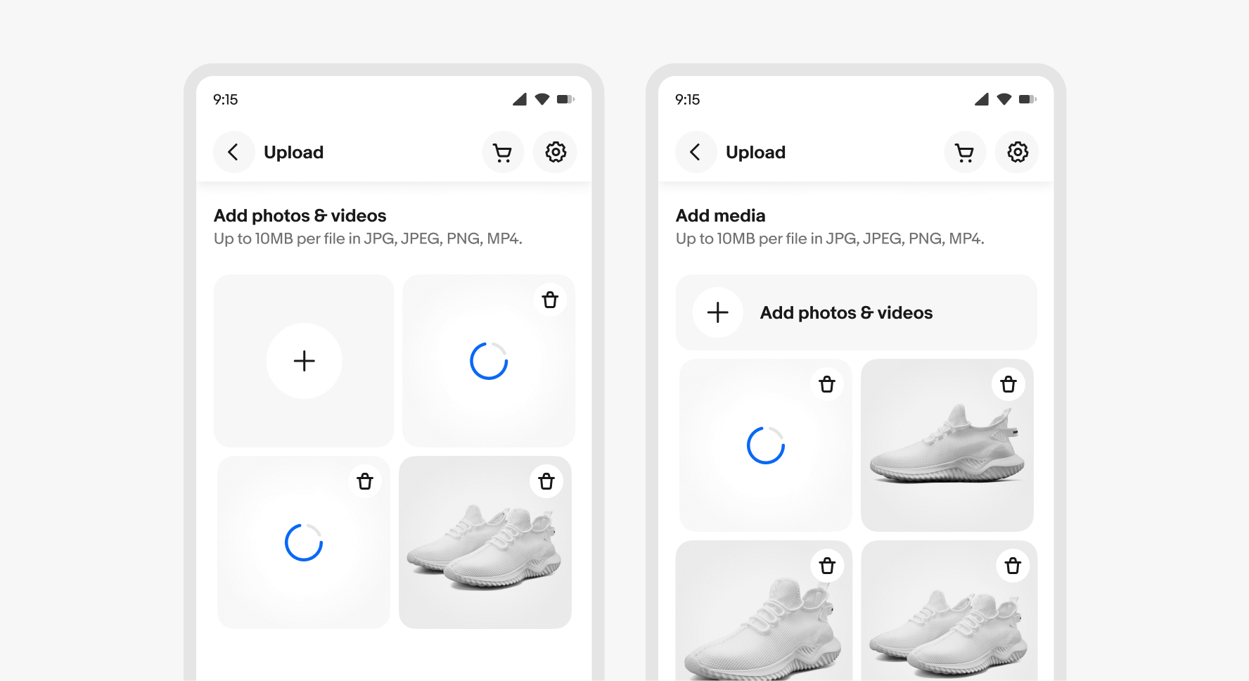
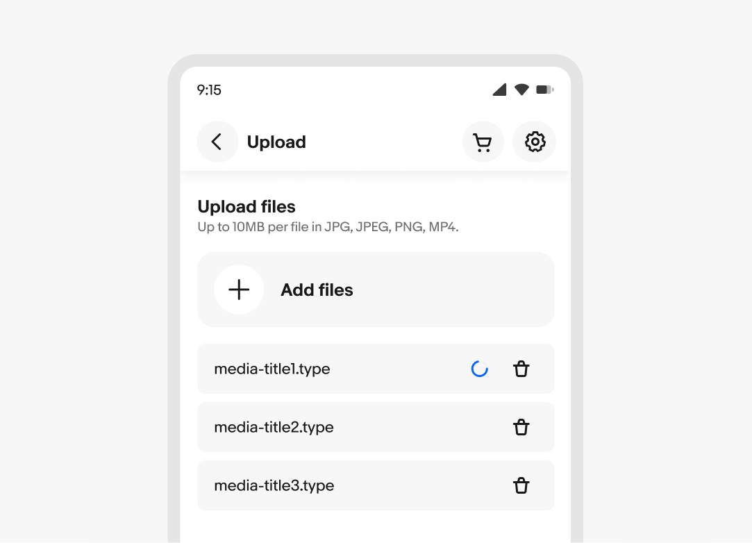
Add file button
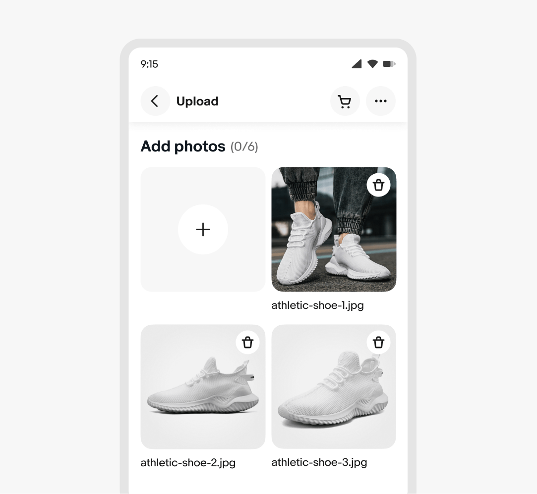
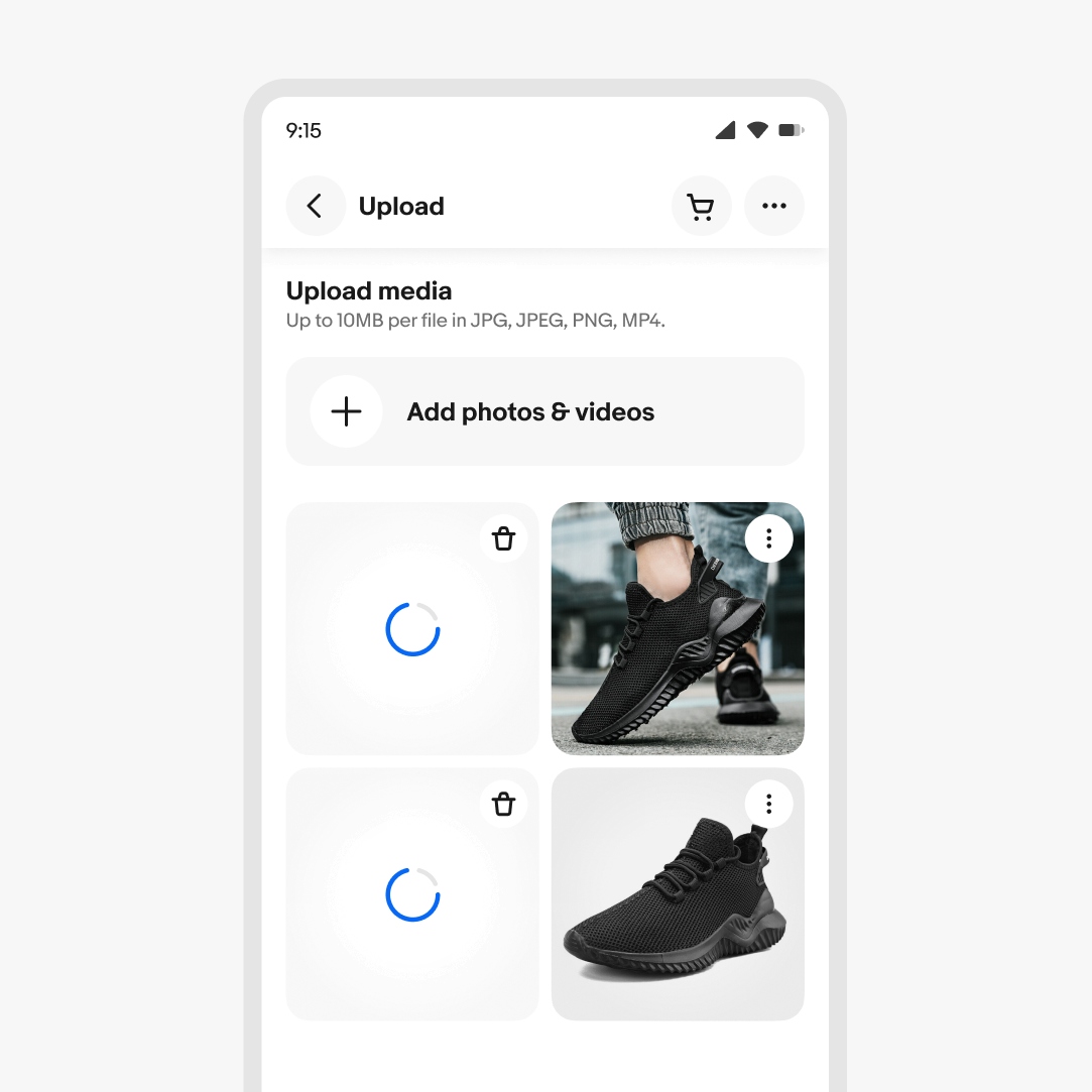
The add file button is used on native platforms instead of the file input field. The button is provided in a square and rectangle with label variants. The heading and description are placed above the gallery section. The add file button leads to the native camera roll, or presents a menu of multiple options, such as take photo or select photo.
File name
The file name is optional and can be included to help users distinguish between different files.
Description
The item description is optional and may be provided to help users understand a document’s features or purpose.
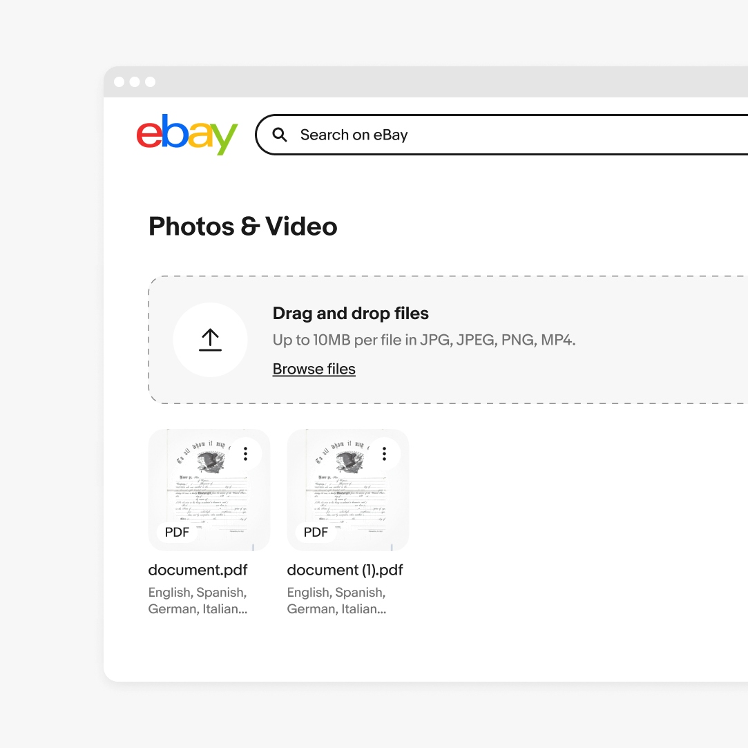
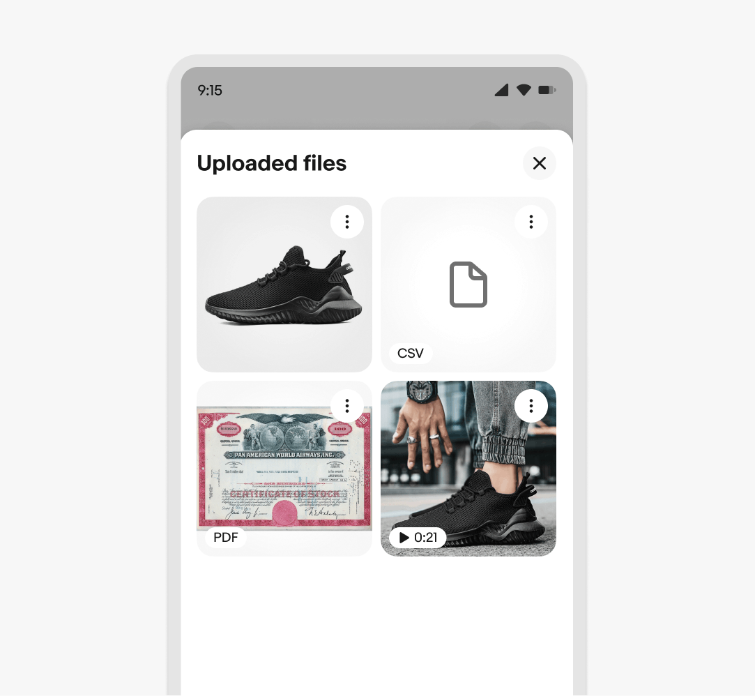
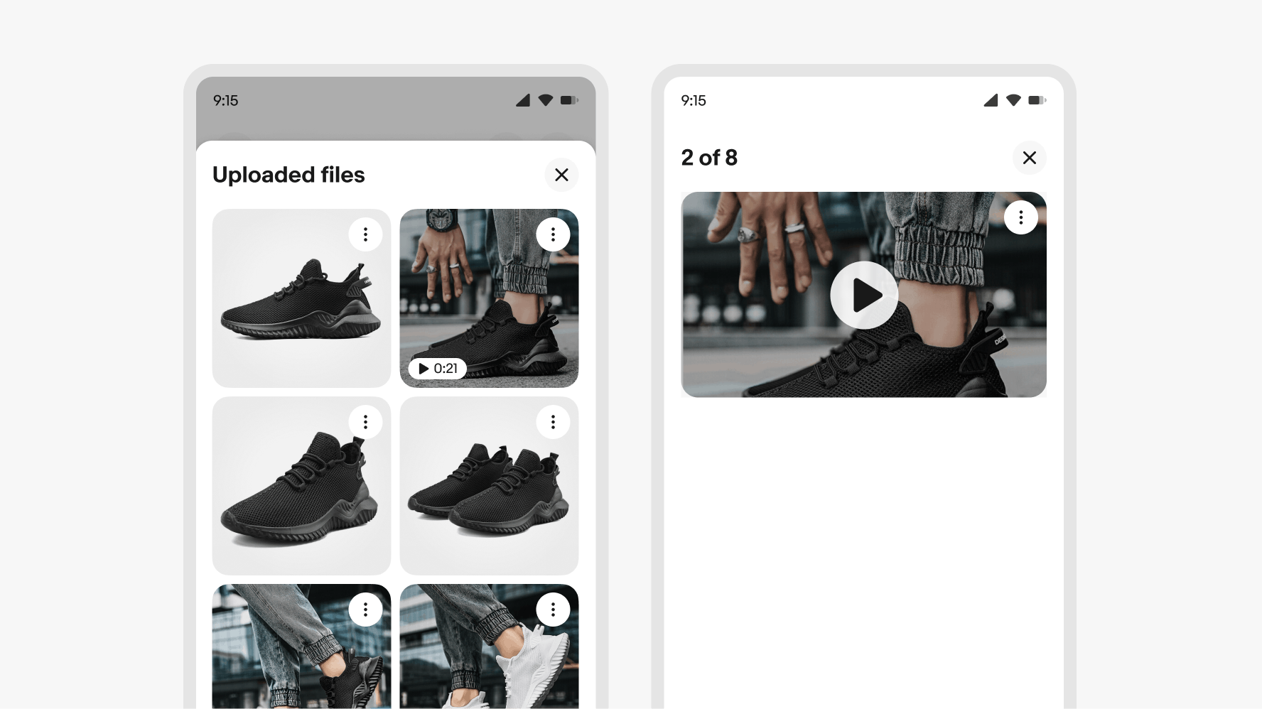
Media types
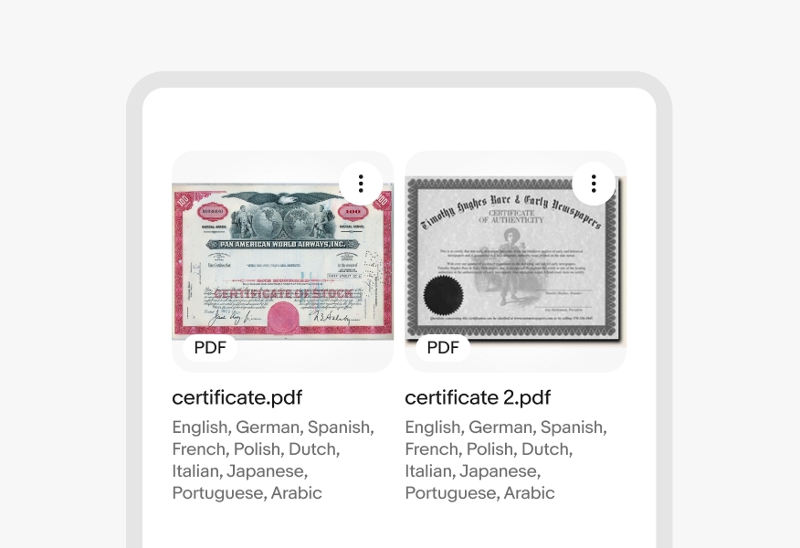
File types other than images are distinguished with the media type badge. Videos includes the play icon and time label. Other file types include a format abbreviation such as PDF, CSV etc.
Upload limits
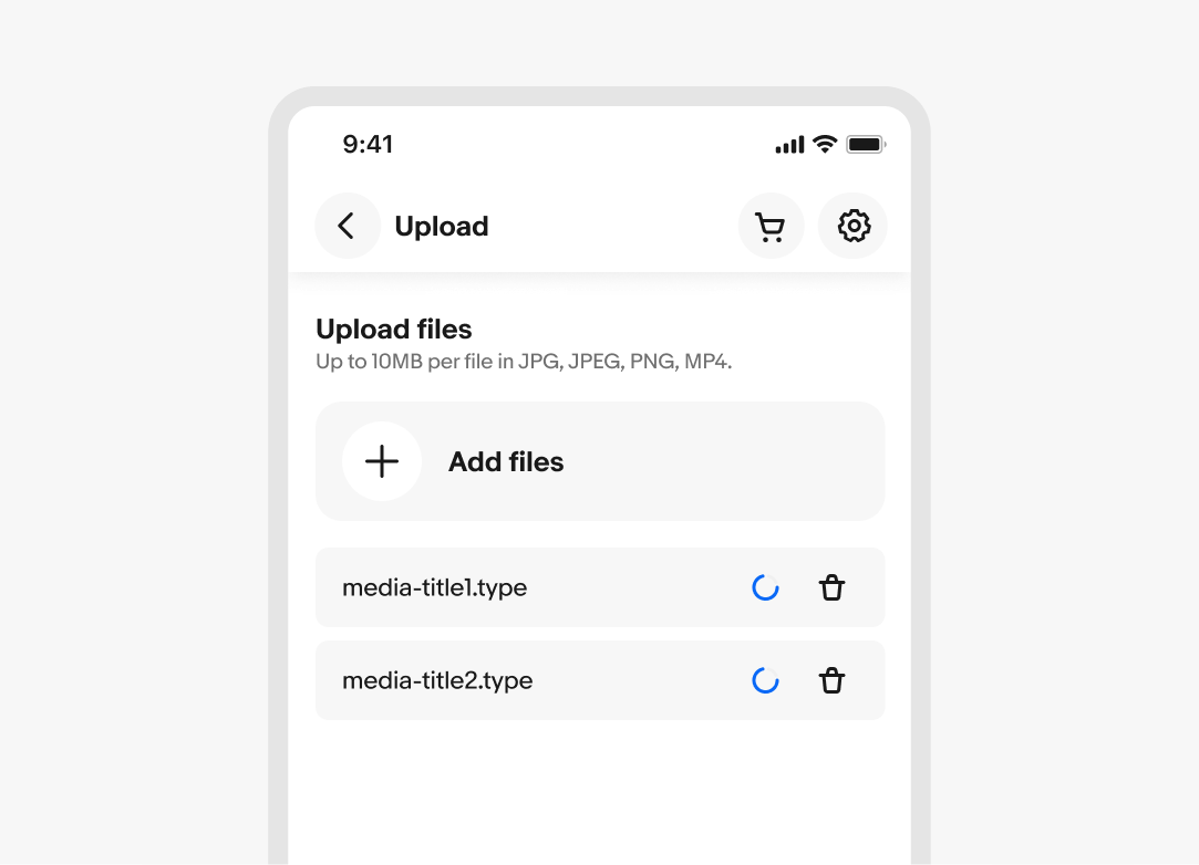
When the file uploader allows multiple files to be uploaded, the file input or add file button remains visible while files upload and all uploaded files appear in a queue. If there is a limit to total files, the file input or file button will hide when the limit is reached. If files are removed so that the total is below the limit, the file input field or add file button will reappear.
Progress states (gallery)
An example of a file gallery showing four files with two in the loading state.
Progress states (list)
The loading spinner sets expectations for the user on how much longer the upload will take to complete.
Validation
If a user selects a file that exceeds the specified size, an error message will appear above the selection/file input field. Users can only select files in the required format, which prevents errors related to file format.
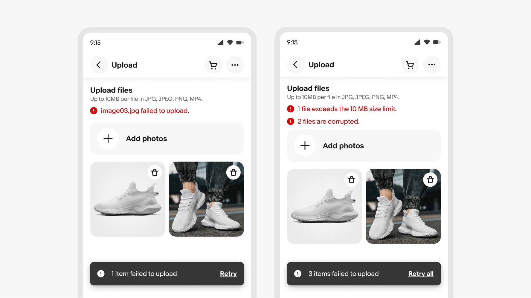
Cancel uploading files
A user can cancel an ongoing file upload by clicking/tapping the button icon located in the corner of the file preview card.
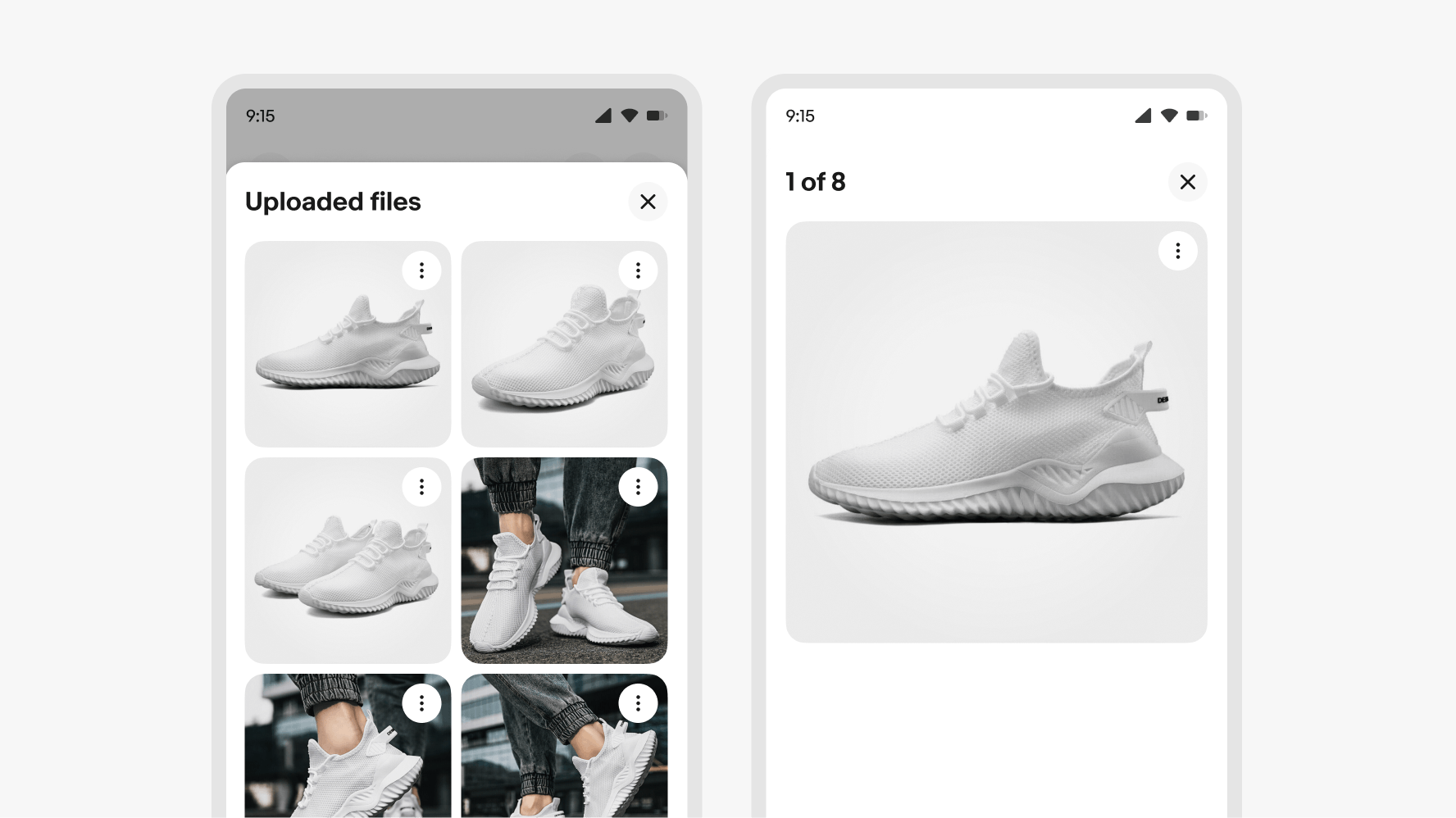
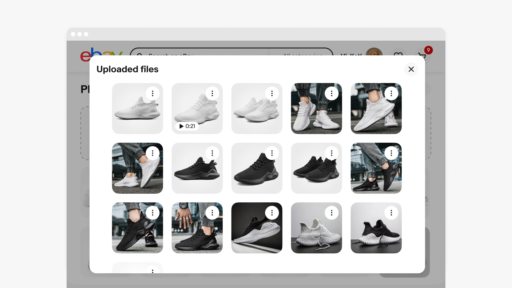
Preview
The file preview is displayed in a bottom sheet or light-box modal that can be accessed from either the main page or the overflow modal (if there are multiple assets). This preview allows for viewing details and an enlarged format for all media types.
Single action
If only a single action is available for an file preview card, such as delete, use an icon button for that specific feature.
Additional actions
If multiple actions are available for a file preview card, these options can be presented in a menu. This menu is accessible through an icon button. The delete action will remove the asset from the system.
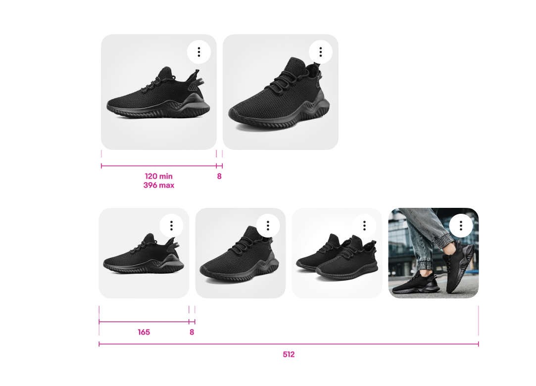
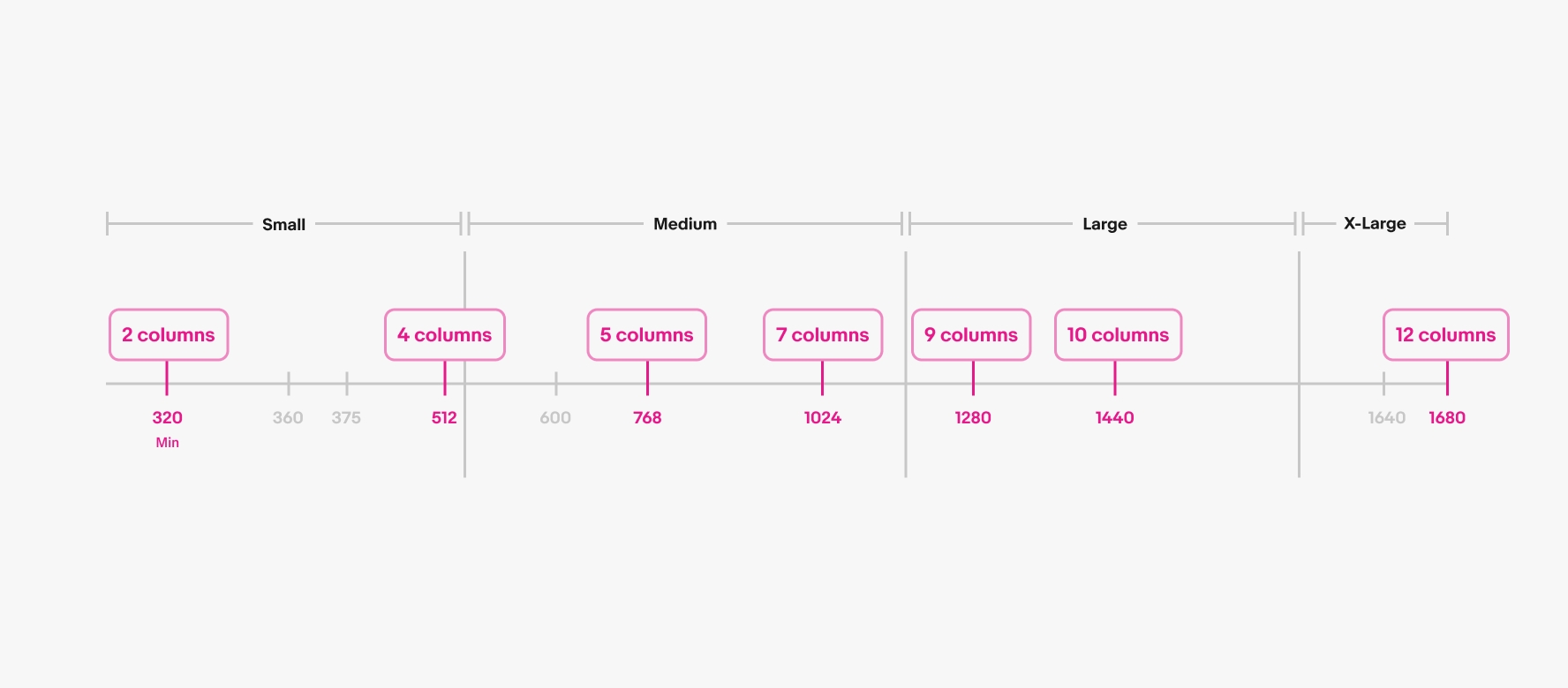
File input width
The width of the file input field is responsive to the size of its parent container which varies per screen size.
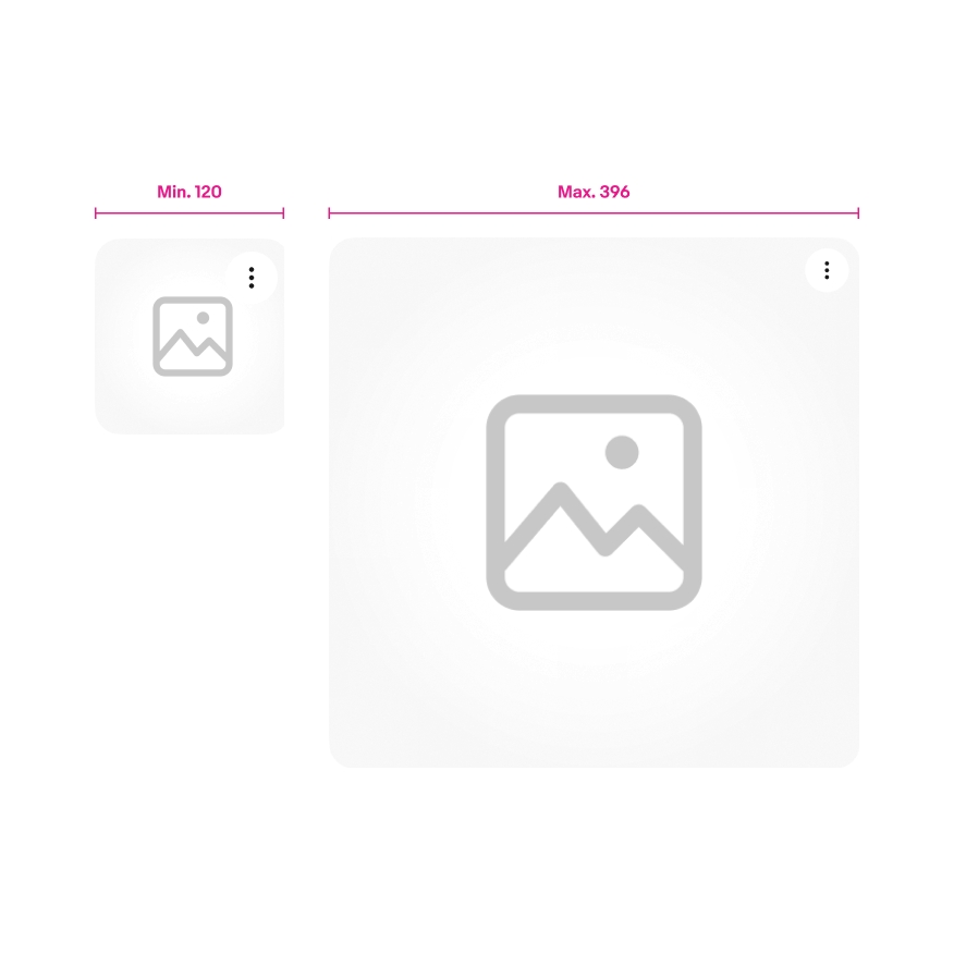
File preview card layout
File preview card have a responsive height and width to maintain a square ratio and fit their grid layout. All cards should be displayed at the same size. The parent container size will determine the file preview card widths, within the boundaries of 120px minimum and 396px maximum.
The responsive grid layout will allow cards to wrap to multiple rows as needed.
- Breakpoint 320 - 2 columns
- Breakpoint 512 - 4 columns
- Breakpoint 768 - 5 columns
- Breakpoint 1024 - 7 columns
- Breakpoint 1280 - 9 columns
- Breakpoint 1440 - 10 columns
Small
On small screens, only two file preview cards can be placed per row. If there are additional card beyond the second row, they can be accommodated using the overflow property.
After tapping the overflow, a panel will open that displays all the cards.
Medium and large
Depending on the width of the parent container, up to 6 file preview cards may fit per row. If there are more cards, they will wrap to a second row. The 6th card in the overflow utilizes the overflow property.
After clicking the overflow, the additional cards are displayed in a modal.
Description
Do truncate the asset description if it extends beyond two rows; the user can read the full description in the file preview.
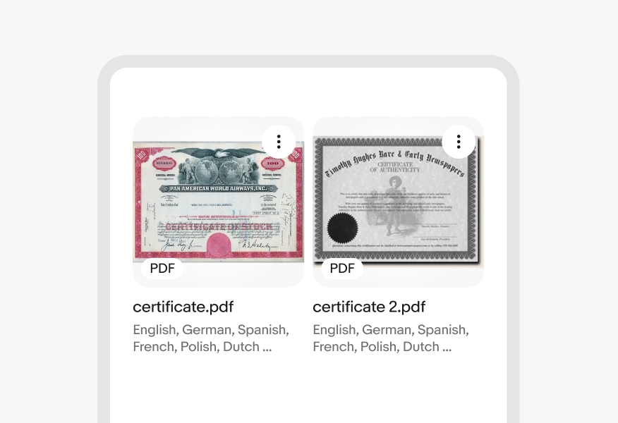
Don’t show more than two lines of description text at a time.