Numeric stepper
A control for editing a numeric value with buttons to decrease or increase the value.
- Skin
- Marko
- React
Our accessibility section covers only the key considerations that impact design thinking at a page level, such as keyboard interaction, heading structure and landmarks. For exhaustive pattern level details & guidance for the web, please visit eBay MIND Patterns.
Keyboard interaction
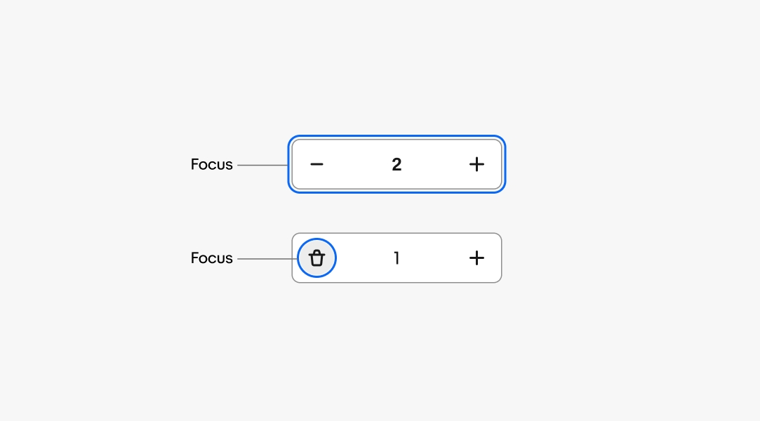
On web, the numeric stepper uses an HTML number input, which includes built-in support for adjusting the value via arrow keys. The increment and decrement buttons have tabIndex=“-1” so that they are not part of the page’s tab order.
Without delete button
- TAB to number input.
- Type in a value or press UP/DOWN arrow to adjust the current value by one.
- TAB to next focusable content on page.
With delete button
- TAB to number input.
- Type in a value or press UP/DOWN arrow to adjust the current value by one.
- TAB to the delete button.
- Press ENTER/SPACE to delete the entry.
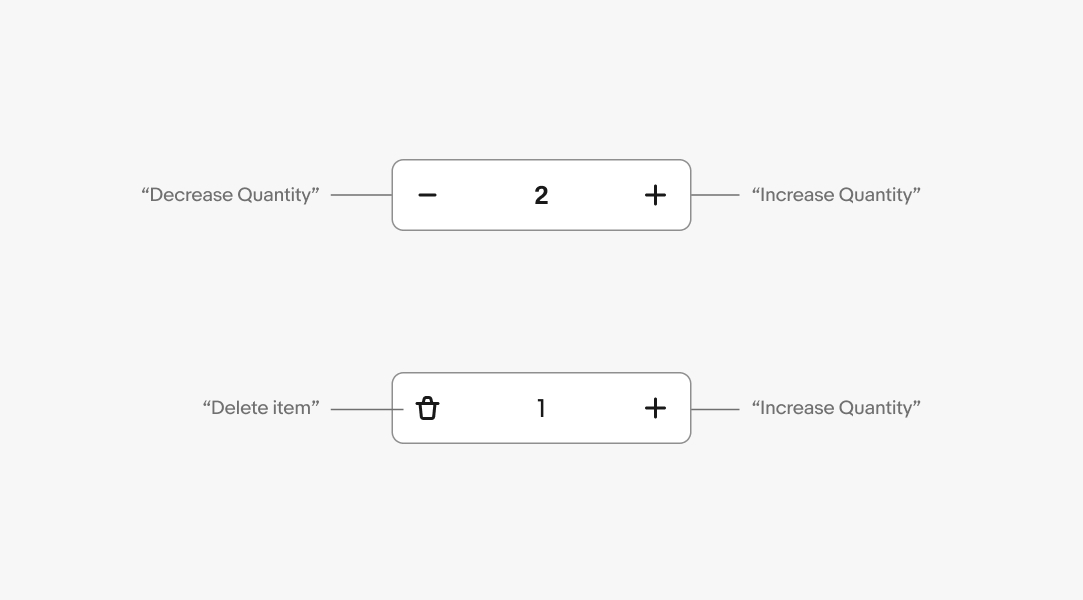
Accessible name
The input field itself should have an accessible label, and the delete icon button should have an accessible name clearly indicating its purpose. For example, a numeric stepper in a shopping cart scenario may have an input field labelled “Quantity” and a delete button labelled “Remove item from cart.”
The increment and decrement buttons should be hidden from the screen reader flow, as they mimic built-in functionality of the number input.