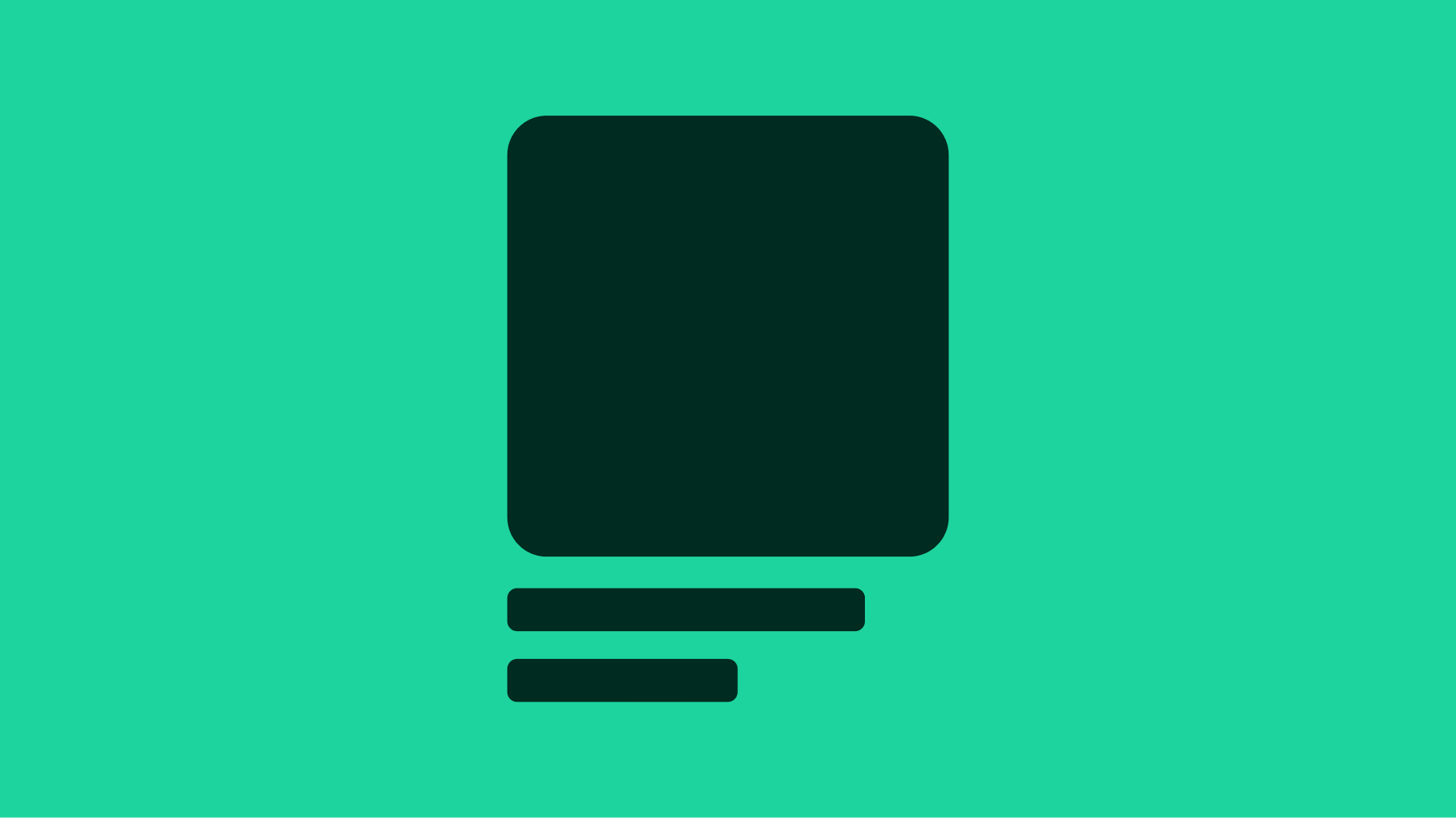
Skeleton loader
A skeleton is a graphical placeholder, reserving physical space in the page for content in cases where a service or action may be slow to resolve. A skeleton can be considered as an alternative to the progress spinner in many situations.
- CSS
- Marko
- React
Lightweight
Skeleton states are simple tools that portray that content is still being loaded—helping reduce user uncertainty.
Structured
Skeletons provide visual hierarchy and suggest the content they are meant to represent whenever possible.
Quick
Skeletons should only appear for a few seconds when needed and disappear when content populates a page.
- Shape
- Shimmer
It is the developer's responsibility to ensure the CLS metric of a page is not negatively impacted by the introduction of a skeleton placeholder; a poor CLS score will occur whenever content shifts unexpectedly. Unexpected movement of page content usually happens because resources are loaded asynchronously or DOM elements get dynamically added to the page above existing content. Skeletons can help mask these problems if they reserve the correct amount of physical space, but can compound the problem when they do not. View helpful skeleton examples in the Skin library.
When to use
- Skeleton loaders on initial page render should be used as a last resort and not built as an integral part of the design
- If UI elements need to be loaded
- If visual layout/format of the content being loaded is mostly known ahead of time to reduce the probability of layout shift
- If the majority of the page will be taking time to load
When to consider something else
- If the visual layout/format of the content being loaded is unknown
- If you need to indicate processing or that a change will occur on the page
- If content can be pre-loaded or optimized in another way, don’t default to skeleton loaders because they’re easy to leverage
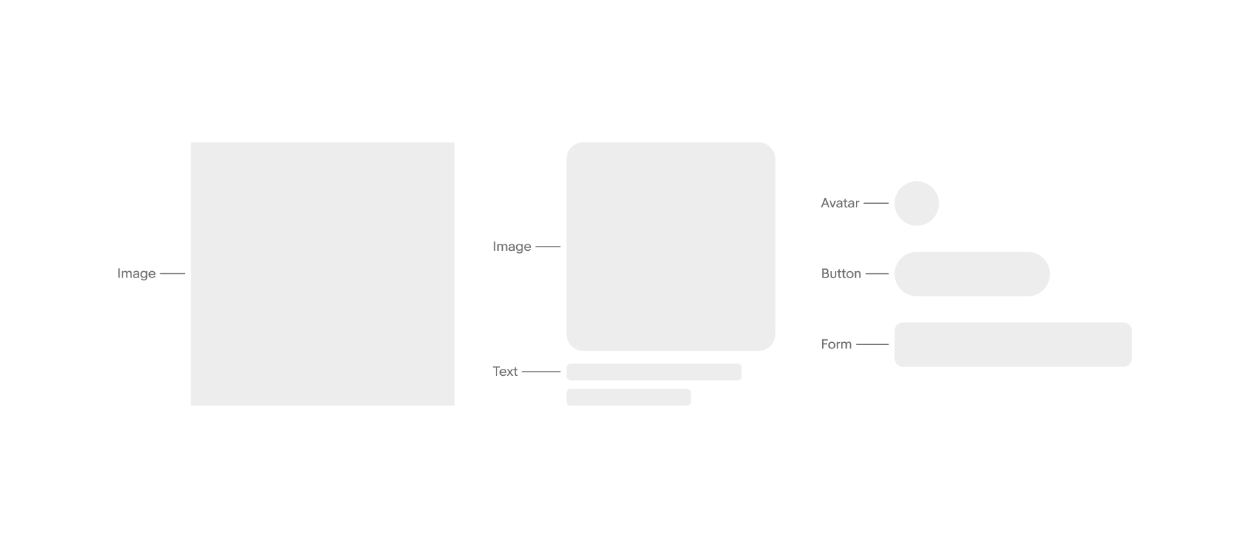
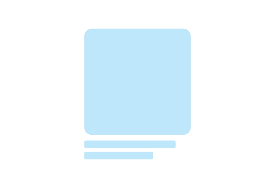
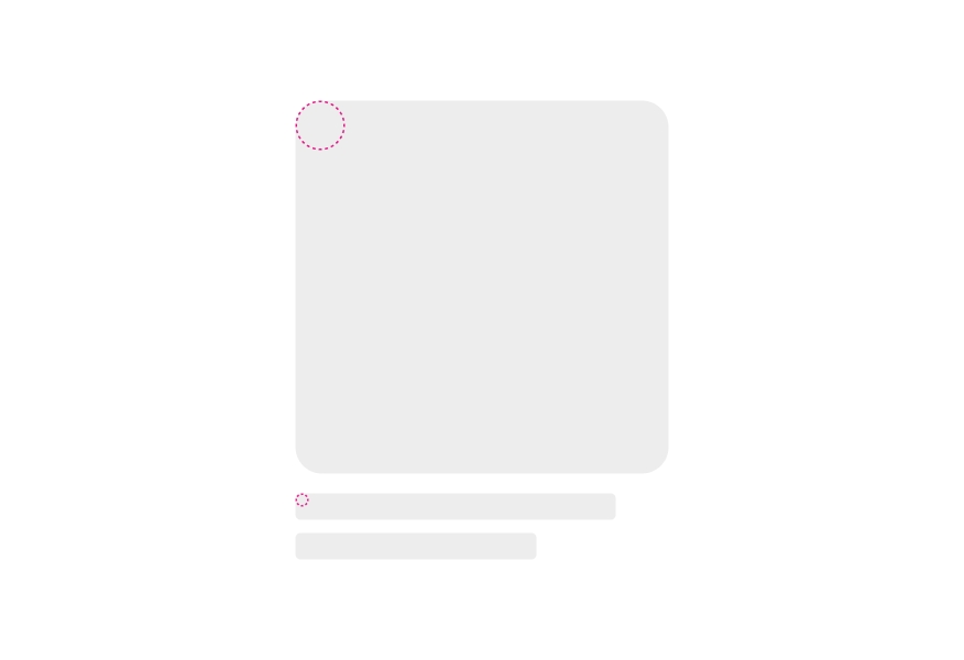
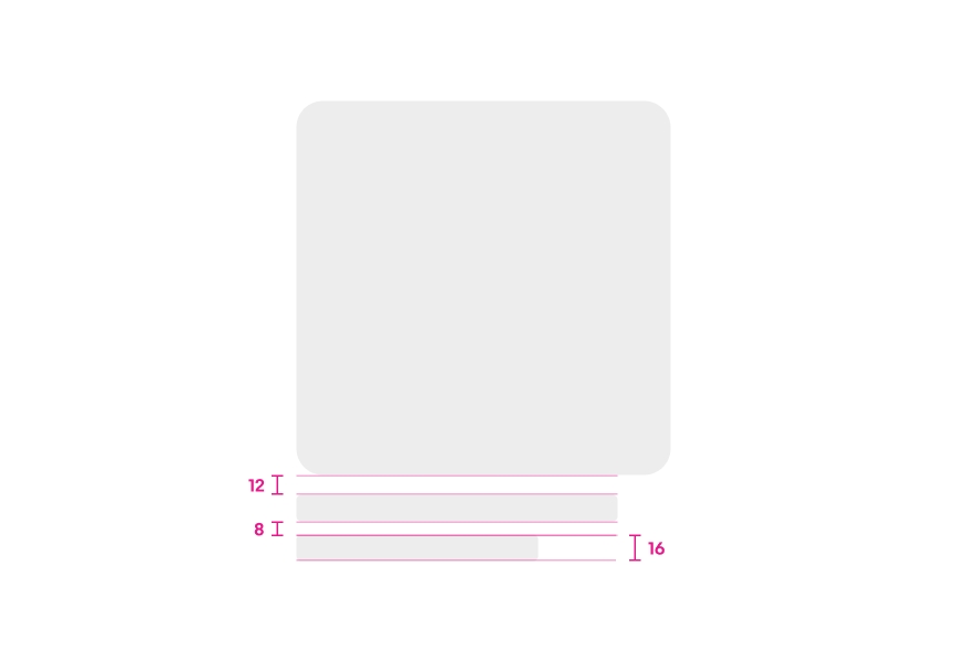
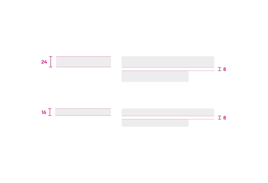
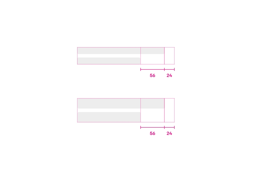
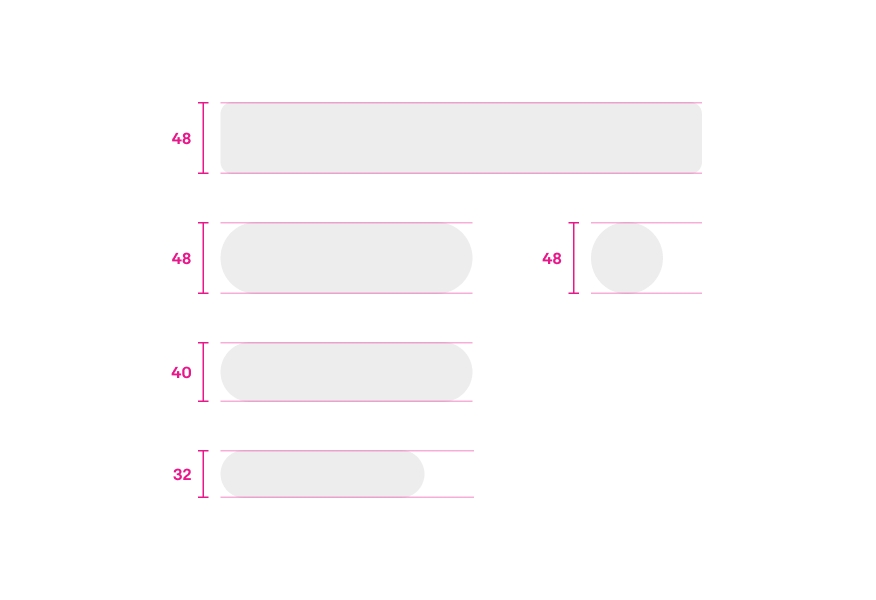
Shape
Skeleton loading experiences are built using simple shapes found within our common components.
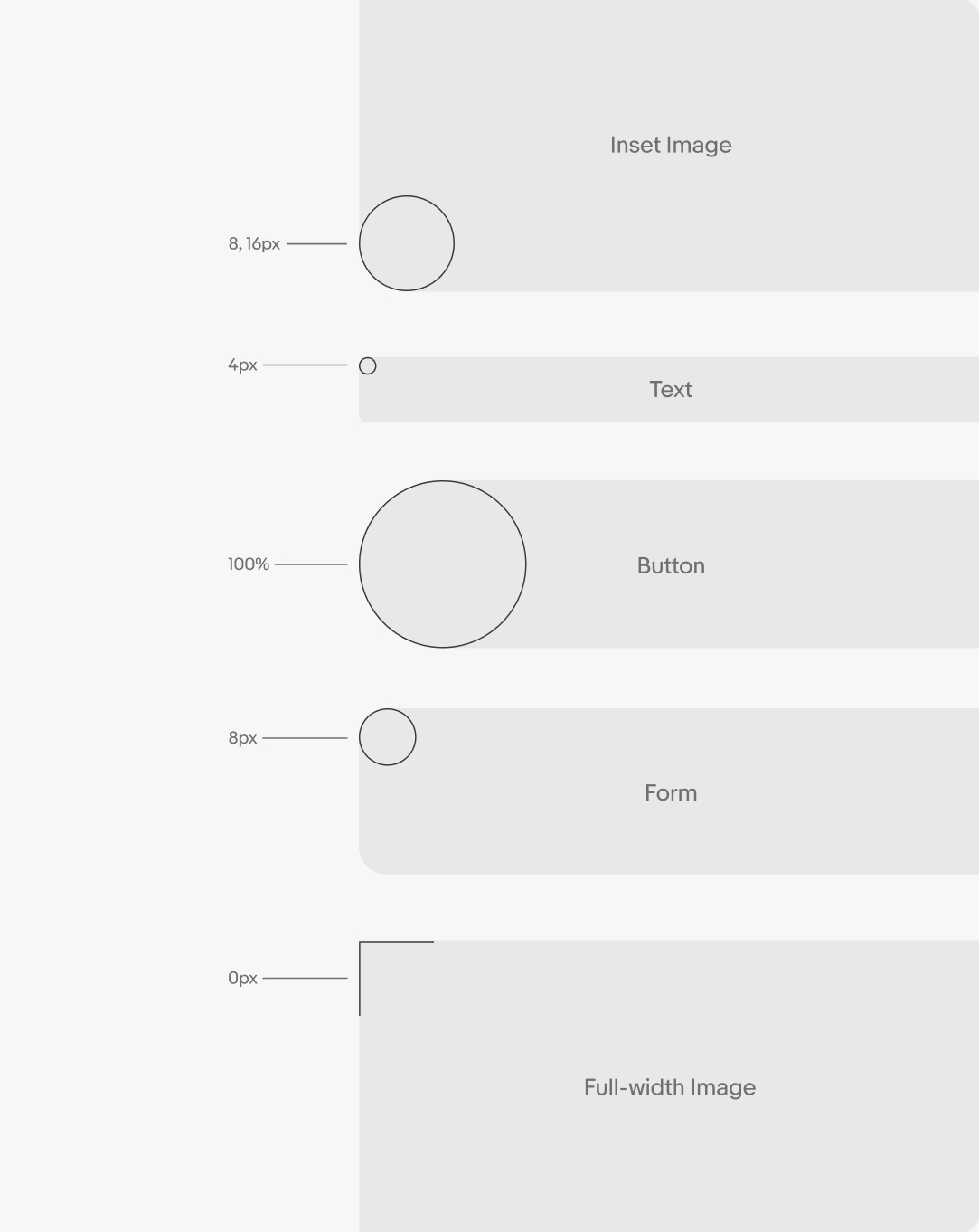
Radius
The radii across shapes vary depending on the component:
- Images are 8 or 16px and follow our image sizing guidance
- Text blocks are 4px
- Buttons are fully rounded
- Forms are 8px
- Full-width images bleed on all edges and have no radius
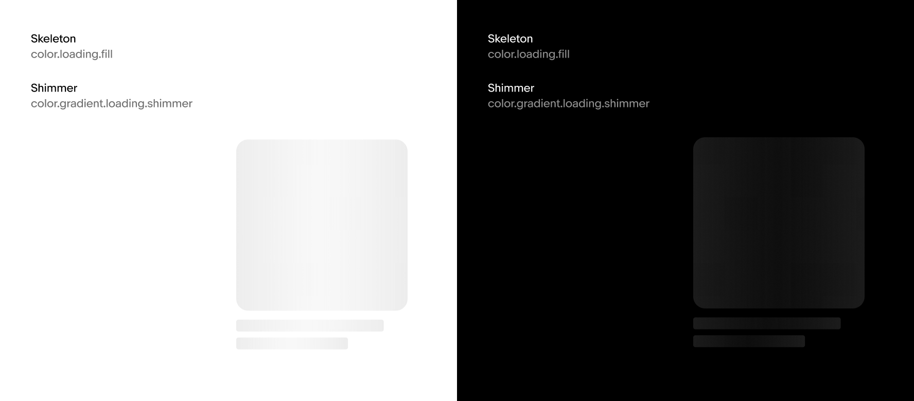
Default color
Skeletons work across both light and dark modes. Learn more about the available Loading color tokens.
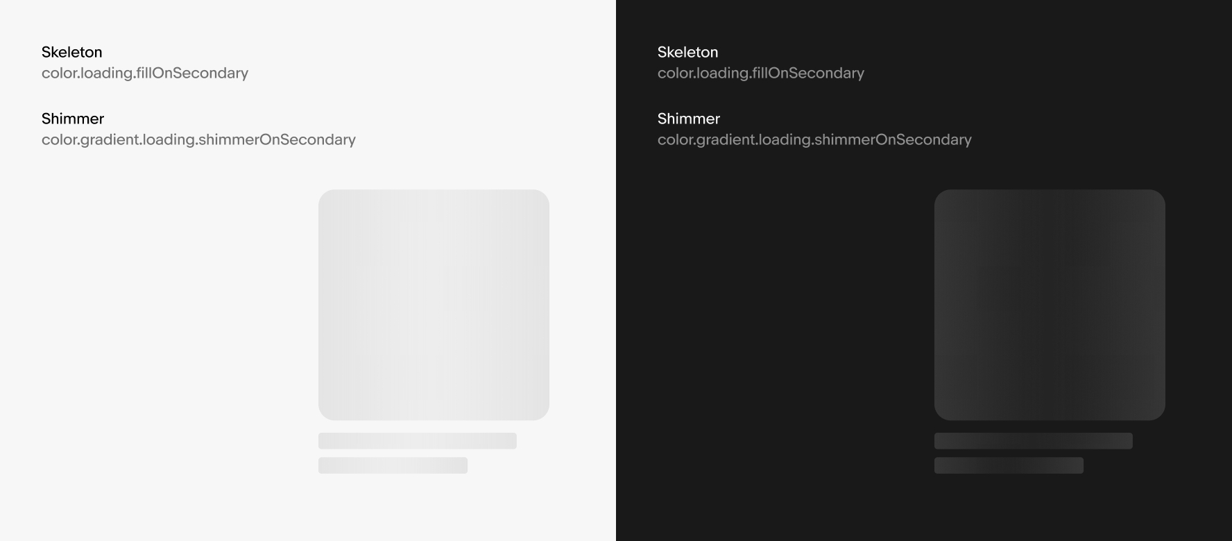
On Secondary color
Skeletons also work on our background secondary color.
Generative AI color
Colored gradient skeletons are used when introducing AI features and generated content. Learn more about how we treat generative AI in the Generative AI foundation. These colored gradients are only to be used for generative AI content.
Introduction
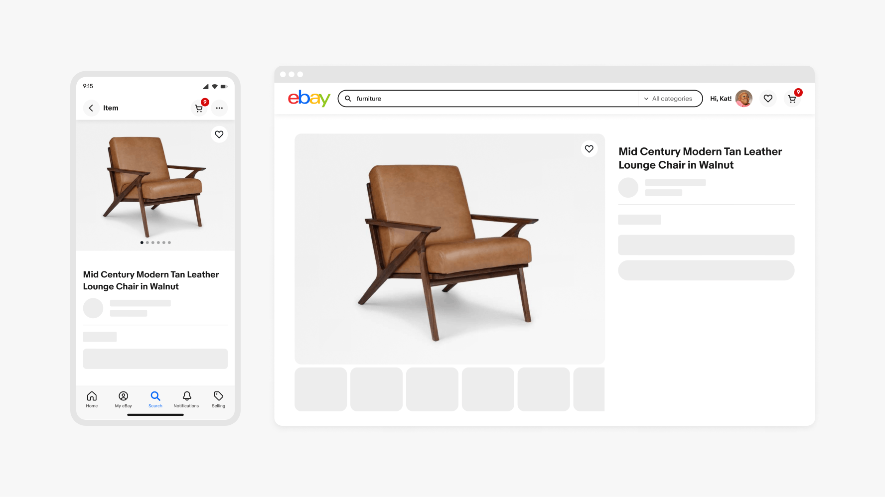
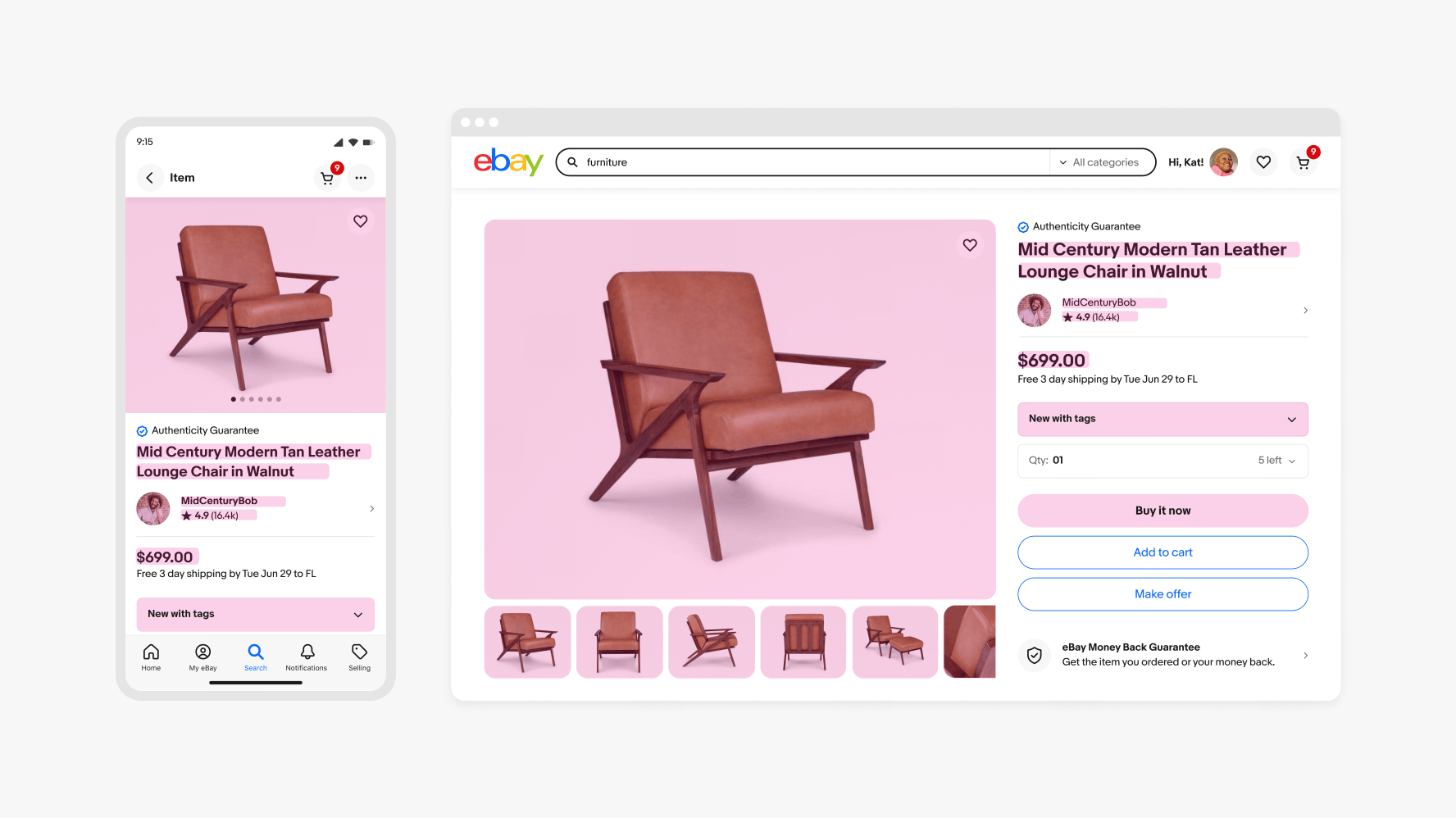
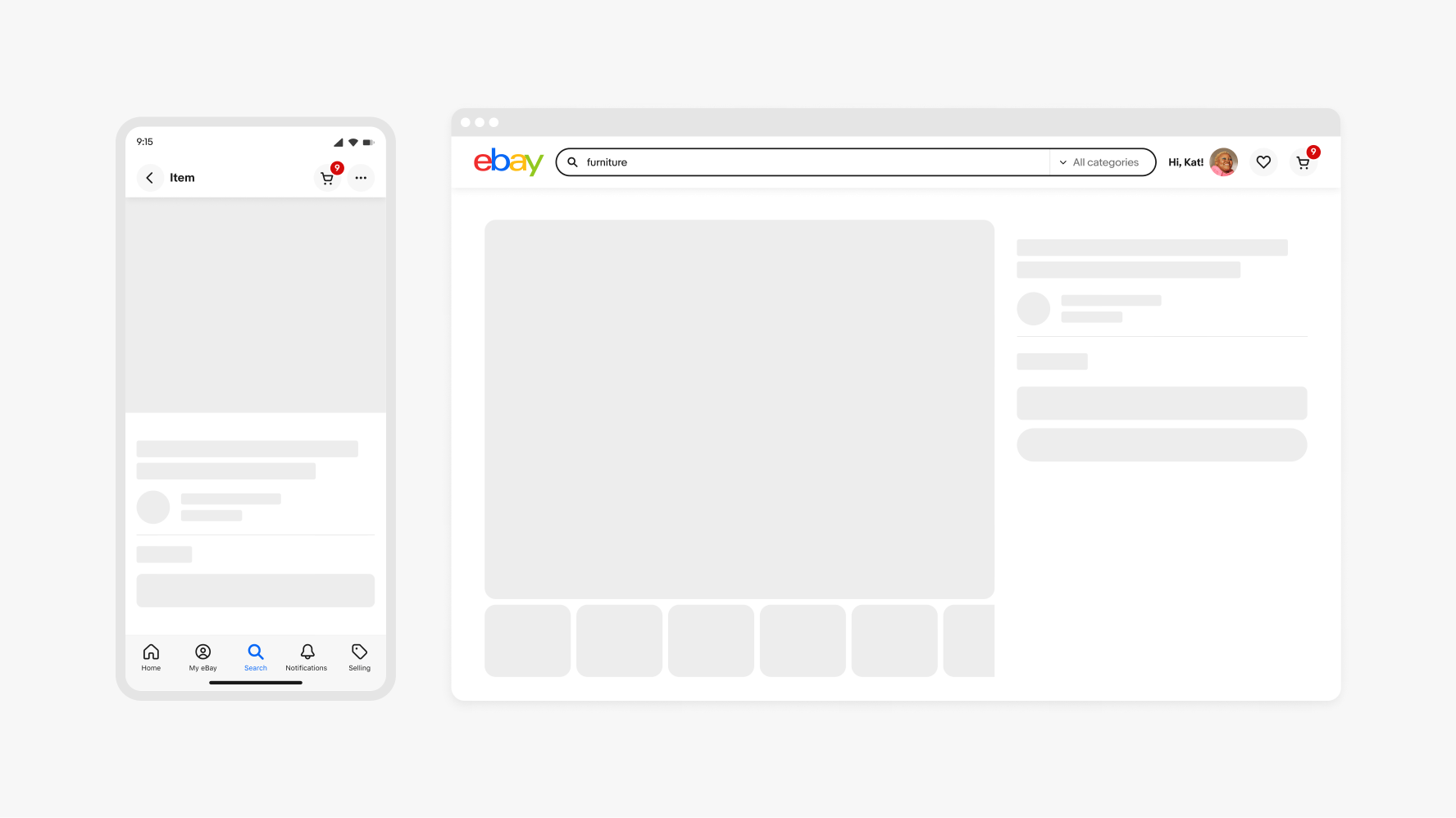
Keep in mind that a full page skeleton may not be required or used on page load. In most cases titles, imagery, and other content is able to be pre-loaded. Skeletons should only be used for content that is not yet ready. Don’t force a skeleton when it isn’t needed or if it will make the loading experience uncomfortable.
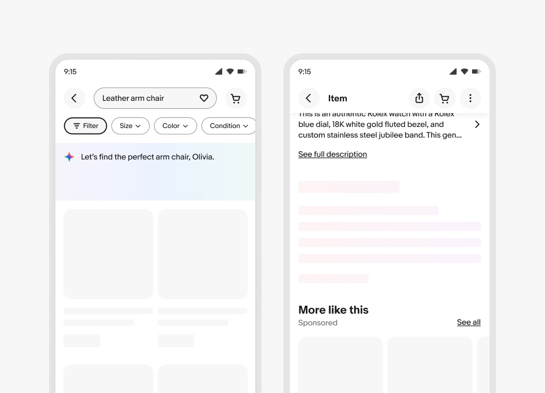
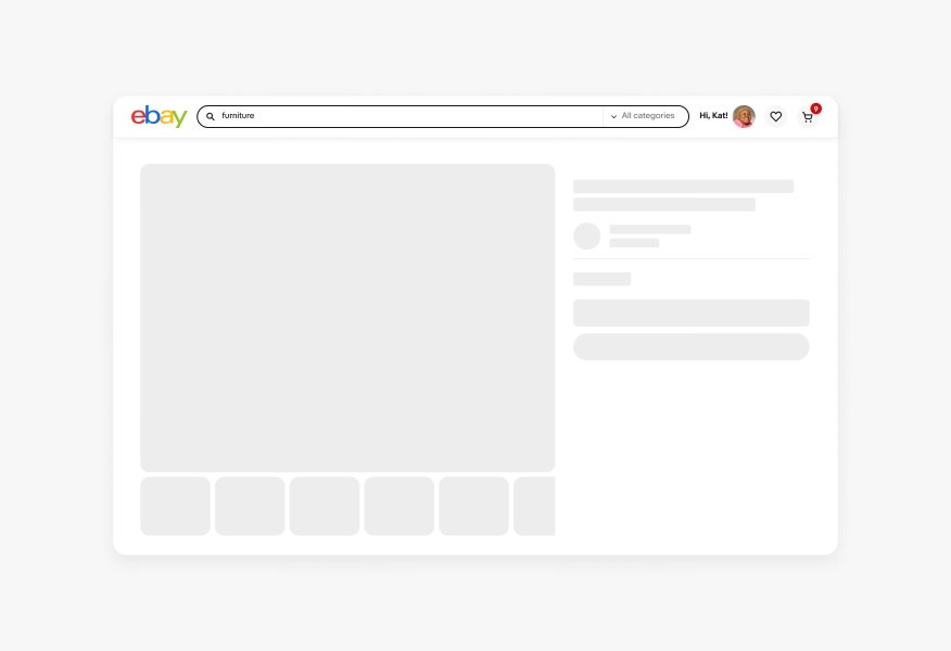
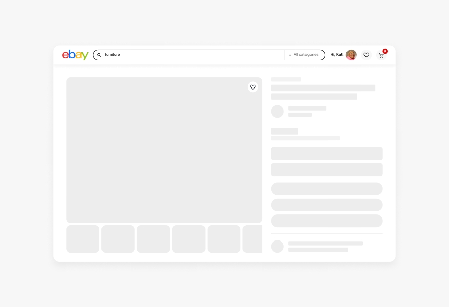
Example
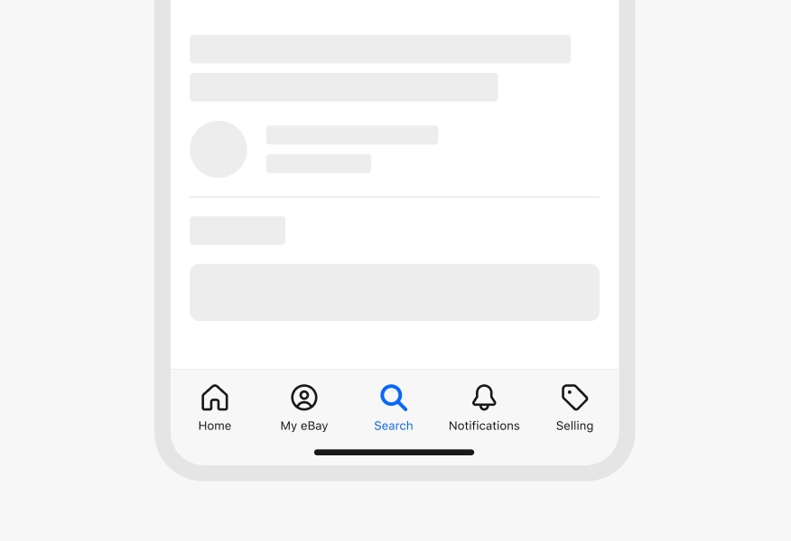
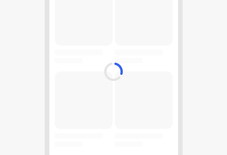
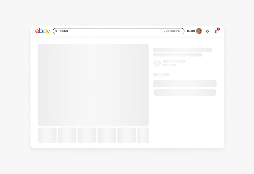
To visually portray how skeletons will look on a page, here is an example of an overarching hierarchy of content. Notice the common components in use such as images, text groups, buttons, and forms that build the overall structure. Detailed elements like program badges, smaller lines of text and icons should not be represented by skeletons. To view a variety of skeleton examples on web, visit the Skin library.
Styling
Do use skeletons in gray when not representing generative AI. Generative AI uses approved color gradients.

Don’t manually change skeletons to arbitrary colors.
Do use the radius found within the components.
Don’t adjust the radius of the skeleton components.

Do use available skeleton components.

Don’t turn other elements like icons into skeletons or make your own skeleton components.
Construction
Do use skeleton layouts that are simplified and hint at the visual hierarchy of a page.
Don’t replace elements 1:1 on a page as a skeleton layout. Complex skeletons can be distracting and provide a poor experience.
Do use skeletons for elements inside a modal if needed.
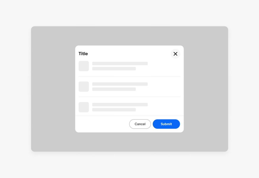
Don’t represent a modal as a skeleton state.

Do use skeletons for common components like images, text, avatars, buttons and forms.
Don’t use skeletons for tool tips, alert notices, snackbars, or navigation buttons.
Behavior
Do use skeleton loading by itself.

Don’t combine skeleton loading with other loading types.
Do animate shimmer effects in the same direction at the same time.
Video description: A shimmer animation on a skeleton loader timed correctly in the same direction.
Don’t offset skeleton shimmer animations.
Do use the shimmer animation on native screens.
Don’t use the shimmer animation on larger html screens unless the load is taking longer than 2.5 seconds.
Item tile
Type
Type block
Form, button, and avatar