AI at eBay
We use AI to superpower the user experience, so we can celebrate—not replace—the human experience on eBay. This framework is rooted in our eBay Responsible AI principles, and it aims to ground our design thinking in honoring and preserving the community we’ve built, while embracing AI in responsible and transparent ways.

Extend human capabilities
We use AI as a tool to build enhanced experiences that proactively anticipate someone’s goals in personalized and meaningful ways.
Empower human agency
We give people control over their AI-powered experiences through transparency and awareness.
Ensure accessibility
We design AI-powered experiences that can be used and understood by a diverse group of people of all abilities.
Champion inclusivity
We mitigate prejudice and bias when using GAI to create new images, videos, or texts with a human in the loop.
Uphold accuracy
We confront the uncanny valley and spread of inaccurate information when using GAI through analysis, testing, and planning.
Iterate responsibly
We engage in a system of checks and balances with our XFN partners, so we can move fast and fix things.
How to write and design for chat experience.
Chat with eBay is built on a scalable, configuration-first framework known internally as AgentX. This allows product teams to build domain-specific “assistants” that function as experts in a given context. AgentX can interpret prompts, evaluate potential actions, and autonomously adapt during a chat session. AgentX can also analyze relevant user signals, such as onsite/in-app location, search history, and saved sizes to return the most relevant responses or recommendations.
The title “Chat with eBay” was chosen in close alignment with brand, product marketing manager (PMM), and other internal stakeholders. This decision accounts for various intent scenarios and anticipated future capabilities.
User intent
Today, assistants have contextual entry points with specific intents and focus category terminology (like fashion, styles, outfits, etc.). Eventually, Chat will incorporate all assistants (e.g. shopping assistants, how-to intent, fashion assistant, seller copilot, etc.) with the ability to switch between intents, passing the user to a new “assistant” as the conversation evolves. While entry points can be intent-specific, all chat experiences should use consistent components documented in Figma. Our goal is to get users accurate and complete information as quickly as possible. We use intents to display relevant prompts.
General knowledge intent
General knowledge intent routes users to advanced AI models to provide informative and contextually relevant responses outside the eBay universe.
Example: “What’s the dress code for Royal Ascot?”
How-to intent
How-to intent provides more details on using eBay, including troubleshooting account issues or finding info on specific tools and features.
Example: “How do I request combined shipping?”
Do’s
- Be clear about capabilities and limitations
- Use prompts to better understand a user’s query and to arrive at a solution quickly
- Provide a way to leave feedback and report content
- Use plain language in a conversational tone, aligned with eBay voice and tone
Don’t’s
- Change the name in the header to reflect the backend “assistant” (e.g. Shopping Assistant)
- Use the terms “chatbot,” “agent,” or “assistant”
- Avoid pronouns (e.g. he, she, him, her) or assigning/implying gender
- Avoid referencing eBay in prompts or responses (e.g. on eBay, with eBay)
Disclosing generative AI (GenAI) is a crucial aspect of responsible AI development. It empowers users, builds trust, and promotes accountability.
Before you begin to write or design, ask yourself: Does the experience use traditional AI, machine learning (ML), or GenAI?
- Traditional AI focuses on performing a specific task intelligently. It refers to systems designed to respond to a particular set of inputs based on a specific set of parameters Example: Automated customer support
- ML uses algorithms trained on data sets to create models that enable machines to perform tasks that would otherwise only be possible for humans. Example: Personalized recommendations
- GenAI is trained on a set of data and will identify patterns to create something new–text, images, video, music, code–to create something new. Example: Magical listings
If you’re writing or designing for GenAI, you must clearly inform users when and how GenAI is being used.
Our confidence in the content generated and the risk it may create for eBay will determine the disclosure used as well as its placement and prominence. Most GenAI experiences will have one disclosure but some may have a combination. Today, we use two types of disclosures in-product: labels and disclaimers
Labels
Labels are single strings of text using the established pattern of [Verb by/with AI] coupled with the full spectrum icon. They lead with a past tense verb to simply articulate how eBay.ai modified content. They’re typically displayed as a standalone string paired with a heading, or used in a sentence/subtext. They’re always paired with the spectrum icon.
We use labels when confidence is high and risk is low.
We have a limited set of pre-approved labels available as components, including: Generated with eBay.ai, Curated with eBay.ai, Summarized by eBay.ai, and Set by eBay.ai. If you have a unique use case that falls outside of these options, please reach out to the content design team.
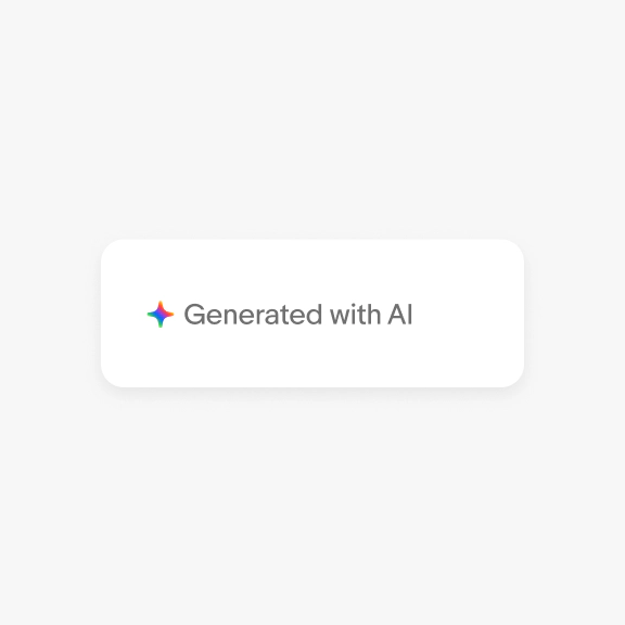
Generated
“Generated with AI” is used when net-new content is created using genAI (e.g. Listing descriptions)
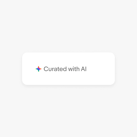
Curated
“Curated with AI” is used when items or recs are thematically grouped using genAI (e.g. Shop the look)
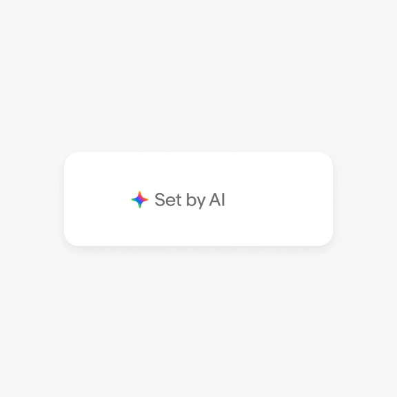
Set
“Set by AI” is used when limits or preferences are suggested using genAI (e.g. setting ad rates)
Disclaimers
Disclaimers are used when confidence is lower and risk is higher. They typically vary based on the product experience, and may or may not include links to solicit feedback or our user privacy notice (UPN). This content should help the user understand key privacy or ethical concerns (e.g. what they’re agreeing to, what they’re responsible for, how we process their data). It should be tailored to your specific use case, drafted by content design in collaboration with the legal counsel. Keep disclaimers concise, ideally not exceeding 3-4 lines. Use a bottom sheet to provide more detailed information. Avoid pronouns and possessives (e.g. our, we) when referencing eBay, AI, or technology.
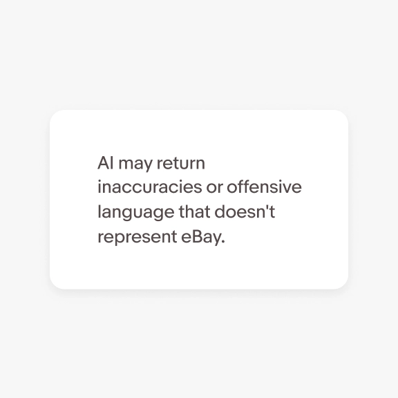
Text only
Use a single string of text to inform the user about broad limitations of the tool or tech. Include (but don’t over-emphasize) the experimental nature of AI, including inaccuracies.
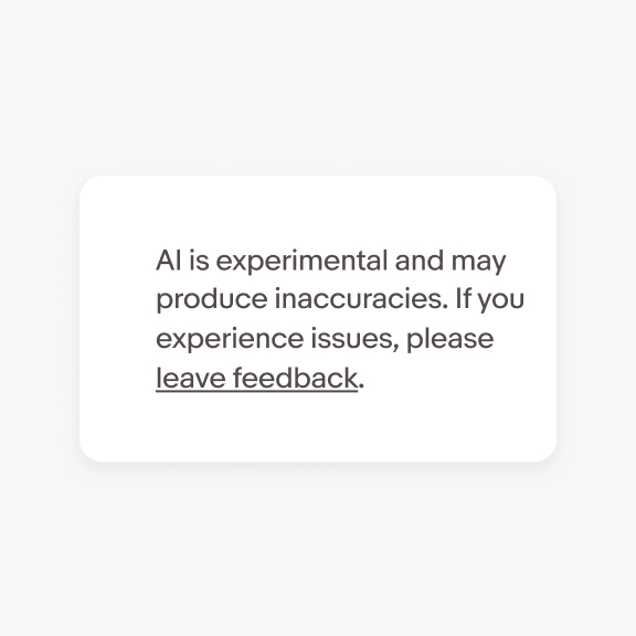
With feedback link
Use max 2 sentences to inform the user about broad limitations of the tool or tech, plus a link to solicit feedback on their experience.
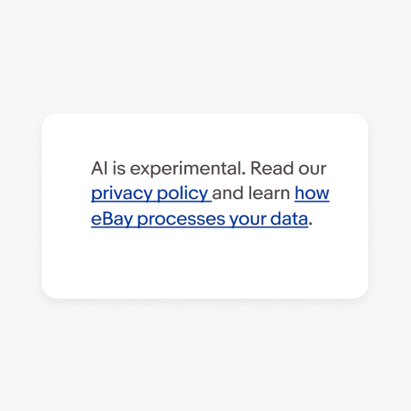
With legal links
Use max 2 sentences to highlight specific risks around accuracy, privacy, or ethical concerns. If we’re collecting data (e.g. PII, credit card info, etc.), or the user needs to provide access to a personal device (e.g. camera roll), we must include a link to our user privacy notice (UPN).
First-run experiences vs. future interaction
On first-run, always display a disclaimer that includes any details that users should be aware of prior to using the experience. The placement and prominence of a disclaimer may change in future interactions or as the user becomes more familiar with the tool or feature, though some experiences may require a persistent disclaimer (e.g. in chat). Consider if/how to inform users of updates that may impact privacy or ethical concerns.
Examples
- Smart Lens (and other image scan tools): Advise users to avoid scanning or uploading imagery with children, pets, or other personal information
- Chat with eBay: Remind users not to include personal information like bank accounts
- Background enhancement in listing: Inform sellers they’re responsible for the accuracy of their listing, including AI-generated imagery; inform buyers that the imagery has been enhanced/modified and remind them to check other imagery prior to purchasing.
Disclaimer templates
Buyer-facing disclaimer
This [content type /attribute of content /combination of attributes] was [verb to describe action] with AI, which uses cutting-edge technology that can sometimes yield inaccurate results.
Seller-facing disclaimer
Please [review/check] your [content type/attribute of content/combination of attributes] before you [add it to your listing / publish it / use it to…]
Examples
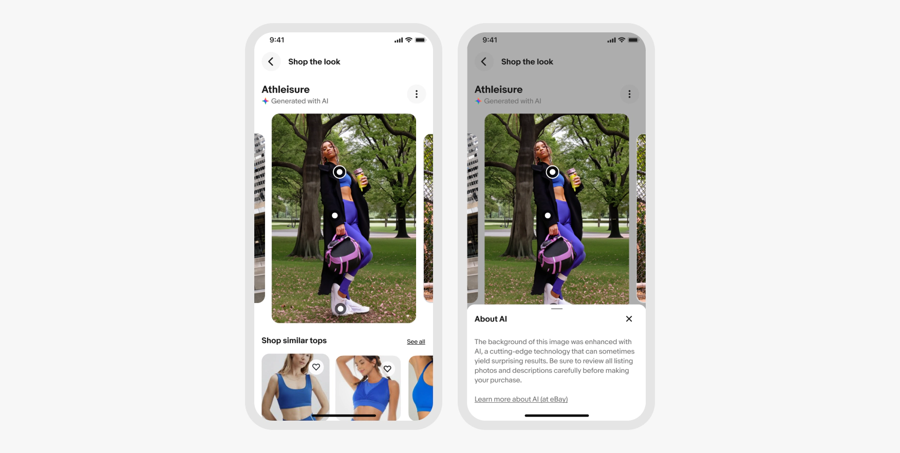
Shop the look

View item
The technology that powers genAI is moving extremely fast with new legislation being introduced to protect consumers just as quickly. Please sign up for office hours early in your design process and again prior to launch to ensure your experience meets current Design System, RAI, A, R&I, and legal guidelines.