Skip to main contenteBay Playbook
  • Get started
  • Foundations
  • Design system
  • Expressions
  • Resources
  • Articles

Design system

  • Overview
    • Overview
    • Color
    • Dimension
    • Spacing
    • Typography
    • Breakpoints
    • Shadow
    • Shape
    • Opacity
    • Motion
    • Overview
    • Status
    • Accordion
    • Action bar
      • Overview
      • Inline notice
      • Page notice
      • Section notice
    • Avatar
    • Badge
    • Banner
    • Breadcrumb
      • Overview
      • Branded button
      • CTA button
      • Icon button
      • Link button
    • Card
    • Carousel
    • CCD
      • Filter chip
      • Input chip
      • Graphs
      • Metrics
    • Date picker
    • Dialog
    • Divider
    • Education notice
    • EEK rating and range
    • Expansion
      • Checkbox
      • Combobox
      • Dropdown
      • Numeric stepper
      • Password
      • Phone number
      • Radio button
      • Select list
      • Switch
      • Text area
      • Text field
    • Item tile
    • List row
      • Overview
      • Expressive loader
      • Skeleton loader
    • Media container
      • Top navigation bar
    • Pagination
    • Popover
    • Progress stepper
    • Search field
    • Section header
    • Segmented button
      • Bottom sheet
      • Panel
    • Signal
    • Snackbar
    • Tab
    • Table
      • Tooltip
      • Tourtip
    • Toggle button group
    • Video player
    • Overview
    • Bulk editing
    • File uploading
      • Text link

File uploading

v1.0

File uploading allows users to upload one or more files to a location.

  • Skin
  • Marko
  • React
Stylized artwork of a file upload pattern.
File uploadingv1.0

Guidelines

Things.People.Love.
  • Get started
  • Foundations
  • Design system
  • Expressions
  • Resources
  • Articles
  • Careers
  • Press
  • Privacy policy
© 2025 eBay. All rights reserved.

eBay Evo, the eBay trademark, and the eBay logo are the intellectual property of eBay Inc.

    Our accessibility section covers only the key considerations that impact design thinking at a page level, such as keyboard interaction, heading structure and landmarks. For exhaustive pattern level details & guidance for the web, please visit eBay MIND Patterns, specifically File Input and File Preview Card.

    Keyboard interaction

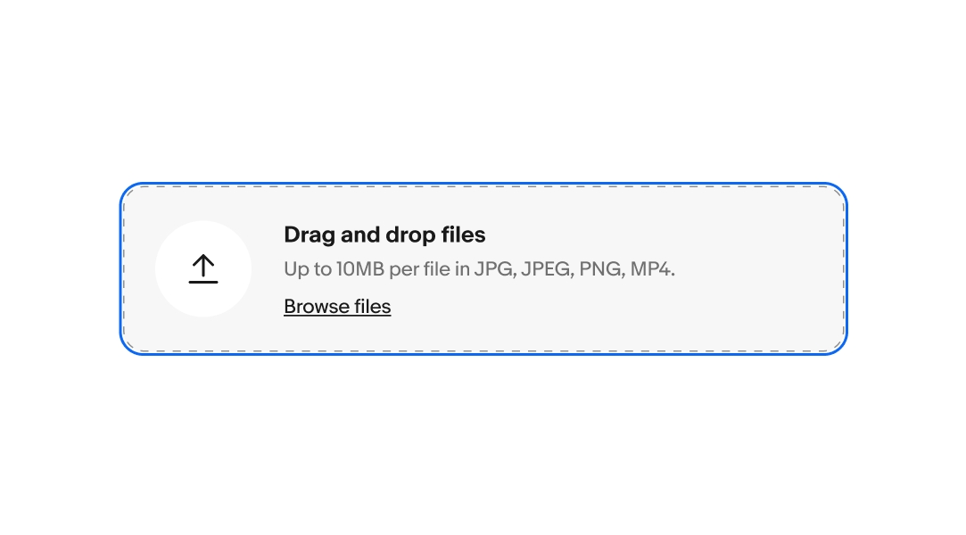
    On web, the file upload pattern consists of a native HTML5 file input field and a list of file preview cards.

    Tab sequence

    1. File input field
    2. If file preview card exists, 1st card’s action button
    3. If file preview card exists, 2nd card’s action button
    4. Etc.
    5. If overflow exists, overflow button

    File input field

    With focus on the file input field, pressing ENTER or SPACE brings up the operating system’s native file browser. The user can use their operating system's typical file browsing controls to navigate and select file(s).

    File preview cards & list items

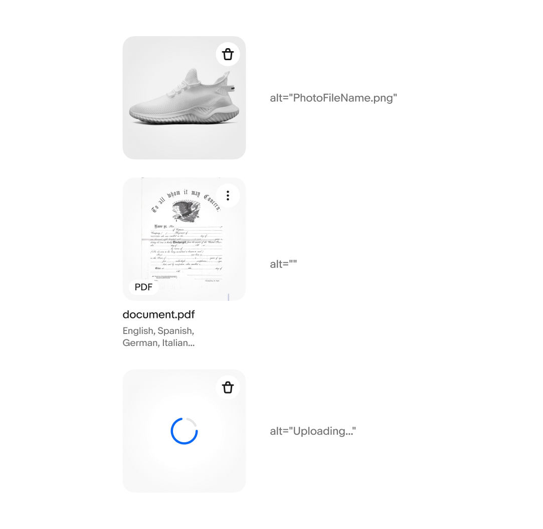
    If a file preview card has a single action, pressing ENTER or SPACE on its action button should perform that action.

    If a file preview card has multiple actions, pressing ENTER or SPACE on its action button should open a menu. The user can navigate this menu with the UP and DOWN arrow keys, select an action with ENTER or SPACE, or close the menu with the ESCAPE key.

    If a performed action results in the removal of the file preview card, keyboard focus should move to an adjacent gallery card’s action button. If there are no remaining file preview cards, focus should move back to the file input field.

    Labeling

    File input field

    The file input field must have a clear label, e.g. “Browse files.”

    File preview cards

    File preview card must contain the file name as part of their accessible name. The name may be displayed as text in the card or included as the alternative text for the preview image. If the file name is displayed visually, the preview image's alternative text should be an empty string to avoid redundancy.

    If a file is in the process of uploading, it should include a progress indicator with appropriate alternative text, e.g. "Uploading..." or "Busy." It is not recommended to make the progress indicator a live region, as this can get noisy for multiple file upload. To convey upload error states, group similar errors into inline notices.

    File input field with focus treatment
    A file preview card with product photo, alt text is 'PhotoFileName.png'  A fil preview card with PDF document preview and visible label of 'Document.pdf'. alt text is empty.  A file preview card containing progress spinner, alt text is 'Uploading...'