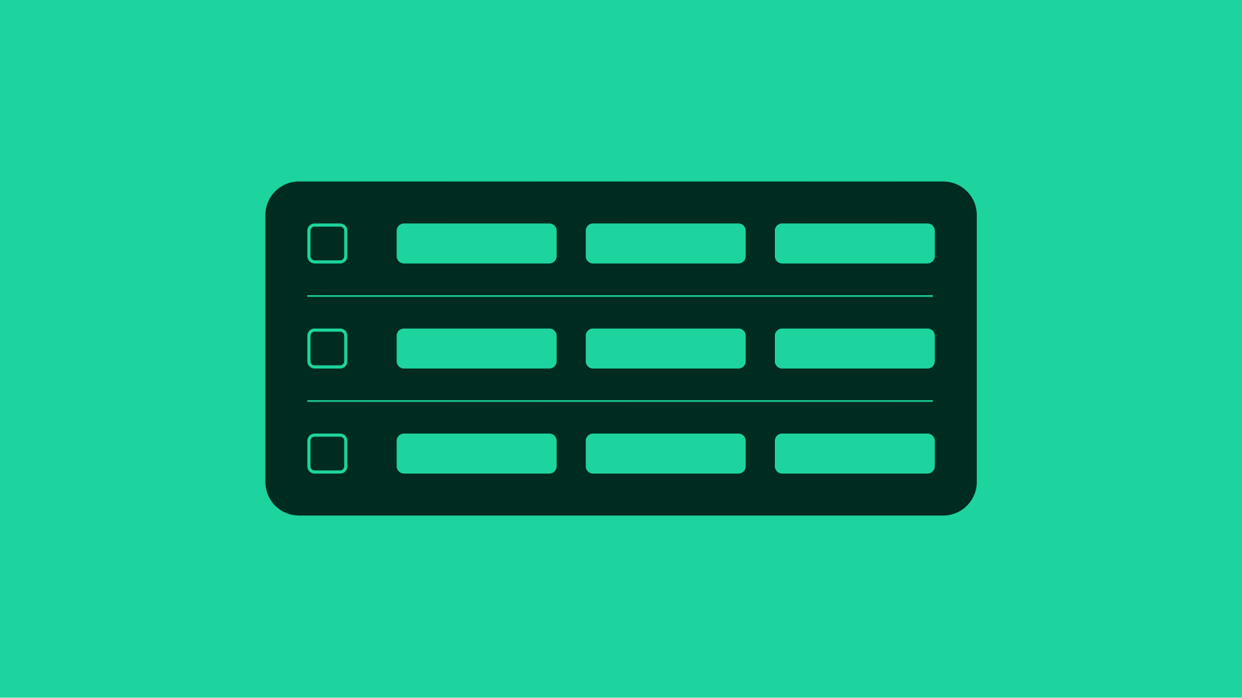
Skip to main contenteBay Playbook
  • Get started
  • Foundations
  • Design system
  • Expressions
  • Resources
  • Articles

Design system

  • Overview
    • Overview
    • Color
    • Dimension
    • Spacing
    • Typography
    • Breakpoints
    • Shadow
    • Shape
    • Opacity
    • Motion
    • Overview
    • Status
    • Accordion
    • Action bar
      • Overview
      • Inline notice
      • Page notice
      • Section notice
    • Avatar
    • Badge
    • Banner
    • Breadcrumb
      • Overview
      • Branded button
      • CTA button
      • Icon button
      • Link button
    • Card
    • Carousel
    • CCD
      • Filter chip
      • Input chip
      • Graphs
      • Metrics
    • Date picker
    • Dialog
    • Divider
    • Education notice
    • EEK rating and range
    • Expansion
      • Checkbox
      • Combobox
      • Dropdown
      • Numeric stepper
      • Password
      • Phone number
      • Radio button
      • Select list
      • Switch
      • Text area
      • Text field
    • Item tile
    • List row
      • Overview
      • Expressive loader
      • Skeleton loader
    • Media container
      • Top navigation bar
    • Pagination
    • Popover
    • Progress stepper
    • Search field
    • Section header
    • Segmented button
      • Bottom sheet
      • Panel
    • Signal
    • Snackbar
    • Tab
    • Table
      • Tooltip
      • Tourtip
    • Toggle button group
    • Video player
    • Overview
    • Bulk editing
    • File uploading
      • Text link

Table

v1.1

Tables are used to organize and display data efficiently to provide users with insights and potential actions.

  • Skin
  • Marko
  • React
Stylized artwork for a table component.
Tablev1.1

Guidelines

NextTip: Tooltip
Things.People.Love.
  • Get started
  • Foundations
  • Design system
  • Expressions
  • Resources
  • Articles
  • Careers
  • Press
  • Privacy policy
© 2025 eBay. All rights reserved.

eBay Evo, the eBay trademark, and the eBay logo are the intellectual property of eBay Inc.

    Our accessibility section covers only the key considerations that impact design thinking at a page level, such as keyboard interaction, heading structure and landmarks. For exhaustive pattern level details & guidance for the web, please visit eBay MIND Patterns.

    Keyboard interaction

    Tab Sequence - Read only

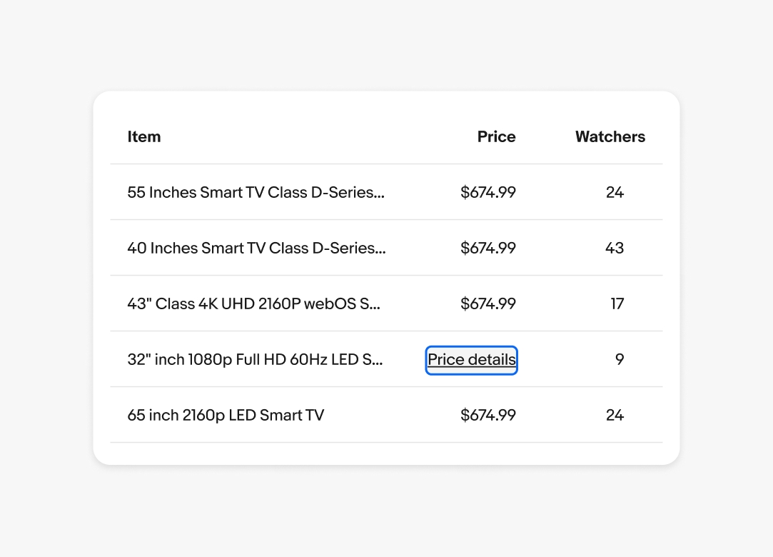
    When a table is in “readonly” mode, table cells are not included in the page’s tab sequence. Note a read only table might include text links inside of a cell, in which case that text link will be part of the page’s tab sequence, not the cell itself.

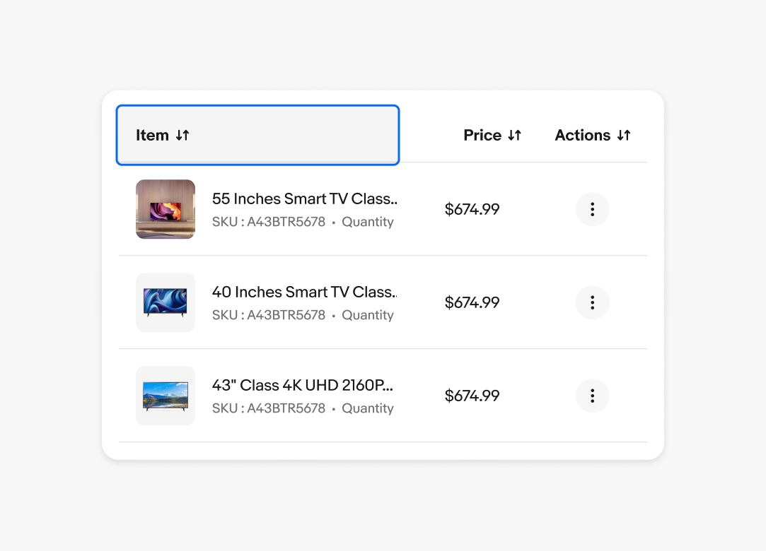
    Tab Sequence - Sortable

    1. Sortable column headers
    2. Row 1 cell links/buttons
    3. Row 2 cell links/buttons
    4. etc

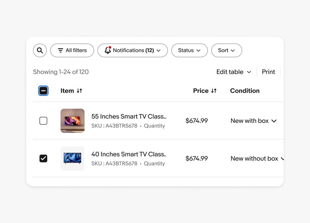
    Tab Sequence - Editable

    1. Select all checkbox
    2. Column headers
    3. Row 1 checkbox
    4. Row 1 cell inputs
    5. Row 2 checkbox
    6. Row 2 cell inputs
    7. etc

    When a table is in edit mode, the table cells themselves are not included in the page’s tab sequence, only the child control is (e.g. it is the textbox inside of the cell that will be keyboard focusable).

    Labeling

    Each column header must convey the current sort direction of the column (i.e. none, ascending or descending) to assistive technology.

    Read-only data table displaying item information without a focus state.
    Data table displaying displaying item information  with a focused state on the first column’s header titled “Item”.
    Editable data table displaying displaying item information with a focused state on the checkbox titled in the heading row for select-all.