Expansion
Expansion is a lightweight container that can function independently or be integrated into a larger surface. Tapping the expansion controls will either expand the content into a larger section or collapse it back to its original size.

Our accessibility section covers only the key considerations that impact design thinking at a page level, such as keyboard interaction, heading structure and landmarks. For exhaustive pattern level details & guidance for the web, please visit eBay MIND Patterns.
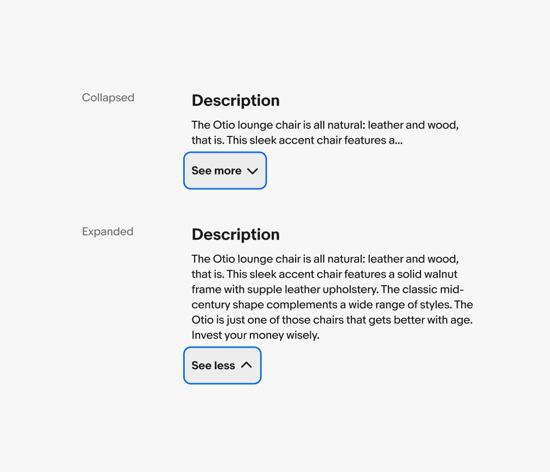
Keyboard interaction - Static content
In a collapsed state, the expansion pattern is a discrete UI component; it consists only of a single focusable button. In HTML, a button can not have any nested interactive elements. Focus stays on the expansion button after expanding or collapsing.
Tab Sequence (collapsed)
- Expansion Button (See more)
Tab Sequence (expanded)
- Expansion Button (See less)
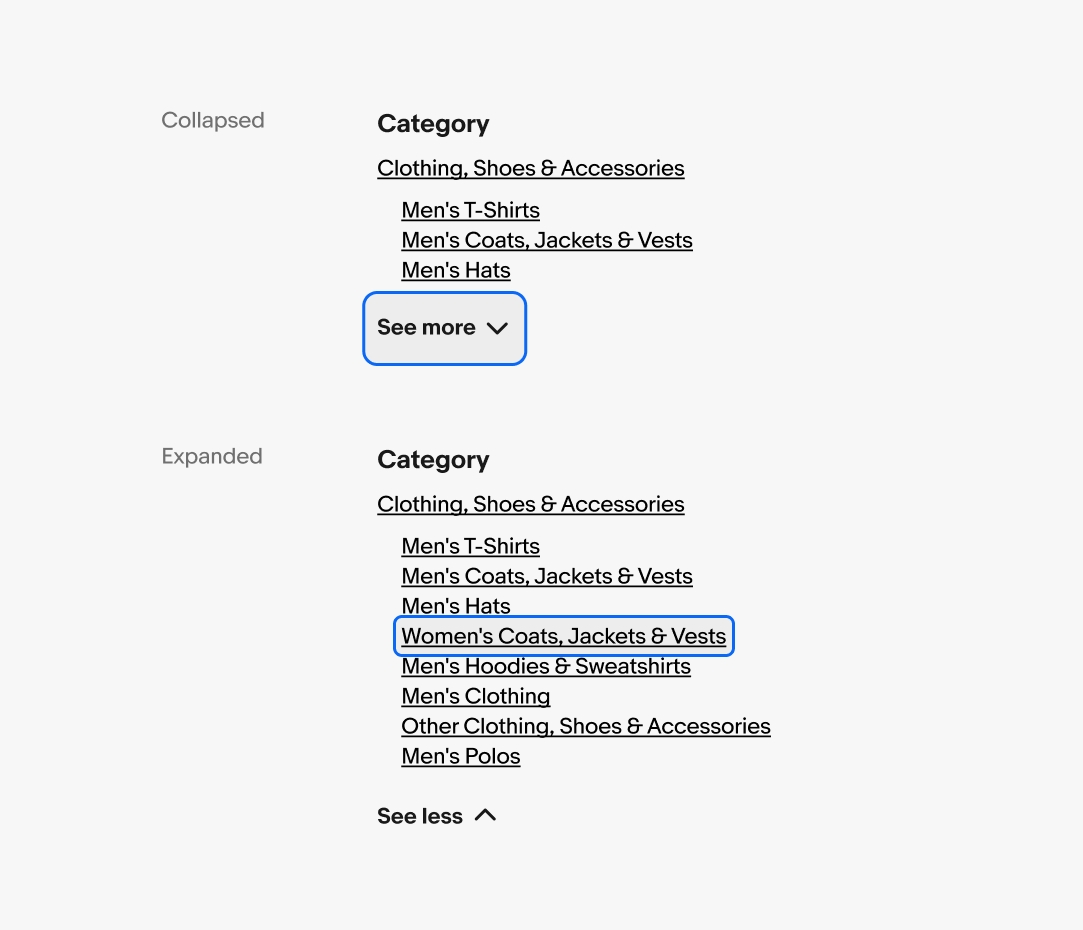
Keyboard interaction - Interactive content
In a collapsed state, the expansion pattern is a discrete UI component; it consists only of a single focusable button. In HTML, a button can not have any nested interactive elements.
In an expanded state, additional interactive elements are revealed that exist prior to the button in the page’s tab sequence.
Tab Sequence (collapsed)
- Expansion Button
Tab Sequence (expanded)
- Revealed Element 1*
- Revealed Element 2
- Revealed Element 3
- Expansion Button
*Keyboard focus moves here when expanded.
Reading order
Since the expanded content appears before the expansion control, it will not be encountered in the screen reader’s natural reading order. One method of mitigating this issue is via focus management: moving the keyboard focus onto the first new element that appears. The downside is that the keyboard user cannot quickly collapse the expansion (they have to find their way back to the button).