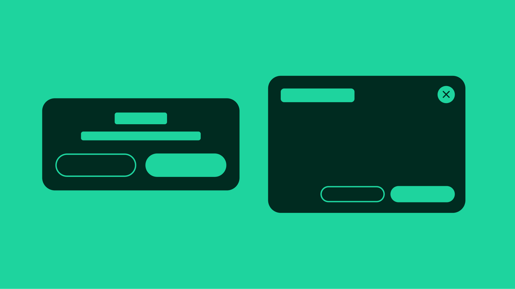
Dialog
v4.0
Dialogs appear in front of other content to ask for a decision or inform users of important information.
Our accessibility section covers only the key considerations that impact design thinking at a page level, such as keyboard interaction, heading structure and landmarks. For exhaustive pattern level details & guidance for the web, please visit eBay MIND Patterns.
Keyboard interaction
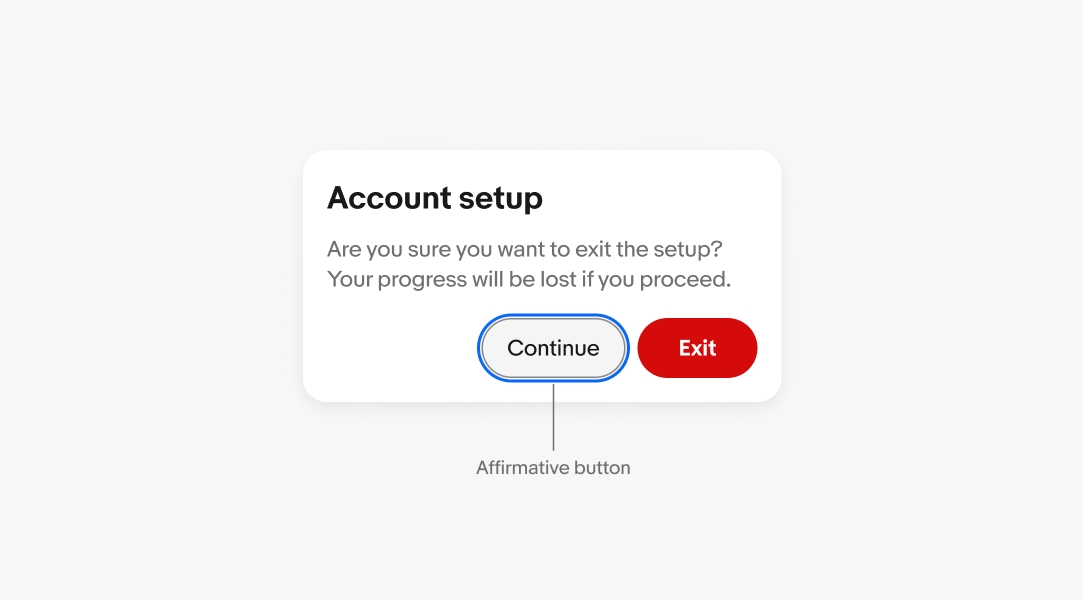
A dialog creates a new tab sequence that is completely isolated and independent from the parent window; ensuring the keyboard is confined to the interactive elements within the dialog.
Tab Sequence
- Close Button
- Interactive Body Element(s)
- Cancel Button
- Affirmative Button*
Labeling
The dialog requires an accessible name; this should match the onscreen title.