Banner
Banners give users visibility to curations, promotions, events, and programs with a CTA that drives them to explore more.
Our accessibility section covers only the key considerations that impact design thinking at a page level, such as keyboard interaction, heading structure and landmarks. For exhaustive pattern level details & guidance for the web, please visit eBay MIND Patterns.
Heading structure
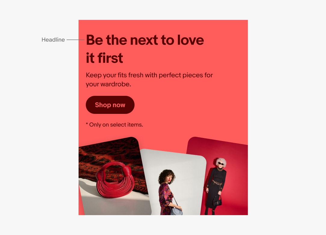
The headline must be positioned logically in the page’s document heading structure.
While a sighted user is able to establish a mental model visually between the overline and headline, the position of the overline before the headline in the document creates a barrier in establishing that same mental model programmatically via assistive technology.
This problem can be mitigated by designating the entire banner as a complementary landmark region. It can be further mitigated by placing the overline after the headline in the document, but then rearranging the visual placement via the CSS order property.
Keyboard interface
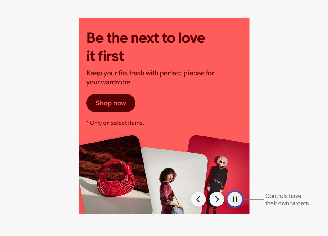
Although the entire banner could be clickable for mouse and touch users, the same is not true for keyboard users (primarily due to the existence of nested interactive elements, e.g. “Terms & Conditions” link). The entire banner should not be keyboard focusable.
Tab sequence
- CTA Button (e.g. Shop Now)
- Disclaimer links
- Prev button
- Next button
- Pause button
Labeling
Every icon-button requires an appropriate accessible name for assistive technology (e.g. “play”, “pause”).