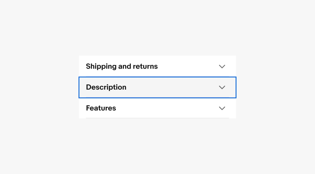
Accordion
An accordion is a tool used to hide and reveal content as part of progressive disclosure. Tapping the icon button on each accordion row will expand or collapse the content.

Our accessibility section covers only the key considerations that impact design thinking at a page level, such as keyboard interaction, heading structure and landmarks. For exhaustive pattern level details & guidance for the web, please visit eBay MIND Patterns.
Keyboard interaction
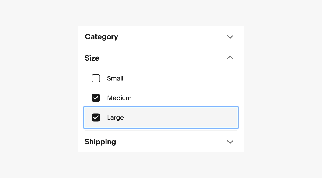
The Accordion component can hide or reveal content in each row. Each accordion title will be in the natural tab index.
Tab Sequence (collapsed)
- Accordion title 1
- Accordion title 2
- Accordion title 3
- etc.
Tab Sequence (expanded)
- Accordion title 1
- Revealed interactive element(s)
- Accordion title 2
- etc.
Reading order
Virtual cursor must be able to move from one header to the next. With virtual cursor on an accordion title, it must be able to open the row via click event simulation. For auto-collapse accordions, any other open row must close, but this should not be announced.