Listing imagery
In addition to eBay-produced imagery, another available resource is the photos uploaded by sellers within their product listings on eBay, also known as listing images. Listing imagery is eBay photography at its most functional form, it can flex from functional to expressive moments with a focus in product-centric narratives. Additional listing imagery includes images sourced by the business unit, approved stock image sites, or eBay photo shoots. Recognizing that we can't control listing imagery, this guidance outlines how to optimize—from curation to execution—the best aspects of listing images within our brand language.

Straight on
When curating images, prioritize images using orthographic angles because they're high-fidelity, versatile for creating successful designs, and add a premium touch.

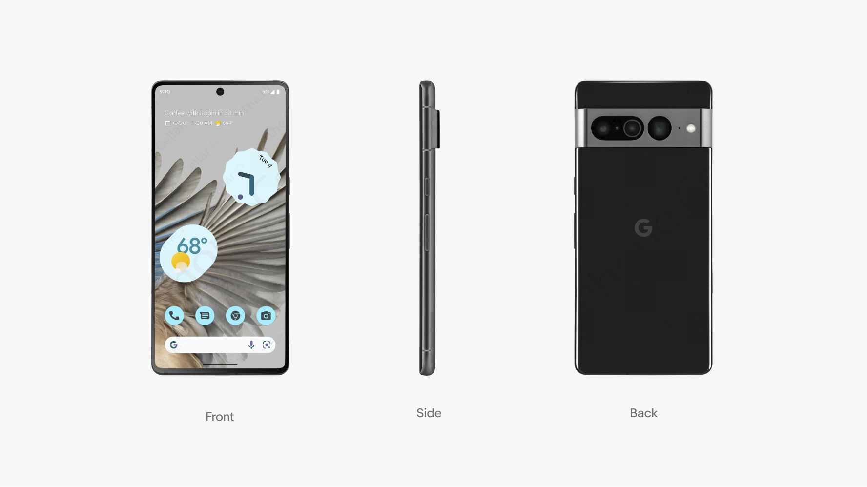
Straight on angle examples


Dynamic angle
If available, choose dynamic angles when featuring the product as a hero item or to emphasize product storytelling.

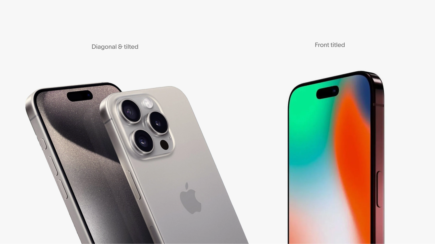
Dynamic angle examples


Continuous lighting
Choose well-illuminated listing images captured with soft, diffused lighting, avoiding high-contrast shadows or dim lighting that may obscure product details, unless professionally executed. Optimal lighting ensures that all product features are clearly depicted in true-to-life colors.

Continuous lighting examples


Best practices
Opt for soft, diffused lighting to highlight all details and enhance the product's appeal.

Avoid high-contrast, over-stylized lighting and heavy shadows that could misrepresent product proportions or emphasize less desirable attributes.

Our current brand language employs three types of shadows when displaying studio products: shadowless products, products with natural shadows and products with contact shadow. Products with any of these shadow types can be featured both inside and outside cards within a layout. Choosing which shadow best suits your goals depends largely on your initial listing image, ensure all products in your composition follow the same shadow treatment and always prioritize an output that feels most authentic and real, given circumstances and final composition.

Natural shadow
When available, always prioritize listing photos featuring the product's natural shadows captured in camera, without artificial shadows or manipulation, for a more authentic and elevated look.

Shadowless
When your goal is to maximize focus on the product's key features use shadowless images. This also will also ensure optimal contrast against colored, textured or photo backgrounds.

Contact shadow
To indicate proximity between multiple items and enhance the composition with depth and dimensionality, apply a contact shadow by creating artificial shadows between products.
Natural shadow
Often times listing images feature natural shadows, referring to the physical shadow a product casts in its natural environment when exposed to light in a real studio setting. It does not mean artificially created natural-looking shadows. If your initial listing image includes its own natural shadow, aim to utilize them as they provide the most realistic and authentic appearance for compositions.


Shadowless
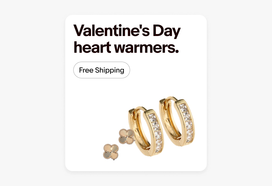
The most versatile and scalable approach to displaying listing images is to present them without shadows. Opt for shadowless when natural shadows are unavailable or if you’re featuring products in complex compositions. Shadowless products can also work for multiple-product compositions. This maximizes focus on the products' key features and ensures optimal contrast against colored, textured, or photo backgrounds.


Contact shadow
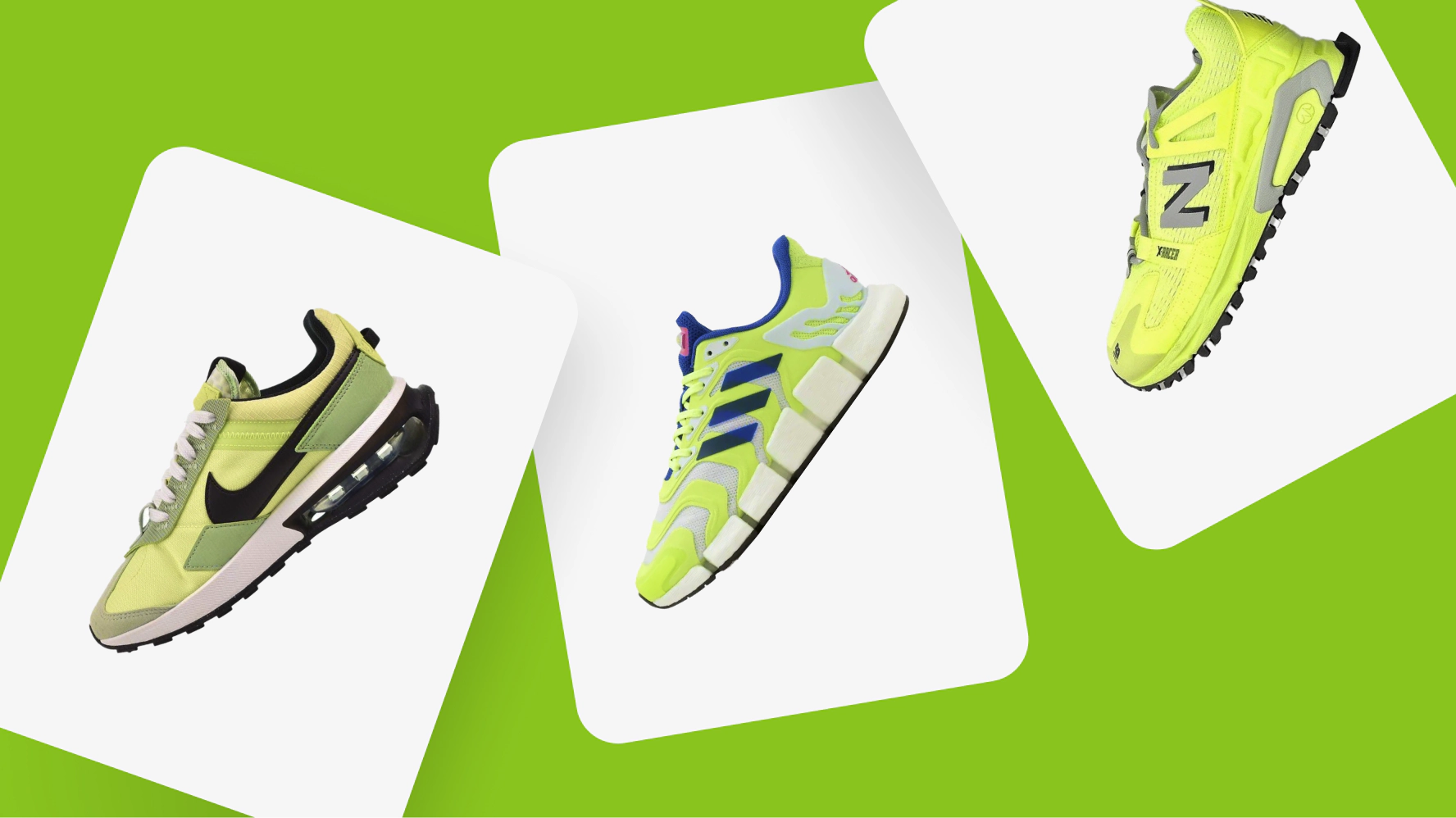
Contact shadow is the only artificially created shadow we utilize. When showcasing multiple products, you can present products inside cards with contact shadows between cards or group them outside of cards and add artificial shadows between the products. Opt for the latter when you want to convey a shared story through the group of products. It captures relatedness and adds depth and dimensionality to the composition.

Cards
In our brand language, cards arranged in a shuffle layout feature contact shadows for better card differentiation and to create a greater sense of depth. To ensure consistency, products featured outside of cards and juxtaposed should also follow the same logic and incorporate contact shadows between products.

Products
Choose to showcase grouped products outside of cards when aiming to collectively convey a shared story or message through the group of products.
If featuring multiple products outside of cards, you have the option to feature them without shadows or with contact shadows. Contact shadows are meant to be subtle and better incorporate products together without diverting attention from the products themselves. Always aim to achieve a natural-looking output to the best of your ability, considering product dimensions, lighting, and positioning. For the best results, please follow the step-by-step instructions provided below.

01: Create a shape
The first step is to create a vector shape of the product you want to generate a contact shadow for. Shadows should only be created for products that are on top of other products.

02: Gradient
The next step is to fill the shape you've created with a gradient—either radial or linear—with a blur effect, using the darkest color of the background product onto which the shadow will be cast. Adjust the intensity and opacity of the shadow as necessary. Generally, aim for the shadow to darken the product behind by approximately 40-50% compared to its lightest area, creating a realistic shadow effect.

03: Mask
The third step involves using the background product as a masking shape to mask the shadow you've just created. This ensures that the shadow is cast only on the background product and not onto the background itself. Then, position the masked shadow behind the original foreground product, slightly offset to make it visible.
To select the perfect shadow style for you composition, capitalize on the product's inherent characteristics first. So, if your listing image features the product's natural shadow, capitalize on it by using it in our various layout options. If no natural shadow is available, consider applying the shadow that best complements your content. For best results, please follow our guidance to select the most appropriate shadow for your content, especially when opting to display products outside of cards. For more instructions on card usage, please visit the Layout Page.
Single products

Natural shadow
If the listing photo features a good natural shadow, prioritize showcasing the product with it included to accentuate its inherent qualities and achieve an elevated look.

Shadowless
If the product lacks a suitable natural shadow, or if you intend to present it against colored, textured, or photographic backgrounds, choose to display the product without any shadow.

Product cards
If you wish to more closely mirror our product shopping experience or want a more branded look-and-feel, consider featuring your product inside a card with either natural shadow or without shadow. When a good natural shadow is available, prioritize it over shadowless.
Multiple products

Dynamic
For a dynamic composition, consider presenting items in a suspended state with artificially-made contact shadows between them.

Separate
Items can be showcased separately without shadows, arranged in an organized way in compositions for a more cohesive look, to add sense of progression, guided storytelling and enhancing overall readability.

Product cards
Items can be showcased within product cards with natural shadow or without shadows.