Include plugin
eBay created the Include—Accessibility Annotations Figma plugin to help designers with accessibility considerations early in their project, and to help with designer-developer collaboration. It is available to the Figma community and free. eBay teams use an internal version.

Headings provide a structure for the content within a screen. They help to divide up content and summarize it which can help users find and understand the content. For screen reader users, when an app uses headings, these provide an additional way to navigate around a screen. Typically, more prominent and heavier text should be for headings, but headings are more about structure than visual appearance.
Some differences in Android or iOS native apps compared to web: there is no concept of heading levels (and therefore no nesting) and describing the main purpose of a screen is typically done with a title in the navigation bar, rather than a heading.
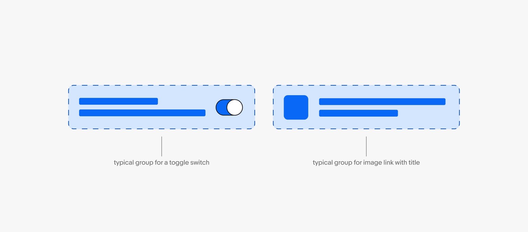
Grouping elements like the contents of a tile or cell can make for a better experience when using assistive technology. If there is no action, or a single action, the grouping makes navigating the screen easier, as it reduces the number of swipes or presses. When more than one action is in a group additional annotation will be needed to explain the expected behavior.
Images that convey meaning are considered informative. Informative images need alternative text that screen readers will announce to communicate the image's purpose, function, or content.
Images that do not convey meaning or are non-functional and adjacent to onscreen text that conveys their meaning are considered decorative. Decorative images do not need alternative text.
Related WCAG Success Criteria
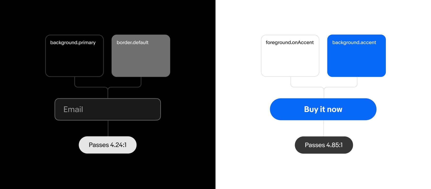
To ensure the experience can be used by those with low vision, colorblindness and others, text, interface controls and informative graphic elements must meet contrast minimums.
- Text minimum contrast 4.5:1
- Large text minimum contrast 3:1 The standard defines large text as 24px or greater, or 19px bold or greater.
- Interface controls and informative graphic elements: 3:1
Exceptions
- Logos and wordmarks
- Disabled controls
- Decorative elements elements providing no information, and having no functionality
- Skeleton loaders covering a large area (e.g. item cards, full screen content)
Related WCAG Success Criteria
Related WCAG Success Criteria
Native apps need to support users who modify text size through the display or accessibility settings in Android or iOS. At different text sizes check for:
- No overlapping text.
- No text extending beyond its bounds, for example, don't create a button label that extends beyond its button container.
- No content that is hidden/cropped offscreen
- If text is truncated, how will users know the full text?
Related WCAG Success Criteria
When actions can be performed with a gesture, ensure there is at least one alternate way to perform this using one finger and taps. As this requirement supports sighted users with limited dexterity but who may not be using assistive technology, the alternate method must be visible. Custom actions can also support assistive technology users.
For example, if the app has ‘swipe to delete’ functionality, to remove a row, provide another way, such as tapping an ‘edit’ button, tapping to select the item, and tapping a ‘delete’ button. Additionally, the app could support custom actions on the row, enabling assistive technology users to delete, while focus is on the row.