Marketing UI graphics overview

We use UI graphics to connect our marketing and top of funnel campaigns to our product. These graphics also serve as quick references to how we use product features, and allows for more in-depth storytelling.
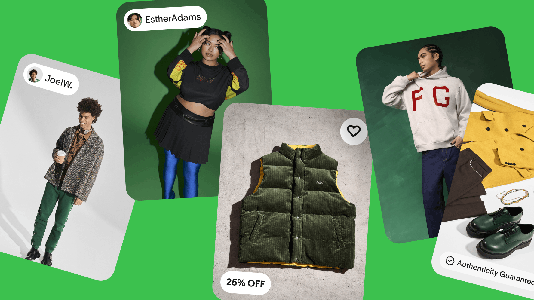
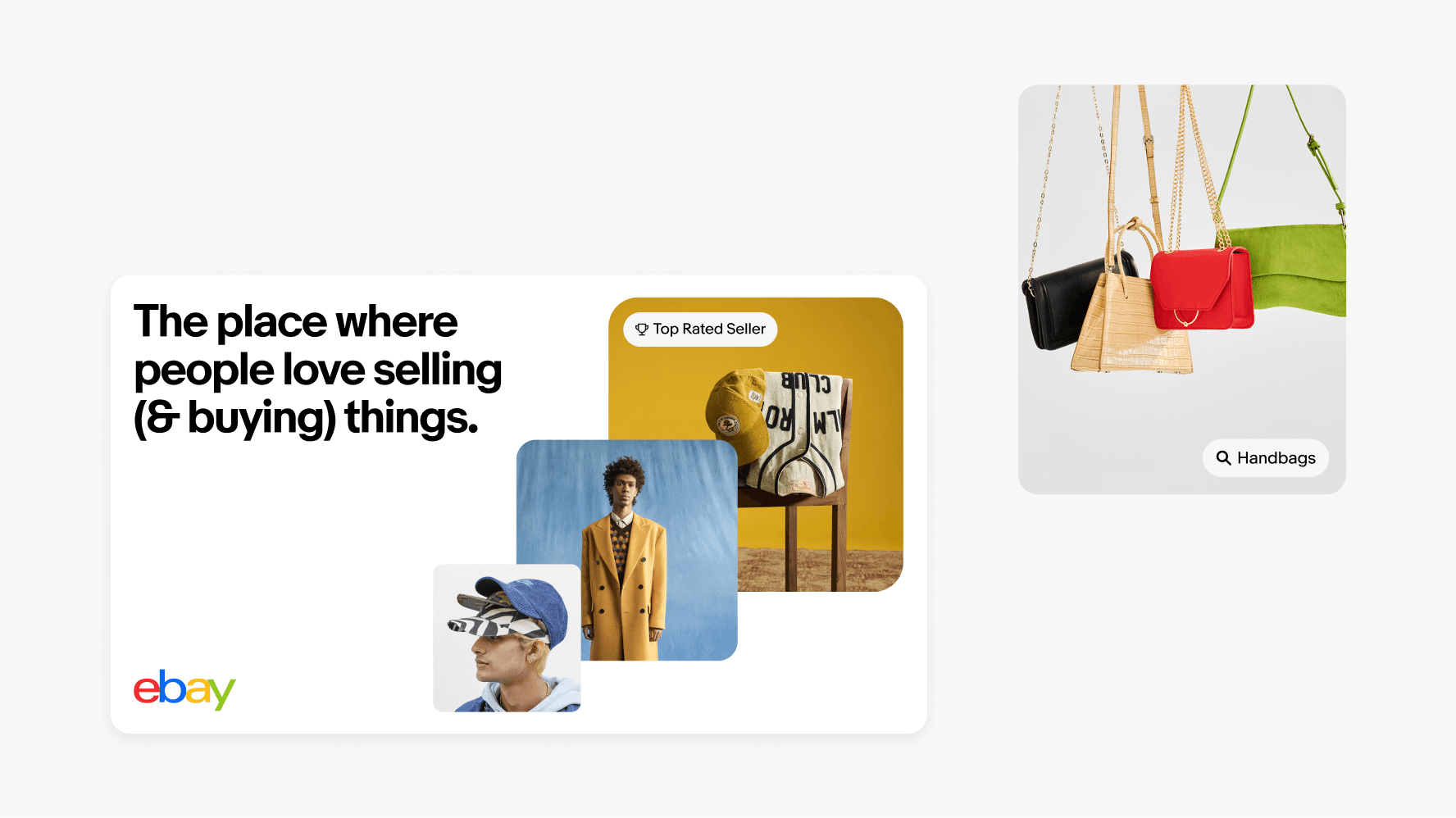
UI elements sit on 5 images stacked on top of a green background.

When to use

Use UI graphics to reinforce our brand language—creating consistency and visual connection across our product and marketing experiences. These graphics are primarily used on tiles and containers aiming to leverage brand equity.

On the left, a ‘Top Rated Seller’ UI Element sits on an image of streetwear on a wooden chair, stacked behind two other images of streetwear in an eBay display ad. An image of four handbags sits on the right with a ‘Handbags’ UI Element.

Container styles

UI graphics have 2 container styles—outlined and filled. When using the outlined options, ensure the stroke color is the same as the text and set to 50% opacity. Outlined options can also follow our tone-on-tone color guidance referenced in the Color pairing tool.
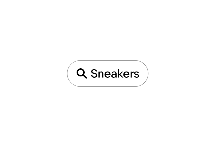
An outlined ‘Sneakers’ UI Element with a search icon.

Outlined

A filled ‘Sneakers’ UI Element with a search icon.

Filled

Types

Numerous UI graphics are available for enhancing storytelling across marketing, social media, and campaigns.

A ‘Collectibles’ category filled UI Element with a search icon.

Category

A ‘SallyMcShoes’ seller handle filled UI Element.

Seller handle

A Top Rated Seller filled UI Element with a top rated seller badge sits above an Authenticity Guarantee filled UI Element with an authenticity guarantee badge.

Program handle

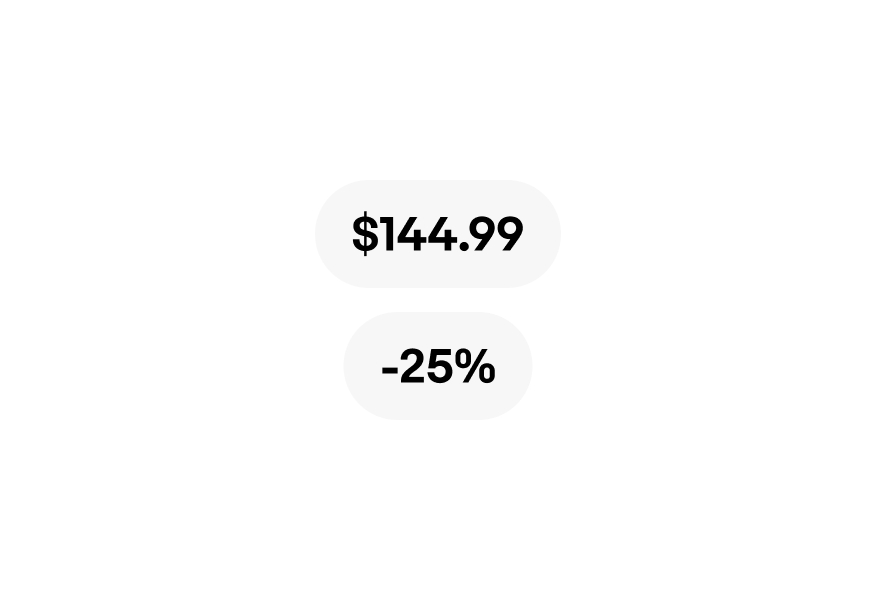
A Pricing fileld UI Element labelled ‘$144.99’ sits above a Pricing filled UI Element labelled -25%.

Pricing

An Authenticity Guarantee blue-filled program badge, an Authenticity Guarantee program badge, a Save icon button, and a filled Save icon button.

Icons

A ‘Great deals’ descriptive  UI Element sits above a ‘Free shipping’ descriptive UI Element.

Descriptions

Size

UI graphics should be sized and scaled to best fit the composition it occupies. Always use your best judgment when scaling UI graphics.

With title

UI graphic heights are determined by the cap height or x-height of the headline.
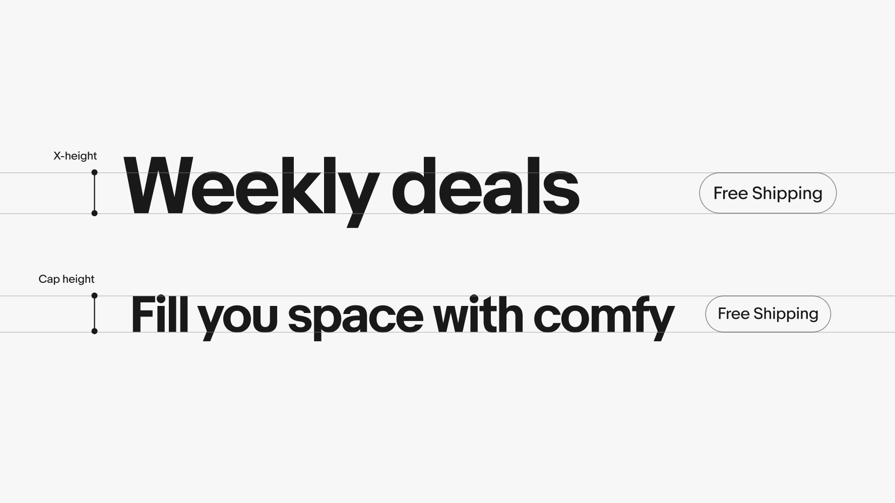
Two ‘Free Shipping’ UI Elements: the first is sized in hight relative to the x-height of a headline, and the second is sized relative to the cap height of a headline.

Without title

In the absence of a headline, the UI graphic's height should be 15% of the the layouts shortest side.
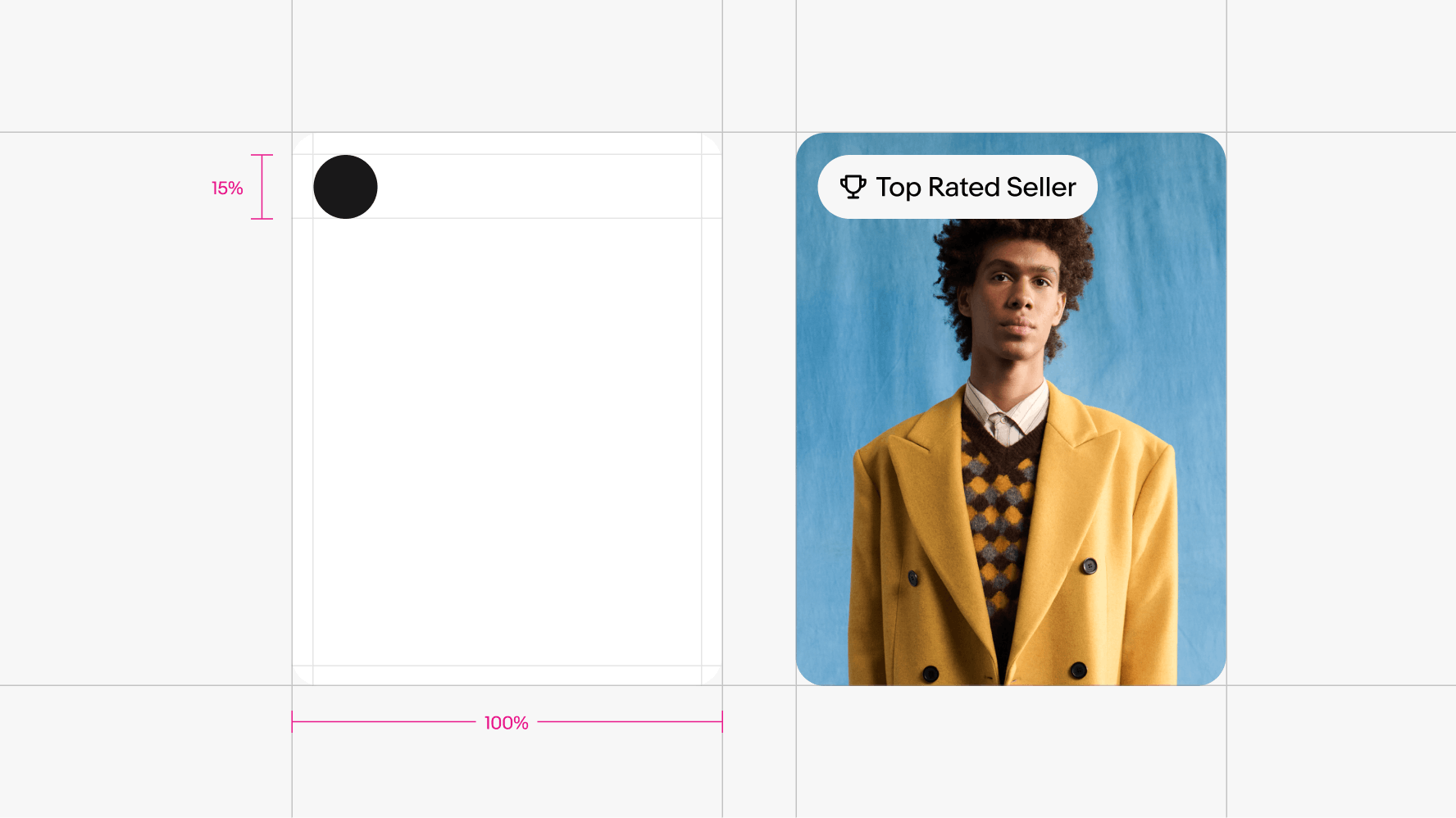
UI Elements on layouts take up about 15% of a layout’s shortest side, demonstrated in a layout diagram to the left. On the right, there is a ‘Top Rated Seller’ UI Element sits on the top left edge of a card layout.

Clear space

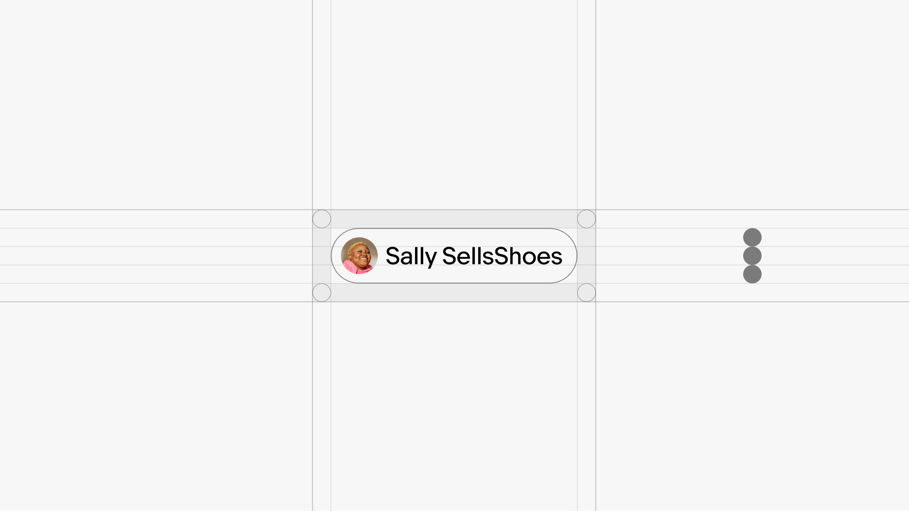
Clear space is necessary to ensure we provide enough visual impact and credit for our brand. The clear space is 1/3 the overall height of the UI graphic.

A ‘SallySellsShoes’ seller UI Element is surrounded by a diagram showcasing the minimum clear space allocated for UI elements.

Position

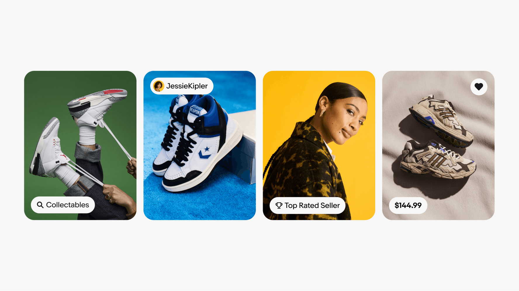
Align UI graphics to any of the four corners of a card. Icons are typically placed in the upper right corner, while pill tag variants are used in the upper and lower left corners.

Four photography cards with UI elements placed in the corners.

Color

Neutrals

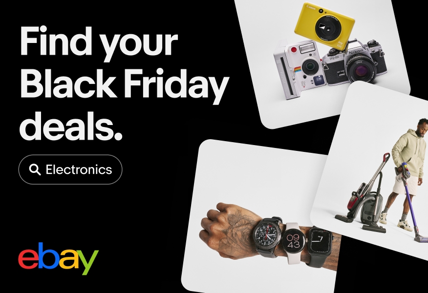
A Black Friday digital eBay ad that includes an ‘Electronics’ UI Element with a search icon sitting below the headline to the left. The UI Element is outlined in white, and sits against the black background of the ad.
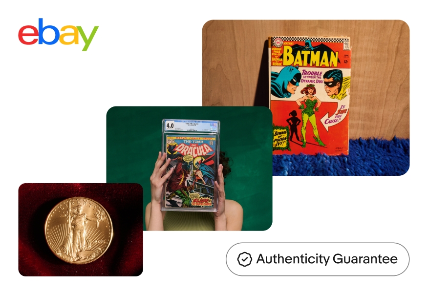
An eBay display ad featuring various images of Authenticity Guarantee product shots features an ‘Authenticity Guarantee’ UI Element on the bottom right of the ad. The UI Element is outlined in black, and sits against the white background of the ad.

Tone-on-tone

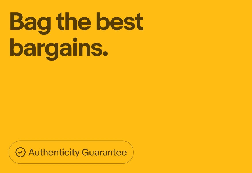
A brown outlined ‘Authenticity Guarantee’ UI Element with a brown authenticity guarantee icon sits in the bottom left corner of a digital eBay ad with brown text and a yellow background.
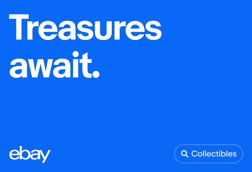
A white outlined ‘Collectibles’ UI Element with a white search icon sits in the bottom right corner of a digital eBay ad with white text and a blue background.

On photography

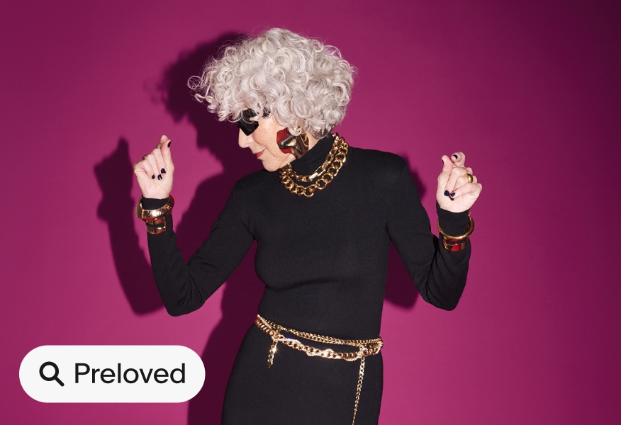
a ‘Preloved’ filled UI Element with a search icon sits on the bottom left corner of an image of a person wearing a black dress and gold accessories dancing against a pink backdrop.
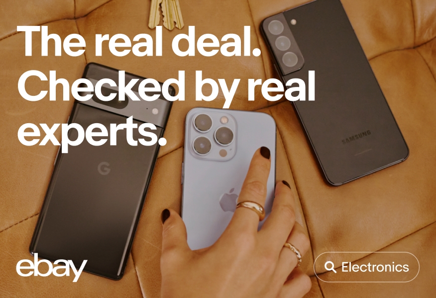
A white outlined ‘Electronics’ UI Element with a white search icon sits on the bottom right of an image of three smartphones sitting on brown leather surface, while a person wearing gold rings and black nail polish reaches for the middle smartphone.

Resources

Change log

DateNotes
Jun, 2024
  • Created with eBay Evo