Best practices
What—and what not—to do when using our marketing UI graphics.
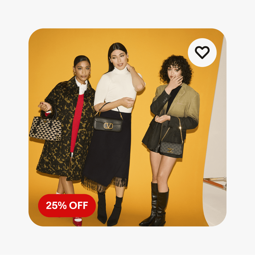
Color fill
Do use the standard filled or outlined neutral pills.

Don’t use colored pills outside of approved tone-on-tone applications.
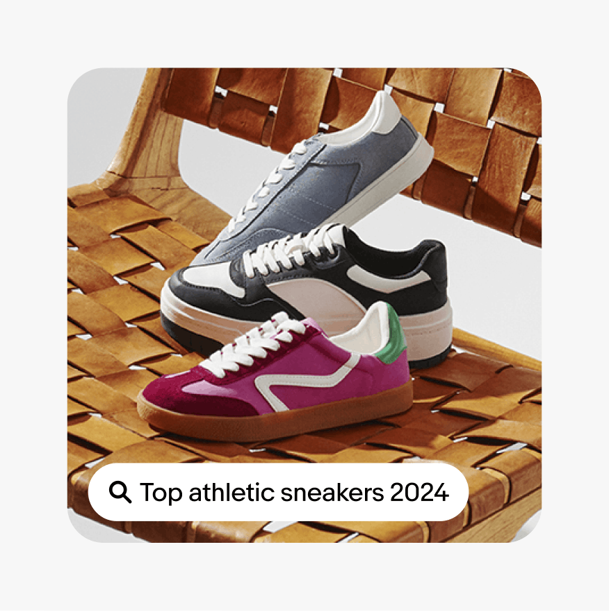
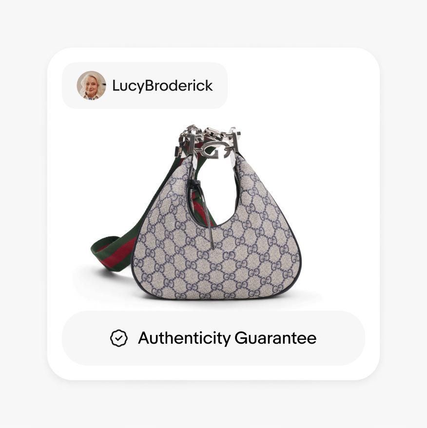
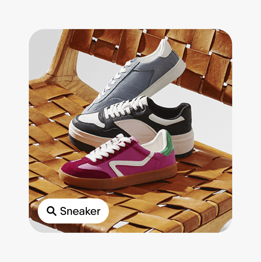
Simplicity
Do select the proper UI graphic to communicate the desired story.

Don't overload the image with too many different UI graphics. Don't stack more than 3 pill tags.

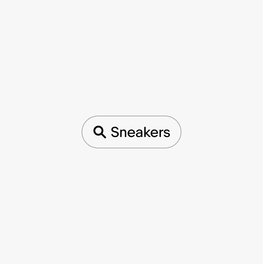
Rotation
Do keep the UI graphic positioned horizontally.

Don't rotate the UI graphics.
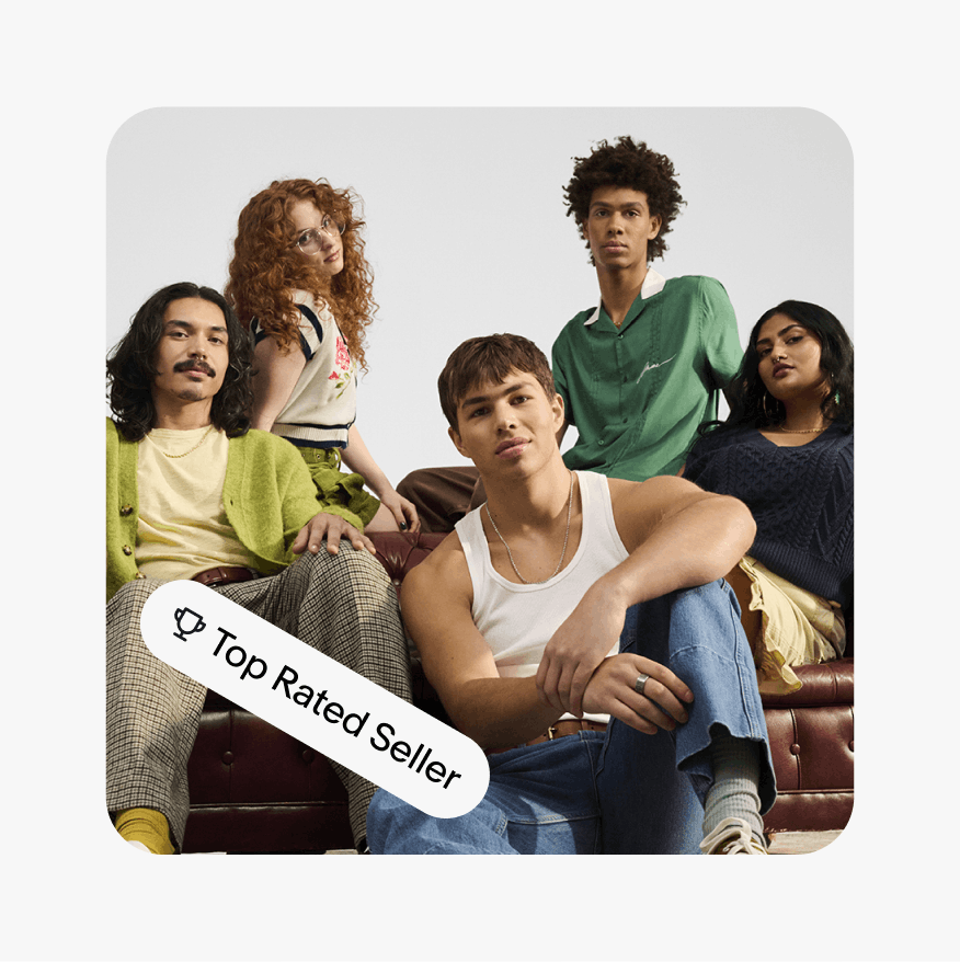
CTA buttons
Do use title case for program badging, when not a product overline.

Don’t use program badging within a pill when there is a CTA in the layout.

Container style
Do follow the pill dimensions of our design system.
Don’t distort or modify the proportion or corners of the pill.
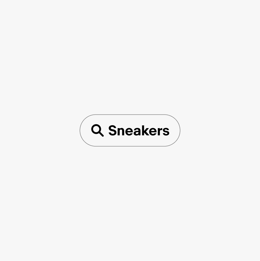
Pill style
Do use Market Sans Regular for the majority of pill tag variants. Only the pricing variants are able to use Market Sans Bold.
Don’t use Market Sans Bold for any pill tags other than the pricing variants.
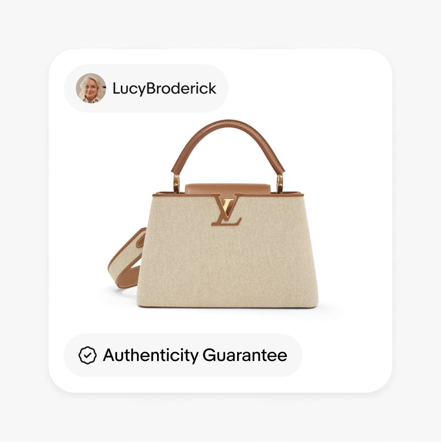
Stacking
Do stack a maximum of 2 pill tags.
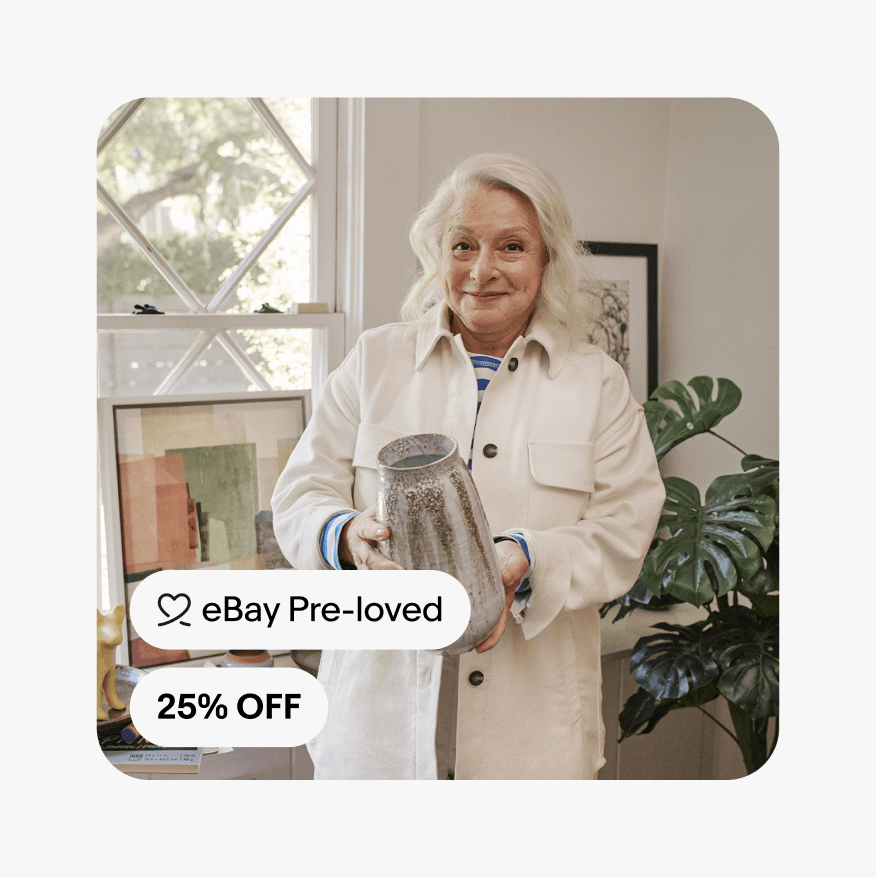
Don’t stack more than 2 pill tags.

Headlines
Do place UI graphics below headlines.

Don’t place UI graphics above headlines or use as an eyebrow.

Be concise
Do keep UI graphics concise.
Don’t be overly wordy with UI graphics.